Stuck between gray and beige, staring at paint swatches and feeling overwhelmed? You’re not alone. Color choices can be tricky, especially when you want something that feels modern yet timeless.
Enter greige – the color that’s quietly changed home design and solved countless decorating dilemmas. In this guide, I’ll help you master greige. You’ll learn:
- Exactly what Greige is
- How to use it in different spaces
- Styling tips and potential pitfalls
Even if you’re redesigning your living room or just want a fresh look, my blog will give you the confidence to choose the perfect neutral. Trust me to walk you through every step of your greige journey.
Understanding Greige: The Perfect Blend of Gray and Beige
Greige is a mix of gray and beige, creating a soft, balanced color that works almost anywhere.
It has the cool tones of gray and the warmth of beige, making it feel both calm and cozy. That’s why greige is such a popular paint choice – it fits with almost any style, from modern to farmhouse.
Depending on the lighting, it can look more gray or more beige, so it’s smart to test a sample first.
Greige works well with wood, metal, and stone, and pairs nicely with both bold and soft colors.
It’s a great neutral if you want something warmer than gray but not as yellow as tan. Simple, stylish, and flexible – that’s the beauty of greige.
The Characteristics of Greige
Learn how this neutral color adapts in different spaces, creating the perfect backdrop for your home design.
- Understanding Greige Undertones: When I first worked with greige, I realized it’s not just one color, it’s a range. Some lean warm with brown hints, others feel cool with gray or blue undertones.
- The Lighting Game Changer: Greige can shift throughout the day. North-facing rooms make it look cooler, while south-facing rooms bring out its warm, creamy side.
- Choosing Your Perfect Greige: Grab several samples, test them at different times, and place them near your furniture. Watch how they change with natural light.
- Matching Greige with Your Space: Don’t overthink it. Let your room guide you. If it feels cold, choose warm greige. If it’s too warm, go with a cooler shade.
Why Greige Is the Versatile Neutral in Interior Design
Learn the color that’s changing the way designers think about neutrals. Greige isn’t just a paint choice, it’s a design strategy that adapts to any style and space, making it the ultimate secret weapon for interior makeovers.
A Perfect Balance of Warm and Cool
Greige is the ideal blend of gray and beige, offering the best of both worlds. It offers the sleek, modern look of gray while adding the softness and comfort of beige.
This makes it incredibly easy to use in different styles. Greige doesn’t lean too cold or too warm, which is why so many designers and homeowners love it. It feels grounded but never boring.
Adapts to Any Lighting
Lighting can change the way a color looks, and greige handles that shift beautifully. In a north-facing room with cooler light, greige leans more gray and subtle.
In a south-facing space filled with warm sunlight, it brings out its beige side and feels warmer and more welcoming. This ability to adapt makes it perfect for any room, no matter how much natural light you get.
Pairs with Everything
One of greige’s biggest strengths is how well it pairs with other colors and finishes. It works great with crisp white trim, deep navy accents, warm wood tones, black fixtures, and even bold colors like mustard or forest green.
If you’re matching it with your floors, furniture, or artwork, greige easily blends in and helps tie everything together. You don’t have to worry about clashing colors or too much contrast—it just works.
Timeless and Stylish
Greige isn’t a trendy color that will feel outdated in a year. It has a timeless quality that makes your space feel fresh but also classic.
You can use it in a full room, as a trim color, or even on cabinetry – and it will always look polished. If you’re unsure what color to use or want something that works long-term, greige is a safe and stylish choice.
Incorporating Greige Into Different Rooms
Change your living spaces with the most versatile neutral color. See how greige can breathe life into every room, from your cozy living room to your serene bedroom, creating a harmonious and classy home design.
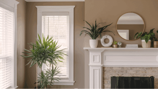
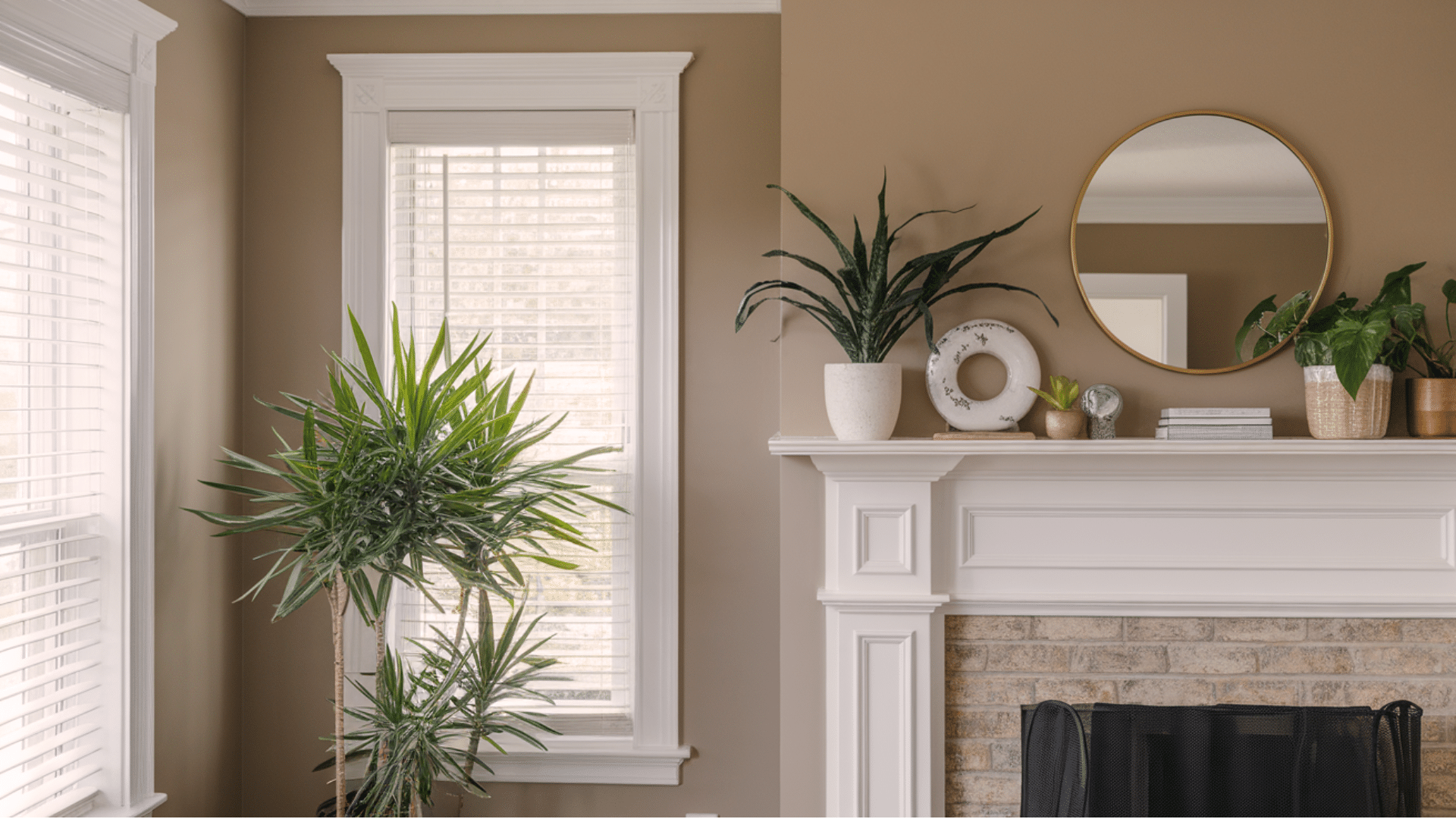
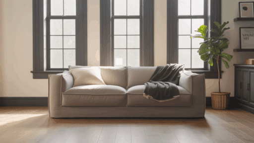
1. Living Room
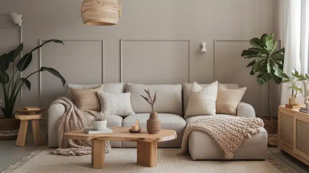
Greige is perfect for living rooms because it creates a calm and cozy feel. It pairs well with wood floors, white trim, and soft fabrics.
You can add colorful pillows, rugs, or art to make the space feel warm and welcoming without clashing. Whether your style is modern or traditional, greige gives the room a clean, comfortable look.
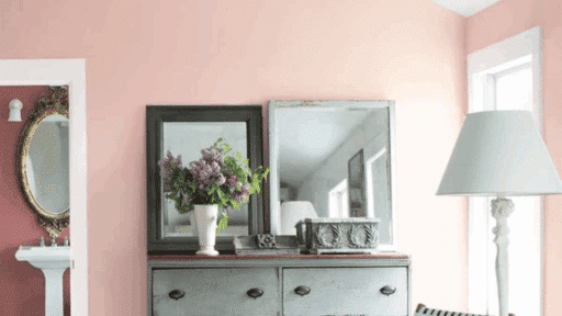
2. Bedroom
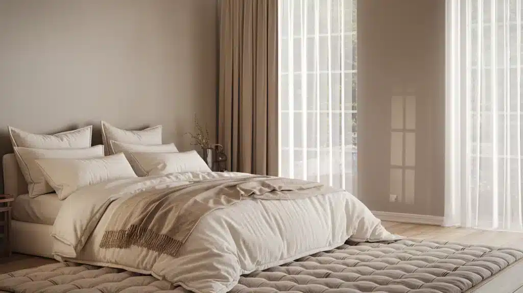
Greige works great in bedrooms because it feels soft and relaxing. It helps create a peaceful space for rest without being too dark or too plain.
Pair it with cozy bedding, warm wood furniture, and soft lighting for a calm, inviting look. You can also mix in light blues, blush, or cream for a gentle pop of color.
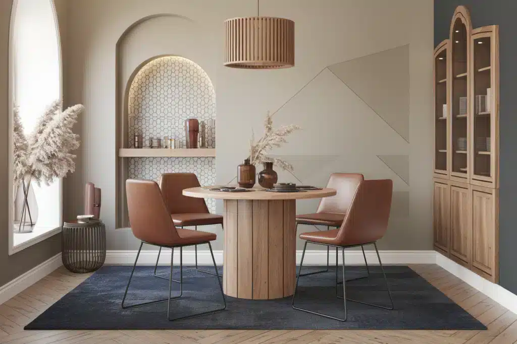
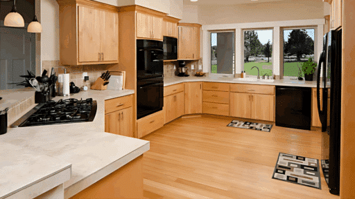
3. Kitchen
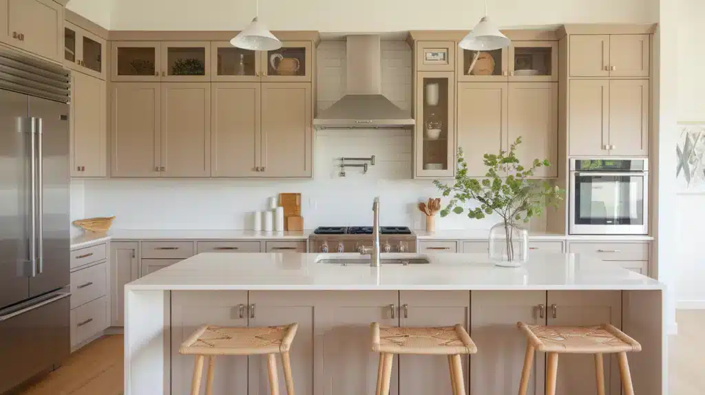
Greige is a great choice for kitchens because it adds warmth while still feeling clean and modern. It pairs nicely with white or wood cabinets, marble or quartz countertops, and metal finishes like black, brass, or stainless steel.
Greige walls or cabinets can soften the look of a busy kitchen and help everything feel more pulled together. It’s a timeless choice that works with many styles
4. Bathroom
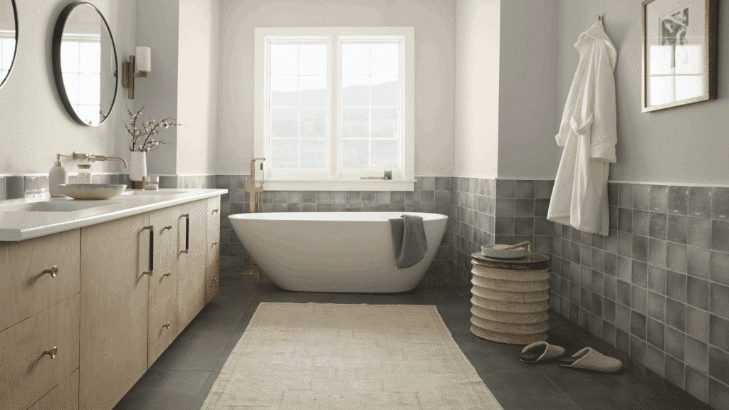
Greige is ideal for bathrooms because it brings a clean, spa-like feel with a touch of warmth. It works well with white tile, natural stone, or wood accents.
If you have a modern vanity or classic fixtures, greige creates a soft, calming backdrop. Add in soft towels and simple decor for a fresh, relaxing space that still feels cozy.
Quick Room Matching Guide
- Living Room: Layer textures
- Bedroom: Soft, calm tones
- Kitchen: Warm undertones
- Bathroom: Light and airy feel
Common Mistakes to Avoid when Decorating with Greige
Greige can be a design dream or a decorating disaster. Find the top pitfalls that can turn your neutral-colored hopes into a bland, lifeless space. Learn how to use this versatile color with confidence and style.
- Ignoring the Undertone: Not all greige is the same – some are warm, others cool. Make sure it matches your floors, furniture, and lighting.
- Skipping Sample Tests: Greige changes with light. Always test samples on your walls at different times of day before committing.
- Mixing Too Many Whites: Pair greige with consistent trim or ceiling whites. Mismatched whites can make the room feel off.
- Overloading with Cool Tones: Too many cool tones with cool greige can feel cold. Balance it with wood or warm accents.
- Using in Dark Rooms Without Warmth: In low-light spaces, choose a greige with beige warmth to avoid a dull or muddy look.
Conclusion
I’ve learned this neutral is the superhero of interior design. Flexible, calm, and incredibly forgiving.
Think of greige as your decorating safety net. Want to refresh your space without major risks? Start small. A throw pillow here, an accent wall there. No pressure. Your home, your rules.
The beauty of greige is its simplicity. It doesn’t demand attention. Instead, it creates space for your personal style to shine. Whether you’re a design newbie or a seasoned decorator, greige works with you, not against you.
Don’t overthink it. Trust your eye. If it feels right, it probably is.
Your perfect space is waiting. And greige? It’s ready to help you find it.

Alex Guerrero, a graduate with a Fine Arts degree from the Rhode Island School of Design, has been a visionary in the world of color and design for over 15 years. His professional journey began in the heart of the fashion industry in Milan, where he developed an acute sense for color harmonies and trends. Alex joined our team in 2018, offering fresh and innovative perspectives on color utilization in various spaces. Renowned for his ability to blend contemporary trends with timeless elegance. Outside of work, Alex is an accomplished painter and a volunteer art therapist, his artistic talents further enriching his professional insights.

What is the exact color shown in “#1 Living Room?”