


When I’m painting cabinets, trim, or furniture, I want a finish that holds up well and looks refined…
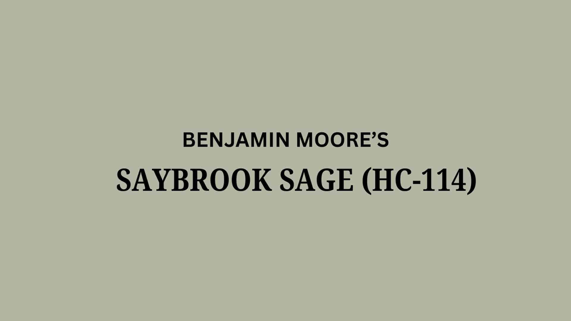
Looking for a soft green paint that makes your home feel calm and cozy? Saybrook Sage by Benjamin…

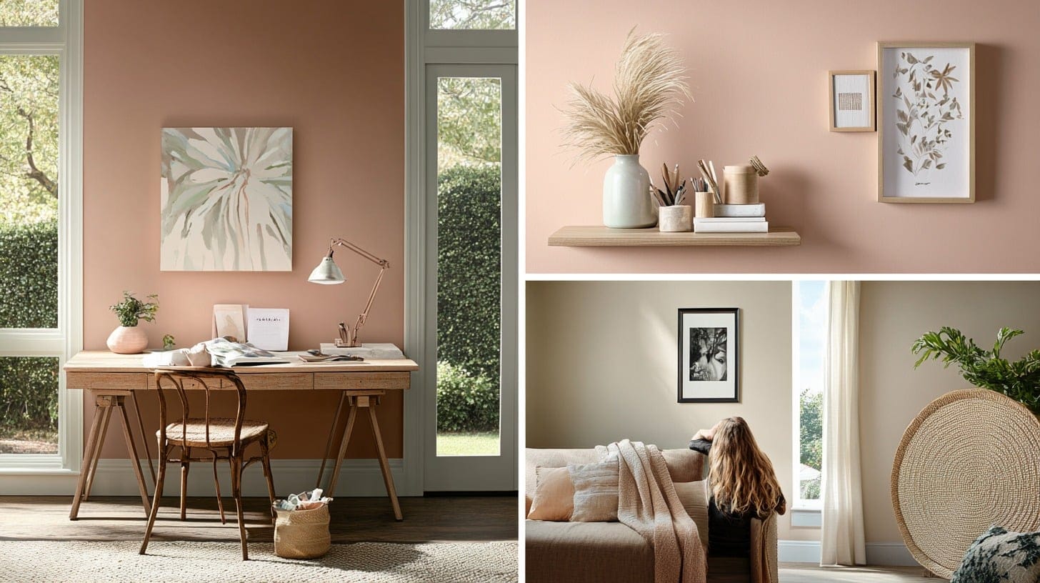
Colors affect our homes in ways we don’t always notice. They can make rooms feel bigger or smaller.…

Some paint colors quietly change a room, and Wind’s Breath (OC-24) is one of them. I first came…

Have you been looking for a paint color that’s both bold and subtle at the same time? Dark…

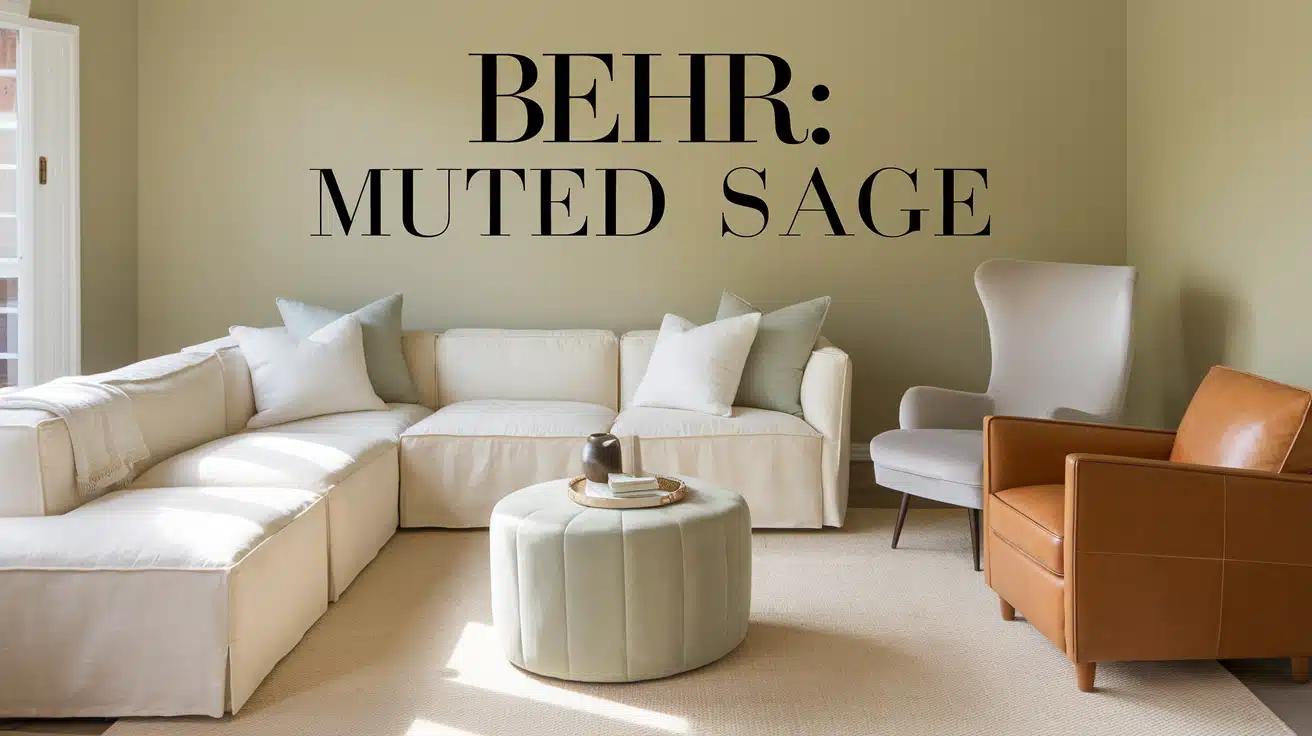
Many people really like Dried Thyme (SW 6186) for their homes. It’s a muted sage green with earthy…
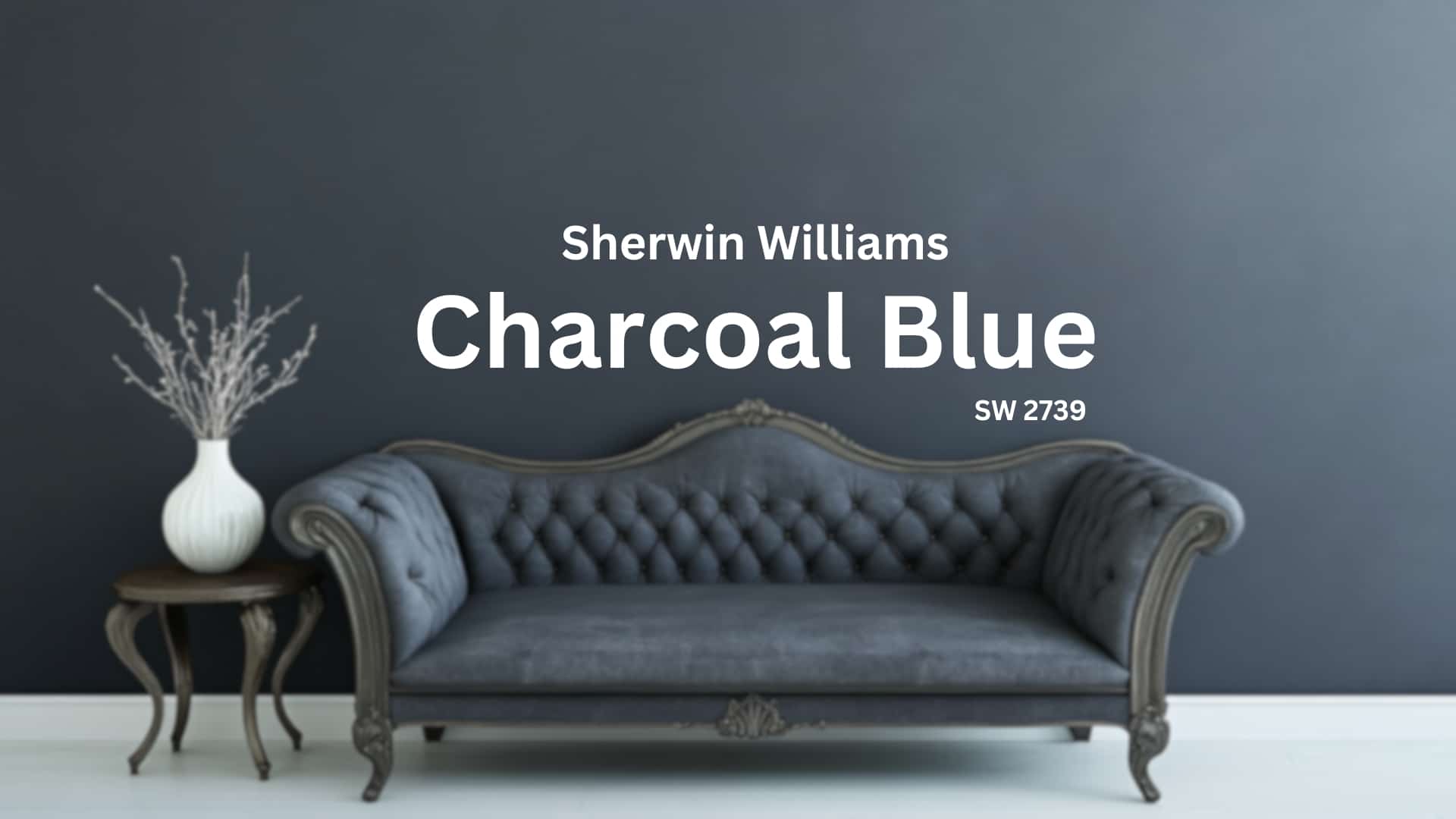
Is Charcoal Blue Right for Your Home? This deep shade from Sherwin Williams mixes blue and gray to…
As an experienced painter, I’ve spent years exploring the incredible world of paint and color, discovering shades that…

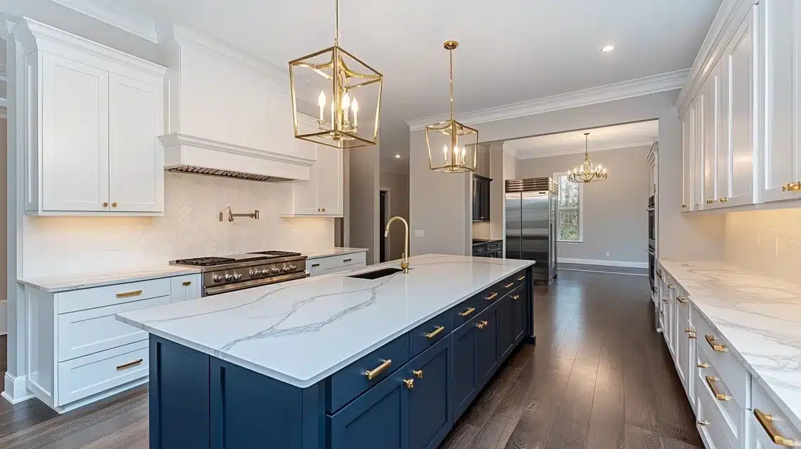
When my family and I recently moved into our new home, I wanted the kitchen to feel like…
I knew this paint color was special when I first saw Sherwin Williams Outer Space (6251). It’s a…
Finding the perfect green paint color can feel overwhelming with countless shades available. Sifting through paint swatches often…
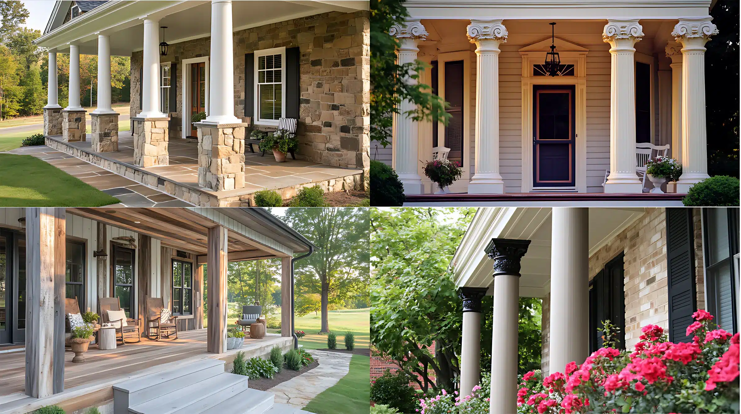
We all love a warm, inviting farmhouse porch. It’s the perfect spot to relax and enjoy the outdoors.…

Are you looking to give your bedroom a touch of darkness? You’re in the right place. This guide…
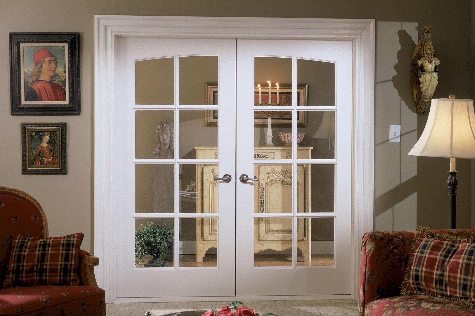
French doors, renowned for their classic style and ability to seamlessly blend indoor and outdoor spaces, are available…

The bedroom layouts have always been so boring and dull. If you have a 10×12 bedroom, the search…

Need to install a fixture or an anti-siphon faucet in your outdoors? Does an existing faucet leak or…