After countless client consultations in which I witnessed the progressive power of dark neutrals, I’ve found that Sherwin-Williams’ Urbane Bronze (SW 7048) and Iron Ore (SW 7069) consistently emerge as top contenders for creating refined spaces. Yet, these rich hues serve dramatically different design visions.
Have you ever painted a sample of each on your wall and watched them alter throughout the day? Urbane Bronze’s warm bronze undertones create a different emotional response than Iron Ore’s cooler, more contemporary presence.
I’ve used both extensively, and I’m sharing my professional insights to help you determine which dark neutral will best achieve your vision.
If you’re considering these colors for a moody bedroom sanctuary or a bold exterior statement, let’s explore which one speaks to your aesthetic.
Understanding Paint Color Basics
Color Terminology
| Aspect | Urbane Bronze (SW 7048) | Iron Ore (SW 7069) |
|---|---|---|
| LRV (Light Reflectance Value) | 8 | 6 |
| Color Category | Dark color (LRV | Dark color (LRV |
| Comparison | Pure white: ~90 LRV, Black: ~0 LRV | Pure white: ~90 LRV, Black: ~0 LRV |
| RGB Value | Red: 84, Green: 80, Blue: 74 | Red: 67, Green: 67, Blue: 65 |
| Hex Code | #54504A | #434341 |
| Undertones | Warm deep brown with subtle green and gray undertones | Rich charcoal black with a soft, warm undertone |
| Best Pairings | Warm whites, muted greens, deep charcoals | Crisp whites, natural woods, muted blues |
| Ideal for | Cozy, bold, and refined interiors | Dramatic, modern, and high-contrast spaces |
Key Differences Between Urbane Bronze (SW 7048) vs. Iron Ore (SW 7069)
Urbane Bronze has warm, rich undertones with subtle brown influences, creating a refined and earthy appearance that feels grounded and natural in most spaces.
Iron Ore presents as deep charcoal with cooler blue-gray undertones, offering a more contemporary and industrial feel that creates dramatic contrast.
In natural light, Urbane Bronze reveals its complex brown-bronze dimension, while Iron Ore maintains its crisp, dark appearance with minimal variation.
Urbane Bronze pairs exceptionally well with warm woods, brass accents, and natural materials. In contrast, Iron Ore creates a stunning contrast with bright whites and works beautifully with silver or chrome finishes.
Urbane Bronze feels more enveloping and cozy when used in larger areas, while Iron Ore provides a more striking structural presence that defines spaces with greater contrast.
Room-by-Room: Urbane Bronze (SW 7048) vs. Iron Ore (SW 7069)
Living Spaces and Open Floor Plans
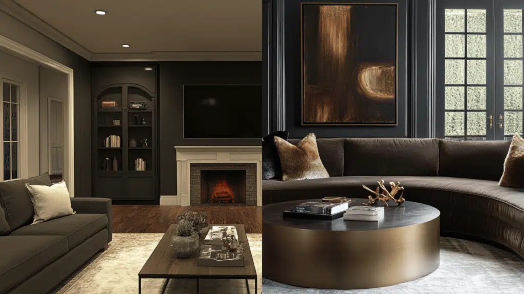
Urbane Bronze: With its LRV of 8, it creates an intimate, refined atmosphere that can make larger spaces feel more defined and intentional. Its warm undertones provide depth that changes subtly throughout the day, adding dimension to walls.
Iron Ore: Its slightly higher LRV (6) maintains a consistent dark presence that creates dramatic backdrops for artwork and furnishings. The cooler undertones establish a more contemporary foundation that allows colorful décor to stand out vividly.
Bedrooms and Relaxation Areas
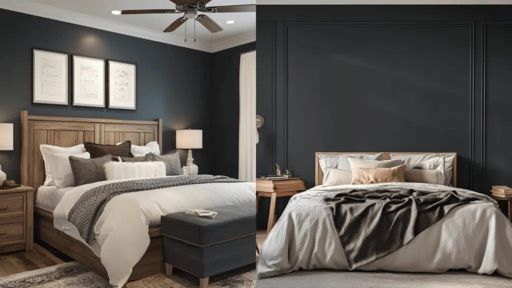
Urbane Bronze creates a protective and grounding cocooning effect. Its earthy warmth pairs beautifully with natural linens, leather accents, and warm-toned woods to create a retreat-like atmosphere.
Iron Ore: Delivers a bold statement that works exceptionally well in primary bedrooms seeking drama. It creates a more modern, crisp envelope that complements cooler bedding tones and glossy white furniture for a striking contrast.
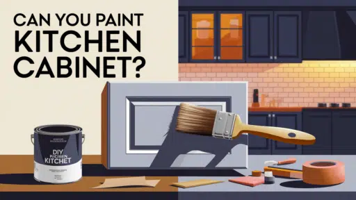
Kitchen
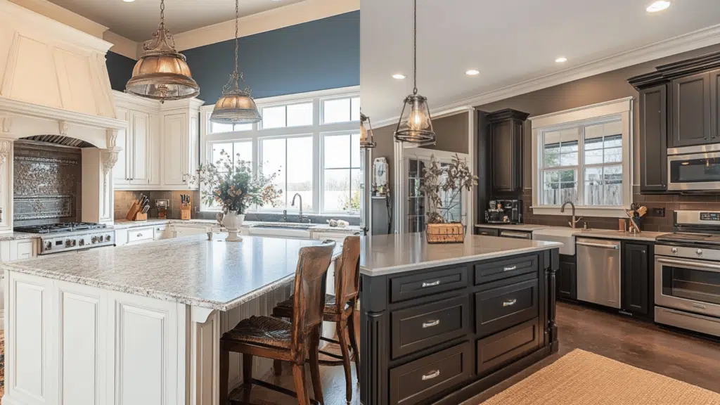
Urbane Bronze is exceptional on kitchen islands or lower cabinets, providing an earthy contrast that grounds the space. It pairs magnificently with marble countertops featuring warm veining, brass fixtures, and wood elements.
Iron Ore creates a more dramatic contrast in cabinetry, particularly when paired with bright whites. It establishes a more contemporary industrial feel that works wonderfully with stainless steel appliances, concrete countertops, and matte black hardware.
Bathrooms

Urbane Bronze: Adds rich warmth that creates a spa-like atmosphere when paired with natural stone and wood elements. It prevents bathrooms from feeling cold while maintaining refinement.
Iron Ore: Delivers modern drama that pairs beautifully with white fixtures and chrome or nickel finishes. It creates distinctive definitions in shower niches and accent walls, making smaller bathrooms feel intentionally designed.
Urbane Bronze vs. Iron Ore for Exterior Use
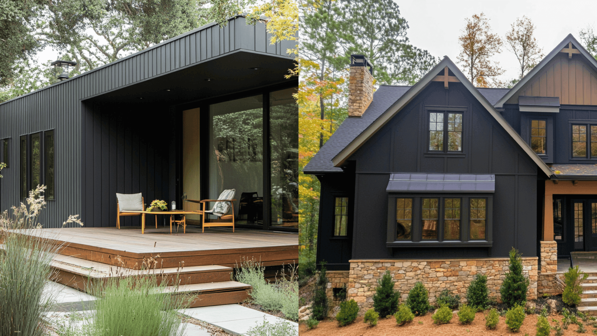
Urbane Bronze (SW 7048) presents as a rich, grounded color that absorbs light beautifully while revealing subtle dimensions in changing daylight. Its warmth becomes more pronounced in morning and evening light, creating a welcoming presence.
It excels in craftsman, farmhouse, and transitional exteriors, complementing natural materials like stone and wood. Urbane Bronze pairs exceptionally with creamy whites (Alabaster or Greek Villa) and natural wood tones for a harmonious, earthy palette.
Iron Ore (SW 7069) offers a commanding presence with its deep charcoal appearance that maintains consistency throughout the day. Its cooler undertones create sharper definition and structural interest.
It defines modern, contemporary, and industrial-inspired exteriors with crisp precision. Iron Ore creates a striking contrast with bright whites (Pure White or Extra White) and works beautifully for accent elements like doors, window frames, and railings.
Both colors appear darker on exteriors than sample chips suggest; Urbane Bronze can read more brown in warm afternoon light, while Iron Ore maintains its deep charcoal presence with minimal shift.
Urbane Bronze vs. Iron Ore: Which One is More Timeless?
Both Sherwin-Williams dark neutrals have established themselves as enduring choices in the deeper color spectrum, though they serve different design philosophies.
Current Color Trends & Long-Term Appeal: Urbane Bronze (SW 7048) connects with the ongoing appreciation for nature-inspired, grounded interiors. At the same time, Iron Ore (SW 7069) satisfies the enduring desire for structural definition and contrast.
Both colors have demonstrated remarkable staying power through changing design cycles, appearing in projects spanning decades.
Versatility Across Changing Decor: Urbane Bronze offers warmth that bridges traditional and contemporary styles, adapting elegantly as design elements around it evolve.
Iron Ore provides a steadfast neutral anchor that allows for significant style shifts in surrounding decor. Neither is inherently more versatile—they accommodate different design objectives and can adapt to evolving tastes.
Real-World Applications: Both colors appear consistently in structural publications and designer portfolios, with Urbane Bronze excelling in spaces that seek to balance warmth with intricacy and Iron Ore, defining spaces where contrast and definition are priorities.
This suggests that timelessness depends more on thoughtful application within the overall structural context than on the specific shade.
Can You Use Urbane Bronze and Iron Ore in the Same Home?
These two Sherwin-Williams dark neutrals can work harmoniously together to create refined depth and structural interest in a cohesive, well-considered design.
Use Urbane Bronze (SW 7048) in spaces where you want to introduce warmth and grounding presence. It excels in rooms with natural materials like wood and leather, creating an organic connection that feels intentional yet relaxed.
Its brown undertones make it perfect for spaces where you entertain or gather, like dining rooms or family rooms.
Reserve Iron Ore (SW 7069) for areas where you want definition and contrast. It is ideal for structural elements that benefit from sharp definition, such as interior doors, window frames, or built-ins.
Its cooler undertones create a more dramatic contrast against whites and light neutrals.
Use these colors strategically within sightlines of each other to create smart transitions. For example, use Iron Ore for an office door visible from a living room with an Urbane Bronze accent wall.
This creates an intentional dialogue between spaces while maintaining distinct characters in each area.
Mistakes to Avoid While Choosing Urbane Bronze vs. Iron Ore
Never select either dark color solely based on digital images or small paint chips. Sample both on multiple walls, as Urbane Bronze can appear significantly browner than expected in warm artificial lighting, while Iron Ore might read almost black in dimly lit spaces.
Watch for undertone shifts throughout the day—Urbane Bronze reveals its rich brown-bronze dimension in morning and evening light, sometimes appearing lighter than expected. In contrast, Iron Ore maintains its depth consistently but can reveal subtle blue undertones in bright natural light.
Consider your room’s finishes and color scheme carefully. Urbane Bronze can clash with cool gray furnishings or flooring, creating an unintentional contrast that feels disjointed rather than intentional.
Beware of using Iron Ore in rooms that already feel cold or stark—its cooler undertones can amplify this effect, creating a space that feels unwelcoming rather than dramatic and worldly.
Always test these colors alongside your existing metals and hardware. Urbane Bronze harmonizes beautifully with brass and gold tones but can appear muddy next to chrome or nickel.
Conversely, Iron Ore creates a striking contrast with warm metals but looks more cohesive with silver-toned fixtures.
Wrapping It Up
After working with both Urbane Bronze and Iron Ore across hundreds of projects, I’ve learned that choosing between them ultimately comes down to the feeling you want your space to evoke.
Urbane Bronze will wrap your rooms in earthy intricacy, while Iron Ore creates structural definition with a contemporary edge.
I encourage you to sample both colors in your actual space, observing them at different times of day before making your final decision.
Remember that lighting, surrounding materials, and even your geographical location will influence how these complex neutrals appear.
Ready to plunge into the world of dark neutrals? Order sample pots today and live with these colors for at least a week. Share your results with me—I’d love to see how these progressive colors bring your vision to life!

Alex Guerrero, a graduate with a Fine Arts degree from the Rhode Island School of Design, has been a visionary in the world of color and design for over 15 years. His professional journey began in the heart of the fashion industry in Milan, where he developed an acute sense for color harmonies and trends. Alex joined our team in 2018, offering fresh and innovative perspectives on color utilization in various spaces. Renowned for his ability to blend contemporary trends with timeless elegance. Outside of work, Alex is an accomplished painter and a volunteer art therapist, his artistic talents further enriching his professional insights.

This is so helpful, thank you! Under the “Urbane Bronze vs. Iron Ore for Exterior Use” paragraph, do you happen to know which tan/brown color they paired the iron ore with, the home on the right? It looks very similar to the wood stain, I love it!