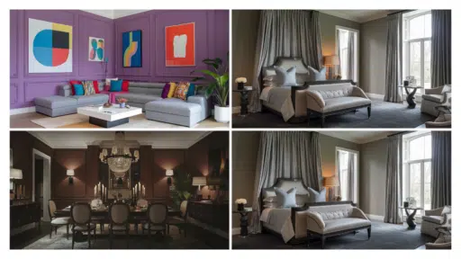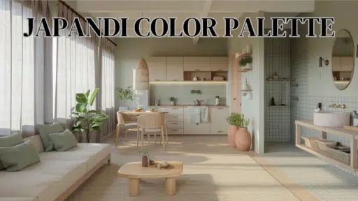

Have you ever wondered how to make your home feel zen and cozy? Enter Japandi, a gorgeous fusion of Japanese minimalism and Scandinavian comfort that takes the design world by storm.
It’s where simplicity meets functionality, and nature connects with muted colors to create something special. Think clean lines and clutter-free spaces but with a warm, inviting twist.
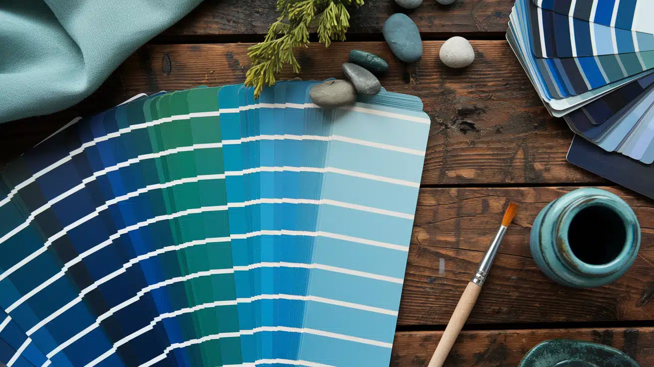
The magic happens in the colors—we’re talking soothing neutrals, gentle earth tones, and whispers of nature-inspired greens that make your space feel like a peaceful retreat.
This guide will explore the Japandi color palette and show you how to use these thoughtfully chosen shades to create your calm sanctuary.
Understanding the Japandi Color Palette
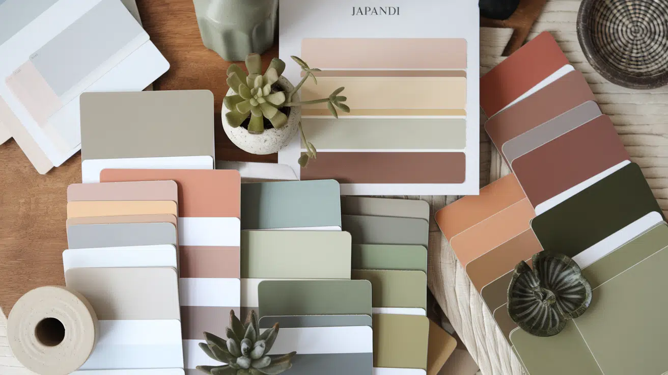
The Japandi color palette draws from two beautiful philosophies – Japanese and Scandinavian. At its heart, this fusion celebrates the beauty of imperfection and cozy comfort.
Think soft, calming neutrals that set the foundation, with gentle, earthy tones bringing warmth to your spaces. This palette is special because it effortlessly blends minimalist Japanese design with the comfort of interiors.
You’ll find a thoughtful mix of warm whites, stone grays, and muted earth tones punctuated by gentle touches of nature-inspired greens.
The palette creates balance by pairing light, airy tones with deeper, grounding shades – like pairing a creamy white wall with warm wooden accents.
The Japandi Color Palette – Key Shades And Their Impact
1. Neutral Tones
These are your canvas colors – the gentle whites, soft beiges, and whisper-quiet grays that set the stage for everything else.
They’re not just backdrop players; they work hard to make your space open and airy.
A warm white wall, for instance, can instantly make a room feel more spacious while creating the clean, minimalist feel that’s essential to the Japandi style.
These neutrals are particularly clever at reflecting light and providing a calming base that lets your furniture and decor pieces shine. They’re also incredibly versatile, playing well with modern and traditional elements.
2. Earthy Shades
The soul-warming browns, gentle terracottas, and muted greens give Japandi spaces their grounding energy.
These colors feel like a warm hug for your home. They’re comforting and natural, bringing the outside world in.
Rich walnut browns can add depth to your space through furniture pieces, while soft terracotta accents create cozy corners that invite you to stay.
These earthy tones work beautifully with natural materials, enhancing the organic feel central to Japandi design.
They’re especially effective at making larger spaces feel more intimate and welcoming.
3. Subtle Green Accents
Here’s where we bring in those life-affirming touches of nature. Olive, sage, and moss greens act like breaths of fresh air throughout your space.
They’re not bold or shouty; instead, they whisper their presence through carefully chosen accents – maybe a softly textured throw pillow or a collection of plants.
These gentle green tones help create that vital connection to nature that Japanese and Scandinavian design value highly.
They’re particularly effective at adding subtle movement and energy to a room without disrupting its peaceful vibe.
4. Contrasting Elements
This is where the magic of depth comes into play. You create visual anchors that define your space and complexity by introducing deeper tones like charcoal, slate gray, and forest greens.
These darker elements act like punctuation marks in your design, drawing the eye and creating intentional focal points.
Think of a charcoal accent wall behind a pale sofa or slate gray tiles in a bathroom—these contrasting elements add drama and interest while maintaining an overall sense of calm.
The key is using them strategically, as artists use shadows to give their paintings depth.
Applying the Japandi Color Palette Room by Room
1. Drawing Room
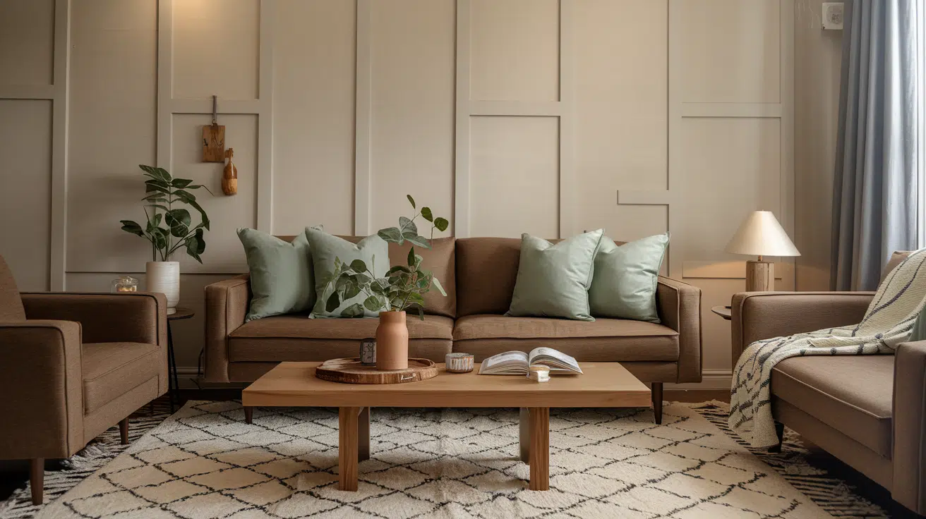
Your living space sets the tone for your entire home, so start with a foundation of calm neutrals on the walls – think warm whites or soft beiges.
Layer in furniture in rich earth tones, like a deep walnut sofa or armchairs in a warm taupe. Sage green cushions and textured throws add life and peace.
The magic happens when you incorporate natural wood elements through coffee tables and side tables, while a neutral-toned textured rug grounds the space.
Remember to keep decorative elements minimal but meaningful, perhaps featuring a few ceramic pieces in earthy shades.
2. Bedroom
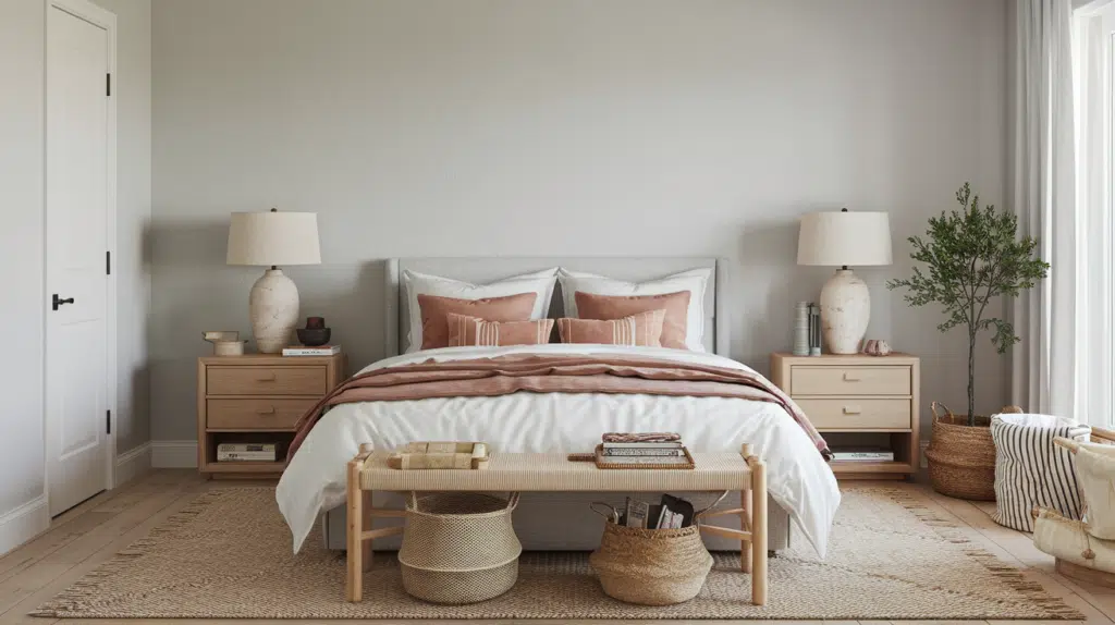
Change your bedroom into a peaceful sanctuary with warm white or the softest gray walls – colors that whisper rather than shout.
Layer the bed with linens in earthy clay tones, adding depth with muted accent pillows in varying textures.
Wooden nightstands bring natural warmth, while ceramic lamps in neutral tones provide soft, ambient lighting. The key is to create a space that feels both restful and refined.
Consider adding abstract art in muted tones to maintain interest without disrupting the calm.
3. Kitchen
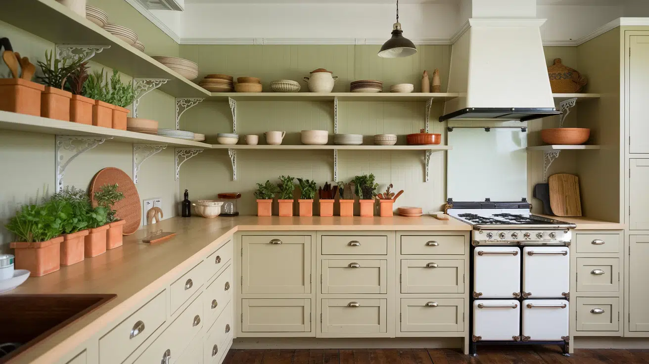
The heart of your home deserves special attention. For a subtle connection to nature, opt for beige cabinetry that feels warm and inviting paired with a muted green backsplash.
Terracotta pots housing fresh herbs bring life to countertops —they’re both functional and beautiful. Rattan pendant lights add wonderful texture while keeping with the natural theme.
Consider using open shelving in light wood tones to display carefully curated items in earthy shades. The overall effect should feel organized yet lived in.
4. Bathroom

Create a spa-like retreat with walls in soft stone or soothing sage green. Wooden usage adds natural warmth, while moss green towels bring in those essential nature-inspired accents.
Incorporate bamboo storage solutions for a touch of Japanese tradition, and add small plants for life and freshness.
To add interest without overwhelming the space, keep the overall palette calm with neutral tiles, perhaps in varying textures. Consider natural stone accessories for those finishing touches.
5. Home Office
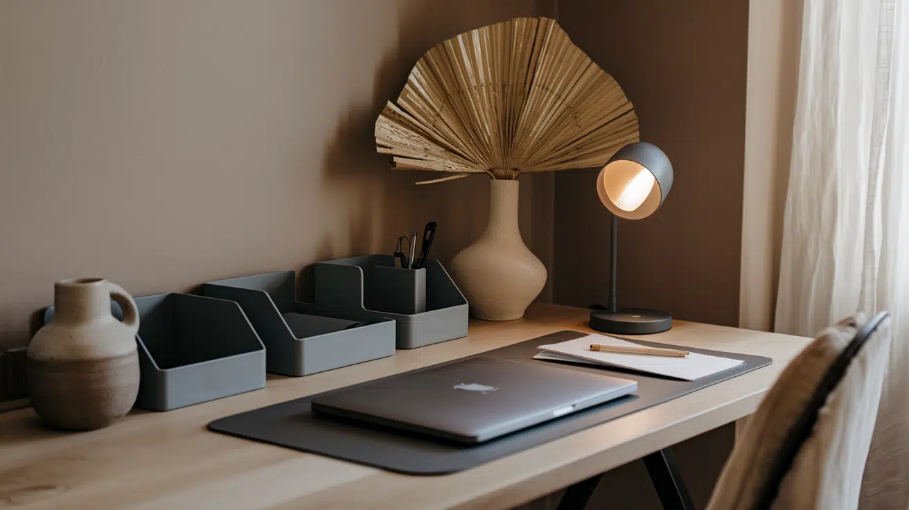
Design a productive yet calming workspace with warm taupe or refined slate gray walls. These colors help maintain focus without feeling pure.
Center the room around a desk in natural wood tones, incorporating charcoal and golden straw accents through thoughtfully chosen accessories.
Keep decorative elements minimal but meaningful – perhaps a piece of inspirational art or a carefully placed plant.
The goal is to create a space that encourages productivity while maintaining the peaceful Japandi style.
Choosing the Right Paint Colors
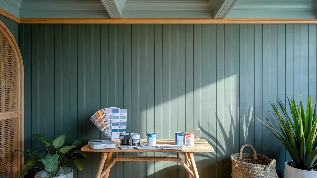
Selecting paint colors for your Japandi-inspired home doesn’t have to be overwhelming. When you understand the key players in this calm palette, it can be quite an enjoyable process.
Expert designers have specific shades that capture the essence of Japandi style while ensuring your space feels both contemporary and timeless.
Let’s break down these choices and learn how to combine them effectively.
1. Warm Neutrals
Swiss Coffee and Ballet White are our top picks because of their versatility. These shades create an inviting backdrop without feeling stark or clinical.
Swiss Coffee offers a creamy warmth that works beautifully in any room, while Ballet White brings a soft, luminous quality to your spaces.
2. Earth Tones
Morris Room Grey and Canyon Dusk add depth and refinement. These colors ground your space and connect it to nature.
Morris Room Grey offers a rich, warm undertone that feels both contemporary and cozy, while Canyon Dusk brings in those beautiful terracotta notes that add warmth and character.
3. Greens
Sage Green and Cascade Green bring nature indoors. These gentle, muted greens add life to your spaces without overwhelming them.
Sage Green has a soft, organic feel that is perfect for creating calm, while Cascade Green provides a slightly deeper option for areas that require more impact.
Japandi Color Options in Trend
1. Alabaster White
A soft, creamy white that creates a clean and welcoming backdrop. Its versatility lets it pair beautifully with natural wood tones and subtle accents, making it perfect for walls and ceilings.
Color Code: #FAF3E0
2. Ballet White
A warm beige-toned white that brings a soft and comforting glow to any room. It works well in spaces designed for relaxation and balance.
Color Code: #F2E8DA
3. Blush Sand
A delicate blend of pink and beige adds gentle warmth to the interiors. It’s a great choice for textiles or small accent areas that want to introduce a soft, natural shade.
Color Code: #E0CFC3
4. Cascade Green
This muted green, inspired by nature, offers a calm and refreshing feel. When paired with wooden elements, it’s ideal for kitchens or bathrooms.
Color Code: #A4C3B2
5. Charcoal Gray
A deep, grounding gray that provides a sense of depth and contrast. It works well as an accent wall or in furniture to anchor lighter tones.
Color Code: #5E5E5E
6. Creamy White
A warm white with a subtle yellow undertone, perfect for creating a bright yet inviting space. This shade enhances the sense of openness in any room.
Color Code: #F3F0E8
7. Earthy Clay
A rich terracotta-inspired shade that brings warmth and grounding to interiors. Use it in decorative pieces or as an accent wall to highlight natural textures.
Color Code: #C09E85
8. Forest Night
A deep green similar to dense woodlands offers a cozy and intimate vibe. It is ideal for corners or accent pieces to bring the outside in.
Color Code: #606C5A
9. Golden Straw
A warm yellow-brown tone inspired by dried straw, perfect for adding a natural and comforting touch to neutral spaces.
Color Code: #DCB482
10. Gray Cloud
A light gray with soft undertones, this color offers a calm and neutral backdrop. It works wonderfully in spaces where simplicity is key.
Color Code: #D1D5D8
11. Jojoba
A dusty green with gray undertones that feels grounded and peaceful. It pairs beautifully with light wood and neutral tones.
Color Code: #B9B99D
12. Moss Green
Inspired by moss-covered stones, this muted green adds a natural, earthy touch to the interiors. It’s perfect for soft furnishings or potted plants.
Color Code: #B0B9A8
13. Pale Taupe
A soft brown-gray shade that brings a sense of warmth and comfort to interiors. It’s great for furniture and accent walls.
Color Code: #D2C6B2
14. Sage Green
A calm and natural green tone that works beautifully in living spaces, complementing wooden textures and neutral palettes.
Color Code: #9CAB7B
15. Slate Gray
A balanced medium gray that adds structure and depth to a room. It’s excellent for large surfaces or detailed accents.
Color Code: #858480
16. Smoky Beige
This subtle blend of gray and beige creates a relaxed and inviting atmosphere. Use it for upholstery or rugs to add warmth.
Color Code: #D3C6C0
17. Soft Stone
A gentle gray with beige hints creates a balanced and natural tone. It’s ideal for bedrooms or spaces that encourage calmness.
Color Code: #E6E4E0
18. Swiss Coffee
An off-white with a creamy finish, this paint adds lightness to any room without being stark. It is perfect for walls, trims, or ceilings.
Color Code: #EEE8D8
19. Warm Taupe
A warm brown with gray undertones, excellent for grounding furniture and decorative accents. It complements both lighter and darker tones.
Color Code: #DFCABA
Conclusion
And there you have it. Japandi isn’t just about mixing neutral colors—it’s a philosophy that celebrates the sweet spot between minimalism and comfort.
The color palette we’ve explored perfectly reflects this, blending serene neutrals with warm earth tones to create graceful and lived-in spaces.
Remember, these aren’t rigid rules—they’re more like friendly guidelines. Feel free to experiment with the colors that speak to you.
Maybe you prefer warmer tones, or those muted greens catch your eye. The key is maintaining balance and calm, which makes Japandi special.
It all comes down to simplicity and harmony. If you follow these two principles, you’ll be shocked at how naturally your space changes into a peaceful Japandi haven.

Alex Guerrero, a graduate with a Fine Arts degree from the Rhode Island School of Design, has been a visionary in the world of color and design for over 15 years. His professional journey began in the heart of the fashion industry in Milan, where he developed an acute sense for color harmonies and trends. Alex joined our team in 2018, offering fresh and innovative perspectives on color utilization in various spaces. Renowned for his ability to blend contemporary trends with timeless elegance. Outside of work, Alex is an accomplished painter and a volunteer art therapist, his artistic talents further enriching his professional insights.