
Are you tired of guessing the paint color of your home’s exterior? Let me introduce you to Accessible Beige—the ninja of neutral paint colors.
Imagine this: a warm color to make your home feel welcoming but refined enough to turn heads in your neighborhood. It’s like finding that perfect pair of jeans that goes with everything in your wardrobe.
What’s cool about Accessible Beige is that it sneakily looks fantastic in any light and complements almost every exterior material.
Whether rocking a modern farmhouse vibe or keeping it classic colonial, this color’s got your back. Want to know why this chameleon of colors might be your home’s new best friend? Let’s jump in!
What Is Accessible Beige For Exterior?
The Subtle Undertones of Accessible Beige
Accessible Beige is a chameleon-like neutral that’s become a favorite for exterior walls. Its warm, greige base strikes the perfect balance between beige and gray, making it incredibly versatile.
You’ll notice its great ability to look warm and welcoming without being too yellow or pink, as traditional beiges can. The subtle gray undertones help it stay refined and current.
How Accessible Beige Compares to Other Exterior Colors
While Agreeable Gray leans cooler and Revere Pewter has stronger gray undertones, Accessible Beige holds its own with a unique warmth that’s not overpowering.
It’s less stark than some popular grays but warmer than typical greiges. This color’s special feature is that it looks fresh and timeless, unlike some trendy neutrals that can quickly feel dated.
Plus, it plays incredibly well with warm and cool exterior elements like stone, brick, and trim.
Is Accessible Beige Warm or Cool?
Understanding Its Balanced Temperature
You might wonder where Accessible Beige falls on the warm-cool spectrum. The answer is a bit of both.
While it’s primarily a warm, neutral paint color, some sneaky gray undertones give it surprising versatility. Think of it as that perfect sweater that works in both fall and spring.
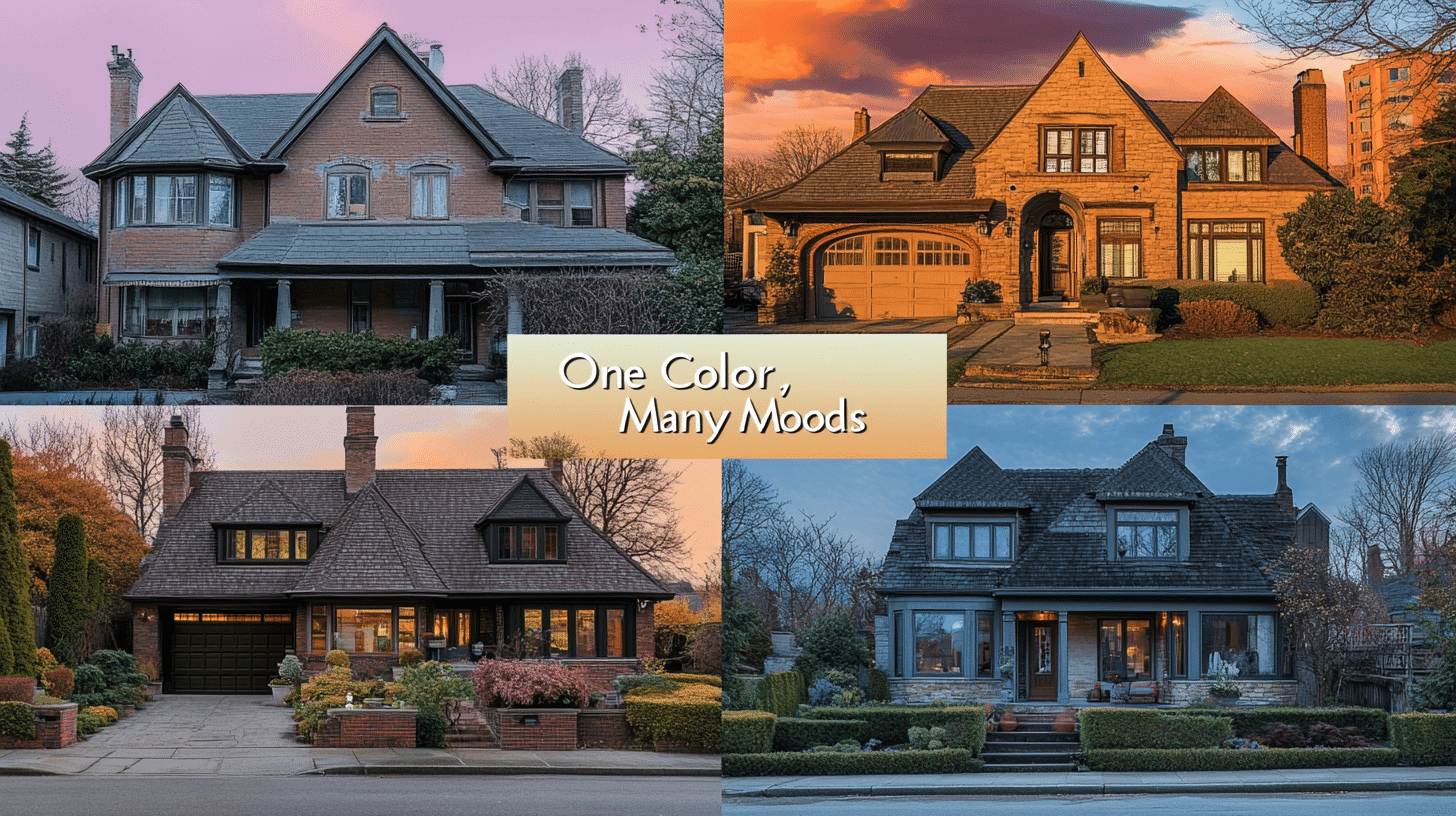
How Accessible Beige Adapts to Different Lighting
When it comes to lighting, this color is quite the chameleon. In bright sunlight, especially in south-facing rooms, Accessible Beige leans into its warmer side, creating a cozy, welcoming vibe.
But if you enter a north-facing room, you’ll notice it picks up cooler undertones and appears more refined and muted.
This adaptability is exactly what makes it so popular for both modern and traditional homes – it just knows how to play nice with whatever light it gets
The Light Reflectance Value (LRV) of Accessible Beige

What Does LRV Mean for Your Exterior?
Let’s discuss Accessible Beige’s LRV of 58—it’s right in the sweet spot for exterior colors.
Here’s why that matters:
- Bright enough to keep your home visible and welcoming but not so light that it’ll blind your neighbors on sunny days
- Reflects just the right amount of light to show off your home’s architectural details without washing them out
- It helps manage heat absorption, making it a practical choice for various climates
Think of it as the “Goldilocks” of exterior paint colors – not too bright or dark, but just right for creating that perfect curb appeal. It’ll make your home stand out while still playing nice with the neighborhood!
Accessible Beige’s Undertones

The Role of Gray in Accessible Beige
Ever wonder why Accessible Beige doesn’t fall into that dated, yellow-beige trap? It’s all about those worldly gray undertones working behind the scenes.
Unlike 90s beige, which could look too warm or yellow, Accessible Beige has a modern edge that keeps it current.
Here’s what makes it special:
- The gray undertones act like a color filter
- softening the warmth
- preventing that dreaded yellow cast that many beiges can develop on exterior walls
Think of it as beige wearing a tailored suit—it’s still warm and approachable but with an air of refinement. This subtle balance is exactly why it works so beautifully on home exteriors and continues to look fresh year after year.
You’ll notice how it maintains its dignity in different lights, never looking too warm or dated. It’s like having a trusted friend who always knows how to dress appropriately for any occasion!
What Exterior Colors Complement Accessible Beige?

Best Trim Colors for Accessible Beige
Finding the perfect trim color for Accessible Beige doesn’t have to be complicated. This versatile shade’s beauty is how well it complements others.
A crisp white trim can create that classic, clean look, while darker accents add drama and depth to your home’s exterior.
- Sherwin Williams Alabaster – creates a soft, harmonious contrast
- Pure White – offers a clean, bright contrast without looking stark
- Urbane Bronze – perfect for shutters and doors when you want drama
Is Accessible Beige Ideal for Exterior Use?
Absolutely. There’s a reason why Accessible Beige has become a go-to exterior color for so many homeowners. It’s one of those rare colors that seems to work everywhere, from modern farmhouses to traditional colonials.
- Handles weather changes beautifully without fading quickly
- Masks dirt and dust better than lighter or darker colors
- Creates a welcoming vibe that works in any neighborhood
- It provides enough warmth to look inviting without being too bold
Think of it as the ultimate “people-pleaser” of exterior paint colors – it works!
Similar Colors To Accessible Beige

Have you ever wondered how these popular neutrals compare to each other? Let me explain. Think of these colors as three siblings—each with a distinct personality but related!
- Accessible Beige is like the warm, friendly middle child. Its cozy undertones and versatile nature create an inviting exterior that feels just right. Not too warm, not too cool – it’s got that perfect balance.
- Agreeable Gray is the cooler, more refined sibling. While still neutral, it leans toward gray undertones, making it perfect for a more modern vibe. When you compare them, you’ll notice that Agreeable Gray brings a contemporary edge, while Accessible Beige offers timeless warmth.
- Balanced Beige is the deeper, more dramatic member of the family. Its lower LRV of 46 packs more punch than its siblings, making it perfect for those wanting more depth in their exterior color scheme.
Think of them as different flavors of neutral—each one special in its way. Accessible Beige hits that sweet spot of warmth and versatility, making it a crowd-pleaser.
Where Does Accessible Beige Work Best on the Exterior?
Are you looking for the perfect spots to use Accessible Beige on your home’s exterior? This versatile color is the ideal outfit for any occasion.
It’s great at creating a look that combines different exterior elements, from siding to accent pieces.
- Main exterior walls and siding – create a welcoming backdrop
- Front doors and shutters – add warmth without overwhelming
- Trim and fascia – pairs beautifully with white or darker accents
- Garage doors – bring cohesion to large surfaces
- Outdoor living spaces – blends perfectly with stone and wood elements
What Colors Pair Well with Accessible Beige on the Exterior?

Want to know what plays nicely with Accessible Beige? This friendly neutral is like the perfect host at a party – it gets along with everyone.
For a stunning exterior, pair it with soft sage greens that echo your landscaping, or go for deep navy blues on shutters and doors for a classic coastal vibe.
Natural wood tones are magical with Accessible Beige, whether a rich mahogany front door or cedar shake accents.
For something more dramatic, dark bronze or charcoal trim can create gorgeous contrast while still feeling sophisticated. Even white stone and brick elements come alive next to this versatile shade.
Pros and Cons of Accessible Beige for Exteriors
| PROS | CONS |
|---|---|
| It hides dirt and grime better than lighter colors, making maintenance easier. | It can appear too warm in intense sunlight, especially in southern exposures. |
| Works beautifully across different styles, from modern farmhouses to traditional colonial. | It might feel too safe or neutral for those wanting a more distinctive exterior. |
| It shows remarkable durability against fading, especially compared to darker colors. | It could look washed out in heavily shaded areas or northern exposures. |
| It creates an inviting vibe without screaming for attention. | Sometimes, it shifts undertones unexpectedly based on surrounding materials. |
| Maintains its appeal through changing design trends. | It may require more thoughtful color pairings to avoid looking bland. |
Conclusion
So, there you have it—accessible Beige isn’t just another pretty color on a paint chip. It’s like that reliable friend who always shows up looking great, no matter the occasion.
This color keeps your home looking fresh and inviting, from sunny mornings to cloudy afternoons.
What makes it special? It’s not just about looking good (though it does that). It’s about being practical, too – hiding dirt like a pro, standing strong against fading, and working with whatever style you have.
Plus, it’s one of those rare colors that doesn’t go out of style – trust me, your home will look just as good five years from now as it does the day you paint it.
Ready to give your home that timeless, welcoming vibe? Accessible Beige might be your perfect match.

Alex Guerrero, a graduate with a Fine Arts degree from the Rhode Island School of Design, has been a visionary in the world of color and design for over 15 years. His professional journey began in the heart of the fashion industry in Milan, where he developed an acute sense for color harmonies and trends. Alex joined our team in 2018, offering fresh and innovative perspectives on color utilization in various spaces. Renowned for his ability to blend contemporary trends with timeless elegance. Outside of work, Alex is an accomplished painter and a volunteer art therapist, his artistic talents further enriching his professional insights.