
Are you looking for a light gray paint that works in any room? Classic Gray by Benjamin Moore might be just what you need.
This soft, gentle color sits between white and gray, making it perfect for both modern and old-fashioned homes.
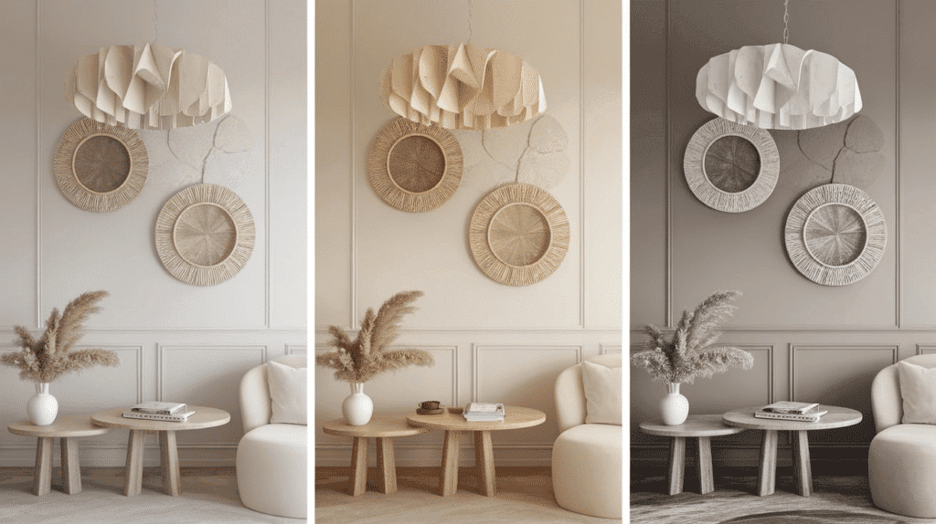
Classic Gray has special hidden colors underneath that change how it looks as the light changes throughout the day.
Sometimes, it seems more blue, sometimes more purple, and sometimes, you might even see hints of beige.
In today’s blog, we’ll look at why so many people love this paint color, how it works with light, and which rooms it looks best in.
We’ll also share some tips for matching it with furniture and other colors to make your home feel just right.
Understanding Classic Gray Undertones
Classic Gray has soft blue and purple undertones. These hidden colors show up differently depending on your lighting. In bright rooms, it might look more blue.
In darker spaces, the purple might come out more. Sometimes, you’ll see hints of beige when the sun hits it. These undertones make Classic Gray change throughout the day as the light changes.
This is why it’s important to test the paint on your walls before painting the whole room. The undertones are what make Classic Gray work so well with many other colors.
Color Terminology
| Attribute | Value |
|---|---|
| Color Code | OC-23 |
| Light Reflective Value (LRV) | 73.67 |
| Hex Code | #E2E0D7 |
| RGB Value | 226, 224, 215 |
What These Numbers Mean?
Color Code (OC-23): This is the official Benjamin Moore identifier for Classic Gray, ensuring consistency in paint selection.
Light Reflective Value (LRV) – 73.67:
LRV measures how much light a color reflects on a scale from 0 (pure black) to 100 (pure white).
With an LRV of 73.67, Classic Gray is a light color that reflects a significant amount of light, making spaces feel bright and open.
Hex Code (#E2E0D7):
A six-character digital color code used in web and graphic design to ensure precise shade representation.
RGB Value (226, 224, 215):
- Red (226): Adds warmth and softness.
- Green (224): Balances the warmth for a neutral, inviting tone.
- Blue (215): Keeps the color light and airy without making it too cool.
Psychology of Light Gray Shades
Light gray colors, like Classic Gray, can change how a room and people feel. Let’s look at why people like light gray so much.
- Gray is calm and helps people relax in a room
- Light gray makes small rooms look bigger and more open
- Gray works well with many other colors
- It helps make bright colors stand out more.
- Light gray can make a room feel cooler in hot weather
Using Classic Gray can help make your home feel peaceful and roomy without being boring.
Why Choose This Color?

Classic Gray by Benjamin Moore fits into any home style, from modern to traditional. It changes nicely with different lighting – looking warmer in yellow light and cooler in natural daylight.
If you find plain white walls too stark, Classic Gray offers a soft touch of color without being too dark.
This color works well in living rooms, bedrooms, kitchens, and even bathrooms. It makes rooms feel bigger and brighter while adding just enough color to feel welcoming and cozy.
Key Features
- Soft, warm gray that doesn’t feel too cool or too beige
- Works well with many other colors, from whites to deep blues and greens
- It makes small rooms feel bigger and adds warmth to large spaces
- It provides a calm background that lets furniture and art stand out
Durability
Benjamin Moore Classic Gray holds up very well over time. The color stays true and doesn’t fade quickly, even in sunny rooms. It handles everyday dirt better than pure whites, hiding small marks and smudges.
When you need to clean or touch up walls, the color blends smoothly without showing patchy spots or differences between old and new paint.
Texture & Finish Recommendations
- For walls, a matte or eggshell finish gives a smooth look without too much shine.
- Satin finish works best in kitchens and bathrooms for easier cleaning.
- Semi-gloss makes a nice contrast on trim and doors.
- For cabinets, choose satin or semi-gloss for better durability and cleaning.
Room-by-Room Color Recommendations
Living Spaces & Open Floor Plans
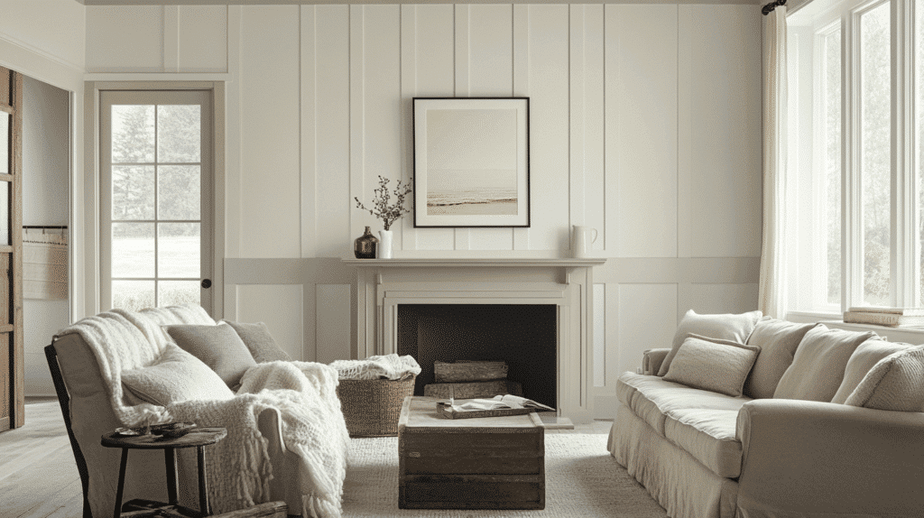
Classic Gray brings a bright, friendly feeling to large rooms. It makes your furniture stand out while keeping the room feeling big and open.
Small Tips:
- Use warmer light bulbs to make Classic Gray feel more cozy in the evening
- Paint trim white for a clean look that frames your walls nicely
Bedrooms & Relaxation Areas
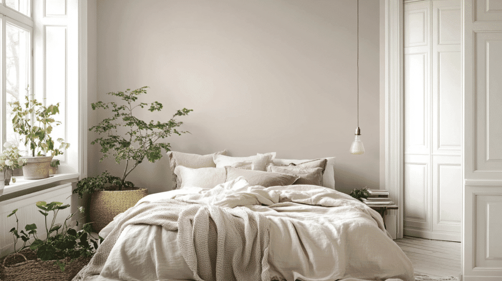
This gentle gray creates a calm feeling that is perfect for sleep and rest. It works well with many bedding colors and doesn’t feel too dark or too light.
Small Tips:
- Add soft blue or green items to bring out the cool side of Classic Gray
- Use blackout curtains in a matching light gray to keep the room peaceful
Kitchens & High-Traffic Zones
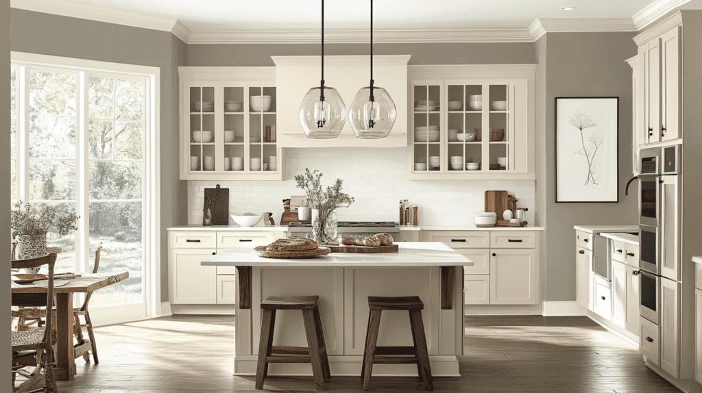
Classic Gray holds up well in busy areas and hides small marks better than white. It makes kitchens feel clean without being too cold.
Small Tips:
- Pair with natural wood cabinets for a balanced, homey look
- Choose a semi-gloss finish in these areas for easier cleaning
Bathrooms & Spa-Like Retreats
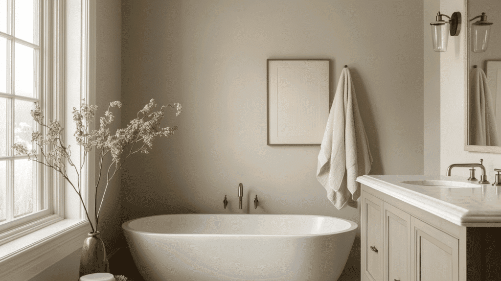
The soft gray tone creates a clean, fresh feeling in bathrooms. It works well with white fixtures and most tile colors.
Small Tips:
- Add plants to bring life to the gray background
- Use thick white towels to create a nice contrast against the gray walls.
Color Pairings & Combinations for Classic Gray
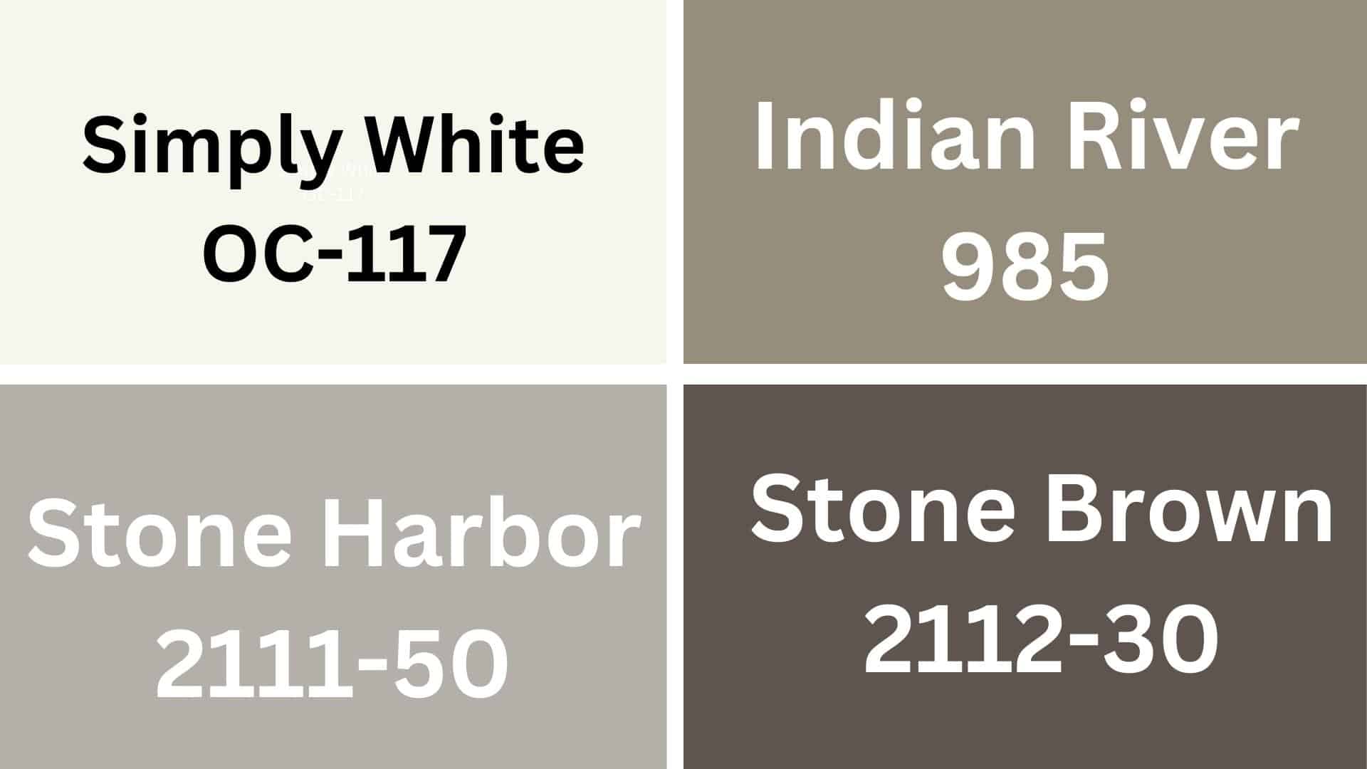
Simply White (OC-117)
Simply White goes very well with Classic Gray in kitchens and living rooms. The mix creates bright, clean-looking spaces that feel open and welcoming.
Indian River (985)
Indian River adds a soft blue touch when paired with Classic Gray. This team works nicely in bedrooms and bathrooms for a calm, peaceful feeling.
Stone Harbor (2111-50)
Stone Harbor is a darker gray that makes Classic Gray look lighter when used together. These grays work well in offices and dining rooms for a simple, pulled-together look.
Stone Brown (2112-30)
Stone Brown brings warmth when matched with Classic Gray. This mix is good for entryways and family rooms, making spaces feel cozy but not too dark.
Creating Cohesive Color Schemes
Cool Color Scheme
Classic Gray works well with blues, greens, and purples to create a calm feeling. Try these cool color combinations:
- Pair Classic Gray with navy blue for a timeless look in bedrooms or offices
- Add soft blue-green accents for a fresh, clean bathroom style
- Combine with light lavender for a kid’s room that isn’t too bright
- Mix with teal for a modern kitchen that feels open and bright
Monochromatic Scheme
Using different shades of gray creates a simple, clean look that’s easy on the eyes. Here are some ways to use gray-on-gray:
- Paint trim in a darker gray like Coventry Gray for subtle contrast
- Use lighter Silver Satin on the ceiling to make rooms feel taller
- Include gray textiles with different textures to add depth without color
- Use mirrors and glass to brighten up an all-gray room and prevent it from feeling dark
Warm Color Scheme
Classic Gray has warm undertones that pair nicely with reds, yellows, and earth tones. Try these warm combinations:
- Mix with soft beige for a cozy living room that feels welcoming
- Pair with light tan furniture to create a natural, earthy feeling
- Use with brick red for a dining room that makes food look better
- Combine with gold or brass fixtures for a touch of richness without being fancy
Coordinating with Furniture & Decor
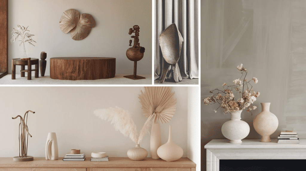
1. Wood Tones
Classic Gray looks great with light oak and white-washed woods. Medium walnut and cherry woods also make the gray feel cozy and warm in any room.
2. Metals
This paint color works really well with brushed nickel and chrome for a clean look. Brass and black metal add a nice contrast that makes the gray stand out more.
3. Fabrics
Soft white, cream, and light blue fabrics look best with Classic Gray. Adding different textures, such as cotton, linen, or wool, makes the room feel more comfortable.
4. Decor
Black and white photos or simple art look clean against Classic Gray walls. Blue, green, or soft pink items like pillows, rugs, and vases bring out the paint’s hidden colors.
Comparing It with Silver Satin
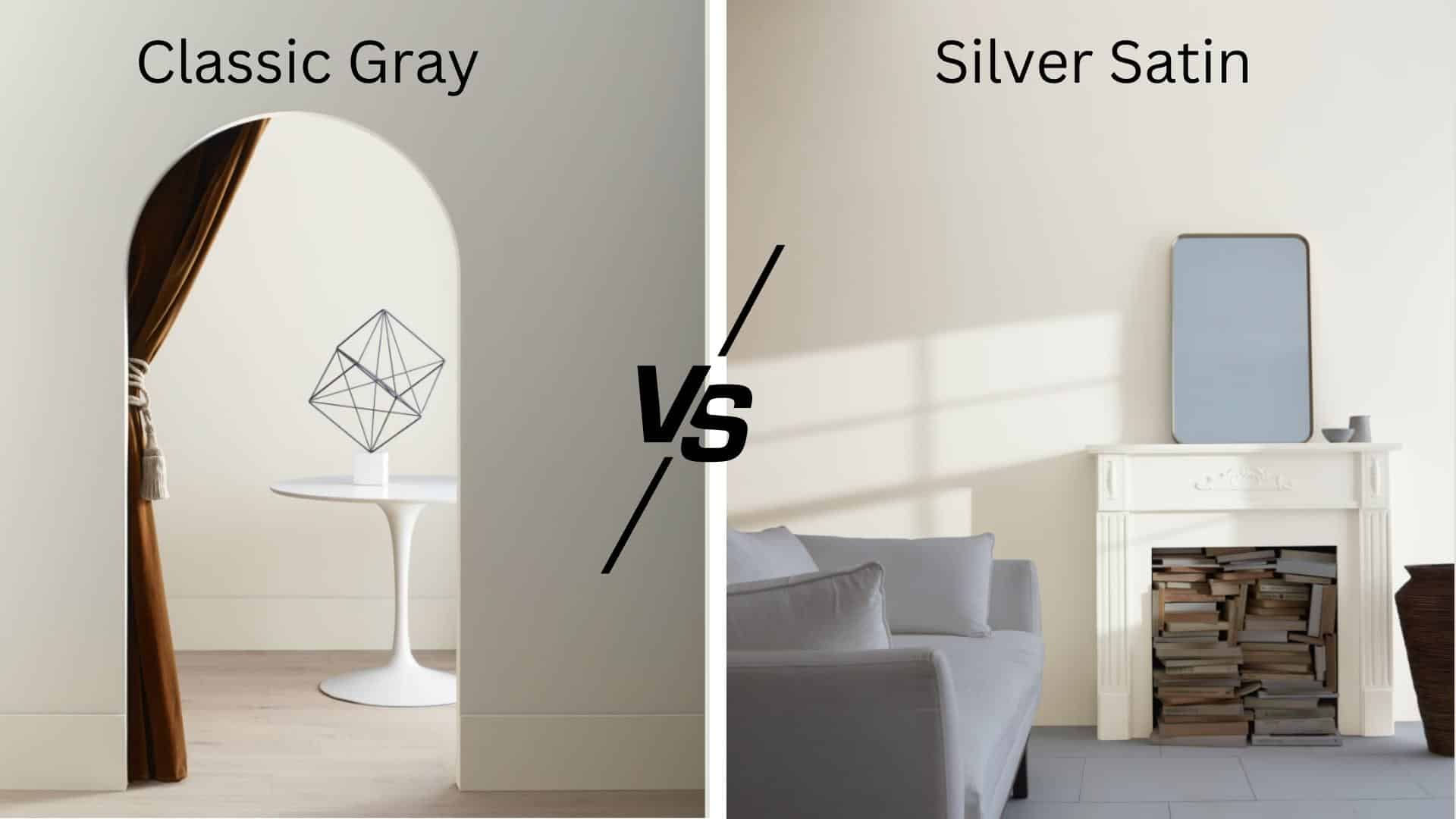
How Classic Gray Differs from Silver Satin (OC-26)
Classic Gray is lighter than Silver Satin. Classic Gray has more beige in it, while Silver Satin has more gray. When you put them side by side, Classic Gray looks softer, and Silver Satin looks a bit shinier.
Warmth and Undertones Comparison
Classic Gray feels warmer because it has brown and beige undertones, while Silver Satin feels cooler because it has blue undertones.
In morning light, Classic Gray looks soft and warm, while in the same light, Silver Satin can look a bit more blue-gray.
Best Use Cases for Each Color
Classic Gray works well in living rooms and bedrooms where you want a cozy feeling. It pairs nicely with wood furniture and warm colors.
Silver Satin is great for kitchens, bathrooms, and hallways. It looks clean with white trim and works well with silver or black hardware. It also makes a good color for office spaces where you want a clean, bright look.
Final Thoughts
Classic Gray is one of the best light gray paint colors around. It works in any room and matches most furniture and colors.
Its blue and purple undertones change throughout the day, making your walls look different as the light shifts.
This color is great for people who find white too plain but don’t want anything too dark. It makes small rooms feel bigger and hides dirt better than white paint.
Classic Gray also stays looking good for years without fading quickly.
Before you paint your whole house, remember to test a small area first. The color can look different depending on your lighting and other colors in the room.
What do you think about Classic Gray? Would you use it in your home? Tell us in the comments below!

Alex Guerrero, a graduate with a Fine Arts degree from the Rhode Island School of Design, has been a visionary in the world of color and design for over 15 years. His professional journey began in the heart of the fashion industry in Milan, where he developed an acute sense for color harmonies and trends. Alex joined our team in 2018, offering fresh and innovative perspectives on color utilization in various spaces. Renowned for his ability to blend contemporary trends with timeless elegance. Outside of work, Alex is an accomplished painter and a volunteer art therapist, his artistic talents further enriching his professional insights.