I’ve helped hundreds of homeowners look through the surprisingly complex world of white paint colors, and I consistently find that the choice between Pure White (SW 7005) and Alabaster (SW 7008) creates the most confusion—and for good reason.
These Sherwin-Williams favorites might seem nearly identical on tiny paint chips, but once on your walls, they create distinctly different environments.
Are you seeking the clean, bright canvas that Pure White delivers or the soft, nurturing warmth of Alabaster?
Having used both extensively in my design practice, I’ve found that choosing between them requires understanding not just their technical differences but also how they’ll interact with your specific space, lighting, and lifestyle.
Let me guide you through the differences that make each of these whites uniquely perfect for different homes.
This comparison highlights undertones, lighting impact, and best use cases to help you choose the right white for your space.
Understanding Paint Color Basics
Color Terminology
| Aspect | Pure White (SW 7005) | Alabaster (SW 7008) |
|---|---|---|
| LRV (Light Reflectance Value) | 84 | 82 |
| Color Category | Bright white | Soft white |
| Comparison | Pure white: ~90 LRV, Black: ~0 LRV | Pure white: ~90 LRV, Black: ~0 LRV |
| RGB Value | Red: 237, Green: 236, Blue: 230 | Red: 237, Green: 234, Blue: 224 |
| Hex Code | #EDECE6 | #EDEAE0 |
| Undertones | Neutral white with a slight warmth | Warm white with subtle beige undertones |
| Best Pairings | Crisp whites, soft grays, muted pastels | Earthy tones, warm neutrals, soft greens |
| Ideal for | Clean, modern, airy interiors | Cozy, inviting, timeless spaces |
Note: LRV (Light Reflectance Value) measures how much light a color reflects. Higher values mean more light reflection, while lower values appear darker.
Key Differences Between Pure White (SW 7005) vs. Alabaster (SW 7008)
Pure White has a crisp, clean appearance with minimal undertones, making it a true neutral white that works well in modern spaces with cool color schemes.
Alabaster is warmer with subtle cream undertones that create a softer, more relaxed feel. It pairs beautifully with warm woods and earth tones.
In natural light, Pure White appears brighter and more reflective, while Alabaster takes on a gentle glow that feels more inviting.
Pure White maximizes light in darker spaces, whereas Alabaster prevents rooms from feeling too stark or clinical.
Design Guidance:
Pure White: Use for trim and ceilings in contemporary spaces where you want a bright, fresh canvas. It’s excellent for small rooms or spaces where maximizing light is crucial.
Alabaster: Best suited for walls in rooms with natural wood furniture, soft lighting, and warm accents. It provides a gentle glow without feeling too stark, making it perfect for living rooms, bedrooms, and kitchens with earthy tones.
Room-by-Room: Pure White (SW 7005) vs. Alabaster (SW 7008)
Living Spaces and Open Floor Plans
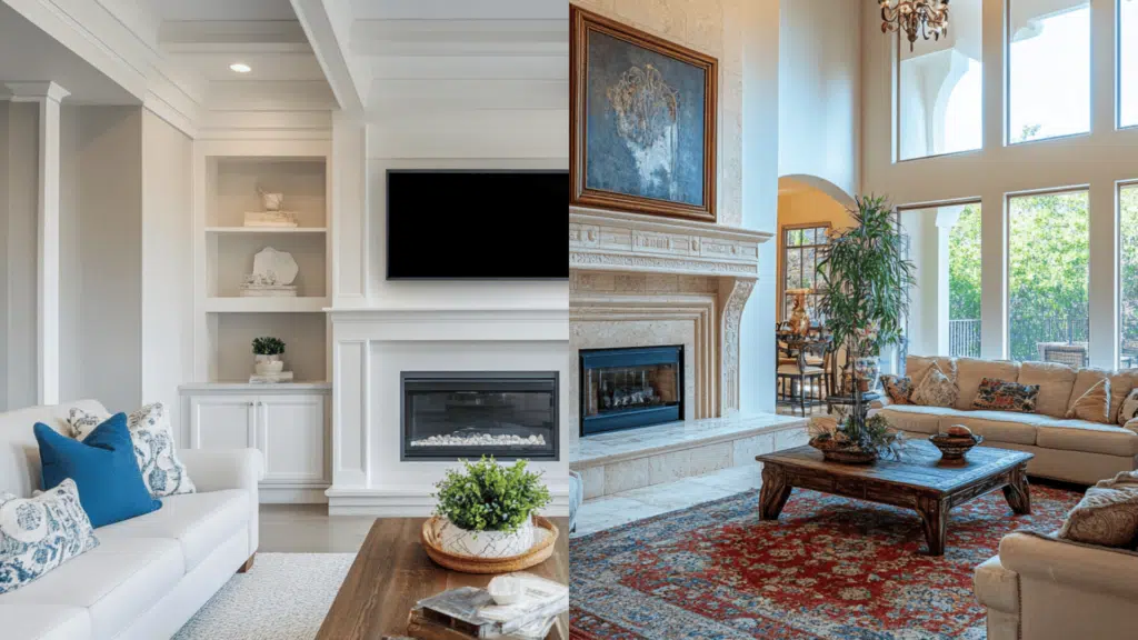
Pure White: With its higher LRV (84), it maximizes light reflection, making spaces feel larger and airier. It also creates a clean, gallery-like backdrop for artwork and colorful furniture.
Alabaster: Its slightly lower LRV (82) and warm undertones create a softer vibe that feels welcoming without being stark. It adds subtle depth while maintaining an open feel.
Bedrooms and Relaxation Areas
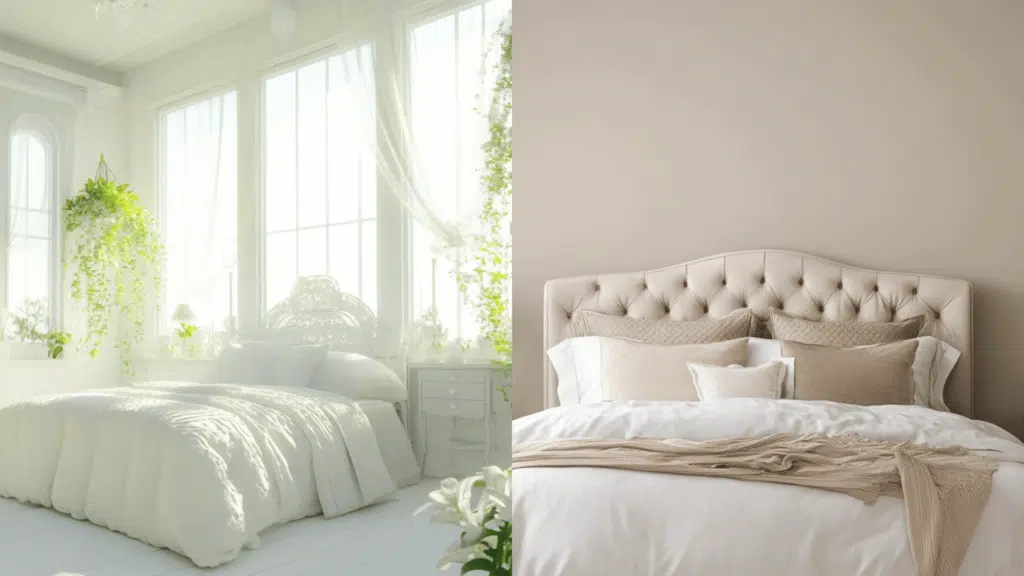
Pure White creates a crisp, fresh canvas that works exceptionally well with cool-toned bedding and accessories. It also provides a clean slate for hanging decor seasonally.
Alabaster: Delivers a gentle, nurturing environment that promotes relaxation. Its warm undertones complement natural textiles and wood furniture, creating a cozy retreat.
Kitchen
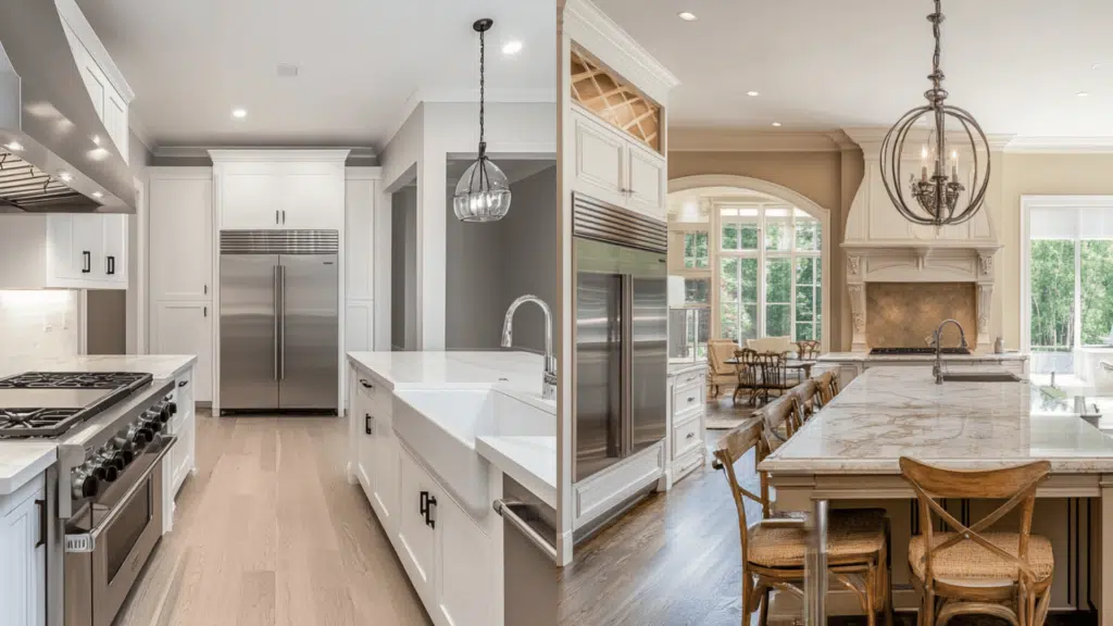
Pure White: This color delivers a bright, hygienic appearance that pairs beautifully with marble countertops and stainless steel appliances. It maintains its true white color in various lighting conditions.
Alabaster adds subtle warmth that softens the utilitarian feel of kitchens. It is particularly flattering with brass hardware, wood elements, and cream-colored cabinets.
Bathrooms
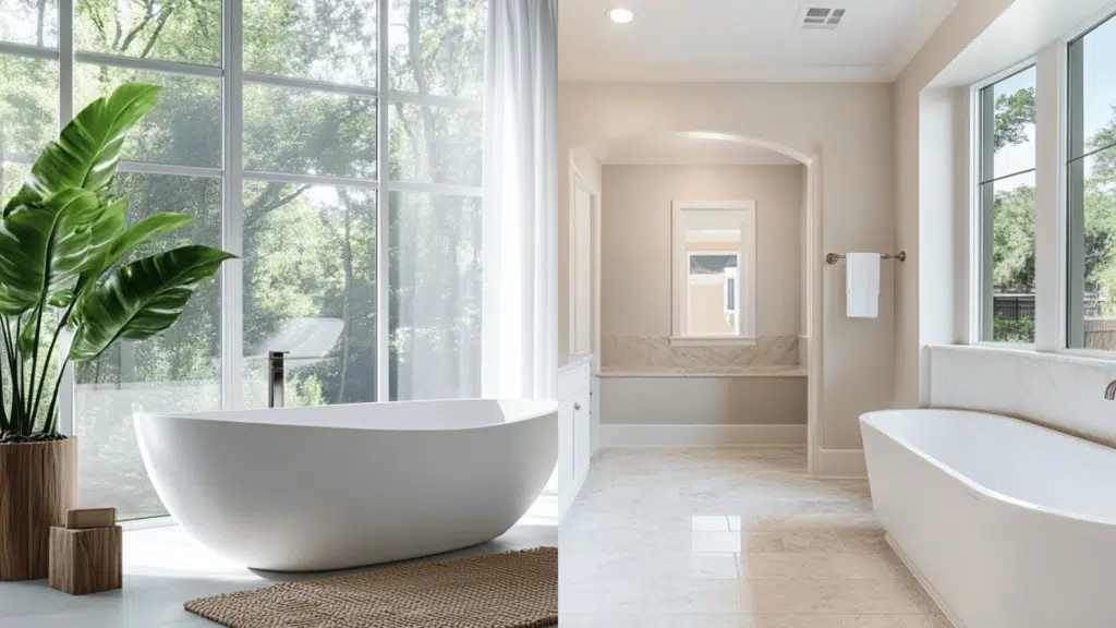
Pure White: This color creates a spa-like, pristine environment that enhances the perception of cleanliness. It is excellent for small bathrooms to maximize light reflection.
Alabaster provides a luxurious, softened white that prevents bathrooms from feeling clinical. It complements natural stone, adds dimension to shower niches, and pairs wonderfully with gold fixtures.
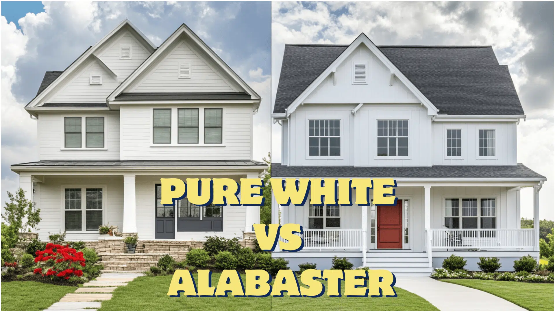
Pure White vs. Alabaster for Exterior Use
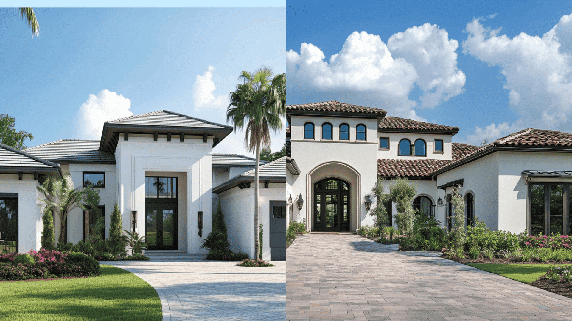
Pure White (SW 7005) presents as a clean, bright white on exteriors that maximizes light reflection in all conditions. Its neutral undertones maintain consistency throughout the day without shifting dramatically.
It excels in modern, contemporary, and coastal structures, creating crisp lines and highlighting structural details.
Pure White pairs exceptionally with black accents (Iron Ore or Tricorn Black) for dramatic contrast and works well with cool-toned stone or brick.
Alabaster (SW 7008) offers a softer, more nuanced white exterior that prevents harsh glare in direct sunlight. Its subtle, warm undertones become more apparent at sunrise and sunset, adding dimension.
It complements traditional, colonial, and Mediterranean home styles with a timeless grace. Alabaster creates a beautiful balance with natural wood elements, warm-toned stone, and bronze or copper accents.
Both whites should be tested on multiple façades as northern exposures may make Alabaster appear more cream-colored, while southern exposures can make Pure White appear almost blindingly bright.
Pure White vs. Alabaster: Which One is More Timeless?
Both Sherwin-Williams whites have proven their staying power through multiple design cycles, appearing consistently in designer portfolios and home publications. Their enduring appeal stems from how they serve different but equally valid design philosophies.
Pure White aligns with the ongoing preference for clean, minimalist interiors and creates a blank canvas that adapts to virtually any style shift. Its neutral undertones make it incredibly versatile across changing decor trends.
Alabaster satisfies the desire for softer, more nuanced whites while offering subtle warmth that complements various design movements. Its gentle cream undertones add dimension without overwhelming spaces.
Both colors have maintained popularity precisely because they accommodate different aesthetic objectives rather than following fleeting trends. Their timelessness depends more on thoughtful application within your overall design context than on the specific shade itself.
The Clear Takeaway: Choose Pure White if you want a clean, gallery-like foundation that maximizes light and creates a crisp backdrop for your decor. Choose Alabaster if you want warmth without leaning into beige, creating inviting spaces that feel lived-in and comfortable.
Can You Use Pure White and Alabaster in the Same Home?
These two Sherwin-Williams whites can work perfectly together to create subtle depth and dimension in a cohesive, refined palette.
Use Pure White (SW 7005) in spaces where you want maximum light reflection and a crisp, clean aesthetic.
It is perfect for ceilings throughout the home, trim in modern spaces, and north-facing rooms where it brightens naturally darker environments.
Reserve Alabaster (SW 7008) for areas where you desire a gentle warmth and softness.
It is ideal for living spaces, bedrooms, and south-facing rooms, where its subtle cream undertones prevent glare while maintaining brightness.
Create smart transitions by using Alabaster on walls with Pure White trim and ceilings, establishing a deliberate layering effect.
The subtle distinction between these whites creates refined visual interest while maintaining a serene, unified flow throughout the home.
Layout Guidance: Use Alabaster for main living areas and Pure White for trim, ceilings, and cabinets to maintain consistency without monotony. This pairing keeps your home feeling fresh and connected while emphasizing key architectural details.
Mistakes to Avoid While Choosing: Pure White vs. Alabaster
1. Choosing from digital images or small paint chips: Never select either white based solely on digital images or small paint chips. Sample both on multiple walls, as Pure White can appear stark and clinical in lit spaces, while Alabaster might read too cream-colored in rooms with warm lighting.
2. Ignoring undertone shifts throughout the day: Watch for undertone shifts throughout the day—Pure White may reveal subtle blue-gray undertones in the evening light. In contrast, Alabaster’s warm notes can intensify in golden afternoon sun, appearing distinctly creamy.
3. Not considering room orientation and natural light: Consider your room’s orientation and natural light. North-facing rooms can make Pure White look slightly blue or gray, creating a cooler atmosphere than intended. South-facing spaces can amplify Alabaster’s warmth, sometimes causing it to have a yellowed appearance that might clash with true white fixtures or furnishings.
4. Failing to test against existing elements: Always test these whites alongside your flooring, furniture, and fixed elements—Pure White may appear discordant against cream-toned stone or cabinets. At the same time, Alabaster might look dingy next to bright white fixtures or appliances.
5. Rushing the decision without proper testing: Take time to observe both colors in your space for at least 48 hours under different lighting conditions. Paint large swatches on multiple walls and view them during morning, afternoon, and evening hours to see how each white truly behaves in your specific environment.
Wrapping It Up
After guiding countless clients through this decision, I’ve found there’s no universally “better” choice between Pure White and Alabaster, only the right choice for your specific space and vision.
I encourage you to invest in sample pots of both colors and paint large swatches on multiple walls. Live with them for at least 48 hours, observing how they alter from morning light to evening lamps.
Take photos at different times of day and trust your instincts about which feels right in your space.
Still uncertain? I’m happy to review photos of your space for personalized guidance. Whatever you choose, apply with confidence; both whites have stood the test of time for good reason.
Which white wins for your home, Pure or Alabaster? Share your pick below!

Alex Guerrero, a graduate with a Fine Arts degree from the Rhode Island School of Design, has been a visionary in the world of color and design for over 15 years. His professional journey began in the heart of the fashion industry in Milan, where he developed an acute sense for color harmonies and trends. Alex joined our team in 2018, offering fresh and innovative perspectives on color utilization in various spaces. Renowned for his ability to blend contemporary trends with timeless elegance. Outside of work, Alex is an accomplished painter and a volunteer art therapist, his artistic talents further enriching his professional insights.