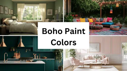

Are you tired of predictable interior palettes? Are you ready to infuse your home with personality and warmth? Boho color schemes offer the perfect solution for creating spaces that feel both curated and carefree.
Bohemian color palettes draw from global influences—think Moroccan markets, Indian textiles, and Mediterranean villages—combining rich hues with natural elements to create spaces that tell your unique story.
If you are planning a complete room modification or simply looking to refresh your space with accessories, understanding how to work with boho colors will elevate your design from basic to breathtaking.
This guide will examine how to select, combine, and apply boho colors across different rooms while avoiding common pitfalls. What’s your biggest challenge when working with bold colors? Let’s locate your perfect boho palette together!
Why Boho Paint Colors Are Having a Moment
Boho colors are experiencing a renaissance as homeowners seek spaces that reflect personal narratives rather than fleeting trends.
These rich, earthy tones—terracotta, mustard yellow, sage green, and indigo—create emotional resonance by evoking natural environments and cultural heritage.
Unlike sterile minimalist palettes, boho colors invite warmth and authenticity, converting houses into homes that tell stories.
Their versatility is unmatched; they complement mid-century modern furniture, add depth to Scandinavian simplicity, or enhance maximalist spaces with layers of visual interest.
The psychology behind these colors speaks to our collective desire for grounding and connection during uncertain times.
By welcoming boho hues, we create simultaneously timeless and deeply personal environments—sanctuaries that nurture creativity and comfort.
Best Earth-Inspired Boho Neutrals
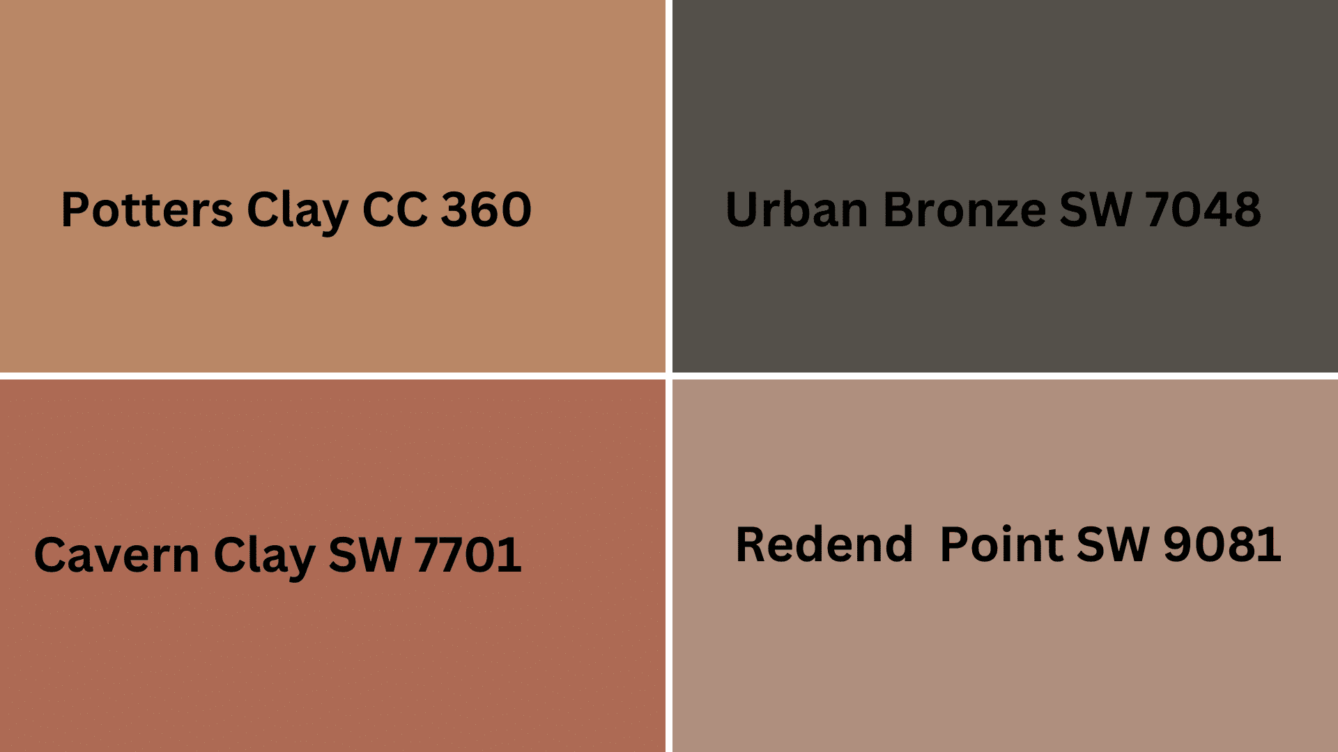
1. Sherwin Williams “Redend Point” (SW 9081)
Property details:
- LRV: Approximately 30,
- RGB values: (Red-174, Green-146, Blue-126)
- Hex Code: #AE8E7E
- Undertones: Warm terracotta with subtle mauve undertones
Best applications: Dramatic accent walls in living spaces, kitchen islands, bedroom feature walls
Lighting effects: Appears richer and more saturated in warm evening light; softens in bright daylight
2. Sherwin Williams “Cavern Clay” (SW 7701)
Property details:
- LRV: 20
- RGB values:(Red-172, Green-107, Blue-183)
- Hex Code: #AC6B53
- Undertones: Earthy orange with subtle brown notes
Best applications: Full room applications in south-facing spaces; exterior accents; feature walls
Lighting effects: Can read more orange in artificial light; earthier in natural daylight
3. Benjamin Moore’s “Potters Clay” (1221/cc-360)
Property details:
- LRV: 28.25
- RGB values: (Red-184-185, Green-132-135, Blue-101-102)
- Hex Code:s #B88465 or #B98766,
- Undertones: Rich sienna with subtle red undertones
Best applications: Home offices; reading nooks; built-ins and millwork
Lighting effects: Deepens considerably in low light; maintains warmth consistently
4. Sherwin Williams “Urbane Bronze” (SW 7048)
Property details
- LRV: 8
- RGB values: (Red-84-, Green-80, Blue-74)
- Hex Code:#54504A
- Undertones: Deep charcoal with olive-bronze undertones
Best applications: Accent furniture, exterior trim, dramatic powder rooms
Lighting effects: Can appear nearly black in low light; reveals complex undertones in bright space.
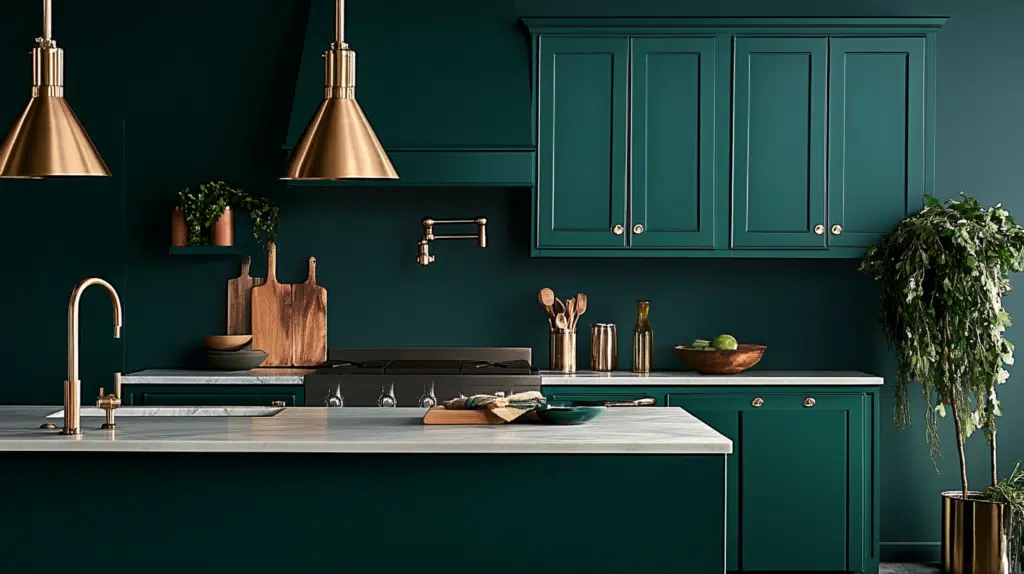
Jewel-Toned Boho Statements
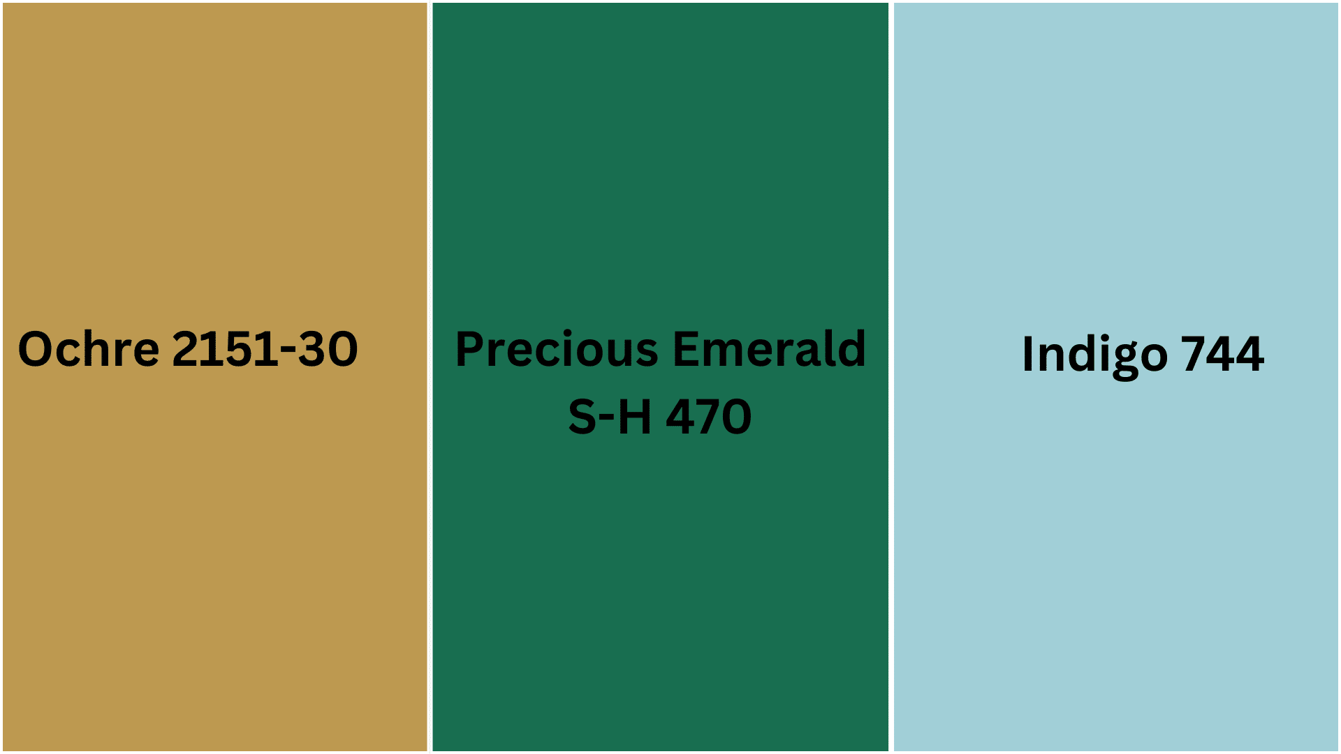
5. Behr Paints “Precious Emerald”(S-H-470)
Property details:
- LRV: 12
- RGB values:: (Red-24-, Green-110, Blue-80)
- Hex Code:#186E50 or #006847,
- Undertones: Deep green with blue undertones
Best applications: Dramatic accent walls; furniture pieces like cabinets or armoires; built-in bookshelves
Lighting effects: Appears almost black in dim lighting; reveals rich depth in natural light
6. Benjamin Moore’s Indigo(744)
Property details:
- LRV: 56.97
- RGB values: (Red-162-, Green-207, Blue-215)
- Hex Code: #A1CFD7
- Undertones: Deep violet with a slight purple influence
Best applications: Powder rooms; dining room accent walls; statement furniture pieces
Lighting effects: Gains depth and mystery in evening light; reveals subtle complexity in bright daylight
7. Benjamin Moore’s Golden Ochre(2151-30)
Property details:
- LRV: 33.73
- RGB values: (Red-187-, Green-153, Blue-81)
- Hex Code: #BB9951
- Undertones: Earthy yellow with amber undertones
Best applications: Living room accent walls, entryways, kitchen cabinetry
Lighting effects: Glows warmly in artificial light; brightens considerably in natural sunlight
Unexpected Boho Choices
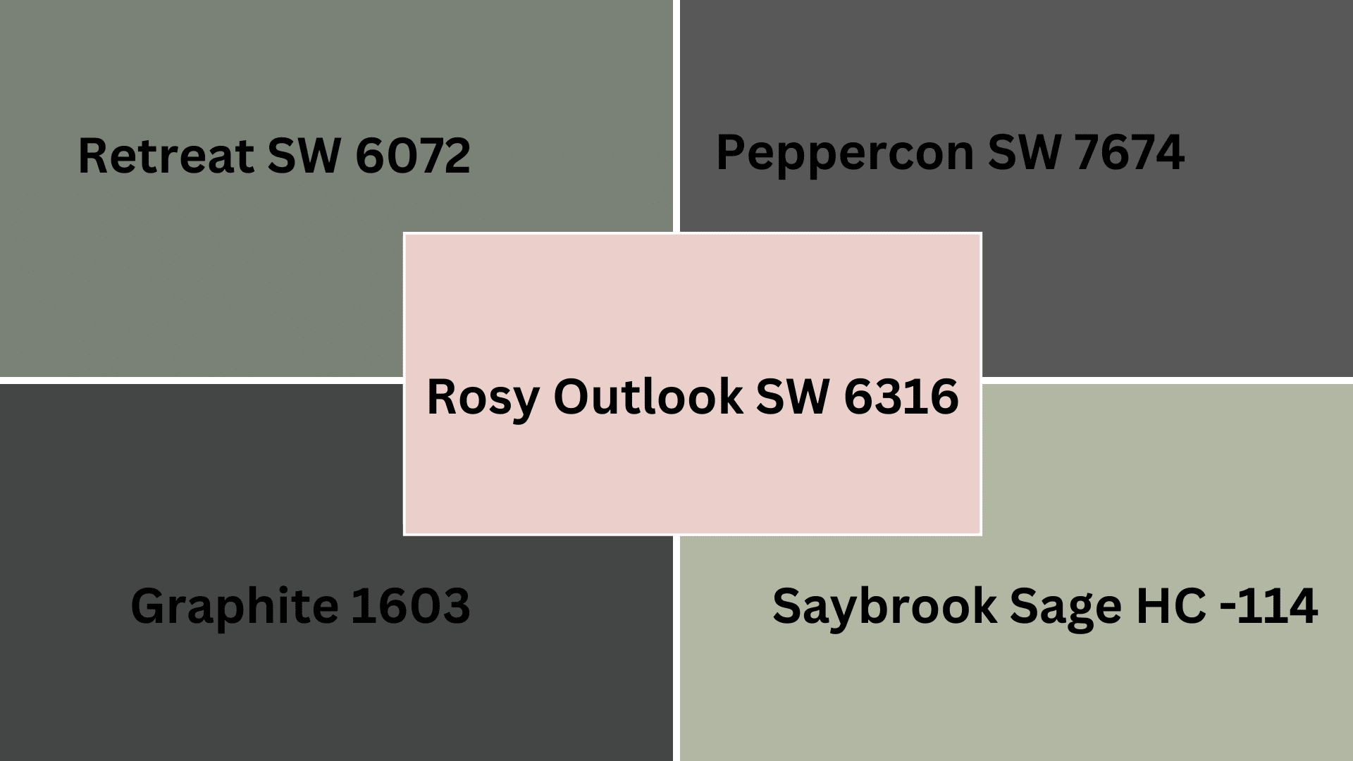
8. Sherwin Williams “Retreat” (SW 6207)
Property details:
- LRV: 21
- RGB values: (Red-122-, Green-128, Blue-118)
- Undertones: Muted sage with a gray-green base
- Hex Code: #7A8076
Best applications: Full room applications in bedrooms and living spaces; kitchen cabinetry; furniture pieces
Lighting effects: Appears more gray in cool northern light; greener in warm southern exposure
9. Benjamin Moore “Saybrook Sage” (HC-114)
Property details:
- LRV: 45.46
- RGB values: (Red-177, Green-183, Blue -162)
- Hex Code: #B1B7A2
- Undertones: Soft sage with subtle earthy undertones
Best applications: Entire rooms seeking calm sophistication; millwork; exterior body color
Lighting effects: Shifts between sage and gray depending on the time of day; most true in natural daylight
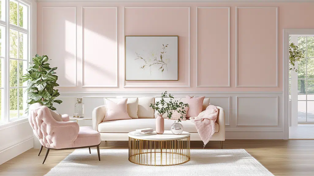
10. Sherwin Williams “Rosy Outlook” (SW 6316)
Property details:
- LRV: 66
- RGB values: (Red-235, Green-206, Blue -203)
- Undertones: Dusty pink with subtle mauve influence
Best applications: Accent walls in bedrooms, bathroom walls, furniture refinishing projects
Lighting effects: Takes on a warmer appearance in evening light; becomes more muted in bright daylight
12. Sherwin Williams “Peppercorn” (SW 7674)
Property details:
- LRV: 10
- RGB values: (Red-88, Green-88, Blue -88)
- Hex Code: #585858
- Undertones: Deep charcoal with subtle warm undertones
Best applications: Accent walls in living spaces, exterior details; dining room feature walls
Lighting effects: Deepens considerably in shadowy corners; reveals complexity in direct light
13. Benjamin Moore “Graphite” (1603)
Property details:
- LRV: 7.59
- RGB values: (Red – 68, Green-70, Blue -71)
- Hex Code: #444647
Undertones: Rich charcoal with subtle blue undertones
Best applications: Statement walls, built-ins and cabinetry, exterior accents
Lighting effects: Appears nearly black in low light; reveals subtle depth in bright spaces
How to Use Boho Colors in Different Spaces
Living Areas
Blend rich jewel tones with earthy neutrals through textiles like pillows, rugs, and wall hangings. Layer colors at different heights—from floor cushions to ceiling-hung tapestries—create visual interest and depth that invites conversation.
Bedrooms
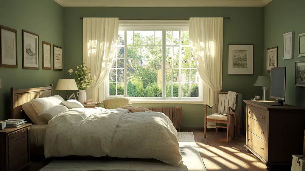
Balance vibrant boho hues with calming neutrals—try terracotta, mustard, or teal as accent colors against white walls and natural wood. Incorporate color through bedding, artwork, and small furniture while maintaining enough visual calm for restful sleep.
Kitchens & Dining
Introduce boho colors through unexpected elements like painted cabinet doors, colorful tile backsplashes, or mismatched dining chairs. Consider open shelving with curated displays of colorful dishware and pottery as functional art.
Outdoor Spaces
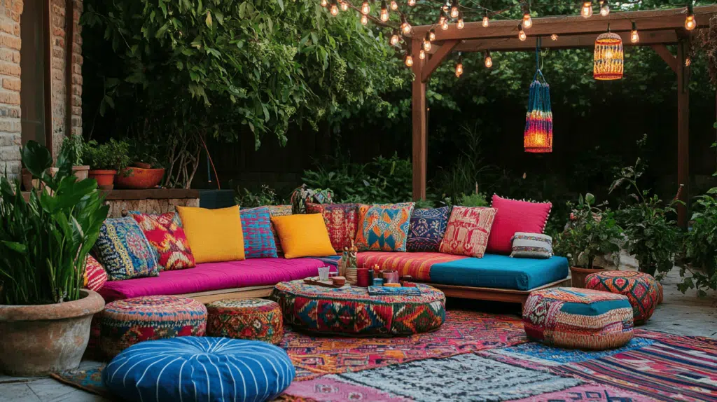
Extend indoor boho palettes to outdoor living with weather-resistant fabrics in saturated hues and patterns. Layer colorful textiles on furniture, hang string lights, and add potted plants with vibrant planters to create a cohesive indoor-outdoor boho experience.
Expert Tips for Painting with Boho Colors
Proper wall preparation is essential for rich, saturated boho colors. Clean thoroughly and patch imperfections for a smooth base. Use tinted primers that complement your final shade; gray primers work well under jewel tones, while white primers help pastels pop. Apply primer with a high-quality roller for even coverage.
For finishes, choose eggshell or satin for living spaces (balancing durability with a subtle glow), matte for bedrooms (creating depth without reflection), and semi-gloss for kitchens (allowing easy cleaning).
Create cohesive flow by selecting colors from the same family but varying their intensity or repeating accent colors as you move between spaces—perhaps as a dominant wall color in one room and accessories in another.
Common Mistakes to Avoid
Boho spaces often fail when overwhelmed by competing statement colors—instead, choose 2-3 key hues complemented by neutrals that allow your eye to rest.
Many homeowners skip testing paint in their space, overlooking how dramatically different lighting can alter colors throughout the day.
Complex boho colors (deep teals, burnt oranges, magentas) require quality pigments—cheaper paints may appear flat or require excessive coats, ultimately costing more.
Perhaps most critical is the disconnect between painted surfaces and textiles. Successful boho rooms feature intentional relationships between wall colors and fabric elements.
Don’t select paint in isolation—bring fabric swatches when choosing colors to ensure your textiles and painted surfaces will create a harmonious, layered effect rather than clashing.
Wrapping It Up
Finding your personal boho color story begins with colors that resonate with your experiences and treasured items. Let your travels, cultural interests, and heirloom pieces guide your palette selection for an authentic boho space.
The timelessness of globally-inspired hues ensures your design remains relevant. Earthy terracottas, indigo blues, and spice-market reds have adorned homes across centuries and cultures, offering character and longevity to your interior design choices.
For successful boho color schemes, start with neutral foundations, incorporate 2-3 statement colors, and integrate natural elements like wood and plants. Allow your color story to evolve naturally as you collect meaningful pieces that speak to you.
Remember: true boho style celebrates imperfection and personal expression—your space should tell your unique color story, not follow rigid design rules. Unleash your inner color pioneer and watch your space bloom!

Alex Guerrero, a graduate with a Fine Arts degree from the Rhode Island School of Design, has been a visionary in the world of color and design for over 15 years. His professional journey began in the heart of the fashion industry in Milan, where he developed an acute sense for color harmonies and trends. Alex joined our team in 2018, offering fresh and innovative perspectives on color utilization in various spaces. Renowned for his ability to blend contemporary trends with timeless elegance. Outside of work, Alex is an accomplished painter and a volunteer art therapist, his artistic talents further enriching his professional insights.