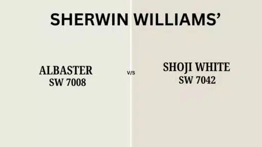
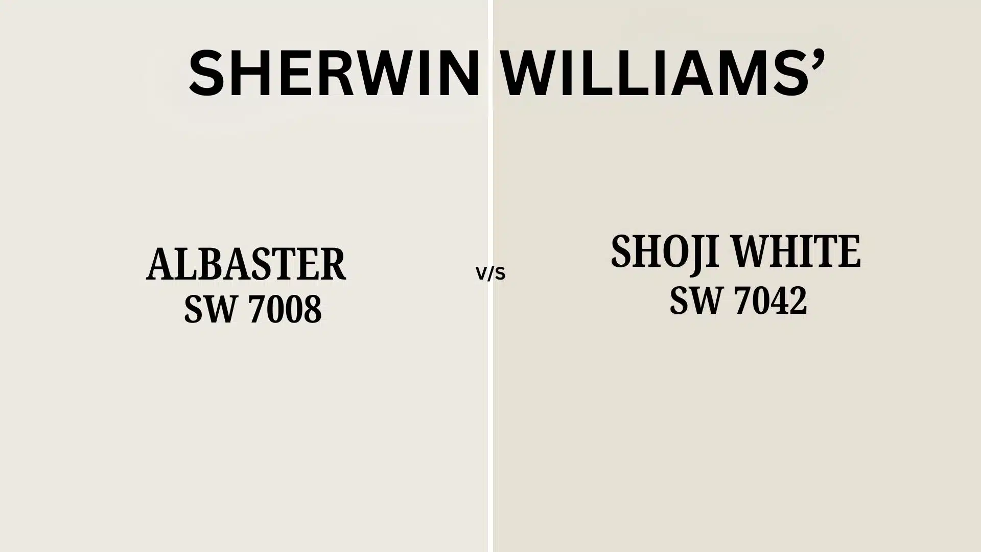
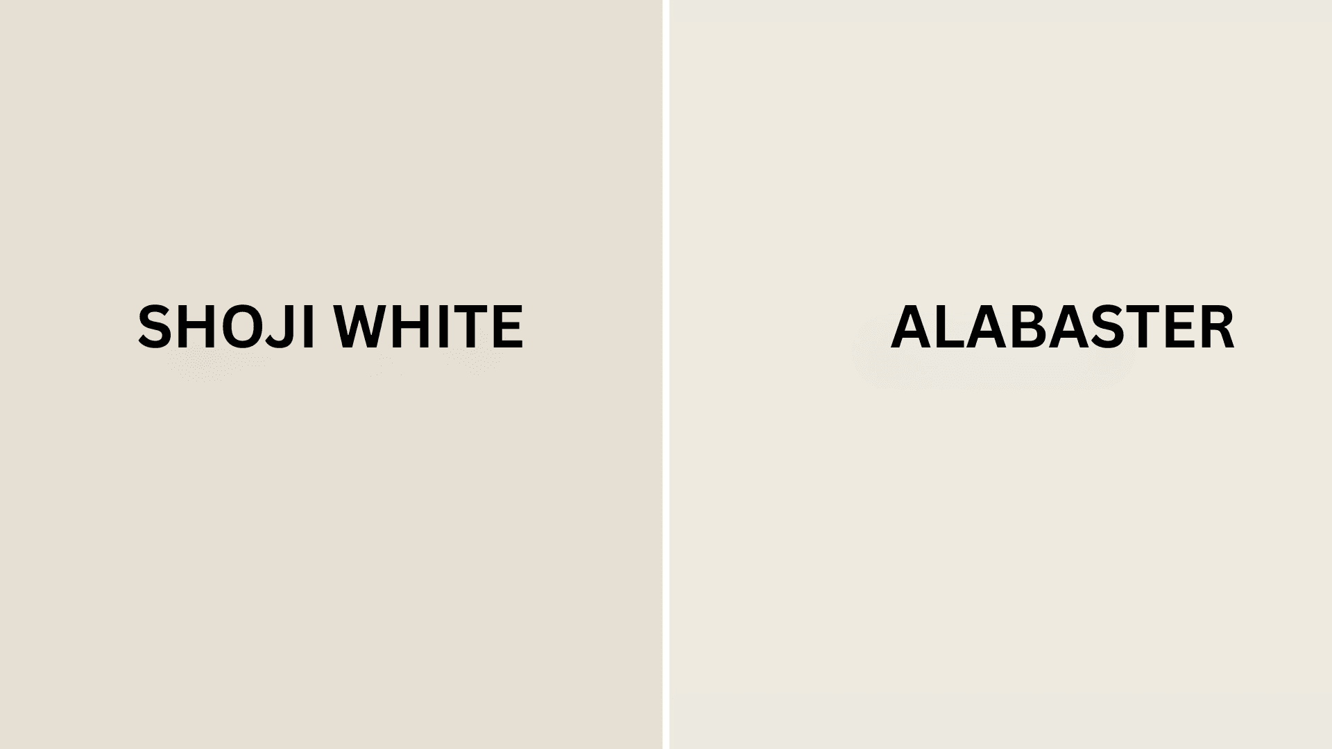
Like gentle whispers of morning light, Sherwin-Williams’ Shoji White (SW 7042) and Alabaster (SW 7008) offer two distinct paths to serenity in your home.
These refined whites, each with its subtle personality, create spaces that breathe with timeless grace—one welcoming the warmth of ancient Japanese paper screens, the other capturing the classic refinement of polished stone.
Both colors are sure, ordinary neutrals, carrying unique undertones that transform your walls into living canvases that shift and respond to the gentle dance of daylight.
More than just whites, Shoji White and Alabaster are occasions, each bringing a different expression of peace into your everyday environment.
They provide perfect backdrops when you’re seeking organic modern warmth or timeless classic grace.
Understanding the Differences: Shoji White (SW 7042) vs. Alabaster (SW 7008)
Color Terminology
| PROPERTY | SHOJI WHITE | ALABASTER |
|---|---|---|
| LRV (Light Reflectance Value) | 74 | 82 |
| Color Category | Off-white/greige (LRV between 70-75) | Soft white (LRV between 80-85) |
| Comparison | Less reflective, more depth | Brighter, more reflective |
| RGB Value | Red: 230 Green: 223 Blue: 211 | Red: 237 Green: 234 Blue: 224 |
| Hex Code | #E0DACF | #F8F3ED |
Undertones
Shoji White carries noticeable warm beige and gray undertones
- It’s a complex grey with strong warmth
- Creates a softened, enveloping neutral with depth
- Appears more colorful and substantial in most lighting
Alabaster has subtle, warm yellow undertones
- It’s a soft white with gentle warmth
- Offers a clean yet not stark appearance
- Maintains its brightness while adding refinement
Psychology of Off-White vs. Soft-White Colors
Shoji White’s beige qualities create a sense of grounding, warmth, and organic comfort.
- Earthy tones: Evoke stability, natural and timeless balance
- Beige-gray influence: Combines the practicality of gray with the comfort of beige
- Benefits: Adds considerable depth to spaces, bridges modern and traditional elements, forgiving in high-traffic areas
Alabaster’s soft white properties convey refined brightness and timeless refinement.
- Luminous warmth: Offers expansiveness without stark coldness
- Yellow-tinted white: Evokes warmth, subtle, and classic culture
- Benefits: It creates a bright backdrop for artwork, maintains a fresh appearance, and balances well with both warm and cool accents
Shoji White offers the perfect balance for those seeking substantial color that functions as a neutral yet adds noticeable character to spaces.
Alabaster offers the ideal solution for those seeking a brighter white that retains warmth without appearing clinical or overly stark.
Shoji White responds beautifully to spaces with great Western or Southern light. It softens brightness while contributing a sense of earthy comfort.
Alabaster excels in spaces with varied or northern exposure, where it helps maintain brightness while contributing a sense of refined warmth.
Why Choose Between These Colors?
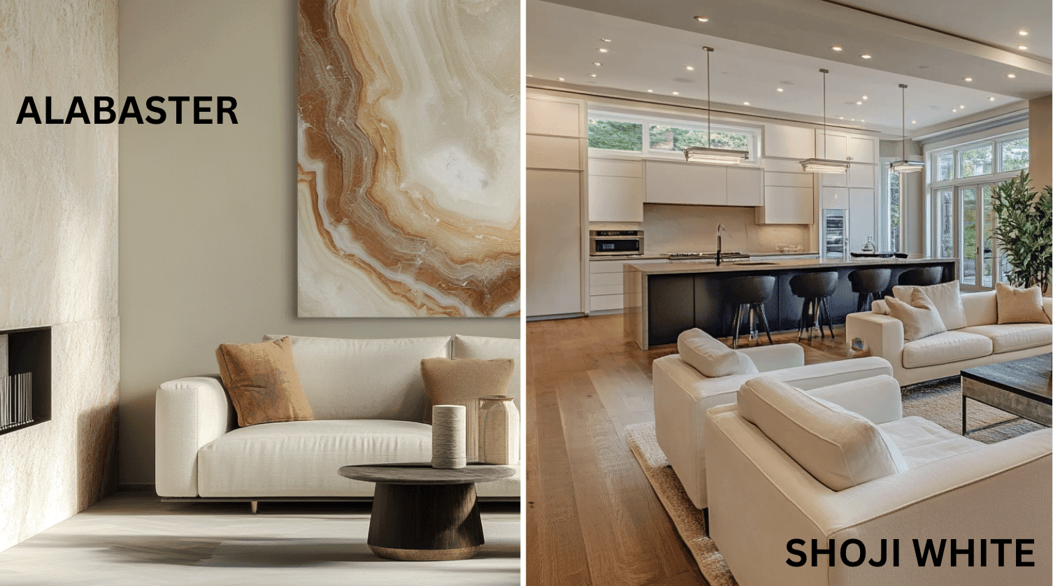
Shoji White (SW 7042)—Shoji White’s grounded warmth evokes a sense of organic comfort and timeless stability, promoting peace in any environment.
This enduring color carries complex undertones that shift subtly with changing light, ensuring your space feels both contemporary and traditionally peaceful.
Alabaster (SW 7008) – The balanced brightness of Alabaster creates an atmosphere of refined grace and timeless versatility that enhances nearly any design direction.
This classic color maintains a consistent soft glow throughout the day, providing a luminous foundation that feels both current and eternally refined.
1. Light Interaction
Shoji White shows remarkable depth in varied lighting conditions. It appears warmer and more colorful in spaces with natural light, developing a cozy, enveloping quality in the evening. Its beige-gray undertones create a substantial presence that makes spaces feel grounded yet bright.
Alabaster offers exceptional brightness and versatility across different lighting conditions. It maintains its soft warmth in both dimly lit spaces and rooms with abundant natural light, creating an expansive yet comfortable atmosphere throughout the day.
2. Adaptability
Shoji White demonstrates impressive adaptability with both traditional and contemporary elements. It creates pleasant bridges between natural materials, such as wood and stone, while complementing modernist furniture and fixtures.
Its considerable warmth provides enough color to feel substantial without overwhelming spaces, making it ideal for open floor plans and transitional design styles.
Alabaster showcases remarkable versatility with existing elements, such as colorful artwork and various wood tones, creating refined connections without competing for attention.
It provides enough brightness to feel open and uplifting while maintaining a refined, enduring quality that works in virtually any design context, from traditional to modern farmhouse.
3. Durability
Shoji White, particularly in premium finishes like Duration or Emerald, delivers outstanding practical performance with excellent coverage and washability.
Its greige tone and complex undertones maintain a refined appearance while providing a forgiving surface that disguises minor marks and imperfections.
Alabaster offers excellent durability with consistent color performance throughout your home, especially in quality finishes.
Its bright tone maintains a clean appearance even in high-traffic areas, and when properly applied, it remains washable and resistant to yellowing.
4. Texture Patterns
Shoji White creates a soft, velvety texture that adds noticeable dimension to walls and features. Its complex undertones produce a beautiful light play that enhances textured surfaces, such as stucco or plaster, while adding depth to simple walls.
Alabaster produces a refined, subtle texture that creates gentle dimension while maintaining a consistent, luminous quality. It enhances decorative moldings and details while providing a cultured backdrop that allows other elements to shine.
Room-by-Room Color Comparison
1. Living Spaces and Open Floor Plans
Shoji White works exceptionally well in open floor plans, seeking a warm, cohesive feel. Its 74 LRV provides substantial color that unifies spaces while maintaining brightness.
Use Shoji White for a grounded, urbane backdrop that complements natural materials like wood and stone while creating an organic, modern style.
Alabaster excels in open floor plans, seeking brightness with a touch of refinement. Its 82 LRV creates expansive, airy spaces without feeling stark or clinical.
Use Alabaster to create a versatile and timeless backdrop that allows architectural details and furnishings to take center stage, maintaining a cohesive flow.
2. Bedrooms and Relaxation Areas
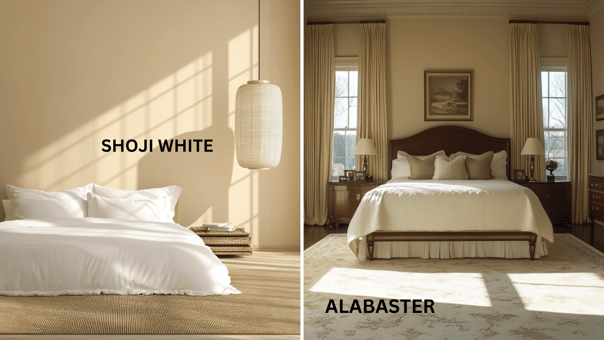
Shoji White creates a cozy, enveloping atmosphere in bedrooms that promotes comfort and tranquility.
The beige-gray undertones evoke a sense of grounded warmth, creating a cultivated neutral that pairs beautifully with textural bedding and natural wood furniture.
Consider Shoji White for bedrooms that seek substantial color while still functioning as a versatile neutral.
Alabaster creates a serene, bright atmosphere in bedrooms that strikes a balance between openness and comfort.
Its soft, warm undertones create a gentle luminosity that pairs beautifully with both vibrant and neutral bedding while maintaining a timeless appeal.
Use Alabaster for bedrooms that seek brightness without sacrificing warmth or culture.
3. Kitchens
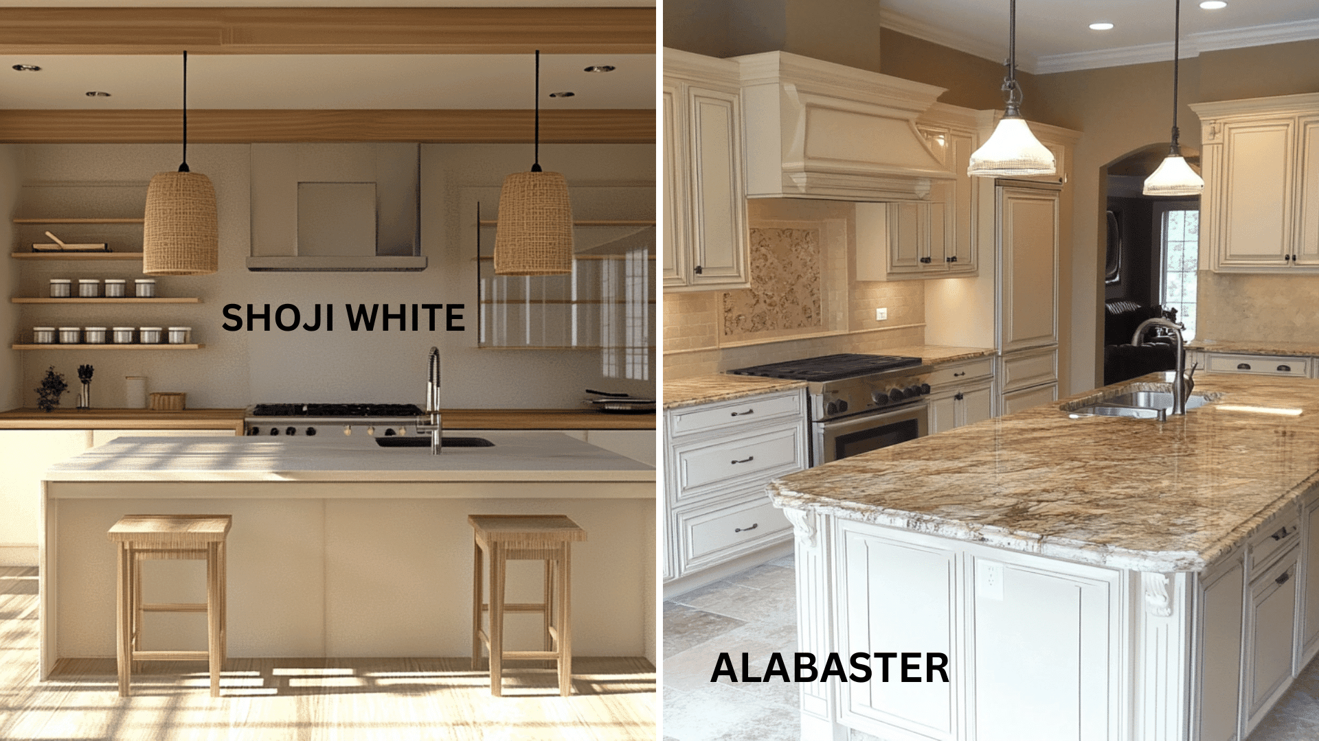
Shoji White cabinets create a warm, substantial presence that pairs beautifully with natural stone countertops and wood accents.
The complex greige quality complements both rustic and contemporary kitchen styles, making it particularly effective in farmhouse and transitional designs.
Pair Shoji White with darker island colors for a layered, genteel kitchen with grounded warmth.
Alabaster cabinets offer a bright, timeless elegance that complements virtually any countertop material and hardware finish.
This versatile white creates a clean, urbane foundation that allows other elements, such as colorful backsplashes or statement islands, to shine.
Use Alabaster for kitchens seeking bright, classic appeal that will endure through changing trends.
4. Bathrooms and Spa-like Retreats
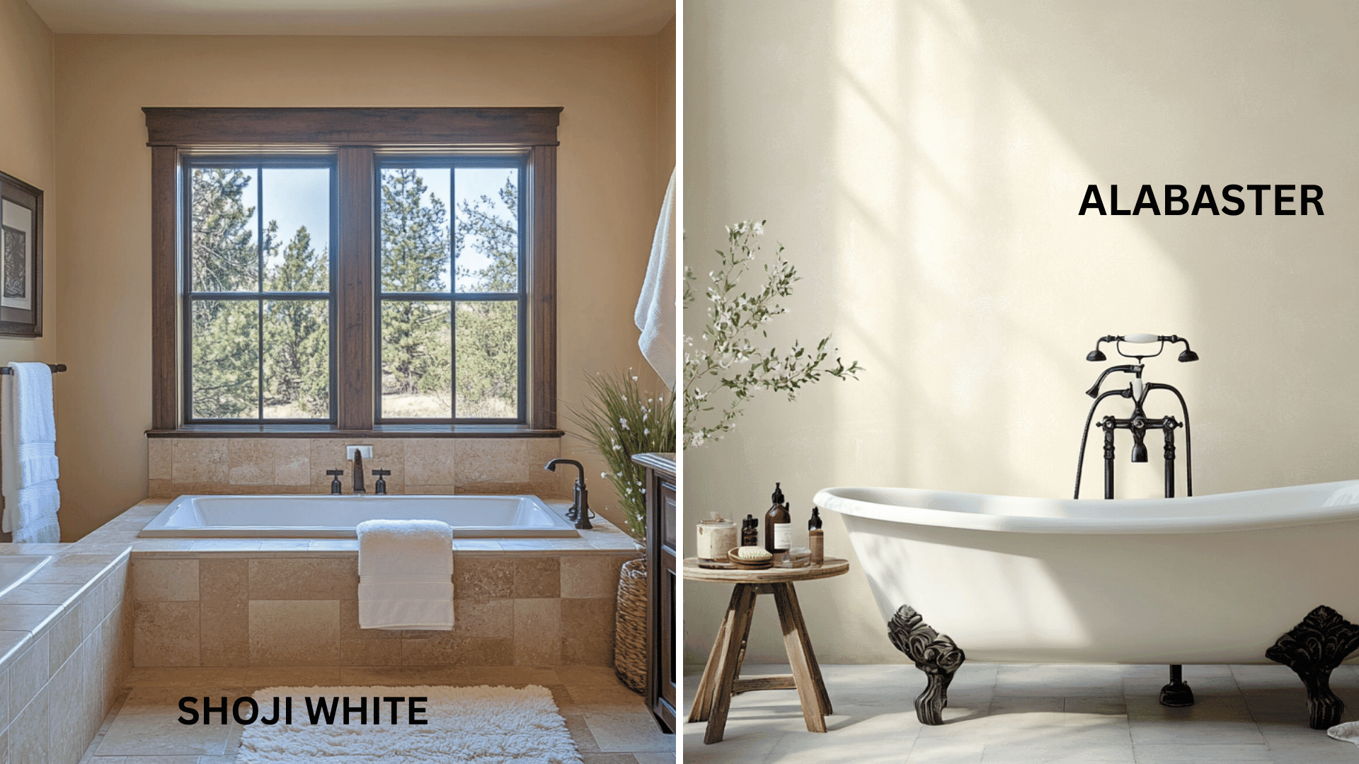
Shoji White creates a warm, refined atmosphere in bathrooms that balances brightness with organic comfort.
Its greige undertones establish a sense of grounding stability while complementing natural stone, wood, and earthy tile selections.
Use Shoji White in bathrooms to achieve a spa-like comfort with substantial color presence.
Alabaster creates a bright, refined atmosphere in bathrooms that feels both clean and comfortably warm.
Its subtle warmth establishes a sense of refined luminosity while complementing marble, chrome, and brass fixtures equally well.
Consider Alabaster for bathrooms seeking a bright, timeless retreat with enduring appeal.
Color Combinations
Shoji White (SW 7042) Combinations
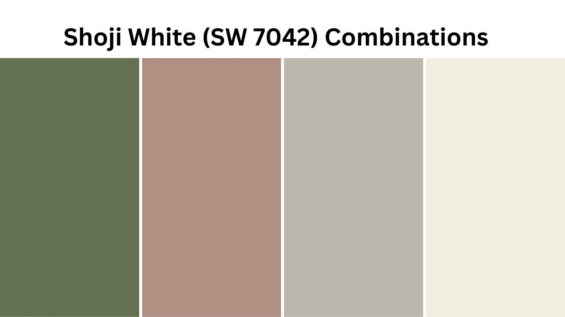
Shoji White is a warm off-white with noticeable beige and gray undertones. Its moderate Light Reflectance Value (LRV) of 74 makes it a substantial neutral that adds depth and organic comfort to spaces while maintaining brightness.
Complementary Trim Colors
- Pure White (SW 7005) – A soft white that brightens and defines Shoji White walls
- Extra White (SW 7006) – A clean white that creates crisp contrast with Shoji White’s warmth
- Snowbound (SW 7004) – A versatile white with slight gray undertones that complements Shoji’s complexity
- Greek Villa (SW 7551) – A warm creamy white that enhances Shoji White’s organic qualities
Coordinating Wall Colors
- Accessible Beige (SW 7036) – A warm beige that extends Shoji White’s warmth with more depth
- Mindful Gray (SW 7016) – A versatile warm gray that creates a cultured palette with Shoji White
- Sea Salt (SW 6204) – A light blue-green that complements Shoji White’s warmth with a cool contrast
- Urban Bronze (SW 7048) – A deep brown-gray that anchors Shoji White in a dramatic, earthy palette
Accent Colors
- Naval (SW 6244) – A deep navy that creates a refined contrast with Shoji White
- Greenfield (SW 6439) – A muted sage green that enhances Shoji White’s organic qualities
- Tricorn Black (SW 6258) – A true black that creates dramatic modern contrast with Shoji White
- Redend Point (SW 9081) – A terracotta that amplifies Shoji White’s warmth in an earthy palette
Alabaster (SW 7008) Combinations
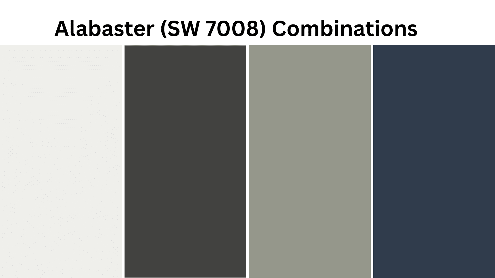
Alabaster is a soft white with subtle, warm yellow undertones. Its higher Light Reflectance Value (LRV) of 82 makes it a bright, versatile foundation that adds refinement and luminosity to spaces while maintaining warmth.
Complementary Trim Colors
- Extra White (SW 7006) – A bright white that creates subtle definition with Alabaster
- Pure White (SW 7005) – A versatile white that enhances Alabaster’s refinement
- Snowbound (SW 7004) – A soft white with gray undertones that complements Alabaster’s warmth
- Ceiling Bright White – A bright ceiling white that maximizes light reflection with Alabaster walls
Coordinating Wall Colors
- Agreeable Gray (SW 7029) – A versatile greige that creates a urbane, cohesive palette
- Repose Gray (SW 7015) – A light warm gray that adds depth while complementing Alabaster
- Sea Salt (SW 6204) – A light blue-green that creates a fresh, timeless palette with Alabaster
- Evergreen Fog (SW 9130) – A muted sage that creates earthy grace with Alabaster
Accent Colors
- Iron Ore (SW 7069) – A soft black that creates refined contrast with Alabaster
- Naval (SW 6244) – A deep navy that offers genteel depth against Alabaster’s brightness
- Urbane Bronze (SW 7048) – A deep brown-gray that grounds Alabaster in an extravagant palette
- Dried Thyme (SW 6186) – A muted olive that complements Alabaster in a nature-inspired palette
Coordinating with Furniture and Decor
Wood Tones
With Shoji White
Shoji White creates beautiful harmony with mid-tone and dark wood finishes. Rich walnut and medium oak enhance its warmth for a cohesive, organic style.
Weathered woods and gray-washed finishes accentuate Shoji White’s complex undertones, creating a cultured, transitional look.
Light natural woods create a bright, Scandinavian-inspired palette that maintains warmth and organic comfort.
With Alabaster
Alabaster pairs beautifully with virtually all wood tones, creating different style effects. Dark walnut, cherry, and ebony create striking contrast against Alabaster’s bright backdrop.
Medium oak and maple provide complementary warmth that improves Alabaster’s subtle yellow undertones.
Lighter woods like ash or bleached oak extend Alabaster’s brightness for a fresh, cohesive style.
Metals
With Shoji White
Brushed brass, bronze, and copper hardware enhance Shoji White’s warmth and create a rich, inviting atmosphere.
Matte black fixtures create contemporary contrast that emphasizes Shoji White’s depth and substance.
Satin nickel and pewter provide a cultivated bridge between warm and cool elements when paired with Shoji White.
With Alabaster
Polished brass, gold, and champagne fixtures amplify Alabaster’s warm undertones for a refined, smart combination.
Chrome and polished nickel create fresh, timeless contrast that emphasizes Alabaster’s brightness.
Matte black hardware creates dramatic definition against Alabaster’s luminous quality for contemporary culture.
Decor
With Shoji White
Natural textures like linen, jute, and unglazed ceramics improve Shoji White’s organic, earthy character.
Deep jewel tones in accents create vibrant contrast while allowing Shoji White’s warmth to ground the space.
Textural elements with varied neutral tones create cultivated layering that amplifies Shoji White’s complex depth.
With Alabaster
Crisp linens and refined textiles in both saturated and pastel tones stand out beautifully against Alabaster’s bright backdrop.
Glossy ceramics and reflective surfaces enhance Alabaster’s luminous quality and create a cultured light play.
Colorful artwork and statement pieces find their perfect backdrop in Alabaster’s bright, versatile warmth.
Head-to-Head Comparison: Which Should You Choose?
Shoji White (Sherwin-Williams SW 7042)
- A substantial off-white with noticeable beige and gray undertones
- Moderate LRV (74) that creates depth while maintaining brightness
- Works best in spaces seeking organic warmth and grounded culture
- Ideal for transitional, farmhouse, and organic modern design styles
- Excels in rooms with abundant natural light, especially western or southern exposure
Alabaster (Sherwin-Williams SW 7008)
- A versatile soft white with subtle warm yellow undertones
- Higher LRV (82) that creates bright, luminous spaces
- Works best in spaces seeking timeless brightness with refined warmth
- Ideal for traditional, modern farmhouse, and contemporary design styles
- Performs beautifully across various lighting conditions, including rooms with limited natural light
Key Differences
- Shoji White contains more noticeable color with its greige undertones, while Alabaster remains closer to a true white.
- Shoji White appears more substantial and grounded, while Alabaster feels brighter and more expansive.
- Shoji White creates organic warmth and depth, while Alabaster offers refined brightness and versatility.
- They serve different roles in design: Shoji White as a colorful neutral and Alabaster as a versatile soft white.
Final Thoughts
Both Shoji White (SW 7042) and Alabaster (SW 7008) transcend trends, each embodying a different expression of timeless culture that makes them perennial favorites among designers and homeowners.
Shoji White delivers organic warmth and substantial character, creating grounded, balanced spaces with depth and complexity.
Alabaster offers refined brightness and versatile warmth that adapts effortlessly to changing styles while maintaining its timeless luminosity.
Whether you choose the earthy embrace of Shoji White or the refined glow of Alabaster, you’re not simply selecting a color—you’re assuming a design philosophy that celebrates the subtle power of refined neutrals to change the spaces we call home.

With a Master in Architectural Studies from University of Pennysylvania, Marwa Haydar has pioneered living spaces since 2005. Her expertise, initially honed in a prestigious architectural firm, is evident in her approach to creating environments. Marwa became part of our team in 2019 and has since been a driving force in our home improvement section, known for her practical yet stylish solutions. She’s been spearheading our design workshops since then, infusing her passion for teaching into her work. In her leisure time, Marwa enjoys exploring historic architecture and is an enthusiastic pottery hobbyist, further enriching her understanding of form and texture.