If you’ve been hunting for that perfect in-between paint color, one that’s cozy but not too dark, neutral but not boring, then Studio Clay by Sherwin-Williams might just be what your home needs.
I stumbled across this shade while helping a friend repaint her home office, and it’s been living rent-free in my head ever since. It’s warm, earthy, and incredibly versatile, with a grounded elegance that works in both modern and classic spaces.
In this blog, I’m going to walk you through everything you need to know about Studio Clay: its undertones, how it plays with light, what colors work well with it, and the best rooms to use it in.
Whether you’re repainting a whole house or just trying to refresh a single wall, Studio Clay is worth your attention.
What Color Is Studio Clay by Sherwin-Williams?
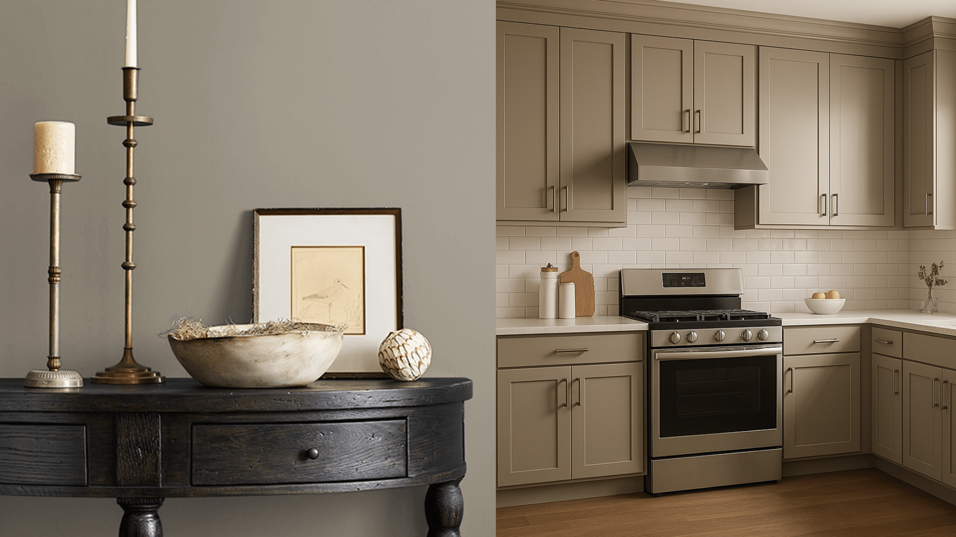
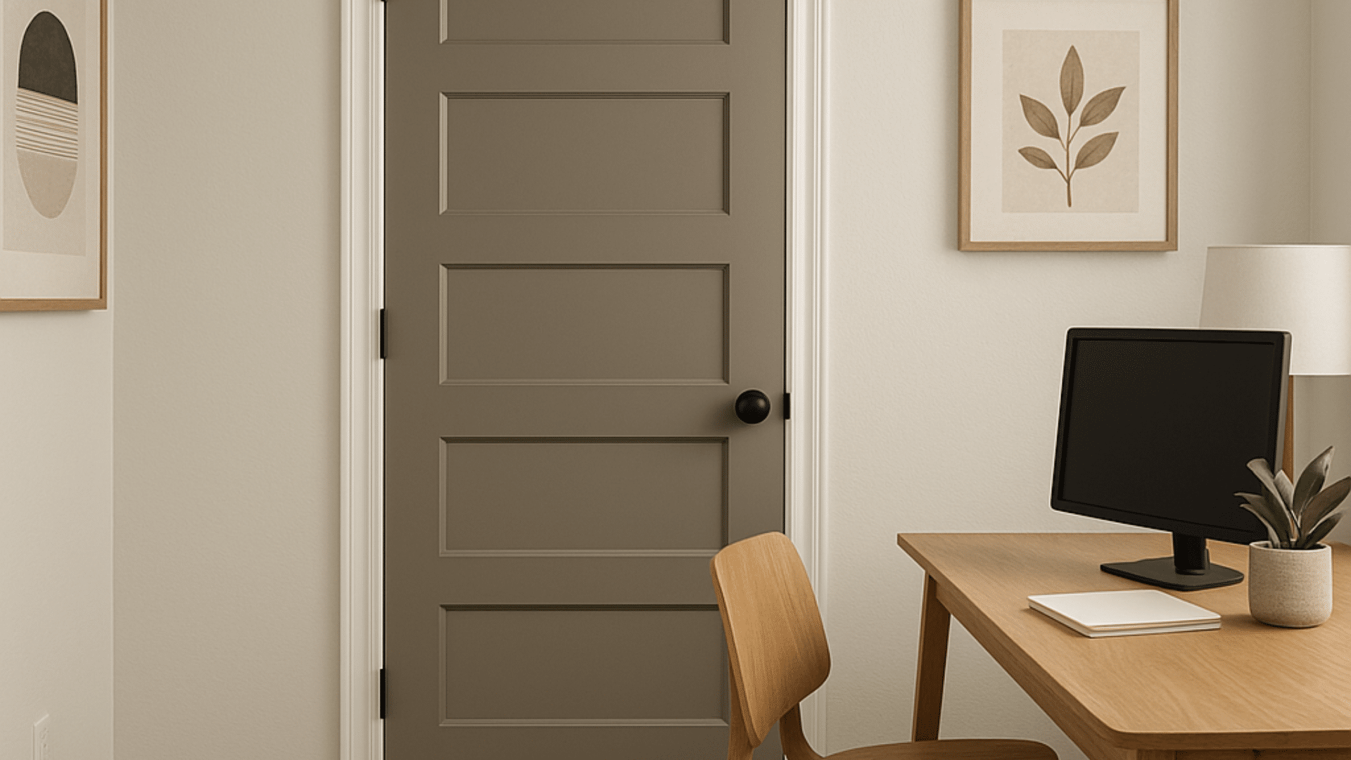
Studio Clay by Sherwin-Williams (SW 9172) is a beautifully balanced warm neutral that blends the calming qualities of gray with the earthy richness of brown.
It occupies that middle ground between greige (a mix of gray and beige) and taupe, making it incredibly versatile for a variety of design styles and color schemes.
What makes Studio Clay stand out is its subtle warmth; it leans a touch warmer than most standard grays, yet it doesn’t drift into the heaviness or visual weight that darker browns and tans can sometimes carry.
The presence of slight brown and violet undertones gives it a quiet sophistication. It doesn’t immediately jump out, but when applied to walls, it creates a cozy, enveloping atmosphere that feels both modern and timeless.
This understated quality makes it an ideal backdrop for both cool accents like blues and grays, and warm ones like rust, cream, or gold.
In essence, Studio Clay has the power to unify a space without overwhelming it, adding just enough pigment to feel intentional while still keeping things neutral and serene.
Studio Clay in Different Lighting
Lighting makes a huge difference with Studio Clay. Since it has a mix of brown and violet-gray undertones, you’ll see some noticeable shifts depending on the light source and time of day.
Natural Light
When studio clay is exposed to ample natural daylight, especially from south-facing or east-facing windows, it tends to show off its softer side.
The sunlight highlights its brown undertones, bringing out a warm, sandy appearance that feels calm and grounded.
In the morning, this color can appear slightly cooler as the light is sharper, but as the day progresses, it gradually warms up and glows gently, creating a serene and welcoming vibe.
Artificial Light
Under artificial lighting, particularly with warm-toned bulbs like incandescent or soft white LEDs, Studio Clay shifts into a deeper, richer version of itself.
The taupe and violet-gray undertones become more noticeable, giving the color a sophisticated, almost velvety feel.
Studio Clay appears warmer and more saturated, which works beautifully in cozy interior settings like dining rooms or bedrooms.
Night Light
At night, with minimal lighting or cool white bulbs, studio clay takes on a moodier, more dramatic tone. It can appear slightly darker and more muted, emphasizing its depth and grounding qualities.
In rooms with little ambient light, like libraries, media rooms, or reading nooks, the color transforms into a warm, shadowy neutral that adds character without feeling overwhelming.
This makes Studio Clay a smart pick for nighttime relaxation areas where you want to encourage calm and comfort after sunset.
Best Rooms to Use Studio Clay
Studio Clay works in almost any room thanks to its balanced tone. But it really shines in certain spaces where its warmth and subtlety can enhance the mood.
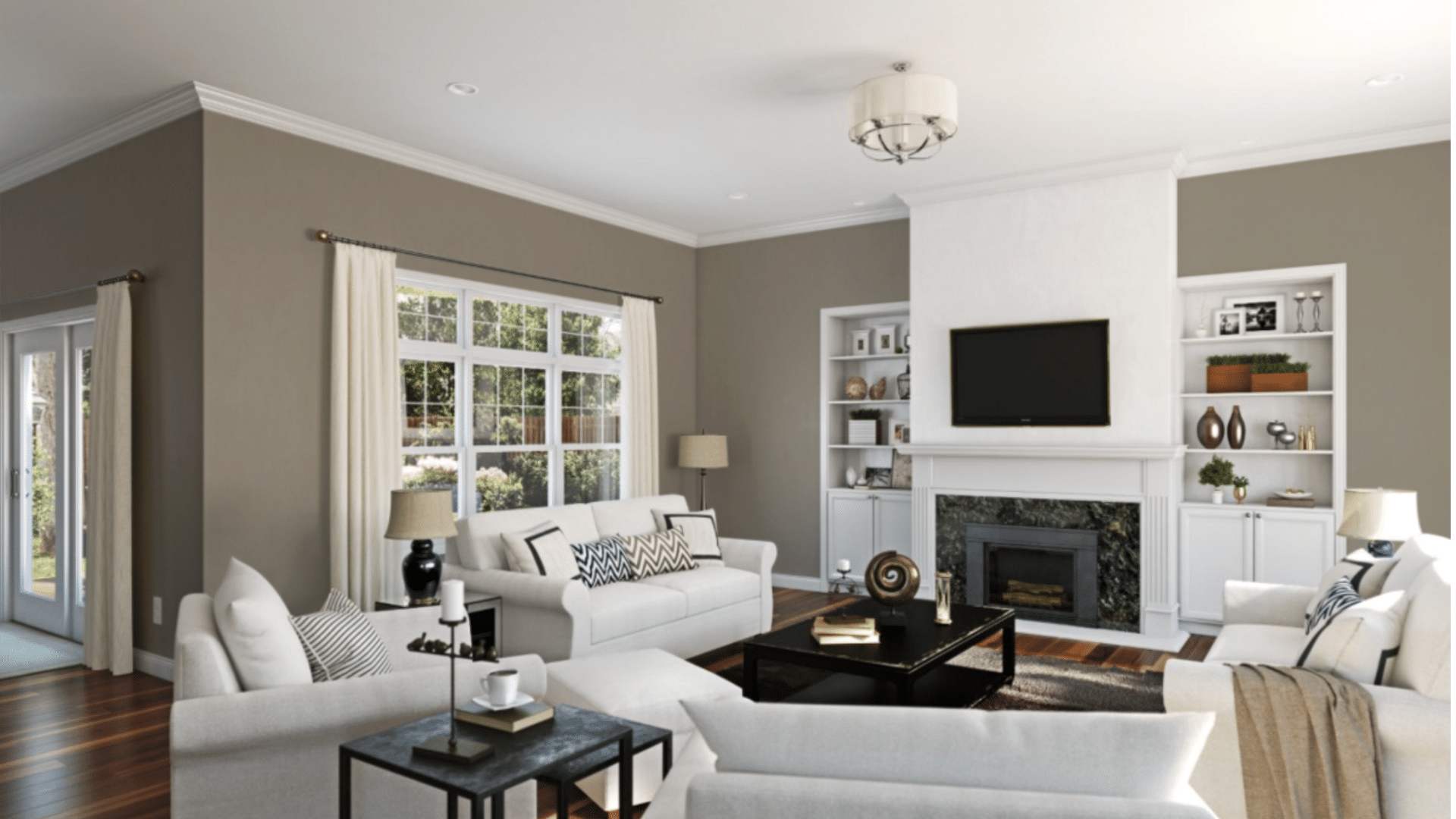
1. Living room: Studio Clay creates a soft and welcoming feel in the living room. Pair it with cream upholstery, dark wood furniture, and greenery for a cozy, modern farmhouse vibe.
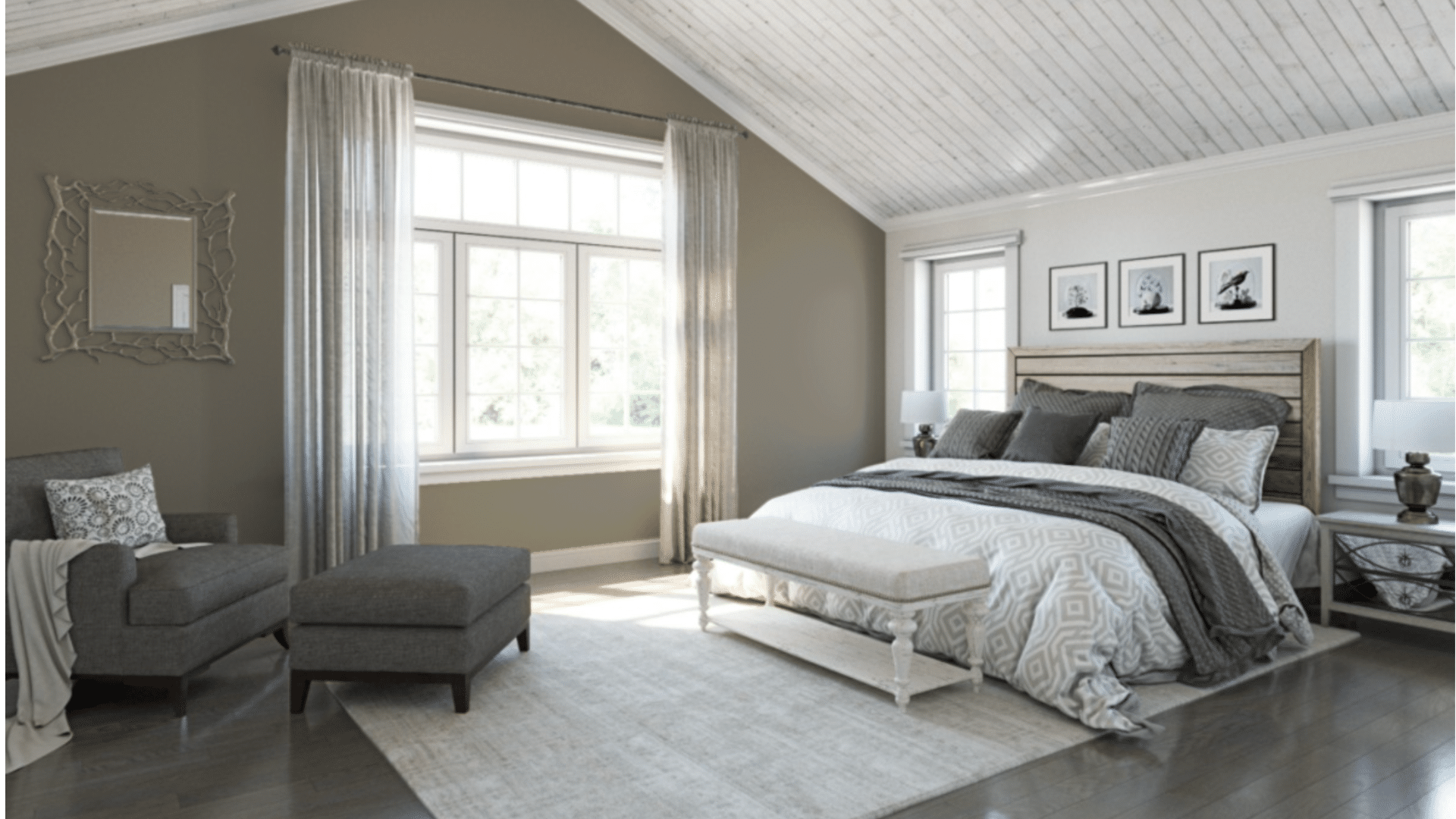
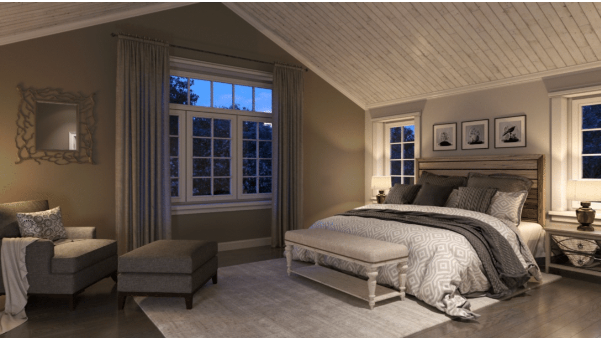
2. Bedroom: This color sets a calming tone for the bedroom. It works beautifully behind a headboard or on all four walls, especially when matched with light bedding and warm metallics.
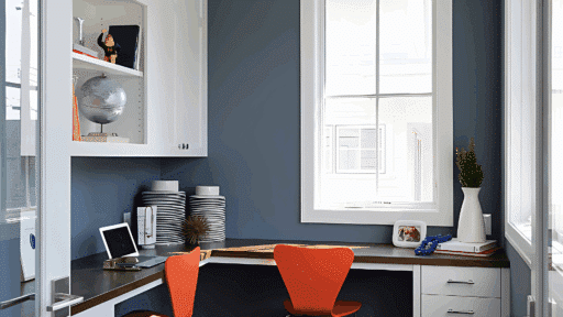
3. Office or Study: Studio Clay brings a grounded energy to home offices or studies. It’s not distracting, yet it’s not boring either, perfect for spaces where focus and comfort matter.
4. Entryway or Hallway: It adds depth and warmth to transitional spaces without making them feel cramped. Try Studio Clay in a hallway with white trim for a clean, elegant look.
Colors That Pair Well With Studio Clay
Because Studio Clay is such a grounded and adaptable neutral, it works well with a wide range of complementary shades. Whether you’re looking for subtle supporting colors or bold accents, this warm neutral forms a solid base for any palette.
1. Coordinating Neutrals
Studio Clay pairs beautifully with other warm neutrals. These combinations create a soft, layered look that feels calm and cohesive.
- Creamy Off-Whites: Perfect for trim, ceilings, or adjoining walls. They keep the space feeling fresh without harsh contrast.
- Warm Beiges: Great for nearby rooms or open layouts. They blend seamlessly with Studio Clay, adding warmth and flow.
- Soft Greiges: A touch of gray mixed with beige offers subtle depth and sophistication, especially on larger surfaces.
2. Accent Colors
Thanks to its neutral base, Studio Clay works well with a variety of accent tones. These colors bring personality while staying grounded.
- Deep Navy or Charcoal: Adds contrast and elegance – ideal for bold statement walls or furniture.
- Earthy Greens: Brings a natural, calming vibe, perfect for rustic or relaxed spaces.
- Rich Browns or Bronze Tones: Offers a modern or cozy feel without overpowering the room.
3. Trim and Ceiling Colors
Pairing Studio Clay with the right white helps define edges and keeps the space balanced.
- Soft Whites: Ideal for trim and ceilings, adding just enough contrast without feeling too stark.
- Bright Whites: Create a crisp, modern look and make Studio Clay stand out more boldly.
Studio Clay vs Similar Shades
Studio Clay stands out in the Sherwin-Williams lineup of warm neutrals, but it’s helpful to see how it compares to similar colors. This comparison will help you decide if it’s the right fit for your style and space.
| Paint Color | Tone & Undertones | Overall Look | Best For |
|---|---|---|---|
| Studio Clay (SW 9172) | Warm, earthy neutral with brown and violet-gray undertones | Deeper, grounded, soft yet rich | Modern or transitional spaces with cozy, calming energy |
| Balanced Beige (SW 7037) | Slightly lighter with subtle yellow undertones | Softer and more golden in feel | Traditional homes, sunny rooms, needing added warmth |
| Perfect Greige (SW 6073) | A balanced mix of gray and beige | More neutral and cooler compared to Studio Clay | Spaces needing a flexible, middle-ground neutral |
| Kilim Beige (SW 6106) | Warm beige with classic undertones | Light, traditional, with a hint of pink warmth | Older homes, formal spaces, or areas with ornate woodwork |
What Real Users Say About Studio Clay
Many homeowners and interior designers who have used Studio Clay speak highly of its versatility and comforting tone. A common theme in reviews is how this color manages to feel warm and inviting without being too dark or too beige.
People love that it creates a calm, grounded atmosphere that still feels stylish and modern.
It’s often praised for being a great backdrop that works with a wide range of furniture styles and color schemes, from minimalist to rustic to transitional.
Those who have used Studio Clay in their homes recommend testing it on large swatches and observing it throughout the day before making a final decision.
Some note that it looks quite different depending on the lighting, appearing more taupe in warm light and more grayish in cooler light.
Others advise pairing it with crisp white trim or warm wood tones to bring out its best qualities. Overall, Studio Clay is considered a dependable, go-to color for creating relaxed, timeless spaces.
Tips for Using Studio Clay in Your Home
Studio Clay is a versatile color, but getting the most out of it depends on how you apply and style it. These tips can help you create a cozy, cohesive look that brings out the best in this earthy neutral.
- Sample first: Always test Studio Clay in your space before fully committing. Paint large swatches on different walls and observe how the color shifts in morning light, afternoon sun, and evening shadows.
- Use with texture: Layer in texture to add interest and dimension. Studio Clay pairs beautifully with chunky knits, woven baskets, rustic wood furniture, and velvet or linen textiles.
- Consider sheen: A matte or eggshell finish works best for this shade. It maintains the soft, grounded look and minimizes glare, helping the color stay cozy and inviting.
- Pair with natural materials: Lean into the earthy vibe by decorating with natural elements like leather, linen, clay pots, jute rugs, and wooden tones. These pairings enhance Studio Clay’s organic charm.
Conclusion
After using Studio Clay by Sherwin-Williams in a few rooms and helping friends try it out in theirs, I can honestly say it’s a color that rarely disappoints.
It’s warm without being overpowering, neutral without being boring, and elegant without being stuffy.
Whether you live in a modern loft or a rustic farmhouse, Studio Clay can bring balance, warmth, and a touch of earthy sophistication to your space.
If you’ve been feeling unsure about your next paint color, give Studio Clay a serious look. Get a sample, test it out, and let it settle in.
Sometimes, the best colors aren’t the flashiest; they’re the ones that simply feel right, and Studio Clay does just that.
I hope this guide helped you get a clearer idea of how to use Studio Clay in your home.

Alex Guerrero, a graduate with a Fine Arts degree from the Rhode Island School of Design, has been a visionary in the world of color and design for over 15 years. His professional journey began in the heart of the fashion industry in Milan, where he developed an acute sense for color harmonies and trends. Alex joined our team in 2018, offering fresh and innovative perspectives on color utilization in various spaces. Renowned for his ability to blend contemporary trends with timeless elegance. Outside of work, Alex is an accomplished painter and a volunteer art therapist, his artistic talents further enriching his professional insights.