When selecting a soft, white paint for your home, Benjamin Moore’s Sea Pearl and White Dove are two options that’ve worked beautifully.
They’re both popular for a reason, but they serve slightly different purposes depending on your lighting, room style, and what kind of feel you want to create.
I’ve used and recommended both for cozy family spaces and sleek, modern homes. If you’re unsure which one fits your project, I’m here to help you break it down.
Sea Pearl leans warm and creamy, while White Dove feels soft, airy, and a bit brighter.
In this post, I’ll take you through how each one looks, where they work best, and how to choose between them. If you’re painting walls, trim, or the whole room, understanding these two shades will make your decision easier.
Overview: Benjamin Moore Sea Pearl and White Dove
Both Sea Pearl and White Dove are warm off-whites, but they offer different undertones and visual effects.
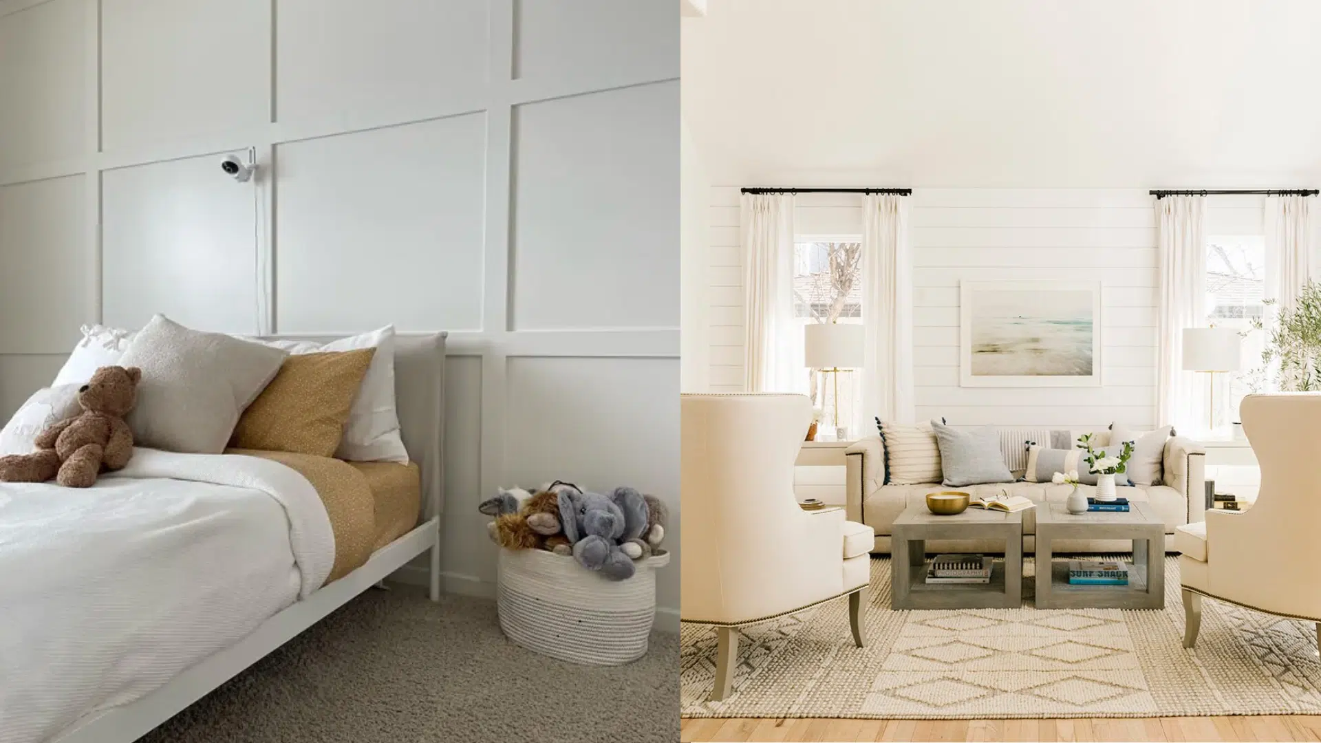
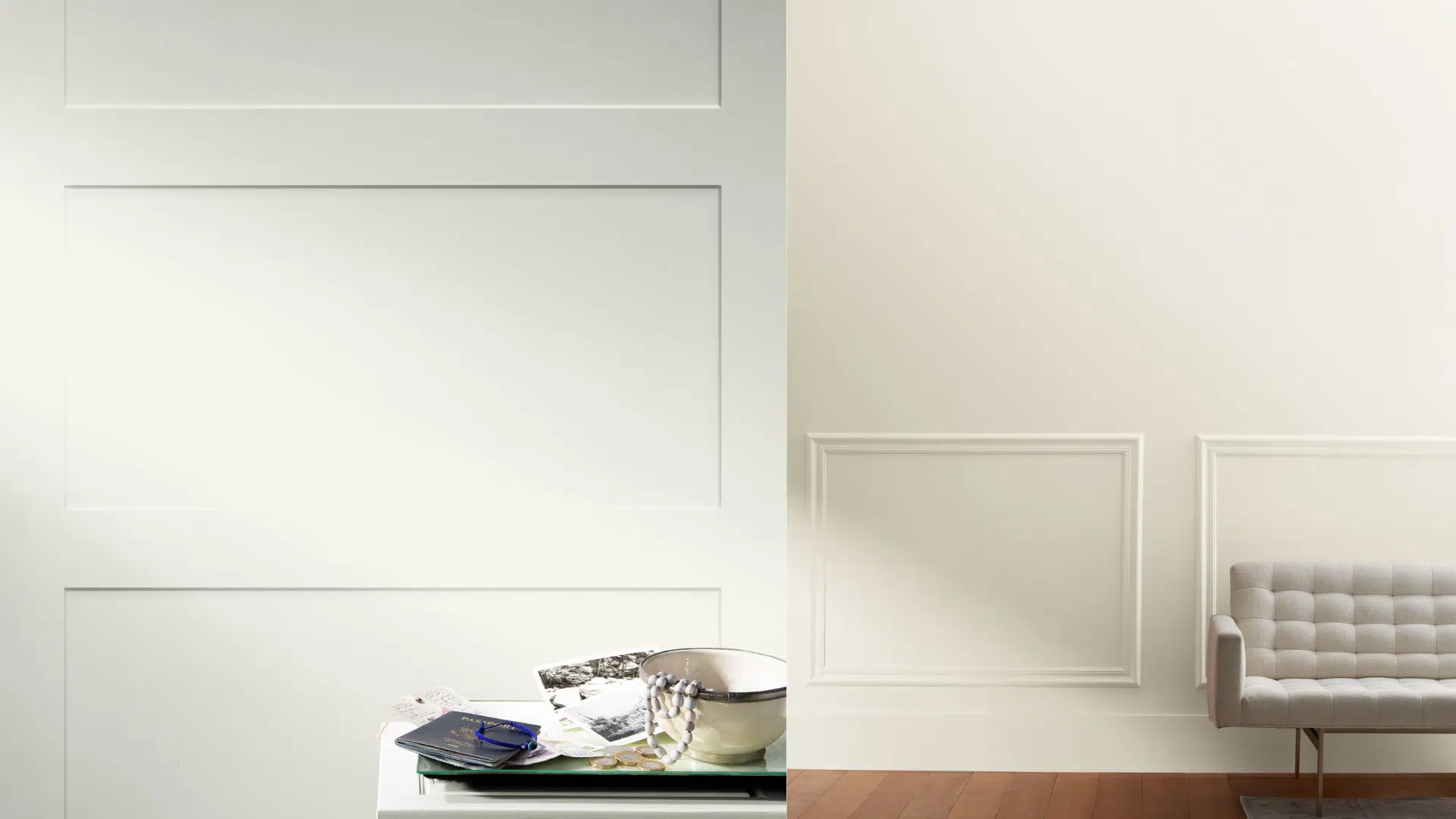
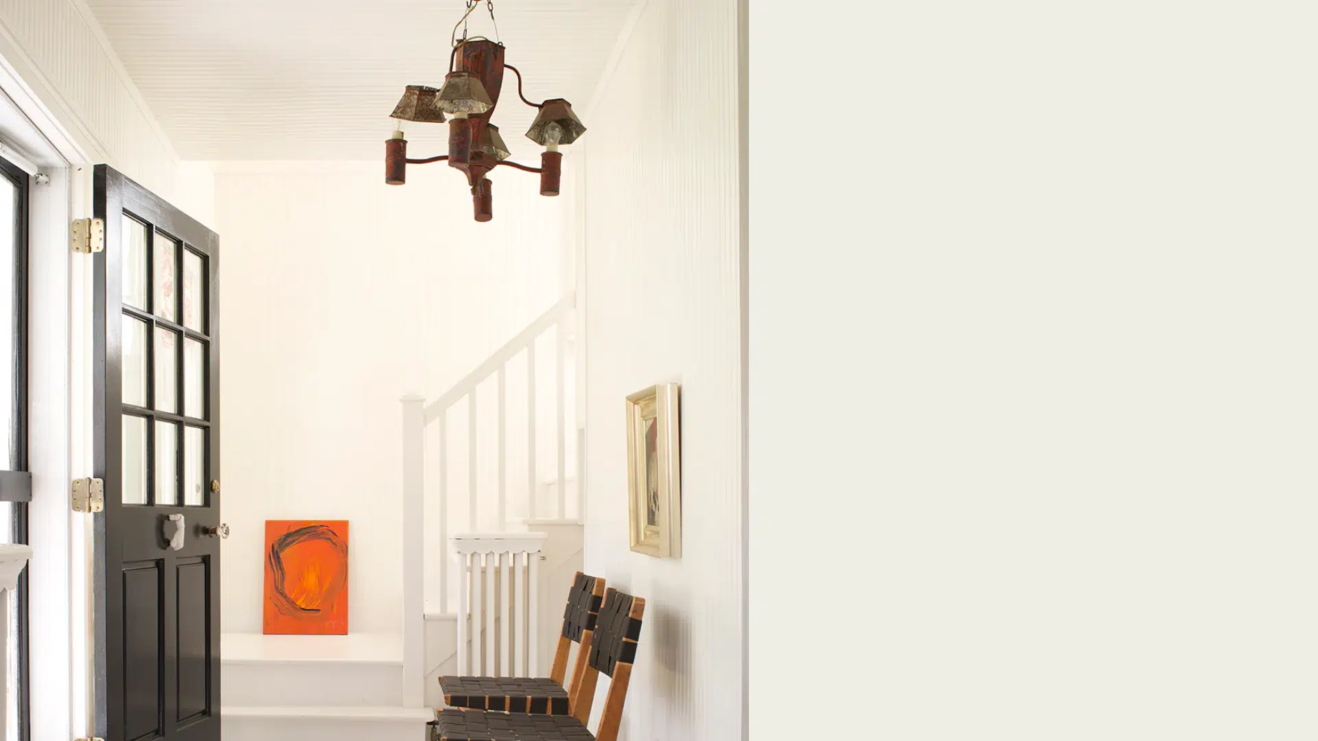
Sea Pearl (OC-19) leans warmer with beige-gray undertones, giving it a soft and creamy look. It works beautifully in traditional homes or where a warmer, grounded white is desired.
White Dove (OC-17) is a brighter off-white with a touch of gray and yellow. It’s clean and soft without being stark, making it a flexible choice for walls, trim, and cabinets.
Both shades offer versatility, but depending on your goals, one may be a better fit for your home than the other.
Key Differences: Sea Pearl vs White Dove
Benjamin Moore Sea Pearl and White Dove differ in tone, brightness, and use. This table offers a quick comparison. Each feature is explained in detail below to guide your decision.
1. Undertone
Understanding undertone is key when choosing the right white paint. It affects how warm or cool a color looks in your space.
- White Dove: Features a soft blend of yellow and gray undertones, making it a warm white that feels gentle, clean, and neutral without looking too creamy or overly bright in any room.
- Sea Pearl: Has a beige undertone, combining beige and gray, giving it a warmer, more grounded look. It leans slightly more beige, which adds a cozy and traditional feeling to interiors.
2. Light Reflectance Value (LRV)
LRV tells you how much light a color reflects. Higher values make rooms feel brighter, while lower ones give a cozier effect.
- White Dove: With an LRV of 85, this shade reflects a lot of light. It brightens up dark spaces and helps make rooms feel open, airy, and more spacious.
- Sea Pearl: Its LRV of 77.95 means it reflects less light than White Dove. It works well in rooms with good natural light, adding a soft, warm glow that feels inviting.
3. Overall Tone
The overall tone impacts how the color feels – whether it’s airy and open or cozy and inviting.
- White Dove: Offers a soft, bright, and neutral tone that works well in both cool and warm settings. It’s ideal for creating a calm, fresh, and balanced atmosphere.
- Sea Pearl: Feels creamier and more muted overall, adding depth and subtle warmth to rooms. It’s excellent for homes with earthy tones or traditional design elements seeking a relaxed backdrop.
4. Best Use
Each color performs best in different types of spaces and lighting conditions.
- White Dove: Works across trim, walls, ceilings, and cabinetry in both modern and transitional homes. It’s especially useful in spaces that need brightness without starkness.
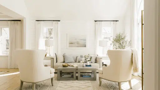
- Sea Pearl: Perfect for bedrooms, living rooms, or dining spaces with natural light. It complements wood furniture and soft furnishings, creating a warm, traditional, and welcoming look.
5. Color Depth
Color depth influences how much a paint color stands out or recedes in a room.
- White Dove: Appears light and crisp, making it ideal for smaller rooms or low-light spaces. It won’t overwhelm the room but still provides warmth and subtle personality.
- Sea Pearl: Slightly deeper in tone, it reads more substantial on walls and offers a richer contrast when paired with white trim or lighter surrounding colors.
6. Finish Feel
The visual texture and polish the color provides once applied and dried.
- White Dove: Has a smooth, clean finish that looks fresh and polished in any sheen. It maintains a modern edge while still feeling comfortable in classic interiors.
- Sea Pearl: Dries with a soft, velvety feel that adds richness and dimension to walls. It enhances cozy environments while still looking refined and elegant.
Quick Comparision
| Feature | Benjamin Moore Sea Pearl | Benjamin Moore White Dove |
|---|---|---|
| Undertone | Warm greige (beige-gray) | Soft warm white with subtle yellow-gray undertone |
| Light Reflectance Value | 77.95 – slightly darker and more muted | 85 – reflects more light and feels brighter |
| Overall Tone | Creamy, grounded, and cozy | Soft, airy, and clean |
| Best Use | Traditional rooms, warm palettes, natural lighting | Modern, transitional, low-light or whole-home use |
| Color Depth | Slightly deeper and more muted | Brighter with a lighter visual presence |
| Finish Feel | Soft and warm, adds character | Crisp, clean, and versatile |
Pros and Cons: Sea Pearl vs White Dove
Sea Pearl and White Dove each offer unique benefits. This section outlines their pros and cons to help you choose the best fit for your space and style.
Sea Pearl
Sea Pearl offers a warm, inviting look with greige undertones, ideal for traditional spaces.Below are its main advantages and a few limitations to consider before choosing it.
| Pros | Cons |
|---|---|
| Warm, grounded appearance with greige undertones | Slightly darker, so it may not brighten dim rooms |
| Excellent for traditional or rustic spaces | Can appear beige in some lighting |
| Works well with warm finishes and natural light | Might not suit ultra-modern designs |
White Dove
White Dove is a soft, clean white that suits many styles and spaces. Below are its main advantages and a few limitations to consider before choosing it.
| Pros | Cons |
|---|---|
| Bright and clean without looking sterile | Slight yellow undertone can show in artificial lighting |
| Very versatile – works with warm and cool palettes | Might feel too soft or light in already bright rooms |
| Ideal for trim, cabinets, and open-concept spaces | Can look a bit plain without contrasting elements |
When to Use Benjamin Moore Sea Pearl vs White Dove
Knowing when to use Sea Pearl or White Dove depends on your space, lighting, and style. This section helps you choose the right shade for each situation.
When to Choose Sea Pearl
Sea Pearl is best for spaces that need warmth, depth, and a cozy feel. This section covers where and when this creamy greige shade works beautifully.
- Warm, traditional interiors: Sea Pearl complements beige carpets, wood furniture, and earthy tones.
- Natural light-rich rooms: It doesn’t over-brighten and adds a calm, creamy vibe.
- Rustic or farmhouse designs: Its grounded tone works well with shiplap, natural stone, and antique décor.
- Subtle contrast: Use Sea Pearl as wall color with crisp white trim for an elegant, layered look.
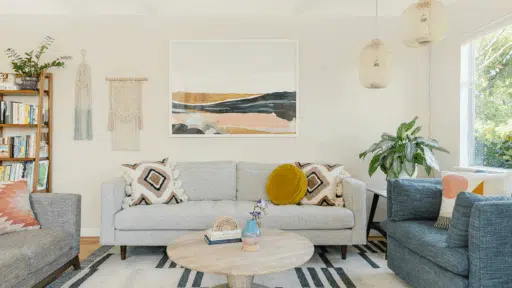
When to Choose a White Dove
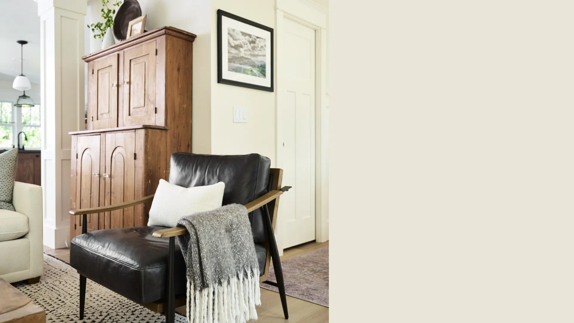
White Dove is ideal for creating bright, soft, and versatile spaces. This section explains when this popular off-white works best in your home’s design.
- Bright, clean design: White Dove keeps things light and soft, especially in small or low-light rooms.
- Modern or transitional homes: Pairs well with cool grays, black, navy, and muted greens.
- Whole-home consistency: A safe, crowd-pleasing white that works in multiple rooms without clashing.
- Trim and ceiling paint: Its balance of warmth and brightness makes it ideal for architectural details.
Tips for Choosing Between Sea Pearl and White Dove
Learn how to test, compare, and evaluate Sea Pearl and White Dove in your space with these practical tips to make a confident, well-matched choice.
- Bold swatch testing: Always test large painted swatches on multiple walls to see how each color looks in your actual lighting before making a final decision.
- Check lighting throughout the day: Colors can shift in appearance under morning light, afternoon sun, and evening bulbs. Observe Sea Pearl and White Dove in every condition.
- Compare with finishes: Place swatches next to your trim, flooring, and fixtures to ensure the color complements your existing elements and doesn’t clash.
- Use two coats when sampling: A single coat might not show the true color. Apply two coats of each paint swatch to see accurate depth and undertone.
- Label your swatches: Avoid confusion by writing the paint name clearly on each swatch, especially if testing multiple whites or applying them in several rooms.
Common Mistakes to Avoid
Many paint decisions go wrong due to small oversights. Avoid these common mistakes when choosing between Sea Pearl and White Dove.
- Treating all soft whites the same: Sea Pearl and White Dove behave differently depending on the space. One may look creamy and calm, the other too bright or cool.
- Relying only on paint chips: Paint chips don’t reveal how the color will react on full walls. Skipping real-world testing often leads to unexpected results.
- Ignoring room direction: Rooms that face north or south affect how whites appear. Sea Pearl may look cooler in a north-facing room, while White Dove brightens it.
- Using White Dove in overly bright spaces: In bright, sunlit areas, White Dove can appear washed out. It needs balance from contrast or deeper accent tones to hold its character.
- Overlooking fixed elements: Your paint needs to match with permanent features like countertops, tile, or wood tones. Choosing without checking these can lead to a visual disconnection.
Conclusion
Benjamin Moore Sea Pearl and White Dove are both beautiful, soft whites, but each offers something unique depending on your space and style.
If you’re drawn to a warm, cozy feel, Sea Pearl gives you that grounded look with its beige undertone – perfect for traditional or rustic rooms. I’d recommend it when you want depth without going too dark.
If you’re after a brighter, cleaner white that still feels soft, White Dove is a great choice. I’ve used it in trim, open-concept layouts, and modern spaces where it blends effortlessly.
Both colors are timeless, so you really can’t go wrong. Think about the light in your room, your existing finishes, and the atmosphere you want to create.
Once you do that, you’ll know exactly which white is right for you.

Alex Guerrero, a graduate with a Fine Arts degree from the Rhode Island School of Design, has been a visionary in the world of color and design for over 15 years. His professional journey began in the heart of the fashion industry in Milan, where he developed an acute sense for color harmonies and trends. Alex joined our team in 2018, offering fresh and innovative perspectives on color utilization in various spaces. Renowned for his ability to blend contemporary trends with timeless elegance. Outside of work, Alex is an accomplished painter and a volunteer art therapist, his artistic talents further enriching his professional insights.