Creating a cohesive color palette throughout your home is one of the most transformative design decisions you can make.
The right colors create harmonious flow, influence mood, and make your entire home feel intentional and beautiful. Colors have a profound psychological effect: warm tones create cozy atmospheres, while cool blues promote a sense of calm.
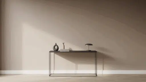
A well-planned whole-house palette ensures smooth transitions between spaces, particularly important in open floor plans.
Sherwin-Williams, with over 150 years of expertise, offers an extensive range of carefully curated colors for modern homes, from timeless neutrals to on-trend hues, along with expert tools to achieve a perfect color story.
Why a Cohesive Color Palette Matters for Your Home
A thoughtfully planned color palette serves as the invisible thread that weaves your home together, creating visual harmony that extends far beyond mere aesthetics.
When colors flow seamlessly from room to room, they establish a beautiful unity that makes your entire home feel intentional and professionally designed.
Creating Harmony Across Different Rooms
Cohesive color schemes eliminate the jarring transitions that occur when each room exists in isolation.
Instead of experiencing visual stops and starts as you move through your home, a unified palette creates gentle transitions that guide the eye naturally.
This doesn’t mean every room must be identical; rather, related colors, varying tones of the same hue, or complementary shades can maintain connection while allowing each space its own personality.
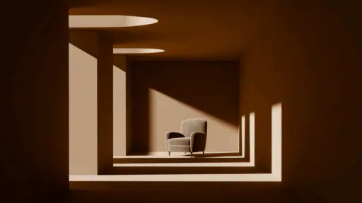
Enhancing Your Home’s Architectural Features
Strategic color choices can dramatically highlight your home’s best architectural elements while downplaying less desirable features.
Light colors can emphasize beautiful moldings and trim work, while darker accent walls can create depth and drama around fireplaces or built-in shelving.
A cohesive palette ensures these enhancements work together rather than competing for attention.
How to Choose Modern House Colors That Work Together
Creating a harmonious modern color palette isn’t just about selecting pleasing shades; it’s about understanding the beautiful interplay of color theory, psychology, and current design trends.
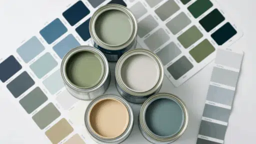
1. The Foundation: Selecting Your Base Color
Your base color sets the entire mood; choose wisely between timeless neutrals and statement-making bolds.
Neutral Powerhouses vs. Bold Statements
Trending neutrals feature warmer tones, shifting away from plain white and gray to incorporate taupe, clay, and beige, with subtle pink or peach undertones.
Sherwin-Williams’ Color of the Year, Quietude, exemplifies this trend as a soft sage with a whisper of blue influence.
2. The Science of Undertones: Your Color’s Hidden DNA
Understanding undertones is the key to the difference between amateur and professional-looking color schemes.
Decoding Undertones Like a Pro
Don’t look at colors in isolation.
Put the color you’re considering next to a pure example of that color; the undertone will quickly reveal itself.
When you place a white paint color with a yellow undertone next to a white one with a blue undertone, the difference between warm and cool becomes instantly, and strikingly, evident.
3. Strategic Use of Accent Colors
Pinterest’s trend report highlights bold primary colors, with expectations of rising popularity in hand-painted murals, bright trims, and custom furniture upgrades in vibrant reds, blues, and yellows.
Use your base neutral for 60% of the space, a supporting color for 30%, and reserve bold accents for 10%.
Trending Accent Colors
Chartreuse acts as a neutral when paired with darker tones, while purple is being called the new neutral in interiors, and brown has taken a sweeter turn with dessert-inspired hues, ranging from chocolate and coffee to caramel and toffee.
4. Mastering the Warm-Cool Balance
Warm colors: yellow, orange, red, and combinations thereof; breathe energy, positivity, and a sense of sunshine into any room. Cool colors, such as green, blue, and purple, evoke relaxation and calm.
North-facing rooms tend to receive the least amount of natural light, so many homeowners opt for paint colors with warm undertones to counteract this lack of light.
5. Paint Finish Strategy: The Final Layer of Sophistication
Your finish choice affects how colors appear, reflect light, and interact with the architecture of your space.
Sheen as a Design Element
A matte finish is nearly as shine-free as a flat finish, providing excellent hiding and depth of color, with slightly more durability. Satin offers a smoother finish and is ideal for high-traffic areas, striking a balance between durability and elegance.
Sherwin-Williams Color Palette Highlights for Modern Homes
When it comes to modern home color palettes, Sherwin-Williams stands as the undisputed leader in both innovation and reliability.
These customer favorites have earned their place in modern homes through beauty, versatility, and ageless appeal.
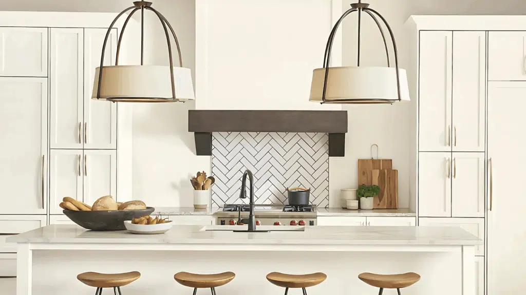
1. Greys and Whites for a Sleek, Minimalist Vibe
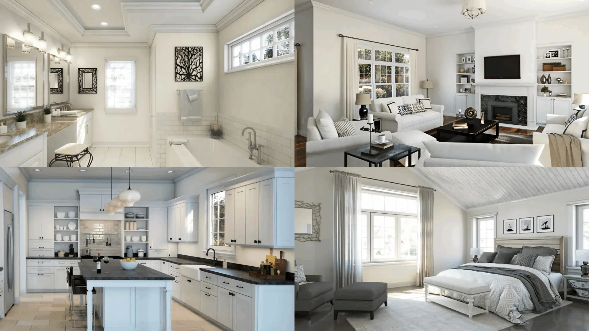
The foundation of modern design lies in beautiful neutrals that create clean, uncluttered spaces. These aren’t your basic grays; they’re complex, nuanced colors that add depth without overwhelming.
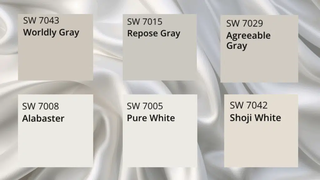
Essential Modern Greys:
- Agreeable Gray SW 7029: The perfect greige with a touch of warmth that makes it feel inviting and livable without being too dark or bold
- Repose Gray SW 7015: A versatile choice for contemporary spaces
- Worldly Gray SW 7043: A beautiful warm grey-greige with a subtle green undertone, perfect for nature-inspired modern approaches
Modern White Essentials:
- Alabaster SW 7008: Soft and warm, ideal for creating a cozy vibe
- Pure White SW 7005: Crisp and clean, perfect for walls or trim
- Shoji White SW 7042: A versatile off-white with subtle gray undertones
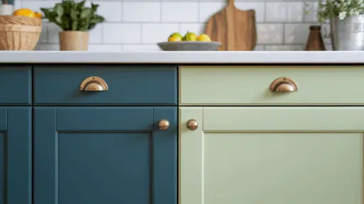
2. Earthy Tones for a Warm, Grounded Feel
Connect with nature through beautiful earth-inspired colors that bring organic warmth to modern interiors.
Modern homes are embracing colors that are poised between warm and cool, adaptable and airy light neutrals that are deeper than white, not quite gray, and venture beyond beige or taupe.
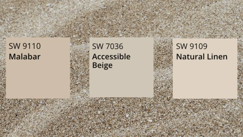
Trending Earth Tones:
- Malabar: Works well with deep accent colors like olive green or charcoal for balanced contrast
- Accessible Beige: Adds warm and inviting tone that perfectly balances neutral elegance with cozy charm
- Natural Linen: Adds subtle energy to a room as a warm neutral
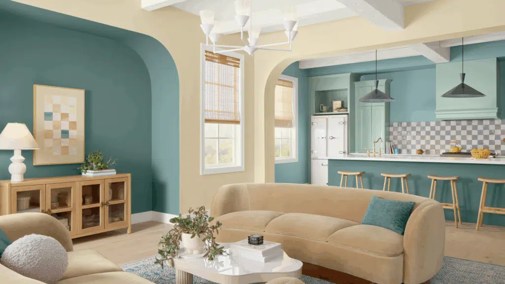
3. Bold and Bright Color Choices to Make a Statement
Modern doesn’t mean monochrome; strategic use of bold colors creates dynamic, personality-filled spaces. A historic color, never more relevant, vibrant yellow-green appeared on three Colormix Forecasts, bringing joyful, tropical brightness that is both eclectic and versatile.
Statement-Making Choices:
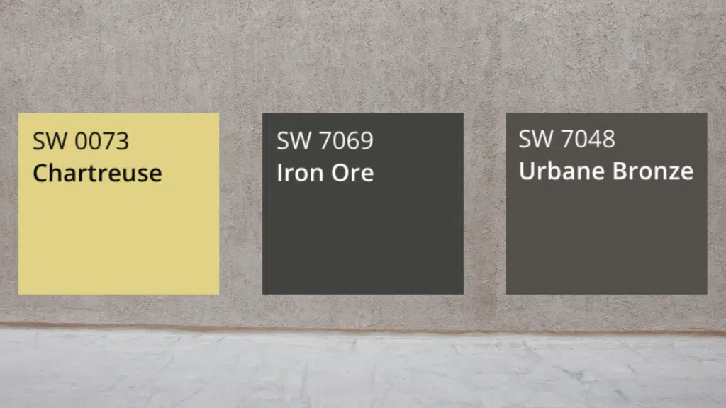
- Chartreuse: A vibrant yellow-green that brings energy and personality, perfect for those who want to make a statement
- Iron Ore: With a depth of tone that’s nearly black, this entrancing brown is at home in warm, welcoming palettes
- Urbane Bronze: A beautiful dark choice for modern accents
4. Blues and Greens for Calming, Coastal Aesthetics
These nature-inspired hues bring a sense of serenity and sophistication to contemporary spaces.
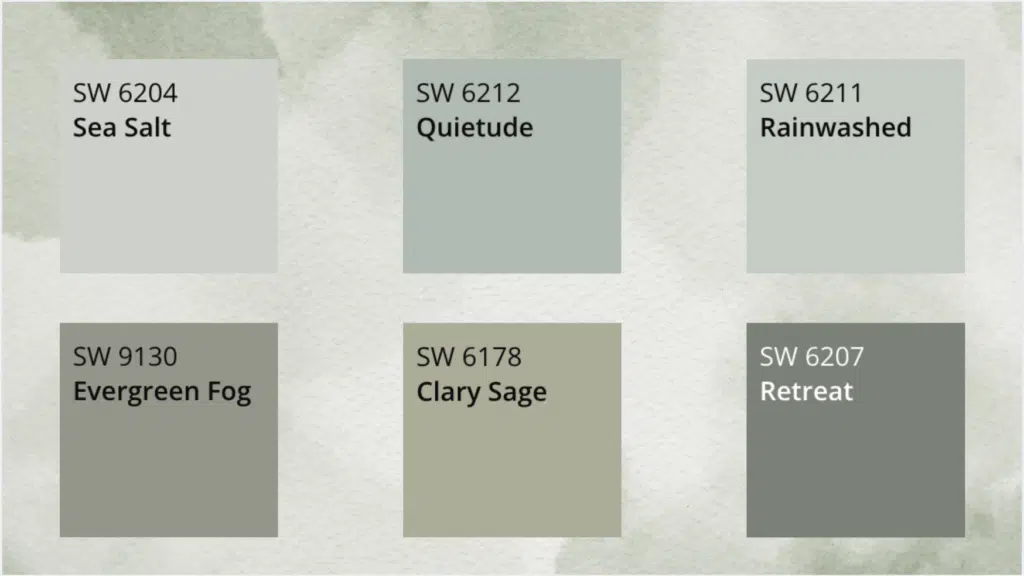
Sea Salt is predominantly green with blue and gray undertones, working beautifully with whites, grays, and navy blue, bringing a welcome pop of calming color to any space.
Coastal-Inspired Moderns:
- Sea Salt: A calming neutral often described as soft, muted greenish-blue with a coastal vibe
- Quietude: A soft sage with a whisper of blue influence for enduring design
- Rainwashed: A blue-green blend with gray that has more intensity than Sea Salt
Essential Modern Greens:
- Evergreen Fog: A beautiful green-gray that’s calming and modern
- Clary Sage: A soft, earthy green that pairs beautifully with warm neutrals
- Retreat: A serene, medium green perfect for creating a tranquil atmosphere
Tips for Using Sherwin-Williams Color Collections in Your Home
Sherwin-Williams’ expertly curated collections eliminate the guesswork from color selection, offering pre-designed palettes that ensure professional-looking results.
How to Use the Capsule Collections:
- Single room approach: Choose 3-4 colors from one capsule to create a beautiful, monochromatic scheme
- Whole house strategy: Use one capsule as your primary palette, selecting 1-2 colors from each of the other capsules as accents
- Seasonal flexibility: The forecast can be mixed and matched in one space, but it can also be used in different rooms in the same house, or you might lean towards basing your entire home on one specific palette
1. The Top 50: Tried-and-True Favorites
Among these loved and trusted hues, you’ll find favored grays, whites, neutrals, and even some unexpected colors. The genius of the Top 50 collection lies in its real-world testing; thousands of homeowners have chosen these colors and consistently deliver beautiful results.
Top 50 Success Strategy:
- Start with one Top 50 color as your base
- Add subtle energy to a room with a warm neutral like Natural Linen or Agreeable Gray, or infuse your space with calm with a cool white like Alabaster or Pure White
- Use the collection’s built-in compatibility to confidently select coordinating colors
2. Mid-Century Modern Mastery
Mid-century modern furniture with its warm wood tones and geometric shapes pairs beautifully with Sherwin-Williams’ earthy neutrals and beautiful accent colors.
Malabar, one of the versatile colors in the Sherwin-Williams Color Capsule, is a soft, sandy beige neutral that embodies a warm, earthy feel and can complement various design styles, from minimalist to boho chic.
Mid-Century Color Pairings:
- Malabar + Charcoal: Combine Malabar with deep accent colors like olive green or charcoal for a balanced contrast
- Agreeable Gray + Warm Wood: Perfect backdrop for teak and walnut furniture pieces
- Sea Salt + Brass Accents: Creates the perfect retro-coastal vibe
3. Contemporary Minimalist Combinations
Contemporary minimalist design relies on subtle color variations and texture to create interest. The Finest Whites Color Collection offers a range of off-whites to dark white paint colors, perfect for creating the layered neutrals that define modern minimalism.
Minimalist Color Strategies:
- Monochromatic whites: Use 2-3 shades from the Finest Whites collection for subtle depth
- Warm gray foundation: Agreeable Gray as the primary color with Pure White accents
- Single accent approach: Choose one bold color from Colour Capsule as your only non-neutral
4. Scandinavian Style Success
Scandinavian design celebrates natural light and organic materials. Shoji White SW 7042 offers a versatile off-white with subtle gray undertones, perfect for creating that bright, airy Scandinavian foundation.
Scandinavian Pairings:
- Shoji White + Natural Wood: Creates the classic Scandi backdrop
- Quietude + White Trim: A soft sage with a whisper of blue influence that soothes any space
- Alabaster + Black Accents: The timeless Nordic contrast
How to Transition Your Palette from Room to Room Effortlessly
Seamless color flow creates homes that feel intentional and professionally designed.
1. The 60-30-10 Rule for Whole House Flow: Professional designers use the 60-30-10 rule to create a cohesive color flow: 60% dominant color, 30% secondary color, 10% accent color.
2. Room-to-Room Transition Strategies: Use the same neutral (like Agreeable Gray) throughout common areas. Keep the same 60% and 30% colors, but change the 10% accent in each room
3. Open Floor Plan Color Harmony: The colors are designed to work beautifully together in any combination, making them perfect for open floor plans where multiple “rooms” exist in one visual space.
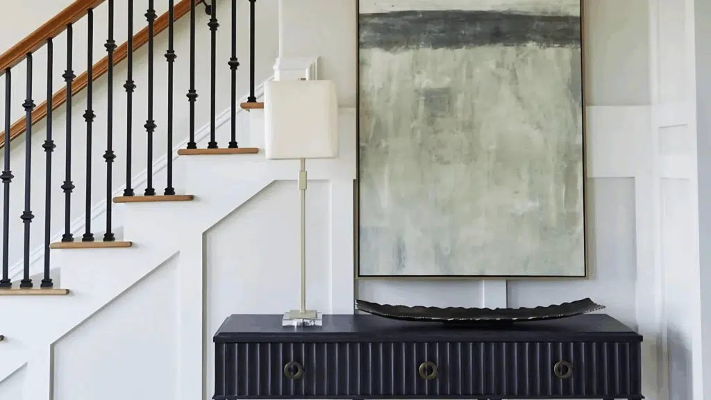
4. Hallway and Transition Space Strategy: Hallways and entryways should serve as neutral bridges between more colorful spaces.
Conclusion
Creating a cohesive whole-house color palette isn’t just about appearances; it’s about crafting a living environment that reflects your personality, supports your lifestyle, and brings you joy every single day.
Throughout this comprehensive guide, we’ve learned how the strategic use of color can turn your home from a collection of rooms into a harmonious, beautiful sanctuary.
From understanding the psychological impact of different hues to mastering the art of undertones and finish selection, you now have the knowledge to make confident color decisions that will stand the test of time.
Start with one room that matters most to you. Use the knowledge you’ve gained to select colors that support how you want to feel and function in that space.

Alex Guerrero, a graduate with a Fine Arts degree from the Rhode Island School of Design, has been a visionary in the world of color and design for over 15 years. His professional journey began in the heart of the fashion industry in Milan, where he developed an acute sense for color harmonies and trends. Alex joined our team in 2018, offering fresh and innovative perspectives on color utilization in various spaces. Renowned for his ability to blend contemporary trends with timeless elegance. Outside of work, Alex is an accomplished painter and a volunteer art therapist, his artistic talents further enriching his professional insights.