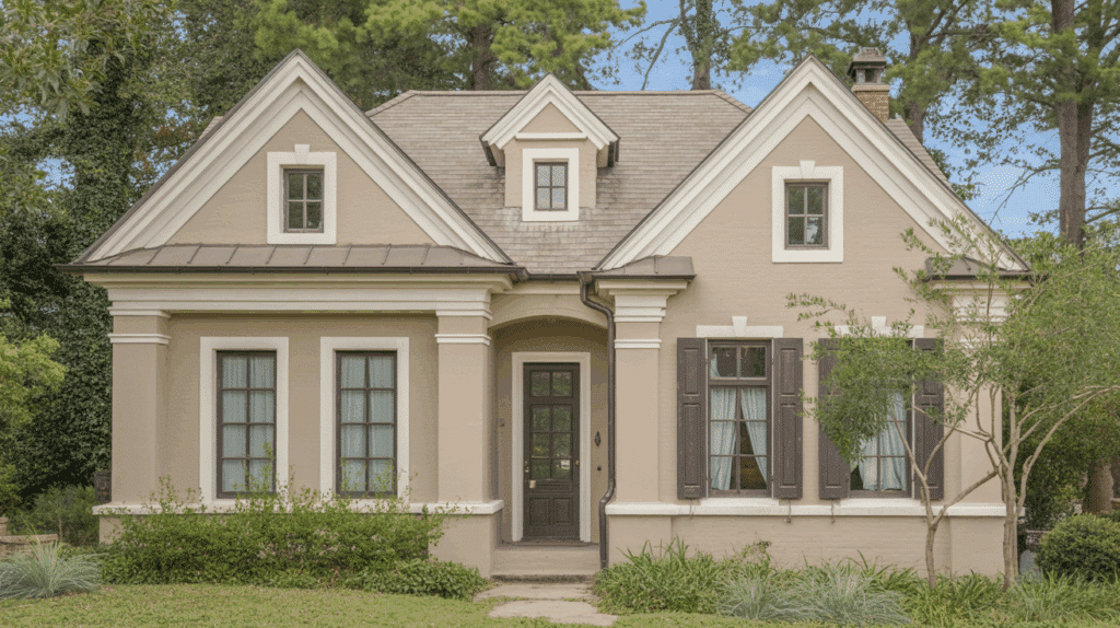
Walk into any modern home, and you’ll likely spot Accessible Beige on the walls.
This popular neutral isn’t just a safe choice. It’s actually a color chameleon that works beautifully in bright morning light and cozy evening settings.
I’m going to show you exactly which accessible beige complementary colors will make your rooms feel perfectly balanced and inviting.
Whether you’re a first-time painter or a seasoned decorator, you’ll find practical color combinations that actually work in real homes.
What Color is Accessible Beige and its Undertone
It’s not too gray, not too beige, just right. This color adapts beautifully to different lighting conditions.
In bright morning light, it feels fresh and airy. Under warm evening lamps, it becomes cozy and inviting. I’ve seen it work wonders in living rooms, bedrooms, and hallways.
The secret? Its warm greige undertones make any space feel balanced and welcoming.
| Property | Value |
|---|---|
| Hex Code | #D0C4B6 |
| RGB | (208, 196, 182) |
| LRV (Light Reflectance Value) | 58 |
| Undertone | Warm greige with slight green-gray |
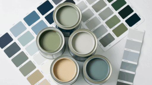
Complementary Color Families for Accessible Beige
I’ve tested countless accessible beige complementary colors in real homes, and these combinations never fail. Here are my go-to palettes that work beautifully together.
1. Clean Whites
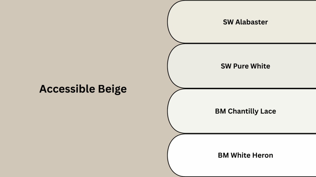
I always reach for clean whites when I want to create fresh contrast with Accessible Beige. These crisp shades make any space feel brighter and more open without competing for attention.
SW Alabaster: I love how this soft, creamy white brings gentle warmth to any room. It creates cozy brightness without feeling stark. This color makes Accessible Beige feel more inviting and comfortable.
SW Pure White: This is my choice for modern, clean spaces. It offers crisp contrast against Accessible Beige. The minimal yellow undertones keep it fresh and contemporary.
BM Chantilly Lace: I use this when I want an airy, fresh backdrop. It has slightly cool undertones that balance perfectly with Accessible Beige. This combination feels open and breathable.
BM White Heron: This muted white with soft gray tints works beautifully in bedrooms. It’s not as stark as pure white. The subtle warmth complements Accessible Beige perfectly.
2. Soft Grays
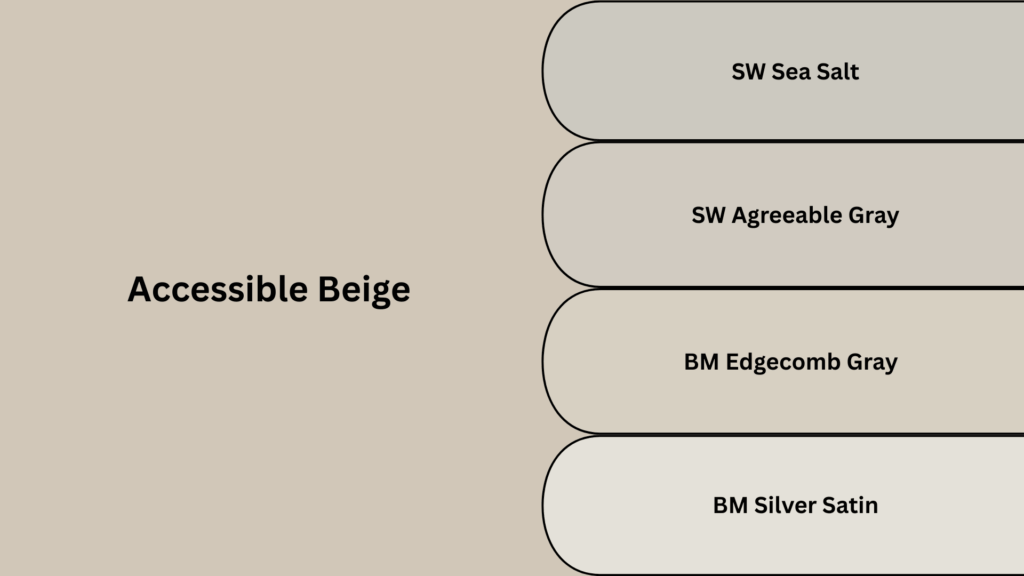
I love how soft grays add gentle depth without creating harsh contrasts with Accessible Beige. These warm gray tones create smooth transitions that make rooms feel perfectly balanced and calming.
SW Repose Gray: I recommend this for spaces that need subtle depth. It has warm greige tones with minimal green undertones. This color creates balanced, calming transitions with Accessible Beige.
SW Agreeable Gray: This smooth, calming tone works in almost any room. It brings gentle contrast without competing with Accessible Beige. The warm beige undertones make it feel cohesive and peaceful.
BM Edgecomb Gray: I choose this refined color for traditional spaces. It has warm greige and earthy taupe undertones. This versatile shade pairs beautifully with Accessible Beige in formal settings.
BM Silver Satin: This understated color has subtle violet and soft greige tones. It creates an ethereal, refined feel next to Accessible Beige. I love it for powder rooms and reading nooks.
3. Earthy Greens
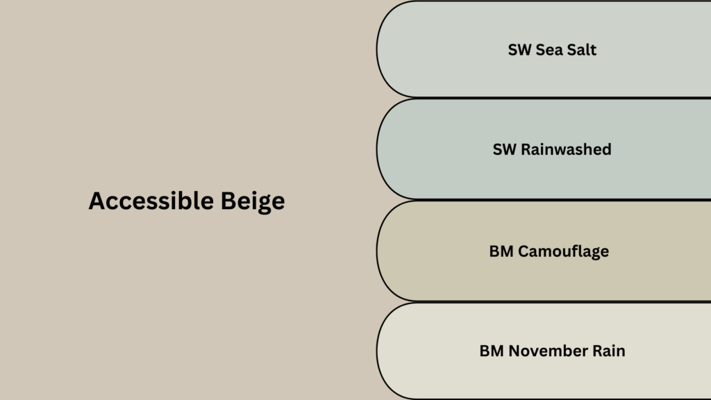
I turn to earthy greens when I want to bring natural, organic calm into a space. These nature-inspired tones pair beautifully with Accessible Beige, creating serene environments that feel grounded and peaceful.
SW Sea Salt: This misty green-blue brings serenity to any space. It has muted, soft undertones that feel naturally calming. I use it in bathrooms and bedrooms with Accessible Beige.
SW Rainwashed: I love this soft aquatic tone for creating peaceful environments. It has gentle blue-green undertones that feel fresh. This color makes Accessible Beige feel more organic and natural.
BM Camouflage: This mellow sage hue has yellow-green undertones with subtle gray. It brings earthy warmth without being overwhelming. I pair it with Accessible Beige in kitchens and dining rooms.
BM November Rain: This hazy gray-green blend feels soft and contemplative. It has gentle, muted tones that create tranquil spaces. I recommend it for home offices and quiet corners.
4. Warm Browns
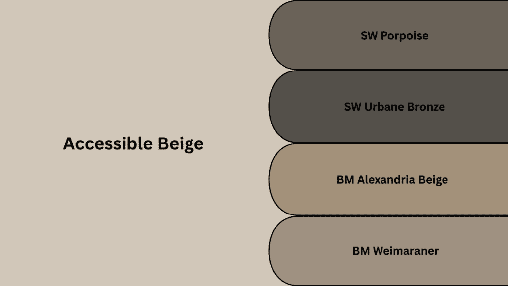
I choose warm browns when I want to add cozy refinement and rich depth to a room. These earthy tones create beautiful contrast with Accessible Beige while maintaining that warm, inviting feeling.
SW Porpoise: This deep, earthy brown adds rich contrast to Accessible Beige. It has slight gray undertones that keep it sophisticated. I use it for accent walls and built-in cabinetry.
SW Urban Bronze: This bold but balanced color brings warmth without being heavy. It has subtle green undertones that complement Accessible Beige beautifully. Perfect for creating cozy reading corners.
BM Alexandria Beige: I choose this for traditional richness and depth. It has warm beige and classic taupe undertones. This color creates classic, timeless combinations with Accessible Beige.
BM Weimaraner: This refined taupe has warm mushroom tones. It brings depth without competing with Accessible Beige. I recommend it for dining rooms and formal living spaces.
5. Muted Blues
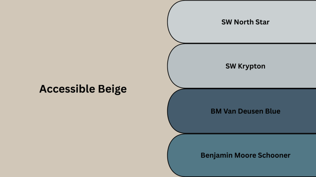
I use muted blues when I want to add subtle drama and personality without overwhelming the space. These soft, cloudy tones bring just enough color to make Accessible Beige feel more interesting and complete.
SW North Star: his misty, calming blue-gray feels peaceful and serene. It has cool undertones that balance Accessible Beige perfectly. I use it in bedrooms and bathrooms for tranquil vibes.
SW Krypton: This cloudy blue-gray combo has slight green undertones. It brings subtle personality without overwhelming the space. I love it for accent walls and powder rooms.
BM Van Deusen Blue: This classic navy twist adds refined drama. It has muted gray undertones that keep it from feeling too bold. Perfect for creating focal points with Accessible Beige.
Benjamin Moore Schooner: This breezy, nautical blue brings gentle coastal charm to any space. It has soft gray undertones that keep it from feeling too bold or overwhelming. I love pairing it with Accessible Beige in bathrooms and bedrooms for that perfect seaside retreat feeling.
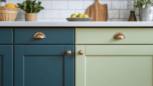
Using Accessible Beige on Trim
I’ve been seeing more homeowners choose accessible beige trim, and it’s actually brilliant. This approach creates a cohesive, modern look that feels intentional rather than traditional.
Yes, especially in tone-on-tone schemes
I actually recommend using Accessible Beige for trim in certain situations. It creates a cohesive, flowing look that feels very refined and modern.
Works well in minimalist or earthy interiors
This approach shines in spaces where you want everything to feel connected. I’ve used it in bedrooms and living rooms where the goal is a calm, uninterrupted flow.
Tips on using different sheens for depth
Here’s my secret; use eggshell for walls and semi-gloss for trim in the same color. The different sheens create subtle definition while maintaining the monochromatic look. This technique adds depth without breaking the visual flow.
Recommended Wall Colors When Using Accessible Beige as Trim
| Wall Color Category | Recommended Colors | Why It Works |
|---|---|---|
| Soft Whites | Alabaster, White Dove, Benjamin Moore Chantilly Lace | Creates bright, airy spaces with warm Accessible Beige trim providing cozy definition |
| Pale Taupes | Taupe Tone (SW 7633), Tony Taupe, Pashmina AF-100, Smokey Taupe 983 | Seamless, sophisticated blending for modern monochromatic schemes |
| Contrast Colors | Urbane Bronze, Benjamin Moore Weimaraner AF-155 | Bold, dramatic walls with Accessible Beige trim softening the intensity |
Mood Board Inspirations for Accessible Beige
I’ve created these mood boards to show you how accessible beige complementary colors work in real room settings. Each style brings out different qualities in this versatile neutral.
1. Classic Serenity
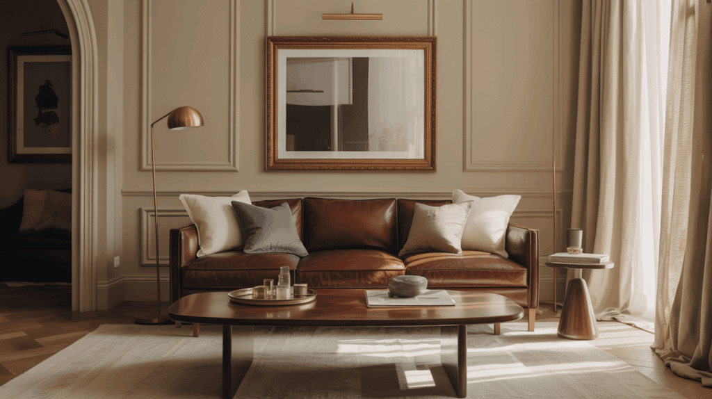
I picture this in a living room with rich leather furniture and warm brass lamps. The combination creates that perfect balance between comfort and refinement that makes guests never want to leave.
- The vibe: Cozy, inviting, and elegant with a timeless appeal.
- Complementary Decor Elements: Natural wood furniture, brass or gold hardware, linen textiles, and warm metallic accents.
2. Natural Calm
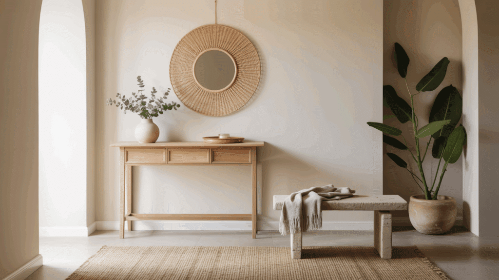
This works beautifully in a bedroom where you want to feel instantly relaxed. The soft greens and natural textures make Accessible Beige feel like a warm hug from nature.
- The vibe: Serene, grounded, and earthy with an organic feel.
- Complementary Decor Elements: Rattan and sisal textures, natural linens, greenery such as potted plants, light stone or marble surfaces.
3. Modern Farmhouse
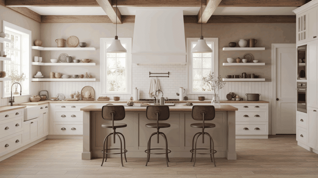
I love this style in kitchens with white cabinets and exposed wood beams. The crisp white trim against Accessible Beige walls creates that perfect farmhouse contrast without feeling too rustic.
- The vibe: Casual yet sophisticated farmhouse charm with clean lines.
- Complementary Decor Elements: White trim and ceilings, wooden beams or accents, black iron fixtures, pottery, and cozy textiles like wool or cotton.
4. Transitional Chic
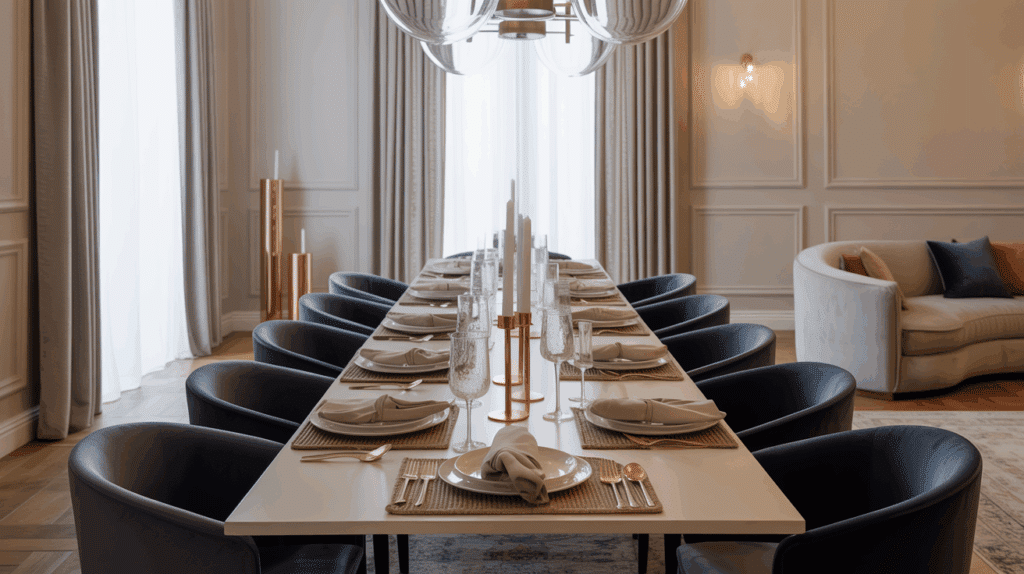
This style shines in dining rooms where you want both comfort and sophistication. The muted navy accents against Accessible Beige create visual interest without overwhelming the space.
- The vibe: Balanced mix of traditional warmth with contemporary simplicity.
- Complementary Decor Elements: Neutral upholstery, velvet cushions in muted blues or greens, subtle metallic accents in silver or copper, sleek furniture lines.
5. Coastal Relaxation
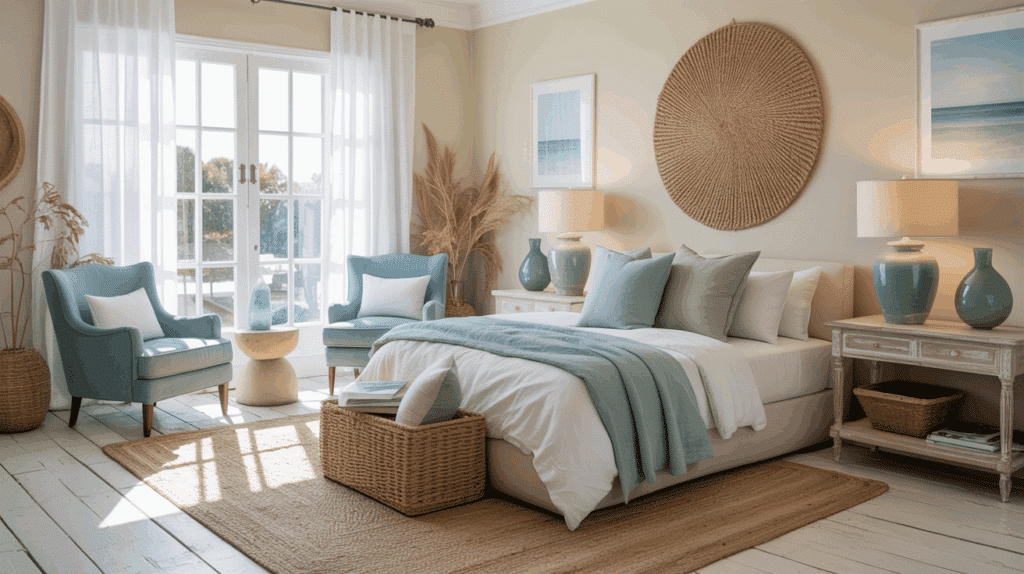
I picture this in a sunroom or coastal bedroom where morning light streams through sheer curtains. The soft blue-greens make Accessible Beige feel like warm sand meeting gentle ocean waves.
- The vibe: Light, airy, and refreshing with a beachy, serene feeling.
- Complementary Decor Elements: Soft blue-green accents, natural fibers like jute, light wood furniture, sea glass or driftwood décor, light-filtering curtains.
Conclusion
Accessible beige complementary colors truly make this neutral shine in ways you might not expect.
I’ve shown you how it anchors any room with perfect calmness and versatility. Whether you use it as your main wall color, trim, or accent, it adapts beautifully to your vision.
Don’t think of it as just another beige; it’s your canvas for creating spaces that feel both sophisticated and welcoming.
Start with one complementary color pairing that speaks to you, then experiment from there. Your home will thank you for it!

Alex Guerrero, a graduate with a Fine Arts degree from the Rhode Island School of Design, has been a visionary in the world of color and design for over 15 years. His professional journey began in the heart of the fashion industry in Milan, where he developed an acute sense for color harmonies and trends. Alex joined our team in 2018, offering fresh and innovative perspectives on color utilization in various spaces. Renowned for his ability to blend contemporary trends with timeless elegance. Outside of work, Alex is an accomplished painter and a volunteer art therapist, his artistic talents further enriching his professional insights.