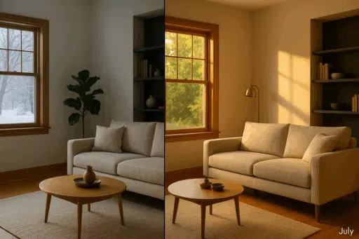

Choosing wall color in Minneapolis is a light game as a style choice. Winter gives you short, cool daylight. Summer floods rooms with long, golden evenings. The same swatch can feel calm in July and icy in January.
In this guide, we’ll translate trends into choices that shine here. We’ll weigh north-facing light, snow glare, oak trim, and open lofts. By the end, you’ll know which families feel warm, which accents add depth, and how to test with confidence.
Choose Your Color Fast for Twin Cities Homes
Start with the light you live in. If a room feels dim from November to March, pick warm, light neutrals that bounce what daylight you get. Creamy off-whites and soft beiges lift mood and keep north rooms from feeling flat.
Crave a January hug. Add depth. A balanced greige or taupe settles a living room. One deep accent in a dining nook or office adds intimacy without shrinking the space. For clean edges and an even finish, consider interior wall painting services from a local pro with color guidance.
North-facing rooms skew cool. Choose hues with gentle warmth. Think soft sage with a touch of yellow, mellow gold, or warm gray-brown. Save icy blues and steely grays for spaces with stronger sun or generous lamp light.
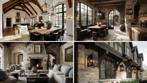
Natural wood trim changes the math. Golden oak loves muted greens, earthy neutrals, and warm grays. Stark white walls push the trim orange. Use a creamy white for brightness without the harsh edge.
White trim gives freedom. In newer homes and condos, crisp casings frame both contrast and calm. Run an off-white or greige through main areas for flow, then add a focused contrast in a bedroom or feature wall.
Still torn. Start with a timeless warm neutral, then layer personality through art, textiles, or one accent wall after you’ve watched the light.
Understanding Minneapolis Light
Winter sun rides low and cool, so grays read icier and colors lose saturation. North rooms never get direct sun, so warm palettes prevent chalkiness. South rooms hold mid-tones and even soft blues. Plan by exposure first, then fine-tune hue and depth to suit the season.
2024–2025 Color Trends — What Actually Suits Minneapolis Rooms
Warm And Cozy Neutrals
After years of cool gray, warmth is winning. Designers are leaning into creamy whites, greige, and taupe because they feel settled and human. In Minneapolis, those tones do more than follow a trend. They soften winter light, keep north rooms from going chalky, and still look fresh on a bright July evening.
Use a creamy off-white when you want a lift without glare. It reflects scarce daylight but keeps a gentle undertone, so walls don’t flash blue in January. Greige adds a touch more body. It reads neutral in summer and quietly cozy when the sun sits low. Taupe brings a subtle earth note that pairs well with wool rugs, oak floors, and the way snow bounces light back into a room.
These colors also bridge styles. In a Craftsman with golden oak trim, warm neutrals calm the orange cast and let the wood look intentional. In a modern condo with white casings, the same palette creates soft contrast and a clean backdrop for art. That flexibility is why warm neutrals sit at the center of 2025 mood boards and real homes alike.
Blues And Blue-Greens
Blue had a headline year in 2024, from airy sky tints to inky navies. Brands rallied around it for Color of the Year picks, which tells us homeowners are craving calm and clarity.
In Minneapolis, the key is undertone. Cool, crisp blues can feel icy in a north-facing room, especially in winter. Look for softened blues with a touch of gray or green so the color holds its warmth when daylight runs cool.
Deeper tones reward good light. A navy or teal reads rich in a sunny living room or a south-facing bedroom. Balance them with warm lamps, wood textures, and creamy textiles so the palette feels welcoming after dark.
If you love a pale blue for a quiet bedroom, test it on the wall and check it from morning to night. The right undertone will stay serene at noon and still feel gentle when snow is bouncing light into the room.
Nature-Inspired Greens
Greens feel at home in Minneapolis. They bring the parks and river valleys indoors when the trees go bare, and they stay calm when summer light turns bright. Sage, olive, and mossy blends read grounded instead of sweet, which keeps rooms feeling composed all year.
These tones also flatter wood. If you live with golden oak trim or floors, a muted green balances the warmth and tones down any orange cast. The pairing looks intentional, not dated, and it works in both Craftsman bungalows and mid-century layouts.
Watch undertones in low light. Very cool, grayish greens can slip toward dull in north-facing rooms. Choose versions with a touch of yellow or beige so the color keeps its life on overcast days.
Start where you spend the most time. A soft sage in the living room or a gentle olive in the dining room adds serenity without stealing light. If you want more drama, take the same family a shade deeper in a study or powder room, then echo it subtly through textiles for a cohesive flow.
Earth Tones And Rich Accents
When the temperature drops, deeper colors feel like a warm blanket. Chocolate brown, terracotta, auburn, and charcoal add weight and intimacy that plain white never delivers. Used with intention, they make a room feel settled instead of small.
Start with scale and light. A south-facing living room can carry a richer wall color without closing in. In a cozier space, keep most walls neutral and use a single saturated plane to anchor the room. The effect is calm, not cave-like.
Balance does the heavy lifting. Pair a deep wall with creamy textiles, warm wood, and a few reflective surfaces so the palette reads layered rather than heavy. Brass, linen, and wool soften edges and keep the mood welcoming after dark.
Earth tones also bridge old and new. Terracotta against oak feels classic, while charcoal next to crisp white trim reads modern and sharp. Either route adds character that survives trend cycles and winter skies alike.
Match Color To Your Home’s Character
- If You Have Natural Wood Trim
Golden oak and maple set the palette before a brush touches the wall. Lean into that warmth. Muted greens, warm grays, and grounded neutrals sit comfortably next to honey and amber tones, so the trim looks intentional instead of loud.
Stark white can backfire. On orange-leaning wood, it pushes the trim even more orange. Choose a creamy off-white or light greige for crisp contrast without the harsh edge.
Read the grain like a fabric swatch. If the wood pulls yellow, a gentle sage or beige with a soft green cast calms it. If the stain runs deeper and cooler, a taupe or warm gray keeps the room cohesive. Test large samples right on the casing and baseboards.
Want a cleaner, modern look without painting the trim. Lift walls a shade lighter than the wood’s body color, then layer black or charcoal accents in fixtures and frames. The trim stays classic, and the room feels current.
Older plaster needs kindness. Go matte or eggshell to soften waves. Stay in medium to light values to keep winter airiness while giving the wood enough contrast to shine.
Finish with floors and furniture. If the floor is oak, echo a thread of your wall color in textiles and art so the wood reads as architecture, not a problem to solve.
- If You Have White Trim Or A Modern Condo Layout
White trim is a clean frame. It sharpens edges and helps colors read true. Use one soft neutral throughout the main zones to keep daylight moving and avoid visual chop across open views.
When you want contrast, choose a mid-tone wall that lets casings pop. Warm gray, putty, or softened blue stays crisp without turning formal. Keep ceilings flat white to lift height.
Lofts bring texture. Go bright with quiet white and let brick and concrete lead. Or ground the room with one deep feature wall while the rest stays light.
Open layouts need a palette that talks to itself. Pull one undertone through, then let each room shift a shade deeper or lighter.
- Accent Walls And Color Zoning
Give accents a job. Anchor a seating area, frame a fireplace, or define a dining nook. Pick a surface you naturally face and keep undertones aligned with your main walls.
Mind sightlines. One bold plane per view is plenty. Repeat the accent lightly in textiles or art. Aim warm lamp light at the feature wall so it stays rich after sunset.
Finishing Touches: Sheen, Samples, And Smooth Execution
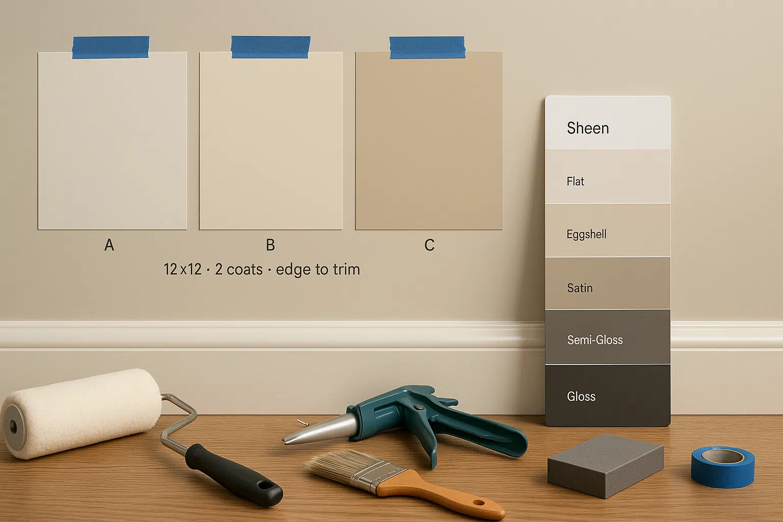
- Choose the right paint finish
Color sets the mood. Finish controls the feel. It decides how light moves on your walls and how well those walls handle daily life.
Matte hides a lot. On older plaster or patched drywall, a true flat softens waves and knocks back shadows. It stays calm in winter and never glares, even with snow outside.
Eggshell is the crowd-pleaser. You get a gentle glow that keeps rooms from looking dull on gray days, plus easier cleaning in busy spaces. It is a smart default for living rooms, hallways, and bedrooms.
Satin steps up durability. Family rooms and kids’ zones benefit from the tougher shell, and the slight sheen lifts color in spaces that feel a touch dim from November to March.
Be careful with higher gloss on big walls. Semi-gloss and gloss are excellent on trim and doors where you want crisp edges and scrubbability. On broad planes, they reveal every ripple and can bounce light in a distracting way.
Match finish to reality. Think about hands on the wall, backpacks on corners, pets, and winter boots. Choose the lowest sheen that still cleans well for your life.
- Always test big swatches
Samples prevent repaints. Put real paint on your walls in generous patches so you see undertones, sheen, and how light shifts across the day.
Test three to five close shades side by side. Paint at least 12 by 12 inches, use two coats, and bring the color down to the trim or floor so nearby materials influence what you see.
Move beyond one corner. Place swatches on the brightest wall, the darkest wall, and near stone, tile, or wood. Check morning, midday, and evening with lights on and off. Watch them work before you commit.
- Coordinate ceilings and trim
Ceilings act like reflectors. Keep them flat and a touch lighter than the walls so light spreads softly. A clean white lifts height. In cozier rooms, a ceiling tinted 10 to 20 percent lighter than the wall keeps things calm.
Trim frames the view. White trim should stay crisp so colors read true. Use semi-gloss on casings and doors for definition. If you have golden oak, pair it with creamy walls rather than stark white so the wood looks rich, not orange.
Unify before color goes up. Caulk gaps, sand rough edges, and spot-prime patches. Paint doors the trim color for a streamlined hall, or give one feature door a soft charcoal in a modern condo.
- When you are stuck, lean on a local pro
If swatches blur together, bring in fresh eyes. A seasoned Minneapolis wall painting contractor like Blue Painting reads your light, trim, floors, and layout, then narrows choices to a few winners. The crew preps well, cuts clean lines, and matches sheen so the result looks seamless. You pick the color. They make it sing.
Avoid Common Paint-Color Mistakes In Minneapolis
Cold gray everywhere
Cool gray looks clean on a chip and bleak by January. Northern light strips warmth from blue-leaning grays, so walls read flat and chilly when the sun rides low.
If you love gray, shift warmer. Greige and putty keep the look tailored while adding life to a north-facing room. They hold color on overcast days and still feel fresh in July.
Test undertones next to trim and floors. A gray that skews blue beside white casings or oak will feel even colder. The right warm gray bridges both and calms the room.
Skipping the sample
Tiny chips lie. Color is about light, scale, and neighbors like trim and floors. A hue that looked perfect on a strip can turn cool, pink, or dull once it hits a real wall.
Paint generous test squares. Two coats, at least twelve inches, on the brightest wall and the darkest wall. Bring the color to the baseboard so the trim tone affects what you see.
Live with it for a day or two. Check morning, midday, and evening under your lamps. If it stays pleasant through all those moments, keep it. If it turns on you, adjust the undertone and sample again.
Forgetting the finish
Color gets the spotlight. Finish does the work. It decides cleanability and how light plays across the room.
Flat hides bumps and waves, which is kind to older plaster. It also tames glare on bright winter days. The tradeoff is durability.
Eggshell is the safe middle. Low sheen, a soft glow on gray afternoons, and better real-life performance.
Satin earns its keep in busy zones. It handles fingerprints and chair scuffs without turning every wall into a mirror.
Match finish to use. Put tougher sheens where small hands and backpacks live. Keep main walls as low sheen as your lifestyle allows, so color looks richer and the space feels calmer.
Neglecting cohesion
A great color can fall flat when the rest of the house speaks a different language. Homes feel calmer when every space shares a thread.
Pick an undertone to carry through. Let rooms shift lighter or deeper within that family. Use architectural pauses for clean handoffs.
Repeat on purpose through textiles, art, or a single painted piece so colors feel chosen together. Line up swatches in the order you move through the home and refine until the sequence feels like a smooth walk.
Chasing fads over comfort
Trends are fun, not the goal. Gut-check bold picks for a gray Tuesday in December and a sunny July evening. If it is not good in both, scale back or soften. Let your habits steer the palette so the room treats you well year-round.
Conclusion
Good color is more than a pretty swatch. It’s light you can feel on a dark afternoon and calm that carries through busy rooms. When we plan around exposure, season, and the bones of the house, walls stop fighting the weather and start working for you.
Use warmth where winter cools the room. Save deeper hues for spaces with sun or strong evening light. Let trim set the frame, then choose finishes that flatter your walls and your day-to-day.
Test big, decide with confidence, and keep a common thread from room to room. That’s how a home reads as one clear story instead of a set of scenes.

Tommy Hardy, an alumnus of the Georgia Institute of Technology with a degree in Mechanical Engineering, has been a go-to figure in residential upkeep and innovation for over 18 years. His career commenced in a leading home appliance manufacturing company, where he mastered the intricacies of household systems. Joining our platform in 2020, Tommy quickly became a reader favorite for his practical and easy-to-follow guides. He took the helm of our DIY section in 2019, consistently delivering content that empowers homeowners. Beyond his professional pursuits, Tommy is a passionate gardener and enjoys woodworking, skills enhancing his hands-on approach to home care.