Selecting interior paint colors is one of the most impactful decisions you can make when updating your home. The right palette can transform cramped spaces into airy retreats, make dark corners feel warm and inviting, and tie together your furniture, artwork, and architectural details into a cohesive design.
Yet standing in front of hundreds of paint swatches at the hardware store can feel overwhelming. Where do you even begin?
This guide walks you through a practical approach to choosing interior paint colors room by room, helping you avoid common mistakes and create a home that feels both stylish and authentically yours.
Start with Your Existing Elements
Before you fall in love with a color on Pinterest, take stock of what you already have. Look at your flooring, countertops, large furniture pieces, and any architectural features like exposed brick or built-in cabinetry. These fixed elements should inform your color choices rather than compete with them.
Pull out the undertones in your existing materials. That beige carpet might have pink, yellow, or green undertones that will clash with certain wall colors. Your dark wood floors might read warm and orange or cool and ashy. Understanding these subtle distinctions helps you narrow down your options before you even pick up a paint swatch.
If you have an open floor plan, you will need to consider how colors flow from one space to another. While each room can have its own personality, using a cohesive palette throughout connected spaces prevents visual chaos when you can see multiple rooms at once.
Consider Natural and Artificial Light
Light dramatically affects how paint colors appear on your walls. A color that looks perfect in a south-facing showroom might feel completely different in your north-facing bedroom. Natural light shifts throughout the day too, making colors appear warmer in morning light and cooler in the afternoon.
North-facing rooms receive cooler, indirect light that can make colors appear more muted and slightly blue. In these spaces, you might want to choose warmer tones to compensate. South-facing rooms get abundant warm light that intensifies colors, so softer or cooler shades often work well. East-facing rooms look brightest in the morning with warm yellow light, while west-facing rooms glow in the afternoon and evening.
Do not forget about artificial lighting. The type of bulbs you use, whether warm incandescent, cool LED, or something in between, will also shift how your paint colors read at night. Always test your top color choices by painting large swatches on the wall and observing them at different times of day under both natural and artificial light.
Room-by-Room Color Strategies
Different rooms serve different purposes, and your color choices should support the mood and function of each space. Bedrooms benefit from calming, restful colors. Soft blues, warm neutrals, sage greens, and muted lavenders promote relaxation and better sleep.
If you want something more dramatic, consider a deep, saturated color like navy or forest green, which can feel surprisingly cozy rather than overwhelming in a bedroom setting.
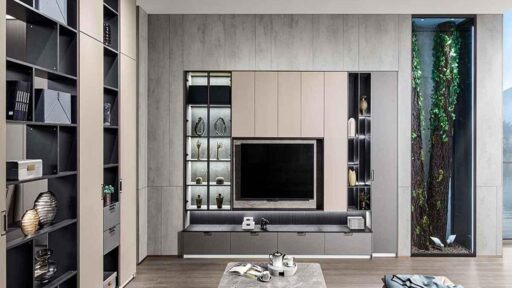
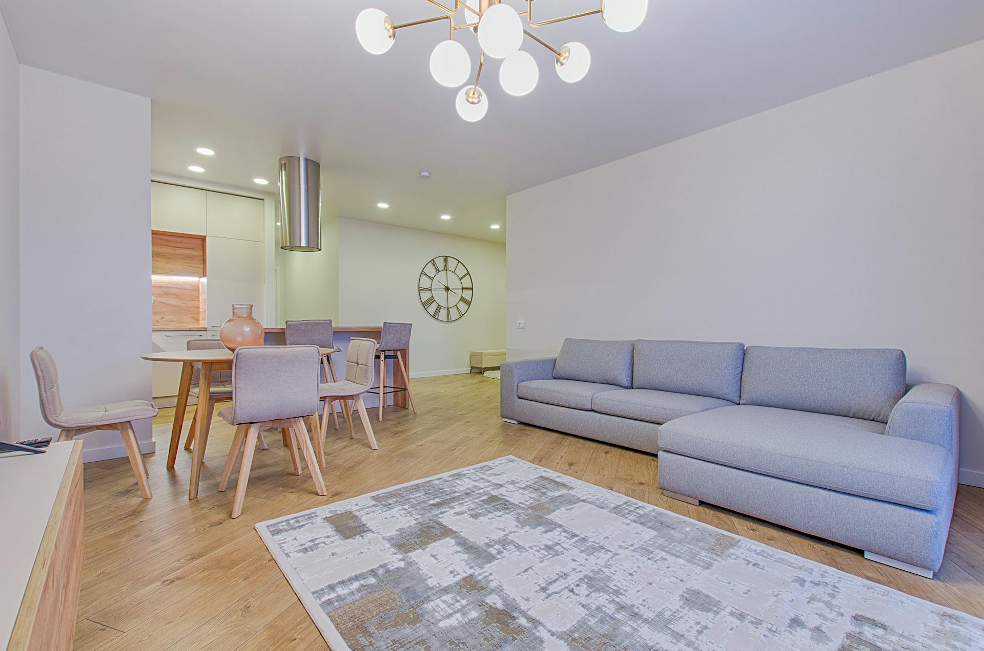
Living rooms and family rooms often work well in versatile neutrals that provide a backdrop for changing decor, artwork, and seasonal accessories. Warm whites, greiges, and soft taupes create timeless bases that allow your furniture and personal style to shine. If you crave color, consider introducing it through an accent wall or in an adjacent dining area.
Kitchens have traditionally favored whites and light colors to emphasize cleanliness and make the space feel larger. However, deeper cabinet colors and moody wall tones have gained popularity as homeowners seek to add personality to this hardworking space. If your cabinetry is neutral, your walls offer an opportunity to introduce warmth or color.
Bathrooms can handle bolder choices since they are typically smaller and enclosed. A rich jewel tone or dramatic dark color can turn a powder room into a memorable design moment. Just ensure you have adequate lighting to prevent the space from feeling too cave-like.
The Importance of Proper Preparation and Professional Execution
Once you have selected your colors, the quality of the final result depends heavily on surface preparation and application technique. Walls with imperfections, old nail holes, or peeling paint need proper repair before any new color goes on. Skipping this step leads to disappointing results that highlight rather than hide flaws.
Primers matter too, especially when making dramatic color changes or covering stains. A good primer ensures true color accuracy and prevents old colors from bleeding through your new paint.
According to industry professionals, many homeowners underestimate the complexity of achieving a flawless finish. “The difference between a DIY paint job and a professional one often comes down to preparation and technique,” explains Will Jo from Soho Painters, a New York City painting company specializing in residential and commercial projects. “Proper prep work, quality materials, and experienced application make colors look richer and last longer. When you invest in getting it right the first time, you save money and frustration in the long run.”
Testing Before Committing
Never choose a paint color based solely on a tiny swatch or digital image. Purchase sample pots of your top two or three choices and paint large test patches, at least two feet square, on the actual walls where the color will be used. If possible, paint samples in multiple spots around the room to see how the color behaves in different lighting conditions.
Live with your samples for at least a few days. Check them first thing in the morning, during the afternoon, and in the evening with your lights on. Notice how your reaction changes and which color consistently makes you happy. This small investment of time and money prevents the much larger expense of repainting when a color does not work out.
Understanding Finishes
The sheen you choose affects both the appearance and practicality of your paint. Flat and matte finishes hide wall imperfections beautifully and create a sophisticated look, but they can be harder to clean and may not stand up well in high-traffic areas.
Eggshell and satin finishes offer a subtle luster that cleans more easily, making them popular choices for living spaces, bedrooms, and hallways.
Semi-gloss and gloss finishes are durable and moisture-resistant, making them ideal for kitchens, bathrooms, and trim work. However, their reflective quality means they show every wall imperfection, so surface preparation becomes even more critical when using higher sheens.
Creating a Cohesive Whole-Home Palette
While each room can express its own character, your overall home should feel connected and intentional. One approach is to select a single neutral that flows through common areas and hallways, then introduce coordinating accent colors in individual rooms. Another strategy is to work within a consistent color temperature, choosing all warm tones or all cool tones throughout the house.
Consider the journey through your home. What do you see when you stand at the front door? How do rooms transition visually as you move from space to space? Paying attention to these sightlines helps you make choices that feel harmonious rather than jarring.
Moving Forward with Confidence
Choosing interior paint colors does not have to be stressful. By considering your existing elements, understanding how light affects color, thinking about the function of each room, testing thoroughly, and paying attention to finishes and flow, you can make informed decisions that result in a home you love.
Take your time with the process. Paint is one of the most transformative yet reversible changes you can make to a space. With thoughtful planning and quality execution, your new colors will enhance your daily life and make every room feel like an intentional expression of your personal style.

Holding a Master’s in Architecture from the University of Texas at Austin, Emily Rodriguez has dedicated more than two decades to the art and science of building renovation. Starting her journey in historic preservation, she developed a profound respect for blending old with new in building design. Emily became a vital part of our team in 2019, renowned for her insightful and innovative renovation tips. She has been leading our DIY home improvement series since ever since, where she shares her wealth of knowledge in turning outdated spaces into modern havens. When not engaged in writing or consulting, Emily is a passionate advocate for heritage conservation and enjoys exploring vintage architecture, a hobby that complements her professional expertise.