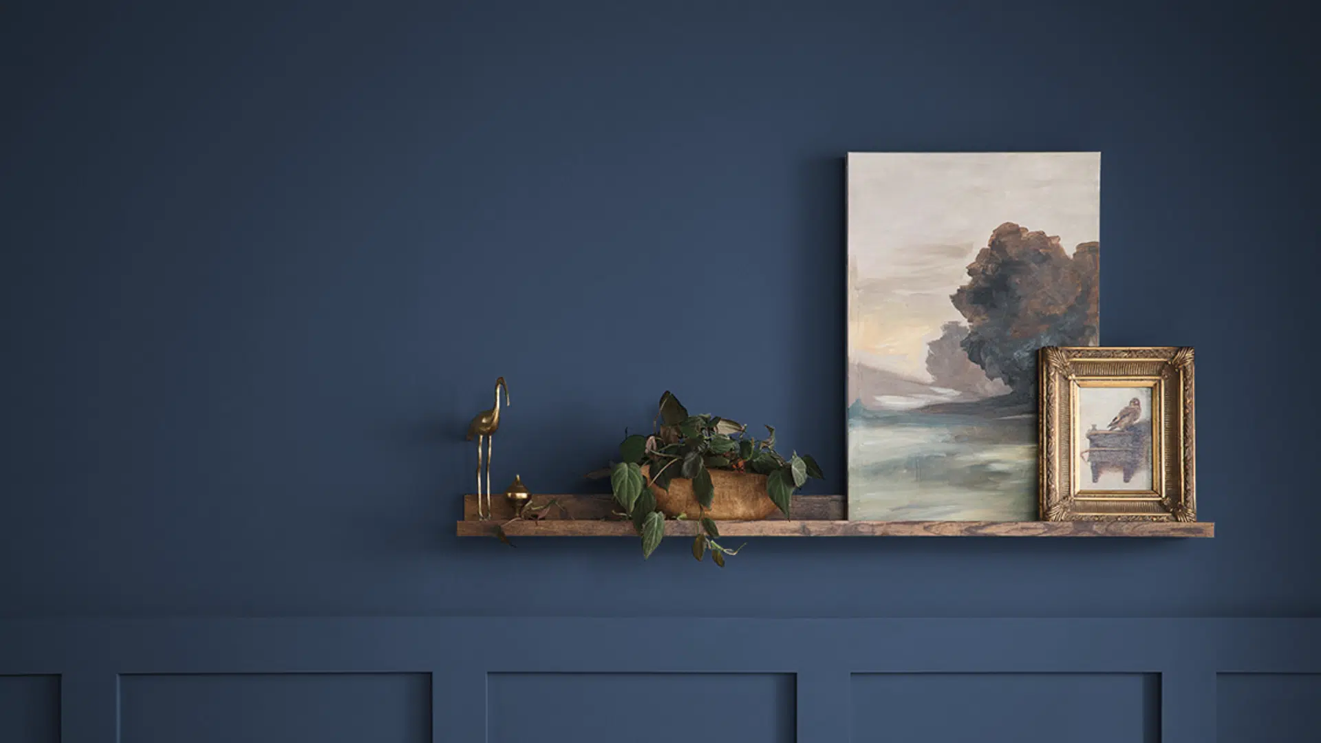
Indigo Batik (SW 7602) by Sherwin-Williams is a deep, rich blue that feels calm yet bold.
It belongs to the blue color family and has a low Light Reflectance Value (LRV) of 8, with a hex code of #3E5063.
I love how this strong shade brings warmth, depth, and a cozy vibe to a space.
I’ve seen it used beautifully on walls, kitchen cabinets, bathroom vanities, and even statement furniture.
In this guide, I’ll help you decide if Indigo Batik is the right fit for your home.
You’ll see where it works best, how lighting affects it, and which paint colors pair well with it. I’ll also include a few similar shades for easy comparison.
If you’re stuck choosing the perfect dark blue, you’re in the right place. Painting a whole room or just an accent wall? I’ll help you move forward with clear, simple advice
What Shade Is Indigo Batik?

Indigo Batik is a rich, dark blue paint color made by Sherwin-Williams. It’s part of the brand’s popular palette of bold neutrals.
This shade stands out because it isn’t just a plain navy; it has a slight purple undertone that gives it a modern, slightly softened edge.
The (LRV) of Indigo Batik is 8, which means it absorbs most of the light that hits it.
In simple terms, it’s a dark color that brings depth and drama to any room. Because it’s so saturated, it can create a strong contrast when used with light trim or white furniture.
This color works especially well in cozy spaces, such as bedrooms, dining rooms, and home offices.
It’s bold but not overpowering, making it perfect for those who want a dark color that still feels relaxed and stylish.
The Subtle Undertones of Indigo Batik
Though Indigo Batik is mainly a deep blue, it isn’t a flat or plain shade. This color has subtle purple undertones that give it more character.
These hints of purple aren’t strong, but they soften the blue and make it feel more balanced.
Depending on the light, Indigo Batik can look slightly cooler or warmer. In natural light, the blue stands out more.
In dim or artificial lighting, the purple tones may show up a bit more. This change adds depth and keeps the color from feeling flat.
Due to its undertones, Indigo Batik complements both warm and cool colors. It pairs beautifully with soft whites, muted grays, and even warm wood tones.
These undertones are what make the color feel calm, elegant, and easy to live with.
How Does It Look in Different Rooms?
Indigo Batik is a flexible paint color that works well in many areas of the home. Below, I’ll explain how Indigo Batik fits into various rooms, such as the living room, bedroom, kitchen, and bathroom.
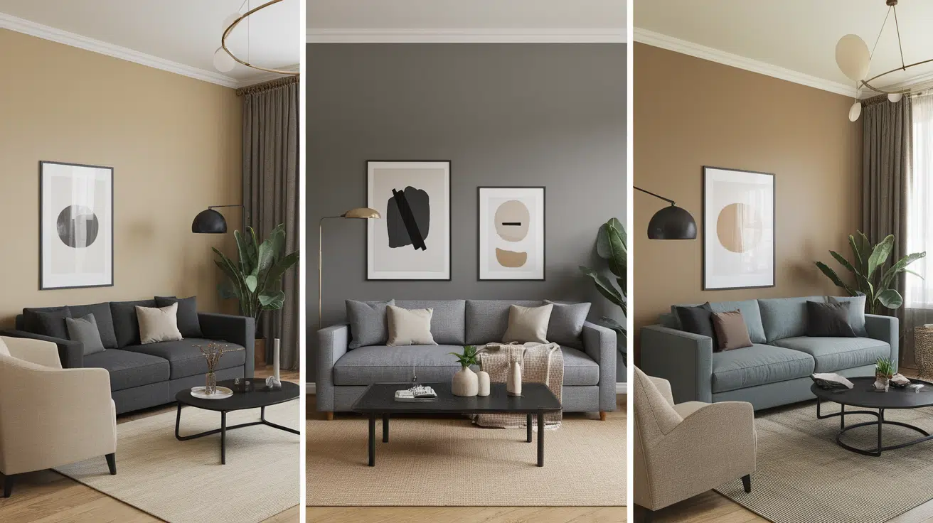
Living Room
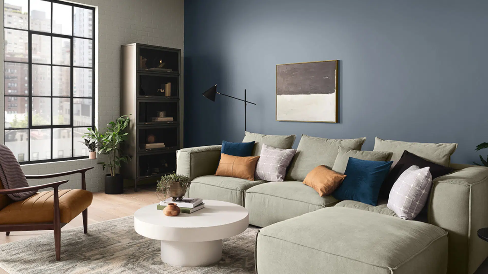
Indigo Batik creates a calm and cozy vibe in living rooms. Its dark tone adds depth and warmth, making the space feel inviting.
It works especially well with light or neutral furniture, adding contrast without overwhelming the room. This combo keeps the space balanced and stylish.
Bedroom
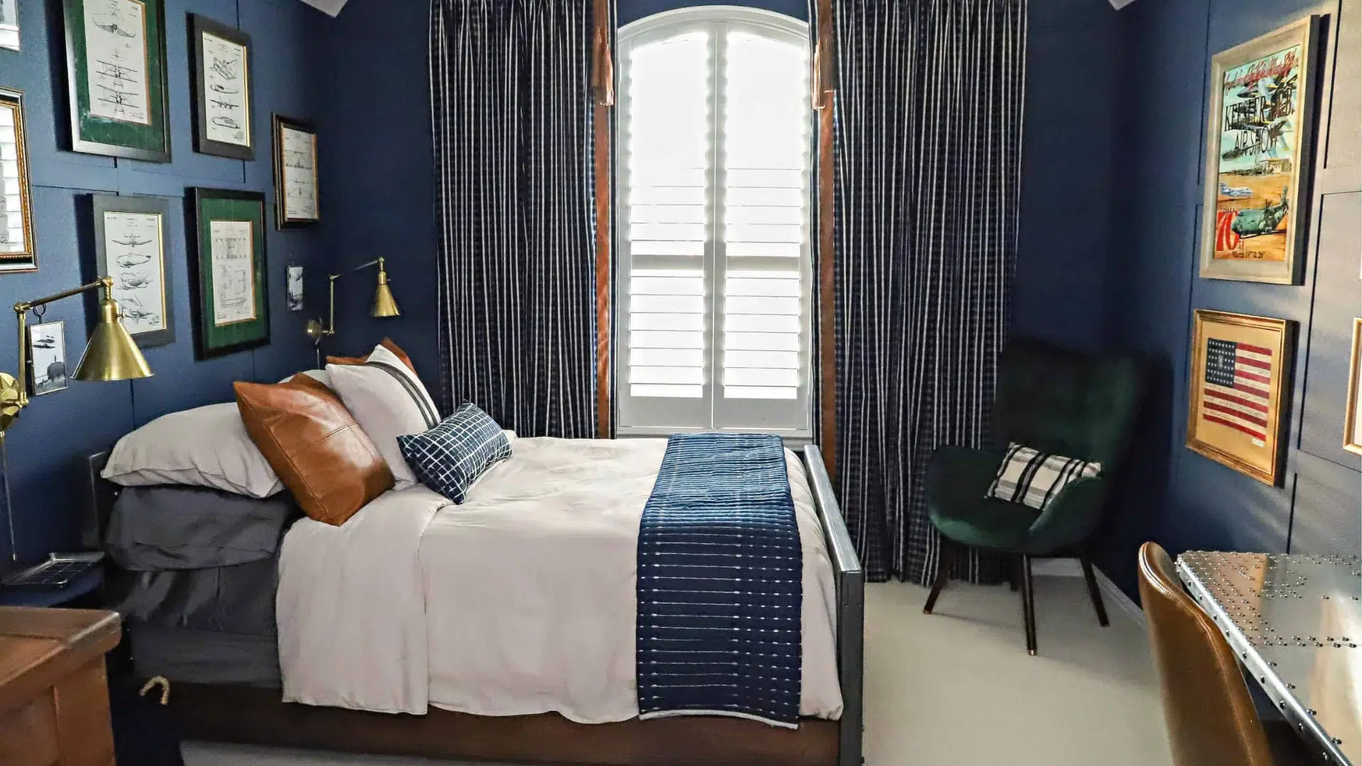
It brings a peaceful and soothing feel to bedrooms, ideal for creating a quiet, restful space where you can relax.
With soft lighting, the color appears even warmer and more comforting. It pairs nicely with creamy whites, soft bedding, and natural textures.
Kitchen
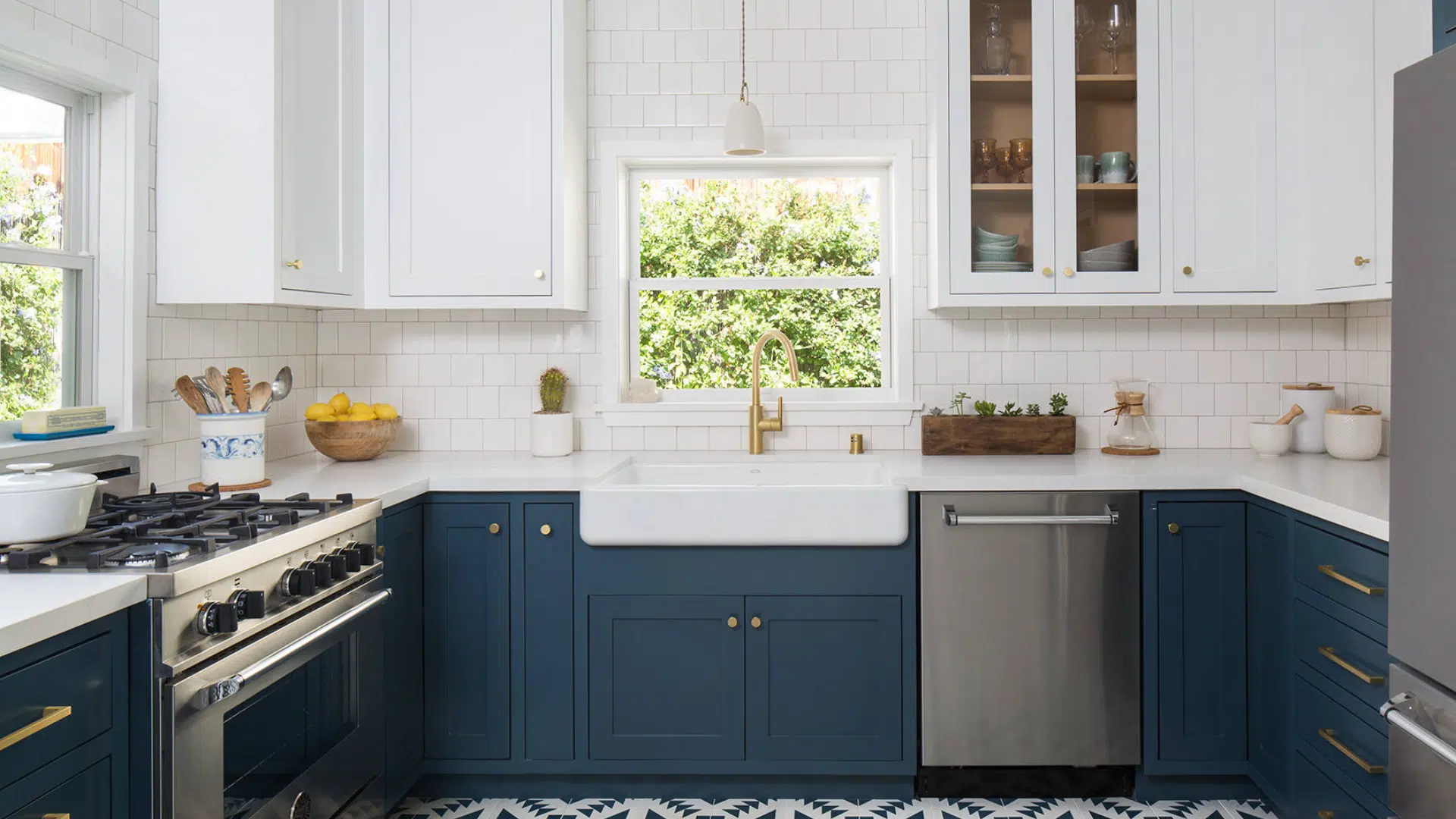
Indigo Batik makes a bold statement in kitchens, especially on lower cabinets or islands. It looks crisp and clean next to white countertops and backsplashes.
This shade adds character without feeling trendy or loud. It also pairs well with brass, black, or nickel hardware.
Bathroom
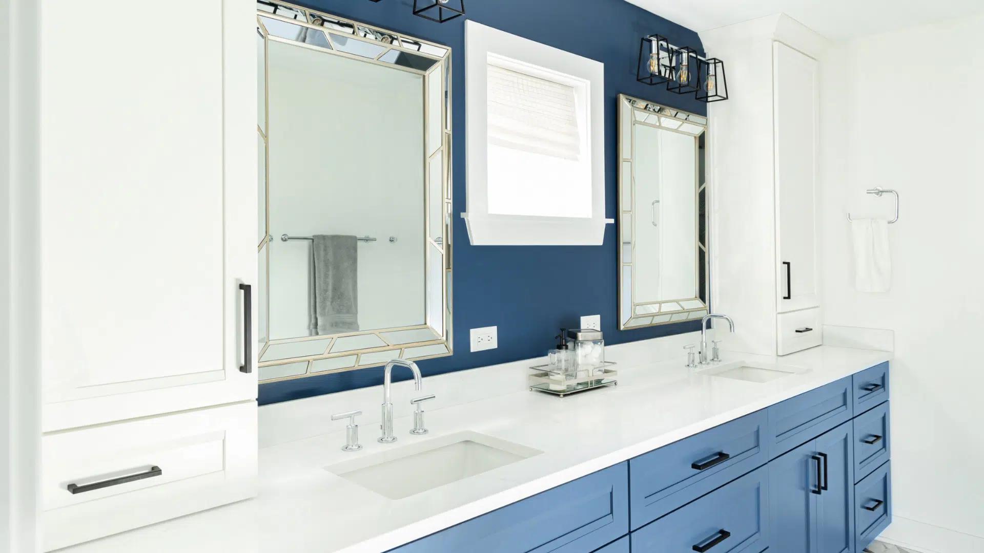
In bathrooms, it adds a clean, fresh look without being too bright. When paired with white tiles, marble, or light vanities, it gives a spa-like feel.
This contrast makes the space look sharp and elegant. The color works well in both full and half baths when styled with chrome or gold fixtures.
Flooring Options That Pair Beautifully with Indigo Batik
Choosing the right flooring is key to making Indigo Batik feel balanced and inviting. Since it’s a deep, moody blue, the floor should help lighten the space or ground it, depending on your style.
- Light Wood Floors: Soft oak, maple, or whitewashed wood adds contrast and keeps the room from feeling too dark. These tones bring warmth and a natural feel.
- Warm Medium-Tone Wood: Chestnut, hickory, or honey-stained floors offer a rich, cozy contrast. They work well in living rooms and bedrooms where you want a mix of bold and inviting.
- White or Cream Tile: White or ivory ceramic tiles brighten up bathrooms or kitchens. They reflect light well and make Indigo Batik pop.
- Light Gray Flooring: Pale gray hardwood or laminate adds a soft, modern look. It complements the blue tones without competing for attention and keeps the room feeling open.
- Patterned or Neutral Rugs: If you have dark floors already, layering with a neutral or lightly patterned rug can soften the overall look. Go for beige, ivory, or muted blues to tie everything together.
Colors That Go Well with Indigo Batik
Pairing Indigo Batik with the right colors can bring out its beauty while keeping your space feeling balanced and welcoming.
- Pacer White: This soft white brings brightness and contrast. It’s perfect for trim, ceilings, or even larger walls if you’re using Indigo Batik as an accent.
- Sands of Time: A gentle beige that adds warmth. It works well in living rooms and bedrooms, especially with wood or neutral-toned furniture.
- Bracing Blue: A lighter blue that blends smoothly with Indigo Batik. Bracing Blue can be used on upper walls or cabinets, while Indigo Batik adds depth on lower areas or accent zones.
- North Star: A pale gray-blue that brings a cool, breezy feel. This is a great option for bedrooms and bathrooms. It softens the strong navy tone and keeps the space feeling open and light.
Indigo Batik Compared to Other Neutral Paints
If you like the look of Indigo Batik but want to look at a few other options, there are several great choices with a similar feel. Below is a quick guide to help you compare Indigo Batik with a few close matches, such as Naval, Charcoal Blue, and Slate Tile.
| Paint Color | Code | Tone | Undertone | Best For |
|---|---|---|---|---|
| Indigo Batik | SW 7602 | Deep blue | Slight purple | Accent walls, cabinets, and bedrooms |
| Naval | SW 6244 | Darker navy blue | Pure blue | Bold statement walls, formal spaces |
| Charcoal Blue | SW 2739 | Muted dark blue | Gray-blue | Moody spaces, modern interiors |
| Slate Tile | SW 7624 | Relaxed blue-gray | Cool gray | Bathrooms, relaxed living areas |
Tips for Using Indigo Batik
These simple tips can help you make the most of this bold blue.
- Use in well-lit rooms. Natural or soft lighting helps balance the deep tone and prevents the space from feeling closed in.
- Pair with light colors. Whites, creams, or light beiges work well to soften Indigo Batik and create contrast.
- Test before painting. Try a sample on your wall to see how the color looks at different times of day.
- Try it as an accent. Use Indigo Batik on one wall, cabinets, or a built-in for a bold but controlled look.
- Use contrast in full rooms. If painting an entire room, add light furniture, trim, or ceilings to keep the space feeling open.
Conclusion
Indigo Batik is a rich color that I’ve found works beautifully in many parts of the home.
Its deep blue tone, with just a hint of purple, brings calm and style without feeling overpowering.
I like using it in bedrooms, on kitchen cabinets, or as an accent wall; it adds the right amount of depth.
When I pair it with soft whites, warm beiges, or light blues, it creates a nice balance and keeps the space from feeling too dark.
With the proper lighting and placement, Indigo Batik can feel cozy and fresh at the same time. It’s a great choice if you want to bring mood and modern charm into your space.
I always recommend trying a sample first. Once you pair it with the right shades, you’ll see how this bold color can add comfort and personality to your home.

Alex Guerrero, a graduate with a Fine Arts degree from the Rhode Island School of Design, has been a visionary in the world of color and design for over 15 years. His professional journey began in the heart of the fashion industry in Milan, where he developed an acute sense for color harmonies and trends. Alex joined our team in 2018, offering fresh and innovative perspectives on color utilization in various spaces. Renowned for his ability to blend contemporary trends with timeless elegance. Outside of work, Alex is an accomplished painter and a volunteer art therapist, his artistic talents further enriching his professional insights.