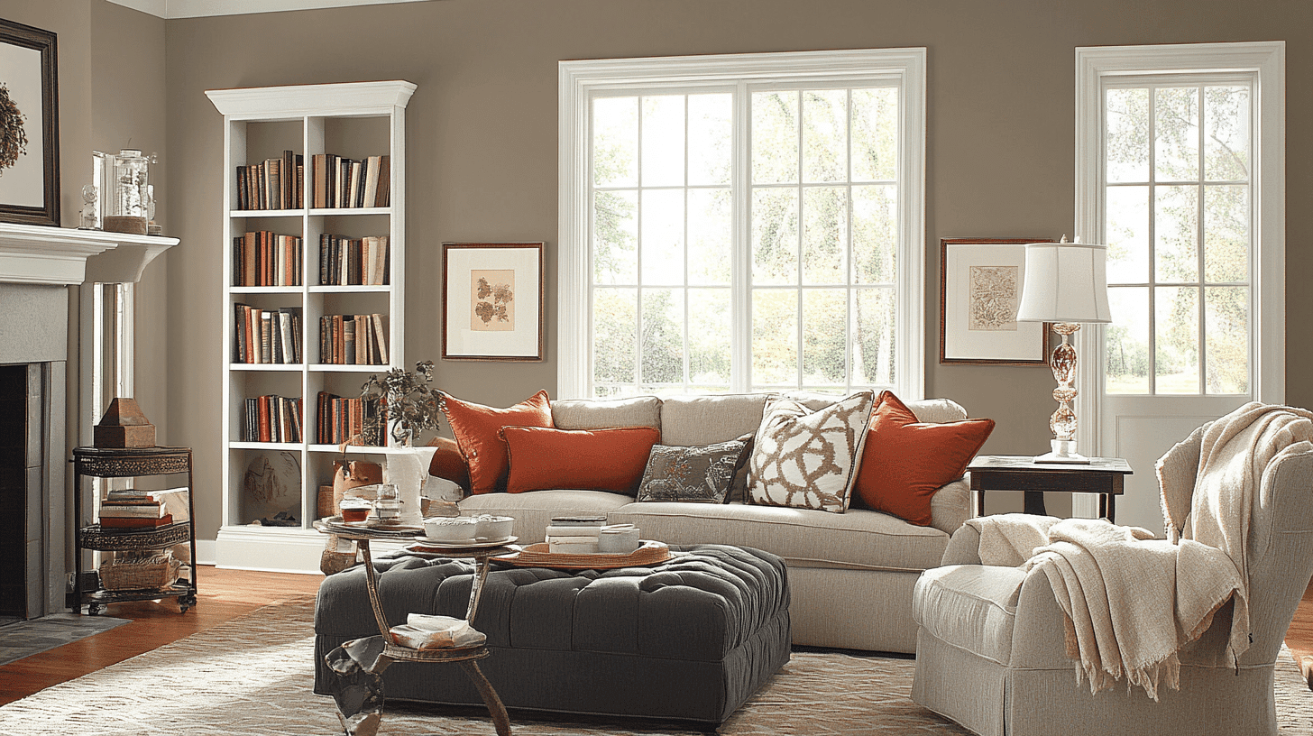
Looking for a color that bridges the gap between modern and traditional? Amazing Gray Sherwin Williams offers the ideal solution.
This balanced mid-tone neutral has quickly gained popularity among designers and homeowners seeking a color that combines timeless appeal with contemporary sensibility.
With its perfect balance of warm and cool undertones, Amazing Gray creates spaces that feel both welcoming and refined—never too cold or too heavy.
This adaptable color shifts beautifully throughout the day, responding to different lighting conditions while maintaining its distinctive character.
For single-room updates or complete home refreshes, Amazing Gray provides a versatile foundation that simplifies design decisions while improving your space.
This thoughtful neutral might be exactly what your home needs to achieve that perfect balance of comfort and style.
Understanding Paint Color Basics
Color Terminology
| Property | Value |
|---|---|
| LRV | 47 (Moderate reflectance, soft neutral tone) |
| RGB Values | 190, 181, 169 (A warm, earthy neutral) |
| HEX Code | #BEB5A9 (A muted greige with warmth) |
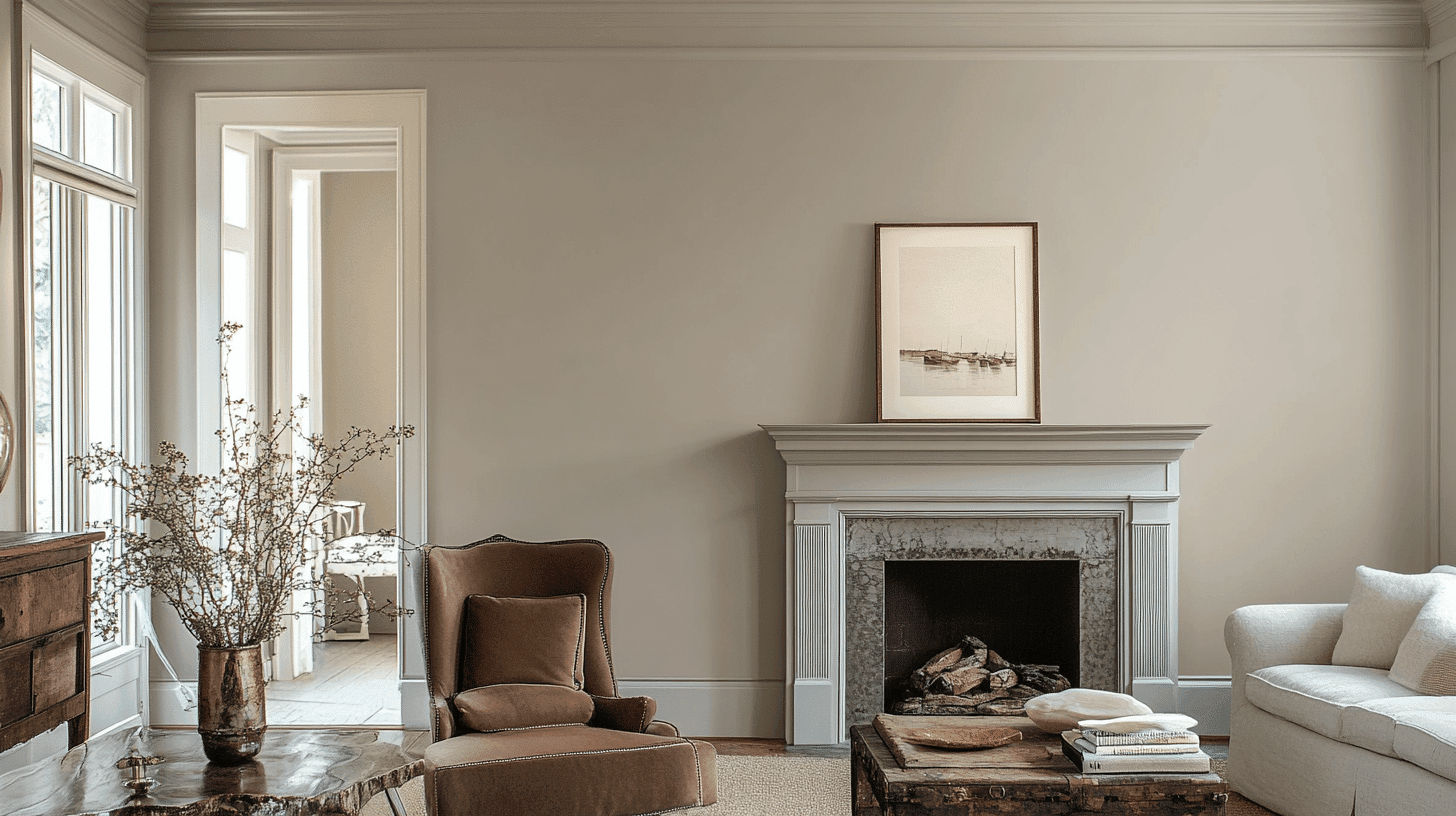
The Psychology of Amazing Gray SW 7044
- Perfect Balance – Creates rooms that feel both contemporary and timeless.
- Calming – Subtle depth provides a sense of tranquility and stability.
- Flexible – Works with diverse design elements from rustic to modern.
- Responsive – Shifts character throughout the day with changing light.
- Foundational – Establishes a versatile backdrop that supports changing design preferences.
Why Choose Amazing Gray SW 7044
Sherwin Williams Amazing Gray delivers a balanced, polished tone that creates visual interest without overwhelming your space. This thoughtful neutral establishes a refined canvas that enhances home features while promoting a sense of flow.
Its practical appeal ensures longevity in your design scheme, turning basic rooms into thoughtfully curated spaces. It’s ideal for those seeking a versatile neutral that rises above fleeting color trends without feeling boring or basic.
1. Key Features of Amazing Gray SW 7044
Amazing Gray offers a perfectly calibrated neutral with subtle depth and excellent coverage. Unlike stark grays that can feel impersonal or traditional beiges that might read as outdated, this balanced gray creates a fresh yet grounded canvas.
Its application distributes light beautifully, adding dimension to walls while maintaining remarkable consistency across various lighting situations. The color’s balanced undertones make it more inviting than cooler grays without veering into overly warm territory.
2. Durability
Sherwin-Williams’ superior formulation ensures Amazing Gray retains its true color integrity even in challenging light environments. This practical shade masks minor surface imperfections and withstands daily life, making it perfect for bustling households.
Low-maintenance without sacrificing quality, its lasting performance maintains visual appeal year after year. The paint’s resistance to everyday marks makes it especially valuable in active living spaces and busy areas.
3. Texture Patterns
Amazing Gray performs exceptionally well across different application techniques. In standard application, it creates a refined, uniform appearance, while specialized techniques can produce striking textural effects.
The color highlights details and moldings with subtle precision. Its neutral profile works well with textured surfaces, capturing light and shadow variations without competing with the underlying texture.
Room-by-Room Color Recommendations with Amazing Gray
Amazing Gray moves seamlessly between different areas of your home, creating a connected design narrative while respecting each room’s unique function.
Its versatility makes it particularly effective in open-concept homes, where it maintains continuity while allowing each zone to express its unique purpose.
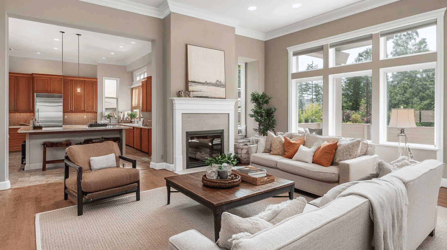
Living Rooms and Gathering Spaces
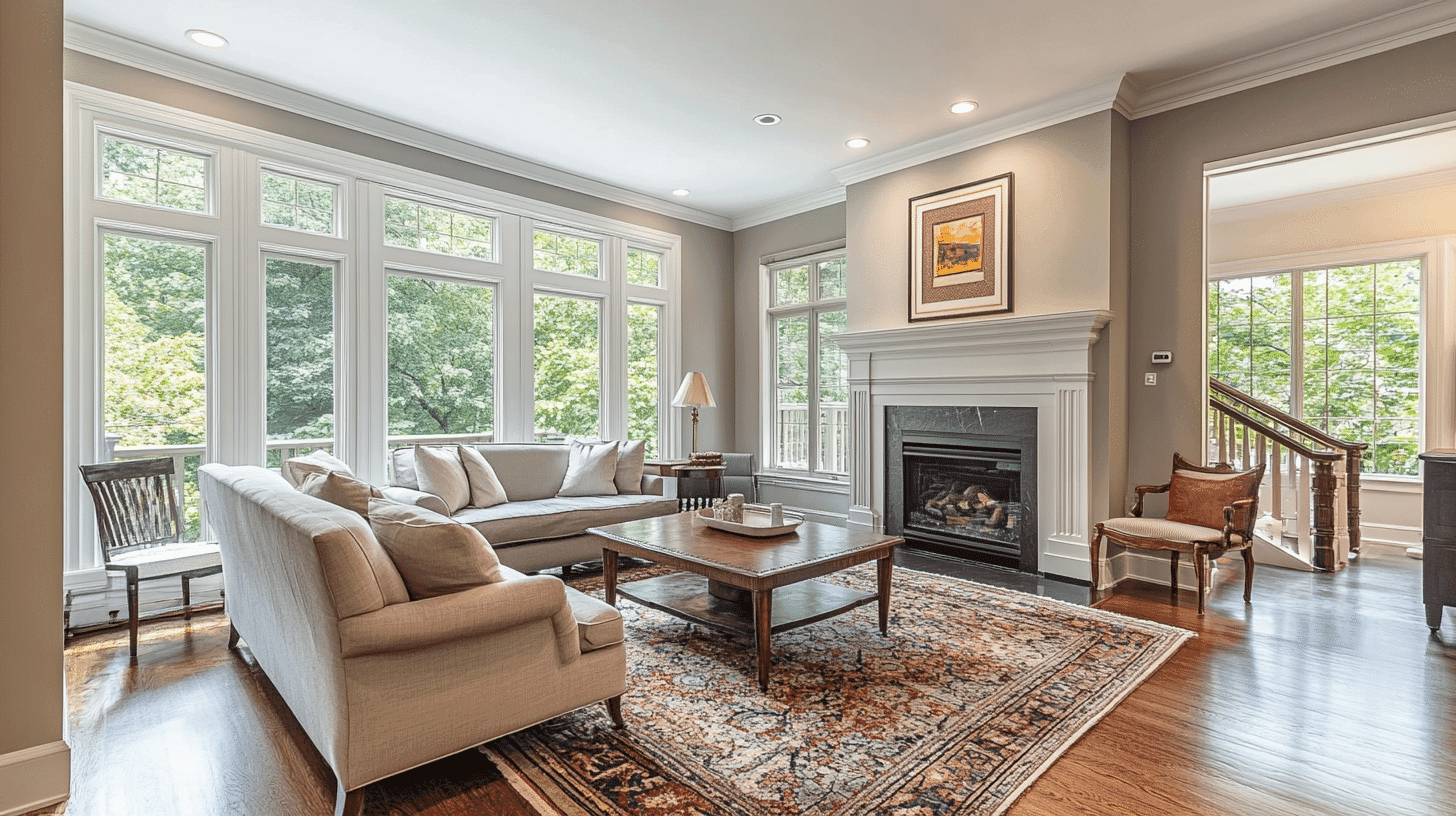
In living areas, Amazing Gray creates a polished, welcoming atmosphere without the coldness of cleaner grays. Its balanced undertones complement natural elements, textured fabrics, and mixed metal accents.
The color enhances both artificial and natural lighting, helping even modest-sized living spaces feel more expansive and inviting.
Kitchens and Dining Areas
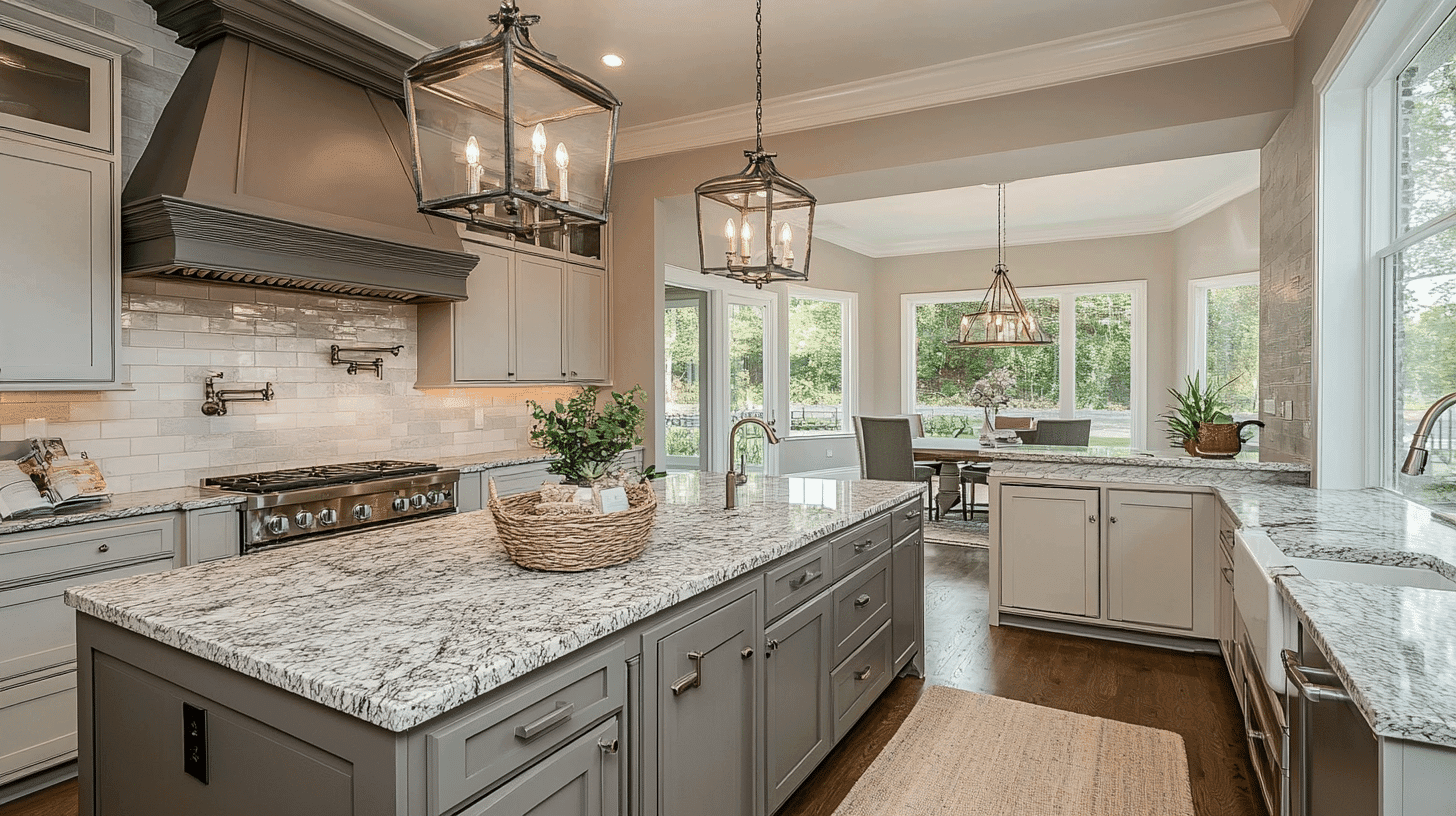
Amazing Gray provides a perfect backdrop for kitchens and dining spaces, allowing cabinetry, countertops, and table settings to command attention. The color establishes a warm, grounded atmosphere that feels both fresh and comfortable.
It pairs exceptionally well with wood cabinetry, creating contrast while maintaining visual flow. White cabinetry gains subtle depth and interest against this balanced neutral.
Bedrooms and Restful Retreats
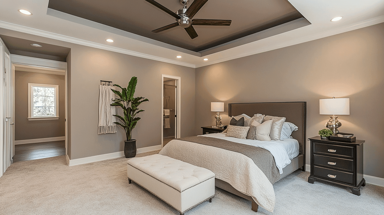
For bedrooms, Amazing Gray creates a serene, restful environment without feeling flat or uninspired.
The color reduces visual stimulation while serving as an ideal background for layered bedding, artwork, and accent pieces without competing for attention.
Its adaptable appeal makes it appropriate for primary bedrooms, guest spaces, and children’s rooms as they grow and change.
Color Pairings and Combinations for Amazing Gray SW 7044
Amazing Gray creates a versatile foundation that enhances both subtle and bold accent colors. Its balanced undertones allow it to work with cool blues and greens, warm terracottas, and deeper neutrals without conflict.
Consider these strategic pairings to highlight Amazing Gray’s refined presence while creating unique design statements that reflect your personal style.
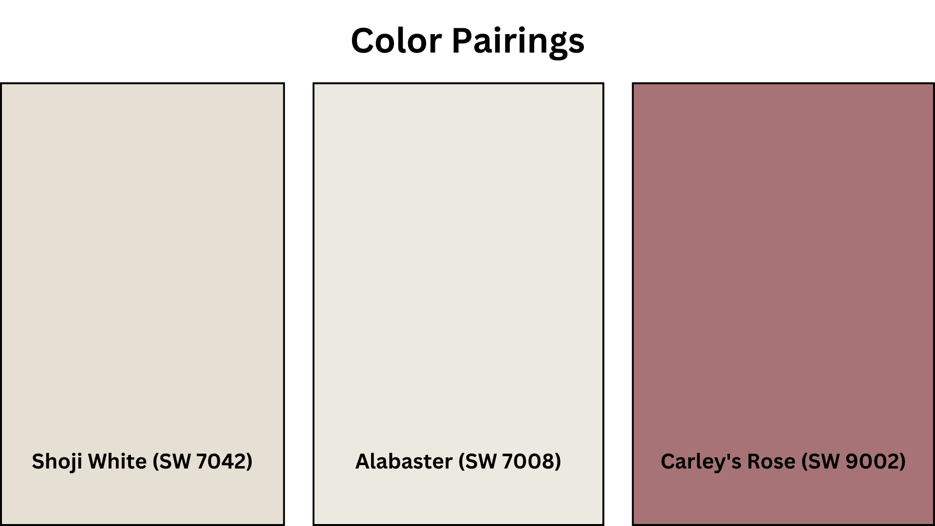
Complementary Trim Colors
- Shoji White (SW 7042) – Creates a soft, flowing transition for a polished, connected look.
- Alabaster (SW 7008) – Offers a crisp, clean contrast for bright, airy spaces.
- Carley’s Rose (SW 9002) – Provides gentle, warm accents that balance Amazing Gray’s neutrality.
Creating Cohesive Color Schemes
Amazing Gray serves as a versatile anchor for diverse color palettes, creating spaces with depth and character. This balanced neutral functions as an ideal canvas, supporting various styles from minimalist modern to layered traditional. Its adaptable nature provides the perfect starting point for virtually any design direction.
Monochromatic Scheme
A monochromatic approach incorporates various greige tones alongside Amazing Gray to create subtle dimension without visual complexity. This versatile neutral helps spaces feel connected yet dynamic.
The subtle variations between related tones create refined layers while maintaining a polished, timeless look that feels intentional rather than one-dimensional.
My recommendations are:
- Amazing Gray on walls with Shoji White SW 7042 trim creates refined, subtle definition.
- Use Amazing Gray in a satin finish on interior doors with matte walls for refined contrast.
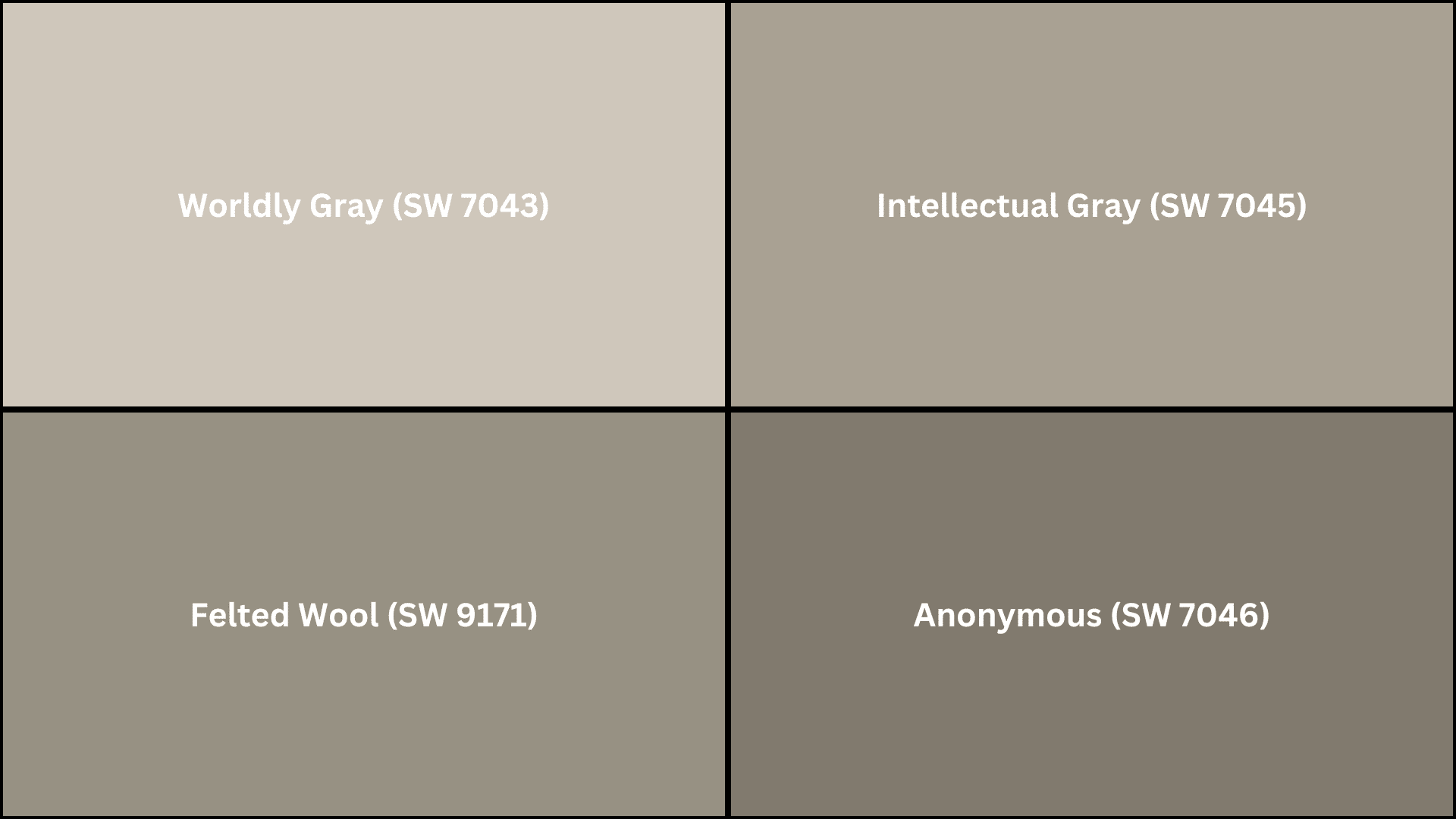
- Incorporate Worldly Gray SW 7043 on built-ins or an accent wall for a touch of depth.
- Add textural elements like natural linen, matte ceramics, and textured throws to bring the palette to life.
Warm Color Scheme
Amazing Gray’s subtle warmth beautifully complements warmer color palettes. This combination creates spaces that feel inviting and rich, especially when natural light illuminates the room.
The relationship between these balanced neutral and warmer hues creates visual interest without dominating the space. Terracotta, amber, and muted rust tones particularly shine against Amazing Gray’s refined backdrop.
My recommendations are:
- Pair with Intellectual Gray SW 7045 in connecting spaces for subtle depth progression.
- Use Felted Wool SW 9171 in dining areas to create an intimate, welcoming atmosphere.
- Add accents in Carley’s Rose SW 9002 for gentle warmth that remains balanced.
- Incorporate natural elements like wood, leather, and woven textures to enhance the warm palette.
Cool Color Scheme
Despite its slight warmth, Amazing Gray pairs beautifully with cooler colors too. This balanced combination creates spaces that feel fresh yet grounded.
The interplay between Amazing Gray’s versatility and cooler tones like sage, slate, or navy produces a balanced, contemporary look that avoids feeling cold or impersonal while maintaining refined appeal.
My recommendations are:
- Try Anonymous SW 7046 in home offices or libraries for focus and depth.
- Use soft blue greens in bathrooms to create a refreshing, spa-like experience.
- Add navy accents through textiles or furniture for classic, timeless appeal.
- Incorporate silver or chrome finishes to enhance the cool palette while maintaining balance.
Coordinating with Furniture and Decor
Amazing Gray creates an ideal backdrop for virtually any furniture style and decor element. Its balanced undertones complement both warm and cool features without competing, allowing your carefully selected pieces to stand out while maintaining a unified design flow throughout your space.
Wood Tones
Amazing Gray works exceptionally well with various wood tones. It adds polish to dark walnut and espresso while providing gentle contrast to lighter oak and maple.
Medium-toned woods like cherry and maple gain definition against this versatile neutral. The subtle contrast creates visual interest while allowing the natural wood grain to become a focal point.
Metals
This balanced neutral complements all metal finishes. Brass and gold hardware create warm, striking accents, while silver and chrome elements add clean, modern contrast.
Matte black fixtures provide a dramatic definition. Oil-rubbed bronze and antique brass add depth and character that complement Amazing Gray’s refined personality.
Fabrics
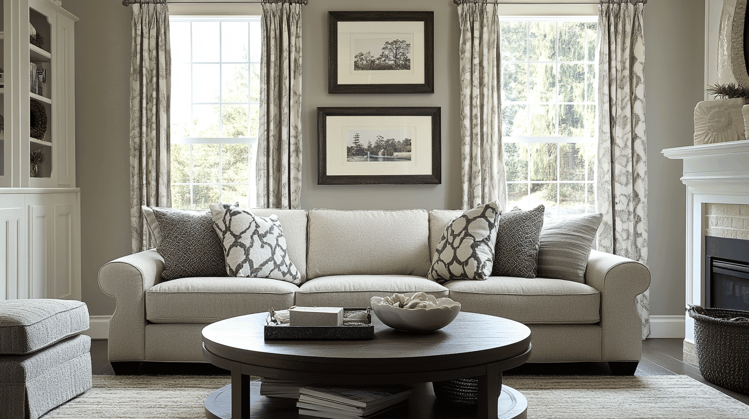
Amazing Gray allows textiles to take center stage. Bold patterns maintain clarity against this neutral backdrop, while textured fabrics like wool, linen, and cotton create subtle visual layers.
Vibrant colors retain their true character without being influenced by wall undertones. Performance fabrics in any hue complement this adaptable neutral.
Decor
The artwork displays beautifully against Amazing Gray, which provides a gallery-like background that doesn’t compete with visual elements. Plants appear more vibrant and organic against this balanced neutral.
Ceramics, glass, and collections become natural focal points rather than competing with wall color, allowing personal treasures to truly shine.
Similar Paint Colors: Alternatives to Amazing Gray SW 7044
If you’re considering options similar to Amazing Gray, these alternatives offer subtle variations while maintaining that balanced appeal.
Each provides a slightly different undertone or depth, giving you the flexibility to find the ideal neutral for your specific lighting conditions and design preferences.
- Worldly Gray (SW 7043)– Lighter with slightly cooler undertones for a more contemporary feel.
- Intellectual Gray (SW 7045) – Deeper with more pronounced depth for a more dramatic statement.
- Felted Wool (SW 9171)– Warmer with subtle taupe influences for a cozier, more organic feel.
- Anonymous (SW 7046)– Richer with greater depth for spaces where you want more intensity.
Final Words
Amazing Gray Sherwin Williams offers a unique solution in today’s world of neutral paint colors. Its most valuable quality is how it adapts to changing light while staying true to its balanced character.
Unlike tricky colors that surprise you after application, this reliable shade performs exactly as expected.
Homeowners often report that Amazing Gray grows more appealing with time. It sits quietly in the background yet improves daily life in subtle ways. From country-inspired designs to sleek modern rooms, this versatile color fits seamlessly across style boundaries.
Choosing Amazing Gray Sherwin Williams means selecting lasting value over fads. Its thoughtful blend ensures you won’t feel the urge to redecorate when design trends change.
For families, creative souls, and practical homeowners alike, Amazing Gray delivers that perfect mix of everyday function and enduring beauty.

Alex Guerrero, a graduate with a Fine Arts degree from the Rhode Island School of Design, has been a visionary in the world of color and design for over 15 years. His professional journey began in the heart of the fashion industry in Milan, where he developed an acute sense for color harmonies and trends. Alex joined our team in 2018, offering fresh and innovative perspectives on color utilization in various spaces. Renowned for his ability to blend contemporary trends with timeless elegance. Outside of work, Alex is an accomplished painter and a volunteer art therapist, his artistic talents further enriching his professional insights.