I’ll admit it, I never thought I’d fall for a pink paint color.
Like many of us, I associated pink with childhood bedrooms, bubble gum, or loud, trendy interiors that didn’t quite feel timeless.
But then I found Pleasant Pink 2094-60 by Benjamin Moore, and everything changed.
I stumbled across it while helping a friend refresh a vintage powder room. We wanted something lighthearted, but not saccharine. Warm, but not peachy.
Pleasant Pink hit all the right notes, and then some.
What I expected to be “cute” turned out to be soft, elegant, and grown-up, with a personality that shifts beautifully from sunrise to sunset.
In this article, I’ll share why this shade deserves a second look, how it behaves in real rooms, and how to style it with confidence, whether you’re a color enthusiast or a long-time neutral lover.
Is Pleasant Pink a Warm or Cool Color?
Pleasant Pink is a warmshade, but it’s soft and creamy, not too sweet or overly bold. It has a subtle undertone that keeps it from feeling like classic bubblegum pink.
In daylight, it feels clean and airy, while in low light, it deepens just enough to create a cozy, welcoming vibe.
Sitting between soft blush and muted coral, it adds warmth without going full beige, making it a great choice for spaces where you want color that’s still neutral-friendly.
Its Light Reflectance Value (LRV) is 73.05, meaning it reflects a good amount of light, perfect for small rooms, entryways, or ceilings.
Unlike cooler tones, Pleasant Pink won’t wash out or feel flat. It keeps its warmth in all lighting, offering personality without overpowering the space.
With warm red and peach undertones, this shade pairs beautifully with brass accents, natural textures, and vintage decor. It’s elegant, flattering, and quietly stylish – perfect for creating a soft, curated look.
Using Pleasant Pink in Your House
Pleasant Pink is more versatile than you might think – here’s how to use it beautifully throughout your home.
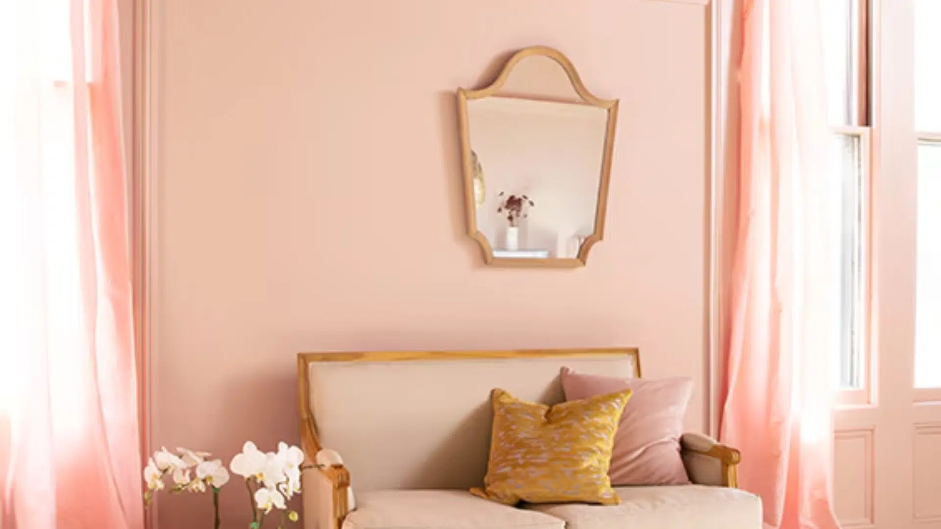
1. Bedrooms
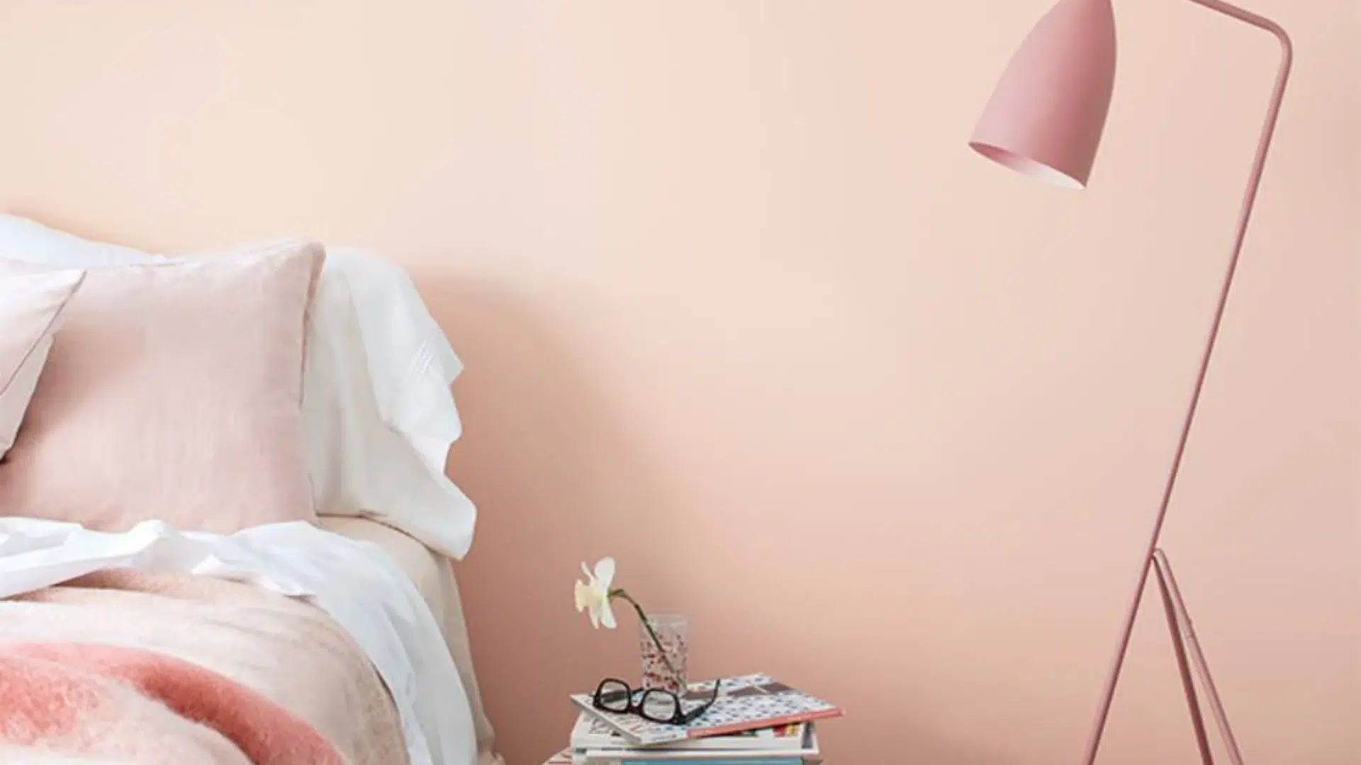
One of the first spaces I recommend Pleasant Pink for is the bedroom, especially if you want a cozy, nurturing atmosphere.
It creates a serene, blush backdrop that pairs beautifully with soft linens, natural textures, and layered lighting.
Try it as:
- A full wall color in a primary or guest bedroom
- An accent behind the bed (especially with tufted or upholstered headboards)
- A ceiling color for a romantic twist in otherwise neutral rooms
Pair it with:
- Crisp white trim for a clean, fresh look
- Warm brass or brushed gold hardware
- Creamy or oat-colored bedding for a soft, layered palette
You can even mix in floral or abstract artwork in blush and burgundy tones to add a bit more depth and storytelling.
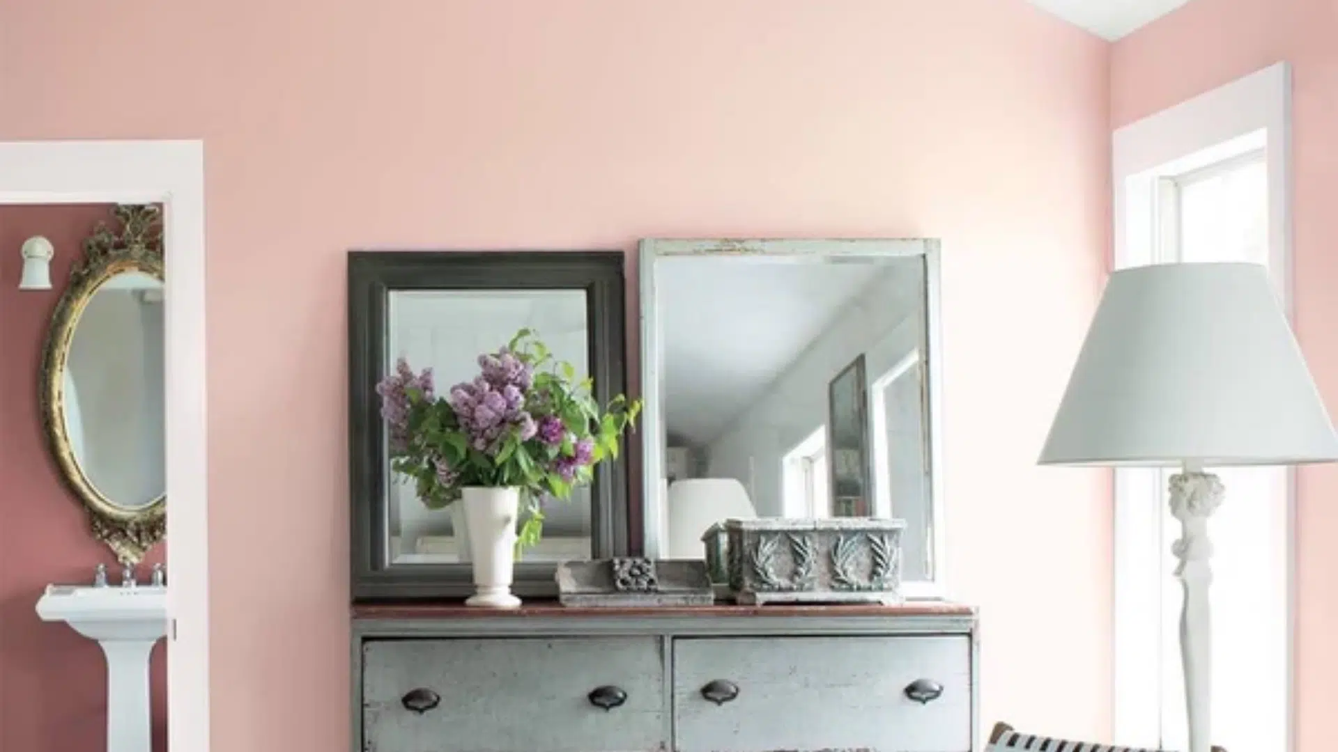
2. Living Rooms
Pink in the living room? Yes, and hear me out. Pleasant Pink isn’t loud, it’s quietly confident. Used in the right space, it creates a light, playful energy that still feels elevated.
It works especially well with:
- Mid-century modern furniture in wood tones
- Rattan or cane accents
- Muted rugs in taupe, gray, or terra cotta tones
- Gallery walls with white or gold frames
Add velvet cushions, woven throws, and ceramic decor, and you’ve got a space that feels personal and polished.
It’s also a great backdrop for green plants and natural light, creating a space that feels joyful but never overstated.
3. Bathrooms & Powder Rooms
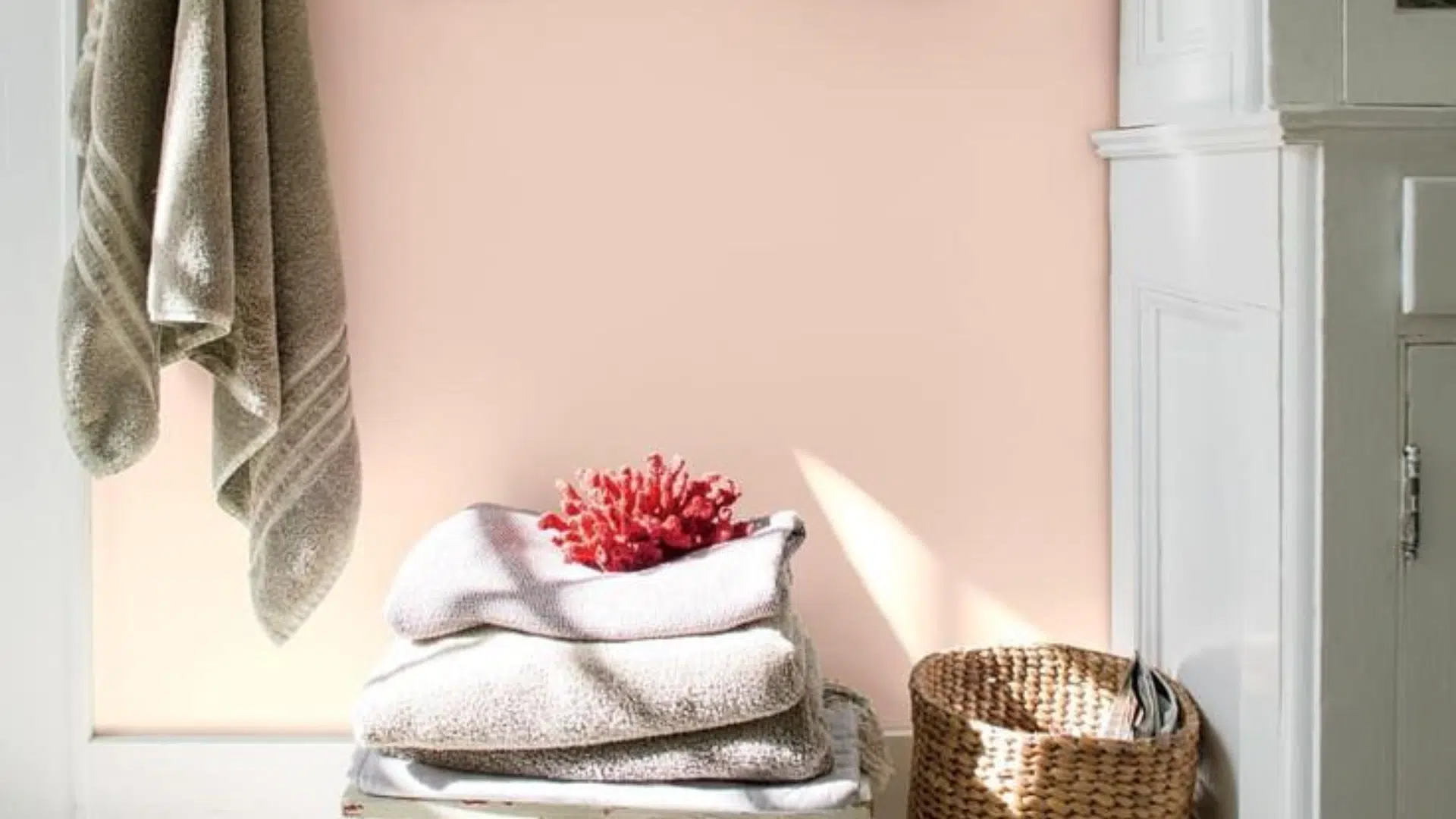
Pleasant Pink truly shines in smaller spaces like bathrooms and powder rooms. The warmth of the color brings out the best in cool-toned tiles and porcelain finishes.
Use it with:
- White subway or hex tiles for a clean contrast
- Marble counters or flooring for a boutique hotel vibe
- Matte black fixtures to add structure
- Natural wood vanities for warmth
Even just a Pleasant Pink vanity or door can make a statement without taking over the room. Add vintage sconces or a gilded mirror to turn the space into a conversation piece guests won’t forget.
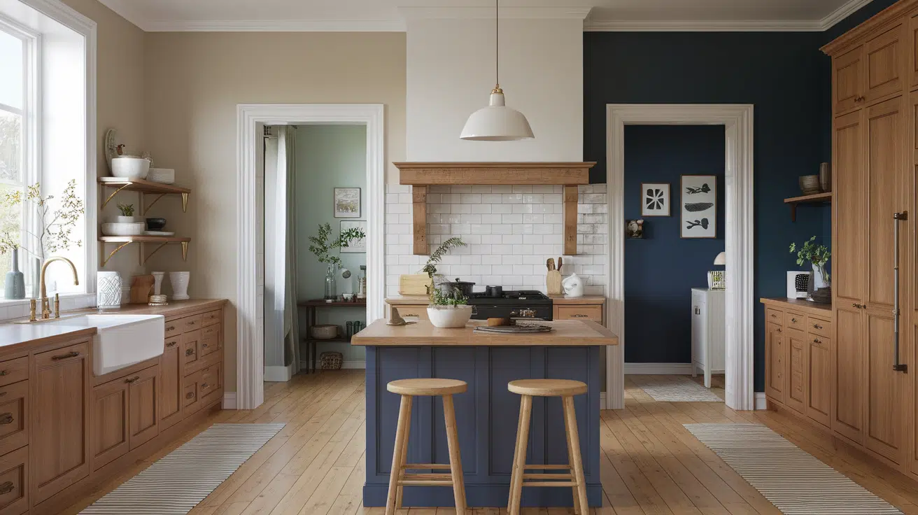
4. Kitchens
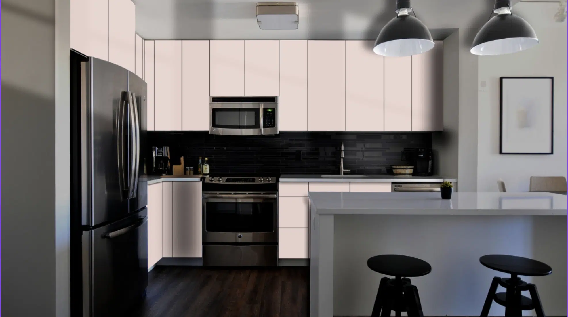
While it might sound unconventional, Pleasant Pink works wonderfully in the kitchen, especially if you’re after a soft, European-inspired look.
Ideas to try:
- Lower cabinets in Pleasant Pink, with white uppers or open shelving
- A Pleasant Pink island as the focal point
- Pink walls paired with white cabinetry and open wood shelving
Pair it with:
- Matte white or light gray countertops
- Subway tile backsplashes
- Gold or brass hardware
- Natural wood stools and accessories
It’s a refreshing, unexpected way to bring personality to one of the most-used rooms in your home.
What Colors Go Well with Pleasant Pink?
Pleasant Pink is surprisingly versatile; it blends beautifully with neutrals, rich tones, and even other pastels.
Best Neutrals
- White Dove: A creamy, soft white that adds warmth without looking yellow.
- Revere Pewter: A classic greige that feels grounding and timeless.
- Edgecomb Gray: A warm, subtle neutral that pairs beautifully with soft tones.
Accent Colors
- Navy Blue or Indigo: Adds modern contrast and depth.
- Olive or Sage Green: Brings an earthy, calming balance.
- Terracotta: A bold, warm accent that adds richness and character.
- Soft Gold or Champagne Metallics: Light-reflective finishes that feel luxe without being flashy.
It also looks beautiful paired with natural textures like linen, rattan, jute, and aged brass.
Similar Shades to Pleasant Pink You Might Like
If you’re curious about Pleasant Pink but want to test a few options, consider the beautiful shades below. They offer slightly different takes on soft, warm blush tones that still feel elegant and livable.
| Paint Color | Brand | Description |
|---|---|---|
| First Light | Benjamin Moore | A softer, cooler blush; Color of the Year 2020 |
| Pink Bliss | Benjamin Moore | Slightly more saturated and warmer than Pleasant Pink |
| Intimate White | Sherwin-Williams | A peachy-pink neutral that leans soft and sunny |
| Setting Plaster | Farrow & Ball | Deeper with a warm, historic character |
Try swatching them side by side in your space and see which one resonates best with your lighting and design style. A little testing goes a long way in finding the perfect pink.
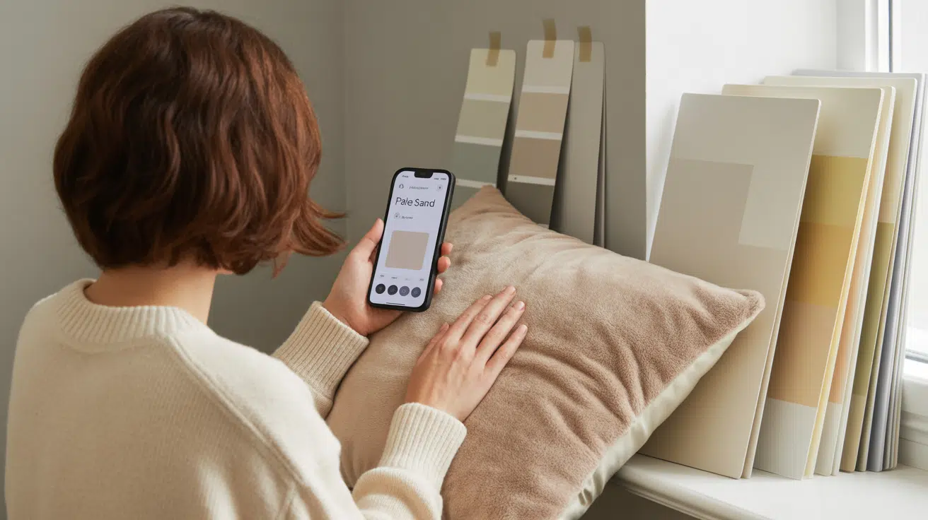
Real-Life Tip: Test It Where You Live
As with all paint colors, Pleasant Pink changes with the light, so testing it in your own space is a must.
I always recommend painting a large sample on the wall or using a peel-and-stick swatch for easy testing.
Check how it looks at different times of day – morning sunlight, afternoon brightness, and evening shadows can all bring out different undertones.
Be sure to view it next to your trim, flooring, furniture, and fabrics to get the full picture. Sometimes a pink that seems bold at first becomes surprisingly soft and welcoming once it’s in your space.
If you’re on the fence about using pink, Pleasant Pink might just change your mind.
Final Thoughts
Pleasant Pink by Benjamin Moore is a warm, inviting shade that adds charm and personality without overwhelming a space.
Its creamy undertones and soft blush feel make it a versatile option for everything from bedrooms and bathrooms to cozy living areas or even a bold front door.
I love how it balances warmth with subtle elegance – it’s not flashy, but it never fades into the background either.
As with any color, testing it in your home is key. Light and surroundings can shift how it looks, so sample first.
If you’re looking for a pink that feels grown-up, grounded, and gracefully warm, Pleasant Pink is definitely worth a try.

Alex Guerrero, a graduate with a Fine Arts degree from the Rhode Island School of Design, has been a visionary in the world of color and design for over 15 years. His professional journey began in the heart of the fashion industry in Milan, where he developed an acute sense for color harmonies and trends. Alex joined our team in 2018, offering fresh and innovative perspectives on color utilization in various spaces. Renowned for his ability to blend contemporary trends with timeless elegance. Outside of work, Alex is an accomplished painter and a volunteer art therapist, his artistic talents further enriching his professional insights.