Looking for a soft green paint that makes your home feel calm and cozy?
Saybrook Sage by Benjamin Moore might be just what you need.
It’s a warm, gentle green that works in living rooms, kitchens, bedrooms, and more.
This color feels natural, like bringing the outdoors inside.
It goes great with wood tones, cream furniture, and all kinds of styles, from farmhouse to modern.
If you’re painting one room or the whole house, it is easy to decorate around and always feels welcoming.
Let’s look at what makes this shade so loved and why it could be the perfect choice for your home.
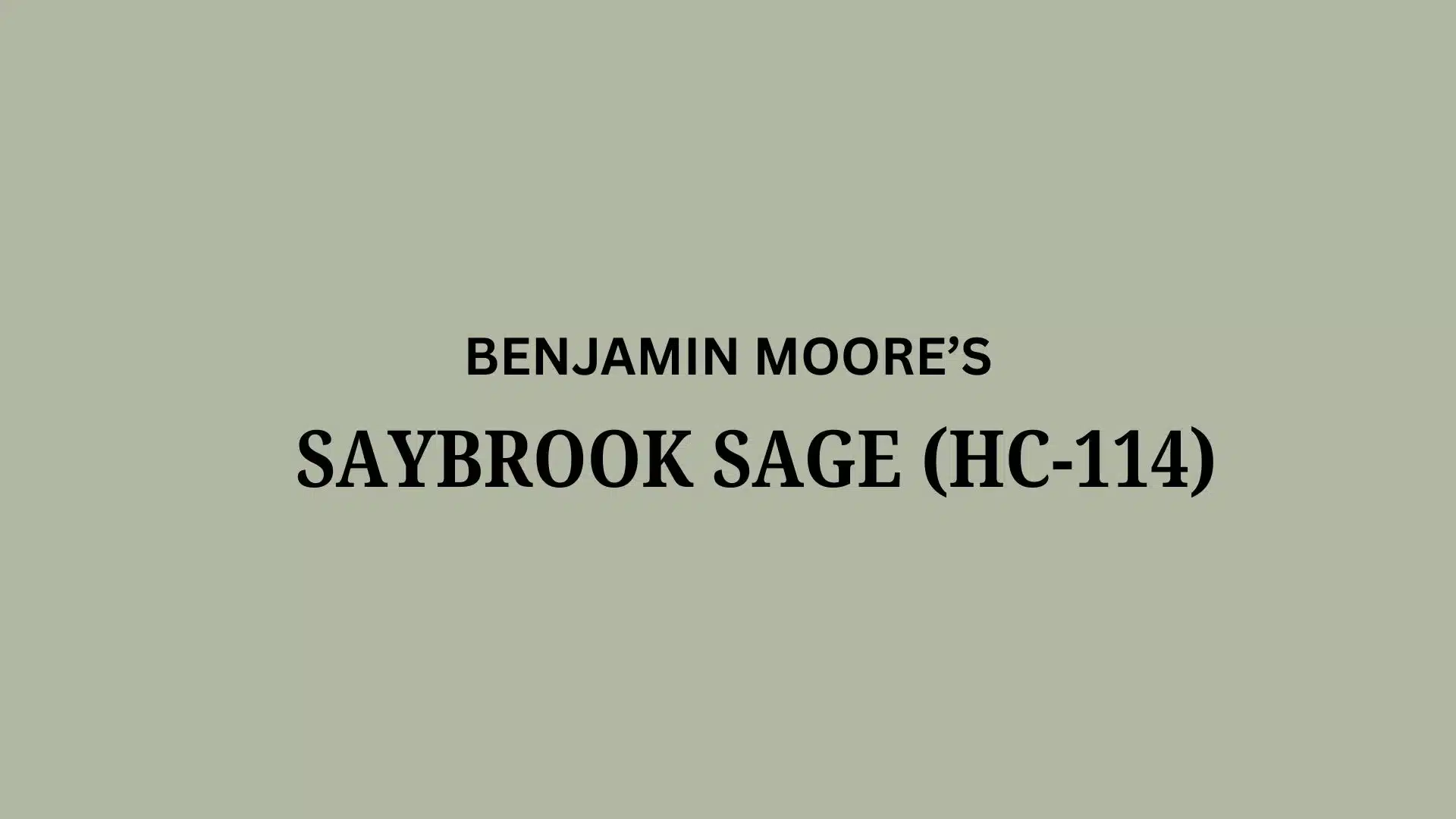
Understanding Benjamin Moore’s Saybrook Sage
This paint color is a beloved soft green paint color by Benjamin Moore.
It converts ordinary walls into calming, natural spaces that work in almost any home.
You can find this color as HC-114 in Benjamin Moore’s Historic Collection.
Color Terminology
Let’s look at what makes this color so special.
These numbers help you understand the true nature of this beautiful paint.
| PROPERTY | VALUE |
|---|---|
| RGB Value | 177, 183, 162 |
| HEX Value | #B1B7A2 |
| Light Reflectance Value | 45.46 |
With its mid-range LRV, it brightens rooms while still adding cozy color.
Keep these codes handy when shopping for matching furniture and decor online.
Undertones:
- It carries gentle gray and subtle blue undertones
- It changes slightly throughout the day, looking different in morning and evening light
- Not a flat green, but a complex, refined sage that feels natural
Psychology of Green Colors
The paint colors we choose affect our daily mood and home feel.
- Natural greens: Create peaceful, stress-reducing environments
- Soft sage tones: Make decorating easier with most furniture styles
- Adaptable wall colors: Look great in both bright sunlight and lamp light
- Advantages: Hides wall flaws, works with most decor, brings the outdoors inside
People love this color because it feels both timeless and fresh at once.
It is like a perfect neutral with personality – it never goes out of style!
Why Choose Benjamin Moore Saybrook Sage?

Benjamin Moore Saybrook Sage (HC-114) is a soft, natural green that makes rooms feel peaceful and balanced.
It works beautifully with many decorating styles and brings a touch of nature indoors.
1. Versatility
This gentle sage changes throughout the day in interesting ways.
Morning sunlight shows its brighter green side, while evening light brings out its softer gray tones.
This feels at home in living rooms, bedrooms, and even kitchens.
It looks great in traditional homes, modern spaces, or anywhere you want a calming feeling.
2. Key Features
It finds the sweet spot between colorful and neutral.
With its medium brightness level, it adds color without overwhelming a space.
This shade has remained popular because it feels both fresh and timeless.
When painted on your walls, it makes your furniture and decor look more expensive.
3. Durability
In Benjamin Moore’s quality paint formulas, this color stands up to daily life well.
The soft green tone hides minor marks better than lighter colors would.
It keeps its beautiful sage color even after cleaning, so your walls look good for years.
This makes it perfect for busy family homes and high-traffic areas.
4. Texture Patterns
This color creates a smooth, calming look that instantly gives rooms a finished feel.
Its gray-green undertones add depth that flat colors can’t match.
This makes white trim and molding stand out beautifully.
It flows nicely between connected rooms while letting your furniture be the main attraction.
Room Color Recommendations: Benjamin Moore Saybrook Sage
Saybrook Sage (HC-114) is a soft green paint that makes rooms feel peaceful and natural.
It shifts subtly throughout the day, looking brighter in morning light and more muted in the evening.
1. Living Spaces and Family Rooms

This gentle green creates a calm feeling in living rooms where you spend most of your time.
It works in almost any style of home, from farmhouse to modern.
- The natural color brings the outdoors inside, making your space feel fresh and alive.
- It pairs beautifully with cream sofas, brown leather, and natural wood tones.
- Try it with white trim and medium wood floors for a balanced, timeless look.
This color helps your room feel put together without being boring.
Your guests will notice how relaxed they feel without knowing why.
2. Kitchens and Dining Areas

This makes kitchens feel fresh but not cold like stark whites can.
This color looks good with many cabinet colors.
- It complements white cabinets by adding just enough color to keep things interesting.
- The sage tone works well with both stainless steel and brass kitchen hardware.
- In dining areas, this color creates a relaxed mood that makes meals more enjoyable.
Food looks more appetizing against this soft green background.
Your kitchen will feel like the welcoming heart of the home.
3. Bedrooms and Relaxation Spaces

This color turns bedrooms into peaceful retreats that help you unwind after busy days.
The natural green tones promote rest.
- It creates a soothing backdrop that isn’t too dark or too light for good sleep.
- This shade works with white, cream, or gray bedding for a clean, spa-like feel.
- The color makes small bedrooms feel more open while keeping a cozy, secure feeling.
You’ll notice better sleep in a room painted this calming color.
Your bedroom will become your favorite place to recharge.
Color Pairings and Combinations for Saybrook Sage (HC-114)

This is a calming green that brings nature inside your home.
Its gentle tone creates peaceful, balanced spaces that feel connected to the outdoors.
Here are the perfect partner colors for this versatile green shade.
Complementary Trim Colors
The right trim color can completely change how this green feels in your space.
These specific colors create beautiful combinations with their soft, natural tones.
1. Paper White (OC-55)
A clean, fresh white that adds brightness against the sage walls.
This pairing works wonderfully in kitchens, bathrooms, and sunrooms where you want a crisp, light feeling.
2. Copley Gray (HC-104)
A rich, earthy gray that adds depth when used with the sage on cabinets or furniture.
This combination creates a grounded, natural look perfect for living rooms and home offices.
3. Tapestry Beige (OC-32)
A warm, neutral beige that softens the green tones.
This pair creates a gentle, harmonious flow between rooms, making it ideal for connected spaces.
4. Smokestack Gray (2131-40)
A deeper, moody gray that creates dramatic contrast as an accent wall or furniture color.
This pairing adds enlightenment to dining rooms or bedrooms without feeling too heavy.
Creating Cohesive Color Schemes
This works wonderfully with many other colors to create a connected feel throughout your home.
This soft green shade can be the perfect starting point for different decorating styles.
Here are three color schemes that use this beautiful green as the main color.
| SCHEME | MAIN WALLS / AREAS | TRIM / ACCENT / CEILINGS | OTHER ROOMS / ACCENTS |
|---|---|---|---|
| Natural | Saybrook Sage (HC-114) | Paper White (OC-55) | Tapestry Beige (OC-32), Pale Oak (OC-20) |
| Warm | Saybrook Sage (HC-114) | Copley Gray (HC-104) | Alexandria Beige (HC-77), Bleeker Beige (HC-80) |
| Cool | Saybrook Sage (HC-114) | Smokestack Gray (2131-40) | Gray Cashmere (2138-60), Silver Mist (1619) |
NOTE: All colors shown are Benjamin Moore paints. Colors will look different in your home’s lighting, so always test samples first before buying full gallons.
Coordinating with Furniture and Decor

This gentle green creates a perfect backdrop that makes your furniture and accessories look amazing.
Its soft sage tone works like a neutral but with more personality than plain beige or gray.
1. Wood Tones
Dark woods like walnut and mahogany create a striking contrast against these sage walls.
The rich wood stands out while the green walls add warmth to the space.
Medium woods such as oak and cherry blend naturally with this color, feeling like they belong together.
Light woods, including pine and birch, add a fresh, modern feel when paired with this versatile green shade.
2. Metals
Brass and gold fixtures glow warmly against the green background, creating a graceful, timeless look.
Silver and chrome hardware provide a clean contrast that feels modern without being cold or stark.
Bronze and copper elements bring out the earthy qualities in the paint, making spaces feel grounded and natural.
These metal combinations work beautifully in kitchens, bathrooms, and lighting throughout the home.
3. Decor
Cream, white, and beige fabrics create a clean palette that lets the wall color be the star.
Rich blues and deep purples make gorgeous accent colors that pop against the soft green walls.
Natural textures like jute rugs, woven baskets, and linen curtains enhance the organic quality of this color.
Plants thrive visually against these walls, doubling down on the connection to nature in your space.
Alternative Paints Similar to Saybrook Sage

These colors are wonderful options if you like this soft green but want to see other choices.
They all have that natural, calming quality with their own unique personalities.
1. October Mist (1495)
- Offers a lighter, mistier green that feels more modern and airy.
- Creates peaceful spaces that feel connected to nature without being too bold.
- Works beautifully with light woods, cream fabrics, and simple, clean-lined furniture.
2. Salisbury Green (HC-139)
- Provides a deeper, more traditional green with stronger historical roots.
- Creates rooms that feel grounded, refined, and timeless in any home.
- Pairs wonderfully with brass accents, rich wood tones, and classic patterns.
3. Aganthus Green (472)
- Gives a brighter, more cheerful green with more yellow undertones.
- Creates spaces that feel fresh, lively, and perfect for kitchens or sunrooms.
- Looks amazing with white cabinets, blue accents, and natural wicker pieces.
4. Croquet (AF-455)
- Offers a softer, mistier green-gray that feels more subtle and neutral.
- Creates versatile backgrounds that change beautifully as light shifts throughout the day.
- Works perfectly with almost any decor style from farmhouse to contemporary.
Final Words
Saybrook Sage by Benjamin Moore is a peaceful green that works in almost any room.
It adds color without being too bright and feels calm and natural.
This shade looks great with white trim, wood furniture, and soft decor.
It also hides small marks better than lighter colors, which is great for busy homes.
Whether you want a cozy bedroom, a relaxed living room, or a fresh kitchen, this green can do it all.
It’s soft, stylish, and easy to decorate around.
Have you tried this color in your home?
Share your thoughts in the comments, we’d love to see how it turned out!
If you want more color reviews, click here to explore other blogs you might enjoy.

Alex Guerrero, a graduate with a Fine Arts degree from the Rhode Island School of Design, has been a visionary in the world of color and design for over 15 years. His professional journey began in the heart of the fashion industry in Milan, where he developed an acute sense for color harmonies and trends. Alex joined our team in 2018, offering fresh and innovative perspectives on color utilization in various spaces. Renowned for his ability to blend contemporary trends with timeless elegance. Outside of work, Alex is an accomplished painter and a volunteer art therapist, his artistic talents further enriching his professional insights.