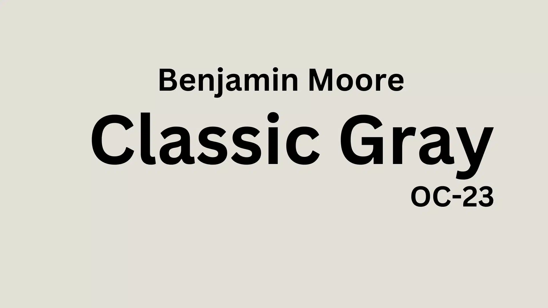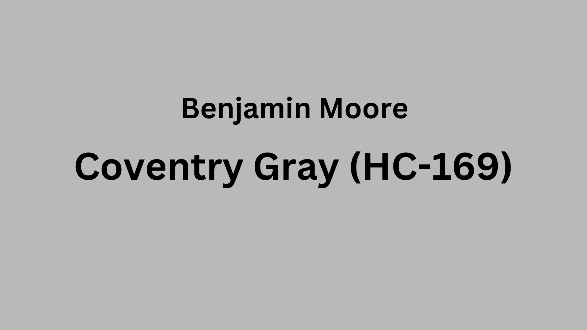
Looking for the perfect gray for your home? Coventry Gray Benjamin Moore (HC-169) is an ideal middle-of-the-road gray for any home.
This medium gray, not too dark or not too light, has cool blue-green undertones that stay neutral in all kinds of light. With an LRV of 48.18, it’s bright enough for small spaces but has enough color to add character to bigger rooms.
This balanced gray creates a feeling of calm and doesn’t feel cold or boring. It works with many colors, woods, and metals, making it easy to use in your home.
In this blog, we’ll look at how to use Coventry Gray in different rooms, what colors go with it, and what furniture looks best with this go-anywhere gray.
Understanding Paint Color Basics
Color Terminology
| Property | Value |
|---|---|
| LRV | 48.18 |
| RGB | (184, 186, 182) or (185, 186, 181) |
| Hex Code | #B8BAB6 or #B9BAB5 |
Undertones:
- Coventry Gray has cool blue-green undertones
- It’s a true medium gray that stays fairly neutral
- Not too dark or light, just right for many spaces
Psychology of Gray
- Medium grays like Coventry Gray create a sense of balance and calm
- Cool undertones: Feel fresh and clean without being cold
- Classic gray: Brings refinement without feeling too serious
- Benefits: Works as a perfect “middle ground” color, goes with many other colors, and doesn’t show dirt easily
Why Choose Coventry Gray (HC-169)?
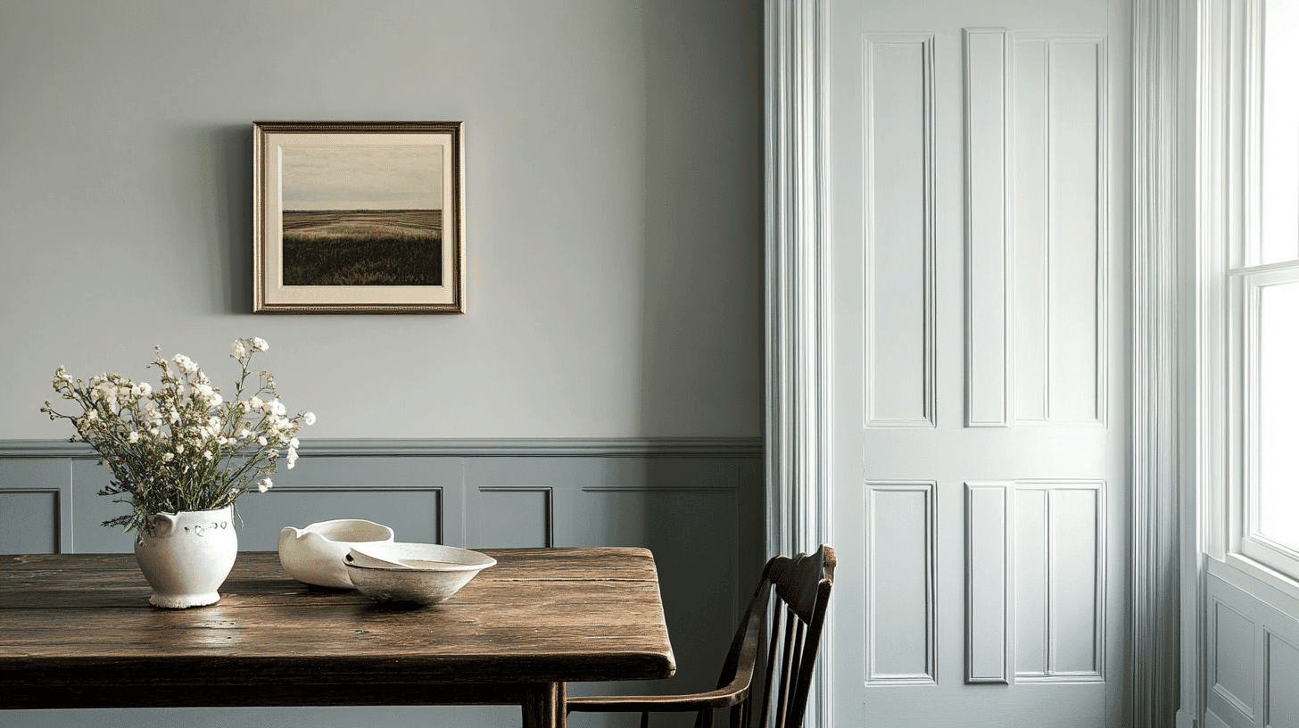
Benjamin Moore Coventry Gray HC-169 works beautifully in all kinds of lighting. It stays true to its medium gray tone in north-facing rooms without feeling too cold.
In sunny spots, it softens nicely without fading away. This balanced gray color creates a perfect backdrop for modern and traditional furniture, giving your space a put-together look without making it feel too dark or serious.
Key features
Benjamin Moore Coventry Gray offers great flexibility with existing items like wood floors, countertops, and furniture.
It creates smooth connections between rooms and spaces. This gray has enough color to feel interesting while staying neutral enough to work with nearly any color scheme. It won’t go out of style quickly like trendy colors often do.
Durability
Benjamin Moore Coventry Gray, especially in quality finishes like Aura or Regal Select, stands up well to daily life with good resistance to scuffs in busy areas.
Its medium depth helps hide fingerprints and small marks better than lighter colors. This paint keeps its true color over time and cleans up easily without fading when properly applied and maintained.
Texture patterns
Benjamin Moore Coventry Gray creates a smooth, rich look that adds depth to walls without overwhelming the space.
Its balanced tone casts gentle shadows that soften bright lighting and make textured surfaces like crown molding stand out nicely.
When used in different finishes, from matte to semi-gloss, it helps constructive details pop while keeping a consistent, refined look throughout your home.
Why it works
Benjamin Moore’s Coventry Gray works because it strikes the perfect balance – not too dark, light, blue, or warm.
Its subtle blue-green undertones complement warm woods and cool metals, while its middle-range LRV (48.18) ensures rooms feel cozy yet spacious.
This adaptable gray shifts slightly throughout the day with changing light, maintaining its classic character from morning to night.
Room-by-Room Color Recommendations with Coventry Gray
1. Living Spaces and Open Floor Plans

- Coventry Gray (HC-169) ‘s neutral tone creates a balanced feel in open floor plans and smoothly connects different areas.
- The 48.18 LRV of Coventry Gray provides enough depth to add character while keeping spaces open and airy.
- For added interest, pair Coventry Gray walls with crisp white trim, such as White Dove OC-17 or Simply White OC-117, for a clean, classic look.
2. Bedrooms and Relaxation Areas

- Coventry Gray creates a calm, peaceful atmosphere in bedrooms without feeling too dark or gloomy.
- The cool undertones in Coventry Gray promote relaxation, while the balanced depth keeps the space cozy but not cramped.
- Try Coventry Gray on all four walls for a cocoon-like feeling, or use it as an accent wall behind the bed for a touch of enlightenment.
3. Kitchens and High-Traffic Zones

- Coventry Gray in eggshell or satin finish stands up well to daily life and hides minor marks and fingerprints better than lighter colors.
- This versatile gray works equally well with white cabinets, dark wood, or even colorful kitchen accessories without clashing.
- Coventry Gray makes a stunning choice for kitchen islands or lower cabinets when paired with lighter upper cabinets for a trending two-tone look.
4. Exterior Usage and Weather Protection

- Coventry Gray offers a timeless, sophisticated exterior that looks clean without being too light or stark.
- This classic gray works beautifully on colonial, craftsman, and modern farmhouse styles, creating curb appeal that stands the test of time.
- Pair Coventry Gray siding with crisp white trim (like White Dove) and a bold front door in Hale Navy or Caliente for a magazine-worthy exterior.
- Its medium tone hides dirt and weather better than lighter colors while reflecting enough heat to be energy efficient.
Color Pairings and Combinations for Benjamin Moore Coventry Gray (HC-169)

Coventry Gray is a versatile medium-toned gray with subtle blue undertones. An LRV of 48.18 strikes a beautiful balance between light and dark, making it a graceful neutral that works well in various lighting conditions and spaces.
Here are color pairings and combinations focusing on your specified colors:
Complementary Trim Colors
- Steam (AF-15) – A warm off-white that softens Coventry Gray’s cooler undertones, creating a balanced and refined pairing
- Yorktowne Green (HC-133) – A deep, historical green that provides rich contrast and depth when paired with Coventry Gray
- Temptation (1609) – A subtle, rosy beige that adds warmth and creates an inviting atmosphere alongside the cooler Coventry Gray
- Silvery Moon (1604) – A light gray with subtle blue undertones that creates a harmonious, tone-on-tone effect when used with Coventry Gray
Creating Cohesive Color Schemes
Monochromatic Scheme
- Coventry Gray (HC-169) for main walls
- Silvery Moon (1604) for trim
- Steam (AF-15) for ceilings
- Stonington Gray (HC-170) for accent pieces or adjoining rooms
- Thunder (AF-685) for a deeper accent in small doses
Warm Color Scheme
- Coventry Gray (HC-169) for main living areas
- Temptation (1609) for dining room
- Smokey Taupe (983) for hallways
- Edgecomb Gray (HC-173) for bedrooms
- Alexandria Beige (HC-77) for a warm kitchen or family room
Cool Color Scheme
- Coventry Gray (HC-169) for main walls
- Yorktowne Green (HC-133) for a statement room or accent wall
- Blue Note (2129-30) for home office
- Van Deusen Blue (HC-156) for formal dining
- Wickham Gray (HC-171) for bathrooms or bedrooms
Coordinating with Furniture and Decor
1. Wood Tones

Rich walnut and mahogany contrast sharply against Coventry Gray’s cool undertones. Light maple or ash provides a fresh, airy feel that brightens spaces painted in this versatile gray.
2. Metals

Polished nickel and chrome hardware enhance the gray’s cool undertones for a crisp, modern appeal. Brass and gold accents create beautiful tension against the cool gray, adding warmth and refinement.
3. Decor

Natural textiles in varied textures add depth and interest against Coventry Gray walls. Introduce navy blue, deep green, or burgundy colors through accent pieces for a balanced and refined look.
Similar Paint Colors: Perfect Alternative to Coventry Gray (HC-169)
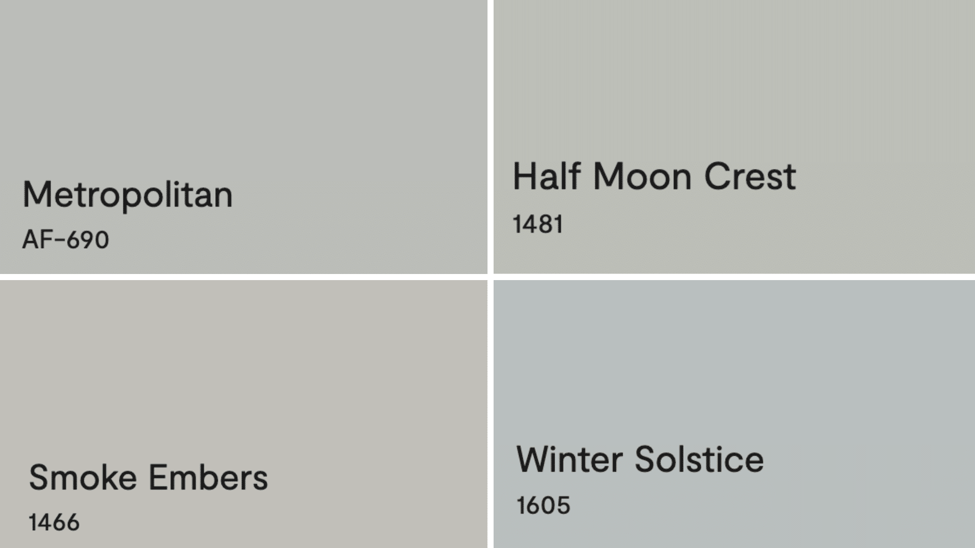
1. Metropolitan (AF-690)
- Offers a cooler, slightly darker alternative with more prominent blue undertones
- Creates a refined, contemporary feel in modern and transitional spaces
- Pairs beautifully with crisp whites and cool-toned furnishings
2. Half Moon Crest (1481)
- Presents a warmer alternative with subtle taupe undertones
- Creates a softer, more relaxed appearance in living areas and bedrooms
- Complements warm wood tones and brass fixtures exceptionally well
3. Smoke Embers (1466)
- Provides a lighter, airier feel with similar undertones but less saturation
- Works wonderfully in spaces with limited natural light
- Creates a soft, elegant backdrop for both traditional and contemporary decor
4. Winter Solstice (1605)
- Delivers a deeper, more dramatic version with stronger blue-green undertones
- Makes a beautiful statement in dining rooms and studies
- Creates stunning contrast when paired with white trim and lighter furnishings
Summing It Up
Coventry Gray Benjamin Moore (HC-169) is a timeless gray that works almost anywhere. Its cool blue-green undertones make it feel fresh and classy without being too serious.
This color pairs well with whites like Steam for trim, deep greens like Yorktowne Green for pop, and many wood types from light maple to dark walnut.
It looks good in living rooms, kitchens, or bedrooms and changes slightly with different lighting. Coventry Gray hides dirt well, keeps its color over time, and helps rooms flow nicely together. It works with both new and old-style homes and furniture.
When you pick Coventry Gray, you’re not just choosing a paint color – you’re bringing home the perfect blend of style and peace of mind in a can!

Alex Guerrero, a graduate with a Fine Arts degree from the Rhode Island School of Design, has been a visionary in the world of color and design for over 15 years. His professional journey began in the heart of the fashion industry in Milan, where he developed an acute sense for color harmonies and trends. Alex joined our team in 2018, offering fresh and innovative perspectives on color utilization in various spaces. Renowned for his ability to blend contemporary trends with timeless elegance. Outside of work, Alex is an accomplished painter and a volunteer art therapist, his artistic talents further enriching his professional insights.