Have you been wondering how to make your golden oak wood look its best? I’ve been there. This warm, honey-colored wood from the 80s and 90s is still in many of our homes today.
I know firsthand that finding colors to match golden oak can be challenging. Those strong yellow-orange tones need the right paint partners.
I’ve found that the perfect color pairings can make golden oak look fresh and modern, while poor choices make it feel outdated.
In my experience, everything from cool blues and greens to warm neutrals and bold accents can work – as long as they complement those warm wood tones.
I’ll share my favorite color options for golden oak and help you avoid common mistakes I’ve seen when pairing colors with this classic wood finish.
How Different Colors Work With Golden Oak Wood
The colors you choose to go with golden oak wood can make a big difference in how your space looks and feels. Good color matches bring out the best in this warm wood, while poor choices can clash badly.
Golden oak has strong yellow and orange undertones that you need to work with, not against. Some colors will make these warm tones look richer, while others will help balance them.
Cool colors like blue and green create a nice contrast with the golden oak’s warmth. This contrast can help make both the wood and the paint color look better.
Warm neutrals like beige and tan can blend with golden oak for a balanced, pleasant look that feels connected and natural.
Your color choices affect:
- How modern or traditional your space feels
- If your golden oak looks dated or timeless
- How big or small your room appears
- The overall mood and energy of your space
- How well your furniture stands out against walls and floors
Colors That Pair Well With Golden Oak
Balanced Beige and Tan Shades
Beige and tan paint colors are natural partners for golden oak wood. These warm neutrals share similar undertones, creating a flow in your space.
Light tans complement golden oak without competing with it. The similar color family creates a balanced look that feels intentional rather than dated.
Warmer beiges with yellow undertones enhance the golden qualities of the wood, making it appear more vibrant.
For a more subtle approach, consider beiges with a hint of gray (often called “greige”). These slightly cooler neutrals help balance the warmth of golden oak without clashing.
Beige and tan work well with golden oak because:
- They create a warm, welcoming atmosphere
- They don’t fight against the wood’s natural yellow tones
- They’re easy to coordinate with most furniture and decor
- They make spaces feel bigger and brighter
- They provide a versatile backdrop for changing accent colors
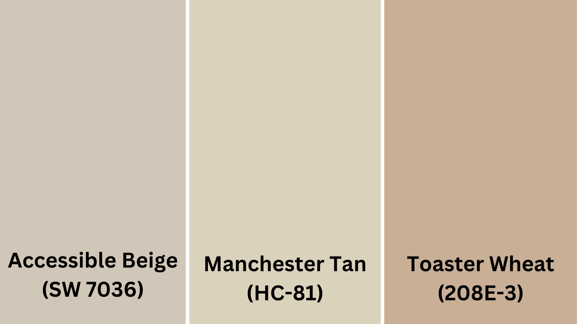
Best Beige Shades for Golden Oak Wood
- Accessible Beige SW 7036 by Sherwin Williams
- Manchester Tan HC-81 by Benjamin Moore
- Toasted Wheat 280E-3 by Behr
Clean White Choices
White paint can create a beautiful contrast with golden oak wood, helping to update and brighten spaces where this wood appears. However, not all whites work well with golden oak.
Avoid stark, bright whites, which can make golden oak look more yellow and dated. Instead, choose soft, warm whites or creamy off-whites that complement the wood’s warmth.
Whites with subtle yellow or beige undertones create a connection with golden oak elements. These whites feel fresh without fighting against the wood’s natural color.
White walls with golden oak trim or furniture:
- Make spaces feel larger and more open
- Create a clean, bright backdrop for the wood to stand out
- Provide contrast that highlights the wood’s grain and color
- Give you flexibility with other decor and accent colors
- Help modernize spaces with lots of golden oak elements
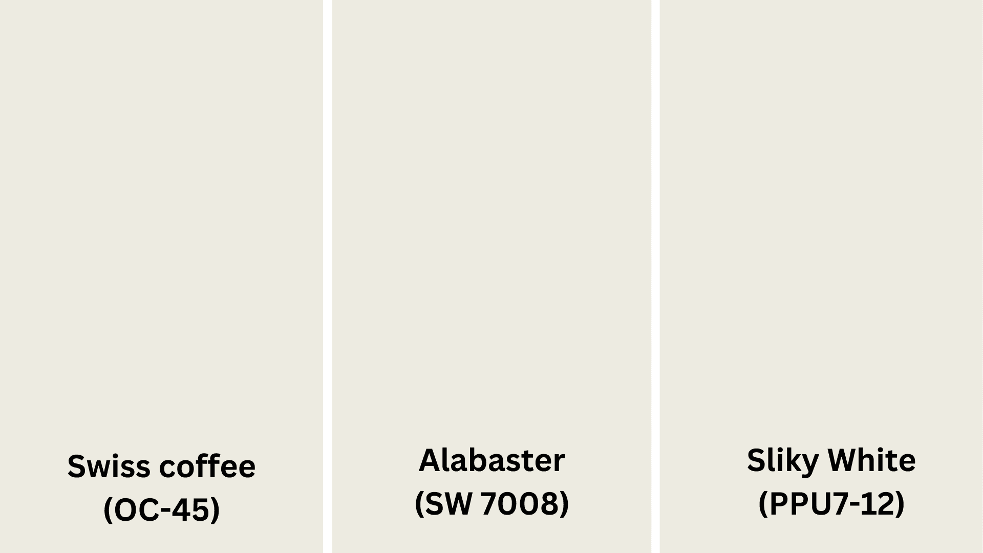
Best White Shades for Golden Oak Wood
- Swiss Coffee OC-45 by Benjamin Moore
- Alabaster SW 7008 by Sherwin Williams
- Silky White PPU7-12 by Behr
Cool-Toned Colors That Balance Golden Oak
Calming Blue Shades
Blue paint colors create a beautiful balance with golden oak wood. Since blue sits opposite orange-yellow on the color wheel, it naturally complements golden oak’s warm tones.
Navy and dark blues add richness and depth while letting golden oak elements stand out as warm accents. These deeper blues make golden oak look intentional rather than outdated.
Medium blues with gray undertones create a soothing backdrop that softens the yellowness of golden oak wood. Lighter, dusty blues add a fresh, updated feel to spaces with golden oak floors or trim.
Blue works well with golden oak because:
- It naturally balances the yellow-orange tones in the wood
- It creates a calming, relaxing atmosphere
- It updates spaces without requiring wood replacement
- It works in both traditional and modern room designs
- It pairs well with most accent colors and metal finishes
For best results, choose blues with slight gray undertones rather than bright, primary blues, which can create too stark a contrast.
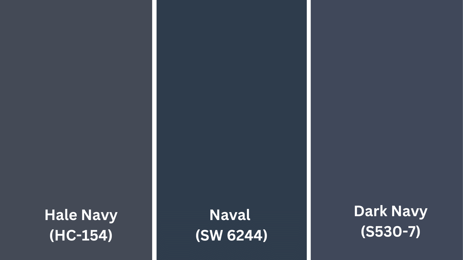
Best Blue Shades for Golden Oak Wood
- Hale Navy HC-154 by Benjamin Moore
- Naval SW 6244 by Sherwin Williams
- Dark Navy S530-7 by Behr
Surprising Purple Options
Purple paint colors can create an unexpected but beautiful partnership with golden oak wood. Since purple contains blue (which complements orange-yellow), it can balance golden oak’s warmth.
Stick with muted, dusty purples rather than bright violet tones. Lavenders and grayed purples provide subtle contrast without overpowering the space.
Deeper eggplant or plum shades create a rich, refined look when paired with golden oak elements. These darker purples make golden oak look intentional and graceful.
Tips for using purple with golden oak:
- Choose purples with gray undertones for a more subtle look
- Test samples in your actual lighting before committing
- Use deeper purples in well-lit rooms and lighter purples in darker spaces
- Consider purple as an accent wall if you’re hesitant about full coverage
- Pair purple walls with purple-toned accessories for a cohesive look
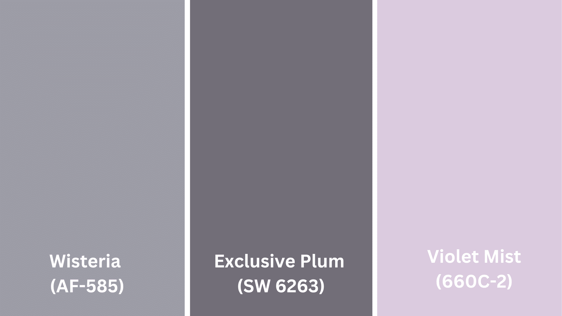
Best Purple Shades for Golden Oak Wood
- Wisteria AF-585 by Benjamin Moore
- Exclusive Plum SW 6263 by Sherwin Williams
- Violet Mist 660C-2 by Behr
Warm Colors That Enhance Golden Oak
Rich Red and Burgundy Choices
Red paint colors can create a warm, vibrant partnership with golden oak wood. The key is choosing reds with brown undertones rather than bright, primary reds, which might clash.
Deep burgundy and brick red tones complement golden oak’s warmth while adding richness and character to your space. These colors create a traditional, comfortable feeling that’s perfect for dining rooms and living areas.
Terracotta and rust reds connect beautifully with golden oak’s orange undertones, creating a balanced, earthy palette. These softer reds feel natural and welcoming.
When using red with golden oak:
- Stick with deeper, muted reds rather than bright, cherry reds
- Consider using red on just one wall as an accent
- Balance with cream or beige on other walls to prevent overwhelming the space
- Add touches of black or dark brown to ground the color scheme
- Keep other elements simple to let the red walls and golden wood be the focus
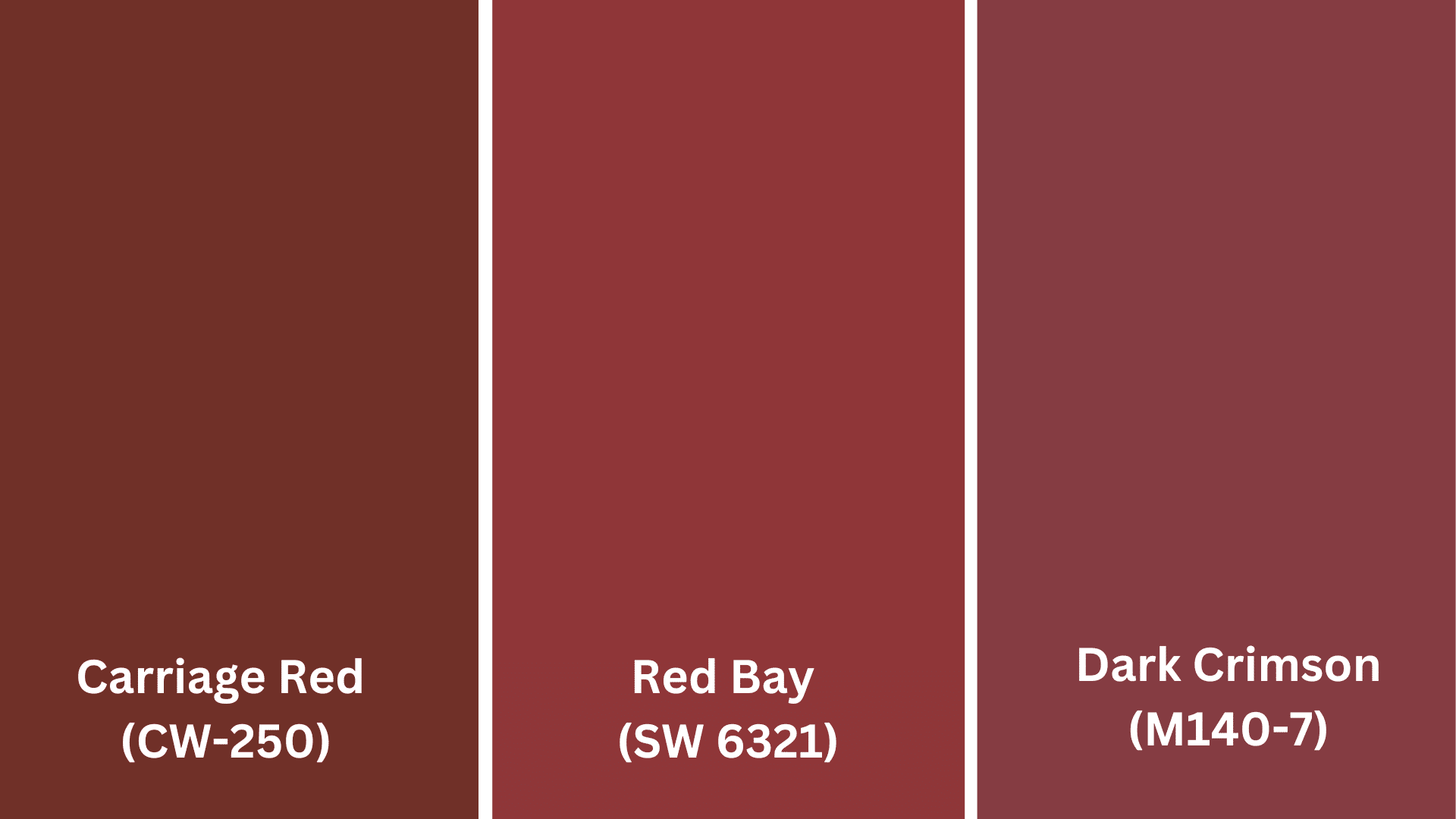
Best Red Shades for Golden Oak Wood
- Carriage Red CW-250 by Benjamin Moore
- Red Bay SW 6321 by Sherwin Williams
- Dark Crimson M140-7 by Behr
Earthy Brown Shades
Brown paint colors naturally extend golden oak’s warmth, creating spaces that feel grounded and cohesive. The right brown can make golden oak elements look intentional and current.
Choose browns that are distinctly darker than your golden oak to create a clear contrast. Coffee, chocolate, and espresso tones create refined backdrops that make golden oak stand out.
For a subtle approach, consider taupe-browns with gray undertones. These create a more contemporary feel while still honoring the warmth of golden oak.
Benefits of brown walls with golden oak:
- They create a cohesive, intentional look
- They add depth and richness to your space
- They hide marks and scuffs better than lighter colors
- They make golden oak look like a deliberate design choice
- They create a cozy, enveloping atmosphere
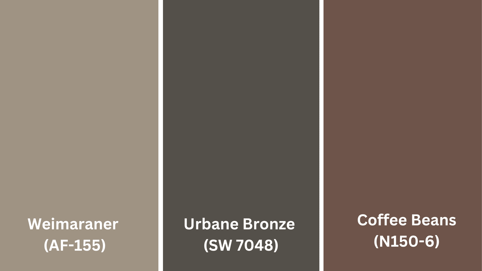
Best Brown Shades for Golden Oak Wood
- Weimaraner AF-155 by Benjamin Moore
- Urbane Bronze SW 7048 by Sherwin Williams
- Coffee Beans N150-6 by Behr
Bold Choices for Golden Oak
Dramatic Dark Accents
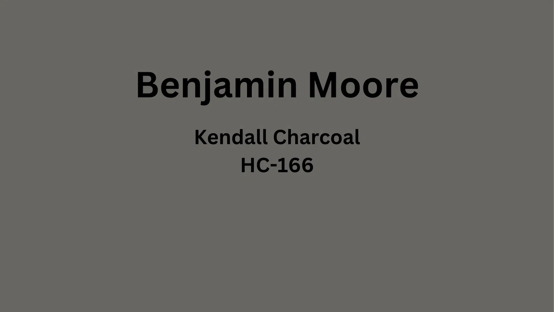
Dark paint colors can change spaces with golden oak, creating dramatic contrast that makes both elements stand out. Deep charcoal, navy, or forest green create cultivated backdrops that give golden oak new life.
Using dark colors with golden oak helps the wood appear more intentional and less dated. These bold choices can make oak trim, cabinets, or furniture look like purposeful design elements.
For best results, ensure your space has adequate lighting to prevent dark walls from making the room feel too closed in. If you’re concerned about the room feeling too small, consider using dark colors on just one wall.
Ways to use dark colors with golden oak:
- Paint a single accent wall in a deep tone
- Use dark paint on built-ins or shelving around golden oak elements
- Try dark lower cabinets with lighter upper cabinets in kitchens
- Balance dark walls with plenty of light-colored furnishings and accessories
- Add mirrors and metallic accents to reflect light in darker spaces
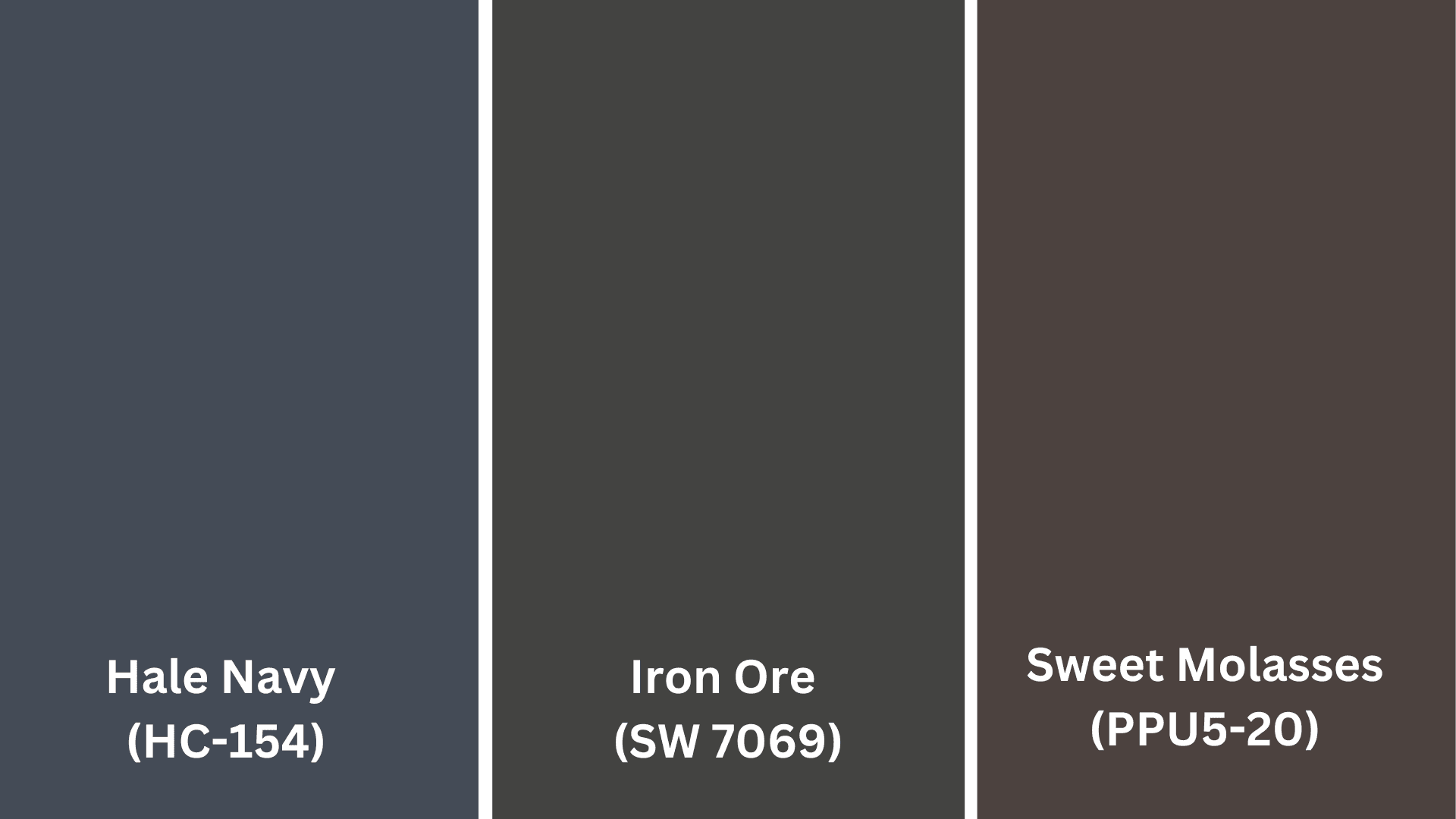
Best Dark Accent Colors for Golden Oak Wood
- Hale Navy HC-154 by Benjamin Moore
- Iron Ore SW 7069 by Sherwin Williams
- Sweet Molasses PPU5-20 by Behr
Common Mistakes to Avoid With Golden Oak
- Using cool, icy colors – Stark whites and cool grays often clash with golden oak’s warm tones
- Choosing yellow or golden paint – These can make golden oak look more yellow and dated
- Going too beige without contrast – Without some color variety, all-beige rooms with golden oak can feel flat
- Picking trendy colors without testing – Just because a color is popular doesn’t mean it works with golden oak
- Ignoring lighting conditions – Colors look different in your space than they do on paint chips
- Using too many different colors – Stick to a cohesive palette to create a pulled-together look
- Being afraid of contrast – Sometimes stronger contrasts update golden oak better than similar tones
Final Thoughts
Finding great colors to pair with golden oak wood isn’t complicated. When you understand how colors work with this warm wood, you can create spaces that look fresh and modern.
If you pick cool blues and greens for balance, neutral beiges, and grays for peace, or bold dark colors for drama, the right paint transforms how you see your oak.
Always test colors in your actual space, think about your lighting, and consider the feeling you want. The best colors make your wood shine while creating a room you love.
With smart color choices, your golden oak can look beautiful and current—no expensive refinishing is needed.
Ready to change your golden oak home? Grab some paint samples today and start testing. Your perfect color combination is waiting to be found.

Alex Guerrero, a graduate with a Fine Arts degree from the Rhode Island School of Design, has been a visionary in the world of color and design for over 15 years. His professional journey began in the heart of the fashion industry in Milan, where he developed an acute sense for color harmonies and trends. Alex joined our team in 2018, offering fresh and innovative perspectives on color utilization in various spaces. Renowned for his ability to blend contemporary trends with timeless elegance. Outside of work, Alex is an accomplished painter and a volunteer art therapist, his artistic talents further enriching his professional insights.