Imagine walking into a cottage where every color feels like a warm welcome. That’s the magic of cottage style—it’s not just decorating; it’s creating memories, and bloom and comfort reign supreme.
From its humble beginnings in shabby chic to today’s beloved cottagecore trend, this timeless style has captured hearts worldwide for a good reason.
Whether the soft whites remind you of grandma’s lace curtains or the cozy earth tones feel like a favorite sweater, each shade tells a story about your space.
You don’t need to be an expert to do it right. Let’s explore how these charming colors can change your home into the cozy retreat you’ve always wanted.
The Essence of Cottage Color Palettes
A cottage color palette is about creating that perfect mix of comfort and charm, where soft pastels dance with warm earth tones to create a space that feels like a warm hug.
Think gentle whites that remind you of fresh linens, subtle grays that reflect morning mist, and touches of muted blues that bring in hints of the sky and sea.
But it’s not just about playing it safe with pastels—the magic happens when you layer in deeper, earthier shades like rich browns and warm beiges.
What makes these palettes special is their work together to create spaces that feel lived-in and loved, never too precious or formal.
It’s about striking that sweet spot between airy and grounded, where every color has a purpose, but nothing feels too planned.
Cottage colors make your space feel like a cozy retreat from the world if you’re going for a classic, shabby look or a more modern coastal vibe.
Room-by-Room Color Guide
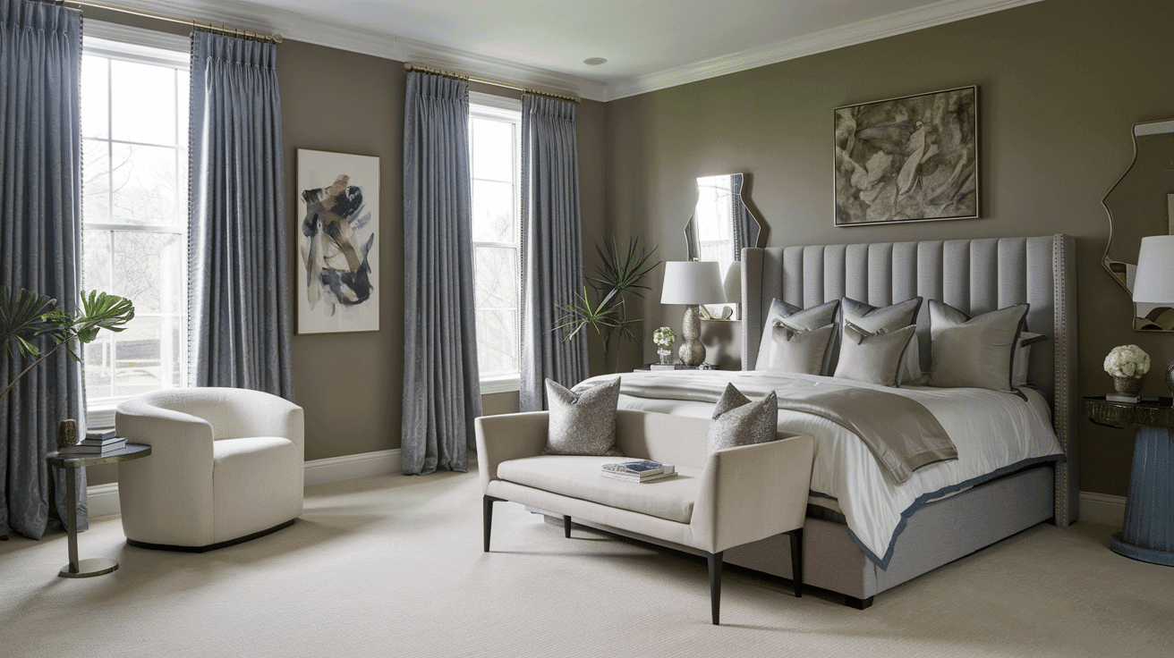
Bedrooms

Remake your cottage bedroom into a peaceful shelter with colors that whisper rather than shout.
Soft, dusty blues like Benjamin Moore’s “Marilyn’s Dress” create the perfect backdrop for rest, while gentle lavenders add a touch of romance without overwhelming the senses.
Consider pairing these with warm whites on trim and ceilings to keep the space airy and calm.
If you’re nervous about using color in your bedroom, start with neutral walls and add color through bedding and accessories. This will make adjusting the room’s mood with the seasons easy.
Living Room

Life happens in Your living room, so choose colors that make everyone feel at home. Warm whites like “White Dove” or “Cloud Cover” on the walls create a welcoming canvas, while deeper blues and soft grays add depth without heaviness.
Don’t be afraid to mix cottage classics like muted sage greens or gentle coastal blues—these colors make every gathering feel more relaxed, and conversations flow more easily.
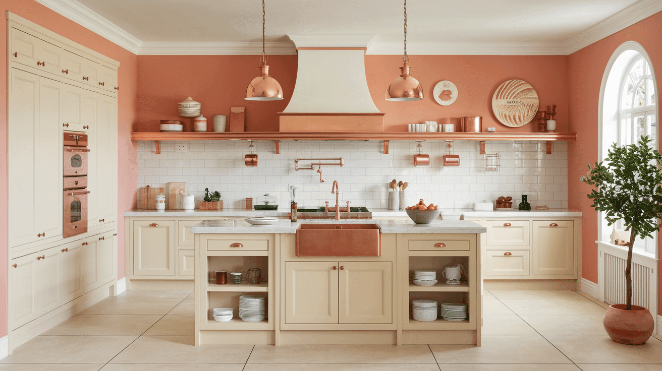
Kitchen

Your cottage kitchen deserves colors that energize and inspire. For your walls, consider warm neutrals like “Coastal Path”—they hide cooking splatters while keeping the space feeling fresh.
Add personality with cabinet colors; soft greens or pale blues work beautifully against warm whites.
Choosing shades that make you want to linger over your coffee or spend an afternoon baking. Glass-front cabinets painted in opposite colors can add charm while showing off your favorite dishes.
Bathrooms

Change your bathroom into a spa-like sanctuary with colors that promote relaxation. Soft whites paired with gentle blues create a clean, fresh feeling, while adding touches of gray or lavender can soften the space.
Consider “French Violet” or “Majestic Mauve” for a subtle pop of color that still maintains that serene cottage feel.
Don’t forget about the finish – using semi-gloss paint not only stands up to moisture but also adds a lovely subtle sheen that makes the space feel more luxurious.
Practical Tips for Choosing Colors

Understanding Color Psychology
Colors are more than just pretty shades on your walls – they’re mood-makers in your cottage home.
Soft blues and greens can create a sense of calm that’s perfect for unwinding after a long day, while warmer tones like gentle creams and pale yellows can make spaces feel more welcoming and social.
Considering natural and artificial lighting, the key is understanding how these colors will play out in your space. Think about how you want each room to feel, not just how you want it to look.
Pro Tips:
- Test paint samples at different times of day to see how natural light affects the color.
- Consider using cooler tones in south-facing rooms that get lots of warm sunlight.
- Remember that colors appear more intense on large wall surfaces than on small swatches.
Balancing Color Harmony
Creating a pleasant color flow throughout your cottage doesn’t mean every room needs to match exactly. Start with a neutral base color like “White Dove” or “Nairobi Clouds” and build your palette from there.
Add depth with varying shades and complementary colors, but keep the overall tone consistent. This approach allows each room to have its personality while still feeling connected to the whole house.
Pro Tips:
- Use the 60-30-10 rule: 60% dominant color, 30% secondary color, and 10% accent color
- Connect spaces by repeating accent colors in adjacent rooms through accessories
- When in doubt, look to nature for color combination inspiration – they’re always pleasant
Cottage Color Palettes: Top Picks for Your Home
1. Angelica

Angelica exudes a peaceful aura ideal for quiet bedroom settings or peaceful bathroom designs. It’s understated yet refined, facilitating a calm and collected environment in any cottage home.
Color code: #D4CECA
2. Atrium White

Atrium White is clean and bright, enhancing the spaciousness of any room. It’s a versatile color that boosts light reflection, making it a top choice for lively living areas and kitchens.
Color code: #FEF3E2
3. Beacon Gray
![]()
Beacon Gray is a soft neutral that suits various decorating styles, from modern to traditional. It provides a refined backdrop for blending furniture and accent pieces.
Color code: #B4B8B5
4. Batik

Batik is a gentle purple with a touch of gray. It is perfect for adding an energy of color without overwhelming it. It pairs well with soft whites and deep greens for a balanced look.
Color code: #9E9AC1
5. Boudoir

Boudoir is a deep, moody mauve that adds a touch of romance and mystery to any space. It is ideal for creating a statement wall or enhancing a cozy niche.
Color code: #7A6469
6. Carob

Carob is a rich, warm brown that produces the earthy tones of the natural world. It’s excellent for warming up living spaces and pairs well with creamy whites.
Color code: #6B4E4B
7. Chantilly Lace

Chantilly Lace is a crisp, clean white that is a perfect canvas for any color scheme. Its bright finish makes rooms appear larger and more inviting.
Color code: #F8F7F1
8. Chestertown Buff

Chestertown Buff is a warm beige that brings a cozy, inviting quality to any room. It’s particularly effective in spaces that desire a touch of warmth without darkness.
Color code: #DDB892
9. Cloud Cover

Cloud Cover is a subdued off-white with a hint of gray, making it an excellent choice for spaces that demand subtlety and softness without starkness.
Color code: #DAD7CD
10. Coastal Path

Coastal Path is a warm beige with earthy undertones. It’s ideal for creating a welcoming and relaxed atmosphere, especially in common areas where comfort is key.
Color code: #C7B7A3
11. Cotswold

Cotswold is a refined green with a hint of gray. It lends a natural and grounded feel to any room and works well in spaces that benefit from a connection to the outdoors.
Color code: #A9A481
12. Crème Caramel

Crème Caramel is a sweet, warm shade that brings a comforting, soft presence to kitchens and dining areas, enhancing a cozy, appetizing atmosphere.
Color code: #F3E0C3
13. Etched Glass

Etched Glass is a pale green that evokes the freshness of spring. It’s ideal for bedrooms and bathrooms that desire a light, refreshing tone.
Color code: #E0E5D7
14. French Violet

French Violet is a bold, deep purple that adds a dramatic flair to any space, perfect for accent walls or decor highlights that demand attention.
Color code: #675682
15. Grant Beige

Grant BeiBeige is a soft, neutral beige that offers versatility and warmth. It is a favorite for living rooms and entryways with a neutral palette.
Color code: #B8A99A
16. Gray Cashmere
Gray Cashmere is a gentle blend of blue and green, providing a soothing backdrop for spaces that aim for calm and restfulness, like spas or master suites.
Color code: #A8B7B6
17. Icicle

Icicle is a crisp, clean white with a slight bluish undertone. Its cool, refreshing look makes it excellent for modern spaces, highlighting minimalistic style.
Color code: #E3E5E1
18. Innocence

Innocence is a soft blue that captures the sky’s lightest tones. It is ideal for nurseries or light-filled sunrooms where a gentle, calming effect is desired.
Color code: #C9E1E8
19. Majestic Mauve

Majestic Mauve is a subtle mauve that lends a refined yet understated touch to any space. It is ideal for bedrooms or living areas that need a hint of warmth and depth.
Color code: #D6C2C6
20. Manchester Tan

Manchester Tan is a light, sandy beige with a warm eaBeige base. It creates a relaxed and comfortable atmosphere in living rooms and hallways.
Color code: #DBD2BC
21. Marilyn’s Dress

Marilyn’s Dress is a soft blue-gray that mimics the quiet Shades of early morning skies. It is perfect for creating a peaceful escape in bedrooms and bathrooms.
Color code: #E5E7ED
22. Misty Blue

Misty Blue is a calm blue with a hint of gray. It evokes the coolness of misty mornings and provides a peaceful, soothing environment for bathrooms and bedrooms.
Color code: #AAB9C1
23. Pashmina

Pashmina is a deep, rich beige with gray undertones. It offers a luxurious and warm feel to dens and libraries where comfort and grace are key.
Color code: #A89C8F
24. Paper Mache

Paper mache is a soft white with subtle hints of beige. It providBeigentle warmth to any space and is especially effective in small areas or spaces with great natural light.
Color code: #EDE5DE
25. Peach Crème Caramel
Peach Crème Caramel is a warm, peachy shade that brings a cheerful, inviting glow to any space. It is perfect for kitchens and dining areas that want a welcoming atmosphere.
Color code: #F4DFB8
26. Periwinkle Beacon Gray
![]()
Periwinkle Beacon Gray offers a unique blend of blue and gray, providing a refreshing but subdued color ideal for calm living spaces or bedrooms.
Color code: #A8A9AD
27. Steam

Steam is a clean, almost pure white that offers a crisp backdrop for modern spaces. It works well in spaces with bold colors or where a sense of openness is needed.
Color code: #EFEFEF
Conclusion
Creating the perfect cottage palette isn’t just about following trends—it’s about telling your home’s story through color.
Every shade you choose adds another layer of charm, making four walls uniquely and wonderfully your space.
Remember those soft whites, gentle blues, and earthy neutrals we discussed? They’re more like friendly suggestions than rigid rules.
Trust your instincts. If that bold periwinkle makes your heart skip a beat, or if that warm caramel tone reminds you of childhood summers, go for it.
Your cottage should be as special as you are. Mix, match, and play with colors until they feel just right. After all, the most inviting cottages aren’t the ones that follow every rule – they’re the ones that feel like coming home.

Alex Guerrero, a graduate with a Fine Arts degree from the Rhode Island School of Design, has been a visionary in the world of color and design for over 15 years. His professional journey began in the heart of the fashion industry in Milan, where he developed an acute sense for color harmonies and trends. Alex joined our team in 2018, offering fresh and innovative perspectives on color utilization in various spaces. Renowned for his ability to blend contemporary trends with timeless elegance. Outside of work, Alex is an accomplished painter and a volunteer art therapist, his artistic talents further enriching his professional insights.