Neutral colors are the quiet heroes of home design. They include soft shades like white, beige, gray, taupe, cream, and even black.
These colors don’t fight for attention – instead, they create calm, cozy spaces that feel easy to live in. That’s why they’re always in style.
People love neutral tones because they work with everything. Your home might lean modern, rustic, boho, or traditional – neutrals can help it all feel pulled together.
They’re great at letting other features – like texture, furniture shape, or natural light – shine.
In this post, we’ll talk about how to use neutral colors in each room of your home. You’ll get simple ideas, decorating tips, and ways to keep things interesting.
I found that neutral colors can help you build a home that feels calm and complete, whether you’re starting from scratch or just freshening things up.
What Are Neutral Colors?
Neutral colors are the soft, muted shades that don’t scream for attention, but that’s exactly what makes them so powerful.
These are colors that don’t show up on the traditional color wheel, like red, blue, or yellow do. Instead, they sit in the background, offering a calm and balanced foundation that works with almost any design style.
- White – Clean, bright, and pure. Great for opening up a space.
- Off-white or Cream – A warmer version of white that feels softer and more inviting.
- Beige – A light brown with yellow or pink tones; very cozy and easy to pair.
- Gray – Can be cool or warm depending on the undertones; sleek and modern.
- Taupe – A mix of brown and gray; subtle and earthy.
- Greige – A trendy blend of gray and beige; works in both warm and cool settings.
- Black – The boldest neutral. Strong and dramatic when used as an accent.
Neutral colors are often considered “safe” choices in home design, but that doesn’t mean boring.
They’re timeless, flexible, and easy to work with. Because they don’t overpower a room, they allow textures, materials, and shapes to take center stage.
Whether you want a soft, serene bedroom or a stylish, modern kitchen, neutral tones provide the perfect base to build from. They can work with any style – traditional, rustic, coastal, or contemporary – and they never go out of fashion.
When used thoughtfully, neutrals bring balance and simplicity to your home, making it feel pulled together without trying too hard.
How to Use Neutral Colors in Every Room
Neutral colors can work beautifully in every room of your home. The key is to use them thoughtfully – layering tones, mixing textures, and allowing natural light to highlight their subtle beauty.
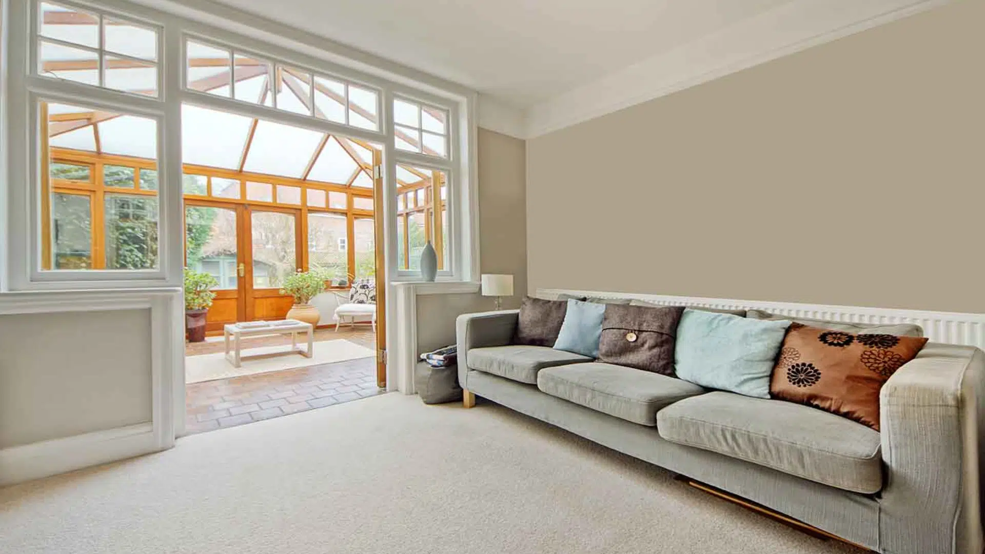
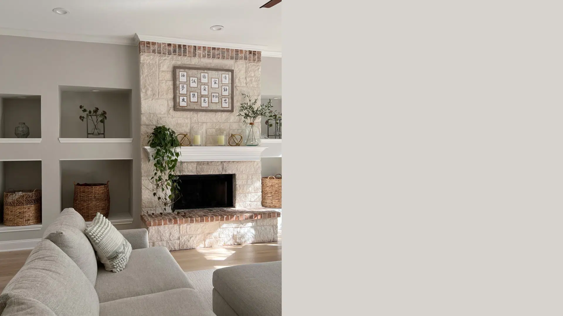
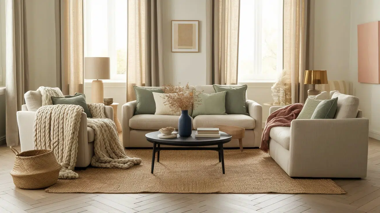
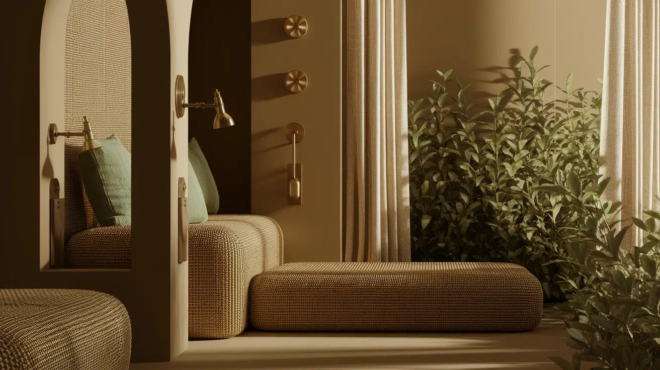
Living Room
In the living room, neutrals help create a cozy, welcoming space. Instead of using just one flat color, try layering different neutral tones like white, tan, and soft gray.
This adds depth without needing bold shades. To keep things interesting, I suggest mixing different textures.
A soft linen couch, a warm wood coffee table, and a leather chair can all live happily together in a neutral color scheme.
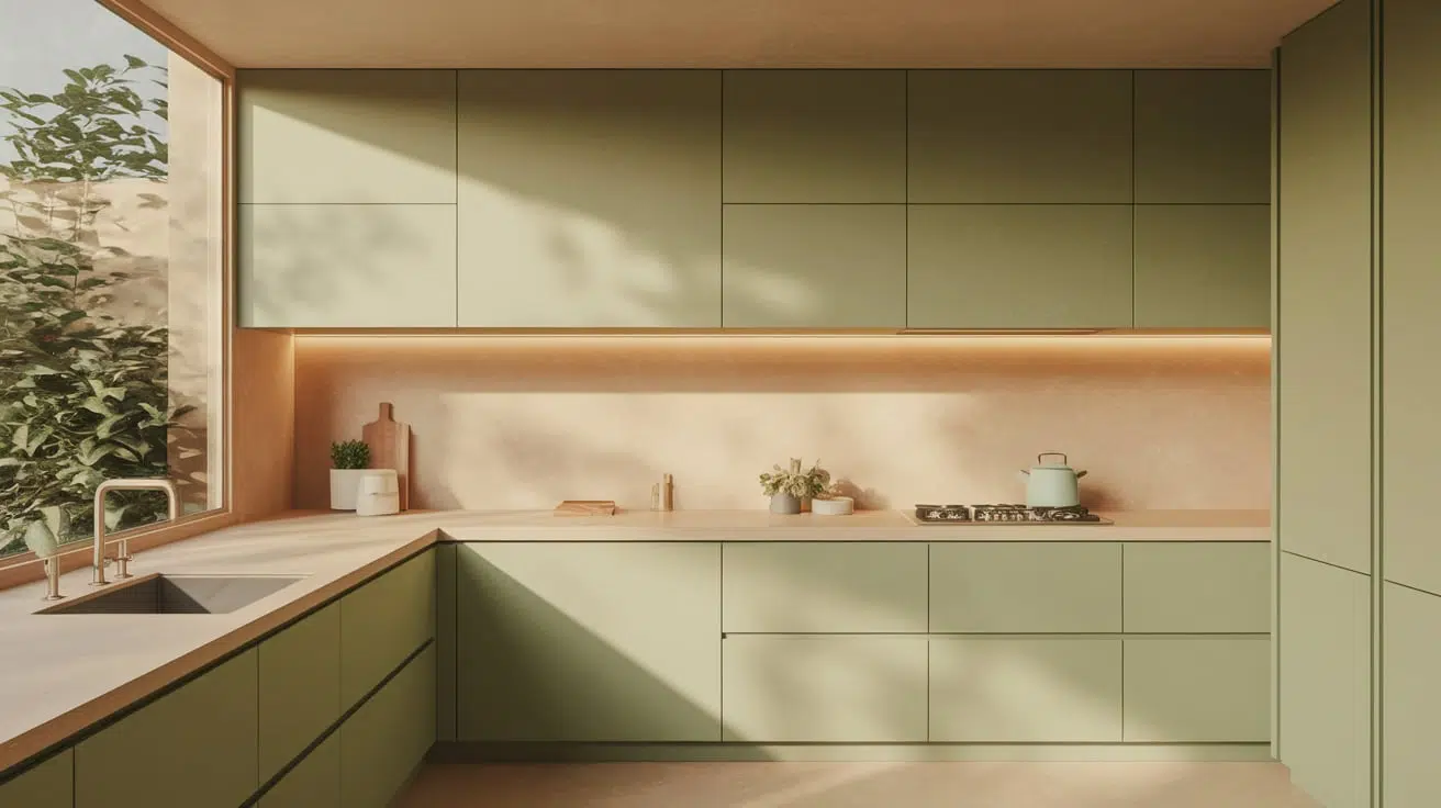
Kitchen
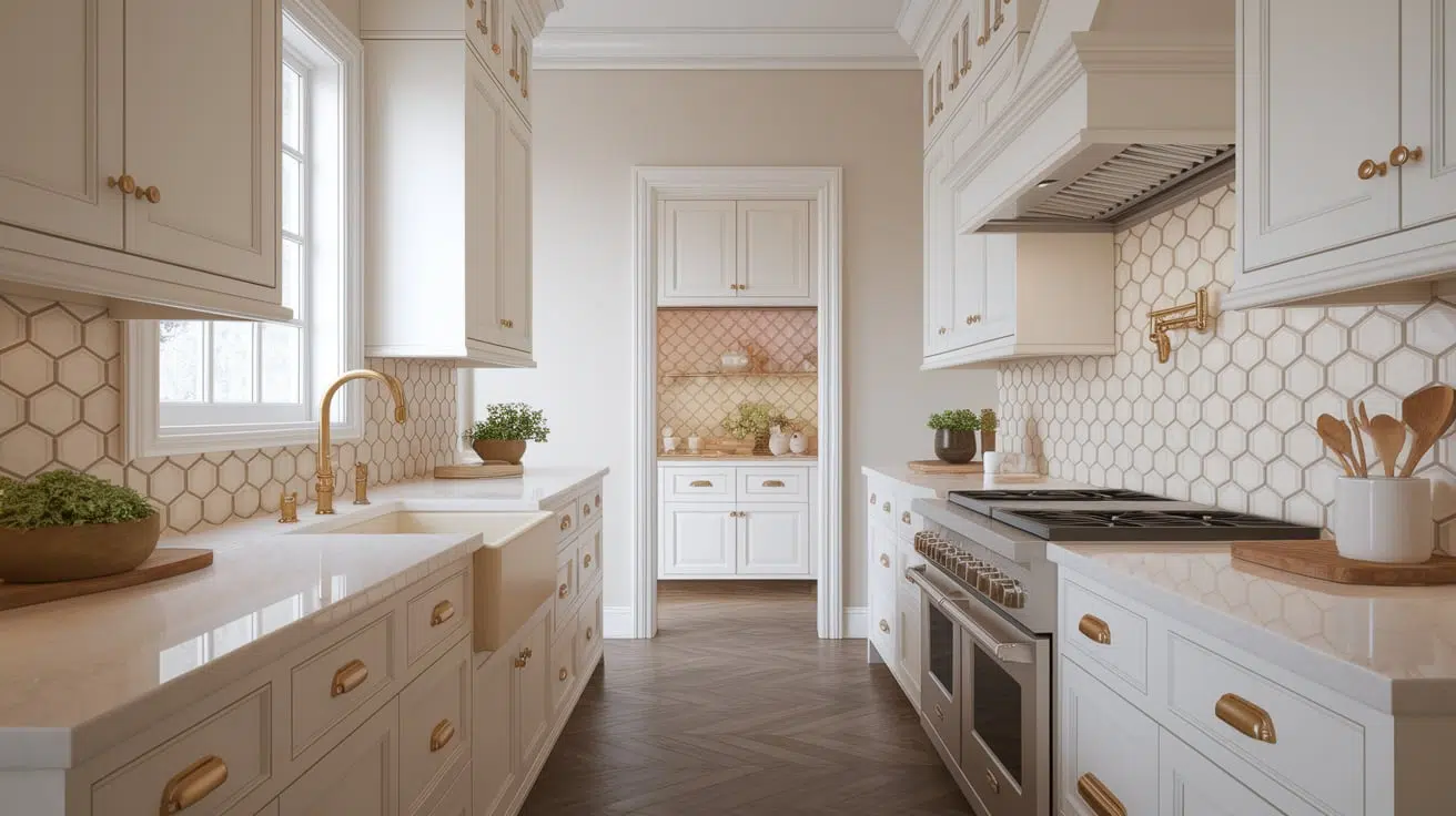
Neutral kitchens feel timeless and clean. Cabinets in white, cream, or light gray create a fresh backdrop that remains timeless.
To add warmth and personality, pair neutral walls or cabinets with wood accents or metal fixtures in brass, black, or stainless steel.
For an added touch ofcharm, consider a patterned tile backsplash. Even a simple geometric design in soft tones can make a big impact in a neutral space.
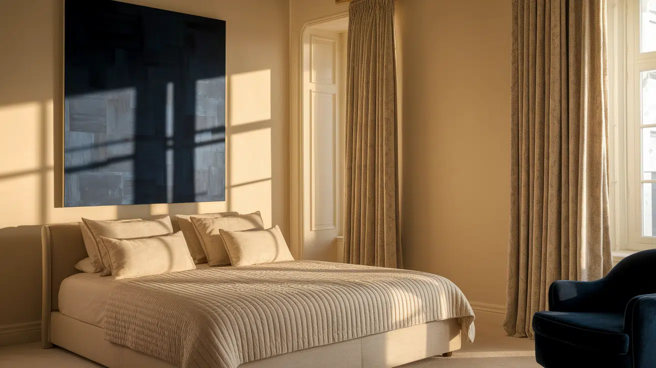
Bedroom
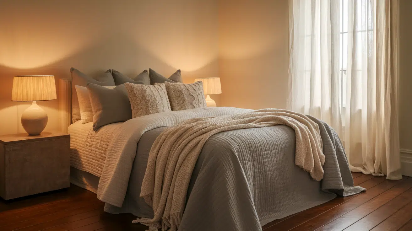
The bedroom is the perfect place to lean into soft, calming neutrals. Select bedding in gentle shades, such as beige, ivory, or pale gray, for a serene appearance.
Creamy wall colors create a warm and relaxing atmosphere. Add cozy lighting, such as soft bedside lamps or warm-toned overhead lights, to bring a sense of calm at the end of the day.
A few layered throw blankets and different textures in the pillows can make the room feel extra inviting.
Bathroom
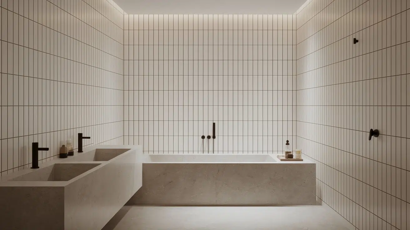
Neutral colors can turn a bathroom into a spa-like retreat.
Crisp whites, soft grays, and natural stone tones create a clean and relaxing atmosphere. Use materials like marble, concrete, or matte tile to bring in subtle texture.
For contrast and personality, try using black or brass hardware. These darker or metallic accents stand out beautifully against a neutral background without overwhelming the space.
Home Office
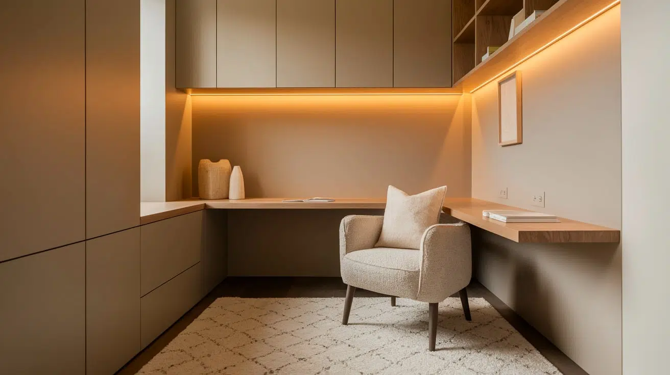
In a home office, neutral tones can help you focus and feel organized. Colors like greige or taupe are perfect for this space because they’re calm but not too bland.
They also adapt well to different lighting throughout the day. Pair neutral walls with wood desks, bookshelves, or floors to add warmth.
I like to add a few soft textures, like a rug or a fabric chair cushion, to keep things cozy without making the space feel too busy.
How Lighting Affects Neutral Colors
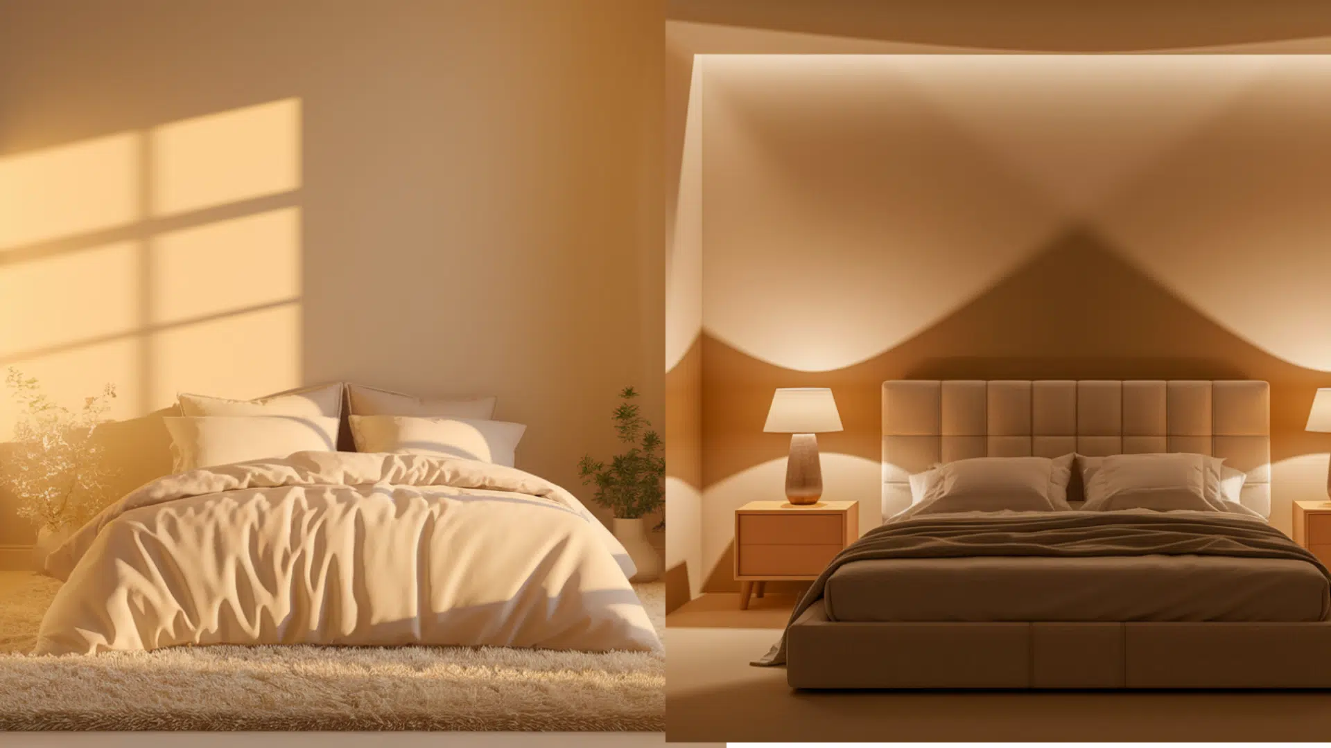
Lighting has a big impact on how neutral colors look in your home. Natural light changes throughout the day. Morning light is cooler and bluish, while afternoon light tends to be warmer and softer.
South-facing rooms get steady sunlight, which helps colors look true, while north-facing rooms often feel dimmer and cooler, making warm neutrals appear slightly gray.
Artificial light matters too. Warm bulbs give off a yellow glow that softens beige and cream but can dull cooler tones.
Cool white or daylight bulbs bring out crisp grays and whites but might make warm colors feel flat.That’s why it’s so important to test paint swatches in your space.
Try patches on different walls and check them in both daylight and at night.
This helps you see how the color behaves and ensures it looks just right in your lighting.
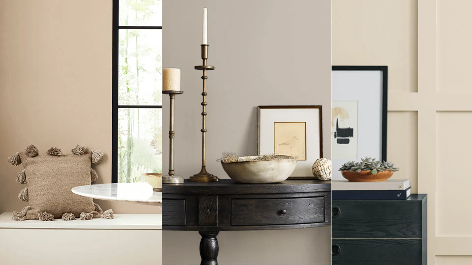
Perfect Neutral Color Combinations
Neutral colors are beautiful on their own, but I’ve found that pairing them thoughtfully makes a space feel classic and fresh. These combos bring the right mix of softness, contrast, and warmth.
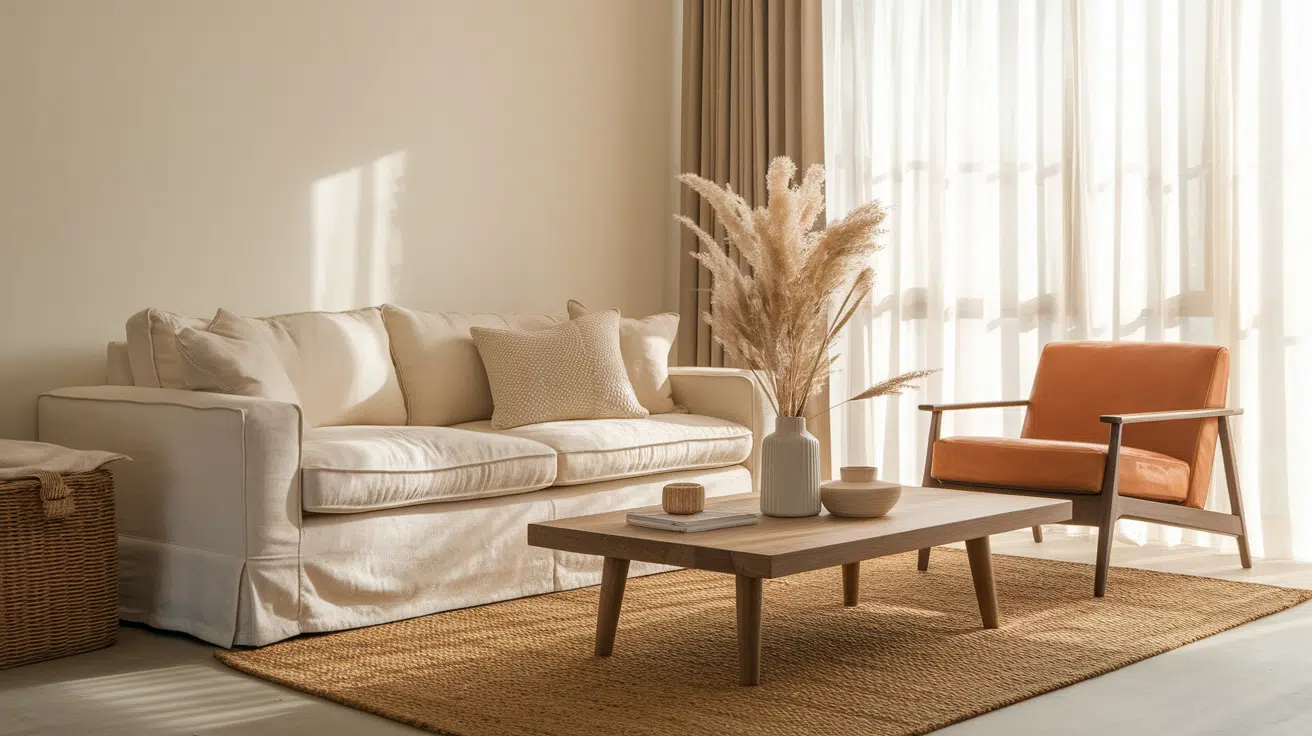
1. White + Wood
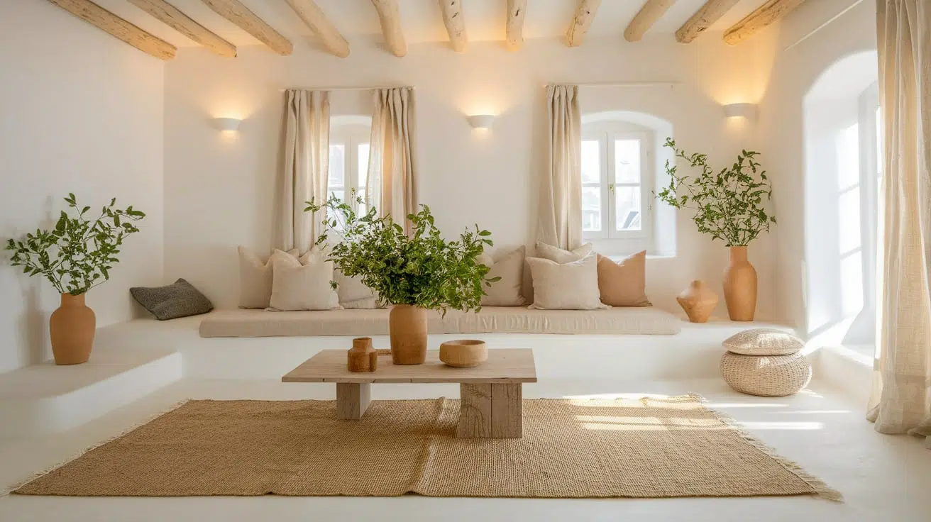
This pairing feels fresh and cozy at the same time. White brightens the space, while natural wood adds warmth, texture, and a grounded feel.
It’s a perfect choice for creating a clean, airy vibe with rustic charm. I love how the mix makes a room feel both relaxed and intentional.
2. Gray + Blush
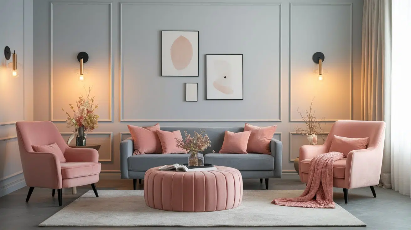
Cool grays paired with soft blush tones create a gentle, modern vibe. It’s a great way to add a hint of color while keeping the room soft and sophisticated.
Use this combo in bedrooms or living rooms for a relaxed, romantic feel. I find it works especially well with cozy textures like knits, velvets, or linen.
3. Cream + Charcoal
Cream keeps things light, while charcoal adds depth and drama. The contrast makes your space feel clean and sharp without feeling harsh.
It works especially well in kitchens or bathrooms with bold finishes. I like how this combo feels both elegant and grounded at the same time.
4. Greige + Black
Greige offers a warm, flexible base, and black accents give it structure. Use this combo to create a balanced, contemporary look with just the right amount of edge.
Black fixtures or trim can give a sleek, modern finish to greige walls.
5.Taupe + Olive Green
This earthy combination feels rich and natural. The green brings a grounded, organic energy that works well in relaxed, cozy rooms.
Add in woven textures or brass for even more warmth. It’s a great way to create a space that feels both calm and connected to nature.
6. Beige + Navy
Classic and crisp, navy adds cool contrast to soft beige. It’s a smart choice for bedrooms, dining rooms, or any space needing a timeless touch.
Navy upholstery or art pops beautifully against beige walls or decor. This combo feels both polished and welcoming, making it easy to live with long-term.
7. Ivory + Soft Sage
Ivory’s warmth pairs beautifully with sage green for a peaceful, nature-inspired vibe. This combo feels light and airy, making it great for kitchens or bathrooms.
Try pairing sage cabinets with ivory counters or backsplash for a fresh look. Soft metals like brushed gold or copper add an extra layer of charm.
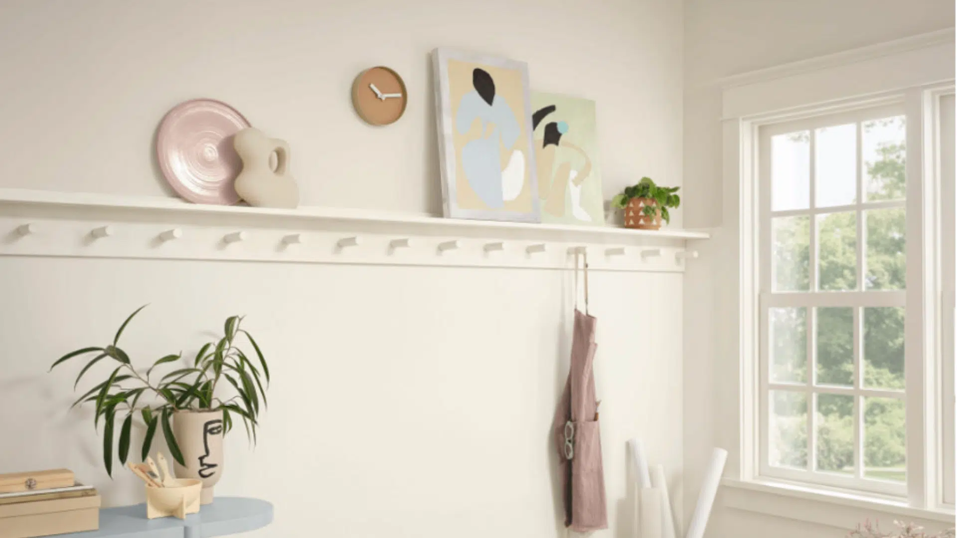
Ways to Keep Neutral Spaces from Feeling Boring
Just because a space is neutral doesn’t mean it has to feel dull. I love how calming and versatile neutrals are, but they can feel plain without the right touches. The good news? It’s easy to add personality and depth without redoing everything.
1. Add Texture:One of the best ways to give neutral rooms personality is by using texture. Think chunky knit throws, woven baskets, linen curtains, natural fiber rugs, or even velvet pillows. These different textures catch the light in unique ways and make the space feel cozy and complete.
2. Use Patterns:Patterns can add visual interest without disrupting a neutral theme. Try subtle options like tone-on-tone prints, herringbone wood floors, or striped throw pillows. These small details bring movement and style.
3. Include Accent Colors:A few pops of color can breathe life into a neutral space. Try adding soft shades like sage green, navy blue, blush pink, or terracotta. These hues complement neutrals well and add a fresh twist to the room.
4. Play with Contrast:Pairing light and dark neutrals is another great way to keep things interesting. These bold pairings add drama without introducing bright or bold colors.
Common Neutral Color Mistakes to Avoid
Neutral colors may seem simple, but using them well takes a little planning. Without the right balance, a neutral space can end up looking flat, mismatched, or too cold.
- Using just one flat color throughout: Sticking to a single shade of beige or gray can make a room feel flat and lifeless. Layering different tones adds depth and interest.
- Ignoring undertones: Neutrals often have subtle undertones like yellow, pink, green, or blue. Mixing clashing undertones can make a space look mismatched without you even realizing why.
- Forgetting about lighting: Lighting affects how neutral colors appear. A soft gray might look icy blue under cool lighting or too warm in a room with yellow bulbs.
- Making it feel too cold or stark: A neutral space without texture, contrast, or warm elements can feel sterile. Add warmth with wood, textiles, and cozy decor.
Conclusion
Neutral colors are a beautiful starting point for any room. They provide a calm, timeless foundation that complementsevery style and season.
When used thoughtfully, neutrals can create a space that feelspeaceful, stylish, and inviting.
The key is to mix tones, play with texture, and add just enough contrast or color to keep things interesting.
Don’t be afraid to experiment. Layer soft shades, bring in natural materials, and see how lighting affects the feel of the room. Whether you love warm beiges or cool grays, there’s a perfect neutral palette for every home.
What’s your favorite way to use neutral colors? Share your go-to combo in the comments – I’d love to hear your ideas!

Alex Guerrero, a graduate with a Fine Arts degree from the Rhode Island School of Design, has been a visionary in the world of color and design for over 15 years. His professional journey began in the heart of the fashion industry in Milan, where he developed an acute sense for color harmonies and trends. Alex joined our team in 2018, offering fresh and innovative perspectives on color utilization in various spaces. Renowned for his ability to blend contemporary trends with timeless elegance. Outside of work, Alex is an accomplished painter and a volunteer art therapist, his artistic talents further enriching his professional insights.