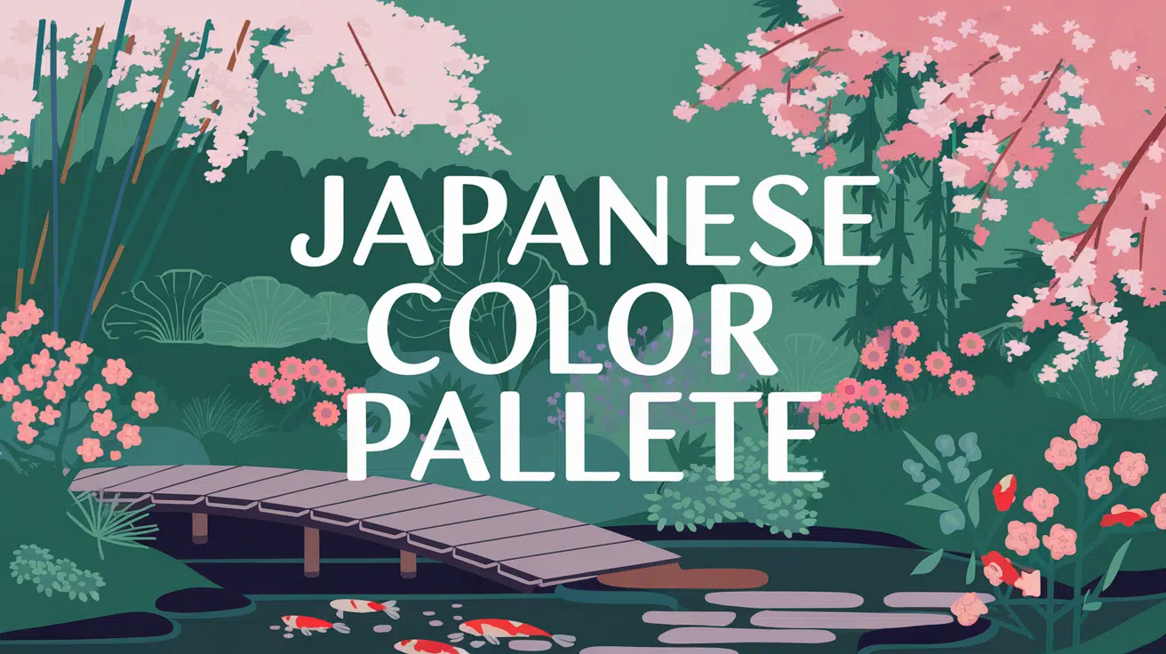
Imagine stepping into a world where every color tells a story – welcome to the beautiful world of the Japanese color palette.
From the delicate pink of cherry blossoms to the profound black of Sumi ink, these colors aren’t just shades on a spectrum; they’re windows into centuries of Japanese culture and design philosophy.
Born in the rich Edo period, nature’s ever-changing canvas inspired these traditional colors (dentouiro).
They created a refined palette that continues to charm designers worldwide. This color system’s growth from ancient kimono workshops to modern digital studios makes it remarkable.
These timeless shades are experiencing a revival in modern design. They offer a perfect blend of cultural depth and modern style.
If you’re a designer seeking inspiration or simply curious about Japanese culture, this palette opens doors to a world where every color carries meaning.
Understanding the Japanese Color Palette
1. Historical Background

Japanese traditional colors (dentouiro) have deep roots in everyday life, dating back to the Edo period. These colors weren’t randomly chosen—they’re inspired by nature, from cherry blossom pinks to bamboo forest greens.
These shades are found in everything from ancient kimonos to temple crafting art, showing how Japanese artisans turned nature’s palette into standardized colors that still appeal to design today.
Each shade tells a story of Japan’s rich cultural heritage and deep connection to the natural world.
2. Color Significance

Japanese colors each carry their meaning and seasonal connections. Nezumi-iro (mouse-colored grays) became popular in the Edo period as a graceful alternative to standard grays.
The color system flows with the seasons
- Spring’s sakura pinks
- Summer’s cooling blues
- Autumn’s warm browns
- Winter’s stark whites and grays
It’s charming how each color was chosen for its beauty and ability to express subtle changes in nature and emotion.
3. Modern Usage

These traditional colors are finding new life in modern design. Thanks to digital tools like NIPPON COLORS, designers can easily access and incorporate these historical shades into modern projects.
You’ll see these effects everywhere, from minimalist interiors to fashion. What’s cool is how these ancient color choices still feel fresh and relevant in today’s design world.
4. Practical Applications

Incorporating Japanese colors into your space doesn’t have to be complicated. Start with simple accents, such as cushions or artwork featuring traditional shades.
The NIPPON COLORS website makes finding authentic Japanese colors and their exact codes easy.
Whether planning a full room makeover or adding subtle touches, these naturally pleasant colors can bring a sense of calm and balance to any space.
39 Best Shades of Japanese Color Palette
1. Sakura Pink

Sakura Pink is inspired by the cherry blossoms that are popular in Japan. These blossoms cover the landscapes in soft pink each spring, celebrated across the country with outdoor gatherings and festivities beneath the blooming trees.
Color code: #E9B4A6
2. Nippon Blue

Nippon Blue is deep and similar to the ocean surrounding the Japanese islands. It is a common color in traditional Japanese indigo dyeing, valued for its deep hue and graceful fade over time.
Color code: #27476E
3. Fuji White

Fuji White brings to mind the snowy peak of Mount Fuji, Japan’s hiJapan’sountain and a cultural symbol. On clear days, its white top is visible from Tokyo, representing purity and calm in Japanese tradition.
Color code: #EAEAEA
4. Matcha Green
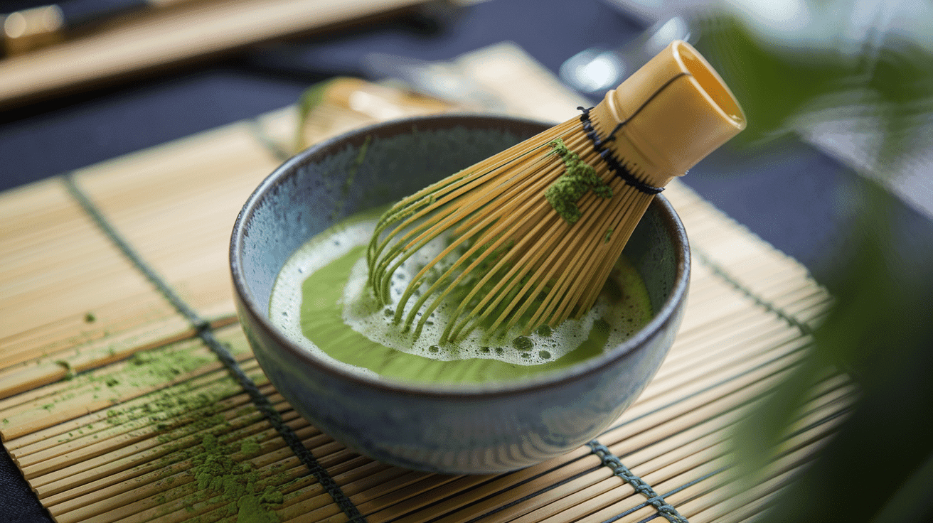
Matcha Green is bright and inspired by the finely ground matcha tea used in traditional Japanese tea ceremonies. This shade symbolizes health and well-being, reflecting the cultural importance of matcha in Japan.
Color code: #91C788
5. Koi Orange

Koi Orange mirrors the lively orange of the koi fish found in traditional Japanese ponds. These fish are admired for their long life and strength, and this color captures their striking appearance.
Color code: #F9AA7D
6. Ginkgo Yellow

Ginkgo Yellow is inspired by the bright yellow leaves of ginkgo trees, which turn lively in the autumn. These trees line many streets and parks in Japan and are known for their beauty and longevity.
Color code: #FBC02D
7. Tatami Beige

Tatami Beige is a warm, earthy beige taken from the color of traditional tatami mats found in Japanese homes. These mats are used for seating and sleeping and are essential to the classic Japanese interior.
Color code: #D8B98B
8. Sumi Ink

Sumi Ink is a rich black inspired by the Sumi ink used in Japanese calligraphy and painting. This deep, saturated black is integral to much Japanese art, representing depth and intensity.
Color code: #1A1A1A
9. Wisteria Purple

Wisteria Purple is soft and named after the hanging wisteria flowers often found in Japanese gardens. These flowers are celebrated for their beauty and are associated with spring.
Color code: #9771B5
10. Torii Red

Torii Red is the vermillion red found in Japan’s torii gates of Shinto shrines. These gates are traditionally painted red to ward off evil spirits and welcome visitors to the sacred spaces.
Color code: #BA4731
11. Zen Gray

Zen Gray is a soft gray inspired by the smooth stones used in Japanese Zen gardens. These gardens are places of meditation designed to promote calmness and mindfulness.
The subtle gray of the socks provides a backdrop that encourages peace and simplicity in one’s surroundings.
Color code: #787878
12. Bamboo Green

Bamboo, a vital green plant deeply implanted in Japanese culture, inspires Bamboo Green. Bamboo is used in everything from construction to culinary arts, and this energetic shade of green mirrors its energy and utility in Japanese tradition.
Color code: #6E8B3D
13. Ryokucha Olive
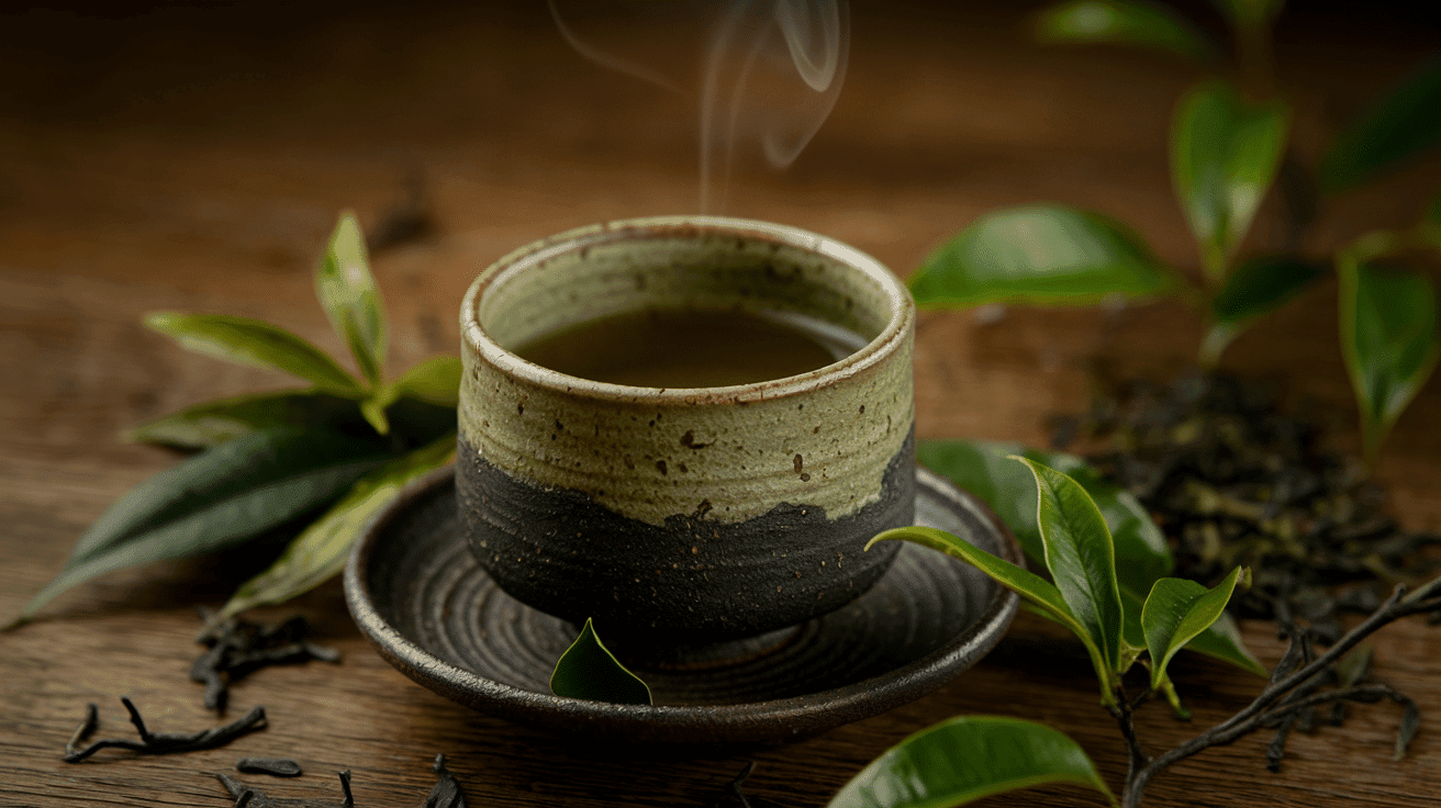
The color of brewed Japanese green tea inspires Ryokucha Olive. This deep olive green evokes a sense of warmth and earthiness, similar to green tea’s comforting and healthful qualities.
Green tea is a staple in Japanese daily life.
Color code: #556B2F
14. Yuzu Yellow

Yuzu Yellow captures the lively shade of the yuzu fruit, a citrus widely utilized in Japanese cuisine for its distinctive tart flavor.
This bright, inviting yellow symbolizes freshness and vitality, reflecting the fruit’s fruit’s taste and aroma.
Color code: #FCD12A
15. Indigo

Indigo, a rich, deep blue, has a long history in Japanese fabric dyeing. It is known for its ability to fade beautifully with age while maintaining its deep essence.
This color symbolizes durability and the timeless beauty of Japanese artisanal crafts.
Color code: #264348
16. Rice White

Rice White is a subtle off-white, reflecting the staple of Japanese cuisine: rice. This color symbolizes nourishment and purity, which are fundamental to Japanese culinary traditions and basic yet essential elements of daily life.
Color code: #FFFFEF
17. Umber Brown

Umber Brown is inspired by the earthy tones found in traditional Japanese pottery.
This deep, rich brown stimulates the warmth and organic quality of clay, reflecting the centuries-old craftsmanship involved in Japanese ceramics.
Color code: #635147
18. Tofu Cream

Tofu Cream is a light cream color similar to freshly made tofu, an essential ingredient in Japanese cooking. This shade suggests simplicity and nature, highly valued in Japanese cuisine.
Color code: #F0EAD6
19. Shogun Gold

Shogun Gold is a regal gold inspired by the opulent armor worn by Japanese Shoguns. This bright, powerful color symbolizes authority and strength, reflecting the historical significance of the Shogun in Japanese society.
Color code: #B8860B
20. Sake Silver

Sake Silver is subtle, reflecting the light color of sake served in traditional porcelain cups.
This shade represents the refinement and formal importance of sake in Japanese culture, suggesting celebration and sincerity.
Color code: #C0C0C0
21. Moss Green

Moss Green is inspired by the lush moss that blankets Japanese gardens, creating a deep, passionate green carpet. This color is integral to Japanese garden design, symbolizing calmness and the enduring nature of growth.
Color code: #8A9A5B
22. Tsunami Navy

Tsunami Navy is a deep navy blue similar to the powerful and majestic seas surrounding Japan. This color conveys the strength and mystery of the ocean, which is often celebrated and respected in Japanese culture.
Color code: #003366
23. Cherry Blossom Mauve

Cherry Blossom Mauve captures the delicate mauve tones of cherry blossom petals. These gentle colors symbolize life’s beauty and are celebrated each spring during the cherry blossom festivals across Japan.
Color code: #F7CFE1
24. Wasabi Green

Wasabi Green is a bright, sharp green inspired by the pungent and spicy wasabi paste used in Japanese cuisine. This color symbolizes the bold flavors and vitality found in traditional Japanese dishes.
Color code: #8F9779
25. Kimono Violet

Kimono Violet is a rich violet seen in many luxurious kimonos. This color represents the grace and cultural significance of the kimono, a traditional Japanese garment that symbolizes grace and history.
Color code: #5B3256
26. Azuki Red

Azuki Red is a deep red, similar to the color of azuki beans, a key ingredient in many Japanese sweets. This rich shade signifies warmth and sweetness, reflecting the comforting qualities of traditional Japanese desserts.
Color code: #7B3F00
27. Emperor Orange

Emperor Orange is a bold orange that reflects the brilliance of the imperial robes worn by Japanese emperors. This striking shade represents power and prestige in Japanese culture.
Color code: #F47A1F
28. Lotus Pink

Lotus Pink is a soft pink inspired by the lotus flowers often found in Japanese ponds. This color symbolizes refinement and purity, reflecting the spiritual significance of the lotus in Buddhism.
Color code: #E4B5B3
29. Sky Blue

Sky Blue reflects the clear, expansive sky of a Japanese summer. This calming color is similar to peaceful days and the boundless potential of the sky above.
Color code: #87CEEB
30. Pearl Gray

Pearl Gray is a gentle gray with a hint of luster, much like the inside of a pearl shell. This refined shade is understated yet graceful, suitable for calm and refined spaces.
Color code: #D9E0E3
31. Tea Brown

The rich, warm hue of brewed Japanese tea inspires Tea Brown. This comforting shade is principal in traditional Japanese tea ceremonies, symbolizing hospitality and the art of tea preparation.
Color code: #635147
32. Nightingale Tan

Nightingale Tan is a pale tan inspired by the famous nightingale floors in Japanese castles and temples. These floors were designed to chirp like nightingales when walked upon, serving as a security measure.
The color signifies subtlety and originality.
Color code: #F4C2C2
33. Seaweed Green

Seaweed Green is a dark, rich green of the seaweed used in Japanese cuisine. This deep green suggests health and the ocean’s climax elements in Japanese food culture.
Color code: #293D26
34. Crane White

Crane White is a pure white inspired by the Japanese crane, a bird symbolizing luck and longevity in Japanese culture. Like the revered crane, this color represents purity and grace.
Color code: #FFFFFF
35. Samurai Black

Samurai Black is a deep, intense black, akin to the armor worn by samurai in feudal Japan. This color symbolizes strength, discipline, and the rich history of the samurai.
Color code: #0D0D0D
36. Pagoda Red

Pagoda Red is a bright, lively red found in the ruins of traditional Japanese pagodas. This color symbolizes protection and spiritual strength, key aspects of pagoda symbolism.
Color code: #C80815
37. Ginger Yellow

Ginger Yellow is a warm, inviting yellow inspired by the color of pickled ginger. This shade is associated with zest and vitality, reflecting Japanese cuisine’s sharp taste and health benefits.
Color code: #FFCB05
38. Coral Orange

Coral Orange is energized and inspired by the coral reefs found around the Japanese islands. This bright orange reflects the lively and colorful underwater world, symbolizing energy and natural beauty.
Color code: #FF7F50
39. Glacier Blue

Glacier Blue is a cool, crisp blue inspired by the winter ice festivals in Japan, where sculptures and structures are carved from ice. This shade captures the clarity and coolness of ice, evoking a sense of serene beauty.
Color code: #B3C4D8
Conclusion
Through our exploration of Japan’s color heritage, we’ve witnessed how these unique shades have bridged the gap between ancient traditions and modern style.
Each color, from the ghostly whites to the deepest indigos, carries its narrative while maintaining its power to change modern spaces and designs.
Take these colors beyond inspiration – recast them into your creative companions. Mix Matcha Green with Pearl Gray for calm spaces, or pair Torii Red with Rice White for striking designs.
The possibilities unfold before you like an artist’s blank canvas waiting to be filled.
Find your creativity with the full range of Japanese colors, where you’ll find precise codes and combinations to fuel your next project.
Start your color experience today and watch these timeless shades breathe new life into your creative attempts.

Alex Guerrero, a graduate with a Fine Arts degree from the Rhode Island School of Design, has been a visionary in the world of color and design for over 15 years. His professional journey began in the heart of the fashion industry in Milan, where he developed an acute sense for color harmonies and trends. Alex joined our team in 2018, offering fresh and innovative perspectives on color utilization in various spaces. Renowned for his ability to blend contemporary trends with timeless elegance. Outside of work, Alex is an accomplished painter and a volunteer art therapist, his artistic talents further enriching his professional insights.