Modern spaces demand color schemes that feel both current and classic. Fall color palette offers exactly that balance, combining cozy, grounded tones with modern appeal.
These seasonal hues work year-round in homes and design projects, creating spaces that feel inviting without relying on trendy shades that quickly go out of style.
This blog breaks down how to use fall color palettes in real-world design scenarios.
From selecting the right combinations to understanding which spaces benefit most from these tones, you’ll find practical approaches that translate directly into confident color decisions for any modern interior.
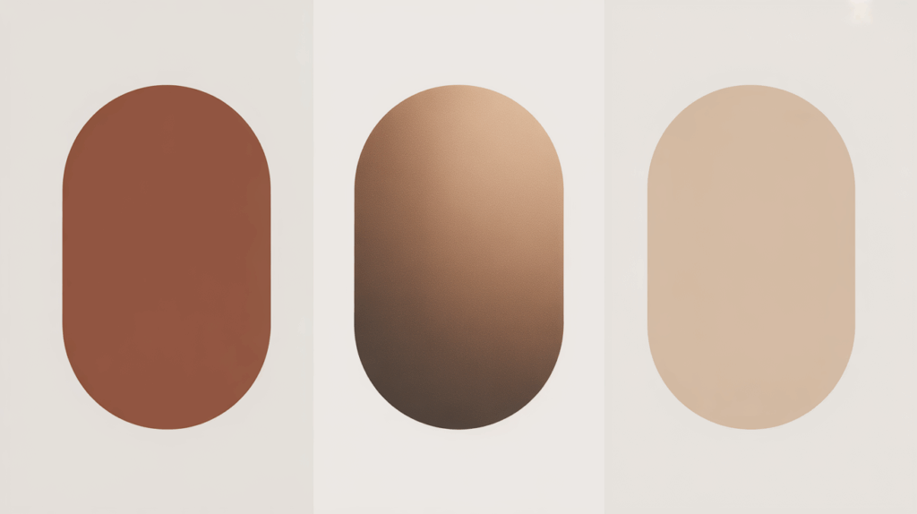
Curated Fall Color Palette for Modern Inspiration
The right fall color codes set the tone for your entire project. These curated combinations pull from different facets of autumn, each offering a distinct mood and application.
Some lean soft and understated, others welcome boldness, and a few go deep and moody. Use them as starting points or apply them directly to your designs.
Calm Autumn
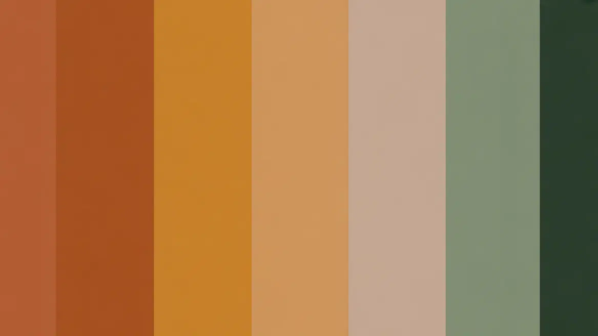
1. Muted Harvest

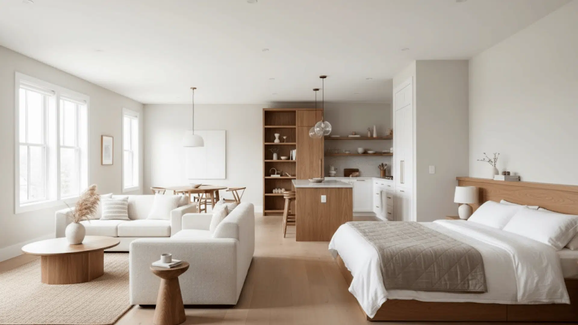
Soft terracotta meets soft beige and sage green. This palette captures autumn’s essence without the intensity, making it perfect for bedrooms or reading nooks where relaxation is key.
2. Linen and Clay

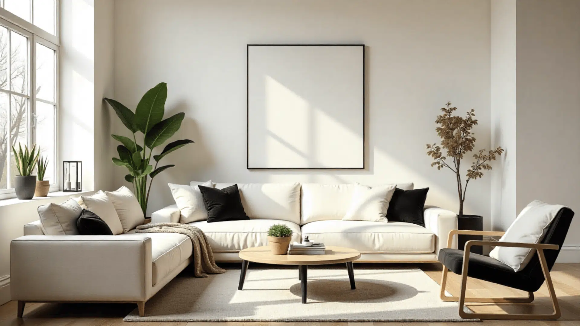
Cream, dusty rose, and pale rust create a breathable combination. It feels collected rather than decorated, ideal for small spaces that need just a touch of softness.
3. Gentle Spice

Cinnamon blush, oatmeal, and soft camel offer subtle comfort. This works beautifully in open-plan spaces where you want color without creating visual barriers.
4. Pale Persimmon

Washed orange, ivory, and light taupe keep things airy. Great for small spaces that need light but can’t handle dark or saturated tones.
5. Stone and Sunset

Greige, peach undertones, and soft white blend smoothly. This palette supports Scandinavian or modern styles where simplicity rules.
6. Quiet Copper

Faded copper, cream, and soft grey create understated sophistication. Perfect for kitchens or bathrooms where you want a metallic touch without high shine.
7. Almond Grove

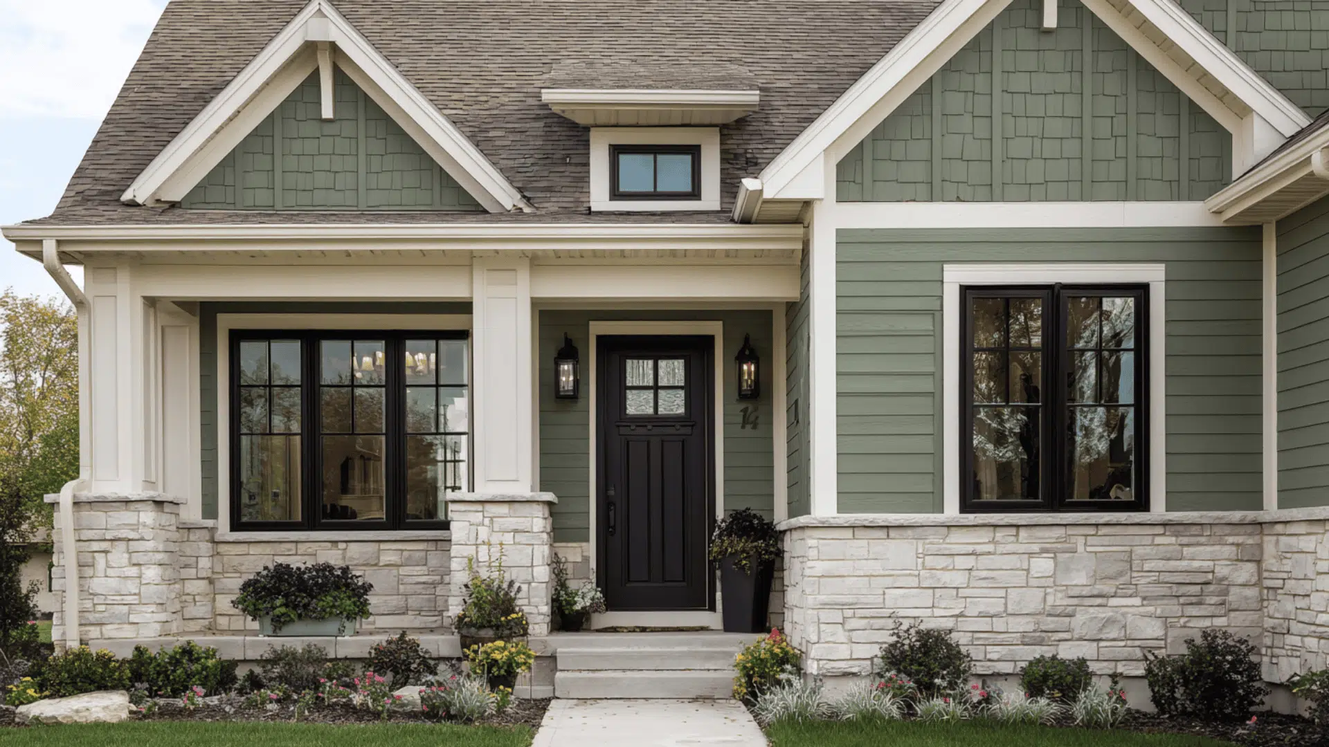
Inviting almond, pale olive, and off-white feel organic and grounded. This combination works well in spaces with abundant natural light and wood accents.
8. Hushed Marigold

Mellow gold, sand, and gentle grey bring cheer without noise. Ideal for home offices or creative studios that need energy but not distraction.
Copper Autumn
9. Burnt Sienna Mix

Rich burnt orange, chocolate brown, and cream deliver classic fall impact. This palette anchors living rooms or dining spaces with a confident tone.
10. Rustic Ember

Deep terracotta, cozy oak tones, and ivory create a sense of inviting comfort. Works particularly well in spaces with brick or exposed wood elements.
11. Amber Glow

Golden amber, rust, and soft black provide a striking contrast. Perfect for accent walls or statement furniture pieces that need to command attention.
12. Twilight Harvest

Deep burgundy, black, brown, and muted gold finish strongly. This palette brings fall’s richness into evening-focused spaces, such as dining rooms or wine cellars.
13. Spiced Copper

Cinnamon red, metallic copper, and tan create a sense of dimensional tone. Excellent for layered textile applications, such as throws, pillows, and window treatments.
14. Clay and Bronze
Earthy clay, bronze metallic, and beige bring artisan quality. This palette supports spaces with handmade or craft-focused design elements.
15. Persimmon Punch

Vibrant persimmon, copper, and cream make a bold statement. Use this in spaces where you want fall color to take center stage.
16. Toasted Almond

Cozy almond, copper accents, and ivory create a refined yet approachable feel. Great for transitional spaces that bridge traditional and modern styles.
Dark Autumn
17. Midnight Forest

Deep forest green, charcoal, and burgundy create a moody complexion. This palette works beautifully in libraries, dens, or cozy lounges.
18. Espresso and Wine

Dark brown, wine red, and black deliver dramatic depth. Perfect for spaces that call for an intimate, enveloping atmosphere.
19. Stormy Plum

Eggplant, slate grey, and deep rust offer unexpected richness. This combination suits modern spaces that aren’t afraid of saturated color.
20. Ink and Ember

Navy black, burnt orange, and charcoal provide striking tension. Ideal for accent features or architectural details that need emphasis.
21. Shadow Olive

Deep olive, espresso, and rust create grounded grace. This palette supports spaces with vintage or industrial design elements.
22. Blackened Copper

Near-black with copper undertones, rust, and grey feels edgy and refined. Perfect for bachelor pads or urban lofts with a masculine lean.
Smart Ways to Use a Fall Color Palette in Modern Projects
Knowing the palettes is one thing. Applying them effectively is another. These strategies help you integrate fall tones into modern spaces without making them feel themed or seasonal.
The goal is a lasting design that happens to draw from autumn’s best colors.
- Start with one dominant tone – Choose a single fall color as your anchor and build around it with neutrals, letting that one shade do the heavy lifting without overcrowding the space.
- Layer textures in similar tones – Use varying materials like velvet, linen, and leather in the same color family to add depth and interest without introducing more colors.
- Balance soft and cool – Pair fall’s soft tones with cooler greys or blacks to keep spaces from feeling too cozy or dated, maintaining a modern edge.
- Use fall colors as accents – Apply bold autumn shades to 20% of the space through pillows, art, or accessories while keeping walls and large furniture neutral for flexibility.
Mixing and Creating Your Own Fall Palette
You don’t have to stick strictly to pre-made combinations. Creating your own fall palette lets you match your specific project needs and personal style.
Start by selecting one hero color from the fall spectrum, maybe a burnt orange or deep olive. Then add a neutral that either softens it up or cools it down, depending on your goal.
From there, introduce one accent color for contrast. This could be a darker shade for drama or a lighter one for breathing room.
Test your combination in small samples first. Paint swatches on poster board and live with them for a few days in different lighting conditions. The colors that still feel right after a week are worth committing to in your space.
Finishing it Up
A fall color palette gives you a reliable foundation for spaces that feel complete and intentional.
These aren’t colors that need perfect timing or trend awareness; they simply work.
It doesn’t matter if you lean toward muted tones, rich coppers, or moody darks; the principle stays the same: choose with purpose and apply with restraint.
Start with one palette from this guide and adapt it to your project’s specific needs.

Alex Guerrero, a graduate with a Fine Arts degree from the Rhode Island School of Design, has been a visionary in the world of color and design for over 15 years. His professional journey began in the heart of the fashion industry in Milan, where he developed an acute sense for color harmonies and trends. Alex joined our team in 2018, offering fresh and innovative perspectives on color utilization in various spaces. Renowned for his ability to blend contemporary trends with timeless elegance. Outside of work, Alex is an accomplished painter and a volunteer art therapist, his artistic talents further enriching his professional insights.