When you walk into a room, what do you notice first? For many, it’s not the wall color, it’s the trim.
Contrasting paint trim has become a fast-growing trend, and for good reason.
It offers an easy, affordable way to highlight architectural features and personalize a space.
From deep charcoals to warm wood tones, the options are endless.
In this guide, we’ll explain how to use this trend to make your home feel more thoughtful, stylish, and completely your own.
Why Contrasting Trim Paint Is Gaining Popularity
Contrasting trim paint is becoming more popular because it adds style and personality to any room without much effort.
Instead of blending in, the trim stands out, framing walls, windows, and doors with clean lines or bold color.
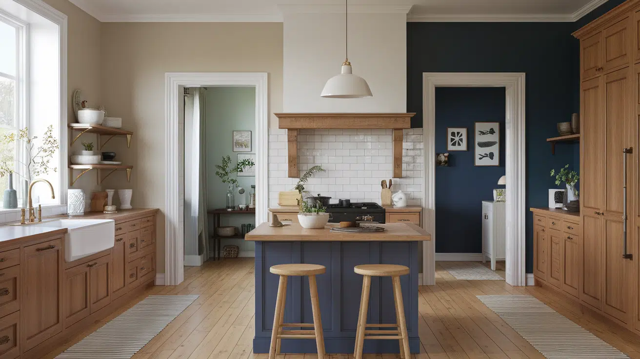
Homeowners love how it highlights architecture and makes colors pop. For example, pairing crisp white trim with navy or deep green walls can instantly modernize a space.
On the other hand, using a darker trim with light walls creates a cozy, dramatic effect. It’s also a great way to update older wood trim without replacing it.
Best of all, this trend works in any room – from kitchens to bedrooms – and suits many styles, from modern to farmhouse. It’s simple, stylish, and effective.
How to Choose the Right Wall and Trim Colors
This part can make or break the look. Getting the color balance right between your walls and trim sets the tone for the entire space.
1. High Contrast vs. Soft Contrast
Not all contrasts need to be dramatic. A black-and-white combo is bold and graphic, while soft contrasts, like greige walls with olive trim, create a calmer mood.
Think about how much impact you want to make and how the room will be used.
For example, a soft contrast may be better for a bedroom or reading nook, while high contrast works well in an entryway or home office where visual impact is welcome.
2. Understanding Undertones and Color Families
When choosing colors, pay attention to undertones. A beige wall with yellow undertones might clash with a trim color that has cool, blue undertones.
Look for shades that either match or complement each other in temperature and mood.
3. Best Paint Sheens for Trimwork
Trim often looks best in a semi-gloss or satin finish. These sheens are more durable, easier to clean, and reflect light in a way that subtly highlights the trim.
Walls, on the other hand, are usually best in matte or eggshell.
Should Trim Be Darker or Lighter Than Walls?
There’s no one-size-fits-all answer here. The right choice depends on the mood you’re going for and how much contrast you want to see.
1. When to Choose Dark Trim for a Bold Look:
- Dark trim is dramatic and grounding. It adds sophistication and makes a strong design statement.
- Use it in rooms where the trim is the hero, such as a dining room, entryway, or office.
2. Using Lighter Trim for an Airy Feel:
- Light-colored trim, like cream or pale gray, can still create contrast when paired with deeper walls.
- This combo keeps the room feeling open and inviting while still offering definition.
3. Matching Mood to Color Depth
- Want a moody room? Go with darker trims.
- Prefer something fresh and bright? Lighter tones may be the better choice.
Consider how you want each room to feel, and let that guide your color decisions.
How Wallpaper, Mood, and Dark Trim Work Together
Painting trim darker than the walls has become a popular way to add style and definition to any room. When combined with wallpaper, this pairing can change not just the look of the space, but the overall mood too.
Dark Trim Adds Contrast
Darker trim creates a strong outline that draws attention to the shape and layout of the room. Unlike white or light trim, which blends in, dark trim stands out and makes walls look more structured.
This works exceptionally well when walls are light or patterned. It adds depth and makes features like doorways, windows, and baseboards pop.
You can use colors like deep navy, charcoal, or even black for a rich, modern feel. It also hides dirt better, which is a nice bonus in high-traffic areas.
Wallpaper Sets the Mood
Wallpaper brings texture, color, and pattern into a room in a way paint alone can’t. Whether you go for soft florals, bold stripes, or geometric shapes, wallpaper can help set the tone – calm, playful, dramatic, or cozy.
When paired with dark trim, the wallpaper feels more intentional and anchored. The dark outline helps prevent the space from feeling too busy or overwhelming.
It frames the wallpaper, giving it a cleaner, more polished look. This is especially helpful in small spaces like bathrooms or offices, where you want a big style impact in a compact area.
They Work Best Together
When you mix wallpaper and darker trim, you’re creating a layered look that feels both timeless and trendy.
The wallpaper draws people in with its design, while the trim quietly supports the room’s shape and structure. This combination works well in many styles—modern, farmhouse, vintage, or eclectic.
Even if the rest of your décor is simple, this pairing makes the room feel finished and thoughtfully designed. It’s a smart way to refresh a space without changing everything.
Real-Life Examples of Painting Trim Darker Than Walls
Seeing real-life pairings can spark ideas. These examples show how different trim colors completely change the feel of a room.
1. Amp Up Architectural Interest
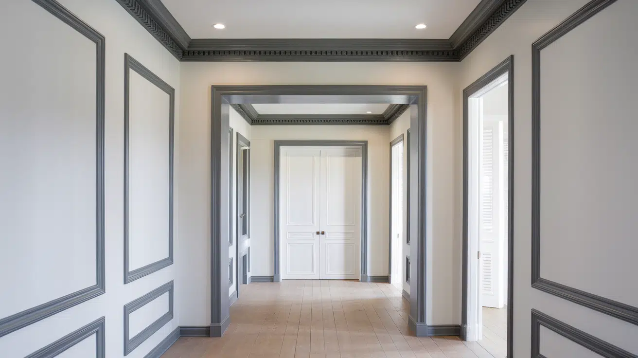
Painted trim can highlight the structure of your home, especially if you have detailed crown molding, wainscoting, or paneled doors.
It helps define each area and brings attention to the craftsmanship that might otherwise go unnoticed.
A deeper shade draws the eye and gives these elements a custom feel, even in newer builds. It can also create a sense of balance when paired with lighter walls or bold wallpaper.
2. Two Shades of the Same Color
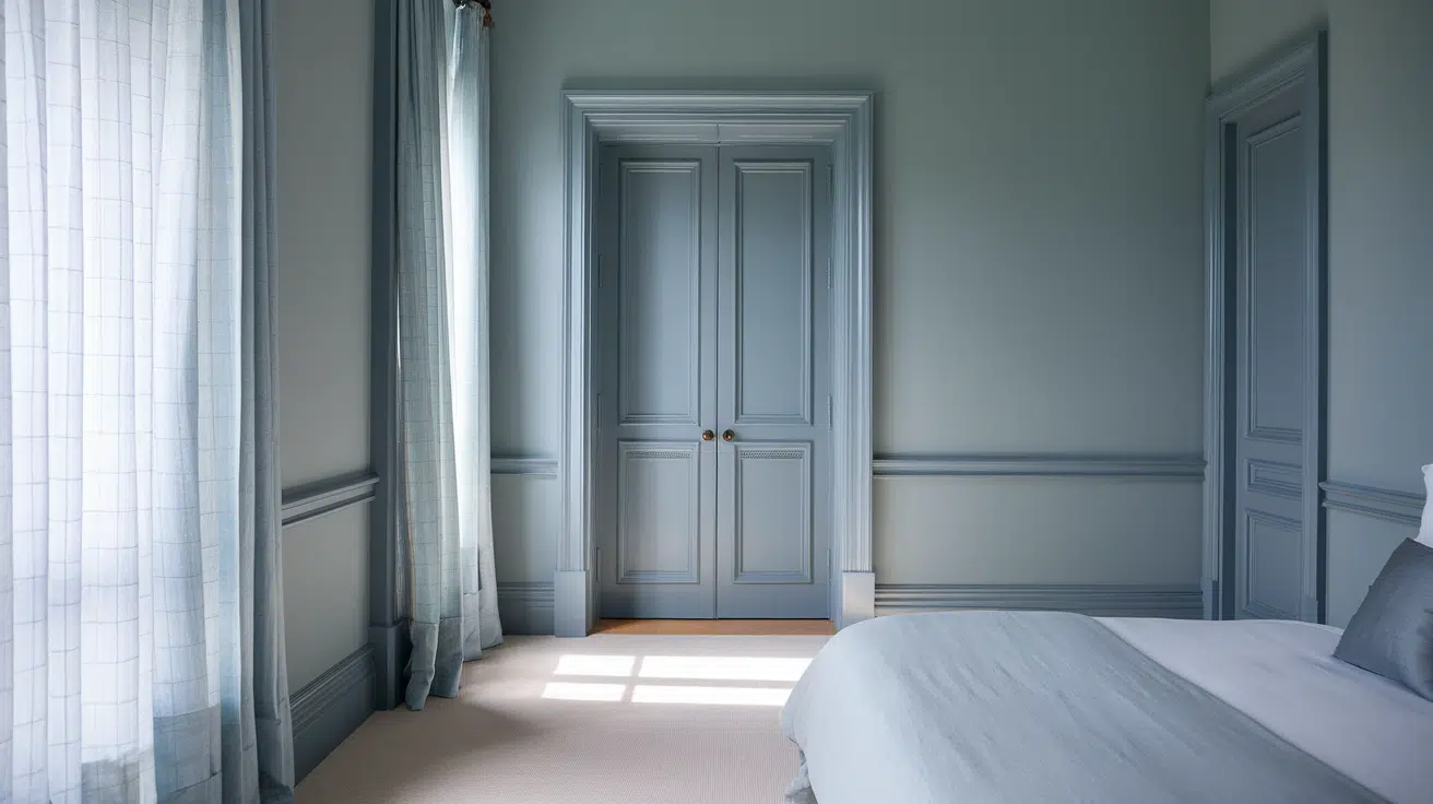
A soft blue-gray wall with a darker steel-blue trim creates a layered, tonal effect that’s easy on the eyes. The colors stay within the same family, so the look feels calm and cohesive instead of busy or loud.
This is a great option if you want contrast without strong visual disruption. It’s subtle, but still adds polish, and it works well in bedrooms, bathrooms, or any space where you want a relaxed vibe.
3. Two-Tone Board and Batten
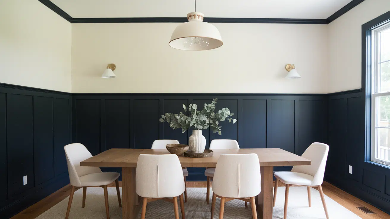
Painting the lower board and batten in a darker color and the upper wall a lighter tone adds depth and dimension.
This works well in entryways, powder rooms, or dining rooms. It’s a design feature that feels high-end but is easy to DIY.
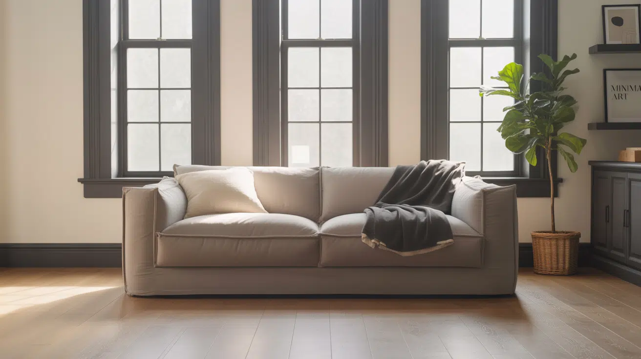
4. Dark Trim with Light Walls
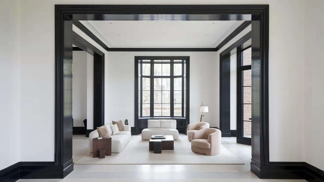
White walls with black, navy, or espresso trim offer classic contrast. The deep tones create crisp lines against the light backdrop, bringing definition and visual strength to the space.
This timeless look adds structure and boldness to minimalist spaces. It never feels overdone and works across many styles – from modern to traditional.
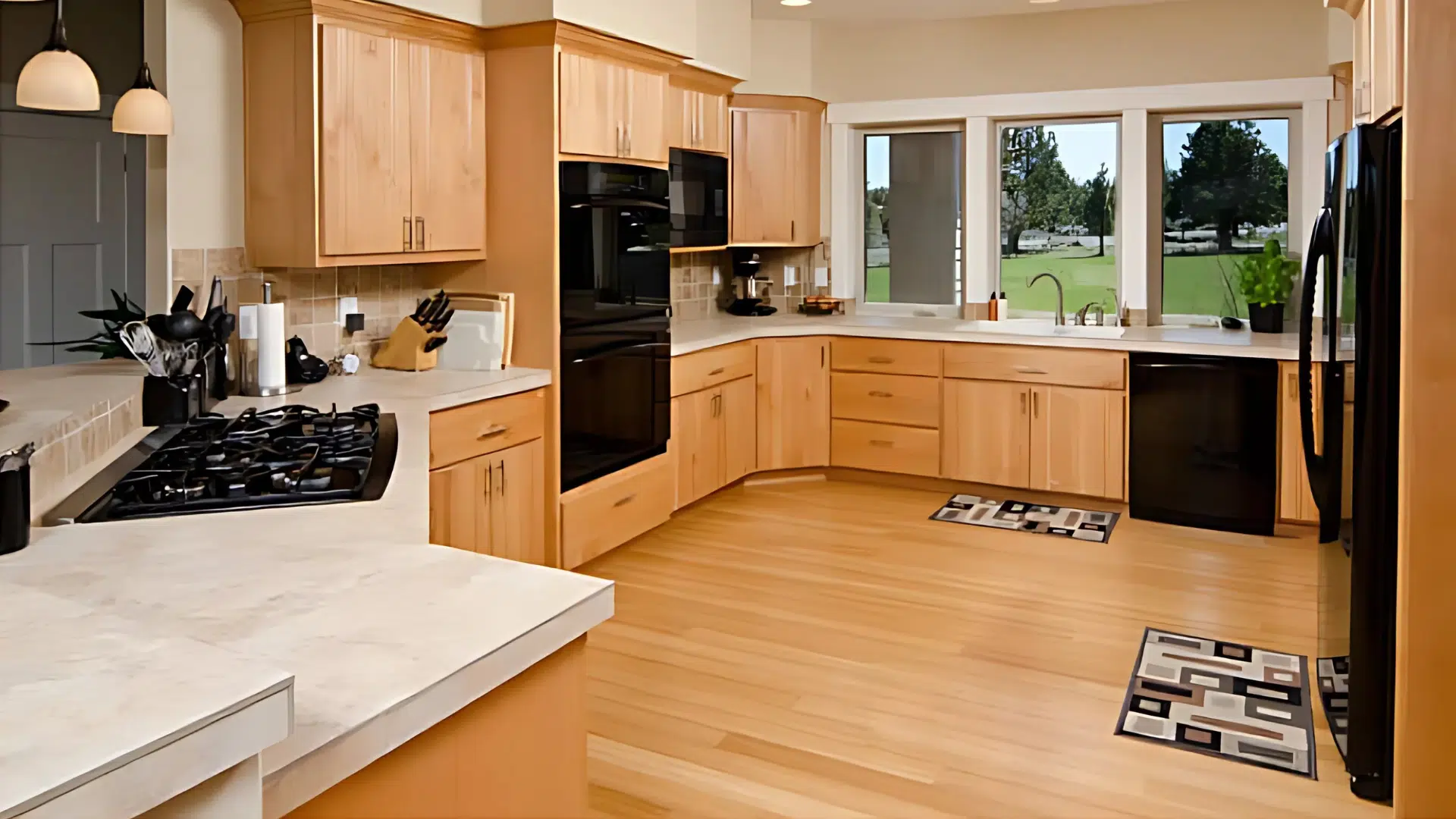
5. Natural Wood Trim Against Soft Walls
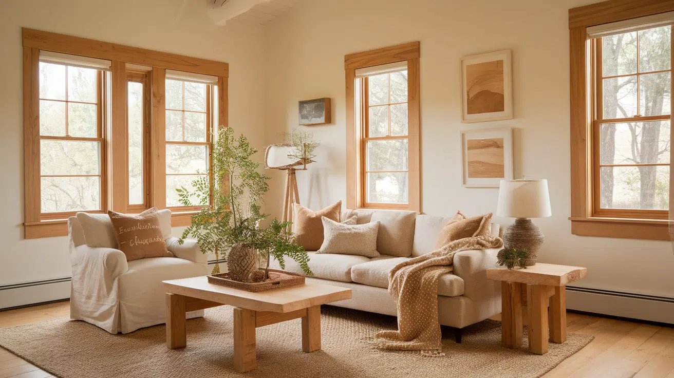
Leaving wood trim in its natural state or staining it adds warmth and texture. Pair it with soft-colored walls like warm whites or muted greens.
It’s a cozy, cabin-like look that feels earthy and inviting.
6. Bright Trim in Kid-Friendly Spaces
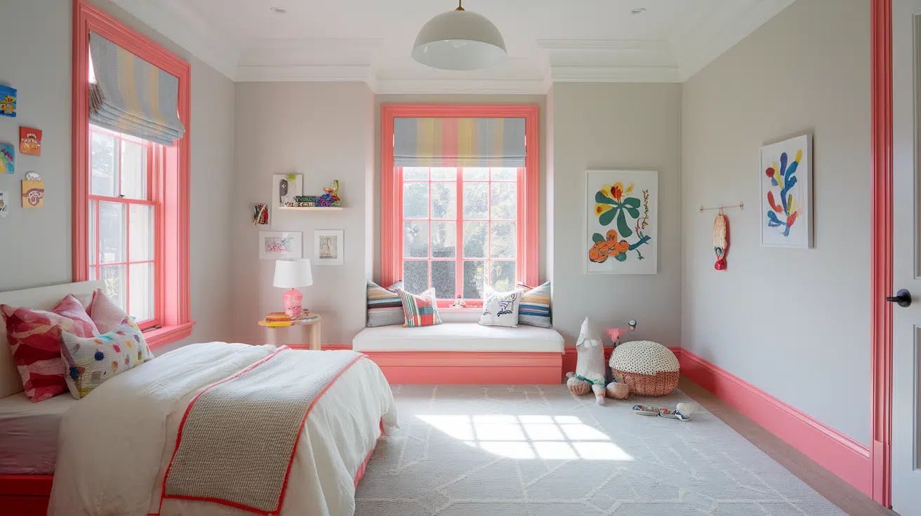
In children’s rooms, use colorful trim to create fun, playful energy. Think aqua trim with soft yellow walls, or bright coral with pale gray.
This is an easy way to add personality without committing to bold wall colors.
Inspiring Light Walls and Dark Trim Color Combos
| Wall Color | Trim Color | Vibe | Best For |
|---|---|---|---|
| White | Charcoal | Modern and timeless | Almost any style; add brass or matte black hardware |
| Soft Greige | Forest Green | Warm, cozy, and sophisticated | Studies, dining rooms, reading nooks |
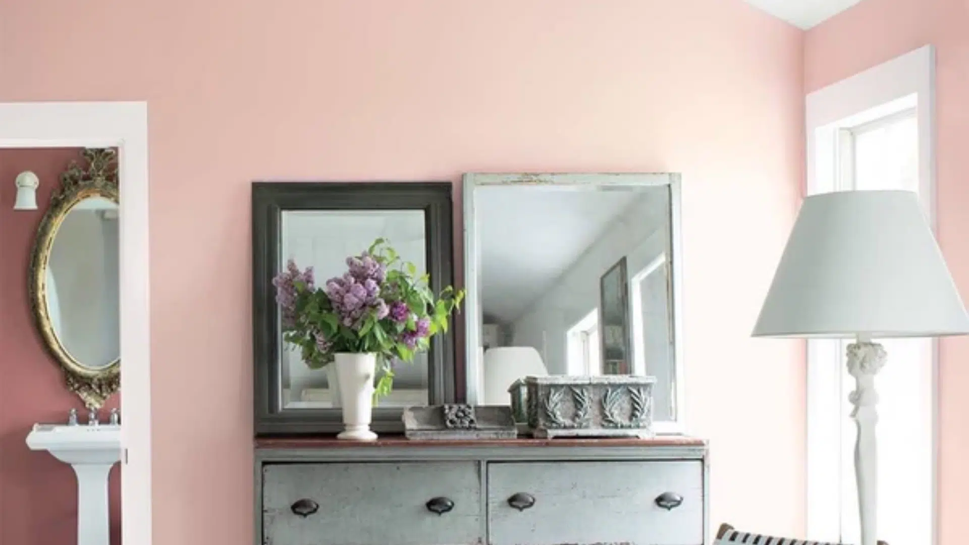
| Blush Pink | Cocoa Brown | Romantic and unexpected | Bedrooms, creative studios with vintage flair |
| Pale Blue | Navy or Midnight Blue | Calming yet bold | Bathrooms, nurseries, coastal-inspired spaces |
Designer Tips for Using Dark Trim with Light Walls
- Keep trim consistent across the room for a cohesive look. Change colors only at clear transitions like doorways.
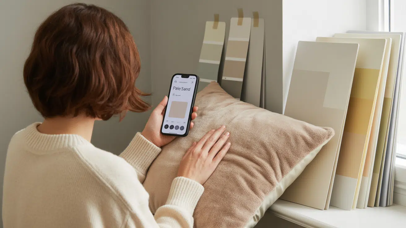
- Test paint samples on different walls and check them in both natural and artificial light.
- Watch lighting changes throughout the day—colors can shift from soft to intense.
- Match trim with floors and fixtures. Make sure your trim color works with wood tones, tiles, and hardware.
Final Thoughts
If you’re thinking about trying the contrasting trim trend, start small, maybe in a powder room, hallway, or home office.
It’s an easy way to experiment without committing to a full remodel.
Contrasting trim adds instant personality, charm, and visual interest to any space.
Go bold with deep hues or keep it soft and subtle; the effect can be truly stunning. This simple design choice does more than outline your walls; it shapes the entire mood of your room.
With the right paint swatches and a little creativity, you can turn ordinary spaces into standout moments.

Alex Guerrero, a graduate with a Fine Arts degree from the Rhode Island School of Design, has been a visionary in the world of color and design for over 15 years. His professional journey began in the heart of the fashion industry in Milan, where he developed an acute sense for color harmonies and trends. Alex joined our team in 2018, offering fresh and innovative perspectives on color utilization in various spaces. Renowned for his ability to blend contemporary trends with timeless elegance. Outside of work, Alex is an accomplished painter and a volunteer art therapist, his artistic talents further enriching his professional insights.