I see homeowners struggling with color choices every day. You walk into a paint store and feel overwhelmed by endless options. Should walls and trim be different colors? Or can they match?
I’ll show you why painting walls and trim same color is becoming a popular choice. This approach can make your space look bigger and more modern.
In this post, you’ll learn about this growing trend. I’ll cover the reasons, pros and cons, and practical tips. You’ll also find color recommendations. By the end, you’ll know if this bold color choice works for your home.
Ready to rethink traditional painting rules? Let’s learn about this fresh approach to interior design.
Reasons to Consider: Painting Walls and Trim Same Color
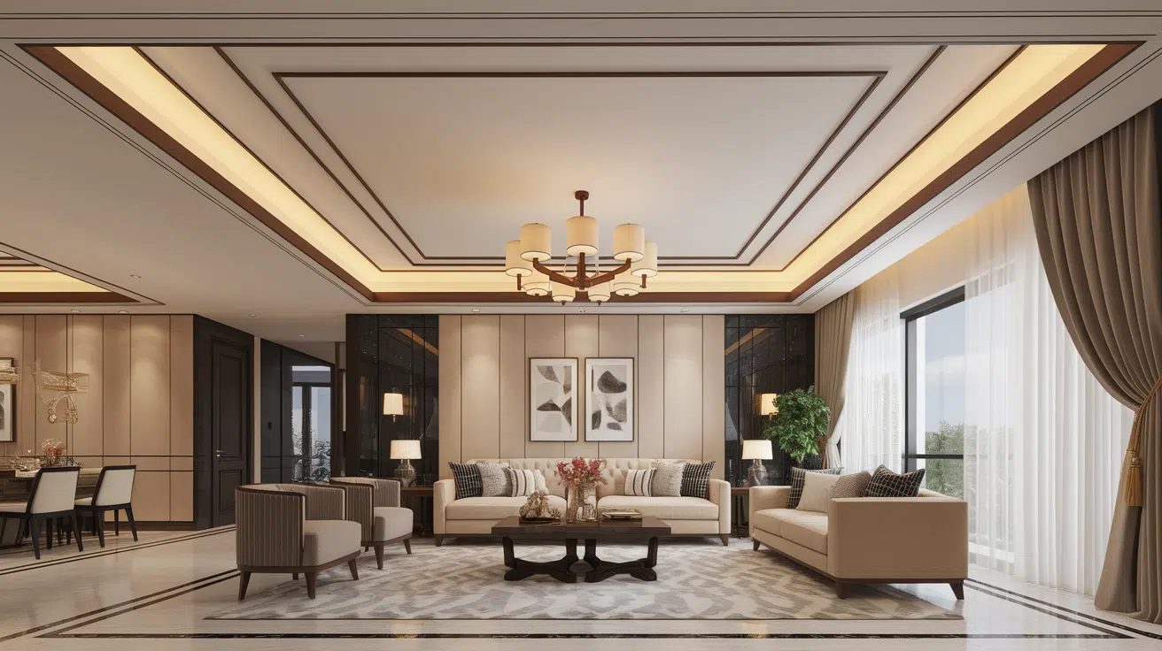
The choice to paint walls and trim the same color is becoming increasingly popular. I find this approach creates a seamless look throughout a space. It simplifies design decisions and highlights architectural features differently than the traditional contrasting trim.
The following are reasons why I consider painting walls and trim same color.
1. Creates a Cohesive Look
When I paint the walls and trim the same color, the room instantly feels unified. This cohesion means all the elements blend smoothly, creating harmony rather than visual breaks. It eliminates the distraction that contrasting trim sometimes causes, making the entire space feel thoughtfully designed and balanced.
The visual flow increases openness, which can be especially beneficial in smaller rooms where color breaks might make the space seem fragmented or cluttered.
2. Makes Spaces Feel Larger
Using the same color on walls and trim helps me create an illusion of expanded space. Without the contrast between wall and trim, boundaries soften, making the eye travel continuously without interruption. This trick visually enlarges rooms, which is perfect for compact or cozy areas.
By removing sharp lines and edges, the space feels less confined and more airy. The seamless transition between surfaces invites a more relaxed, open atmosphere that I appreciate.
3. Highlights Architectural Details Differently
Although it might seem counterintuitive, painting trim the same color as walls can still emphasize architectural features. Instead of relying on color contrast, the design shifts focus to texture, shadow, and form. I notice that the subtle variations in finish or light reflection bring out moldings, ledges, and door frames uniquely.
It creates a more understated elegance where details are appreciated quietly, rather than loudly through stark color contrasts, adding a classy touch.
4. Simplifies Color Choices
Choosing one color for walls and trim simplifies my decision-making process. It reduces the pressure to find the “perfect” trim shade to match or complement wall color, which can be overwhelming. This streamlined approach cuts down on confusion and makes the painting project less stressful.
I can focus on selecting a single hue that resonates with the vibe I want rather than worrying about how multiple tones will interact. This is especially helpful when aiming for a calm, focused design statement.
5. Modern and Minimalist Appeal
Painting walls and trim the same color perfectly suits my preference for modern, minimalist interiors. This method reduces visual clutter and creates clean lines that feel fresh and current. It aligns with simplicity and elegance, key principles of minimalism.
By using the same paint color, the room looks crisp and uncluttered, allowing other design elements like furniture or artwork to shine. The overall effect is stylish yet approachable, appealing to contemporary tastes.
6. Easy to Maintain and Touch Up
From a practical perspective, using the same color on walls and trim makes maintenance much easier. If a scuff or mark appears on the trim or wall, I simply use the same paint for quick touch-ups rather than keeping multiple colors on hand.
This means less hassle and less chance of a mismatch during repairs. The uniform color scheme also tends to fade evenly, avoiding patchy or inconsistent appearances over time, which helps keep the space looking fresh and cared for.
7. Helps to Create a Soothing Environment
I find that when walls and trim match, the entire space feels more serene and calm. The lack of color tension lets me focus on other aspects, like natural light and texture, which contribute to a peaceful atmosphere.
This monochromatic approach fosters relaxation because nothing visually competes for attention. It increases well-being by creating an environment that feels orderly and soothing. For me, this makes the home a true sanctuary where I can unwind fully.
Pros and Cons of Painting Walls and Trim the Same Color
Painting your walls and trim the same color is a bold design choice that can create a seamless, modern aesthetic. It offers a cohesive and unified look, making the space appear larger and more classy. However, like any design decision, painting walls and trim same color comes with its own set of advantages and drawbacks.
| Pros | Cons |
|---|---|
| Creates a cohesive, modern look | Can make a space feel smaller or darker |
| Visually simplifies and streamlines the room | Eliminates contrast, which may reduce architectural interest |
| Hides imperfections in trim and wall intersections | Harder to touch up or repaint later if the trim gets scuffed |
| Allows furnishings and decor to stand out | Not ideal for traditional or ornate interiors |
| Makes ceilings appear taller when trim blends in | May look flat without variation in finish or sheen |
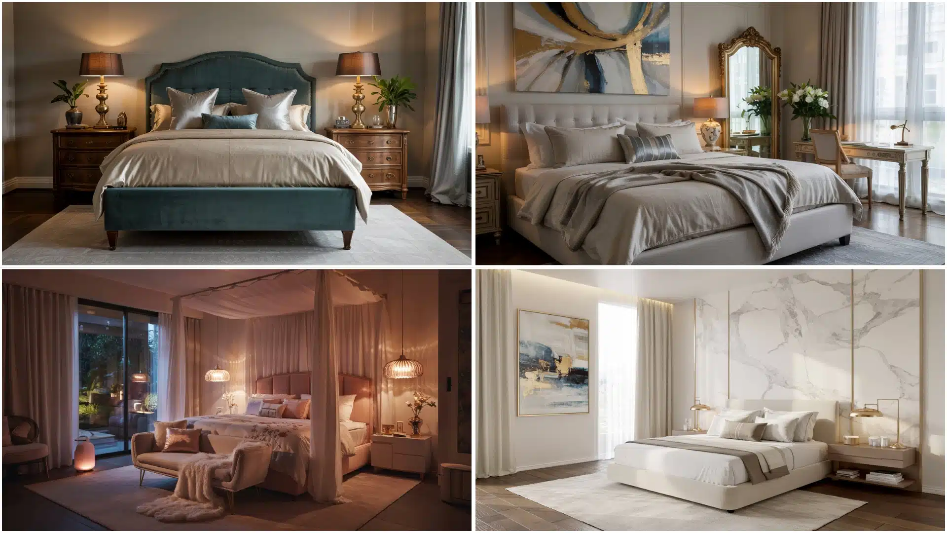
Top Color Choices for Painting Walls and Trim Same
Painting walls and trim the same color is a bold yet classy way to transform any space.
This approach can make rooms feel unified, open, and modern. The color you choose sets the entire mood, so it’s important to match your selection with the atmosphere you want to create.
The following are seven color ideas to inspire your next painting project, where walls and trim seamlessly blend for maximum impact.
Soft Warm White
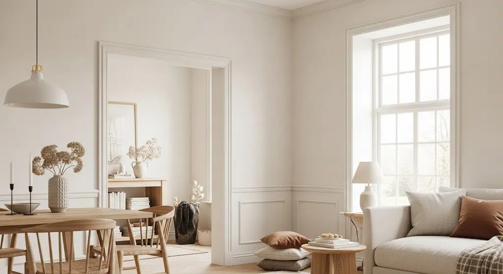
Using the same soft white for both the walls and trim creates a seamless, calming effect that increases the natural light in the room.
The lack of contrast draws attention to the textures and shapes of the furnishings rather than breaking up the visual field. It gives the space a refined simplicity and elegance, ideal for an airy, open look without visual interruption.
Sage Green
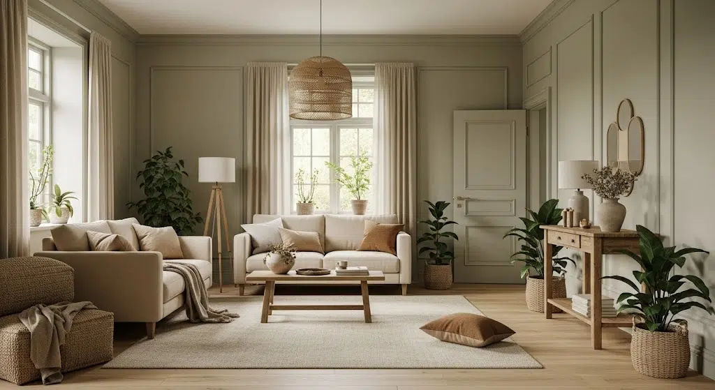
Keeping the sage green consistent across the trim and walls reinforces the connection with nature, making the room feel peaceful and grounded.
It allows the greenery and natural wood elements to take center stage without any harsh framing.
The monochromatic approach adds depth and warmth, creating a cozy and organic ambiance that feels effortlessly unified.
Blush Pink

Blending the blush pink across the walls and trim fosters a sense of softness and romance throughout the space.
This approach eliminates sharp lines or visual breaks, amplifying the delicate, feminine charm of the room.
It helps the soft fabrics, floral arrangements, and plush furnishings harmonize beautifully, adding to the cohesive feel of a carefully curated palette.
Powder Blue
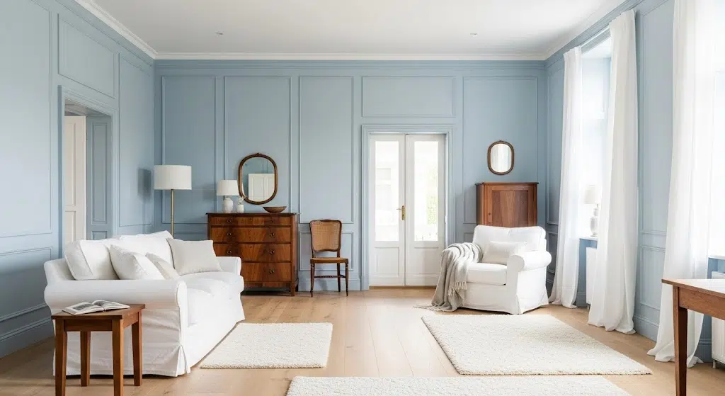
Keeping the powder blue consistent across all the architectural elements adds charm and a touch of nostalgia. The soft, cool tone envelopes the space in serenity and ensures the darker wood furniture stands out without competition.
The uniform color makes the historical elements feel fresh and updated while retaining a graceful, timeless aesthetic.
Greige (Gray-Beige)
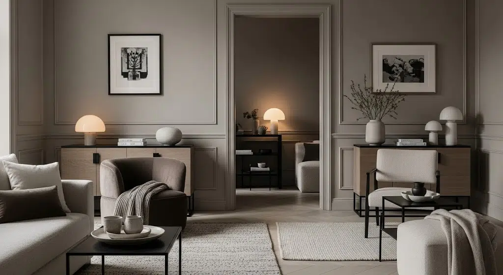
Using the same warm greige for the trim and walls produces a beautifully balanced and understated backdrop.
It allows the furnishings to shine without any visual noise, while the tone-on-tone scheme contributes to a sense of timeless elegance.
This subtle monochrome approach creates harmony between classic architectural elements and contemporary décor choices.
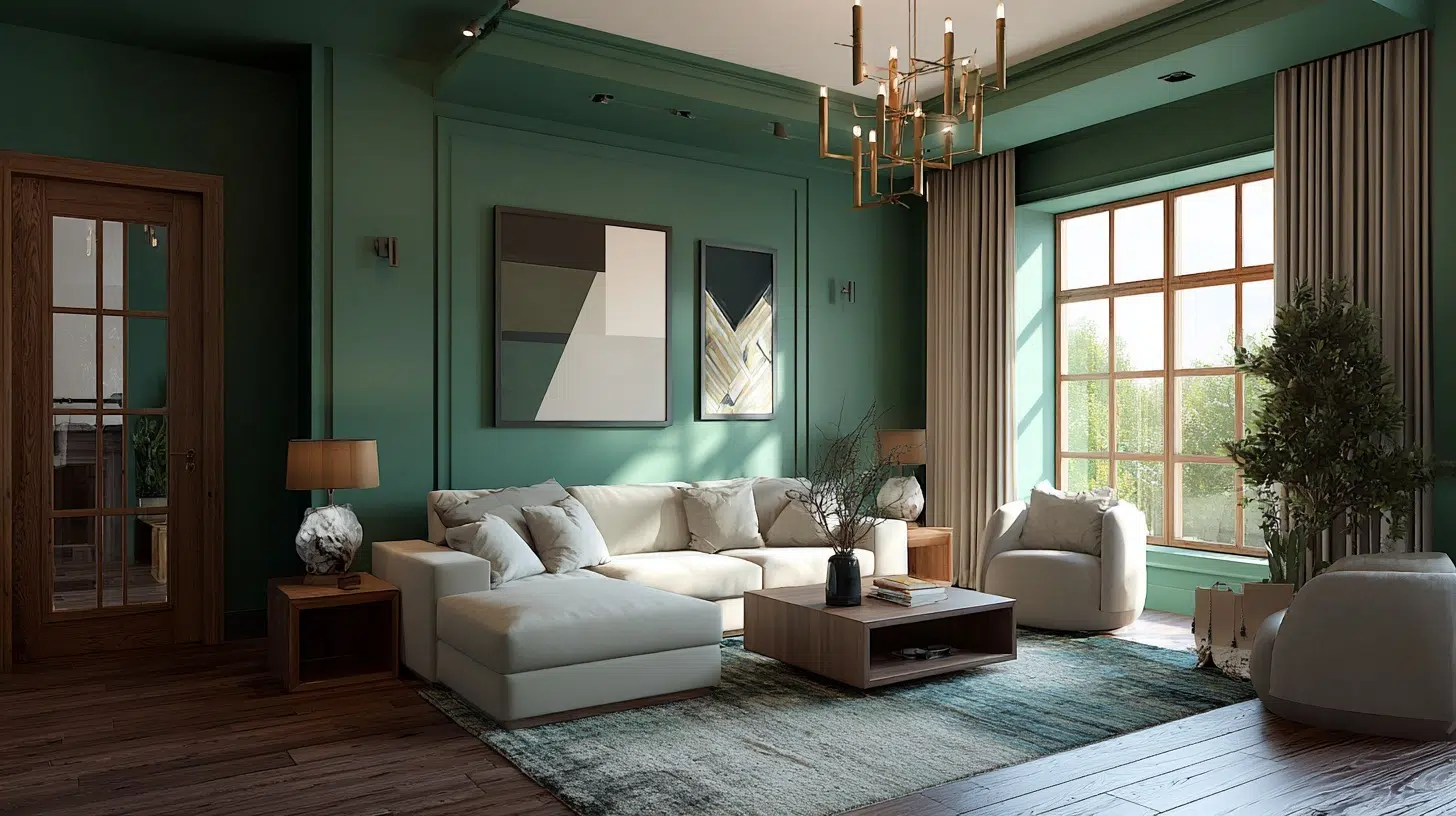
Midnight Navy
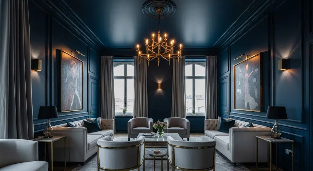
This richly saturated room, using midnight navy for both the walls and trim, delivers a luxe, dramatic atmosphere.
The single-color envelope makes the white and gold accents pop, highlighting the artwork and furniture with a gallery-like intensity.
It also emphasizes the architectural detailing by relying on shadow and sheen instead of contrast, which feels deliberate and classy
Charcoal Gray

Matching the charcoal gray trim to the wall color adds to the moody style of this masculine-inspired space. The uniformity contributes to a dramatic, cocoon-like effect, making the room feel bold and enveloping.
Without competing contrast lines, the focus shifts to the interplay of lighting, textures, and statement furniture, creating a sleek and powerful visual impact.
Tips for Achieving the Perfect Monochrome Look
Achieving the perfect monochrome look can change a space with beauty and simplicity. It’s about balancing shades, textures, and lighting to create a unified yet dynamic atmosphere.
The following are some tips that help make painting walls and trim same color design truly stand out:
- Choose a base color that resonates with the mood you want, whether calming blues or warm neutrals, to set the tone consistently throughout the space.
- Use varying shades and tints of the same color to add depth and dimension, preventing the room from looking flat or monotonous.
- Incorporate different textures, like matte walls, glossy furniture, and soft textiles, to create visual interest and tactile contrast within a single color scheme.
- Pay attention to lighting; natural and artificial light can shift how the monochrome palette appears, so adjust light sources to increase the chosen color’s richness.
- Layer patterns subtly, such as stripes or geometric shapes in the same hue, to bring energy to the design while staying cohesive.
- Maintain consistency in undertones; mixing warm and cool variations of the same color can disrupt the seamless look, so stick to one undertone family for harmony
The Bottom Line
This approach gives you more design freedom. You can focus on furniture and decor instead of worrying about color coordination. Plus, your space will feel more expensive and thoughtfully designed.
Start small with one room. Test how painting walls and trim same color looks and feels in your space. Choose a color you truly love because you’ll see it everywhere.
Remember, trends come and go. But the benefits of this approach, bigger-looking rooms, easier maintenance, and modern appeal, make it worth considering. Your home should reflect your style, not just follow rules.
What color will you choose for your first monochromatic room?

Alex Guerrero, a graduate with a Fine Arts degree from the Rhode Island School of Design, has been a visionary in the world of color and design for over 15 years. His professional journey began in the heart of the fashion industry in Milan, where he developed an acute sense for color harmonies and trends. Alex joined our team in 2018, offering fresh and innovative perspectives on color utilization in various spaces. Renowned for his ability to blend contemporary trends with timeless elegance. Outside of work, Alex is an accomplished painter and a volunteer art therapist, his artistic talents further enriching his professional insights.