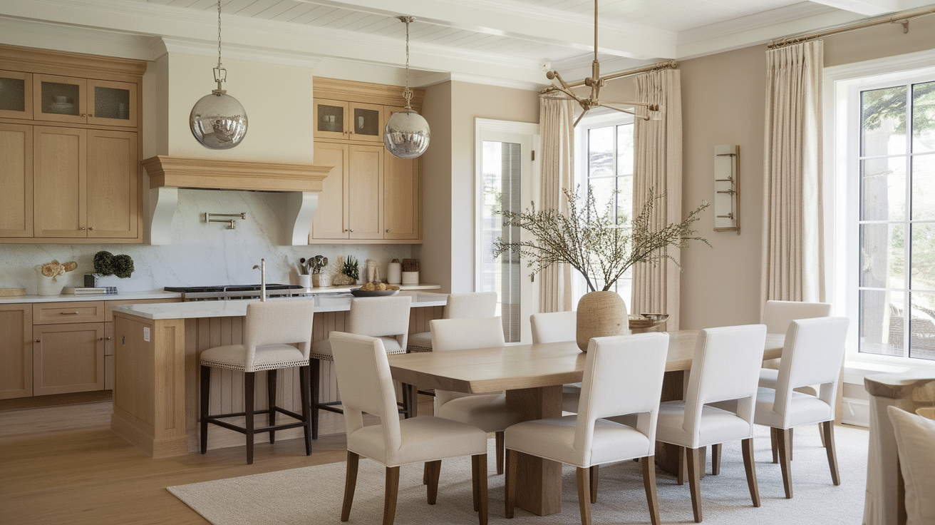
Choosing the right paint color for your kitchen walls can make a huge difference when working with oak cabinets.
I know how tricky it can be to balance those warm, golden tones without making the space feel outdated.
Oak actually pairs well with so many shades, from soft creams to bold contrasts like navy or charcoal.
In this guide, I’ll walk you through 21 beautiful paint color ideas that look great with oak cabinets.
You’ll also get tips on how much paint you might need, how lighting affects the final result, and which trim colors can help everything feel complete.
If you want your kitchen to feel fresh and pulled together, you’re in the right place.
How Much Paint Do I Need?
Before seeing color choices, let’s start with how much paint you’ll actually need. A gallon of paint typically covers 350–400 square feet per coat. Here’s a quick breakdown:
- Measure Wall Area: Add the width of each wall and multiply by the ceiling height. Subtract the square footage of windows and doors (roughly 20 sq ft per door and 15 sq ft per window).
- Account for Cabinets & Trim: Subtract wall space hidden by cabinetry if you don’t plan to paint behind it.
- Factor in Two Coats: Multiply your total square footage by two.
- Add 10% for Waste: Always purchase a bit extra for touch-ups or miscalculations.
For a 12×12 kitchen with standard eight-foot ceilings and minimal windows, expect to use approximately 2 to 2.5 gallons.
Paint Color Tips for Oak Cabinets
Balance warmth by working with oak’s golden undertones—they can be enhanced or softened depending on your use of complementary warm hues or cooler contrasting ones.
It’s important to finish wisely; eggshell and satin finishes offer a good balance of durability and a soft sheen that doesn’t highlight wall flaws.
To tie the look together, coordinate accents using crisp white trims or introduce a darker accent wall to add depth and visual interest
Top Paint Colors That Go With Oak Cabinets
These hues are subtle yet transformative, especially in traditional or transitional kitchens.
1. Sherwin-Williams Repose Gray (SW 7015)
Repose Gray is one of those colors that always feels easy to live with. It’s a soft grey with gentle warmth, which works beautifully with oak cabinets.
I like how it brings balance, cool enough to modernize the room, but still warm enough to complement golden wood tones.
It keeps the space calm and versatile.
2. Benjamin Moore Horizon (OC‑53)
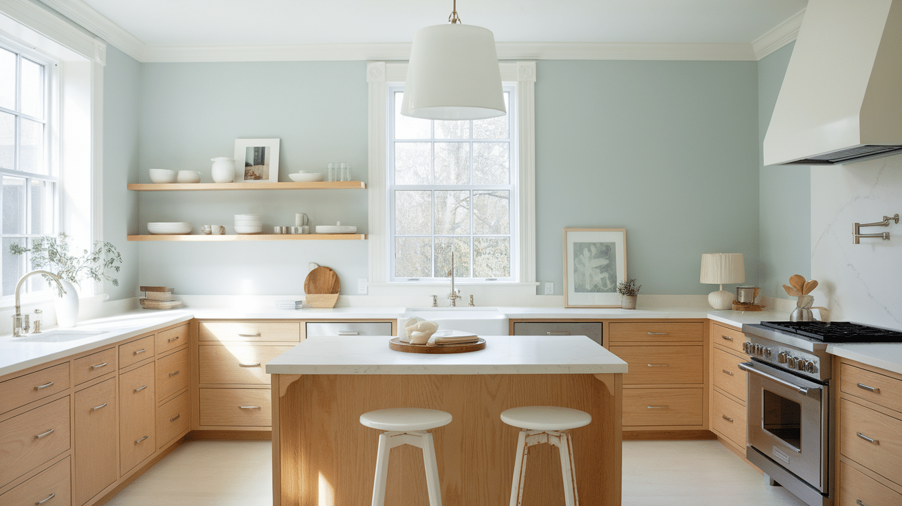
Horizon is a delicate pale gray with subtle blue undertones that freshen up a kitchen while keeping it bright. It’s ideal if you want contrast without going too dark.
This color feels clean and airy, which makes it especially helpful in smaller kitchens or those with limited natural light.
I recommend pairing it with cool-toned counters and brushed nickel fixtures for a cohesive, refreshing vibe that doesn’t feel overly cool or sterile.
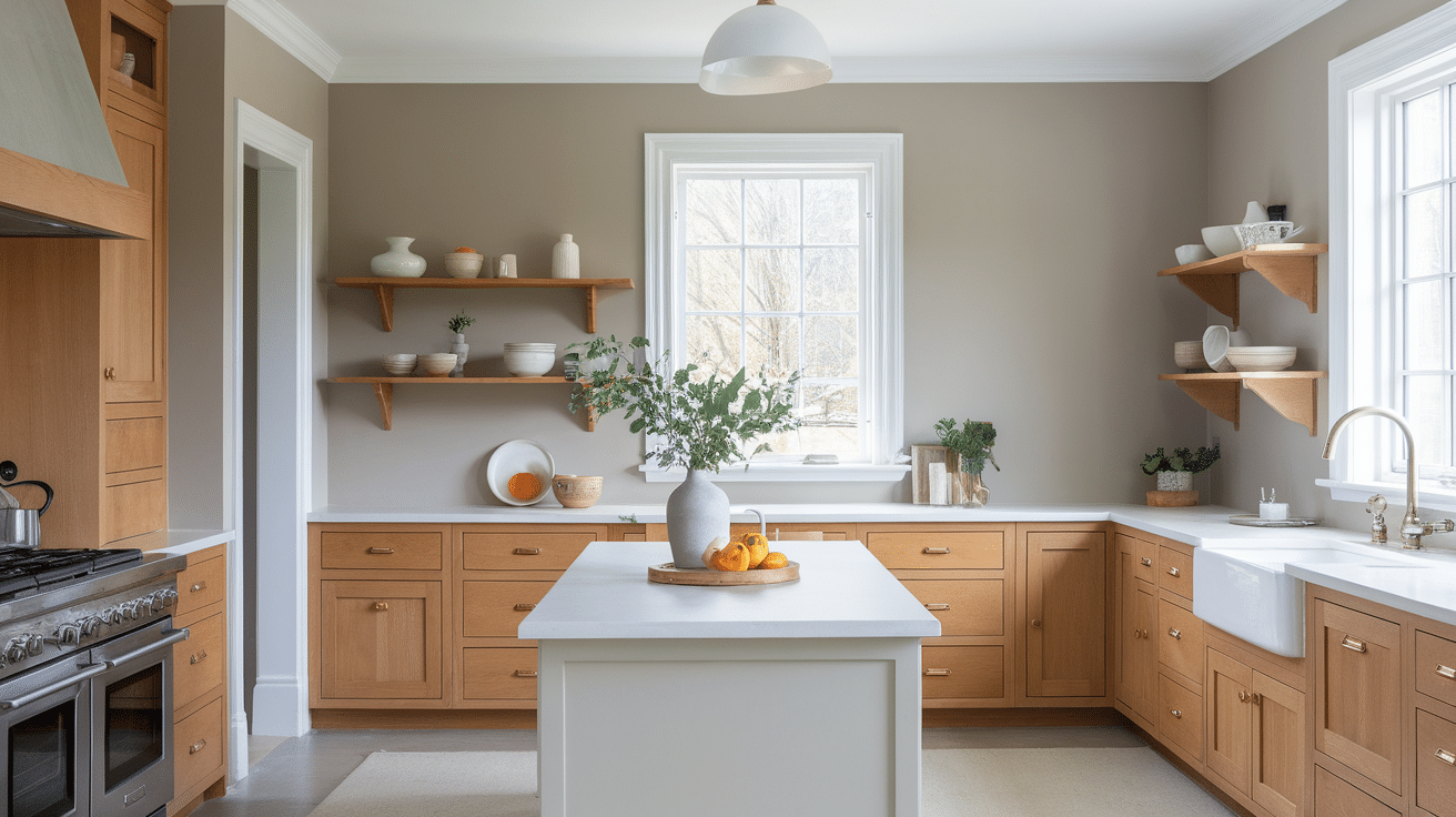
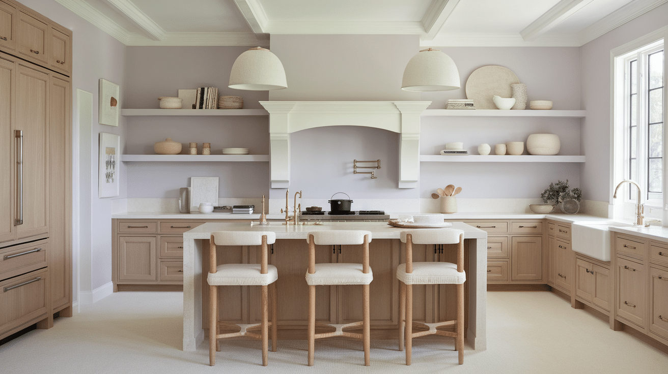
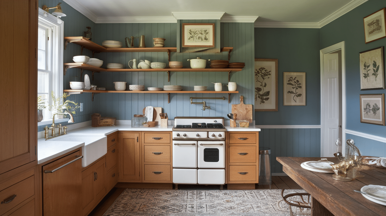
3. Benjamin Moore Edgecomb Gray (HC‑173)
Edgecomb Gray is a warm greige that brings out the best in oak cabinetry. It leans more beige than gray, offering a cozy yet neutral feel that complements the natural warmth of wood.
I love using this color in farmhouse kitchens, especially with open shelving or antique accents.
It adds a grounded, lived-in look without making the room feel heavy or dark, great for spaces where comfort and charm go hand in hand.
4. Sherwin-Williams Alabaster (SW 7008)
Alabaster is a creamy white that instantly brightens a space and adds a soft, welcoming glow. It’s ideal for kitchens with oak cabinets that need a lighter touch.
I often recommend it for smaller kitchens or those without much natural light, because it opens up the space beautifully.
The warm undertone blends nicely with oak without looking too yellow. It’s a fresh, timeless shade that works with nearly every decor style.
5. Farrow & Ball Wimborne White (No. 239)

Wimborne White offers a warm, buttery tone that makes oak cabinetry feel right at home. It’s not as stark as a bright white, which means it softens the contrast and brings in a sense of balance.
I love how it reacts to natural light throughout the day, glowing in the morning and feeling cozy at night.
This shade adds charm and a slightly vintage feel, especially with brass or wood accents.
6. Benjamin Moore Balboa Mist (OC‑27)
Balboa Mist is a light greige with a touch of lavender in its undertone, which adds just the right amount of coolness to balance warm oak.
It’s perfect for kitchens where you want a neutral palette but still crave personality. I love how it adapts to light throughout the day, shifting softly while always feeling elegant.
It pairs nicely with quartz countertops, modern backsplashes, or even classic ceramic tiles.
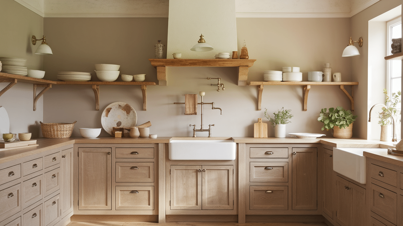
7. Benjamin Moore Manchester Tan (HC‑81)
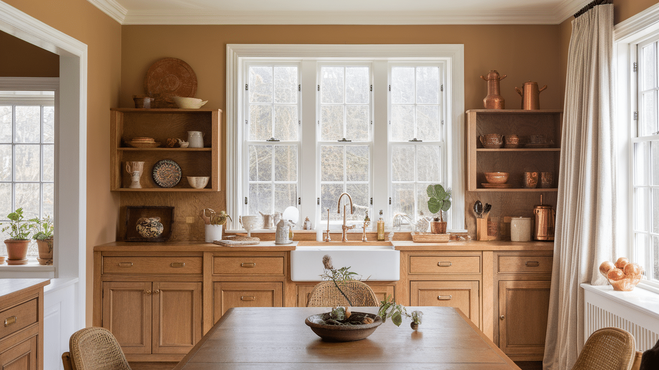
Manchester Tan is a warm, dependable beige that enhances oak’s natural beauty without overpowering it.
I like to use it in kitchens filled with morning light, where the soft tan picks up subtle golden tones. It gives the space a welcoming, grounded feel.
This is a classic, safe choice if you want something neutral that still has depth. It works beautifully with wood floors, stone countertops, and traditional-style fixtures.
8. Sherwin-Williams Accessible Beige (SW 7036)

Accessible Beige is the perfect mix of beige and gray, offering just enough warmth to harmonize with oak. I love how it creates a grounded, earthy feel while keeping things updated.
It’s great in kitchens where you want a neutral backdrop without going full gray.
This shade blends seamlessly with both traditional and modern decor, making it one of the most flexible choices for a long-lasting kitchen color.
9. Behr Sandstone Cove (MQ3‑06)
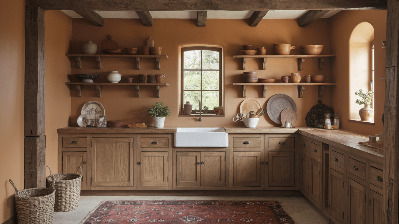
Sandstone Cove is a rich, earthy neutral that brings an organic, grounded quality to your kitchen. It plays beautifully with oak’s golden tones and looks especially nice in rustic or craftsman-style spaces.
I like how it feels warm and inviting without being too dark or heavy.
If you enjoy decorating with natural materials like wood, jute, or ceramic, this paint color adds to that relaxed, handmade feel.
10. Benjamin Moore Pale Oak (OC‑20)
Pale Oak is a warm taupe that brings understated elegance to any space. It blends soft gray and beige tones, making it ideal for kitchens with oak cabinetry.
I recommend this shade when you want something neutral but not too bland; it has just enough personality to stand out.
Pale Oak also looks amazing in open-concept layouts where it flows into dining or living areas, keeping everything soft and cohesive.
11. Sherwin-Williams Sea Salt (SW 6204)

Sea Salt is a breezy green-blue that adds a calm, coastal feel to your kitchen. I like using it when oak cabinets need a fresh update, but still deserve to be the star.
It’s light, cheerful, and works well in both modern and casual spaces. Pair it with white trim and natural accents like woven blinds or light stone for a refreshing, spa-like environment.
12. Benjamin Moore Wythe Blue (HC‑143)
Wythe Blue is a soft, dusty teal that’s full of charm and personality. It brings vintage flair to kitchens while complementing the rich tones of oak cabinets.
I often suggest this color when clients want a space that feels nostalgic but still updated.
It looks especially beautiful with aged brass fixtures or antique wood pieces. This color adds elegance without going over the top.
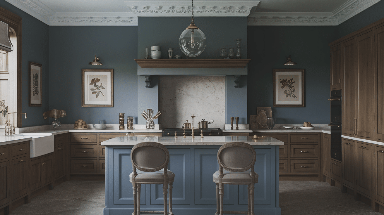
13. Farrow & Ball Pigeon (No. 25)
Pigeon is a deep gray-green that adds mood and sophistication to your kitchen.
It’s the kind of color that changes throughout the day, cool and soft in the morning, dramatic in the evening.
When paired with oak, it creates a beautiful contrast without feeling harsh. I like this one for traditional, shaker-style kitchens or anywhere you want that “heritage home” feel.
14. Behr Caribbean Current (P460‑7)
Caribbean Current is bold, vibrant, and full of personality. It’s great for homeowners who aren’t afraid of color and want their kitchen to stand out.
I’ve seen it used beautifully with lighter oak finishes to create contrast and energy.
It pairs well with clean lines, matte black hardware, and open shelving. If you’re feeling adventurous, this deep blue brings excitement to your space.
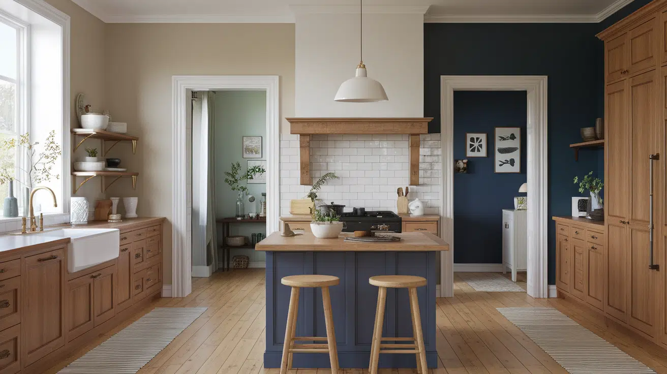
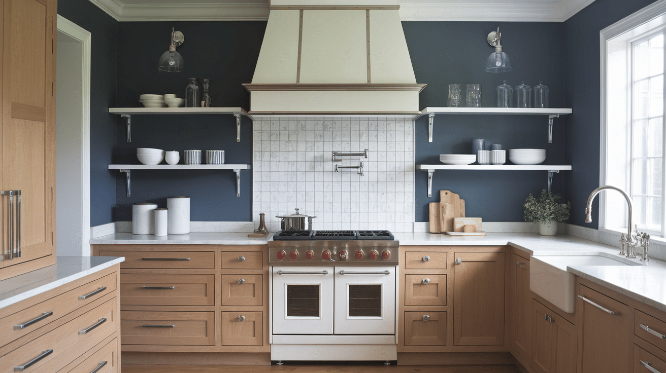
15. Sherwin-Williams Naval (SW 6244)

Naval is a rich, saturated navy that anchors a kitchen beautifully. I love using it on feature walls, islands, or even lower cabinets. It works with oak by providing a strong contrast that’s still classic.
This shade feels refined and grounded, especially when paired with white quartz or marble countertops.
Add in brass fixtures, and you’ve got a space that feels timeless and stylish.
16. Benjamin Moore Newburyport Blue (HC‑155)
Newburyport Blue is a dark navy with a hint of gray, which makes it a little more subtle than a true navy.
I find it pairs especially well with oak when you want contrast without sharp edges.
It’s excellent for accent areas or backsplashes behind wood cabinets. This color adds richness and gives the kitchen a quiet sense of elegance.
17. Sherwin-Williams Iron Ore (SW 7069)
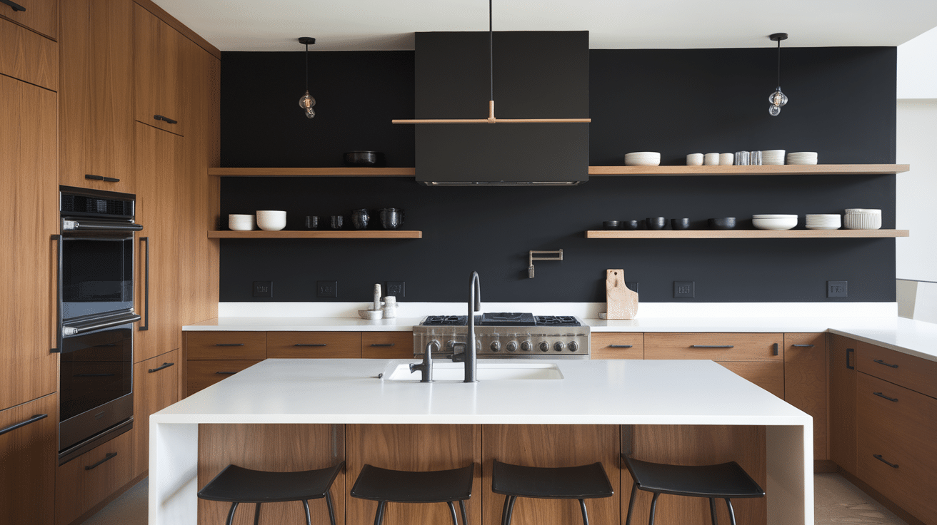
Iron Ore is a near-black charcoal that adds serious depth and sophistication. It’s bold and contemporary, which works well with oak in modern spaces.
I often use it for kitchen islands or statement walls when I want to create contrast that feels dramatic but refined.
Pair it with matte finishes or brushed metal for a sleek, stylish look that still feels grounded.
18. Benjamin Moore Hale Navy (HC‑154)
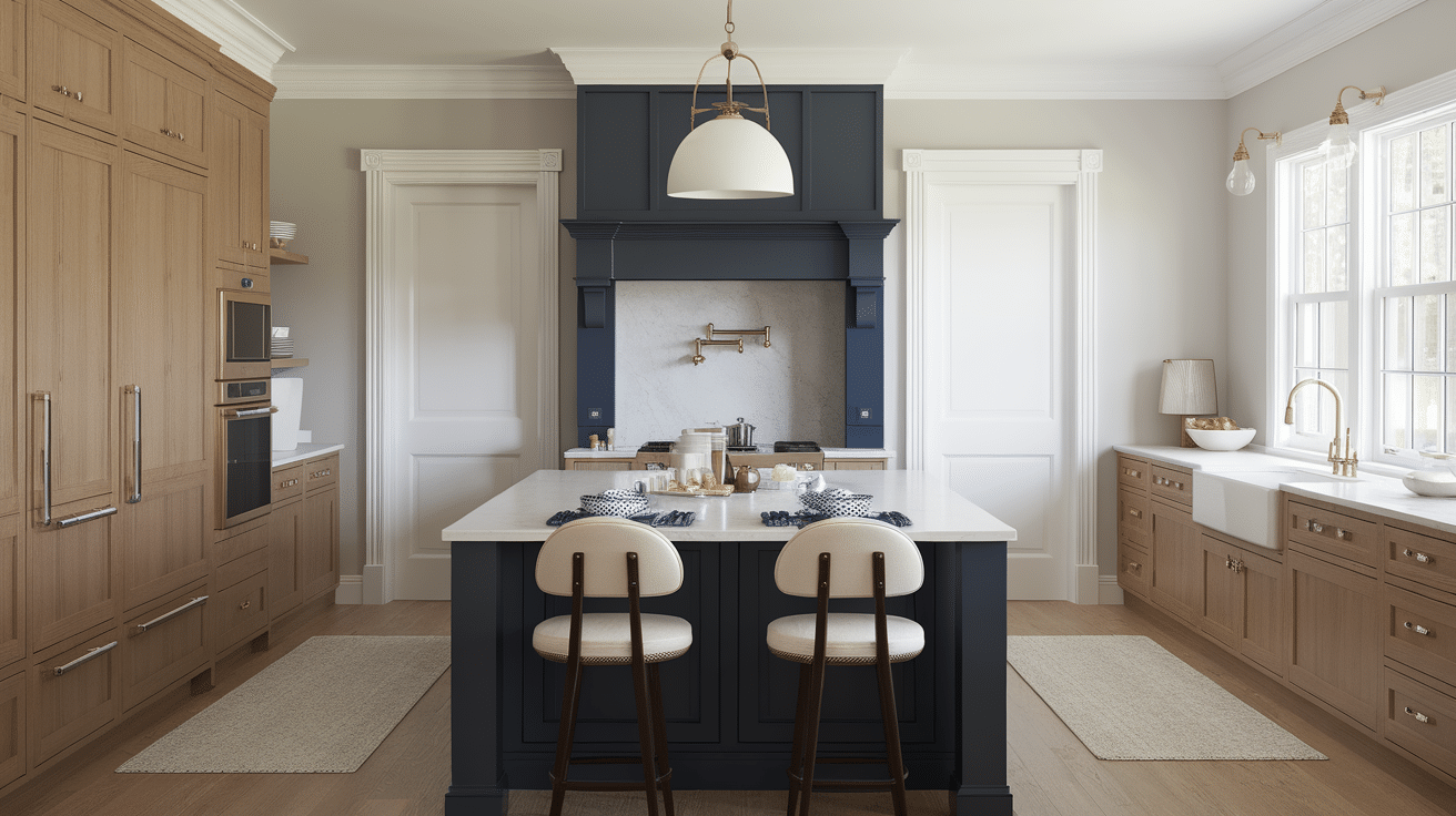
Hale Navy brings a strong, reliable contrast to any kitchen. I love using it with oak cabinets when I want the room to feel high-end but still homey.
The deep navy tone works with everything, white counters, marble, wood, you name it.
It’s a designer favorite because it’s bold but not too loud, stylish but still approachable for everyday living.
19. Farrow & Ball Inchyra Blue (No. 289)
Inchyra Blue is a deep blue-gray with soft lavender undertones that shift depending on the light. It’s a sophisticated color that plays beautifully off oak’s golden tones.
I love it in kitchens where you want drama without going full black.
It works especially well with soft whites, warm metals, and natural materials like wood and stone.
20. Sherwin-Williams Evergreen Fog (SW 9130)

Evergreen Fog is a misty green-gray that brings calm and clarity to the kitchen.
It’s modern and understated but still adds character.
I like using this color to bring a subtle organic feel to oak cabinetry. It’s great for open kitchens or spaces with lots of natural light, creating a peaceful, cohesive atmosphere you can enjoy every day.
21. Benjamin Moore Deep River (1564)
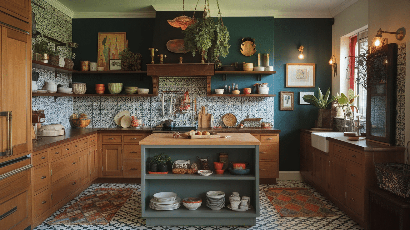
Deep River is a dark teal that feels rich and artistic, perfect for kitchens with a bohemian or eclectic edge.
It creates a cozy, lived-in vibe that complements oak cabinetry without feeling too heavy.
I recommend pairing it with vintage lighting, patterned tile, or open shelving for a warm, inviting space full of personality.
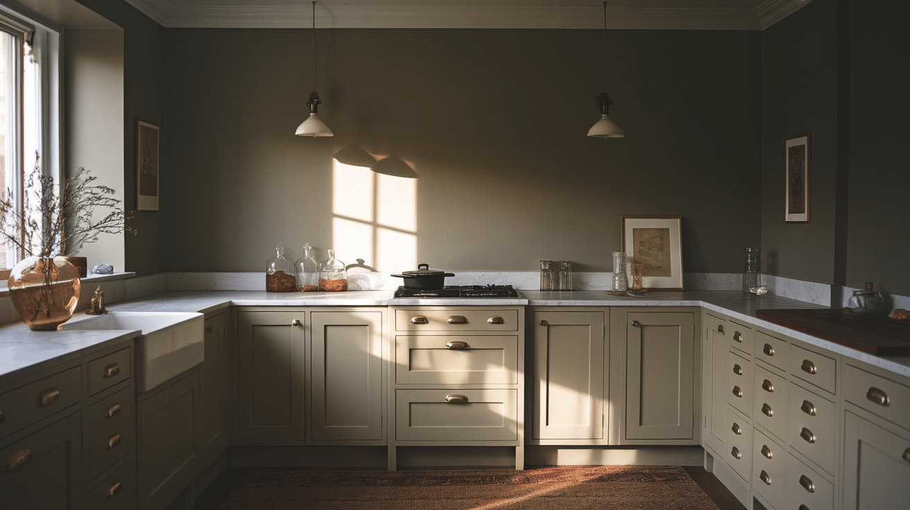
How Lighting Affects Paint Colors for Oak Cabinets
Lighting can dramatically affect how a color appears in your kitchen.
Natural Light
Natural light plays a big role in how paint colors look. What seems bold in one room might feel soft and subtle in another, all because of the sunlight.
- North-facing kitchens have cooler light. Warm paints like Manchester Tan or Alabaster balance this chill.
- South-facing kitchens receive bright, warm light all day, allowing cooler shades like Horizon or Sea Salt to shine.
- East-facing kitchens are brighter in the morning and dimmer at night, so try versatile mid-tones like Edgecomb Gray or Wythe Blue.
- West-facing kitchens get warm afternoon light that can intensify the reds and yellows in your oak. Go for muted blues or beiges to soften the glow.
Artificial Light
Artificial lighting can shift the way your colors appear, sometimes making them warmer, cooler, or even slightly muted.
It’s worth testing your color and wall combo under lamps or ceiling lights, too.
- Warm white bulbs (2700–3000K) enhance oak’s natural color but can make some beiges appear yellow.
- Cooler white bulbs (4000–5000K) can neutralize oak’s warmth. They are best paired with a cream or soft gray to avoid a washed-out look.
Take note of how your selected shade looks under both kinds of lighting throughout the day.
Paint can shift in appearance, especially in rooms with minimal windows.
Best Trim Colors to Pair with Oak Cabinets
To frame your kitchen walls and oak cabinetry perfectly, consider one of these trusted trim shades:
| Paint Color | Description | Best Use |
|---|---|---|
| Sherwin-Williams Pure White (SW 7005) | A neutral, clean white that complements both warm and cool tones without feeling harsh. | Versatile choice for modern or transitional kitchens. |
| Benjamin Moore White Dove (OC‑17) | A soft white with creamy undertones—ideal for cozy, traditional spaces. | Creates a gentle transition from golden oak cabinetry. |
| Benjamin Moore Simply White (OC‑117) | Bright with slight yellow warmth, great for sunlit interiors. | Perfect for bright kitchens with oak cabinets. |
| Behr Ultra Pure White | Affordable and reliable; delivers crisp, sharp definition. | Best for bold contrast on trims, ceilings, and frames. |
Best Accent Wall Colors to Complement Oak Cabinets
Don’t want to commit an entire wall to a bold color? You can still bring in drama without overpowering the space:
- Paint the kitchen island in a rich color like Naval or Deep River.
- Add color behind open shelving with Inchyra Blue or Iron Ore for depth.
- Highlight a breakfast nook wall in Newburyport Blue or Evergreen Fog.
This strategy keeps the main kitchen light and neutral while introducing character through small pops of color.
Conclusion
With these gorgeous paint color ideas, from soft and subtle neutrals to moody, saturated hues, you’re sure to find the perfect shade to pair with your oak kitchen cabinets.
Whether your style leans farmhouse chic, coastal calm, or bold and modern, the right paint can elevate your kitchen and create a space that feels fresh, warm, and personal.
Remember to account for lighting, choose your trim wisely, and calculate paint quantities accurately to avoid waste.
With a little planning and the right color palette, your oak cabinets will no longer feel outdated; they’ll become the heart of a kitchen you love to spend time in.

Alex Guerrero, a graduate with a Fine Arts degree from the Rhode Island School of Design, has been a visionary in the world of color and design for over 15 years. His professional journey began in the heart of the fashion industry in Milan, where he developed an acute sense for color harmonies and trends. Alex joined our team in 2018, offering fresh and innovative perspectives on color utilization in various spaces. Renowned for his ability to blend contemporary trends with timeless elegance. Outside of work, Alex is an accomplished painter and a volunteer art therapist, his artistic talents further enriching his professional insights.