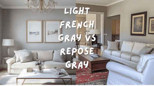

When I first decided to select the perfect gray for my home renovation, I faced a tough competition between two popular Sherwin-Williams contenders: Light French Gray and Repose Gray. Have you been caught in this same color dilemma?
Light French Gray intrigued me with its soft, blue-violet undertones, which create a distinctly cool, contemporary feel.
Meanwhile, Repose Gray won me over with its versatile warmth and subtle taupe notes that adapt beautifully to changing light conditions.
As I tested both colors throughout my home, I found out how dramatically different they could appear depending on room orientation, lighting, and existing décor.
Which aspects of these well-known grays matter most to your space? In this comparison, we’ll take a closer look at how Light French Gray and Repose Gray differ in tone, lighting response, and design compatibility, room by room.
You’ll also find a side-by-side visual reference to help you better understand their real-world impact in varied settings.
Understanding Paint Color Basics
Color Terminology
| Aspect | Light French Gray (SW 0055) | Repose Gray (SW 7015) |
|---|---|---|
| LRV (Light Reflectance Value) | 53 | 58 |
| Color Category | Mid-tone color | Light color |
| RGB Value | Red: 194, Green: 192, Blue: 187 | Red: 204, Green: 201, Blue: 192 |
| Hex Code | #C2C0BB | #CCC9C0 |
Key Differences Between Light French Gray vs Repose Gray
Light French Gray (SW 0055) is a cooler, blue-toned gray with slight violet undertones that create a cultured, airy feel. It appears more modern and crisp, especially in north-facing rooms.
Repose Gray (SW 7015) is a warmer greige with subtle taupe undertones that produce a cozier, more relaxed atmosphere. It reads more neutral in most lighting conditions and is more versatile.
Your choice depends on whether you prefer the cooler, contemporary look of Light French Gray or the warmer, more adaptable quality of Repose Gray, as well as your specific lighting and existing decor.
Room-by-Room: Light French Gray vs. Repose Gray
Living Spaces and Open Floor Plans
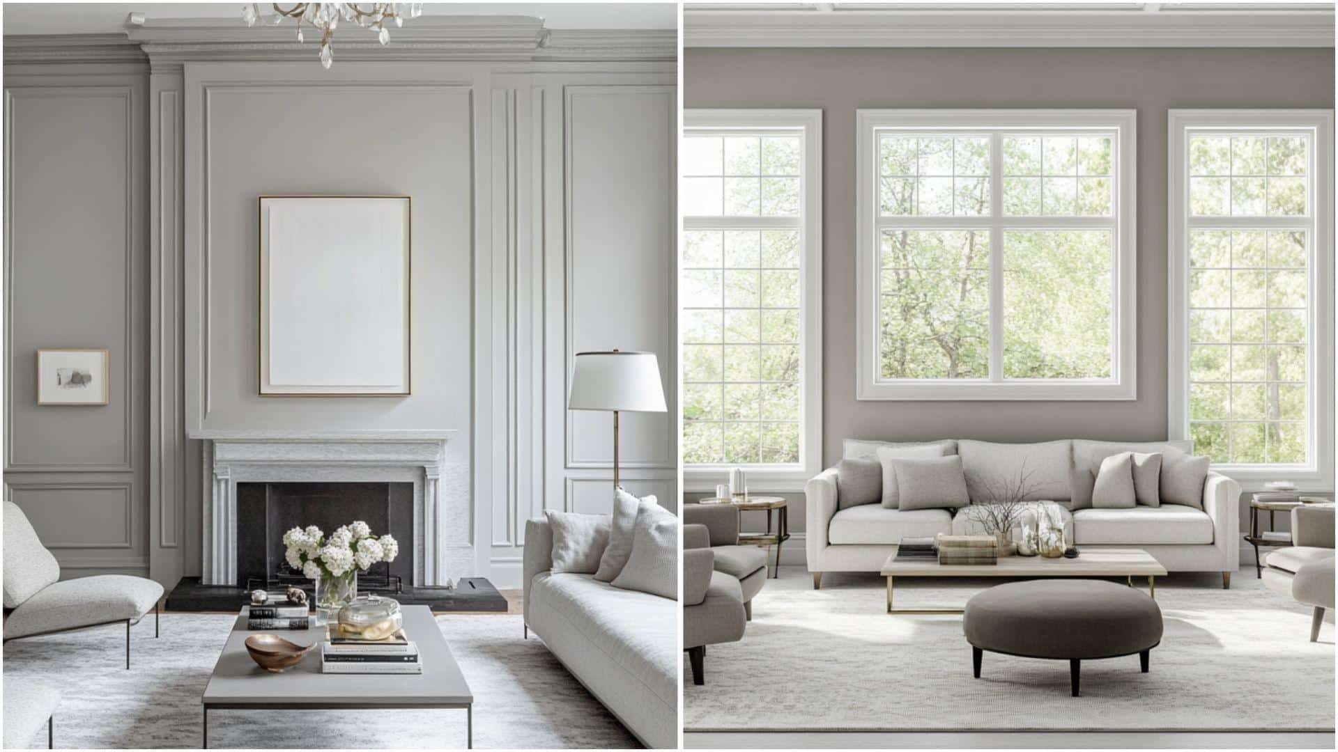
Light French Gray: This cooler gray creates an airy, urbane atmosphere. Its blue-violet undertones provide a contemporary feel and pair beautifully with crisp white trim.
Repose Gray: These warm undertones create a versatile, inviting neutral that adapts well to changing light. It enhances both modern and traditional furniture while maintaining a calm backdrop.
Bedrooms and Relaxation Areas
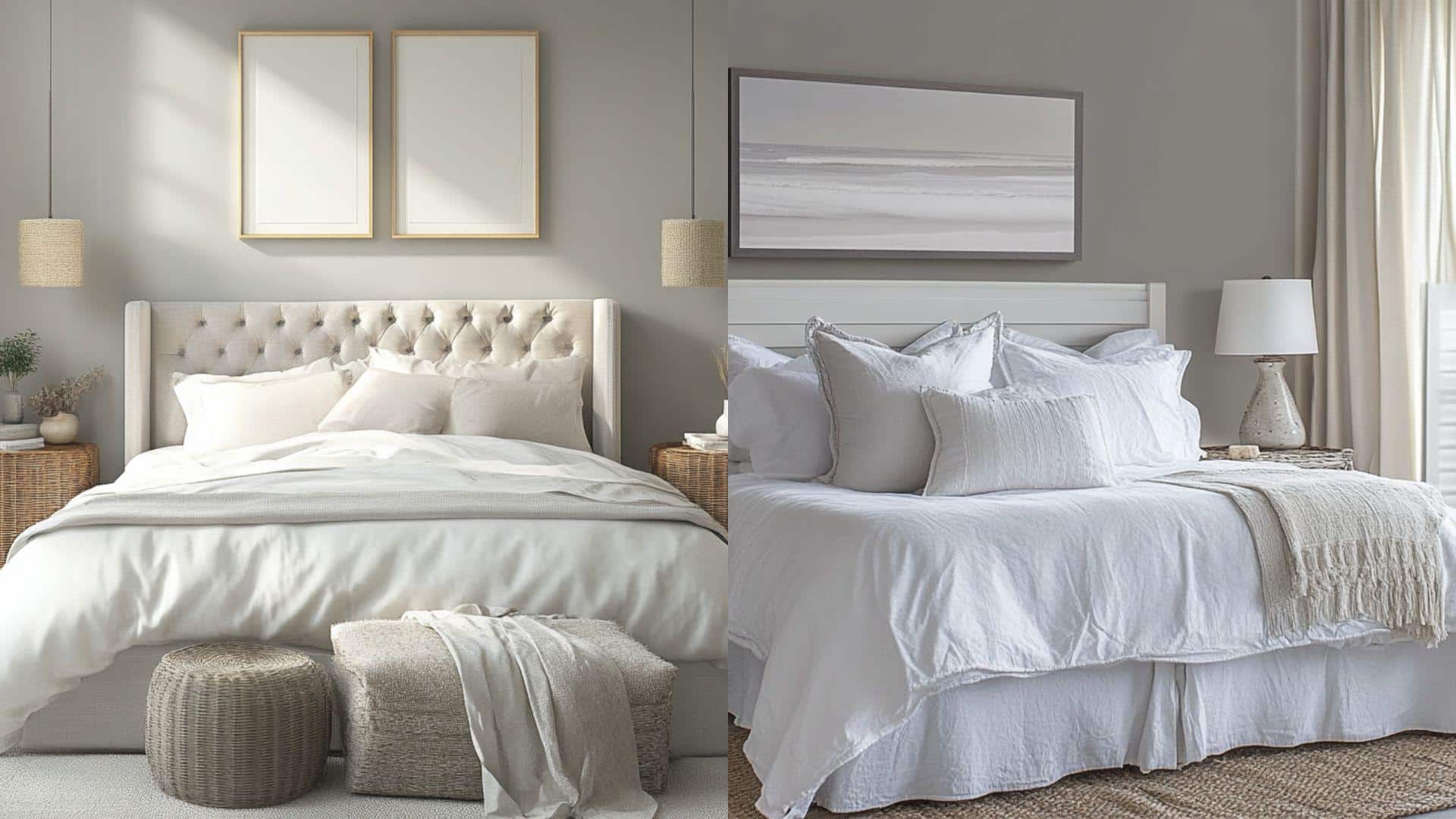
Light French Gray establishes a serene, refined environment that works exceptionally well with blue, purple, and silver accents. It creates a peaceful, cool sanctuary effect.
Repose Gray’s subtle warmth delivers a cozy, grounded feeling. It complements earth tones and natural textiles and creates a versatile backdrop for changing bedroom decor.
Kitchen
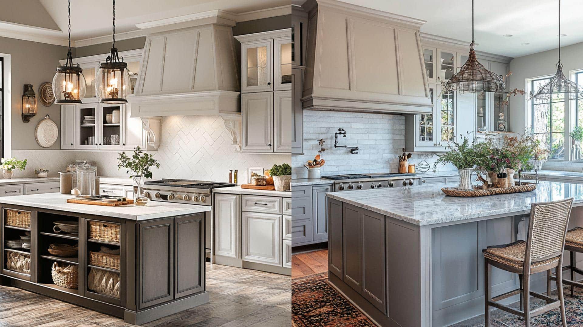
Light French Gray: Creates a clean, contemporary look that pairs well with white cabinets and marble or quartz surfaces. Its cooler tone balances warm wood elements beautifully.
Repose Gray adapts seamlessly to various lighting conditions, making it perfect for kitchens with mixed light sources. It creates harmony with both stainless steel and brass fixtures.
Bathrooms
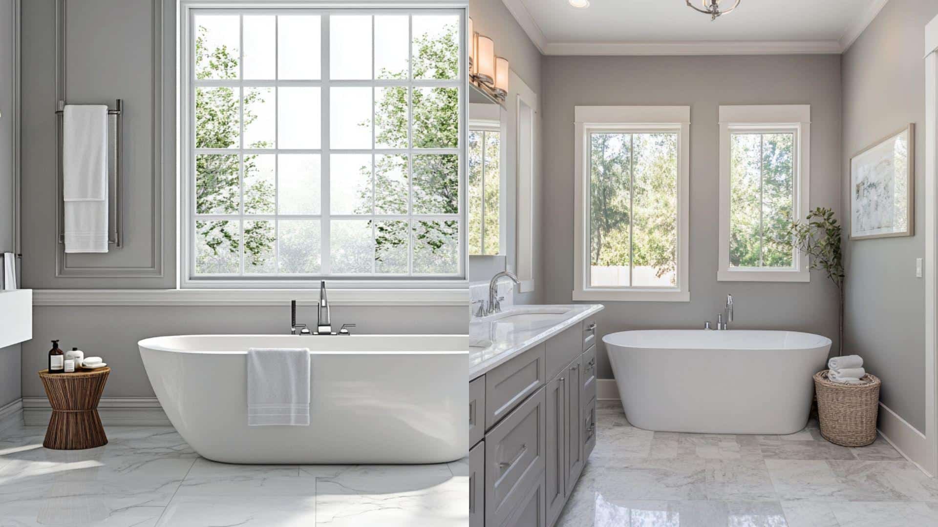
Light French Gray produces a spa-like, refreshing atmosphere that enhances the brightness of white fixtures. Its subtle blue undertones complement cool tile selections.
Repose Gray adds warmth and intricacy to bathrooms, particularly flattering with natural stone, greige tiles, and brushed nickel fixtures. It maintains its balanced tone even in limited natural light.
Which One Is More Timeless? Light French Gray vs Repose Gray
Both Sherwin-Williams colors have established themselves as enduring neutrals in the gray family, though they serve different design objectives.
Current Color Trends & Long-Term Appeal: Repose Gray (SW 7015) aligns with the ongoing preference for versatile, adaptable neutrals with warmth, while Light French Gray (SW 0055) represents the enduring appeal of cooler, more refined gray tones.
Versatility Across Changing Decor: Repose Gray transitions easily between design styles due to its balanced warm undertones, making it highly adaptable to decor shifts. Light French Gray creates a more distinctive cool backdrop that requires more deliberate coordination but offers timeless appeal.
Real-World Applications: Both colors appear consistently in designer portfolios across varied architectural styles. Repose Gray shows remarkable staying power in transitional and contemporary spaces, while Light French Gray maintains popularity in modern and traditional designs seeking refinement.
Mistakes to Avoid
Never select either color based solely on photos or small paint chips. Sample both on multiple walls, as Light French Gray can appear too cool and shadowy in north-facing rooms, while Repose Gray might wash out in intense natural light.
Watch for undertone shifts throughout the day. Light French Gray may reveal its blue-violet undertones in the afternoon light, whereas Repose Gray’s warm taupe notes can emerge more distinctly in the warm evening light.
Consider the orientation and natural light of your room. South-facing rooms can neutralize the coolness of Light French Gray, diminishing its distinctive character. North-facing rooms may amplify Repose Gray’s cooler properties, potentially masking its intended warmth.
Wrapping It Up
After living with both Light French Gray and Repose Gray samples in my home for weeks, I learned that choosing between them ultimately comes down to your specific vision and environment.
Is your space calling for the cool refinement of Light French Gray or the versatile warmth of Repose Gray?
I found that testing large swatches on multiple walls at different times of day was essential, and I recommend that you do the same.
How does each color make you feel when you walk into the room? Which one complements your existing furnishings and creates the atmosphere you desire?
Remember, there’s no objectively “right” choice between these beautiful grays. Trust your instincts and the evidence of your test samples.
Ready to add grace to your space? Pick up your samples today and watch how these colors can completely reinvent your home!

Alex Guerrero, a graduate with a Fine Arts degree from the Rhode Island School of Design, has been a visionary in the world of color and design for over 15 years. His professional journey began in the heart of the fashion industry in Milan, where he developed an acute sense for color harmonies and trends. Alex joined our team in 2018, offering fresh and innovative perspectives on color utilization in various spaces. Renowned for his ability to blend contemporary trends with timeless elegance. Outside of work, Alex is an accomplished painter and a volunteer art therapist, his artistic talents further enriching his professional insights.