Are you trying to get that perfect mid-century modern look in your home?
Picking the right paint colors can be one of the hardest parts. I went through the same thing while updating my old 1950s bungalow, so I understand the challenge.
The good news is, you don’t have to try a dozen samples or spend a lot of money on a designer. In this guide, I’m sharing true mid-century paint colors that can completely change your space.
I’ve tested many of these myself in different rooms and lighting. These colors aren’t just trendy, they’re true to the mid-century style and bring out the character of that design.
If you’re redoing an entire house or just giving one room a fresh look, these paint colors will help you create that timeless mid-century feel.
Let’s take a closer look and find the one that fits your home just right.
What Defines a Mid-Century Paint Color?
Mid-century modern colors weren’t chosen by accident. They reflect a time in history, right after World War II, when people were hopeful and excited about the future.
The colors from the 1940s to the 1960s mixed bold, rich shades with softer, earthy tones. Warm oranges and browns were used next to deep teals, chartreuse, and mustard yellows.
What made these colors special was how designers used them together. They mixed bright and natural shades in ways that felt fun but still calm.
Most mid-century colors are a little muted, not too bright or sharp. They often have warm, earthy undertones and look great with natural wood, leather, and stone.
A true mid-century look usually starts with a neutral base, like cream or beige. Then, it adds small pops of color through furniture, art, or even a single painted wall.
This keeps the space stylish without making it feel too loud or busy.
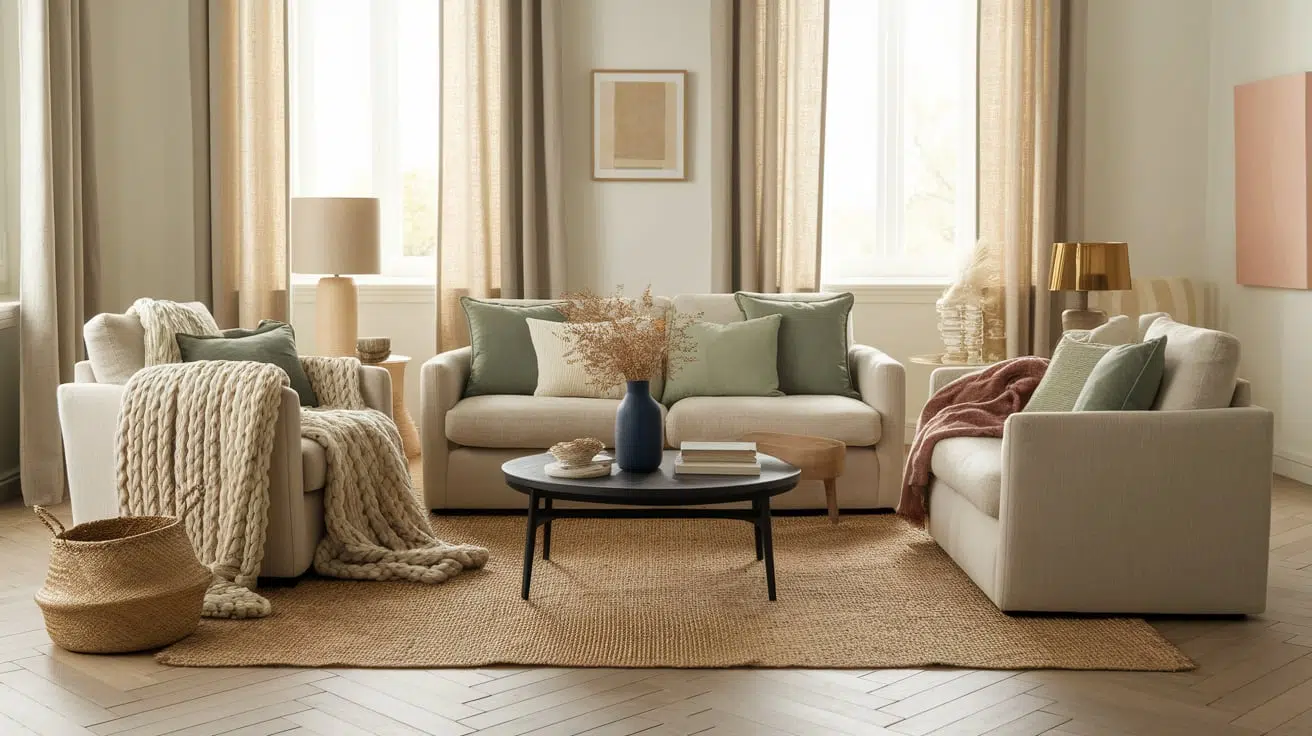
Top Mid-Century Paint Colors
These paint colors really capture the feel of the era but still look great in today’s homes. I’ve pulled together a mix of shades from different brands – some make a bold statement, while others are more neutral and easy to live with.
1. Sherwin-Williams Cavern Clay (SW-7701)
Cavern Clay (LRV-20) is a warm terracotta that gives any room a cozy, earthy feeling. It brings back the desert tones that were popular during the mid-century years.
This color looks amazing in living or dining rooms, especially when paired with walnut furniture or brass details.
It shifts slightly throughout the day, becoming more orange in the morning and more red in the evening.
Use it on a single wall behind a sideboard, or go bold and paint the whole room. Add white trim to keep the space feeling fresh and bright.
2. Benjamin Moore Terra Cotta Tile (2090-30)
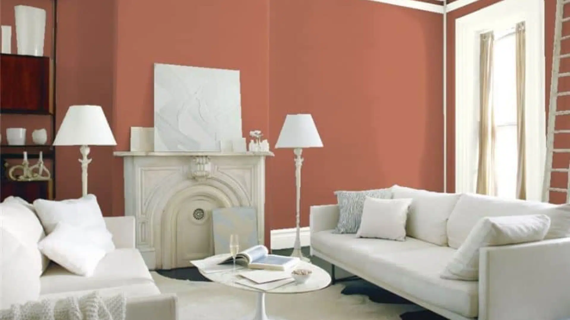
Terra Cotta (LRV-14.14) Tile is a rich, earthy color with red undertones that give it a bit more drama than typical terracotta.
It was commonly seen in mid-century homes, especially in warm-weather areas like the Southwest.
This shade works beautifully as a background for wood furniture and indoor plants. It brings energy and warmth into offices or living spaces.
Pair it with turquoise accessories to create that classic mid-century color combo that always catches the eye.
3. Behr Spanish Sand (OR-W07)
Spanish Sand (LRV-64) is a soft, warm neutral with subtle orange undertones.
It gives off mid-century vibes without being too bold, making it great for open floor plans or whole-house color schemes.
This shade changes slightly with the light, sometimes looking more golden, sometimes more beige.
It works well in almost any room and keeps things feeling natural and grounded. Pair it with dark wood and black accents for a balanced, authentic mid-century modern look.
4. Farrow and Ball Pale Powder (No.204)
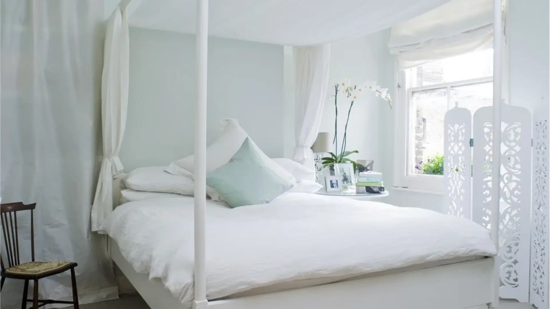
Pale Powder (LRV-70) is a gentle mix of blue and green with a soft, chalky finish.
It reminds you of pastel bathroom tiles from the 1950s, but it feels more modern and relaxed.
This color works well in bedrooms or bathrooms where you want calm, soothing tones. Depending on the light, it leans more green or more blue, so it’s flexible with different decor.
Try pairing it with warm wood and small pops of color like yellow or coral to keep the space fun and vintage.
5. Sherwin-Williams Mint Condition (SW-6743)
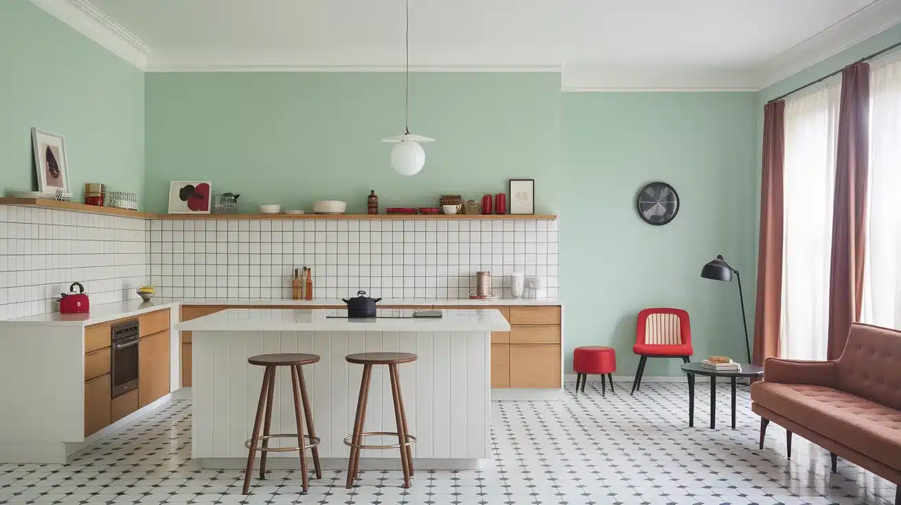
Mint Condition (LRV-73) is a light, refreshing green with a little bit of gray that keeps it from feeling too sugary.
It has a playful, retro feel, especially in kitchens or bathrooms where mint-colored appliances once ruled.
This color makes a great accent wall or adds beauty when used in smaller spaces.
Pair it with white tile or light wood for a clean look, then add red or black accessories for a cool mid-century twist. It’s cheerful but still easy to live with.
6. Behr Rose Sorbet (150A-2)
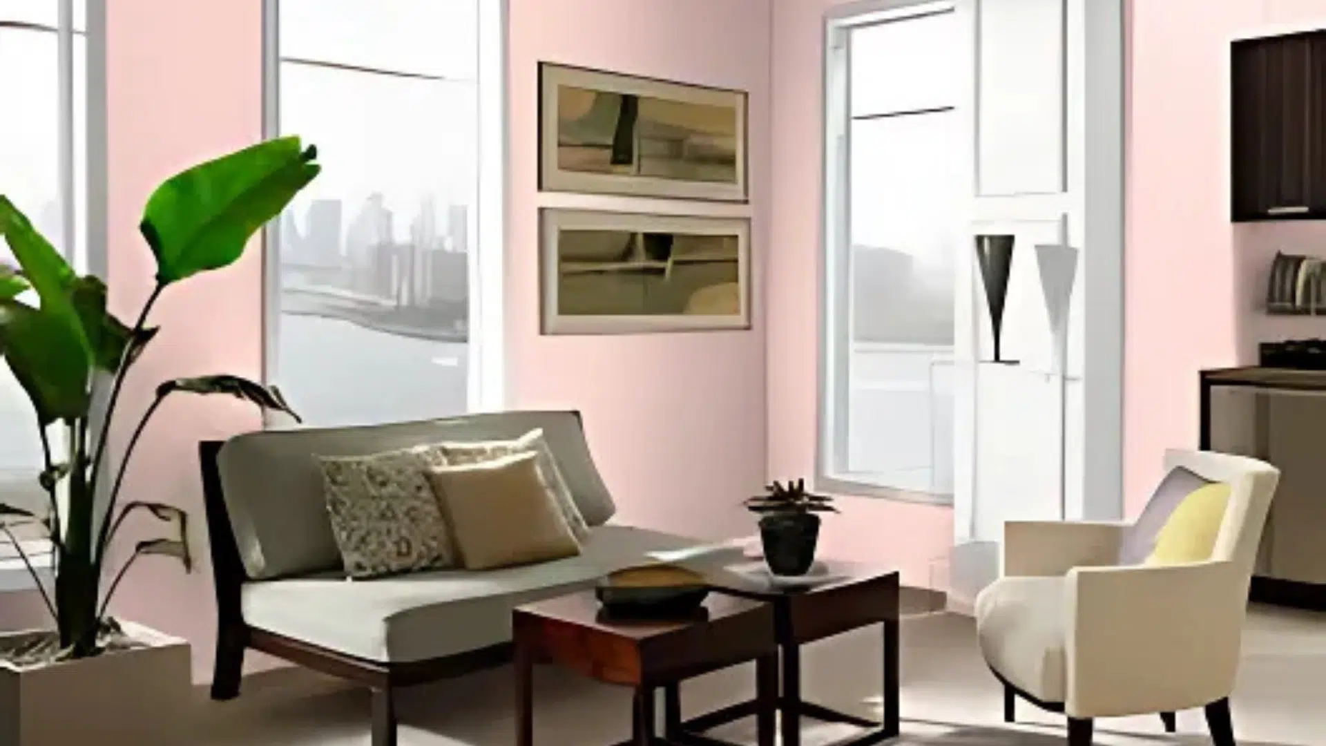
Rose Sorbet (LRV-72) is a soft pink with a slightly dusty tone, making it feel gentle but not too sweet.
It reminds you of the pink bathrooms and kitchens that were everywhere in the 1950s. This shade adds warmth and a flattering glow to bedrooms, powder rooms, or even a cozy dining space.
It has a bit of gray mixed in, which keeps it from feeling too bright or childish.
Pair it with black-and-white tile, chrome fixtures, and natural wood for a true mid-century look that feels stylish and fresh.
7. Benjamin Moore Electric Blue (2061-40)
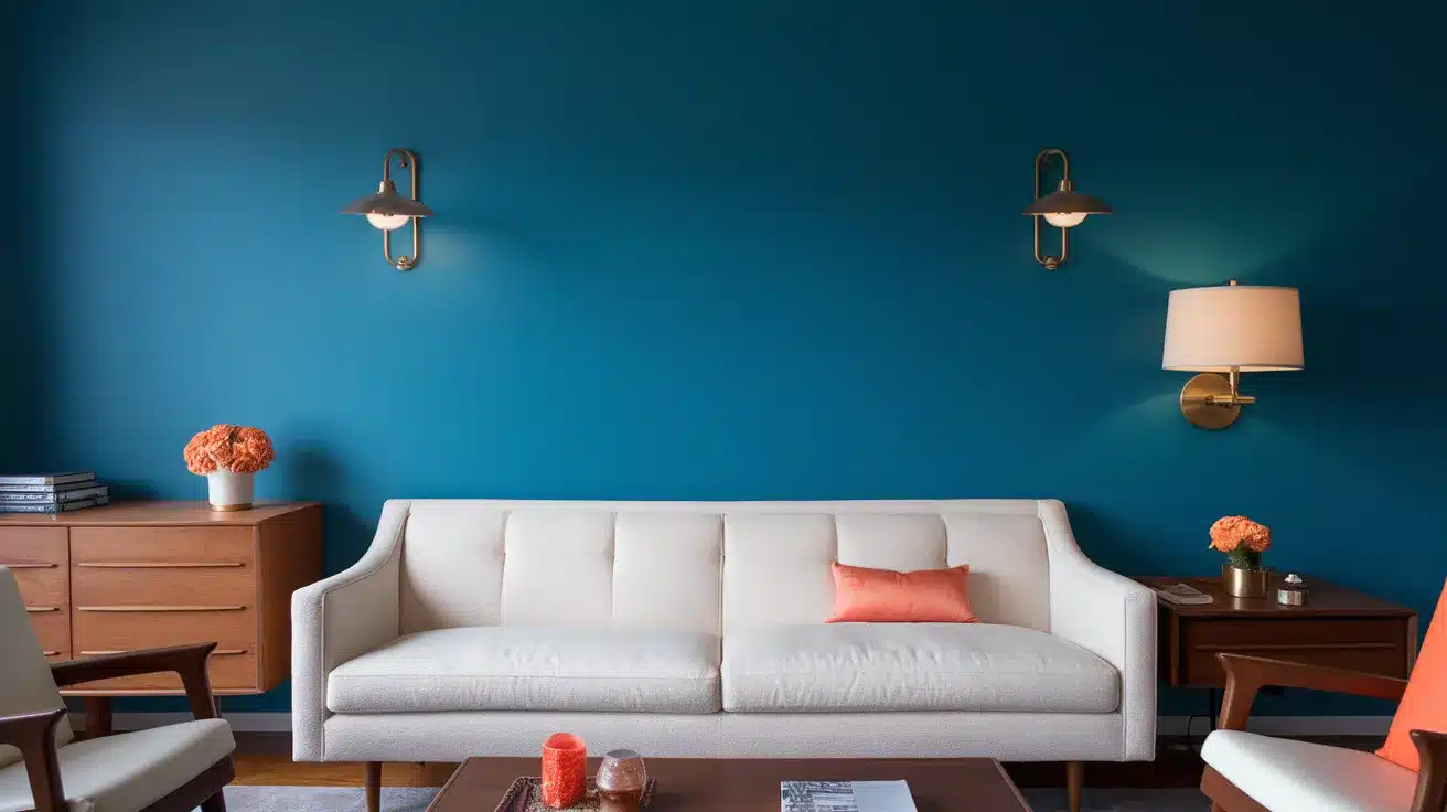
Electric Blue (LRV-27.68) is a bold, vibrant shade with a hint of turquoise that brings energy into any room.
It’s the kind of color that mid-century design is known for, strong, cheerful, and full of life. Use it as an accent wall behind a white sofa or bookshelf to make the space pop.
Even though it’s bright, it has a soft warmth that keeps it from feeling cold.
Match it with brass, walnut wood, and a touch of orange or coral for a fun, balanced mid-century vibe.
8. Sherwin-Williams Chartreuse (SW-0073)
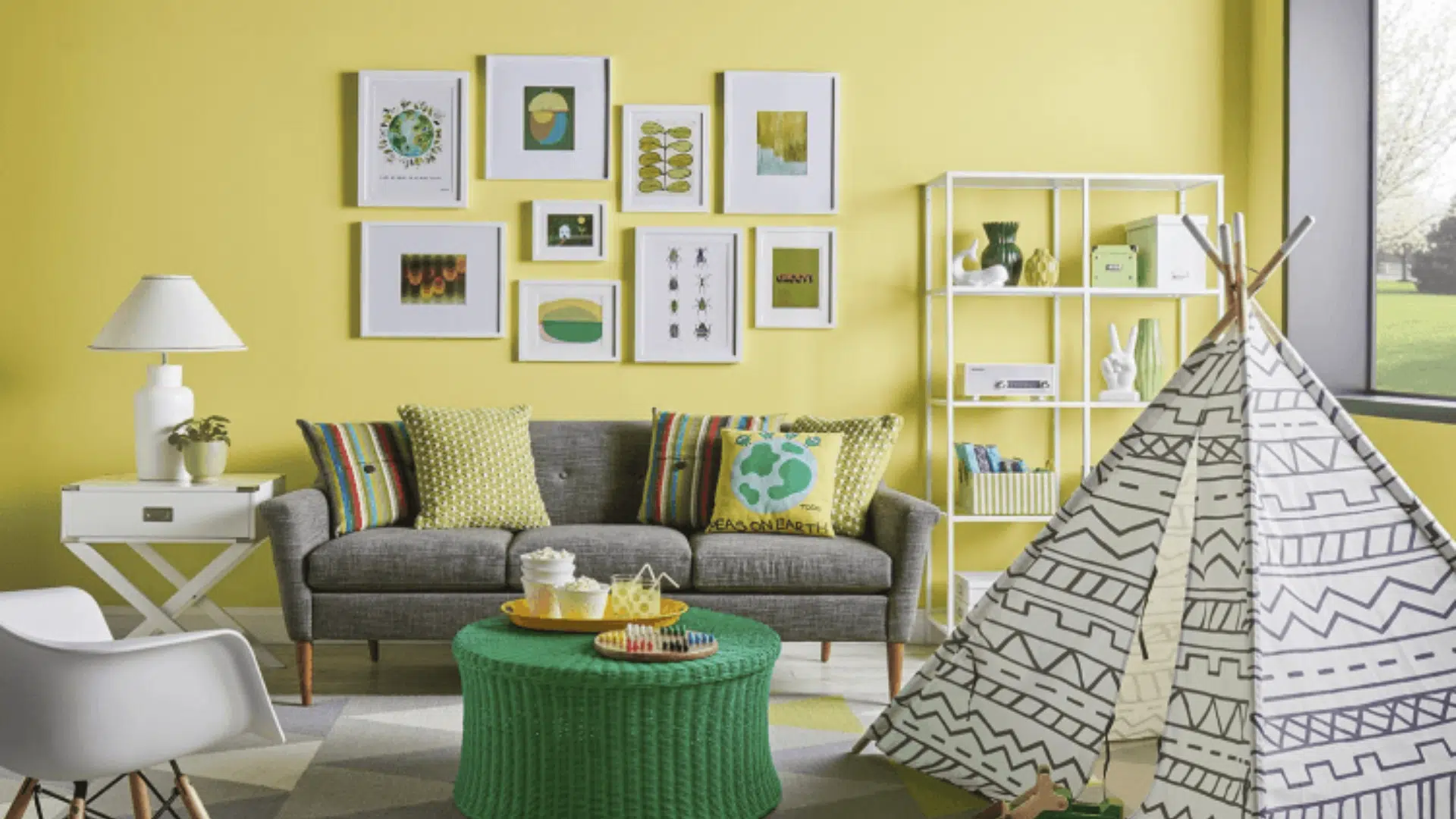
Chartreuse (LRV-64) is a bold yellow-green that instantly gives a room that classic mid-century flair.
It was used often in the 1950s and ’60s, from walls to decor to fabric prints.
It’s best used in small amounts – on an accent wall, inside bookshelves, or on a piece of furniture.
This color grabs attention and brings life to a space, so it’s great in rooms that need a bit of spark. Balance it with plenty of white, wood, or leather to keep it grounded and stylish.
9. Valspar Mustard Seed (260-5)
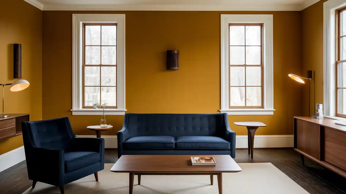
Mustard Seed (LRV-37.562) is a rich, golden yellow that adds warmth and character without being too bright.
It’s a grounded color that fits well in mid-century spaces, especially living rooms or kitchens. This shade works great with other warm tones and creates a cozy, welcoming feel.
It has enough depth to hold its own but won’t overpower a room.
Try pairing it with navy blue, white trim, and dark wood for a colorful but classic look that still feels timeless.
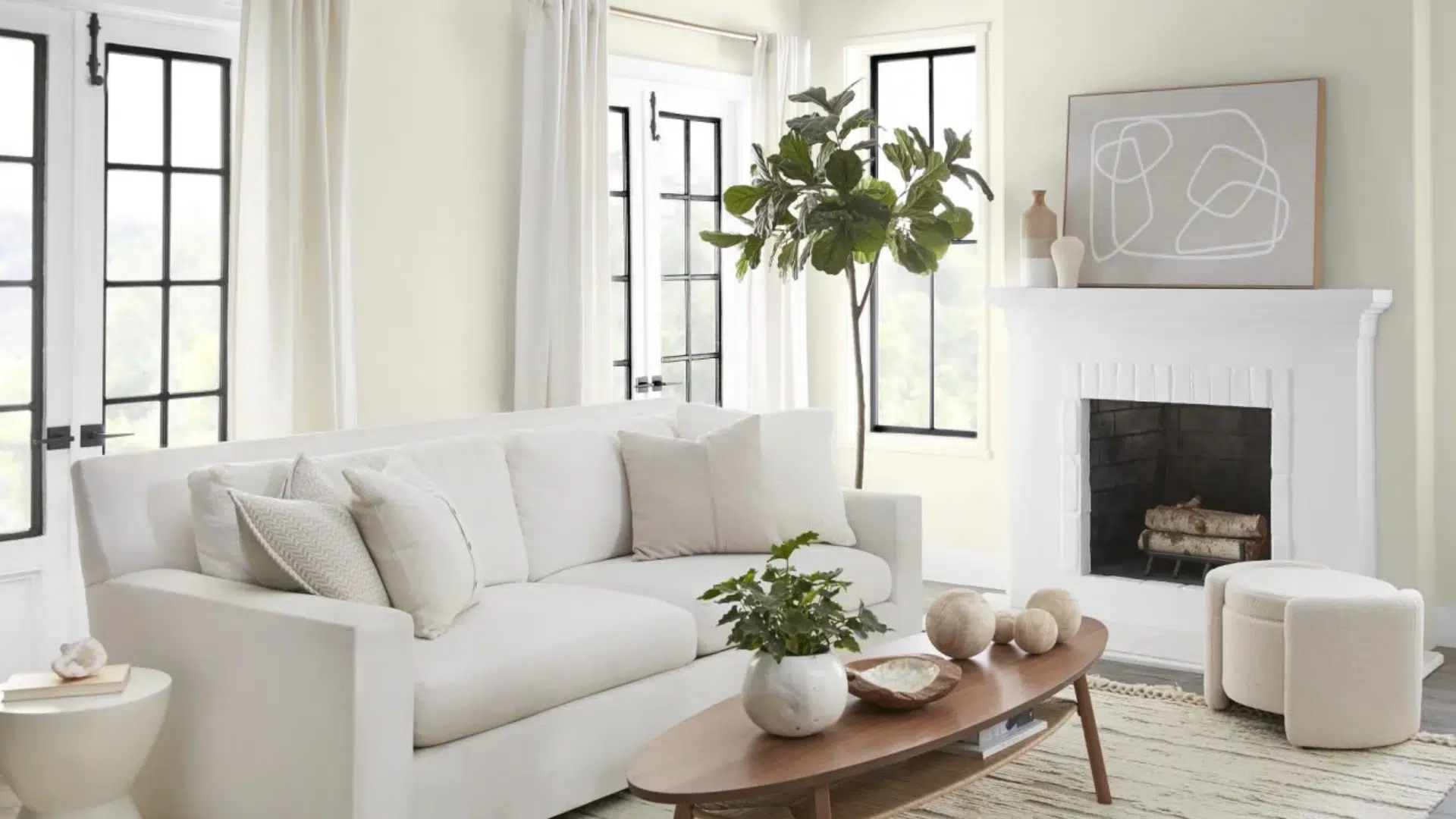
10. Benjamin Moore White Dove (OC-17)
White Dove (LRV-83.16) is a soft white that’s perfect for mid-century homes. It’s clean and crisp but has just enough warmth to feel inviting.
This color works great as a neutral base, letting your mid-century furniture and accent colors stand out.
Use it on walls, ceilings, or trim to brighten up any space without making it feel too stark.
Pair it with bold colors like avocado green or teal to create a fresh but balanced design that highlights both your paint and decor.
11. Sherwin-Williams Accessible Beige (SW-7036)
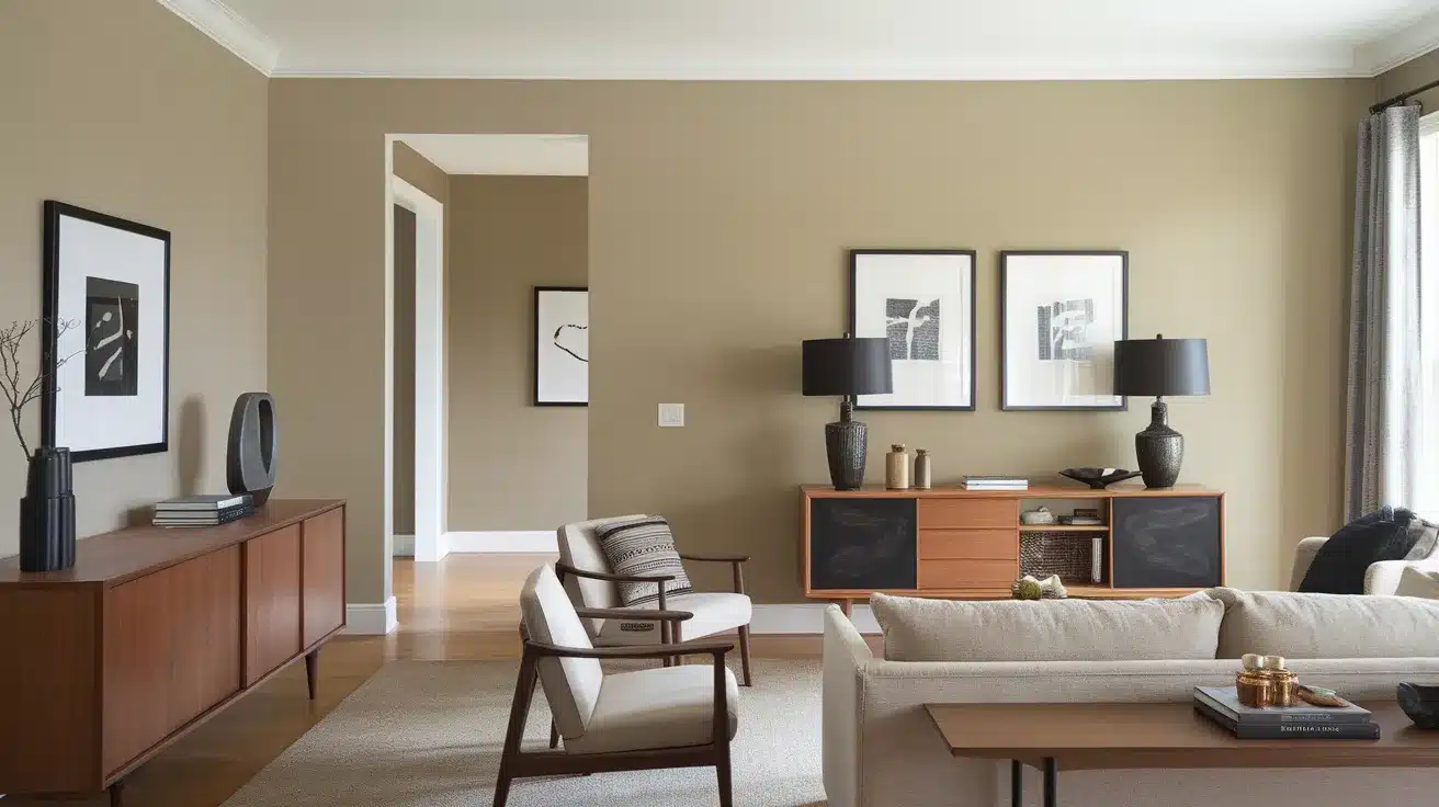
Accessible Beige (LRV-58) is a warm, soft neutral with just the right mix of beige and gray.
It’s a great color for tying together different rooms, especially in homes with open floor plans. This shade looks good in all kinds of light and feels calm and natural.
It pairs really well with mid-century furniture, especially darker woods and black or brass accents.
Use it in living spaces, hallways, or bedrooms where you want a subtle backdrop that still has personality.
12. Farrow and Ball Cornforth White (No.228)
Cornforth White (LRV-77) may have “white” in the name, but it’s really a gentle light gray with warm undertones.
It’s perfect for creating a soft, neutral space that still feels rich and layered.
This color works beautifully in bedrooms, living rooms, or even kitchens where you want a clean look that isn’t too cool or sterile.
It pairs well with colorful mid-century accents like teal, coral, or mustard and blends smoothly with wood and metal finishes.
13. Valspar Midnight Bayou (C115)
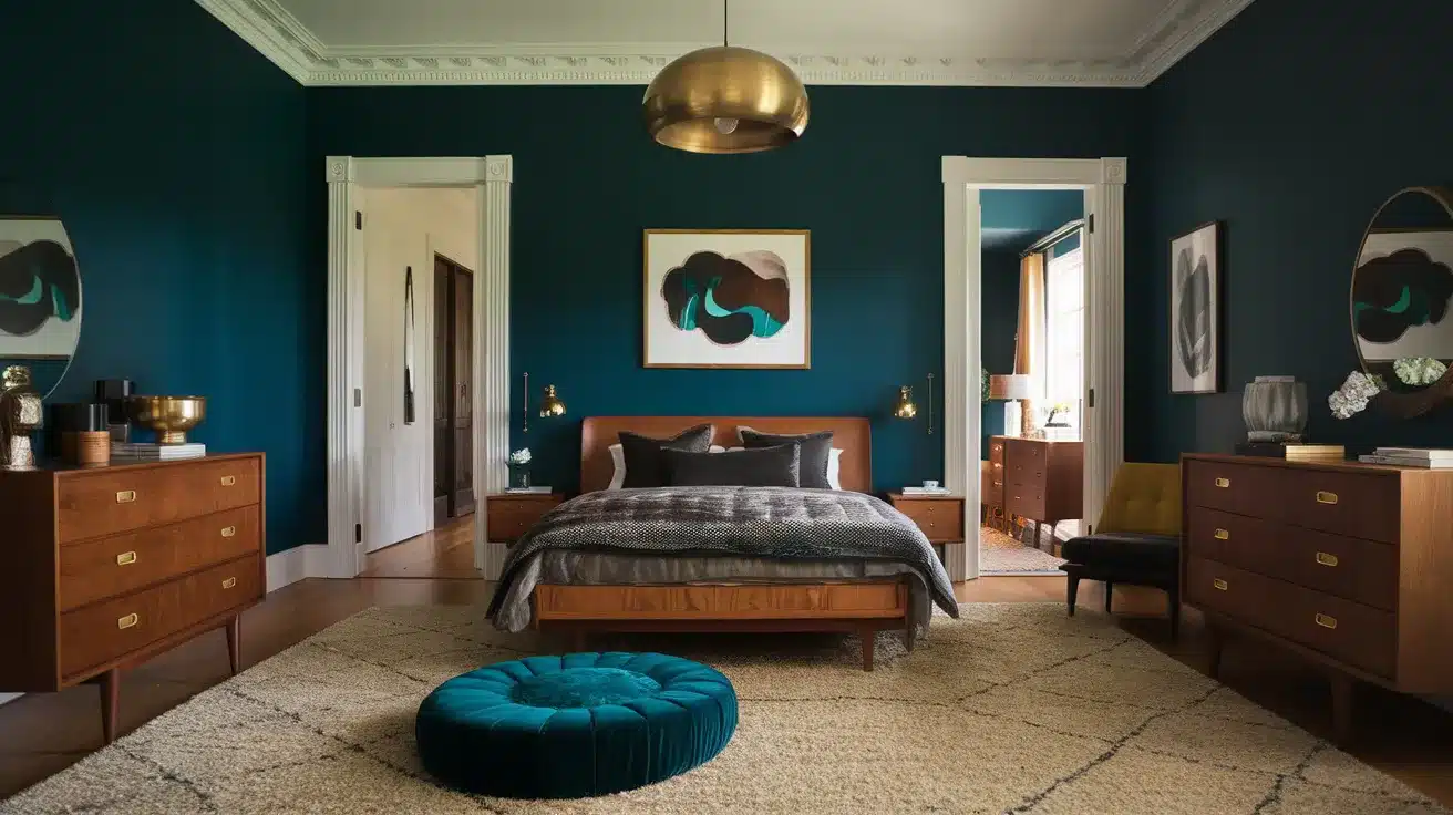
Valspar Midnight Bayou (LRV-5.66) is a deep, dramatic teal with rich blue and green undertones that give it a bold yet stylish presence.
It’s the kind of color that adds instant depth and worldliness to a room, making it ideal for accent walls, cozy bedrooms, or dramatic dining areas.
The moody tone brings a sense of calm while still feeling stylish and strong. Midnight Bayou pairs beautifully with warm woods, crisp white trim, and metallic finishes like brass or bronze.
If you’re looking for a color that feels both grounded and striking, Midnight Bayou is a stunning, timeless choice.
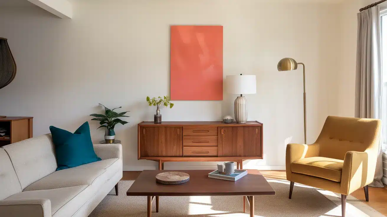
14. Sherwin-Williams Coral Reef (SW-6606)
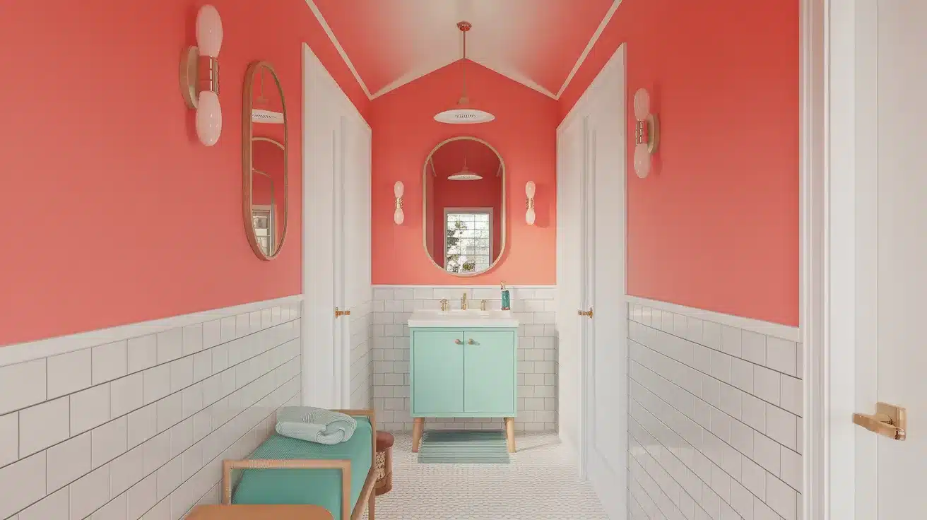
Coral Reef (LRV-29) is a bright, cheerful coral that adds a playful pop of color to any space.
Its color is somewhere between orange and pink, making it a great choice for accent walls or fun details like doors or ceilings.
This color brings warmth and energy without feeling too wild. It pairs perfectly with teal, white, and natural wood.
Use it in a hallway, entryway, or even a small bathroom to make a bold but beautying mid-century statement.
15. Benjamin Moore Avocado (2145-10)
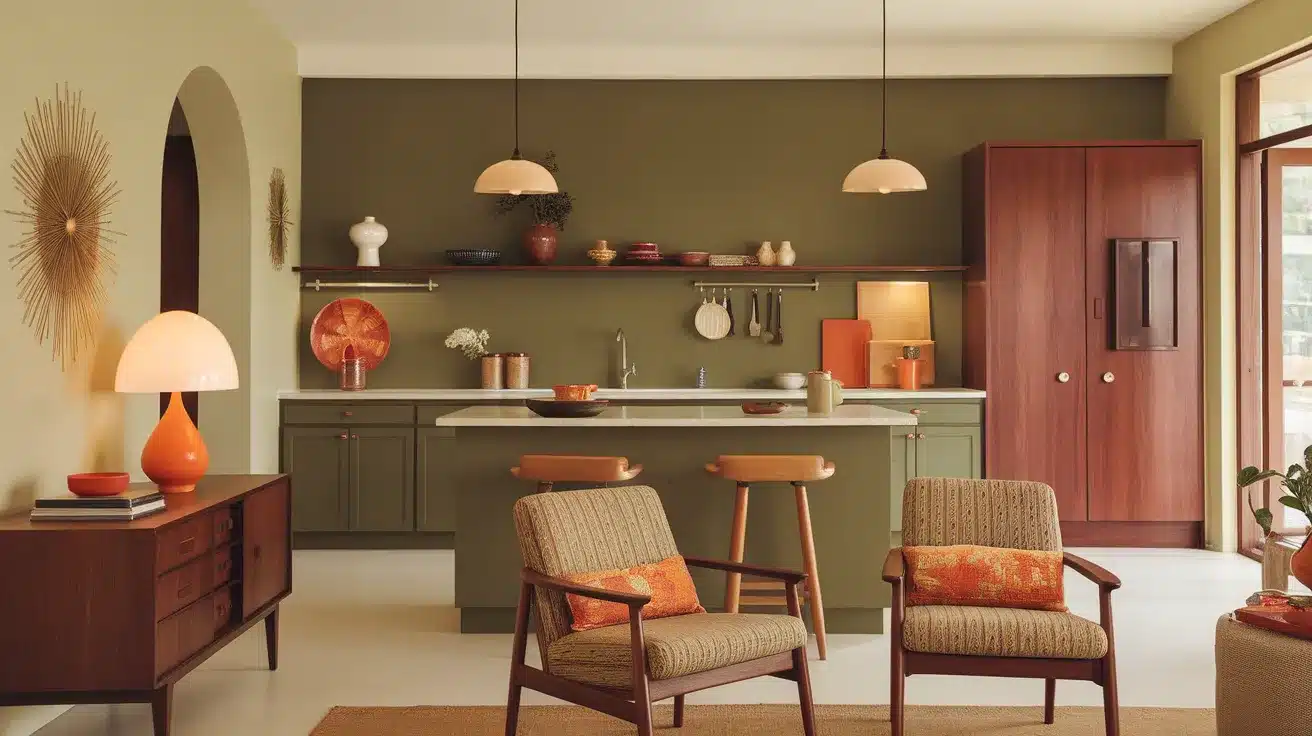
Avocado (LRV-16.52) is one of the most iconic mid-century colors.
It’s a rich green with earthy brown tones that instantly brings warmth and personality into a room.
This color was everywhere in the ’60s and ’70s, and it still works beautifully today. Use it on a feature wall, kitchen cabinets, or even in a cozy dining room.
Avocado pairs perfectly with warm whites, orange accents, and classic wood furniture. If you want to go full retro, it’s a perfect pick.
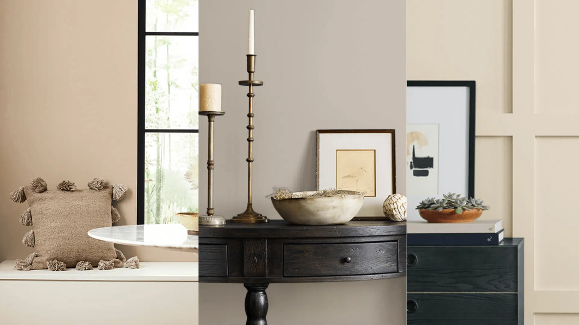
Tips for Styling Mid-Century Paint Colors
I’ve learned that choosing a mid-century paint color is just the beginning – the way you use that color can truly change the whole space.
- Start small – Try your color on an accent wall or small room before going all in.
- Follow the 60-30-10 rule – Use 60% of a main color, 30% of a secondary, and 10% as an accent.
- Check undertones – Make sure the undertone of your paint matches your furniture and décor.
- Think about flow – Keep colors consistent or complementary from room to room.
- Highlight architecture – Use color to draw attention to unique mid-century features like beams or built-ins.
- Don’t forget the ceiling – A bold or soft ceiling color can add character to the whole room.
- Always test first – Paint a sample and see how it looks in different lighting before committing.
With a little planning, your space can feel stylish, timeless, and totally you.
Conclusion
Mid-century colors bring more than just style – they add warmth, feeling, and a touch of history to your home. These shades take us back to a time when design focused on comfort, simplicity, and looking ahead.
That’s why they still feel so timeless. You might be drawn to a bold color like avocado green or prefer a soft, welcoming shade like warm tan or dusty pink.
Whether your style leans modern or vintage, there’s a mid-century color that can fit your space and show off your personality.
The key step? Always test first. A color that looks great on a swatch might feel totally different on your walls, especially as natural light shifts throughout the day. I’ve learned that firsthand.
So, which mid-century colors speak to you? Have you tried any at home? Share your favorites in the comments – I’d love to hear what’s working in your space!
If you enjoyed this blog, be sure to check out this guide on popular interior paint colors.

Alex Guerrero, a graduate with a Fine Arts degree from the Rhode Island School of Design, has been a visionary in the world of color and design for over 15 years. His professional journey began in the heart of the fashion industry in Milan, where he developed an acute sense for color harmonies and trends. Alex joined our team in 2018, offering fresh and innovative perspectives on color utilization in various spaces. Renowned for his ability to blend contemporary trends with timeless elegance. Outside of work, Alex is an accomplished painter and a volunteer art therapist, his artistic talents further enriching his professional insights.