Finding the right paint color can be challenging, especially when matching an existing wall, favorite fabric, or a special piece like a vintage rug.
Even a slightly off shade can throw off the balance of a room and create unwanted contrast.
Thankfully, today’s color-matching tools, combined with a few simple techniques, make the process much easier.
From identifying undertones to using helpful mobile apps, you can now match paint with more confidence.
In this guide, I’ll show you how to find a color that fits your space perfectly, saving time, avoiding mistakes, and creating a cohesive look throughout your home.
Why Paint Color Matching Matters
A good match keeps the look clean and consistent. A small mismatch in tone or undertone distracts the eye and throws off the entire room.
Matching paint helps fix patches, link new and old decor, and tie in sentimental or existing pieces like vintage tiles or favorite furniture.
Matching also saves time, money, and extra work; instead of repainting an entire wall, a small, well-matched section blends right in.
When the color fits the space, it creates unity. Every surface looks like part of one complete design instead of a mix of guesswork.
How to Find a Perfect Paint Match
Matching paint starts with a plan. Light, texture, and nearby colors all affect how a shade looks. Look closely at the space, test samples, and choose based on what already works in the room.
1. Start with What’s Already in the Room
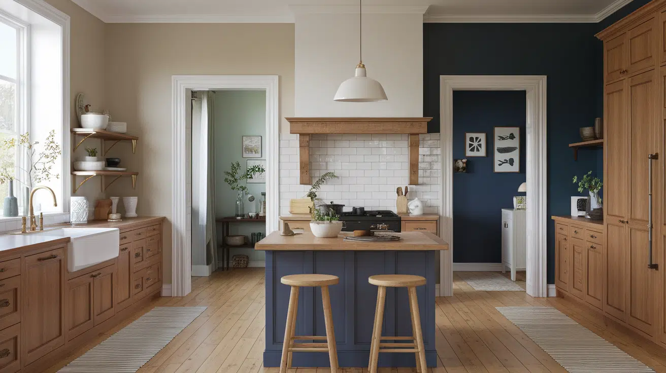
Flooring, cabinets, countertops, and large furniture all affect how a paint color looks.
A warm wood floor might need creamy white or sage green to stay balanced.
Cool tile works better with soft blue or beige.
Lighting plays a role, too. LED lights cool things down, while incandescent bulbs warm them up.
Check undertones using a piece of white paper. This reveals if a surface is warm or cool. It also helps with materials like stone or marble, where undertones are subtle.
2. Decide on the Feeling You Want
Paint controls the room’s mood. Warm tones like rust, coral, and gold bring energy and comfort.
Cool tones like green, blue, and lavender create a peaceful and open feel. Soft yellow or coral adds cheer in creative areas or play zones.
Natural light changes how the color looks. Bright rooms support deeper tones, while dim spaces do better with lighter shades.
Mid-tones and darker neutrals work well in busy homes with pets or kids. They help hide scuffs and stains.
In high-traffic areas, choose finishes made for cleaning, satin or semi-gloss, that hold up better over time.
3. Use Color Theory to Guide You
Simple rules help find the right match. Complementary colors (like blue and orange) make bold contrasts.
Analogous colors (like teal, blue, and green) feel calm. Triadic sets (like red, yellow, and blue) stay lively without looking scattered.
Start with one main color. Add lighter or darker versions of it, or place neutrals like soft white, gray, or taupe around it. This keeps everything connected.
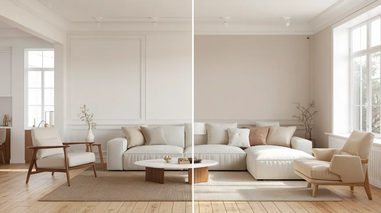
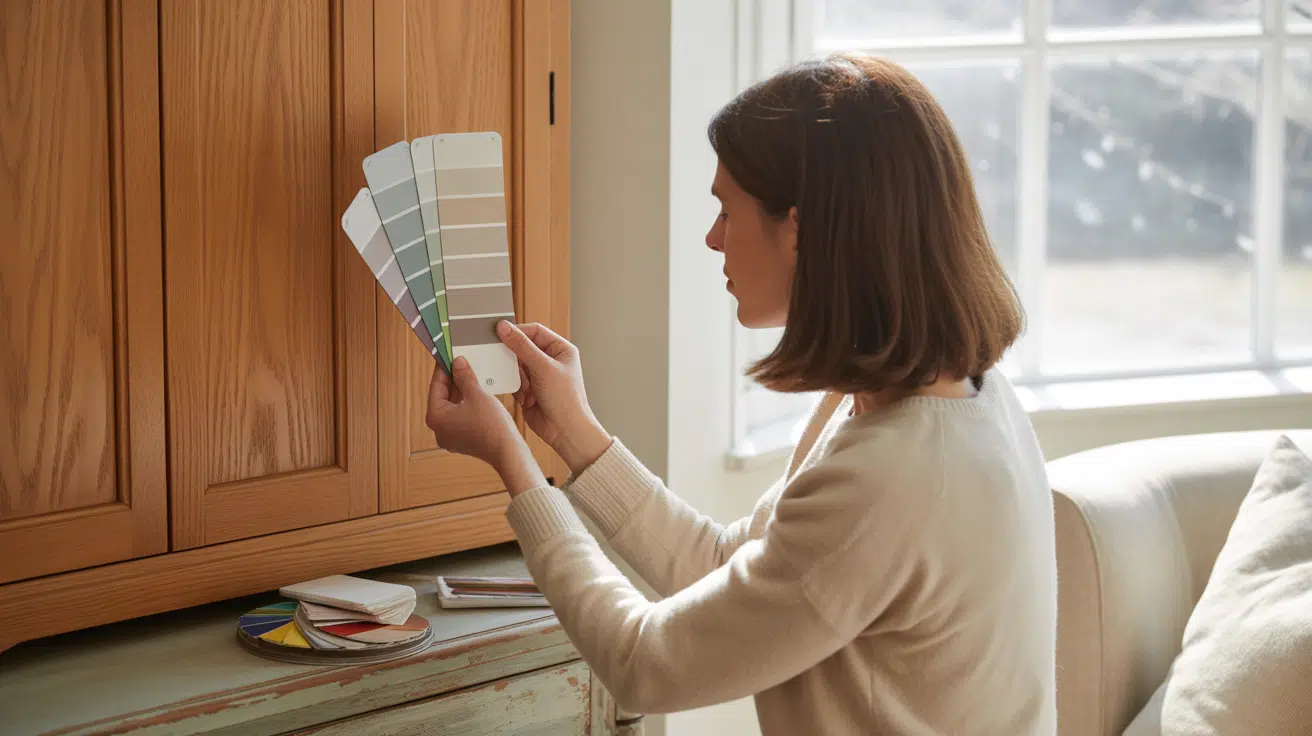
Always compare swatches in the room next to the trim and furniture. A beige might look perfect in the store, but it turns pink or peach at home.
4. Always Try a Sample First
Paint often looks different on the wall. Test it first. Put samples on multiple walls and check them during the day and under lights at night.
South-facing rooms look warmer; north-facing rooms feel cooler.
Use poster boards to avoid damaging walls.
Move the samples around to see how the shade looks in every corner. Let each one dry fully before judging; wet paint looks glossier and darker.
This step prevents surprises after the paint goes on for good.
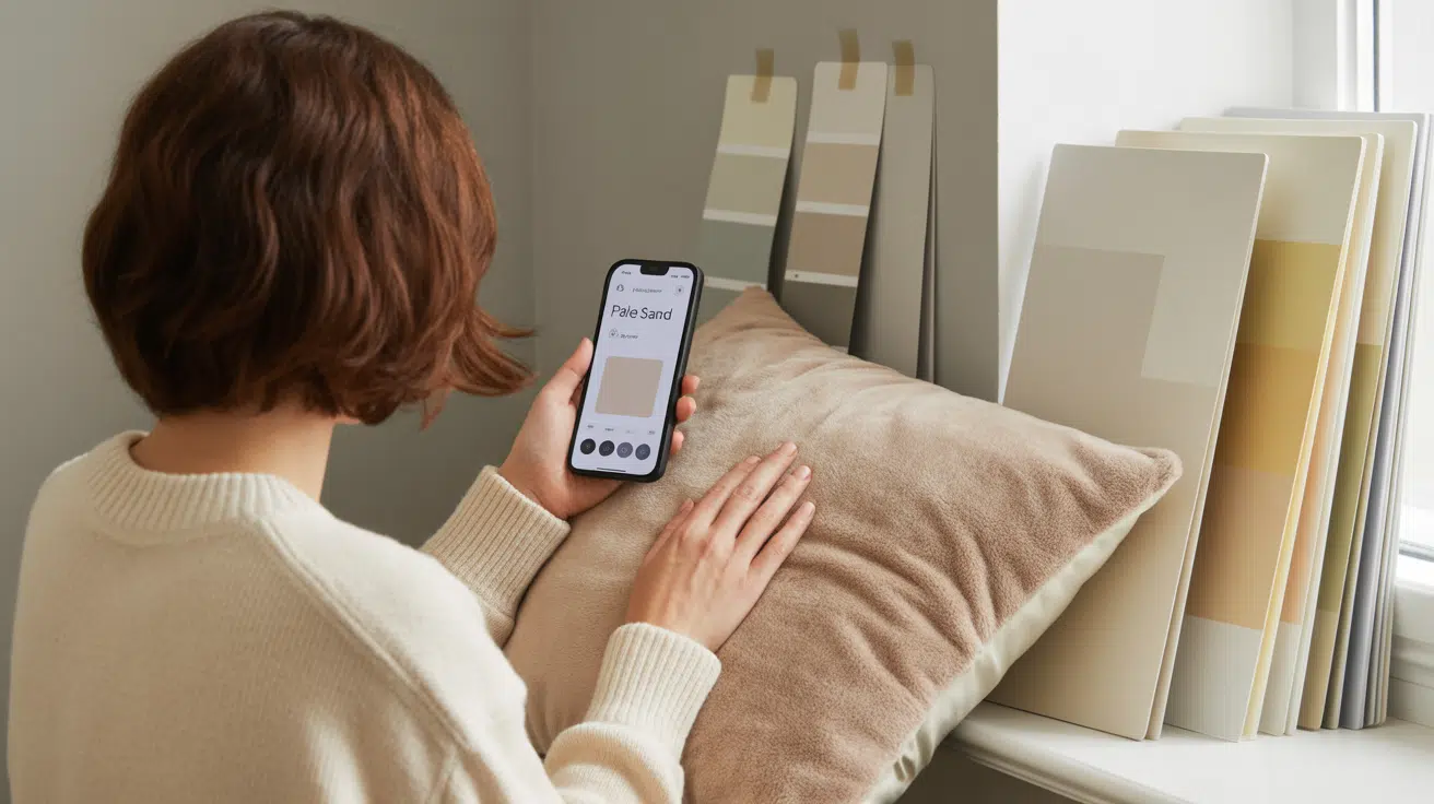
5. Find Inspiration in What You Already Own
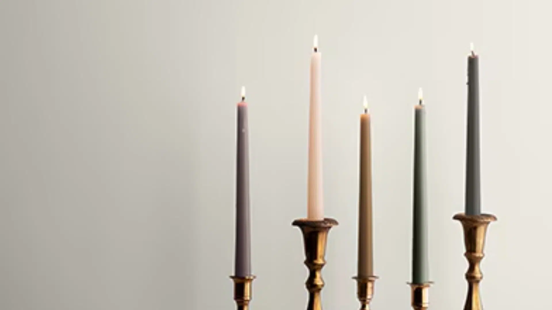
Look at pillows, blankets, artwork, or rugs in the room. A favorite scarf or book cover can inspire a color that already fits the mood.
Use a paint app to scan that item and find similar shades from top brands. Slightly darker or lighter versions often work better on large surfaces.
Apps also help pull accent colors from the same item for shelves, cabinets, or trim.
Look in small places too, inside books, pottery, or curtains. These sources often give colors that already feel like part of the home.
6. Build a Balanced Color Palette
Once the main color works, build the rest of the palette around it.
Think about ceilings, trim, doors, and accent walls. Light or dark contrast helps each part of the room stand out.
The ceiling is often overlooked, but it significantly impacts how open or closed a room feels. A soft white lifts the space, while warmer tones create a cozier feel.
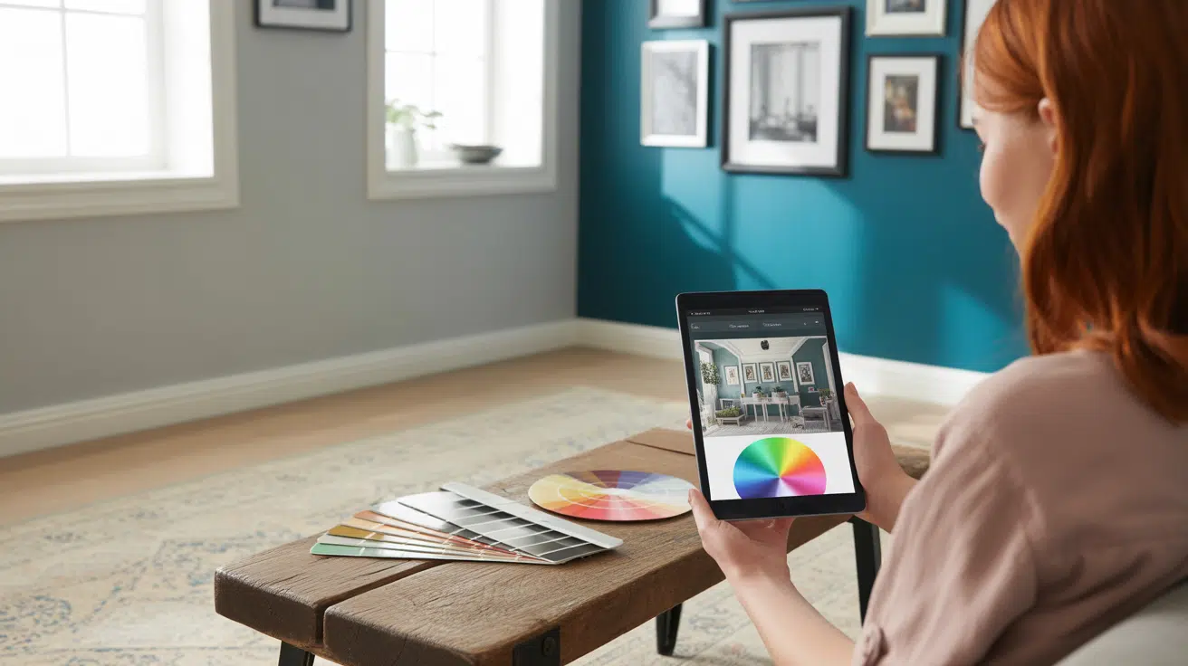
Most apps let users preview palettes with uploaded room photos.
Stick to 3–5 core colors in one space to maintain a clean and easy-to-follow look.
7. Think About the Room’s Size and Function
Paint changes the way a room feels. Light colors reflect more light and help small spaces feel bigger. Dark tones add depth and make larger rooms feel more cozy and grounded.
Use washable, darker colors in areas such as hallways, entryways, or children’s rooms.
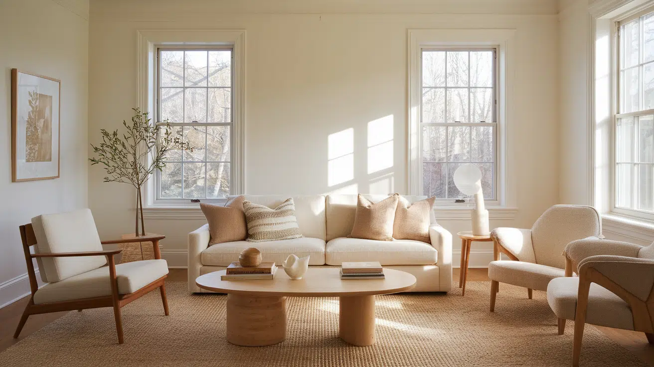
Choose soft shades for quiet spaces, such as bedrooms or reading nooks.
In media rooms or home offices, deeper matte colors also help absorb sound and reduce echo, making the space feel more relaxing.
8. Keep the Flow from Room to Room
Colors should feel connected as someone moves through the home.
Repeating trim, undertones, or wall colors in different rooms creates flow without making everything look the same.
A warm gray in the living room might show up again as a trim or accent wall in the hallway. This approach maintains a consistent and smooth color palette.
Stick to one undertone, warm or cool, to avoid clashing transitions, especially in open floor plans or narrow passageways.
How to Pick the Right Finish for the Job
Knowing how to choose the right paint finish helps improve both the look and function of your space. Start by thinking about the room’s purpose and traffic level.
- Flat or matte finishes work well in low-traffic areas like bedrooms or ceilings. They hide flaws but are harder to clean.
- Eggshell or satin finishes offer a soft sheen and easy cleanup, making them ideal for walls in living rooms, hallways, or dining areas.
- Semi-gloss or gloss finishes are best for trim, doors, kitchens, and bathrooms; they resist moisture and stand up to scrubbing.
To get the best result, use shinier finishes to highlight features and matte finishes to soften the look. Limit each room to one or two finishes for a clean, unified appearance.
Benefits of Matching Paint Correctly
Matching paint the right way has more benefits than you might think:
- Helps blend old and new surfaces for a seamless look
- Cuts down on the need for full repaints
- Keeps features like trim, tile, or furniture intact
- Prevents clashing tones and patchy touch-ups
- Supports better lighting and color balance in the room
- Makes room-to-room transitions look smooth and clean
- Reduces paint waste and extra trips to the store
- Saves money by avoiding mistakes and re-dos
- Leads to a more polished and finished result
How to Use an App to Match Paint?

Paint-matching apps help find close matches fast. Popular options include:
- Sherwin-Williams ColorSnap
- Behr ColorSmart
- Benjamin Moore Color Portfolio
- Project Color by Home Depot
- Nix Paint Sensor (with a handheld device)
Use apps during the day, scanning clean, flat, matte surfaces. Stay away from glare or reflections. The better the photo, the more accurate the match.
Once the app shows a shade, buy a sample and test it in the room. Some apps save color picks and show mockups of the space using real photos, which helps plan ahead.
These tools support both quick fixes and full room updates.
Conclusion
Color matching removes the guesswork and keeps rooms looking polished and consistent.
A little prep, checking undertones, testing samples, and thinking through room use make a big difference.
Apps, sample boards, and room previews offer the confidence to pick the right color the first time.
The right match brings balance, supports function, and keeps the design feeling complete.
Take time, trust what works in your space, and let color make the room feel like it belongs.

Alex Guerrero, a graduate with a Fine Arts degree from the Rhode Island School of Design, has been a visionary in the world of color and design for over 15 years. His professional journey began in the heart of the fashion industry in Milan, where he developed an acute sense for color harmonies and trends. Alex joined our team in 2018, offering fresh and innovative perspectives on color utilization in various spaces. Renowned for his ability to blend contemporary trends with timeless elegance. Outside of work, Alex is an accomplished painter and a volunteer art therapist, his artistic talents further enriching his professional insights.