Most visitors won’t remember your flooring or ceiling tiles, but they will remember how your reception walls made the space feel. Were they blank? Covered in random posters? Lit by cold overhead bulbs? Wall color, art, and basic architectural details send signals about how organized and up to date your office is. If the room looks like an afterthought, people notice. The upside is that wall decor is relatively easy to change. With a few smart updates, a pretty average lobby can start to look polished without touching anything else.
Start With a Wall Color That Supports Your Reception Decor
Color sets the mood faster than almost anything else in a reception area, and people pick up on it right away. Some shades look great in the morning but turn dull under afternoon lighting, so the wall color you choose has to handle both. Neutrals with softer undertones—warm grays, off-whites, muted greens—usually hold up better as the light shifts. If you’re unsure where to start, it helps to look at how muted greens behave in different rooms or how neutral tones hold up in tight or brightly lit spaces. Seeing those examples makes it easier to picture how a color might react in a reception setting where the lighting isn’t always predictable.
One small medical practice in Denver chose a softened green-gray after testing samples against their bright morning light and warm afternoon tones. Once the color was in place, the space immediately felt calmer, and patients often mentioned that the waiting area felt “less clinical.” That change alone made art selection easier, because every frame and print sat against a backdrop designed to support it rather than compete with it.
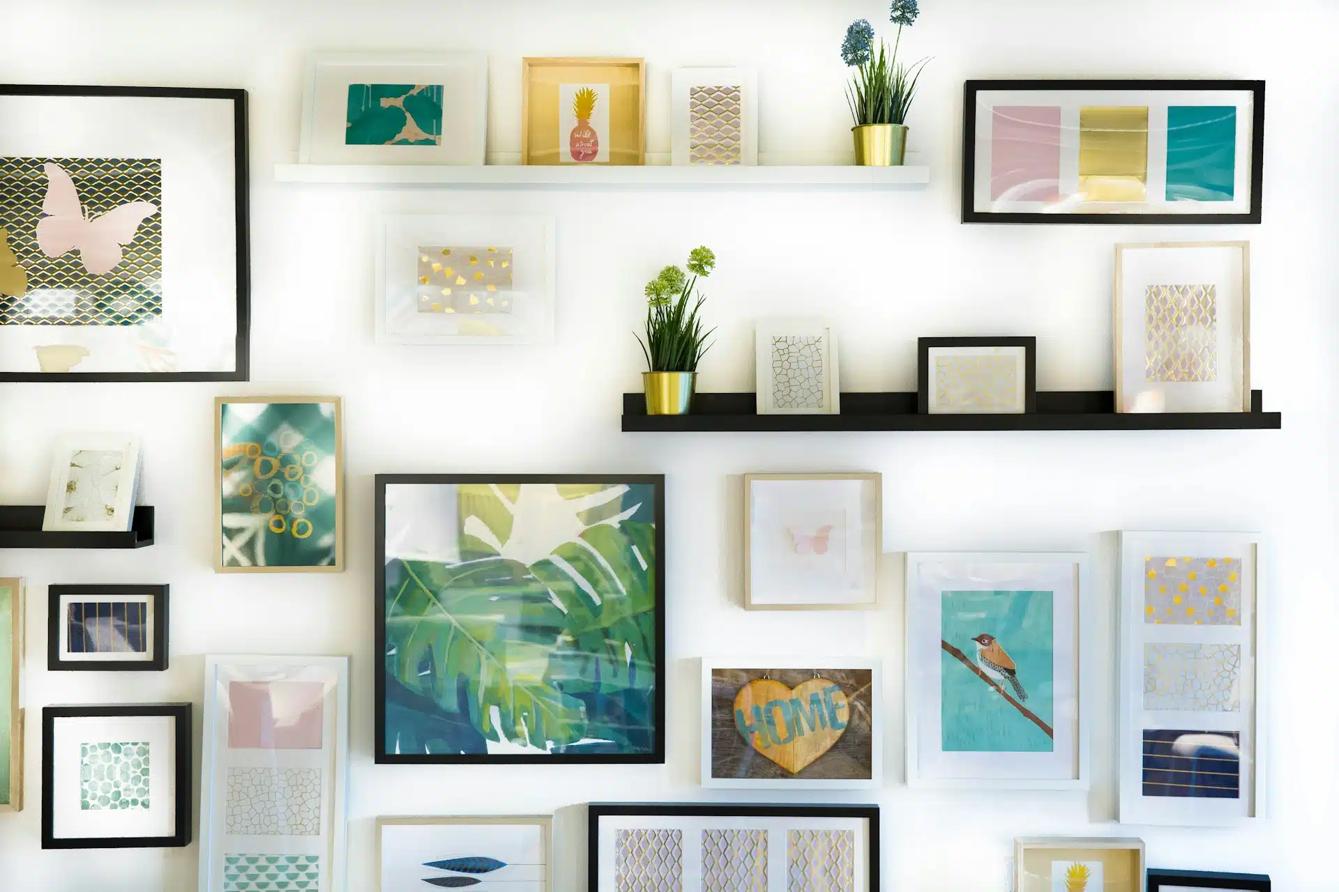
Use Art and Framed Prints to Anchor the Room
Artwork is often the most visible visual feature in a reception area, so scale and placement matter. Larger pieces look cleaner and calmer than clusters of small frames. Landscapes, abstract prints, and subtle geometric work tend to age well and avoid polarizing tastes. A small design firm in Austin uses a single oversized abstract canvas to anchor its reception wall, and visitors routinely comment on how intentional the space feels even though the rest of the room is simple. Cohesion—not theme—is what makes the difference.
Getting the height right matters more than most people think. If a picture is a little too high or too low, the whole wall feels off, and you notice it every time you walk past. In most reception areas, the easiest approach is just to hang things where people naturally look, not where the drywall seams happen to fall. When in doubt, I’ve found this simple walkthrough from Christie’s on hanging artwork to be a good gut check. Even nudging a frame up or down an inch can make the whole setup feel more settled.
Add Architectural Details to Create Depth
Reception areas often feel flat because long walls lack structure. Adding vertical trim, narrow paneling, or subtle textured elements gives the eye a place to pause. Many offices use light color-blocking to frame a seating zone or define the path toward the check-in area. These soft boundaries guide movement without adding visual clutter.
A tech startup in Minneapolis added a narrow slat wall behind a bench seating area. The feature wasn’t large, but it added texture, softened sound, and made the space feel more grounded. Architectural details like these help small lobbies feel more finished, especially when paired with warm lighting.
Make the Check-In Area Clear With Professional Signage
Even with thoughtful wall decor, visitors still need a clear sense of where to check in. Professional lobby signage solves that efficiently. It works best when integrated into the wall decor rather than added as an afterthought. A simple dimensional sign near or above the desk provides clarity without overpowering the room.
A dental office in Phoenix reduced confusion and improved visitor flow by adding clean, brushed-metal signage above the counter. Before that change, staff frequently stopped conversations to redirect patients. The new signage blended into the room’s neutral palette and immediately improved wayfinding. When signage feels like part of the decor rather than a utilitarian label, it reinforces your brand while keeping traffic moving.
Use Texture and Soft Surfaces to Warm the Room
In a lot of reception areas, the noise bounces around more than people realize. Hard walls don’t absorb anything, so every ringtone and conversation ends up hanging in the air. Once you add some texture to the walls, the room changes fast. A simple fabric panel, a stretched textile in a frame, or even a strip of cork along the seating area can take the edge off the sound and make the space feel less echo-heavy. It also warms up the room visually. Offices that want a cleaner, more polished look—without leaning too soft or residential—usually find that a few textured pieces strike the right balance.
If you need inspiration for layering textures without overwhelming a space, looking at balanced living spaces can help. Guides that break down how decor and room styling interact often translate surprisingly well to reception walls when applied with restraint. The goal is an atmosphere that feels calm, grounded, and deliberate.
Use Lighting to Highlight the Right Features
Lighting can make or break whatever you put on the walls. If the room uses only overhead fixtures, everything tends to look flat, no matter how nice the art or paint color is. Adding a couple of sconces or a small directional light immediately changes how the space feels. Warmer bulbs usually make reception areas feel calmer, while cooler light fits better in very modern offices or studios. If you’re trying to sort out which way to go, the U.S. Department of Energy’s breakdown of lighting basics gives a simple explanation of how color temperature affects the mood of a room.
A counseling office in Oregon replaced its bright overhead LEDs with a mix of warm, wall-mounted fixtures and soft task lighting. The artwork instantly looked better, and clients frequently commented that the room felt less stressful. Light doesn’t just illuminate décor—it influences how people experience the space.
Organize the Wall to Support Visitor Flow
Wall decor can make visitor flow clearer without adding signs everywhere. A distinct color behind the reception desk, a vertical panel marking the check-in point, or a contrasting material behind seating helps direct people without verbal instruction. When the walls subtly indicate where to stand, sit, or wait, the reception area feels more intuitive.
Some offices go a step further by framing the check-in zone with architectural trim or a soft accent wall. These choices don’t need to be bold to be effective; consistency and placement matter more than intensity. The combination of clear surfaces, defined zones, and well-placed wall decor creates a reception area that feels logical to navigate.
Bring It All Together for a Reception Area That Wows Visitors
You don’t have to redo the whole lobby to make it feel better. Most offices get a big lift just by fixing the walls—fresh paint, art that actually fits the space, and a few small details that break up blank surfaces. Clear lobby signage helps more than people expect; it saves visitors from that awkward “am I in the right place?” moment. After that, a couple of textured pieces and better lighting usually settle the room down. It ends up feeling quieter, warmer, and a lot more organized. Not perfect, maybe, but definitely the kind of space people notice in a good way when they walk in.

Tommy Hardy, an alumnus of the Georgia Institute of Technology with a degree in Mechanical Engineering, has been a go-to figure in residential upkeep and innovation for over 18 years. His career commenced in a leading home appliance manufacturing company, where he mastered the intricacies of household systems. Joining our platform in 2020, Tommy quickly became a reader favorite for his practical and easy-to-follow guides. He took the helm of our DIY section in 2019, consistently delivering content that empowers homeowners. Beyond his professional pursuits, Tommy is a passionate gardener and enjoys woodworking, skills enhancing his hands-on approach to home care.