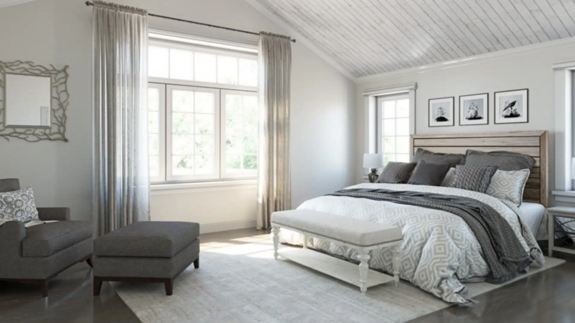
When I first used Repose Gray by Sherwin-Williams, I was surprised by how soft and easy it felt in every room.
It’s a light gray with just a hint of warmth, so it doesn’t look cold or dull. Repose Gray works well in almost any space – from living rooms to bedrooms and even kitchens.
What I love most is how versatile it is. You can pair it with many colors and still get a clean, calm look.
In this blog, I’ll share my favorite colors that go with Repose Gray, whether you want to keep things neutral or add a bit of contrast.
From warm whites and soft blues to rich blacks and natural greens, there are so many great options. If you’re planning to paint with Repose Gray, these ideas will help you build the perfect color palette.
Understanding Repose Gray (SW 7015)

Repose Gray (SW 7015) by Sherwin-Williams is one of those go-to paint colors that works in almost any space.
It’s a soft, light-to-medium gray with a warm undertone, which helps it feel cozy instead of cold.
What makes Repose Gray so versatile is its slight mix of beige and a touch of green, giving it a balanced, grounded feel.
It’s neutral enough to act as a backdrop, but it also adds just enough color to make a room feel pulled together.
With a Light Reflectance Value (LRV) of 58, it reflects a decent amount of light without being too bright. That means it looks great in both well-lit and low-light rooms.
Repose Gray offers the perfect mix of warmth, softness, and flexibility, making it great for walls, trim, or even cabinetry.
Best Coordinating Colors for Repose Gray
Repose Gray is one of those paint colors that works with almost everything. It is in the middle, not too warm, not too cool, so it matches well with many other shades.
1. Pure White (SW 7005)

Pure White is a bright, clean white. It works really well next to Repose Gray and makes everything feel neat and fresh.
Use it for trim, ceilings, or doors to give your room clean lines. This combo is a smart choice for bathrooms and kitchens because it helps the space feel tidy and fresh.
The white makes the gray stand out more, giving the room a simple and up-to-date look.
2. Eider White (SW 7014)

Eider White is a soft white with just a small amount of warmth. It doesn’t jump out but instead blends softly with Repose Gray.
If you like rooms that feel calm and not too bright, this is a great option. It’s nice for places like bedrooms or living rooms where you want to relax.
You can use it on walls, trim, or even on furniture for a soft and smooth look.
3. Naval (SW 6244)

Naval is a strong navy blue color. It brings a bold and steady feeling to a space.
Try it as an accent wall to make one part of the room stand out, or use it on a front door for a classic look.
It also works well on kitchen cabinets or shelves.
When paired with Repose Gray, it adds contrast and gives your room a more put-together feel without being too bright.
4. Urbane Bronze (SW 7048)

Urbane Bronze is a dark shade with both brown and gray mixed in. It’s a rich color that adds weight and warmth to a room.
You can use it on cabinets, doors, or even some pieces of furniture. Together with Repose Gray, it creates a cozy feeling that works great in dining rooms, reading corners, or even home offices.
It makes the space feel steady and welcoming.
5. Sea Salt (SW 6204)

Sea Salt is a soft mix of green and blue. It reminds people of the ocean or a quiet beach. When used with Repose Gray, it gives the room a calm and fresh feel.
It’s perfect for bathrooms, bedrooms, or laundry rooms, anywhere you want a peaceful, relaxing mood.
It helps make small rooms feel lighter and more open.
6. Halcyon Green (SW 6213)

Halcyon Green is a gentle green-blue color that’s not too strong. It brings just the right touch of color to a room without making it loud.
This shade looks great in family rooms, offices, or even entryways. Repose Gray makes the space feel soft, friendly, and natural.
It’s a good mix if you want to keep your room calm but not plain.
7. Pavestone (SW 7642)

Pavestone is a deeper gray that leans a little cooler. It’s darker than Repose Gray, so it provides a nice contrast while remaining in the same color family.
Pavestone can be used on lower cabinets, doors, or even one wall to give the room a bit more depth.
This pair works well in modern homes where you want things to look clean, neat, and not too busy.
8. Anew Gray (SW 7030)

Anew Gray is a warm gray that’s slightly deeper than Repose Gray. Together, they create a smooth, soft look with just a little contrast.
This combo works really well in open floor plans like connected living rooms and hallways, where you want the colors to match, but not be the same.
It keeps the space feeling warm, balanced, and cozy, without making it feel too simple or too bold.
How to Test and Use Coordinating Colors with Repose Gray
Before painting an entire room, it’s a good idea to test your colors first. Even if a color looks just right online or in the store, it can look very different once it’s on your wall.
Try It in a Different Light
Paint colors change depending on the light. A color that looks warm and soft in the morning might look cooler or darker at night.
Try painting a small area of your wall and checking how it looks at different times of day, with natural light and with your room’s lights on.
Think About the Room
The way a color feels can depend on how the room is used. For example, soft colors work well in bedrooms, while bold ones might be better for an office or dining room.
Also, consider your furniture, floors, and decorations. Ensure your new paint color complements your existing decor.
Use Bigger Swatches
Small paint chips can be hard to picture on a full wall. Instead, try painting a larger piece of poster board or a sample patch right on the wall.
This helps you clearly see how the colors look next to each other and how they change with the light.
Common Mistakes to Avoid When Pairing Colors
Picking paint colors can be fun, but it’s easy to make a few mistakes along the way. Here are some common ones to watch out for so your room looks the way you imagined.
- Test Before You Paint: Always try samples on your wall to see how the color looks in different lighting.
- Watch the Undertones: Make sure other colors match Repose Gray’s soft undertones to avoid clashing.
- Limit Accent Colors: Stick to one or two accent shades to keep the room from feeling too busy.
- Think About the Whole Room: Choose colors that work with your existing furniture, flooring, and decor.
Conclusion
Repose Gray is a flexible and easy-to-use color that can fit almost any home style.
It goes well with many other shades, such as clean whites, soft blues, or deep neutrals, if you like modern, cozy, or classic looks.
The key to getting the look you want is testing colors first, checking the lighting in your room, and thinking about how the colors work with your furniture and decor.
Try to keep things simple. Don’t mix too many bold colors at once. Stick with a small color group that feels calm and even.
Repose Gray gives you lots of freedom to try different looks while still keeping things soft and neat.
With the right matches, it can help make your space feel just right – warm, welcoming, and easy to live in.

With a Master in Architectural Studies from University of Pennysylvania, Marwa Haydar has pioneered living spaces since 2005. Her expertise, initially honed in a prestigious architectural firm, is evident in her approach to creating environments. Marwa became part of our team in 2019 and has since been a driving force in our home improvement section, known for her practical yet stylish solutions. She’s been spearheading our design workshops since then, infusing her passion for teaching into her work. In her leisure time, Marwa enjoys exploring historic architecture and is an enthusiastic pottery hobbyist, further enriching her understanding of form and texture.