
Some paint colors quietly change a room, and Wind’s Breath (OC-24) is one of them. I first came across it while helping my sister choose shades for her new home, and it immediately stood out.
It wasn’t white, but it wasn’t beige either; it struck the perfect balance in between.
In this post, I’ll show you exactly why Wind’s Breath has become such a popular neutral choice for many homeowners. You’ll learn what makes this shade stand out from other similar colors and where it works best in your home.
By the end of this blog, you’ll know:
- The specific undertones of Wind’s Breath
- Which rooms suit it best
- Lighting considerations
- Complementary colors for your space
I’ve used this color in multiple projects and can honestly tell you – it might be the flexible neutral option you’ve been looking for.
About Benjamin Moore’s Wind’s Breath (OC-24)
If you’re considering Wind’s Breath for your home, it helps to see all the key characteristics in one place.
Below is a quick overview to help you understand what makes this color so versatile and why it continues to be a favorite among homeowners and designers alike
| Feature | Details |
|---|---|
| Brand | Benjamin Moore |
| Color Code | OC-24 |
| Undertones | Soft greige with a hint of warmth |
| LRV | 69.59 – light and airy without being stark |
| Best For | Living rooms, bathrooms, hallways, kitchen cabinets |
| Pairs With | Warm woods, soft whites, muted blues, greens, and creams |
| Style Fit | Works with modern, rustic, traditional, and transitional styles |
This table gives you a snapshot of Wind’s Breath’s flexibility and charm. Whether you’re working with natural materials or bold accents, this color quietly elevates any space it touches.
The Deep Undertones that Make Wind’s Breath Stand Out
Wind’s Breath isn’t just another neutral color. It has soft greige undertones with a hint of warmth that make it special. The Light Reflectance Value (LRV) of Wind’s Breath is 69.59, which means it reflects a good amount of light while still providing some depth.
I’ve noticed that this color changes throughout the day. In the morning sunlight, you might see more of its warm beige qualities. By afternoon, the gray tones become more visible. Under lamp light at night, it can feel cozier and more golden.
This color-shifting quality is what I love most about it. In a living room with an oak coffee table, cream-colored area rug, and linen curtains, the shade adds dimension without competing for attention. It works equally well in a bedroom with matte brass lamps, natural wood dressers, and ivory bedding, bringing a calm, cohesive atmosphere.
You don’t need to worry about temperature extremes. Wind’s Breath naturally adjusts to its surroundings.
That easy versatility is a big reason why so many homeowners love using it throughout their spaces.
How Wind’s Breath Affects the Feel of a Room?
Wind’s Breath creates a calming atmosphere that’s hard to match. It softens harsh lines, making rooms feel both cozy and open—especially helpful in smaller spaces.
1. Soft, Spacious, and Welcoming
In tight rooms, the lightness of Wind’s Breath opens things up without the starkness of bright white. Corners feel less sharp, and the space gains a gentle, welcoming quality.
2. Mood and Lighting Tips
This shade brings ease to any room. It avoids the chill of cool grays and the heaviness of warm beiges, striking a comfortable middle ground.
Warm it up: Use soft yellow bulbs to highlight its cozy undertones.
Cool it down: White LED lights give it a crisper, modern edge.
3. Works Well with Furniture
Whether you have light oak floors or dark walnut cabinets, Wind’s Breath adapts. It pairs beautifully with wood tones, linen upholstery, and metal accents.
Best of all? You don’t need bold decor to make the room feel finished—this color does the heavy lifting.
What Makes Wind’s Breath a Great Choice for Any Space?
1. Fits Every Style
Modern apartments: Pairs beautifully with clean lines and minimal palettes.
Traditional homes: Complement crown molding, classic furniture, and warm lighting.
Rustic spaces: Balance natural wood beams and stone features without clashing.
2. Easy to Pair With Other Colors
Works with bold blues and greens for contrast.
Soft pinks and creams create a subtle, calming palette.
Doesn’t overpower your accents—it plays a supporting role beautifully.
3. Beyond the Walls
Use it in hallways to create smooth transitions between rooms.
Great for ceilings, trims, or cabinetry if you want tonal contrast without drama.
4. Always Looks Fresh
Its tone stays interesting through changing seasons and lighting.
Unlike other neutrals, it doesn’t become dull or overly trendy.
Wind’s Breath adapts as your home evolves, making it a timeless investment in your design.
Top Spots to Use Wind’s Breath Around Your Home
Wind’s Breath is a soft, airy paint color that brings calm and lightness to any room. This gentle off-white with subtle gray undertones works well in many areas of your home. These are the best places to use this versatile paint color:
1. Living Room
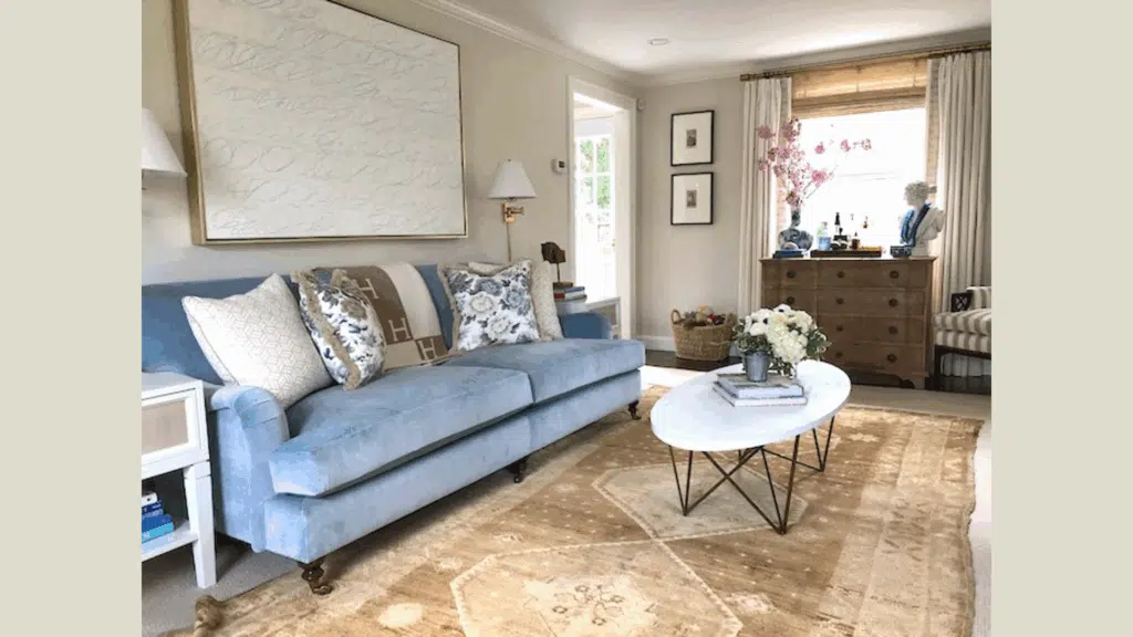
The living room is where Wind’s Breath really shines. Its soft tone creates a welcoming space for family and guests. I’ve found that it works well with both fabric and leather furniture.
The neutral base lets your artwork and accessories take center stage. This means you can change pillows, throws, and decor with the seasons without needing to repaint.
In open floor plans, this color helps define the living area while still flowing smoothly into nearby spaces.
2. Bathrooms
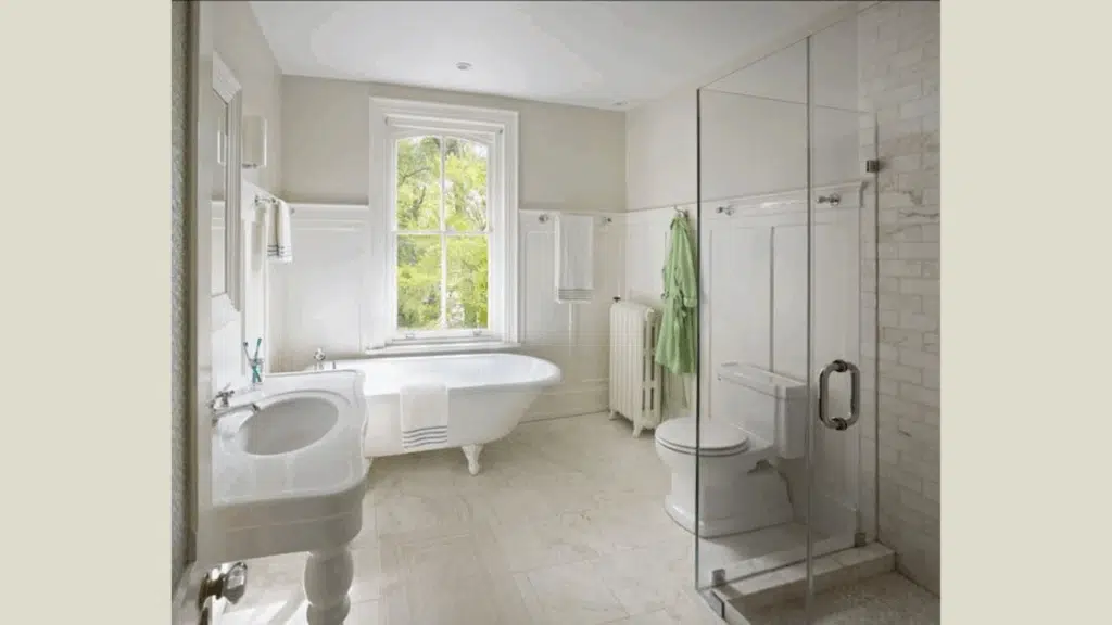
Small bathrooms look bigger with Wind’s Breath on the walls. The light-but-not-white quality opens up tight spaces.
In larger bathrooms, it adds warmth that stark whites can’t match. It pairs beautifully with white tiles and fixtures while softening the overall look.
The color also hides water spots and doesn’t show dirt as easily as pure white does – a practical bonus for busy bathrooms.
3. Kitchen Cabinets
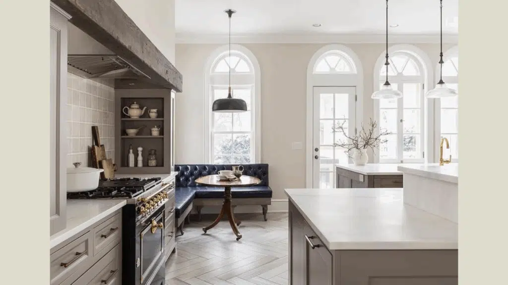
Try Wind’s Breath on kitchen cabinets for a fresh look that isn’t plain white. It gives just enough color to feel special without taking over your kitchen.
Lower cabinets in Wind’s Breath with white upper cabinets create a layered look that feels current but not trendy.
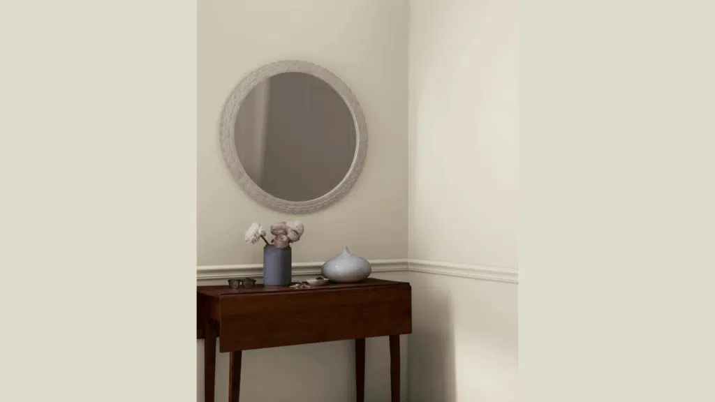
4. Connecting Hallways
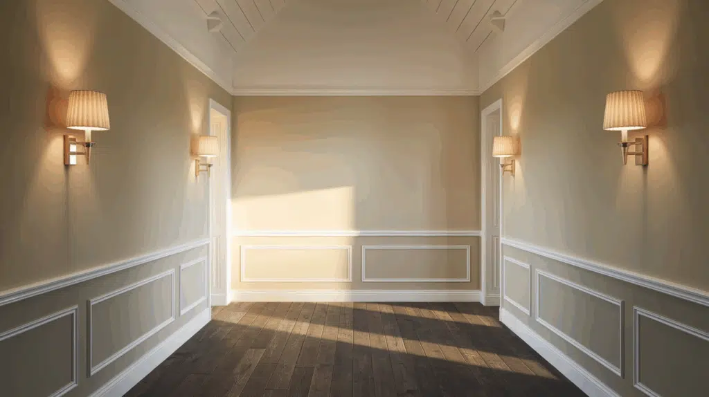
Painting hallways and connecting spaces with Wind’s Breath helps your home feel planned and pulled together.
The color creates flow as you move from room to room. This is an easy way to make your home feel bigger and more connected without a major remodel.
Flooring Styles That Work Best with Wind’s Breath
Wind’s Breath pairs well with many flooring options, giving you plenty of choices when planning your home design. These are some flooring styles that match particularly well with this soft, airy paint color:
1. Light Wood Floors – Fresh & Scandinavian
Light oak, maple, or birch floors enhance Wind’s Breath’s airy quality. The warm undertones in both materials create a seamless, serene look, perfect for Scandinavian, coastal, or minimalist interiors.
2. Whitewashed Woods – Relaxed & Coastal
Whitewashed or bleached wood floors pull out the soft gray tones in Wind’s Breath. This pairing feels beachy and breezy, making it ideal for coastal, cottage, or casual-modern spaces. It adds brightness without stark contrast.
3. Warm-Toned Tiles – Organic & Transitional
Beige, taupe, or cream tiles blend with the warmth of Wind’s Breath for a cohesive look. This combo suits transitional or Mediterranean-style homes, especially in kitchens or bathrooms with natural stone elements like limestone or travertine.
4. Dark Contrasting Woods – Classic & Sophisticated
Deep walnut or mahogany floors create a bold contrast. Against Wind’s Breath walls, the result is elegant yet balanced, making it ideal for traditional, formal, or historic interiors. It adds visual weight while keeping the space open.
Rug Selection Tips – Layered & Cozy
Pair Wind’s Breath walls and flooring with neutral-toned rugs (cream, tan, soft gray) to create warmth and texture. For more character, choose rugs with subtle blue or sage green patterns—a great fit for boho, classic, or transitional styles. Just keep the tones muted to maintain a calm, grounded look.
The right rug can elevate Wind’s Breath walls and tie your whole room together. Here are some easy guidelines:
Stick to soft neutrals: Choose rugs in cream, tan, taupe, or soft gray for a seamless, layered look.
Introduce muted patterns: Subtle patterns in blue, sage green, or dusty rose add interest without overpowering the calm backdrop.
Avoid overly bright tones: Bold, saturated colors can clash with Wind’s Breath’s softness. Keep things subdued to preserve its serene effect.
Play with texture: Chunky weaves, flatweaves, or lightly distressed finishes enhance visual depth and warmth.
Size matters: Use larger area rugs in open spaces to ground furniture and smaller rugs in hallways or entryways to create visual flow.
These tips help maintain the color’s tranquil feel while letting your floors and furnishings shine.
Wind’s Breath vs. Other Benjamin Moore Colors
I’ve created a simple comparison table that shows how Wind’s Breath stacks up against other similar Benjamin Moore colors:
| Color | Undertones | When to Choose It |
|---|---|---|
| Wind’s Breath (OC-24) | Soft grey with subtle warmth | Best for: Spaces where you want a neutral that works with both warm and cool colors. Great for homes with changing light throughout the day. |
| Classic Gray (OC-23) | True gray with slight purple hints | Best for: Rooms where you want a lighter, cooler feel. Works well in south-facing rooms that get lots of warm sunlight. |
| Pale Oak (OC-20) | Beige with pink undertones | Best for: Spaces where you want a warmer, cozier feel. The pink undertones make it feel more inviting, but can clash with some wood tones. |
| Edgecomb Gray (HC-173) | Greige with green undertones | Best for: Rooms with plants or green accents. Slightly darker than Wind’s Breath, making it better for larger spaces with lots of light. |
| White Dove (OC-17) | Creamy white with yellow hints | Best for: When you want something closer to white but not stark. Much lighter than Wind’s Breath, so it won’t add as much warmth. |
| Balboa Mist (OC-27) | Gray with violet undertones | Best for: Modern spaces with cool-toned furniture. It can feel too cool in north-facing rooms where Wind’s Breath would work better. |
What makes Wind’s Breath special is its perfect balance between warm and cool tones, making it more flexible than most other options. It doesn’t lean too far into beige or gray territory, keeping it truly neutral.
Conclusion
Wind’s Breath stands out as a reliable, go-to neutral that works beautifully in nearly any home. With its perfect balance of warm and cool undertones, it’s more adaptable than many other shades.
Before you commit, test a sample on different walls and observe how it looks throughout the day, from morning light to evening lamp glow.
I’ve used this color in many homes, and it consistently delivers a timeless look. But remember, you’re the one living with it, so trust your instincts. If Wind’s Breath feels right, that’s your answer.
Ready to refresh your space? Start with a sample and see the difference Wind’s Breath can make.
If you’re considering lighter options for other rooms, check out my review of Benjamin Moore’s Wrought Iron (2124-10)– another fantastic color that pairs beautifully with Urbane Bronze for a whole-home color scheme.

Alex Guerrero, a graduate with a Fine Arts degree from the Rhode Island School of Design, has been a visionary in the world of color and design for over 15 years. His professional journey began in the heart of the fashion industry in Milan, where he developed an acute sense for color harmonies and trends. Alex joined our team in 2018, offering fresh and innovative perspectives on color utilization in various spaces. Renowned for his ability to blend contemporary trends with timeless elegance. Outside of work, Alex is an accomplished painter and a volunteer art therapist, his artistic talents further enriching his professional insights.