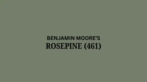
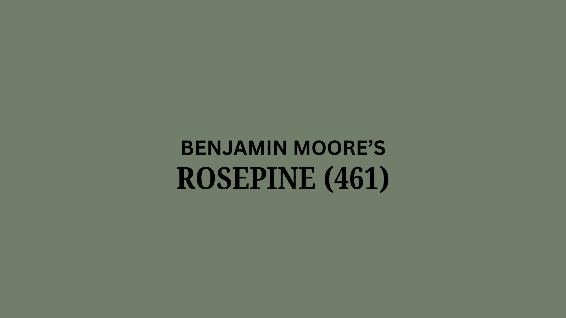
Looking for a green that feels rich, classy, and easy to live with? Benjamin Moore’s Rosepine might be just the shade.
This deep forest green has soft gray undertones that keep it balanced and calm, never too bold or flat.
It shifts gently with the light, bright and lively in sunlit rooms, and cozy and intimate in lower light, while always maintaining a sense of refinement.
Great for living rooms, bedrooms, or accent walls, Rosepine complements both traditional and modern spaces.
It’s a designer favorite for creating rooms that feel grounded, sophisticated, and effortlessly connected to the natural world.
Understanding Benjamin Moore Rosepine
Benjamin Moore Rosepine (461) is a deep, earthy green with soft gray undertones.
It feels fresh in daylight and cozy at night, offering a rich yet balanced look for any space.
Color Terminology
This color features a muted, earthy tone ideal for grounded, natural designs.
The table shows its key color metrics.
| PROPERTY | VALUE |
|---|---|
| LRV | 20.82 |
| RGB | 115, 126, 107 |
| Hex Value | #737E6B |
With a low LRV, it offers a cozy feel and rich depth, perfect for modern, calming interiors.
Undertones
- It features soft forest and earthy green undertones.
- It shifts beautifully during the day, feeling cooler in north light and warmer in sunlit spaces.
- Not just plain green, but a muted, timeless shade that blends with classic and modern decor alike.
The Psychology of Forest Greens
The paint shade we pick influences our daily feelings and home atmosphere.
- Earthy greens: It build calm, cozy spaces that feel grounded
- Natural tones: It make rooms feel more relaxed and timeless
- Subtle wall colors: It look amazing with wood, plants, and textured décor
- Benefits: Add depth without overwhelming, pair well with any style, create a peaceful retreat
Homeowners love this color because it feels both graceful and easygoing.
It’s like having the perfect natural backdrop with charm, and it always feels just right!
Why Choose Benjamin Moore’s Rosepine?
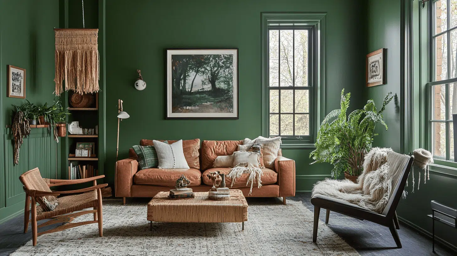
Benjamin Moore Rosepine is a rich forest green with a soft gray undertone, bringing refinement and calm to any space.
1. Versatility
Rosepine blends well with various design themes, including traditional, farmhouse, mid-century modern, and boho-inspired interiors.
It shines on walls, built-ins, furniture, and accent pieces, pairing naturally with warm woods, crisp whites, and metallics.
Bright rooms feel fresh and grounding; low light renders them deeper and more intimate, while still maintaining a peaceful and polished appearance.
2. Key Features
With a light reflectance value around 20, Rosepine delivers a sense of depth without overpowering the room.
Its soft gray-green blend creates a layered, dimensional finish that’s equal parts smart and approachable.
This trusted shade from the Classic Color Collection is compatible with all of Benjamin Moore’s premium paint lines, delivering beautiful results.
3. Durability
Rosepine withstands everyday life with impressive longevity.
Its rich tone resists fading indoors and can even stay vibrant in suitable exterior applications.
Whether in busy areas or accent zones, this color endures in durability and style.
4. Texture Patterns
Rosepine applies cleanly with excellent coverage when used with a brush, roller, or sprayer.
Available in a variety of sheens, it adapts easily to your surface, whether you’re painting cabinetry, walls, or furniture.
Each coat brings a smooth, refined result, elevating your space with a classic and balanced finish.
Room Color Advice: Benjamin Moore’s Rosepine
Benjamin Moore’s Rosepine is a deep, graceful forest green with soft gray undertones, offering a rich yet calming vibe.
Part of the Classic Color Collection, it shifts beautifully with the light, bright by day, cozy by night.
Whether on walls, built-ins, or accents, it adds a timeless, polished feel to any space without feeling overdone.
1. Living Spaces and Open Floor Plans
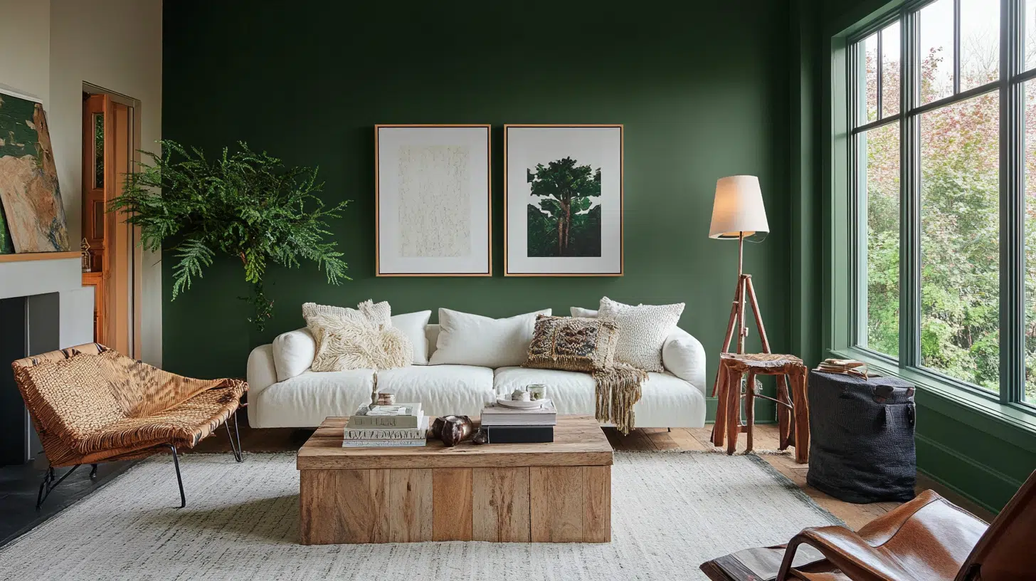
This rich green creates a grounded atmosphere in open living spaces where calm and comfort are most valued.
It fits beautifully in any home style, from rustic to modern farmhouse designs.
- The deep tone adds character, making your space feel refined and thoughtfully arranged.
- It looks stunning with light furniture, gold accents, and natural wood textures.
- Pair it with crisp white trim and stone fireplaces for a warm, refined look.
This shade helps your room feel cozy and complete without being too bold or dramatic.
Your family will love how relaxed and inviting the space feels every day.
2. Bedrooms and Relaxation Areas
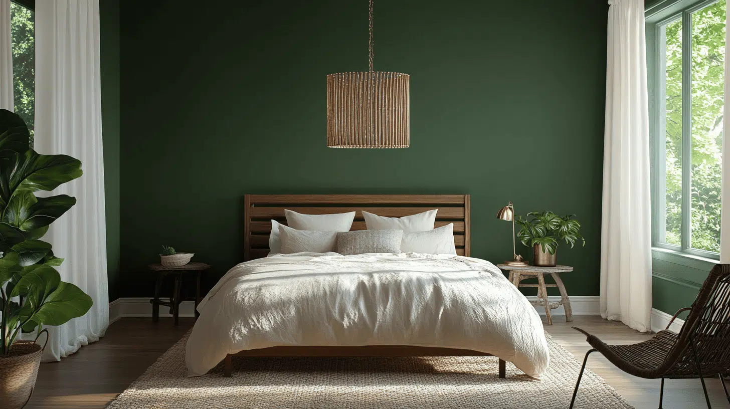
This deep green creates a calm, cozy vibe in bedrooms where rest is key.
It fits beautifully behind the bed as a feature wall, adding depth and quiet drama.
- The color pairs well with neutral bedding, soft throws, and warm lighting for a restful look.
- It looks lovely with pale wood furniture, ivory linens, and brushed brass accents.
- Pair it with light curtains and soft rugs for a balanced, peaceful space.
This shade helps bedrooms feel serene and stylish without being too bold or dark.
Kids and adults alike will love how cozy and adaptable the space feels over time.
3. Kitchens and High-Traffic Areas
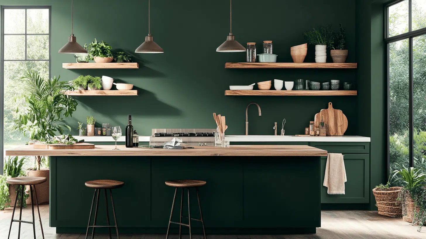
This earthy green stands out in kitchens where function meets style every day.
It fits beautifully on lower cabinets or kitchen islands for a rich, grounded touch.
- The color pairs well with marble counters, brass pulls, and warm wood accents.
- It looks stunning with pearl or satin finishes that offer both shine and durability.
- Use Regal Select or Aura formulas for easy cleanup and lasting beauty.
This shade helps kitchens feel refined and welcoming without losing practicality.
Your guests will love how polished and inviting your cooking space looks.
Color Pairings for Benjamin Moore’s Rosepine
Rosepine is a rich forest green with soft gray undertones and an LRV around 20, giving it a deep, grounded feel that’s full of character.
It’s perfect for creating lavish, cozy spaces with a touch of drama.
Ready to build a color palette around it?
Complementary Colors for Rosepine
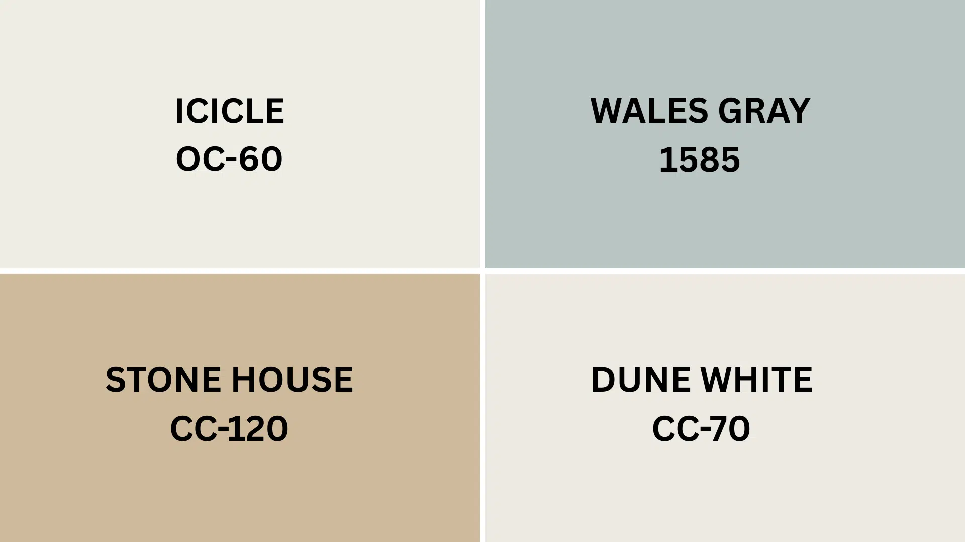
Pairing the right colors with Rosepine can enhance its natural sophistication and revamp the feel of your space.
Icicle (OC-60): A soft white with gentle gray undertones, Icicle creates a delicate, layered look when paired with White Heron. Try it on trim or nearby walls for a light, airy feel with just a hint of depth.
Wales Gray (1585): With a bluish-green tint, this mid-tone gray brings a grounded, timeless vibe. It’s great for accent walls or adjacent rooms where you want to add a touch of boldness without straying from White Heron’s cool, lavish vibe.
Stone House (CC-120): This warm, tan-toned neutral offers a cozy balance to White Heron’s crispness. Think café au lait meets toasted almonds, it’s perfect for cabinetry, furniture, or rooms that connect to your White Heron walls.
Dune White (CC-70): A classic soft neutral from the Designer Classics Collection, Dune White adds a whisper of warmth. It complements White Heron’s clean look while creating a more welcoming, lived-in feel.
Each of these pairings highlights a different side of White Heron, from crisp and cool to warm and cozy.
Creating Cohesive Color Schemes
These handpicked Benjamin Moore color palettes featuring Rosepine (461) take the guesswork out of designing a space that feels both stylish and balanced.
Whether your style leans warm and cozy or cool and modern, there’s a combo here that will look just right, morning, noon, or night.
Just choose the one that fits your vibe and lighting, and let Rosepine do the rest.
| SCHEME | MAIN WALLS / AREA | TRIM / ACCENT / CEILINGS | Other Rooms / Accents |
|---|---|---|---|
| Monochromatic | Rosepine (461) | Sage Tint (458) Rainy Afternoon (1575) | Everglades (460) Louisburg Green (HC-113) Dark Celery (2146-10) |
| Warm | Rosepine (461) | Stone House (CC-120) Dune White (CC-70) | Shaker Beige (HC-45) Coastal Path (AF-380) |
| Cool | Rosepine (461) | Wickham Gray (HC-171) |
NOTE*: Paint colors from the Benjamin Moore collection may vary under different lighting conditions, so testing samples in your actual space is recommended before finalizing your selection.*
Coordinating with Furniture and Decor
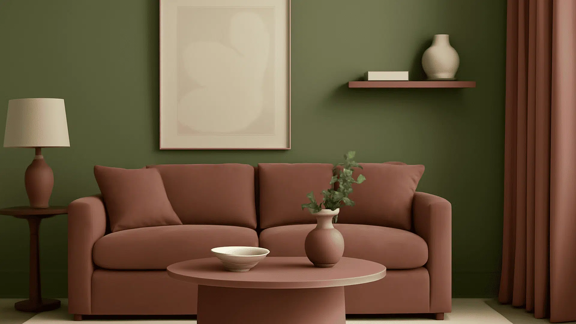
Benjamin Moore’s Rosepine (461) is a deep, graceful green with soft gray undertones that make it feel both rich and easy to live with.
It works beautifully as a bold wall color or a subtle accent, adding calm, timeless style to any space.
Its earthy tone lets furniture and décor shine, creating a look that’s polished yet relaxed.
1. Wood Tones
Light oak or maple offers a soft contrast that brightens the green, giving the space a fresh, modern feel.
Walnut or cherry enhances Rosepine’s richness, creating a warm, polished look that feels cozy and upscale.
Reclaimed or weathered wood brings out its earthy, organic side, perfect for farmhouse or rustic-inspired rooms with natural character.
2. Metals
Brass or gold accents add warmth and refinement, balancing Rosepine’s cool undertones for a welcoming, luxurious look.
Matte black hardware creates bold contrast and a modern edge, making it a great choice for kitchens and bathrooms.
Brushed nickel or silver highlights Rosepine’s gray undertones, giving the space a cool, clean, and contemporary feel.
3. Decor
Textural elements like linen, wool, and woven materials add depth and enhance Rosepine’s natural, calming feel.
Artwork in cream, ivory, or terracotta tones stands out beautifully against the green, much like brass or gold accents.
Plants and greenery bring a lively contrast while reinforcing Rosepine’s earthy, organic vibe.
Similar Paint Colors: Perfect Alternatives to Rosepine
The colors have subtle differences that, depending on your lighting and desired look, might make one work better in your home.
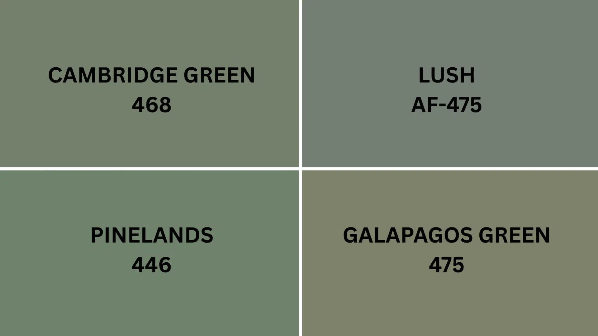
1. Cambridge Green (468)
This lush, earthy green has just a touch of gray, giving it a soft, sophisticated feel.
It works beautifully as a neutral, whether on an accent wall, trim, or an entire room, offering quiet grace without being too bold.
Depending on the light, it shifts between sage and muted forest, making it a timeless favorite.
Try pairing it with creams, natural wood, or brass for a warm, classic look.
2. Lush (AF-475)
With its deep green tone and hint of blue, Lush feels like a walk through a rainforest after rain; calm, rich, and full of depth.
It brings warmth and comfort, and pairs beautifully with warm neutrals, earthy textures, and gold accents for a touch of luxury.
Perfect for creating mood in libraries, dining rooms, or dramatic feature walls.
3. Pinelands (446)
Pinelands is a rich forest green that manages to feel both smart and relaxed.
It adapts beautifully to different lighting, giving your space a grounded, timeless look.
It pairs effortlessly with crisp whites, warm woods, and natural stone, making it ideal for living rooms, cabinetry, or full-room applications where you want depth without going too dark.
4. Galápagos Green (475)
Inspired by the lush greenery of the Galápagos Islands, this deep, mysterious green brings a touch of adventure and refinement.
It shifts with the light, adding rich dimension and sophistication to any space.
Pair it with ivory, walnut, or antique brass to create a warm, worldly atmosphere.
It’s a great choice for accent walls, built-ins, or cozy nooks like studies and powder rooms.
Final Thoughts
Benjamin Moore’s Rosepine brings instant charm and grace to any space.
Its rich, nature-inspired green is perfect for cozy bedrooms, stylish living rooms, or refined dining areas.
It pairs beautifully with wood, brass, and texture, and its depth adds incredible dimension to walls, especially when paired with layered lighting.
Thinking of trying it? Test a sample in your lighting and see how it shifts throughout the day.
Where would you use Rosepine first?
Drop your ideas in the comments!
And if you’re craving more color inspiration, click here to explore our favorite paint picks.

