Tired of boring wall colors that make your home feel bland and uninspiring?
Sherwin-Williams Austere Gray might be exactly what you need to fix that problem!
This beautiful gray-green shade turns plain rooms into calm, stylish spaces that feel both cozy and lavish.
It performs great in any room, from quiet bedrooms to busy family areas.
You’ll love how it makes your furniture stand out while keeping everything feeling peaceful and balanced.
This smart color choice complements both traditional and modern decorating styles in your home.
If you’re painting one wall or several rooms, this color always looks amazing.
Get ready to see why so many people are picking this wonderful color for their favorite spaces.
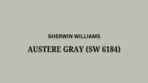
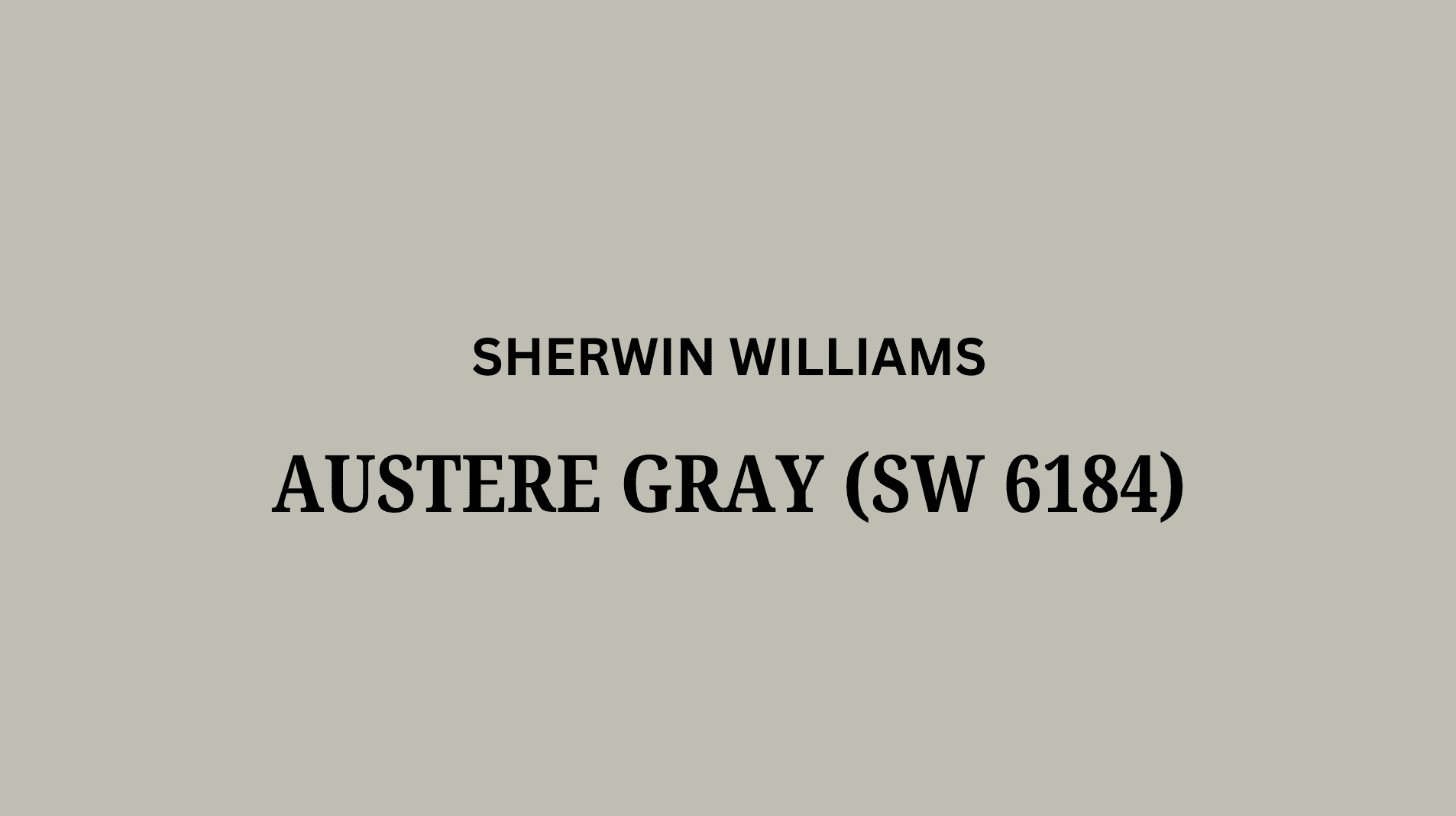
Understanding Sherwin-Williams’ Austere Gray
This is a cultured, light gray-green paint color by Sherwin-Williams.
It turns ordinary walls into cool spaces that suit almost every home style.
You can locate this shade as SW 6184.
Color Terminology
Here’s an easy guide to the color details you need about this paint choice.
This chart helps you grasp the Light Reflectance Value (LRV), RGB, and HEX numbers quickly.
| PROPERTY | VALUE |
|---|---|
| LRV | 51 |
| RGB | 190 / 191 / 178 |
| Hex Value | #BEBFB2 |
These numbers indicate that the color is a medium-light, complex neutral, ideal for refined and thoughtful spaces.
It shines in contemporary or transitional interiors that want a refined yet approachable backdrop.
Undertones:
- It has cool blue undertones that add depth and complexity
- It shifts beautifully as natural light moves throughout your day
- Not a simple gray, but a layered, serious color that feels intentional
Psychology of Gray Colors
The paint we choose influences our daily feelings at home, especially nuanced shades like this.
- Cool grays: Build focused, calming environments
- Complex neutral tones: Make design choices feel effortless
- Refined wall colors: Appear different yet stunning as lighting changes throughout the day
- Advantages: Conceals minor surface flaws, complements most decor, creates instant classiness
Homeowners choose this shade because it feels both current and enduring.
It’s like a perfectly crafted blazer for your walls – always radiant and appropriate!
Why Choose Sherwin-Williams Austere Gray (SW 6184)?

Sherwin-Williams Austere Gray is a refined, light paint that makes any room feel calm and glossy.
It’s incredibly versatile because it works nicely with most furniture styles and decorating choices in your home.
1. Versatility
This shade changes beautifully as natural light changes throughout your day.
Morning brightness reveals its airy, fresh qualities, while evening light brings out deeper, more serious tones.
You can paint it anywhere, such as studies, living rooms, bedrooms, or home offices.
It suits traditional homes, contemporary spaces, or transitional styles, making it incredibly adaptable for use in various settings.
2. Key Features
This hits the perfect balance between cool and warm gray-green tones.
With its moderate LRV of 51, it adds character without making spaces feel dark or heavy.
Homeowners have chosen this shade for years because it feels both current and timeless.
After painting your walls, you’ll see how it elevates your existing furniture and artwork.
3. Durability
When applied with premium paint lines, it handles daily life exceptionally well.
This complex neutral conceals minor scuffs and everyday wear better than lighter shades do.
The high-quality formula maintains its gorgeous appearance even through regular cleaning and touch-ups over time.
4. Texture Patterns
This paint gives walls a refined appearance that immediately elevates any room’s style.
Its cool blue undertones add depth and complexity without feeling overwhelming or busy.
It highlights trim work and structural details with subtle, graceful contrast throughout your space.
It connects rooms flawless while allowing your decorating style to shine as the main focus.
Room Color Recommendations: Sherwin-Williams Austere Gray
This is a soft green paint that makes any room feel calm and lavish.
It shifts subtly during the day, appearing more blue in bright light and greener in softer evening hours.
1. Living Spaces and Family Rooms

This shade performs wonderfully in living areas where your family gathers for daily activities and relaxation.
It creates a refined backdrop that makes the room feel grounded and urbane.
- This complex neutral helps your bold artwork and colorful accessories pop against the walls beautifully.
- It suits both contemporary and traditional styles, so it adapts when you update your decor.
- Pair it with warm wood furniture and cream accents for a look that feels radiant yet comfortable.
Your guests will love how thoughtful and pulled-together your space feels instantly.
The cool undertones create a focused atmosphere that encourages meaningful conversations and quality time.
2. Bathrooms and Spa-Like Retreats

Bathrooms painted in this hue feel fresh and spa-like without being too cold or clinical.
It’s perfect for creating a tranquil wellness space in your home.
- The gray-green tone makes bathrooms feel serene and zen-like while staying cultured and calming.
- It complements white fixtures, marble counters, or natural wood vanities beautifully for spa vibes.
- This color creates the perfect backdrop for relaxing baths and peaceful morning routines.
Daily self-care rituals feel more luxurious against this soothing background color choice.
Your bathroom becomes a personal sanctuary where stress melts away after long days.
3. Bedrooms and Relaxation Spaces

Bedrooms benefit from colors that promote focus and help you feel truly centered.
This shade creates the perfect environment for rest and quiet contemplation.
- It alters bedrooms into serene retreats that help clear your mind after demanding days.
- This versatile color pairs beautifully with white, charcoal, or soft taupe bedding choices.
- It makes compact bedrooms appear larger while maintaining that intimate sanctuary feeling you need.
You’ll find deeper rest in a room painted this calming color choice.
It’s like wrapping your bedroom in a peaceful fog that soothes your spirit nightly.
4. Exterior

This refined shade performs wonderfully on home exteriors where you want timeless curb appeal.
It creates a graceful first impression that feels both welcoming and distinguished.
- The complex color complements natural landscaping and makes your home blend beautifully with the surroundings.
- It pairs perfectly with white trim, black shutters, or natural stone accents for classic appeal.
- This color weathers beautifully over time while maintaining its urbane appearance through seasons.
Your home will stand out in the neighborhood for all the right reasons.
It’s like giving your house a tailored suit that never goes out of style.
Color Pairings and Combinations for Austere Gray (SW 6184)
This is a cultured, pale color that works in almost every space of your house.
Its balanced tone creates smart rooms that feel both calm and refined throughout your day.
Here are some perfect partner colors for this wonderfully complex shade.
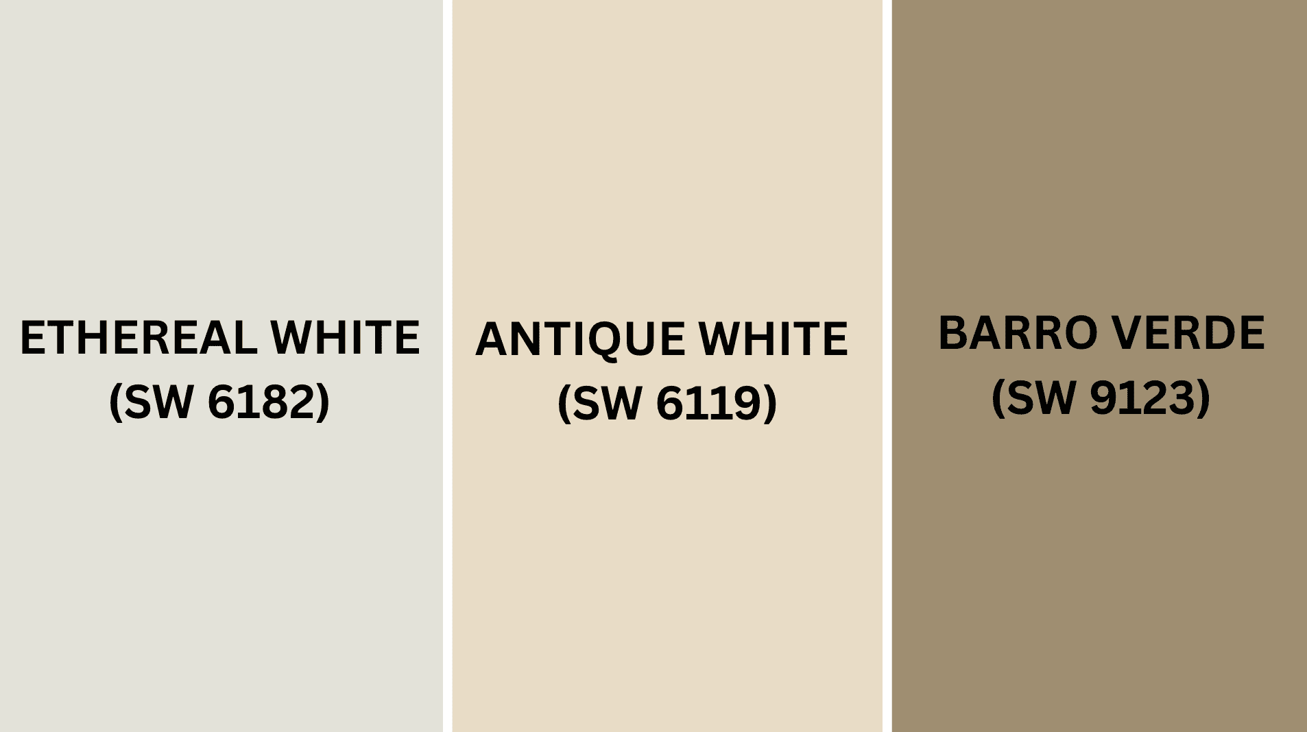
Complementary Trim Colors
Choosing the right colors to pair with this hue can significantly alter the appearance of your space.
These specific colors make stunning combinations with this cool, thoughtful gray-green.
1. Ethereal White (SW 6182)
A pure, bright white that creates lovely contrast with this urbane main color.
It highlights structural details and molding without feeling too sharp or overwhelming.
Your trim will appear crisp and clean while keeping the overall mood serene and glossy.
2. Antique White (SW 6119)
A warm, creamy white that softens the cool undertones and adds gentle contrast beautifully.
It works as a ceiling color or on built-ins when this shade covers the walls.
This pairing creates a timeless, graceful look that feels both classic and completely current.
3. Barro Verde (SW 9123)
A rich, earthy green that adds depth and drama when used as accent elements.
It makes a stunning feature wall or cabinet color in studies or home offices.
This combination feels like bringing nature’s enlightenment indoors with designer-level style and intention.
Creating Cohesive Color Schemes
Sherwin-Williams Austere Gray pairs beautifully with many other colors to create a balanced flow throughout your home.
This refined color serves as an excellent foundation for various decorating approaches and personal styles.
Here are three different color schemes that feature this graceful hue as the star.
| SCHEME | MAIN WALLS / AREAS | TRIM / ACCENT / CEILINGS | OTHER ROOMS / ACCENTS |
|---|---|---|---|
| Monochromatic | Austere Gray (SW 6184) | Ethereal White (SW 6182) | Clary Sage (SW 6178), Softened Green (SW 6177) |
| Warm | Austere Gray (SW 6184) | Antique White (SW 6119) | Accessible Beige (SW 7036), Natural Linen (SW 9109) |
| Cool | Austere Gray (SW 6184) | Barro Verde (SW 9123) | Sea Salt (SW 6204), Tradewind (SW 6218) |
NOTE: All colors shown are Sherwin-Williams paints. Colors will appear different depending on your lighting, so always test samples on your walls before buying full gallons.
Coordinating with Furniture and Decor

Sherwin-Williams Austere Gray creates a refined backdrop that makes your furniture and accessories shine beautifully.
Its gray-green tone provides a refined backdrop that highlights your favorite pieces without overwhelming the space.
1. Wood Tones
Rich woods like mahogany, walnut, and dark cherry create a gorgeous warmth that perfectly complements these lavish walls.
The combination feels both glossy and inviting at once.
Lighter woods such as birch and ash bring fresh, contemporary vibes when paired with this complex shade.
Natural wood finishes complement the color’s worldly character wonderfully.
2. Metals
Brass and copper fixtures glow beautifully against the gray-green background, adding luxurious warmth throughout your space.
Brushed nickel and pewter hardware offer a refined contrast that feels current without being harsh or cold.
Matte black accents create a striking definition on the walls, bringing bold refinement that enhances the grace of any room.
3. Decor
Deep colors like burgundy, forest green, and charcoal navy create stunning focal points against these thoughtful walls.
They add richness and drama without feeling overwhelming or too busy for daily living.
Soft tones like cream, sage, or pale gray blend with this paint, creating serene, spa-like atmospheres.
Textured fabrics, leather accents, and ceramic pieces add a refined, upscale appeal to the colors.
Alternative Paints Similar to Sherwin-Williams Austere Gray
If you enjoy this shade but would like to explore other possibilities, consider these related options.
Each offers the same refined quality but adds its own unique character to your rooms.
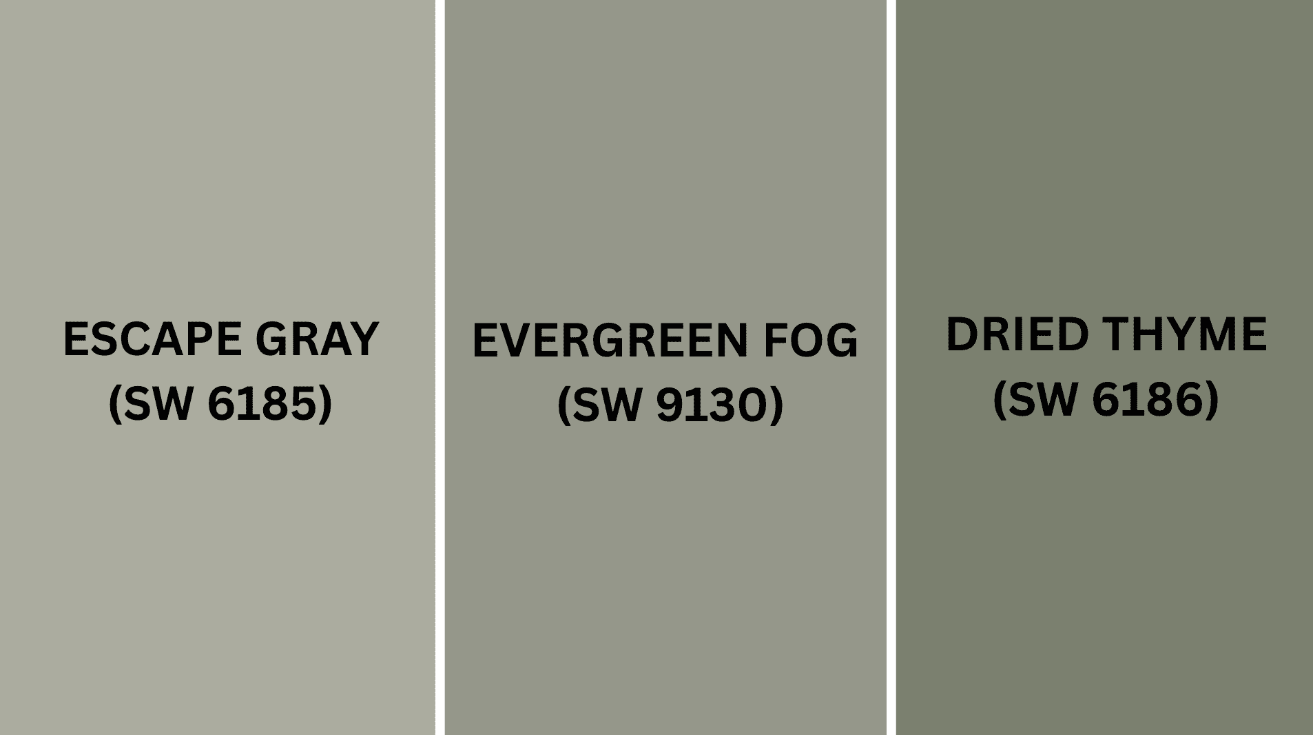
1. Escape Gray (SW 6185)
Escape Gray provides a lighter, more airy version with softer undertones throughout.
It creates rooms that feel open and breathable.
- Makes spaces feel more relaxed and casual without losing that refined quality.
- Works wonderfully in smaller rooms with limited light to add brightness and openness.
- Pairs perfectly with white, cream, or light wood accents for a fresh, updated look.
This shade is ideal when you want something gentler and more approachable overall.
It keeps the same refined vibe but feels lighter and more welcoming on your walls.
2. Evergreen Fog (SW 9130)
Evergreen Fog gives you a deeper, more dramatic version with richer green influences showing through.
It creates rooms that feel grounded and substantial.
- Establishes cultured spaces that feel connected to nature without being too overwhelming or bold.
- Shows beautiful complexity that enhances plain surfaces and structural features throughout your home perfectly.
- Changes subtly with lighting, offering different moods as natural light moves through your space.
Your home will feel graceful and thoughtful with this distinguished choice.
It’s perfect for creating refined spaces where important conversations and work happen naturally.
3. Dried Thyme (SW 6186)
Dried Thyme offers a warmer alternative with more pronounced earthy undertones for added coziness.
It feels inviting and comfortable in every space.
- Adds warmth to larger rooms while maintaining a urbane, not casual quality throughout.
- Has enough depth to create interest without becoming too dark or moody for daily living.
- Performs wonderfully with both neutral and bold accent colors throughout your entire home.
This color creates spaces that feel both radiant and welcoming, beautifully.
It’s like Austere Gray’s friendlier cousin, bringing extra warmth to any room.
Final Thoughts
This amazing Sherwin-Williams Austere Gray proves that choosing the right paint can completely alter the way your home feels every day.
From creating spa-like bathrooms to living areas, it works magic in every space you paint.
The color pairs beautifully with almost any furniture style and decorating choice you already love.
You’ll enjoy how it adds instant style and makes guests feel impressed when they visit.
Plus, it’s tough enough to handle a busy family life while staying gorgeous for many years to come.
If you opt for bold accent walls or subtle whole-room coverage, you can’t go wrong with this choice.
Ready to recast your home with this stunning color?
Share your decorating dreams in the comments below!
If you’re interested in color review content, feel free to click here and explore other blogs that you might like.

Alex Guerrero, a graduate with a Fine Arts degree from the Rhode Island School of Design, has been a visionary in the world of color and design for over 15 years. His professional journey began in the heart of the fashion industry in Milan, where he developed an acute sense for color harmonies and trends. Alex joined our team in 2018, offering fresh and innovative perspectives on color utilization in various spaces. Renowned for his ability to blend contemporary trends with timeless elegance. Outside of work, Alex is an accomplished painter and a volunteer art therapist, his artistic talents further enriching his professional insights.