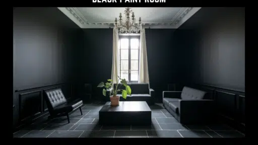
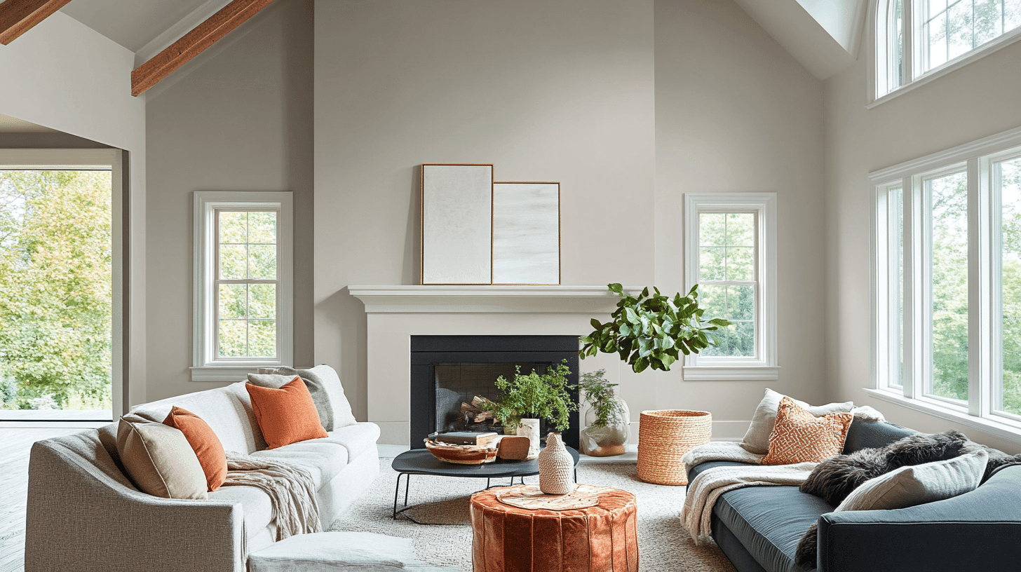
Like the serene stillness of early morning fog, Sherwin Williams’ Mindful Gray drapes your space in balanced tranquility.
This refined mid-tone gray transcends ordinary neutrals, carrying a perfect equilibrium of warm beige and cool blue undertones that remain remarkably stable throughout changing light.
Mindful Gray creates a sanctuary of calm—a centered, intentional atmosphere that nurtures both mind and space.
What you’ll learn in this guide: This complete guide covers everything about Mindful Gray, from its technical color details and LRV to room-by-room usage tips.
You’ll also find the best color combinations and pairing ideas with furniture and decor, plus how it compares to other popular gray paint colors. We’ll share application tips and techniques for perfect results, along with real pros and cons to help you decide if it’s right for your space.
Its subtle depth invites natural light to play across surfaces, maintaining its distinct personality throughout the day without dramatic shifts.
More than just another gray, Mindful Gray is an experience—one that brings the centering comfort of mindfulness into one’s everyday environment.
It’s the perfect backdrop for modern minimalist designs and traditional spaces seeking refined balance.
Understanding Sherwin Williams’ Mindful Gray
Color Terminology
| PROPERTY | VALUE |
|---|---|
| LRV (Light Reflectance Value) | 48 |
| Color Category | Considered a mid-tone gray (LRV between 40-55) |
| Comparison | Pure white: ~90 LRV, Black: ~0 LRV |
| RGB Value | Red: 188 Green: 183 Blue: 173 |
| Hex Code | #BCB7AD |
Undertones:
- Mindful Gray has balanced warm beige and cool blue undertones
- It’s a medium gray with remarkable stability across different lighting conditions
- Not a flat or one-dimensional gray, but a refined, complex neutral with noticeable depth
Psychology of Balanced Gray Colors
Balanced grays like Mindful Gray create a sense of calm and timeless culture.
- Centered tones: Offer focus and visual stability in spaces
- Balanced neutrals: Evoke mindfulness, intentionality, and refined comfort
- Benefits: More nuanced than stark whites or trendy grays, adds substantial presence to spaces and creates a refined backdrop for both colorful furniture and natural elements.
Mindful Gray provides the perfect balance for those seeking a substantial neutral that isn’t too dark or overwhelming.
Its balanced undertones make it particularly versatile in spaces with varying exposures, where it helps maintain consistency while contributing a sense of refined calm.
Why Choose this Color?
The balanced nature of Mindful Gray evokes a sense of intentionality and refinement that promotes tranquility in any environment.
This enduring color carries complex undertones that remain remarkably stable with changing light, ensuring your space feels both current and timelessly refined.
Best Paint Finishes for Mindful Gray by Room
1. Living Rooms and Bedrooms: Use an eggshell or satin finish for the main walls in living spaces. These finishes hide minor wall flaws while giving enough sheen to make cleaning easier. The slight shine helps Mindful Gray’s undertones show through without being too glossy.
2. Kitchens and Bathrooms: Choose a satin or semi-gloss finish for areas that get more moisture and need frequent cleaning. These finishes protect against grease, steam, and water spots while making the color easy to wipe clean. Semi-gloss works especially well behind sinks and stoves.
3. Hallways and High-Traffic Areas: Go with a satin finish for spaces that see lots of activity. This finish resists scuffs and marks while maintaining Mindful Gray’s refined look. It’s tough enough for busy areas but not so shiny that it shows every fingerprint.
4. Ceilings and Trim: Use a flat or matte finish for ceilings to hide imperfections and reduce glare. For trim work, semi-gloss or gloss finish creates a nice contrast against Mindful Gray walls while being easy to clean and maintain.
5. Home Offices and Studies Eggshell finish: Works best in quiet spaces where you want a calm, focused feeling. This finish reduces eye strain from computer screens while keeping the sophisticated look of Mindful Gray.
Key Features
Sherwin Williams Mindful Gray offers exceptional stability and versatility across different lighting conditions. It maintains its balanced character in dim spaces while creating a refined, welcoming atmosphere in rooms with varied natural light.
Its timeless neutral quality provides a refined backdrop that complements both colorful elements and natural textures without appearing cold or dated.
Adaptability
Sherwin Williams Mindful Gray demonstrates remarkable adaptability with existing elements like white trim and natural wood fixtures, creating harmonious blends between spaces.
It provides enough depth to feel substantial and grounding while maintaining a refined, enduring quality that won’t quickly date your interior design choices.
This versatile gray works equally well as an all-over color for creating calm, atmospheric environments or as a complementary element to deeper accent walls.
Durability
Sherwin Williams Mindful Gray, particularly in premium finishes like Duration or Emerald, delivers outstanding durability with excellent coverage in both new and repainted areas.
Its balanced tone and subtle, complex undertones maintain a refined appearance throughout your home while providing a forgiving surface for everyday living.
This paint resists staining and maintains color consistency even with regular cleaning when properly applied.
Texture Patterns
Sherwin Williams Mindful Gray creates a soft, velvety texture that adds subtle dimension to walls and architectural features.
Its complex undertones produce a stunning light play that enhances moldings and adds visual interest to even simple walls.
When applied to different finishes, it can stylishly highlight architectural details while maintaining a consistent, refined appearance throughout connected spaces.
Room-by-Room Color Recommendations with Mindful Gray
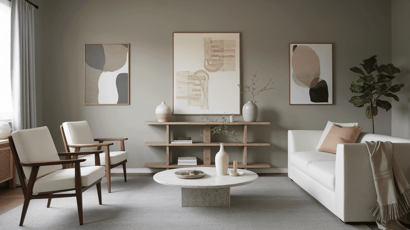
Living Spaces and Open Floor Plans
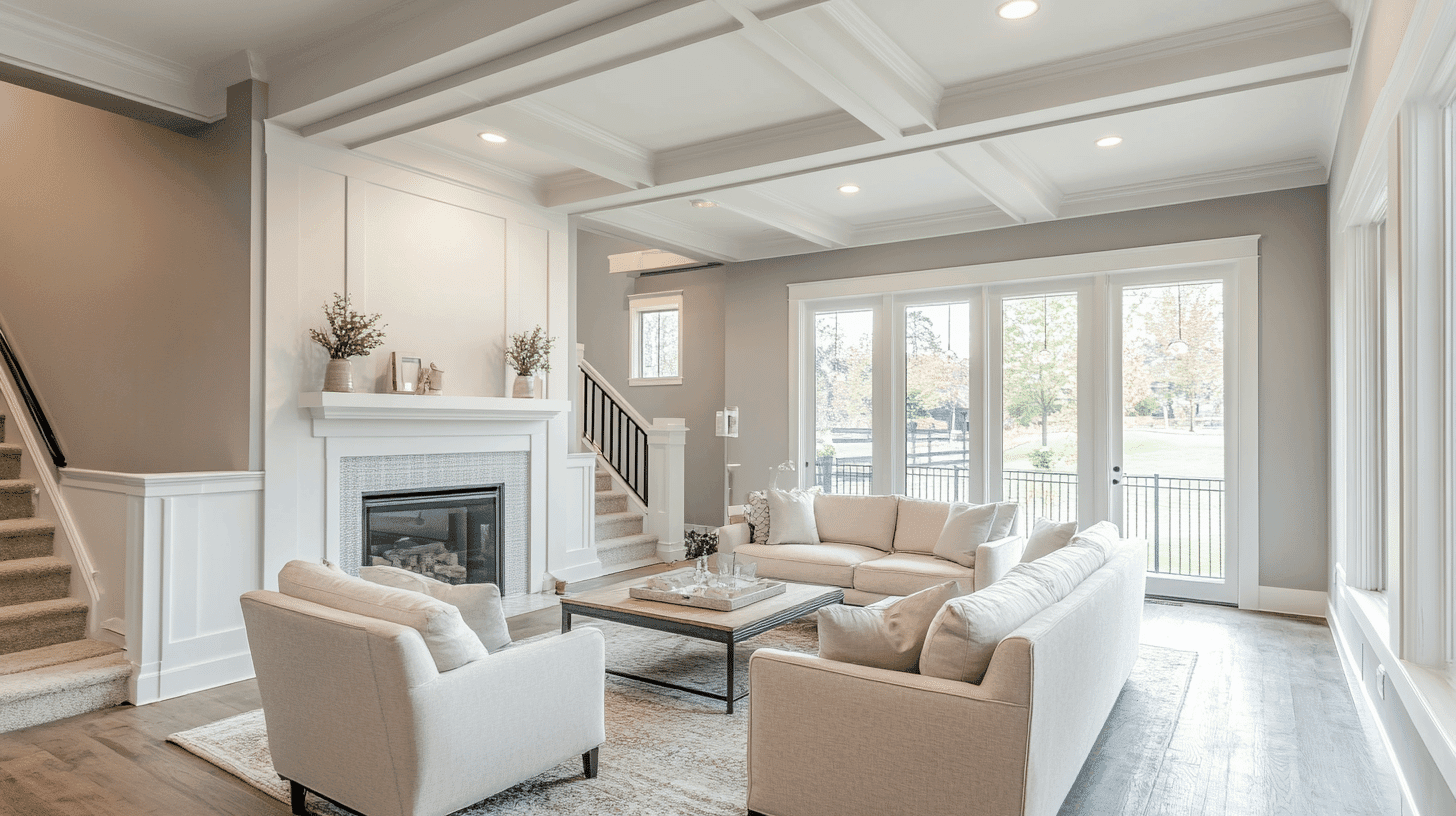
- Mindful Gray works exceptionally well as an all-over color in open floor plans, creating a cohesive space while maintaining a refined, timeless palette.
- The 48 LRV of Mindful Gray provides a substantial, grounding feel that makes spaces appear intentionally designed without feeling heavy.
- Use Mindful Gray to unify different areas in larger spaces while allowing colorful furnishings and artwork to stand out against its tranquil backdrop.
Pro Tip: Paint all connecting walls the same color but use different accent colors in each area through pillows, rugs, and artwork. This creates visual zones while keeping the flow smooth between spaces.
Bedrooms and Relaxation Areas
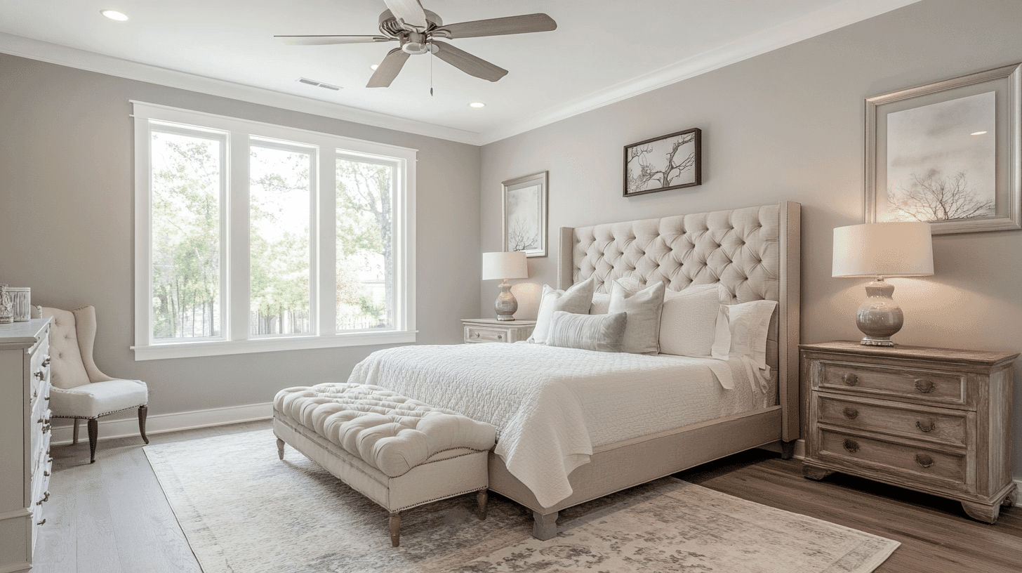
- Mindful Gray creates a cocooning atmosphere in bedrooms that promotes relaxation.
- The balanced undertones in Mindful Gray evoke a sense of calm while creating a refined backdrop for bedding and furniture of any style.
- Consider Mindful Gray for all walls to create a serene sanctuary that feels both refined and intimate without sacrificing warmth.
Pro Tip: Use warm-toned lighting like soft white LED bulbs (2700K-3000K) to enhance Mindful Gray’s warm undertones in bedrooms. This creates a cozy feeling in the evening while keeping the space fresh during the day.
Kitchens
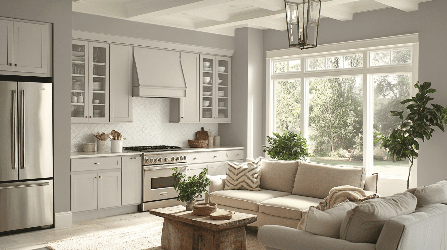
- Mindful Gray, in satin or semi-gloss finish on walls, creates a refined element that pairs beautifully with white and wood cabinetry.
- The balanced depth of Mindful Gray enhances stainless steel appliances and various countertop materials, making it adaptable to kitchen styles from contemporary to transitional.
- Mindful Gray walls paired with white cabinets create an appealing contrast that grounds the kitchen while maintaining a refined, cohesive feel.
Pro Tip: Use Mindful Gray on the island or a feature wall if you want to add depth without overwhelming the space. Pair it with white upper cabinets and you’ll get contrast without making the kitchen feel smaller.
Bathrooms and Spa-like Retreats
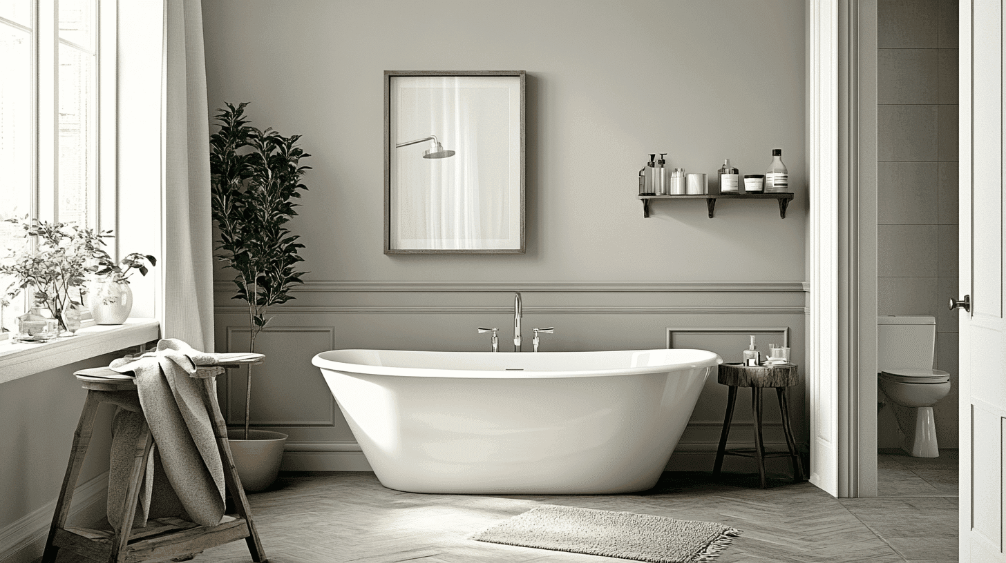
- Sherwin Williams Mindful Gray creates a balanced, refined atmosphere in bathrooms. Its stable undertones establish a sense of calm while hiding water spots better than lighter colors.
- This versatile shade pairs beautifully with both chrome and bronze fixtures, marble, and natural wood, creating a timeless, refined retreat that feels both stylish and intentional.
- Use Mindful Gray on all walls in bathrooms to create a sense of sophistication without sacrificing tranquility.
Pro Tip: Add white or cream tiles as wainscoting up to chair rail height, then use Mindful Gray above. This protects the most splash-prone areas while creating visual interest and making the bathroom feel taller.
Mindful Gray Color Combinations
Mindful Gray is a balanced, refined mid-tone gray with subtle warm beige and cool blue undertones. Its medium Light Reflectance Value (LRV) of 48 makes it a substantial, grounding foundation that adds sophistication and versatility to spaces while maintaining refined balance.
Let me help you with color pairings and combinations for this shade.
Complementary Trim Colors
- Pure White (SW 7005) – A bright, clean white that creates crisp definition with Mindful Gray
- Extra White (SW 7006) – A cooler white that balances Mindful Gray’s subtle warmth
- Alabaster (SW 7008) – A soft, warm white that harmonizes with Mindful Gray’s balanced quality
- Greek Villa (SW 7551) – A warm white that complements Mindful Gray with subtle softness
Coordinating Wall Colors
- Repose Gray (SW 7015) – A lighter gray that creates a tonal link with Mindful Gray
- Dorian Gray (SW 7017) – A deeper gray that creates natural progression in open floor plans
- Agreeable Gray (SW 7029) – A warmer greige that complements Mindful Gray’s balanced neutrality
- Gauntlet Gray (SW 7019) – A deeper charcoal that creates a dramatic contrast with Mindful Gray
Accent Colors
- Naval (SW 6244) – A deep navy that creates refined contrast with Mindful Gray’s neutrality
- Evergreen Fog (SW 9130) – A muted sage green that provides a natural complement to Mindful Gray
- Urbane Bronze (SW 7048) – A deep earth tone that grounds Mindful Gray in a compatible palette
- Coral Clay (SW 9005) – A warm terracotta that energizes spaces while complementing Mindful Gray
Coordinating with Furniture and Decor
Wood Tones
Mindful Gray pairs beautifully with a wide range of wood tones, offering different refined effects. Medium oak, walnut, and maple create a harmonious balance against Mindful Gray’s refined backdrop.
Light wood tones like birch provide complementary brightness that enhances Mindful Gray’s balanced undertones.
For a more contrasting look, espresso or ebony woods create striking depth, highlighting Mindful Gray’s nuanced quality and creating a refined modern beauty.
Natural, unstained wood creates organic harmony that enhances Mindful Gray’s depth and sophistication.
Style Tip: For a warm, cozy look, combine Mindful Gray with medium-toned woods like walnut or cherry and brass fixtures. This creates a welcoming atmosphere perfect for living rooms and bedrooms.
Metals
Brushed nickel, chrome, and stainless steel enhance Mindful Gray’s cool undertones and create a contemporary look.
Matte black fixtures create a modern contrast that emphasizes Mindful Gray’s refinement. While Mindful Gray works beautifully with cool metals, brass and bronze accents create a vibrant tension between warm and cool elements—opt for brushed or antiqued finishes for a more refined pairing.
Gold and champagne finishes provide a stylish, timeless combination that complements Mindful Gray’s distinguished character with warmth and luxury.
Style Tip: For balanced modern style, mix metals by using brushed nickel for main fixtures and adding brass accents through lighting and cabinet hardware. Mindful Gray’s balanced undertones make this work seamlessly.
Decor
Natural fibers like linen, cotton, and wool in earthy tones create textural interest against Mindful Gray walls while providing necessary warmth.
Glass, ceramic, and stone elements add weight and prevent Mindful Gray from feeling too flat in spaces with limited natural light.
Style Tip: For a spa-like retreat, combine Mindful Gray with white linens, natural wood accents, and chrome fixtures. Add green plants and stone accessories for a calming, natural look.
Mindful Gray vs. Agreeable Gray: A Thoughtful Comparison
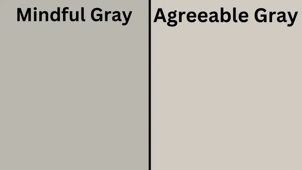
Mindful Gray (Sherwin Williams SW 7016)
- A balanced mid-tone gray with subtle warm beige and cool blue undertones
- Medium LRV (Light Reflectance Value) that creates refined, intentional spaces
- Works well in contemporary, transitional, or traditional interiors
- Best for spaces where you want substantial depth with balanced undertones
Agreeable Gray (Sherwin Williams SW 7029)
- A versatile greige with warmer undertones
- Higher LRV (around 60) creates a lighter, more adaptable backdrop
- It contains more pronounced warm undertones that create a cozier atmosphere
- Popular for creating neutral, welcoming environments that work with many design styles
Key Differences:
- Mindful Gray has more balanced undertones, while Agreeable Gray has more pronounced warm undertones
- Mindful Gray appears slightly deeper in most lighting conditions
- Mindful Gray creates more refined sophistication, while Agreeable Gray is more versatile and cozy
- They serve similar roles in design – both as refined neutrals with slightly different character and undertones
Final Thoughts
Mindful Gray tops trends, illustrating the perfect balance between depth and neutrality that makes it a perennial favorite among designers and homeowners seeking refined, intentional spaces.
Its subtle complexity allows it to adapt effortlessly to changing styles and seasonal accents, ensuring longevity in your design choices.
Whether creating calm in evening light or providing a canvas for contrasting elements, Mindful Gray delivers a timeless quality that both grounds and promotes a space.
In choosing this exceptional shade, you’re not simply selecting a color—you’re welcoming a design philosophy that values balance, refinement, and enduring beauty in the spaces we call home.
Ready to change your space with Mindful Gray? Start by testing it in your room’s lighting conditions. Pick up a sample from your local Sherwin-Williams store and paint a large swatch on different walls. See how it looks in morning light, afternoon sun, and evening lamplight.
What room in your home would benefit most from Mindful Gray’s calming presence? Share your paint plans with us in the comments below!

Alex Guerrero, a graduate with a Fine Arts degree from the Rhode Island School of Design, has been a visionary in the world of color and design for over 15 years. His professional journey began in the heart of the fashion industry in Milan, where he developed an acute sense for color harmonies and trends. Alex joined our team in 2018, offering fresh and innovative perspectives on color utilization in various spaces. Renowned for his ability to blend contemporary trends with timeless elegance. Outside of work, Alex is an accomplished painter and a volunteer art therapist, his artistic talents further enriching his professional insights.