Ever walked into a room and felt instantly at peace, but couldn’t figure out why?
The walls might hold the answer.
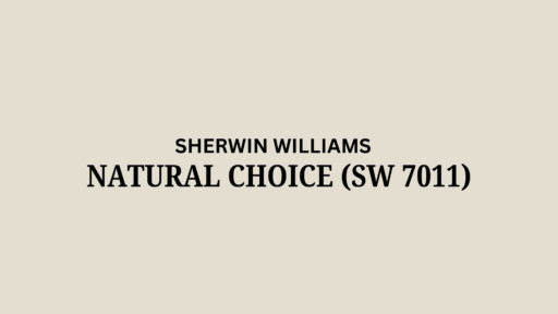
While most people overlook white paint as “just white,” designers know better – and Sherwin-Williams Natural Choice (SW 7011) might be their best-kept secret.
What makes this understated shade so magical?
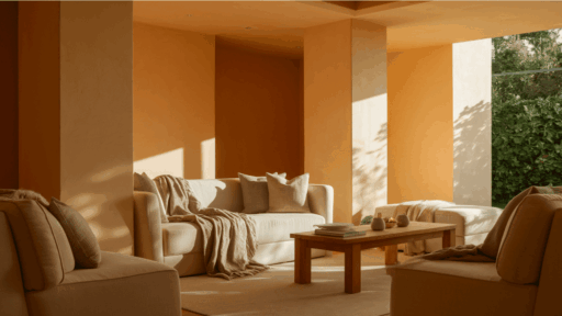
Unlike clinical whites that feel like a doctor’s office, Natural Choice carries warm yellow and subtle brown undertones that create spaces that actually feel lived-in.
With its impressive 73 LRV, it brightens dark corners without the harsh glare of pure whites.
The real mystery is how this chameleon-like color shifts throughout the day, revealing different personalities as light moves across your walls.
It’s not just paint, it’s a mood-setter that works silently in the background, enhancing everything from rich wood furniture to colorful accent pieces.
Could this be the missing element in your home’s design story?
Let’s explore the charm of this quietly confident color.
Understanding Paint Color Basics
Natural Choice is a popular off-white paint color by Sherwin-Williams.
It creates warm and inviting spaces that feel open and welcoming.
This versatile neutral works beautifully for both interior and exterior applications, making it a go-to choice for homeowners and designers alike.
Color Terminology
Let’s look at the technical details of SW Natural Choice (SW 7011).
These numbers help designers and painters understand exactly what this color looks like.
| PROPERTY | VALUE |
|---|---|
| LRV | 73 |
| RGB | 227 / 222 / 208 |
| Hex Value | #E3DED0 |
The high LRV of 73 shows why Natural Choice brightens up rooms so well.
You can use the RGB and Hex values to match this color for digital designs or order custom items.
Undertones:
- Natural Choice has warm yellow undertones from its yellow hue family
- It also has subtle brown undertones, giving it a beige appearance
- Not a stark white, but a natural, soft, creamy off-white
Psychology of Off-White Colors
Colors affect how we feel in a room, even light ones like Natural Choice.
The right off-white can make a big difference in your home.
- Warm off-whites like Natural Choice create a feeling of comfort and coziness.
- Cream-based neutrals: Bring a mellow and inviting feeling to any room
- Natural off-whites: Make spaces feel larger, brighter, and more welcoming
- Benefits: Easy on the eyes, works well in various lighting conditions, and pairs nicely with both colorful and neutral furniture.
Natural Choice is a timeless choice that won’t go out of style.
It works as a perfect backdrop for your favorite furniture and decorations, creating spaces that feel both fresh and cozy.
Why Choose the Sherwin-Williams Natural Choice?

1. Versatility
Natural Choice performs exceptionally well in various lighting conditions, adapting beautifully throughout the day.
This versatile neutral works equally well in modern farmhouse designs, traditional spaces, and contemporary homes.
Its soft warmth makes it an ideal choice for nearly any room or exterior application, creating a consistent yet fiery look.
2. Key Features
With a high LRV of 73, Natural Choice effectively brightens smaller or darker spaces without appearing stark or clinical.
This timeless off-white is in Sherwin-Williams’ Warm Whites and Finest Whites collections, offering a neutral foundation that will never go out of style.
Its subtle depth provides just enough character without overwhelming your decor choices.
3. Durability
Natural Choice performs excellently in Sherwin-Williams’ premium paint lines, such as Duration and Emerald, offering superior coverage and longevity.
These quality formulations resist staining, scuffing, and fading, making maintenance significantly easier.
The color maintains its warm, inviting appearance year after year, even in high-traffic areas or on exterior surfaces exposed to the elements.
4. Texture & Finish
Natural Choice delivers a smooth, even appearance across different sheens, from flat to semi-gloss.
Its creamy undertones beautifully enhance natural light while softening harsh edges and transitions.
This paint color creates a subtle texture that adds dimension to walls without competing with decorative elements or statement pieces in your space.
Room-by-Room Usage Guide
Natural Choice creates the perfect foundation for each room’s unique purpose while maintaining its warm, refined character.
This versatile neutral adapts beautifully to different spaces, enhancing both your decor and everyday living experience.
1. Living Rooms & Open Floor Plans

- Natural Choice creates a seamless flow throughout open concept spaces, maintaining consistent warmth without feeling monotonous.
- Its high reflectivity makes rooms appear larger and more expansive, bouncing light throughout the space effectively.
- Provides a graceful neutral backdrop that allows furniture and decor pieces to stand out without competition.
2. Bedrooms
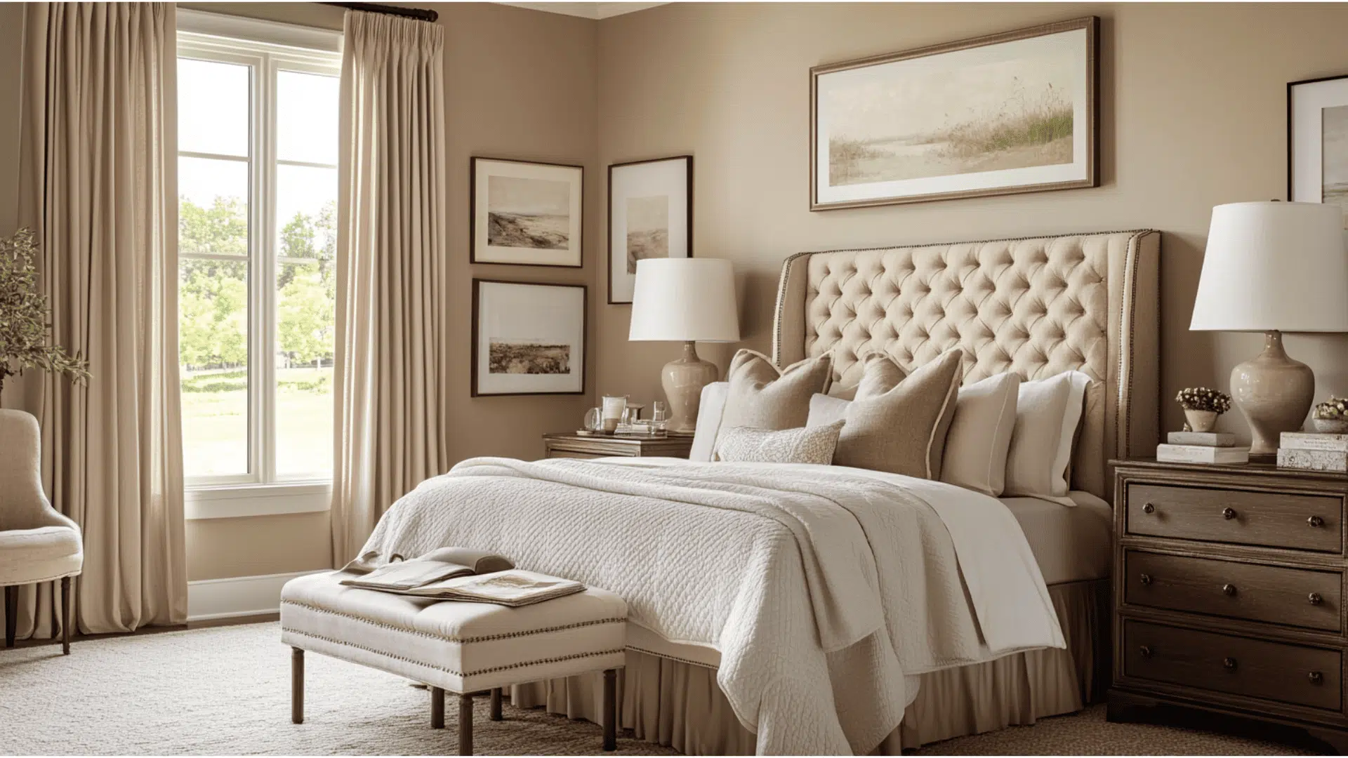
- Natural Choice creates a serene bedroom atmosphere with its soft, cozy undertones that promote relaxation and restfulness.
- Pairs beautifully with blues, greens, and soft neutrals for a calming color palette that enhances sleep quality.
- The warm undertones create a subtle glow in morning and evening light, making the space feel inviting at all hours.
3. Kitchens
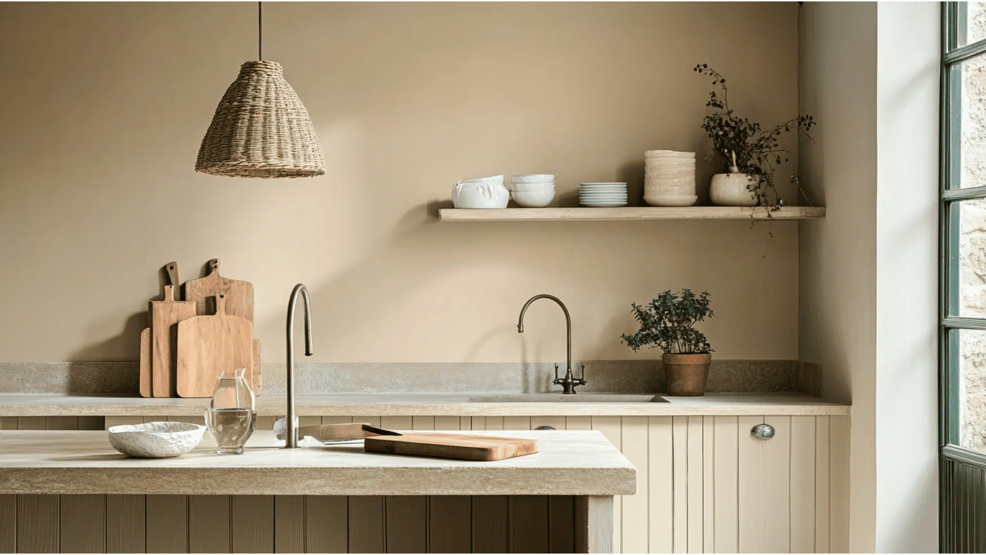
- Natural Choice complements both light and dark cabinetry, making it extremely versatile for kitchen design.
- The warm undertones create a welcoming atmosphere in a space where family and friends often gather.
- Higher sheen finishes like satin or semi-gloss make this color easy to clean and maintain in high-traffic cooking areas.
4. Bathrooms

- Natural Choice creates a clean, fresh appearance in bathrooms without the clinical feel of stark whites.
- The warm undertones complement popular bathroom materials, including brass fixtures, chrome hardware, and natural wood vanities.
- Performs well in both large master bathrooms and smaller powder rooms, adapting to different lighting conditions.
Color Pairings and Combinations for Sherwin-Williams Natural Choice (SW 7011)

Natural Choice is a versatile off-white with warm yellow and brown undertones.
Its high Light Reflectance Value (LRV) of 73 makes it a lighter neutral that brightens spaces while adding warmth and subtle dimension.
Here are color pairings and combinations for this shade.
Complementary Trim Colors
Choosing the right trim color can make a significant difference when using Natural Choice.
These colors work especially well with Natural Choice and can highlight its warm undertones.
Analytical Gray (SW 7051)– A refined mid-tone gray that creates graceful contrast with Natural Choice, adding depth and definition to details and trim work.
Sensuous Gray (SW 7081) – A rich, versatile gray with subtle warm undertones that complements Natural Choice beautifully, creating a refined color palette for modern and traditional spaces alike.
Each of these colors brings out different qualities in Natural Choice.
Try a few sample pairings to see which one works best in your lighting and space.
Creating Cohesive Color Schemes
Here are three different color schemes that use Natural Choice as the main color.
1. Monochromatic Scheme
- Natural Choice (SW 7011) for warm, clean base
- Shoji White (SW 7042) for slightly deeper warm off-white for trim or cabinetry
- Accessible Beige (SW 7036) for medium-tone greige for accent walls or upholstery.
2. Warm Color Scheme
- Natural Choice (SW 7011) for creamy neutral with subtle warmth
- Spiced Cider (SW 7702) for warm terra cotta for accent walls, decor, or statement furniture
- Moth Wing (SW 9174) for rich taupe for cabinetry, built-ins, or soft furnishings
3. Cool Color Scheme
- Natural Choice (SW 7011) balances the cool elements with a touch of warmth
- Jubilee (SW 6248) for cool slate blue for bathrooms or home offices
- Morning Fog (SW 6255) for pale gray-blue for trim, ceilings, or adjoining rooms
Coordinating with Furniture and Decor
Natural Choice is a friendly color that complements almost any furniture and decoration.
Its warm, off-white tone creates a perfect backdrop for showcasing your favorite things.
1. Wood Tones
Natural Choice looks great with a variety of woods, ranging from dark to light.
This makes decorating easy, regardless of the furniture you already have.
Dark woods, such as walnut and mahogany, create a rich contrast against Natural Choice’s light walls.
Medium woods, such as oak and cherry, add warmth while maintaining a bright atmosphere.
Lighter woods, such as maple and pine, blend nicely with Natural Choice for a fresh, airy look.
2. Metals
Antique brass and oil-rubbed bronze fixtures add a touch of warmth that brings out Natural Choice’s soft undertones.
Matte black hardware creates clean lines and modern contrast against the off-white walls.
Brushed nickel and chrome keep spaces feeling bright and reflect light beautifully in rooms painted with Natural Choice.
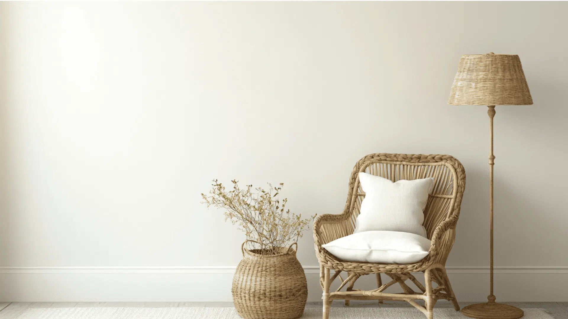
3. Decor
Soft fabrics, such as linen, cotton, and wool, look right at home against Natural Choice’s gentle background.
Teal, green, and charcoal gray accents complement Natural Choice perfectly, creating a calm and peaceful atmosphere in any room.
Natural items, such as plants, woven baskets, and stone, bring texture and life to the clean canvas that Natural Choice provides.
Similar Paint Colors: Perfect Alternative to Natural Choice (SW 7011)

These refined neutrals offer subtle variations on Natural Choice’s popular formula while maintaining versatility across diverse spaces and lighting conditions.
1. Pearly White (SW 7009)
- Lighter neutral with subtle warm undertones that brightens spaces without feeling stark
- Excellent for living rooms, hallways, and open concept areas that need a cohesive look
- Pairs wonderfully with dark wood accents, sage green, and brushed nickel hardware.
2. Ivory Lace (SW 7013)
- Creamy off-white with yellow undertones that add warmth to any space
- Perfect for dining rooms, bedrooms, and areas that need a soft, inviting atmosphere
- Complements rich textiles, gold fixtures, and traditional furniture pieces
3. Shoji White (SW 7042)
- Soft greige with subtle green undertones that creates a serene, grounded atmosphere
- Ideal for meditation spaces, sunrooms, and transitional areas seeking balance
- Works with natural materials, matte black fixtures, and minimalist décor
Summing It Up
Exploring Sherwin-Williams Natural Choice (SW 7011) reveals why this simple color graces countless homes.
This versatile off-white isn’t just another paint option, it’s a design foundation that adapts to your vision while enhancing everything around it.
Whether bathed in morning sunlight or evening lamplight, Natural Choice reveals new dimensions that keep spaces feeling fresh and inviting.
Its warm undertones create the perfect canvas for both bold statements and subtle design choices.
As you consider your next painting project, remember that sometimes the most powerful design elements are the ones that work their magic quietly.
Natural Choice might be that perfect balance of warmth, light, and timeless appeal your home has been waiting for.
If you’re interested in more color review content, feel free to Click Hereand explore other blogs you might enjoy.

Alex Guerrero, a graduate with a Fine Arts degree from the Rhode Island School of Design, has been a visionary in the world of color and design for over 15 years. His professional journey began in the heart of the fashion industry in Milan, where he developed an acute sense for color harmonies and trends. Alex joined our team in 2018, offering fresh and innovative perspectives on color utilization in various spaces. Renowned for his ability to blend contemporary trends with timeless elegance. Outside of work, Alex is an accomplished painter and a volunteer art therapist, his artistic talents further enriching his professional insights.