Ready to meet your home’s new favorite neutral? Sherwin Williams Passive is the gray you’ve been dreaming of easy, smart, and effortlessly stylish.
This beautifully balanced gray isn’t too warm or too cool; it’s perfectly neutral, making any room feel calm, cozy, and inviting.
In this guide, you’ll uncover what makes Passive stand out: its soft brightness , stunning look under natural light, and great versatility that works with both modern and traditional styles.
We’ll also show you how Passive changes different rooms, from cozy bedrooms to inviting living spaces, plus tips on finishes and coordinating colors.
Let’s discuss and study why Passive could be exactly what your home needs.
Understanding Paint Color Basics
Colors have undertones, which are the subtle color hints hiding within a main shade. Passive has neutral undertones that lean neither too warm nor too cool, making it an exceptionally versatile true gray.
Passive reflects a good amount of light while still providing enough depth to add interest to walls.
This gray changes subtly throughout the day – appearing slightly cooler in morning light, neutral at midday, and softly muted in evening hours.
North-facing rooms may highlight their cooler qualities, while south-facing rooms will maintain their balanced, neutral character.
Color Terminology
| Attribute | Value |
|---|---|
| SW Code | SW 7064 |
| Light Reflective Value (LRV) | 60 |
| RGB | 203 / 204 / 201 |
| Hex Value | #CBCCC9 |
Psychology of Gray Shades
Gray colors, like Passive, can significantly impact how we experience a space.
- Gray spaces create a stylish, timeless foundation that feels both refined and calming.
- Gray walls promote feelings of stability.
- Gray is ideal for people who want a contemporary, refined aesthetic.
Using a balanced gray like Passive helps establish a peaceful, neutral foundation that complements rather than dominates your home.
Why Choose Sherwin-Williams Passive?
Passive performs beautifully in various lighting conditions – it maintains its neutral character in natural daylight, shows subtle depth in afternoon light, and creates a cozy atmosphere under artificial lighting at night.
This versatile gray transitions smoothly between contemporary minimalist designs and more traditional, classic interiors.
Key Features
Passive displays different characteristics depending on the surface. On trim, it appears crisp and clear. On walls, it provides a soft, velvety depth.
In spaces with complex lighting, Passive reveals subtle dimensions without becoming too dark or heavy.
This gray shifts slightly throughout the day – appearing more silver in bright natural light and developing a softer, more muted quality in evening lighting. These subtle transitions add visual interest and depth to your spaces.
Durability & Maintenance
Passive is practical for daily living as it conceals minor scuffs and imperfections better than lighter or darker extremes.
- Regular dusting with a microfiber cloth helps maintain color clarity.
- Clean walls with a mild soap solution and soft cloth when needed.
- Use touch-up paint for minor marks and scuffs.
- Select stain-resistant formulations for high-traffic areas and family rooms.
- Avoid ammonia-based cleaners, which can dull the finish over time.
Texture & Finish Recommendations
Choose the right paint finish to match your room’s function and style needs.
Paint Finish Quick Reference Chart:
| Finish Type | Best For | Key Benefits |
|---|---|---|
| Flat | Ceilings, textured walls | Hides imperfections, minimal shine |
| Eggshell | Living rooms, adult bedrooms | Subtle sheen, forgiving of flaws |
| Satin | Bathrooms, kitchens, kids’ rooms | Easy to clean, moisture resistant |
| Semi-gloss | Trim, doors, details | Durable, creates contrast |
- Eggshell – Ideal for living areas and adult bedrooms, offering a subtle sheen that’s forgiving of wall imperfections.
- Satin – Perfect for bathrooms, kitchens, and children’s spaces due to its cleanability and moisture resistance.
- Flat – Excellent for ceilings or textured walls when you want to minimize attention to surface irregularities.
- Semi-gloss – Recommended for trim, doors, and constructive details to create refined contrast with wall color.
Room-By-Room Recommendations
Select paint colors that match each room’s purpose and create the perfect mood for daily living.
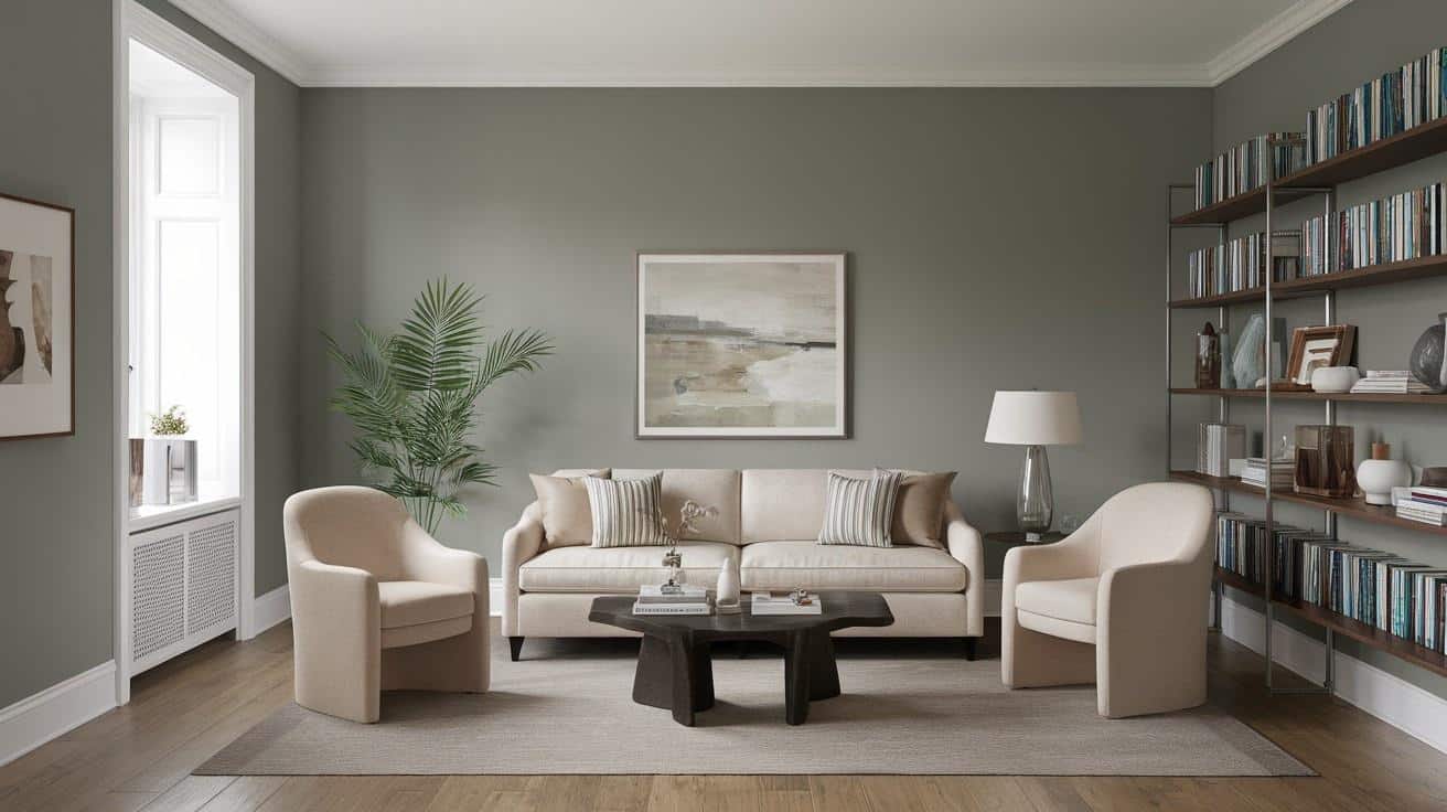
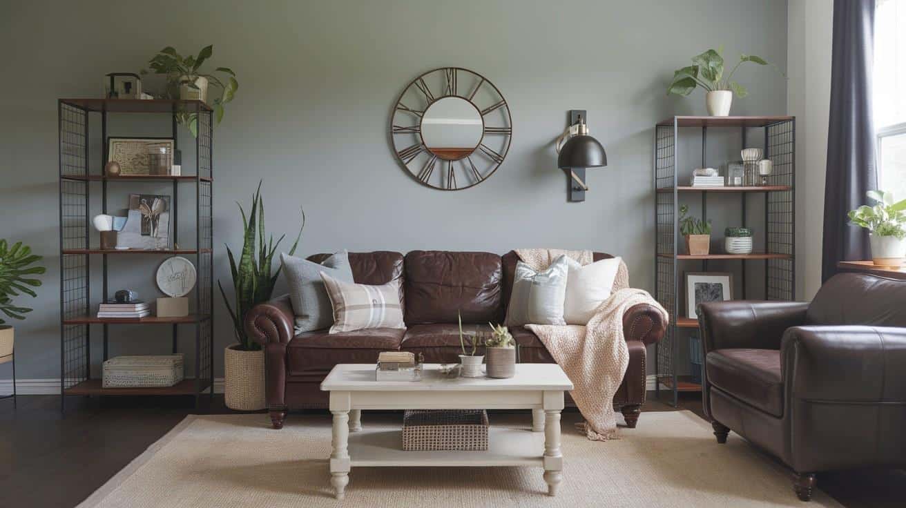
1. Living Spaces & Open Floor Plans
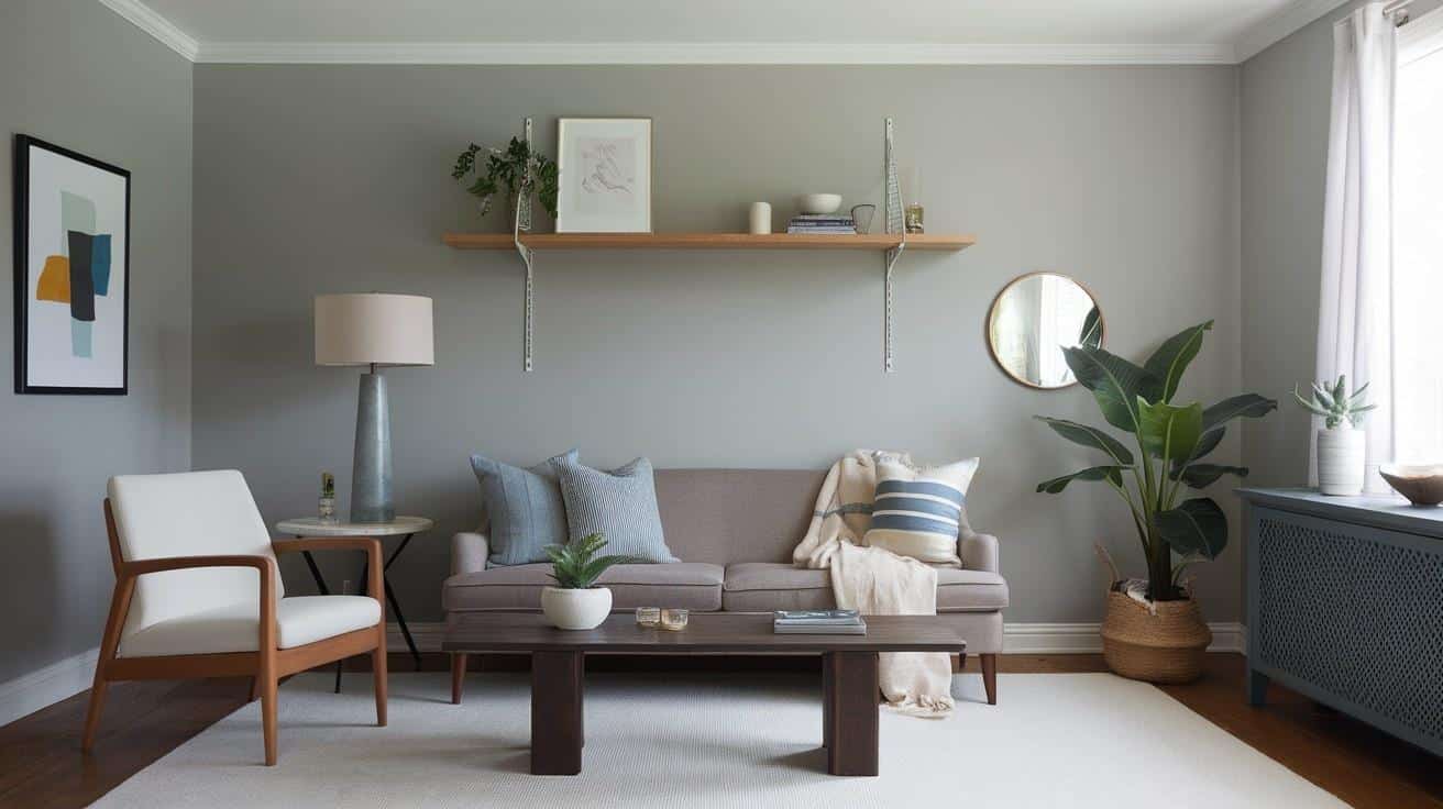
Passive creates a stylish foundation in living areas that feels both contemporary and timeless. It complements various furniture styles and helps define spaces in open-concept homes while maintaining visual flow.
Styling Tips:
- Layer different textures to add dimension against the neutral gray background.
- Use varied lighting sources to highlight the subtle shifts in how Passive appears throughout the day.
2. Bedrooms & Relaxation Areas
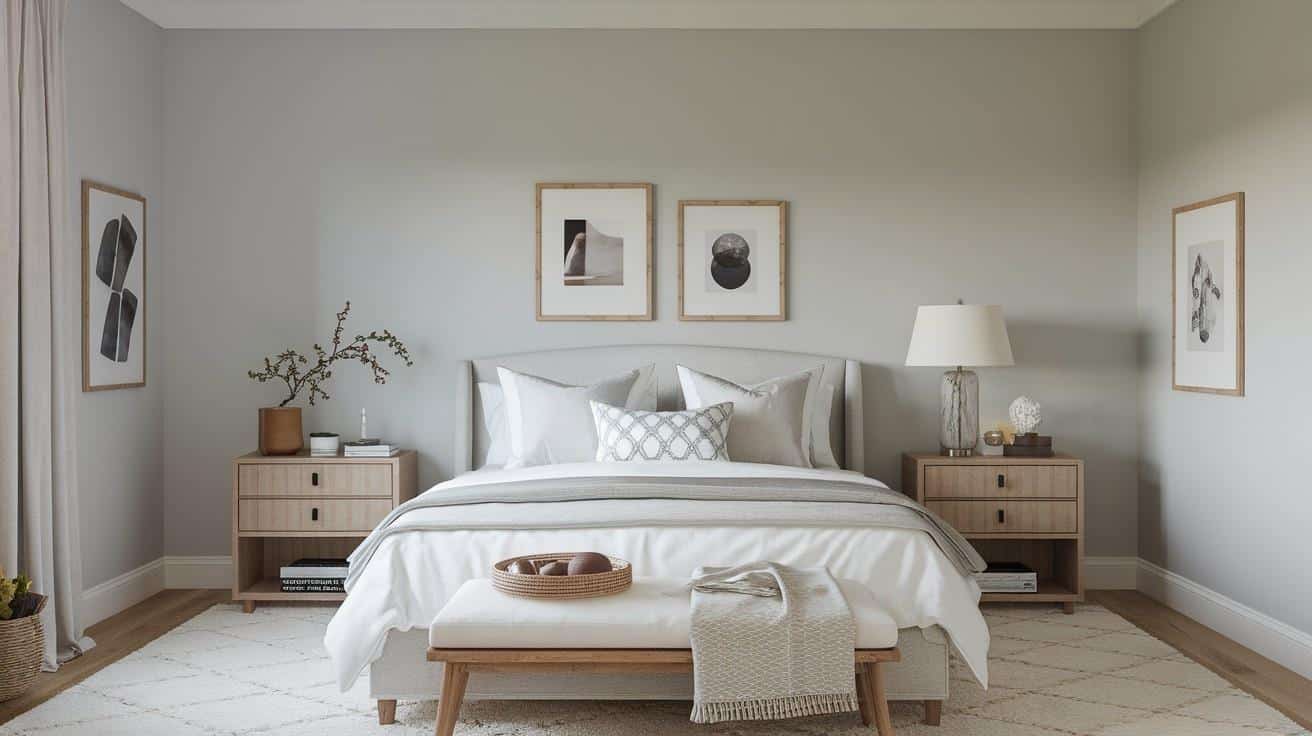
Passive establishes a peaceful atmosphere in bedrooms that supports restful sleep. It’s substantial enough to add character to master suites yet neutral sufficient to adapt to changing bedding and decor.
Styling Tips:
- Combine with soft whites and natural linens for a serene, hotel-inspired bedroom.
- Add textural elements like woven throws or velvet pillows to enhance the refined quality of the gray walls.
3. Kitchens & High-Traffic Areas
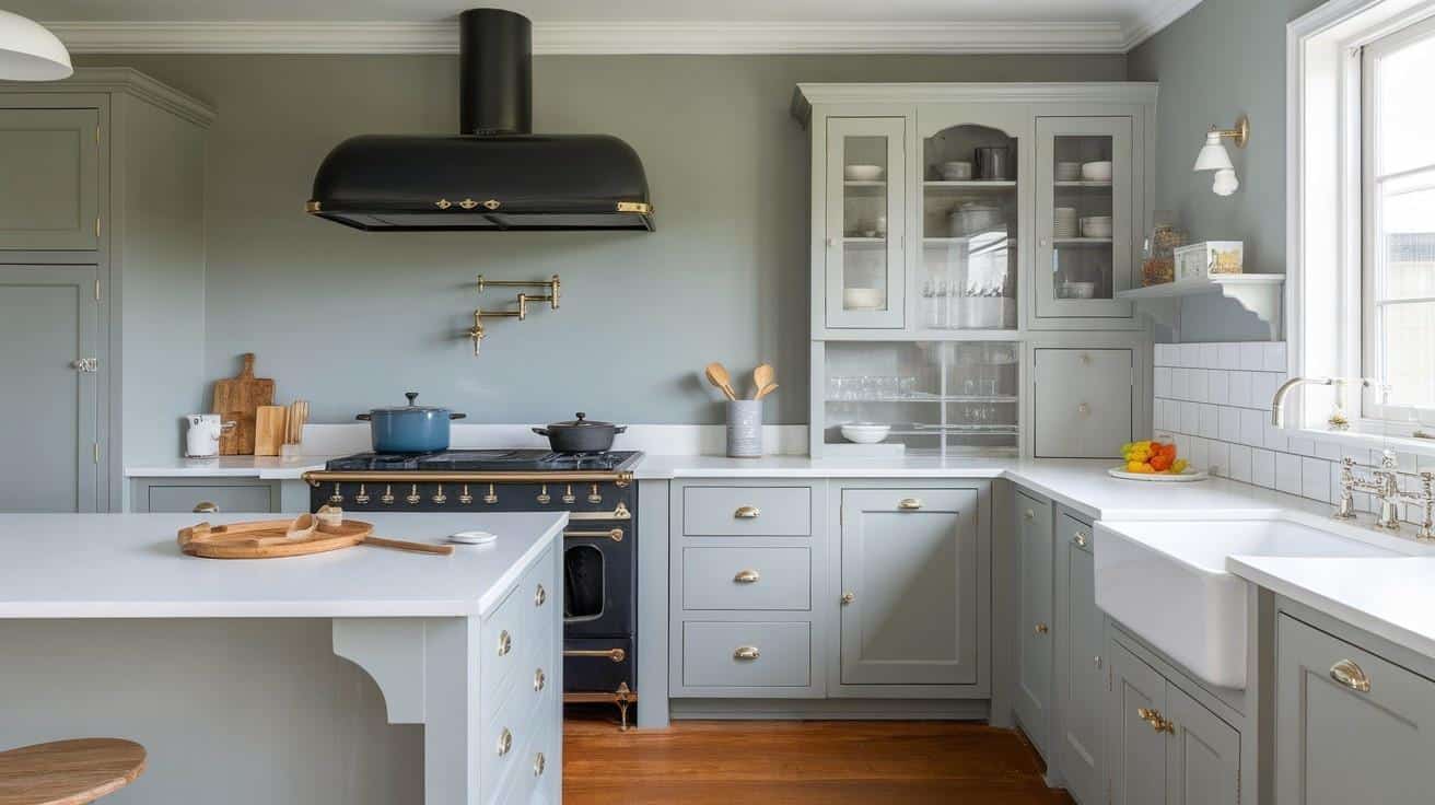
Passive performs exceptionally well in kitchens, providing a refined neutral that complements various cabinet finishes and countertop materials while enduring the demands of a busy family life.
Styling Tips:
- Use Passive on walls with white cabinets for a clean, contemporary kitchen.
- Consider Passive for upper cabinets paired with darker lowers for a trendy two-tone look.
4. Bathrooms & Spa-like Retreats
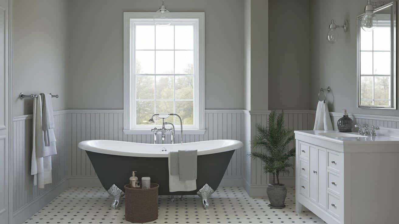
Passive gives bathrooms a refined, spa-like quality. Its neutral character works beautifully with marble, porcelain, and chrome fixtures, making even compact bathrooms feel stylishly appointed.
Styling Tips:
- Incorporate natural elements like wood accessories to warm up a Passive bathroom.
- Choose coordinating towels in deeper grays or accent colors to create layered interest.
Color Pairings & Combinations
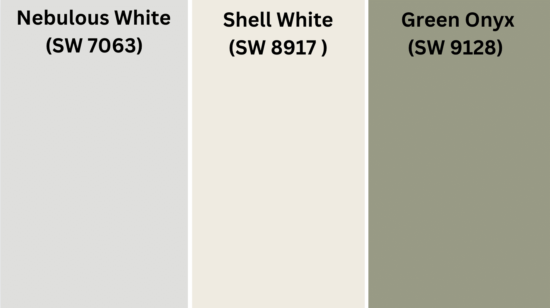
1. Nebulous White (SW 7063)
Nebulous White blends perfectly with Passive. This lighter gray creates a subtle, refined layering effect when used with Passive on adjacent walls or constructive features.
2. Shell White (SW 8917)
Shell White offers a soft, warm contrast to Passive. This creamy white shade provides brightness that balances Passive’s depth, working especially well in kitchens and bathrooms.
3. Green Onyx (SW 9128)
Green Onyx adds an organic and earthy contrast when paired with Passive, offering a grounded, nature-inspired touch that complements the cool neutrality of the gray.
Creating Cohesive Color Schemes
Build beautiful color combinations using these three proven approaches with Passive as your foundation.
Monochromatic Scheme
- Combine Passive with lighter and darker grays for refined depth
- Add silver or pewter accents for a cohesive, stylish look
- Utilize varying textures within the gray palette to create visual interest
Warm Color Scheme
- Pair Passive with soft beiges and taupes for a welcoming, neutral environment
- Add terracotta or rust accents for warmth and dimension
- Incorporate brass or gold elements to enhance the cozy atmosphere
Cool Color Scheme
- Mix Passive with blue-grays for a tranquil, contemporary feeling
- Add sage or eucalyptus green tones for a refreshing, nature-inspired palette
- Use matte black accents to create modern contrast and definition
Quick Color Pairing Reference:
| Scheme Type | Main Colors | Accent Colors | Metal Finishes |
|---|---|---|---|
| Monochromatic | Passive + light/dark grays | Silver, pewter | Chrome, brushed nickel |
| Warm | Passive + beiges, taupes | Terracotta, rust | Brass, gold |
| Cool | Passive + blue-grays | Sage, eucalyptus | Matte black, steel |
Passive excels in all these combinations due to its balanced undertones and adaptable character.
Coordinating with Furniture & Decor
1. Wood Tones
Passive creates an ideal backdrop for a wide spectrum of wood finishes, enhancing their natural beauty.
- Medium woods like oak and cherry gain definition against Passive walls
- Both pale blonde wood and dark espresso finishes stand out beautifully
2. Metals
Passive complements virtually all metal finishes, allowing you design flexibility throughout your home.
- Black and dark bronze metals create dramatic, contemporary contrast
- Brushed nickel and chrome provide a sleek, cohesive look against this gray
3. Decor
Passive serves as an excellent foundation for various decorative elements, allowing them to shine.
- Bold, colorful art pieces stand out dramatically against the neutral background.
- Textural elements like woven baskets and natural fibers add organic warmth to the gray palette.
Similar Colors & Alternatives
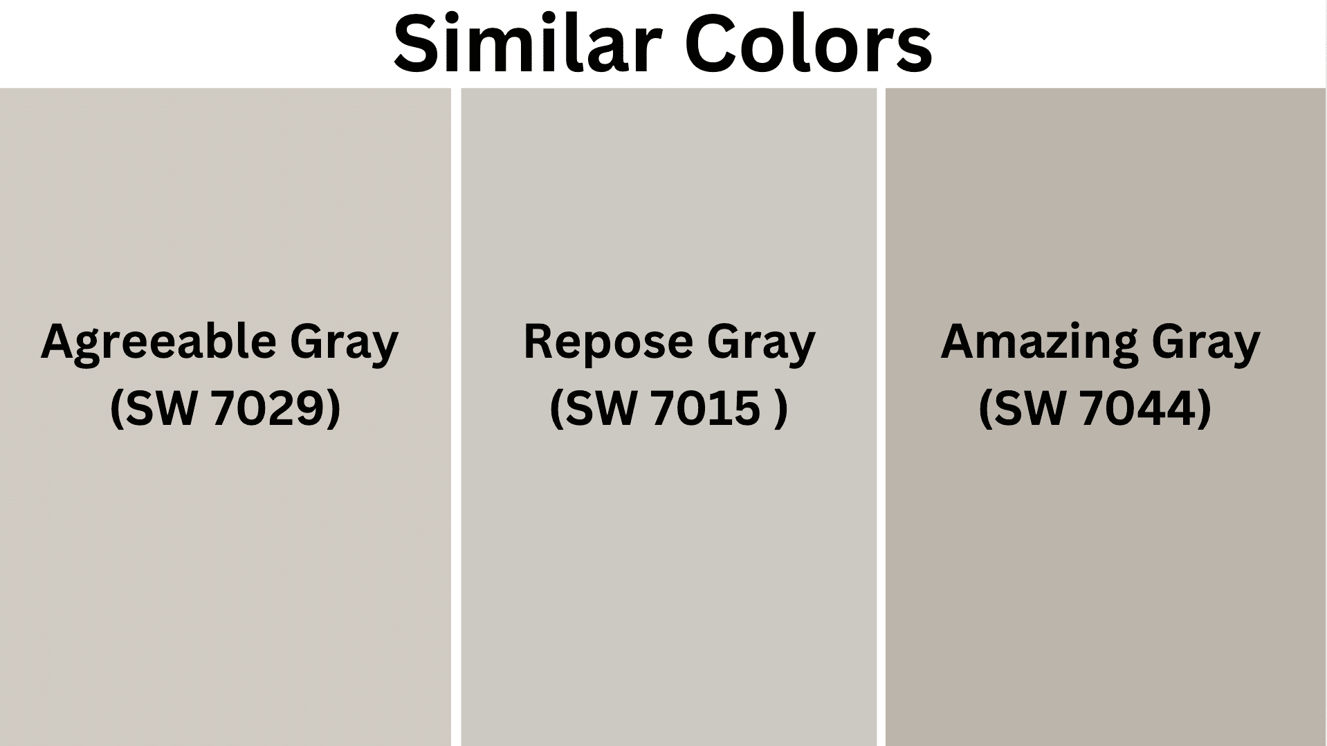
1. Agreeable Gray (SW 7029)
Agreeable Gray offers a warmer alternative to Passive. Its beige undertones create a softer, cozier feeling while maintaining a refined gray character.
2. Repose Gray (SW 7015)
Repose Gray is slightly warmer than Passive with subtle taupe undertones. It’s an excellent choice if you want a gray that feels a bit more enveloping and less neutral.
3. Amazing Gray (SW 7044)
Amazing Gray is deeper than Passive with distinct greige qualities. It creates more dramatic spaces while still maintaining versatility with various decor styles.
Gray Paint Comparison Table:
| Paint Color | Warmth Level | Undertones | Depth | Best For |
|---|---|---|---|---|
| Passive (SW 7064) | Neutral | Balanced | Light | Versatile, modern spaces |
| Agreeable Gray (SW 7029) | Warm | Beige | Light | Cozy, traditional rooms |
| Repose Gray (SW 7015) | Slightly warm | Taupe | Light-medium | Enveloping, comfortable areas |
| Amazing Gray (SW 7044) | Cool-neutral | Greige | Medium | Dramatic, contemporary spaces |
Final Thoughts
Passive is a balanced, true gray with an LRV of 60 that creates refined spaces with plenty of versatility.
It transitions beautifully throughout the day, maintaining its neutral character while revealing subtle depths as lighting changes.
If you desire a timeless neutral that works with evolving design trends and complements rather than competes with your furnishings, Passive is an excellent choice.
It performs beautifully in both contemporary and traditional homes.
Consider testing a sample of Passive in your space to experience how this refined gray responds to your unique lighting before committing to the full project.

Alex Guerrero, a graduate with a Fine Arts degree from the Rhode Island School of Design, has been a visionary in the world of color and design for over 15 years. His professional journey began in the heart of the fashion industry in Milan, where he developed an acute sense for color harmonies and trends. Alex joined our team in 2018, offering fresh and innovative perspectives on color utilization in various spaces. Renowned for his ability to blend contemporary trends with timeless elegance. Outside of work, Alex is an accomplished painter and a volunteer art therapist, his artistic talents further enriching his professional insights.