Sherwin Williams Rockport Gray (SW 7064) is a deep, polished color that brings warmth and calm to any room.
This medium-toned gray, with its subtle undertones, offers a refined backdrop for modern and traditional spaces alike.
While it leans toward the cool side, it retains a balanced, neutral quality that can easily complement a variety of décor styles.
If you’re updating your living room, bedroom, or kitchen, Rockport Gray serves as a versatile foundation that adds depth without overwhelming the space.
Its understated classiness creates an atmosphere that is inviting and quiet yet never too cold or clinical.
This paint is ideal for homeowners who want a neutral color that feels substantial and timeless, one that will pair well with various textures, colors, and furniture choices.
Understanding Sherwin Williams Rockport Gray (SW 7064)
Color Terminology
| PROPERTY | VALUE |
|---|---|
| LRV (Light Reflectance Value) | 24.00 |
| Color Category | Medium-to-dark gray |
| RGB Value | Red: 116 Green: 113 Blue: 113 |
| Hex Code | #747171 |
Undertones
Rockport Gray carries subtle, cool undertones, which give it a slightly blueish hue. This soft undertone helps to make the color appear more refined and approachable.
It’s not a harsh or stark gray but a muted, composed color that shifts beautifully in natural light. Depending on the lighting in your room, Rockport Gray can appear to have hints of charcoal or even taupe, making it an incredibly versatile color.
The Psychology of Medium-Toned Grays
Grays like Rockport Gray are known for creating a calming, balanced environment. Unlike brighter, more energetic colors, medium-toned grays bring a sense of stability and refinement to a room.
They are often used in spaces where relaxation and focus are important, such as bedrooms, home offices, and living rooms.
Key Benefits:
- Creates a Calm Environment: The neutral tones of gray boost stability, making it easier to unwind and relax.
- Complements Many Décor Styles: Rockport Gray works with both modern and traditional designs, offering a timeless appeal.
- Versatility: It pairs well with bold accent colors, wood tones, and metallics, giving you freedom in decorating.
Why Choose This Color?
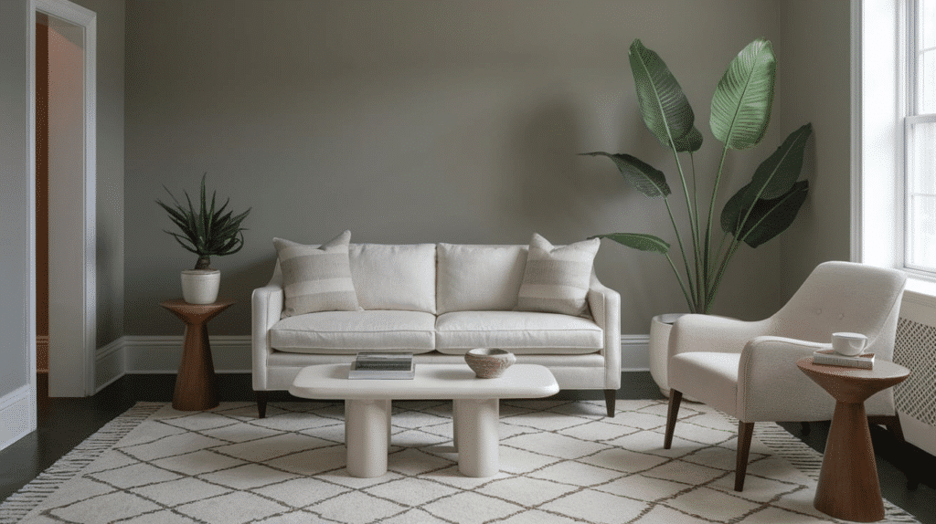
Sherwin Williams Rockport Gray offers more than just a simple neutral—it’s a color that provides depth and character while remaining hidden.
Its balanced tone makes it a perfect choice for those looking for a gray that can fit into a variety of settings, from cozy and intimate spaces to open, airy areas.
If you are trying to create a stylish, polished room or a more relaxed and serene atmosphere, Rockport Gray provides a solid foundation for your interior design.
It’s a timeless shade that works just as well in a modern minimalist design as it does in a more classic, traditional setting. Its subtle undertones allow it to adapt to and complement a wide range of décor styles.
Key Features of Sherwin Williams Rockport Gray
Adaptability:
Rockport Gray is a color that effortlessly adapts to different lighting conditions. In bright natural light, it appears softer and warmer, while in dimmer settings, it takes on a more dramatic, deeper tone.
This makes it highly versatile for use in various rooms, from bedrooms and living areas to kitchens and bathrooms.
Durability:
When applied with premium finishes like Duration or Emerald, Rockport Gray maintains its rich appearance without fading or yellowing.
Its color consistency ensures it remains a reliable choice for high-traffic areas and spaces exposed to the sun.
Subtle Texture Play:
The medium depth of Rockport Gray creates a soft texture on walls that enhances the overall design of the space.
Its understated depth adds a layer of sophistication without overwhelming the other design elements in the room.
Rockport Gray Room-by-Room Recommendations
1. Living Spaces and Open Floor Plans
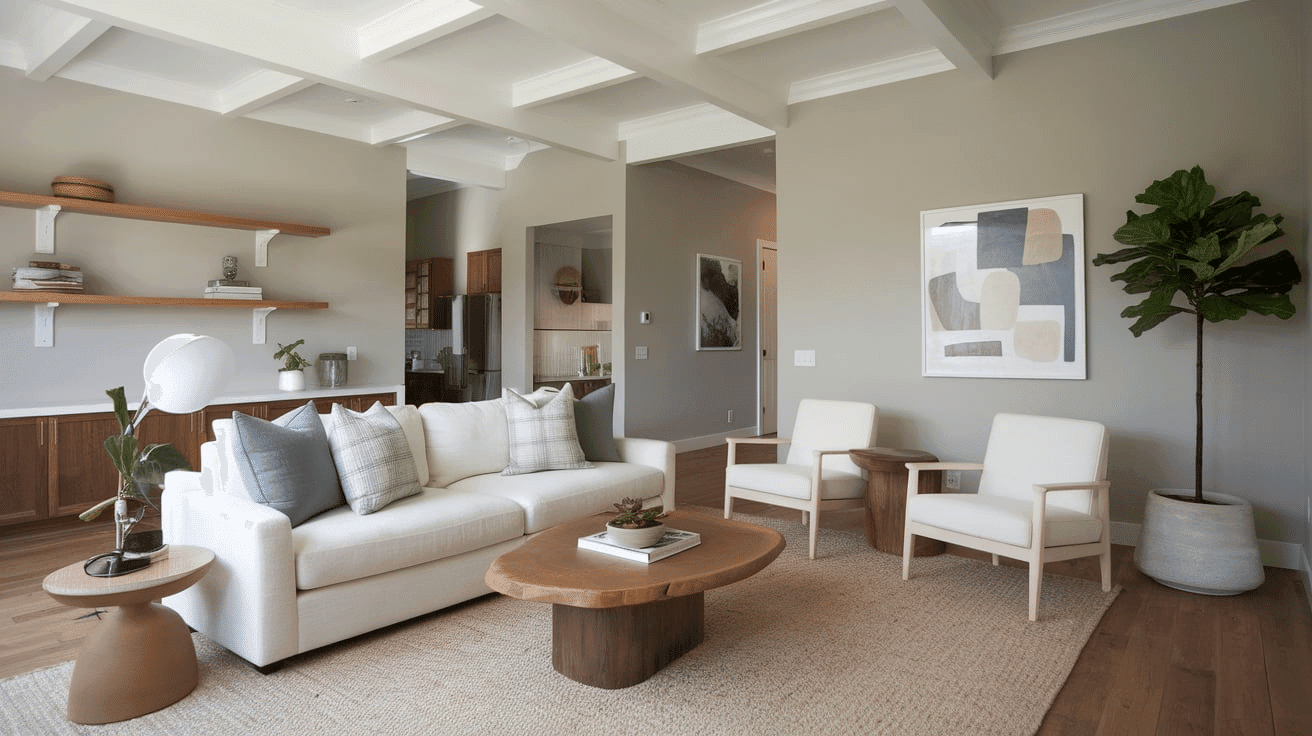
In open floor plans, Rockport Gray works wonderfully as an all-over color that unifies the space. The depth of the shade brings a sense of structure while maintaining a calm atmosphere.
The rich gray tones allow for pops of color through accent pieces like furniture, artwork, or decorative pillows. It also helps to connect different sections of the room while creating a welcoming, cohesive environment.
For larger, open areas, Rockport Gray provides a balanced brightness that doesn’t overwhelm the senses. It’s particularly effective in spaces where you want to add a bit of culture while keeping the overall tone grounded and approachable.
2. Bedrooms and Relaxation Areas
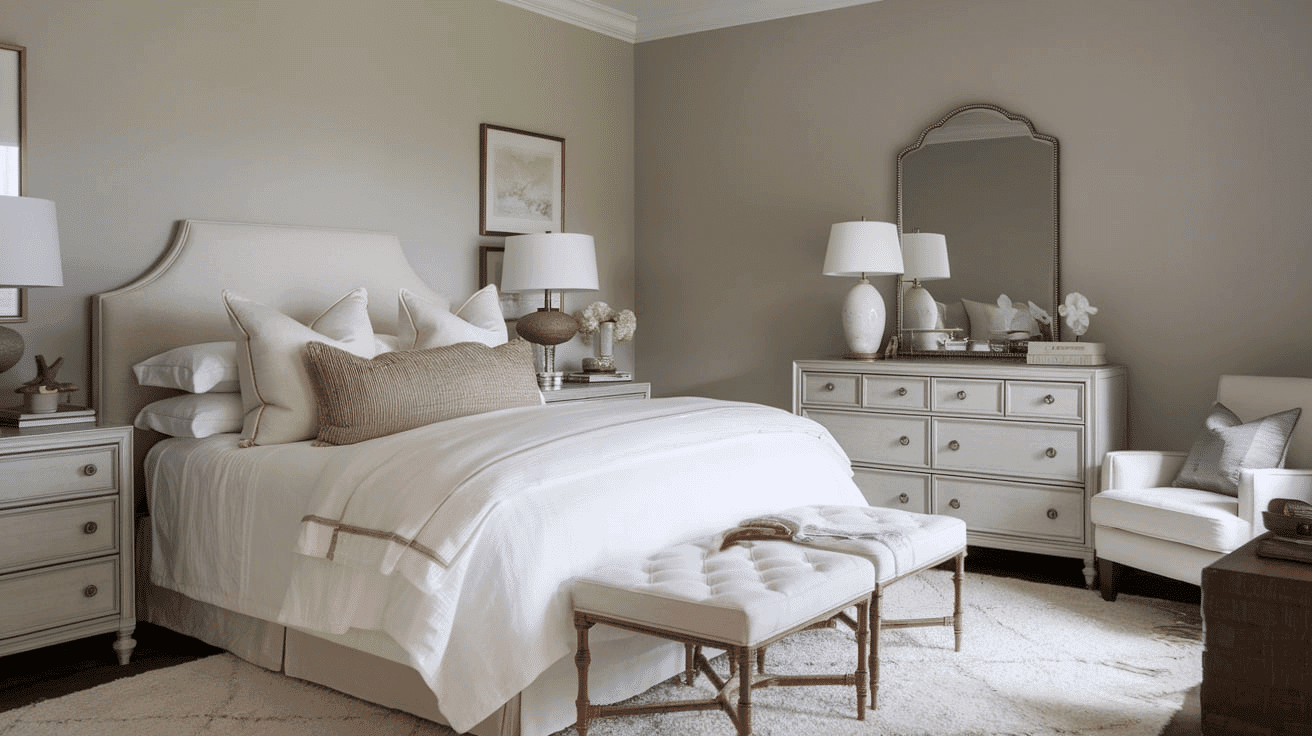
For bedrooms, Rockport Gray is an ideal choice for creating a peaceful, relaxing environment. The muted undertones of the paint allow for a calming atmosphere, making it easier to wind down at the end of a long day.
The color works well with both light and dark wood tones, allowing you to create contrast and visual interest.
This versatile color also pairs beautifully with different bedding options, from rich, bold patterns to softer, neutral designs.
Rockport Gray’s soothing vibe helps establish a serene retreat for rest and relaxation, offering a neutral palette that isn’t too cold or clinical.
3. Kitchens
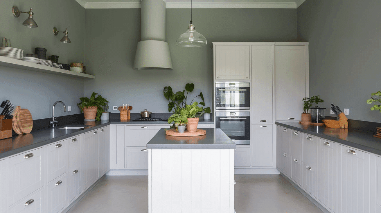
In kitchens, Rockport Gray can be used on both the walls and the cabinetry, offering a fresh, modern look. Its medium depth creates a welcoming space that contrasts beautifully with sleek, dark countertops and high-end appliances.
When paired with white or off-white backsplashes, Rockport Gray creates a clean, contemporary feel.
This color works well in both traditional and contemporary kitchens, offering a polished backdrop for various kitchen designs.
In addition, Rockport Gray makes for an excellent complement to brass or gold accents, providing a refined, timeless look.
4. Bathrooms and Spa-like Retreats
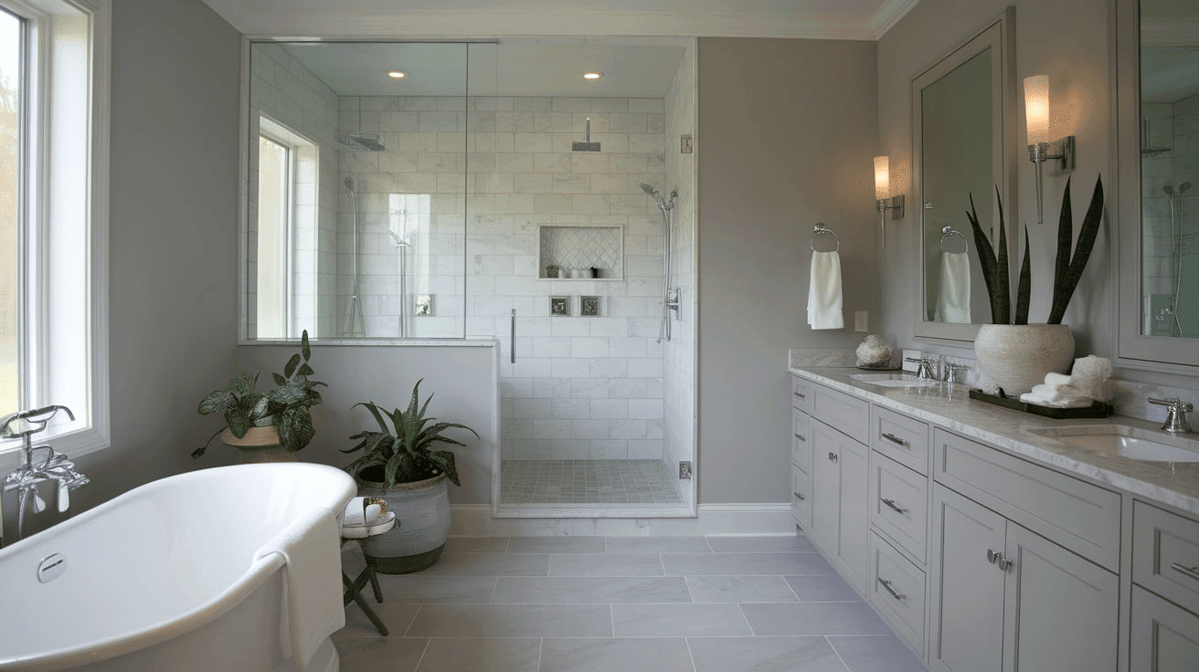
In bathrooms, Rockport Gray evokes a serene, spa-like atmosphere that enhances relaxation. The cool undertones of the color create a sense of peace, making it the perfect shade for a calm retreat.
When used with marble, granite, or wood accents, Rockport Gray creates an inviting and timeless space. Its versatility means it pairs well with chrome, brass, or matte black hardware.
It’s also ideal for both modern and traditional bathroom designs, offering a neutral backdrop that lets your other design elements shine.
Color Combinations with Rockport Gray
Sherwin Williams Rockport Gray is a graceful and refined neutral that pairs well with a variety of other colors.
Here are some complementary, coordinating, and accent color ideas to pair with Rockport Gray:
Complementary Trim Colors:
- Extra White (SW 7006): A bright, clean white that contrasts beautifully with the darker tone of Rockport Gray.
- Pure White (SW 7005): A soft, creamy white that creates a subtle distinction with Rockport Gray while maintaining balance.
- Alabaster (SW 7008): A warmer off-white that softens the coolness of Rockport Gray and adds warmth to the space.
Coordinating Wall Colors:
- Repose Gray (SW 7015): A light, warm gray that complements Rockport Gray with a more subtle, softer tone.
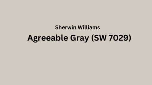
- Agreeable Gray (SW 7029): A versatile greige that creates a balanced, cohesive look when paired with Rockport Gray.
- Sea Salt (SW 6204): A light blue-green that provides a fresh contrast to the cooler undertones of Rockport Gray.
Accent Colors:
- Naval (SW 6244): A deep navy blue that creates a dramatic contrast with the medium gray tones of Rockport Gray.
- Rosemary (SW 6187): A muted, sage green that adds a natural, calming feel when paired with Rockport Gray.
- Serious Gray (SW 6256): A cool, medium blue-gray that improves the refined quality of Rockport Gray.
Coordinating with Furniture and Decor
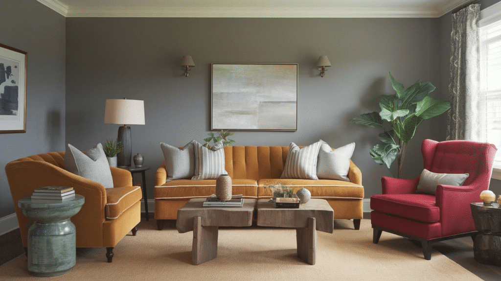
Wood Tones
Rockport Gray pairs beautifully with a wide range of wood tones, especially dark wood like walnut or mahogany, which creates a striking contrast with the medium gray shade.
Lighter wood tones, such as oak or ash, provide warmth and balance to Rockport Gray’s cool undertones.
For a more cohesive look, you can pair it with gray-washed wood for a serene, coastal aesthetic or with natural, unstained wood for an organic, clean contrast.
Metals
Rockport Gray complements chrome, stainless steel, and polished nickel hardware, creating a cool, modern look.
If you prefer more warmth, brass and gold accents add a bit of glamour, contrasting with Rockport Gray’s coolness.
For a more dramatic contrast, matte black fixtures will emphasize the depth of the color.
Decor
Rockport Gray is an excellent backdrop for natural fibers like linen, cotton, and wool, as well as materials like leather and velvet.
Using these textiles adds texture and warmth to the space while also preventing it from feeling too cold. Colorful accents in jewel tones, such as emerald, ruby, or sapphire, stand out beautifully against Rockport Gray’s neutral backdrop.
Similar Paint Colors: Perfect Alternatives to Rockport Gray
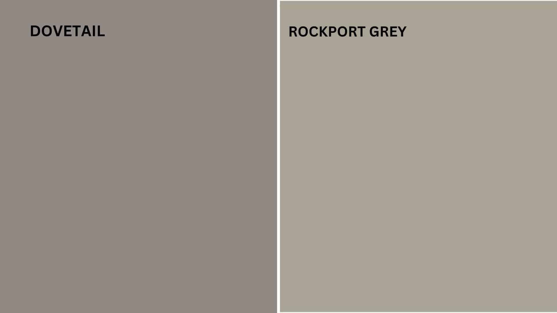
Rockport Gray (SW 7064):
A deep, refined gray with subtle, cool undertones that create a calming, refined atmosphere.
Dovetail (SW 7018):
A similar medium-gray with a slightly warmer undertone, offering a balanced look that works well in various lighting conditions.
Key Differences:
- Rockport Gray is slightly cooler and deeper, while Dovetail has a warmer, more neutral quality.
- Rockport Gray is ideal for contemporary and minimalist settings, while Dovetail is better suited for more traditional or transitional interiors.
Final Thoughts
Sherwin Williams Rockport Gray (SW 7064) offers a refined, balanced gray that enhances any space without overwhelming it.
If you’re looking to update a living room, create a serene bedroom, or add complexity to your kitchen or bathroom, Rockport Gray provides the ideal neutral backdrop.
Its versatile, timeless appeal makes it an excellent choice for any room, giving you the flexibility to create a calm, refined environment that is both modern and enduring.
By choosing Rockport Gray, you’re not just selecting a color; you’re assuming a design element that will stand the test of time and offer both grace and comfort.

