Tiny homes don’t leave room for trial and error. One sofa that’s 4 inches too deep, one rug that’s a size off, and suddenly circulation, comfort, and style all suffer. The fastest way to de-risk decisions is to “see” them first. With today’s AI room planners, you can turn a phone photo into side-by-side layouts in minutes, compare options, and buy with confidence. We’ll walk through a repeatable workflow for studios and compact one-bedrooms-zoning, storage, color/light tricks, and a rapid A/B/C test you can reuse. We’ll also note where Paintit.ai fits into the process to keep the whole exercise fast and visual.
Map Your Life, Then Map the Room
Before you drag a sofa, list the functions your space must support this year-not last: sleep, work, dine, relax, exercise, host. Rank them. If you’re a WFH person three days a week, that workstation isn’t a “nice to have”; it’s core. If you host often, flexible seating beats a massive sectional. Your layout succeeds when your routine has a place to land.
Think flow and focal points. Flow is the set of natural walking paths between doorways and zones. Focal points are where eyes land first (a window, a media wall, a headboard). Try to align the main seating’s sight line with the best focal point and let secondary zones “borrow” leftover views.
Three studio zoning archetypes keep cropping up because they work:
- L-shape: Bed and sofa make an L, creating a sleep nook and a living lane.
- Gallery: Zones line up along one long wall; the opposite wall floats storage and a desk to keep the center open.
- Divider-core: A bookshelf, curtain track, or slatted screen creates a semi-separate sleep bay while keeping light and air moving.
Write a 5-item brief: what must fit, what can flex, where the views/light are best, preferred bed size, and your storage pain points. This “life map” drives every choice that follows.
Measure Once, Photograph Smart
Good previews start with good inputs. Grab a tape, paper, and your phone.
- Measure the box: Length, width, ceiling height. Mark door and closet widths and swing directions; note window sizes and sill heights. Map outlets and data ports if you’ll be desk-heavy.
- Light audit: Note how the room behaves AM vs. PM. Where does glare hit a screen? Where does the evening feel dim?
- Shoot reference photos: Stand back to capture each wall square-on. Then take two diagonals. The straighter the walls in frame, the more trustworthy your comparisons will feel later.
Test 3 Layouts in Minutes (the rapid A/B/C)
Your first goal isn’t perfection-it’s range. Build three contrasting passes:
- Baseline: The “obvious” arrangement you’d do by instinct.
- Bold: A swing at something you’d never try (e.g., bed on the window wall, sofa floating).
- Balanced: A hybrid that steals the best flows from the first two.
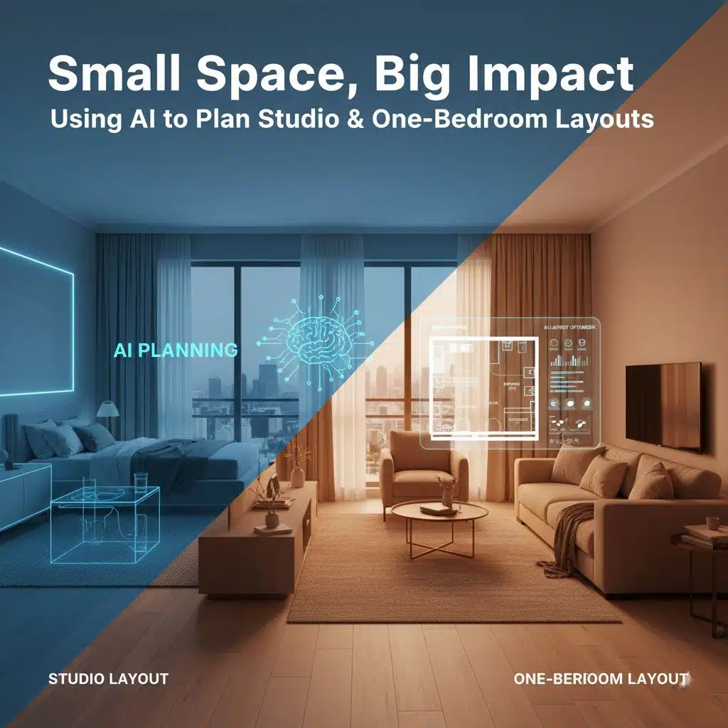
Before you move anything heavy, run a quick mock-up. Drop a photo into AI room design to compare three zoning options side-by-side and see what actually works in your space.
Tools like Paintit.ai make this a five-minute test instead of a weekend project: upload your room photos, try multiple furniture placements and palettes, and export visuals you can mark up for decisions with a partner.
As you compare A/B/C, judge them against hard criteria, not vibes:
- Clearances: Can you walk lanes comfortably, open doors and drawers, pull a chair back? Aim for ~90 cm (about 36 in) for main walkways and ~45 cm (18 in) between a sofa and coffee table.
- Seat count: How many people can sit without dragging in chairs from the kitchen?
- Storage volume: Count real cubic storage (shelves, drawers), not just “there’s a cabinet.”
- Sight lines: From the sofa, do you see a window, art, or just the side of a wardrobe?
Export your three renders and annotate them with what feels good or off: pinch points, awkward views, or “dead corners” that could become storage.
Scale & Multi-Use Furniture That Earns Its Footprint
In small homes, every piece must do more than one job-or earn the right not to.
Sleepers, wall beds, and daybeds
- A sleeper sectional turns hosting up a notch, but measure pull-out lengths and make sure front-clearance is still walkable on movie nights.
- Murphy beds or wall beds free daytime floor area. Check ceiling height and wall clearances for mechanisms.
- Daybeds can shift between lounge and guest use; pair with a slim side table that doubles as a nightstand.
Dining-desk hybrids and flexible tables
- A drop-leaf table hosts friends then parks skinny against a wall as a 2-seat desk.
- Nesting and stacking tables become ad-hoc side tables when needed, then disappear.
Ottomans and benches with storage
- These hide throws, games, or tech while doubling as perches for guests.
- At the entry, a lid-top bench swallows shoes and bags so visual clutter never makes it to the living zone.
Clearance cheat sheet
Use these rules of thumb when sanity-checking any render:
- Main walkways: ~90 cm / 36 in
- Secondary paths: ~45-60 cm / 18-24 in
- Sofa-coffee table gap: ~45 cm / 18 in
- Dining chair push-back: aim for ~90 cm / 36 in behind the chair for easy egress
(Designers vary by context, but these ranges keep daily use smooth in compact rooms.)
Light, Color & LRV: Make the Room “Read” Bigger
Small spaces live or die by how they handle light. Two levers matter most: LRV and color temperature.
LRV (Light Reflectance Value)
LRV is a 0-100 scale printed on professional paint chips that indicates how much light a color reflects (100) or absorbs (0). In compact rooms, colors with higher LRVs bounce more light around, helping walls visually recede. Finish matters too: higher-gloss paints reflect more light than matte, but you trade off glare and texture.
Color temperature and layers
For living and sleeping zones, 2700-3000K reads warm and relaxing; it flatters wood tones and soft furnishings and makes evenings feel calmer. Save cooler temps (4000K+) for task zones where alertness matters.
Build three layers even in a studio:
- Ambient: a soft, even base via ceiling or wall-wash fixtures.
- Task: desk lamps, reading sconces, under-cabinet strips.
- Accent: picture lights, LED strips on shelves, or a small uplight to graze a plant.
Place mirrors where they catch light from windows-not opposite clutter. Hang curtains high and wide to fake taller windows, and let the hem just kiss the floor to avoid visual “breaks” that shorten the wall.
Color blocking
Use color blocking to “draw” rooms within rooms-e.g., a slightly deeper accent rectangle behind the headboard, or a tone-on-tone arc that wraps a reading nook. Keep the blocks aligned to furniture so they anchor zones, not fight them.
Storage You Don’t See (But You Feel)
Visual quiet is the secret to a small home that feels big.
- Go vertical: Float shelves above sofa backs and door heads; most rooms hide 30-45 cm of unused vertical just below the ceiling.
- Under-bed and under-sofa zones: Shallow bins are for low-rotation items. If it’s daily-use, it needs a faster home.
- Media wall with concealed cubbies: A shallow wall of doors painted the same color as the wall “disappears,” but swallows cables, routers, and remotes.
- Entry drop-zone: Hooks, a tray, and a lidded bin stop micro-mess right at the door.
Style Cohesion: One Palette, Repeated Materials
Variety shrinks rooms; repetition stretches them. Lock a simple scheme:
- 60/30/10: 60% light neutral (walls, big rug), 30% mid-tone (sofa, curtains), 10% accent (art, pillows).
- Material rhythm: Repeat one metal (e.g., brushed brass) and one wood tone across zones to unify.
- Low-profile decor: Shallow shelves, slim lamps, and plants with vertical habit add depth without eating floor area.
As you pick colors, check LRV to keep the overall read light. A whisper-darker hue in one zone is fine; the key is that most surfaces reflect enough light that the eye reads “spacious.”
From Render to Reality: Budget, Phasing, and Sourcing
Turn your chosen render into a measurable list.
Write down each piece with width × depth × height, finish, and lead time. Add “clearance notes” next to anything that opens or pulls out. When in doubt, tape the footprint on the floor to get a feel for bulk.
Phase the makeover
- Weekend 1: Lighting and curtains. These change perception instantly.
- Weekend 2: Rug and seating swap.
- Weekend 3: Storage wall + cable control.
- Weekend 4: Art, mirrors, plants.
Sanity-check before buying
- Circulation test: Do your clearances still check out?
- Screen ergonomics if your plan includes a workstation: seat-to-monitor distance in the 50-100 cm (20-40 in) range cuts eye strain; adjust text size as needed. Avoid glare sources behind your screen.
- Task lighting: If you read/write on paper regularly, be sure you have adequate task light; offices often target 20-50 foot-candles for paper tasks, with more for LCD monitor tasks-desk lamps help without blasting the whole room.
Case Study: A 28 m² Studio, Two Ways
Constraints: 4.8 m × 5.8 m rectangle; one long window wall; entry opposite the bed wall; no gas; one closet; WFH 3 days/week; host 2-3 people monthly.
Concept A – Divider-core
- A 1.6 m open-shelf divider floats behind a daybed to form a shallow sleep bay.
- A 160 × 230 cm rug anchors the living zone; a nesting coffee table set flexes for guests.
- Desk sits by the window to borrow light; task lamp at 3000K keeps skin tones natural on calls.
- Pros: sleep zone feels private; living gets a focal point; shelves add storage.
- Cons: divider eats 30-40 cm of depth; requires careful cable routing.
Concept B – Gallery flow
- Bed tucks lengthwise along the long wall with a tone-on-tone color block to “frame” it.
- Opposite wall carries a floating media/storage run with concealed doors.
- A drop-leaf table serves as a two-seat desk daily and expands to dine four.
- Pros: clean central lane (no obstructions); easiest to clean; maximal wall storage.
- Cons: less visual separation for sleep; headboard view is the media wall unless art is curated.
Side-by-Side Notes
Criteria | Concept A (Divider-core) | Concept B (Gallery) |
|---|---|---|
Main walkway | 90 cm loop around divider (meets target) | 100 cm straight shot (best circulation) |
Seats without extra chairs | 4 (daybed + 2 stools) | 3-4 (sofa + 1 stool) |
Closed storage volume | Higher (divider + media run) | Medium (long media run only) |
Screen glare risk | Low (desk parallel to window) | Medium (desk angle needs shade) |
Setup cost | Medium (divider + lighting) | Low (no divider) |
Outcome: The resident chose Concept B for easier cleaning and a longer sight line. We kept a 2700-3000K lighting plan with a bright task lamp at the desk, and specified wall colors in the 65-75 LRV band to keep the room airy without going chalky.
Final Checklist & Template
- Photograph straight-on walls and two diagonals before any changes.
- List functions in order of priority.
- Measure the room shell, door/window swings, and outlets.
- Generate three contrasting layouts with AI room design and export side-by-side. Use Paintit.ai to iterate quickly.
- Check clearances: 90 cm main walkways; ~45 cm sofa-table; don’t block door swings.
- Pick a palette with LRVs that keep the overall read light; use color blocking to mark zones.
- Layer light: ambient, task, accent; aim for warm 2700-3000K in living/sleep zones.
- Choose furniture that earns its footprint (sleeper, drop-leaf, ottoman with storage).
- Convert your render into a measured shopping list and phase work over weekends.
- For WFH, confirm monitor distance and add task light to meet reading needs.
Why This Workflow Works for Today’s Small Homes
Studios and one-bedrooms are compact almost everywhere. Recent U.S. data puts the average studio around 457 sq ft (42.5 m²) and one-bedrooms at ~735 sq ft (68.3 m²), which explains why space-savvy planning is mainstream now-not niche. RentCafe AI tools compress the feedback loop: you try three ideas, compare them visually, and commit to the one that meets your circulation, seating, and storage targets. And because you’ve seen the result before you buy, your returns plummet and your space starts working on day one.
If you only do three things this month: tighten your walkways, set a warm layered lighting plan, and run a three-way layout test with Paintit.ai. Your small home will feel bigger-not because the walls moved, but because everything else finally does.
Liam Bennett holds a degree in Computer Science from the University of Edinburgh and has over 15 years of experience in technology and digital innovation. He began his career in software development, focusing on user-friendly systems and backend architecture. Liam joined our platform in 2025 to lead our Tech section, where he simplifies complex topics—from smart home devices and AI tools to cybersecurity and troubleshooting tips. Known for his clear, practical advice, he helps readers navigate today’s fast-evolving tech landscape. Outside of work, Liam enjoys building custom PCs and contributing to open-source projects.


