Instead of chasing trends, designers reveal that color contrast should be used as a strategy. Deep colors ground the space, bright accents punctuate it, and creamy neutrals stop the room from feeling heavy.
Just take a look at the new Kettal furniture collections to see which are the best colors for decorating your home this winter. Here’s how to steal that logic for a winter living room that reads intentional, warm, and quietly expensive.
Why This Winter Is The Season Of Contrast: A New Design Formula
The key shift for 2026 is that color is no longer used to set a single mood. Instead, color is being used as a design tool. Deep tones establish the “architecture” of a room, while bright accents serve as punctuation marks: small, bright, and memorable. This balance is especially important in winter, when daylight is limited and artificial light does most of the work.
This matters because living rooms have to serve many purposes. They’re not just formal spaces; they’re also where you watch TV, work briefly, or take a call. Contrast helps organize that daily chaos.
It’s easier to understand the layout of the room, and it’s easier to prevent the room from feeling flat, especially in the winter when daylight hours are short, and everything tends to be darker.
The Foundation Layer: Deep Tones To Hold the Furniture Together
If you want your living room to look sophisticated instead of cluttered, start with anchor tones. Think of chocolate brown, forest green, and midnight blue as the foundation layer, just as a great coat anchors a winter outfit.
If you choose darker upholstery, midnight blue is the most practical option. It hides everyday wear and tear, stands out in the evening light, and pairs well with both warm and cool accents.
The Moroso Gentry Sofa is the perfect example of how a blue sofa with brown cushions can look luxurious without making the room feel too boring. The material catches light in a way that makes the color pop, and the silhouette reads as architectural.
Forest green is ideal when you want depth with a softer edge. A piece like the Two-Tone Tufty Time sofa seen on Tomassini Arredamenti furniture ecommerce makes green feel approachable, especially with the dark velvet and light fabric combination. In a winter color scheme, that matters; green should feel like a “wrap-up” color, not a formal statement.
Lighting Without a Lamp: Cloud Dancer as a Soft-Glow Neutral
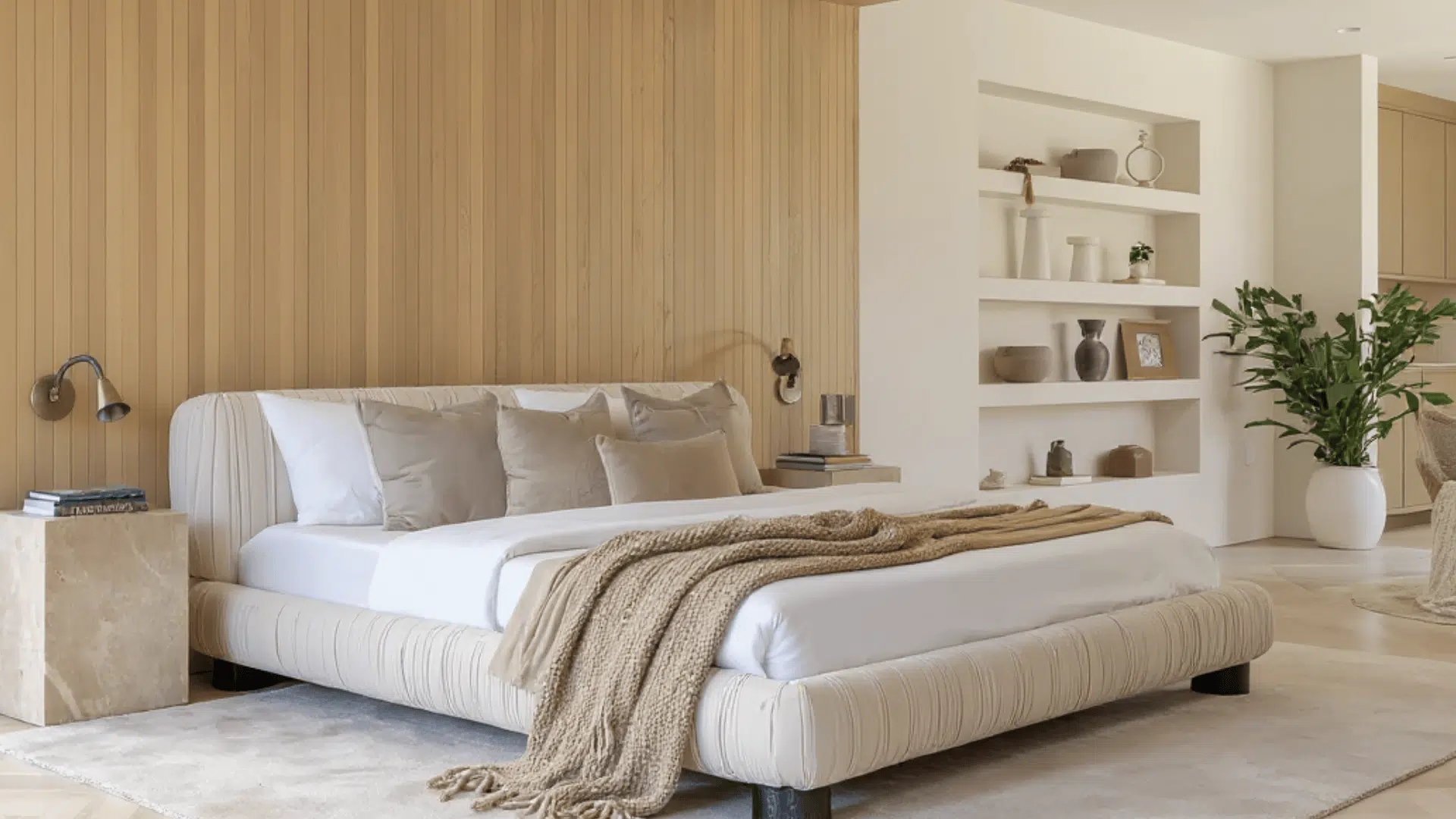
The new year isn’t asking for white boxes. The balancing color in this story is Cloud Dancer, a creamy off-white that functions as a soft light source within the color scheme. It’s not stark. It’s not icy. It’s designed to brighten the room without erasing the depth created by darker tones.
The best way to use Cloud Dancer is on large, calm surfaces around your deeper anchors. Consider curtains that diffuse daylight, a pale rug that frames the seating area, wall treatments like boiserie, or a warm paint color instead of bright white. If your sofa is dark, a Cloud Dancer rug is one of the fastest ways to prevent the room from feeling too dense.
The Accent Rule: High Impact, Zero Chaos
The biggest mistake with winter accents is overuse. This season works when color is contained.
Red comes first. Shades like Winterberry or Chili Oil feel bold without drifting into holiday clichés. A compact piece like the Bongo coffee table by Meridiani turns red into a focal point instead of background noise.
Pumpkin orange only works when it commits fully. The Pumpkin Sofa by Ligne Roset proves that one strong silhouette can replace ten smaller accessories. One statement beats many attempts.
Yellow is trickier. Lemongrass only survives when it’s graphic and grouped. Dining chairs like the Masters chair by Kartell work because they form a visual unit, separate from the living area. The key is repetition, not scatter.
Dark wood or lacquer should always be nearby. It keeps bright colors grounded.
Violet: The Accent You Don’t See Coming
Purple can look costume-like quickly, so it’s best used as a “jewel tone detail” rather than the main theme. Violet looks great paired with midnight blue and creamy neutrals or against chocolate brown with warmer metallics.
One smart way to incorporate violet into a room without committing to a large purple object is through reflective design. The Rapunzel Mirror, designed by Atelier Oï for Zanotta, is made of cowhide enriched with an interwoven Alcantara in the shades of gold, blue, and violet.
Mirrors also serve a practical purpose in winter by bouncing limited daylight and preventing deep palettes from feeling too enclosed. In other words, violet can be both aesthetically pleasing and functional when incorporated into a piece that changes the way the room feels.
How to Adapt This Winter Palette And Make It Personal
This flexible winter palette is built on a simple logic: a deep base, a creamy balance, controlled accents, and one mystery note. Personalizing it is mainly about how far you push saturation.
For a quieter version, keep the base color deep, but choose more muted accents; if you prefer a bolder look, choose one statement piece in Pumpkin or Red and keep everything else subdued. One iconic color statement looks more expensive than five smaller attempts.
The point is to set up a living room that feels sharp, warm, and current when winter hits and you start spending more hours at home.

With a Master in Architectural Studies from University of Pennysylvania, Marwa Haydar has pioneered living spaces since 2005. Her expertise, initially honed in a prestigious architectural firm, is evident in her approach to creating environments. Marwa became part of our team in 2019 and has since been a driving force in our home improvement section, known for her practical yet stylish solutions. She’s been spearheading our design workshops since then, infusing her passion for teaching into her work. In her leisure time, Marwa enjoys exploring historic architecture and is an enthusiastic pottery hobbyist, further enriching her understanding of form and texture.