Choosing the right SW Alabaster coordinating colors can feel confusing because this shade looks different in every room and lighting setup.
Today, I’ll walk you through the best combinations that make Alabaster look its best, along with tips designers use to keep the color balanced.
You’ll see how different shades work with it and how small choices can change the whole room.
By the end, you’ll know exactly how to build a clean, calm palette that works in any space without second-guessing your choices.
What is Sherwin-Williams Alabaster?
Sherwin-Williams Alabaster (SW-7008) is a warm white paint color with soft yellow undertones. These undertones give it a gentle warmth that keeps it from feeling cold or sharp in any room.
Its LRV is 82, which means it reflects a lot of light. This helps brighten darker spaces and makes small rooms feel more open and airy.
Alabaster is a designer favorite because it works with many color palettes. It pairs well with warm neutrals, soft greens, deep blacks, and popular greige tones.
It can look more yellow in warm lighting, like rooms with west-facing sun or warm bulbs. This is most noticeable when it’s next to beige or tan finishes.
In cooler lighting, Alabaster looks creamy and soft instead of yellow. This gives the room a clean, warm look without feeling too bright or stark.
Best SW Alabaster Coordinating Colors
Alabaster works well with warm neutrals, soft greens, bold dark shades, and cool grays. These groups help balance its warm undertone and create simple, clean palettes for any room.
Warm Neutral Coordinating Colors
Warm neutrals pair well with Alabaster because they share soft, earthy undertones. They create a smooth, calm look that works in many rooms.
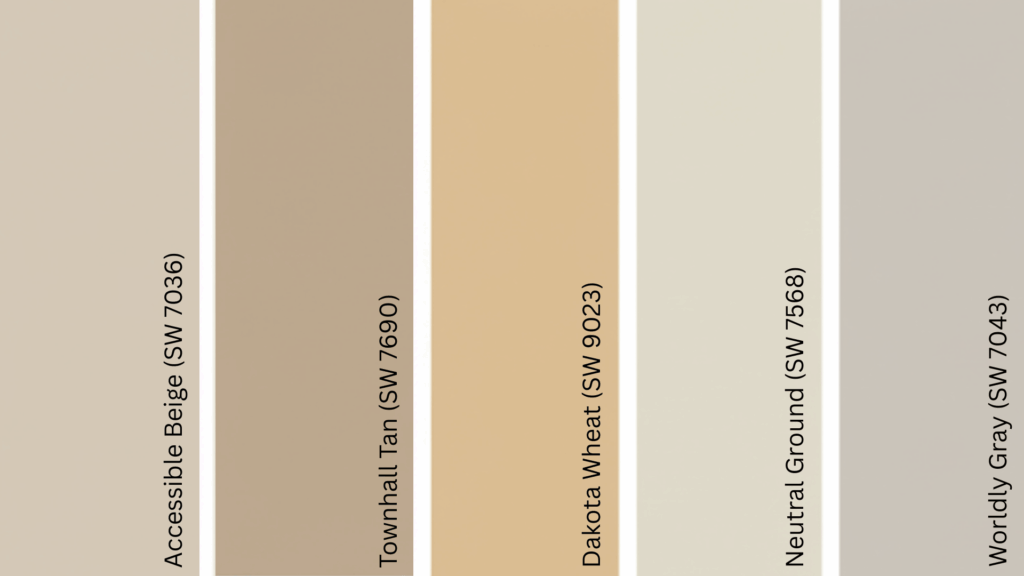
1. Accessible Beige (SW 7036)
Accessible Beige (SW 7036) is a warm beige with gentle gray undertones and an LRV of 58. It adds light contrast next to Alabaster without feeling cool or heavy.
It works well with Alabaster because both share warm undertones, creating a smooth, balanced transition between colors
2. Townhall Tan (SW 7690)
Townhall Tan (SW 7690) is a cozy tan with soft golden undertones and an LRV around 44. It brings a warm, grounded feel to a room without overwhelming the space.
It works well in kitchens or family rooms. This color pairs with Alabaster because its warm, natural tone adds depth while keeping the palette simple and inviting.
3. Dakota Wheat (SW 9023)
Dakota Wheat (SW 9023) is a warm yellow-beige with an LRV near 55. It adds a gentle golden warmth that feels natural and earthy.
It looks great in kitchens, dining rooms, or spaces with warm flooring. This color works with Alabaster because both have warm undertones that create a comfortable and connected look.
4. Neutral Ground (SW 7568)
Neutral Ground (SW 7568) is a balanced tan with an LRV of 70, giving it a soft, light appearance. It feels warm without looking yellow.
Use it in open-concept spaces or main living areas. It pairs well with Alabaster because its subtle warmth keeps the palette smooth and unified.
5. Worldly Gray (SW 7043)
Worldly Gray (SW 7043) is a warm greige with an LRV of 57. It adds light contrast while keeping rooms soft and neutral.
It works well in bedrooms and offices. This shade pairs with Alabaster because its greige undertone adds quiet depth without fighting the warm white walls.
Soft Greens & Muted Naturals
Soft greens help cool down Alabaster’s warmth. They create a calm, balanced palette that feels fresh and relaxed.
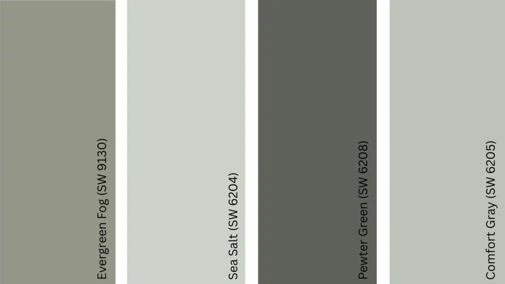
6. Evergreen Fog (SW 9130)
Evergreen Fog (SW 9130) is a muted green-gray with an LRV of 30. It brings an earthy, peaceful tone to any room.
Use it in living rooms, bedrooms, or accent walls. It pairs with Alabaster because the cool green tone balances the warmth of the white, creating a steady, natural look.
7. Sea Salt (SW 6204)
Sea Salt (SW 6204) is a soft green-blue with an LRV of 63. It can look greener or bluer depending on the light.
It works well in bathrooms, bedrooms, and calm living spaces. This shade pairs with Alabaster because its cool color softens the warm undertones, keeping the palette light and soothing.
8. Pewter Green (SW 6208)
Pewter Green (SW 6208) is a deep, muted green with an LRV of 12. It adds bold depth without feeling harsh.
Use it for cabinets, islands, or accent walls.
It pairs with Alabaster because the deep green creates rich contrast while Alabaster keeps the space bright and balanced.
9. Comfort Gray (SW 6205)
Comfort Gray (SW 6205) is a light gray-green with an LRV of 54. It offers a soft, airy feel with just a hint of color.
It works well in bedrooms, offices, or bathrooms. It pairs with Alabaster because the gentle green tone cools the warmth of the white, creating a smooth, relaxed palette.
Bold Accent Colors for Contrast
Bold colors create a clear contrast with Alabaster, making details stand out. They work well on doors, cabinets, islands, and accent walls.
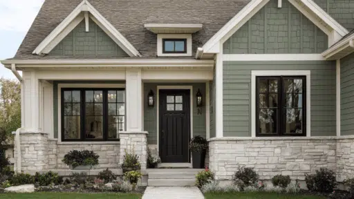
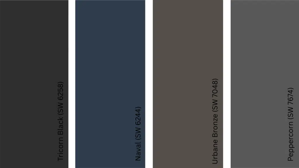
10. Tricorn Black (SW 6258)
Tricorn Black (SW 6258) is a deep, true black with an LRV of 3. It offers a strong, clean contrast against Alabaster.
It works well on doors, trim, or modern accents. This shade pairs with Alabaster because the sharp difference highlights architectural lines and adds a modern edge.
11. Naval (SW 6244)
Naval (SW 6244) is a deep navy blue with an LRV of 4. It brings a classic, rich look to any space.
It’s great for kitchen islands, built-ins, and statement walls.
It pairs with Alabaster because the navy depth makes the warm white appear brighter and more defined.
12. Urbane Bronze (SW 7048)
Urbane Bronze (SW 7048) is a warm brown-gray with an LRV of 8. It delivers a grounded, earthy feel.
Use it on cabinets, accent walls, or doors.
It pairs with Alabaster because the warm undertones connect smoothly, while the darker depth adds strong contrast.
13. Peppercorn (SW 7674)
Peppercorn (SW 7674) is a deep charcoal gray with an LRV of 10. It gives bold contrast without the sharpness of black.
It works well on interior doors, islands, or focal walls. This shade pairs with Alabaster because it adds structure and depth while keeping a softer edge than true black.
Cool & Soft Grays
Cool grays help balance Alabaster’s warmth, creating a clean and modern look.
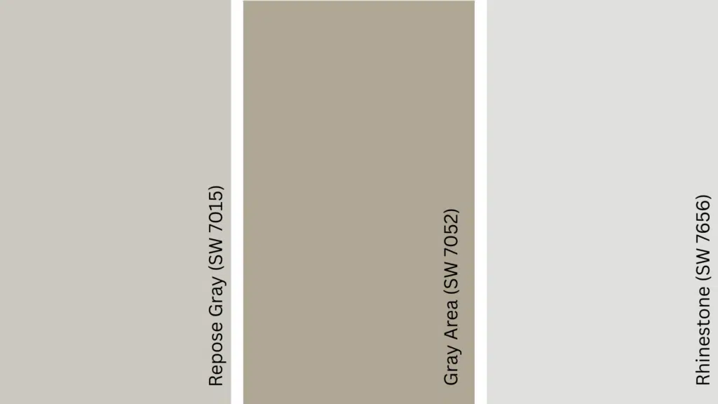
14. Repose Gray (SW 7015)
Repose Gray (SW 7015) is a soft gray with an LRV of 58. It stays mostly neutral with a slight warm undertone.
It works in bedrooms, hallways, and living rooms. It pairs well with Alabaster because it softens the warmth and creates a smooth, modern contrast.
15. Gray Area (SW 7052)
Gray Area (SW 7052) is a stone-like gray with an LRV of 46. It adds a bit more depth while staying cool and steady.
Use it in offices, dining rooms, or accent walls. This shade pairs with Alabaster because it balances the warm white without feeling too sharp or cold.
16. Rhinestone (SW 7656)
Rhinestone (SW 7656) is a crisp white-gray with an LRV of 75. It feels clean and light with a cool edge.
It works well for trim, ceilings, or minimalist spaces.
It pairs with Alabaster because its cool tone prevents the white walls from looking too creamy, keeping everything fresh and bright.
Best Trim Colors With Alabaster

Alabaster works with several white trim colors, and each one creates a different level of contrast. The right choice depends on whether you want a soft mix or a sharper edge.
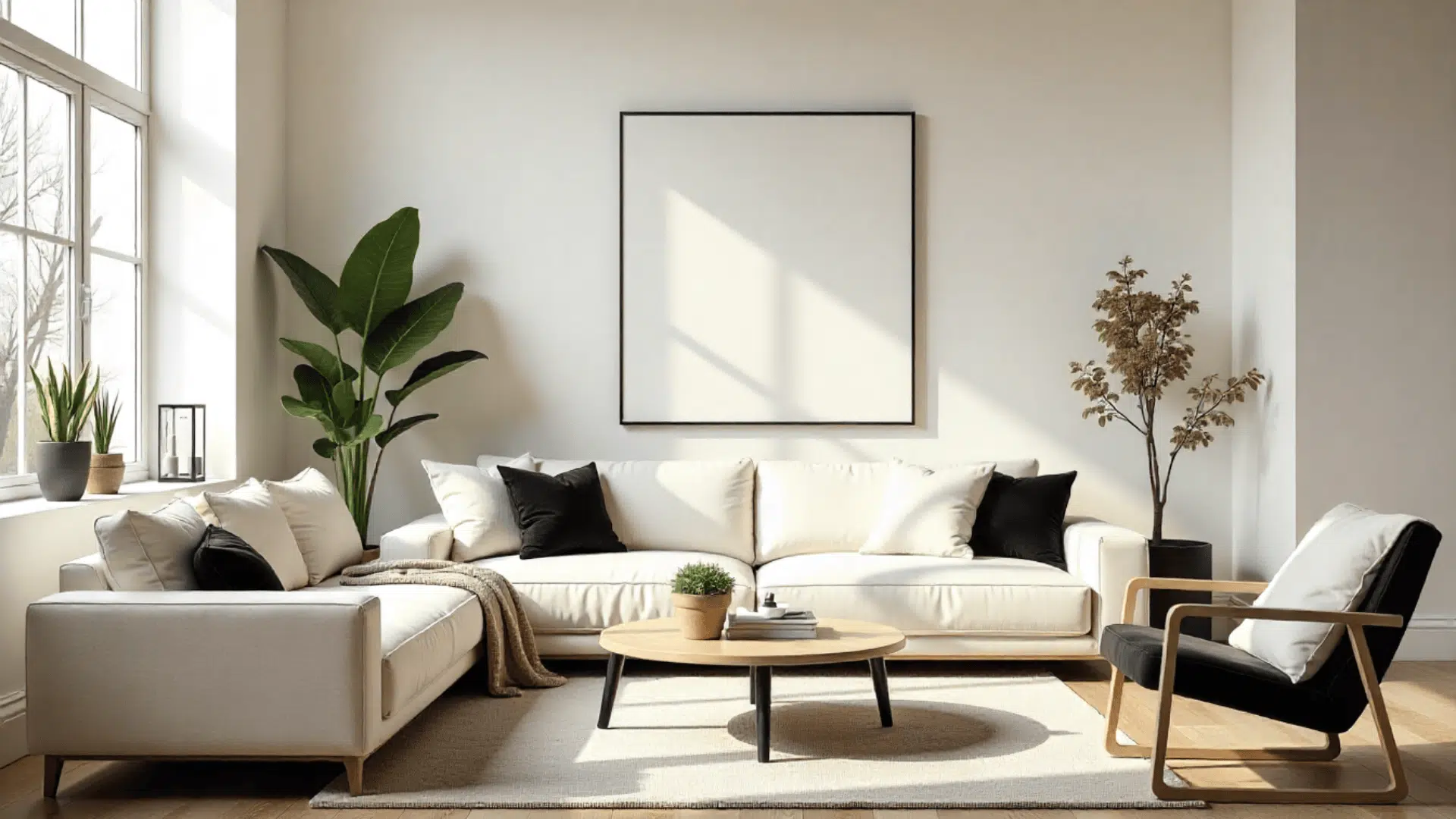
1. Pure White (SW 7005)
Pure White has a soft warmth that mixes well with Alabaster. With an LRV of 84, it offers light contrast without looking too bright. It works well in bedrooms and living rooms where you want a clean but gentle finish.
Use Pure White when you want trim that stands out slightly. A satin or semi-gloss sheen makes it appear brighter against Alabaster walls.
2. Extra White (SW 7006)
Extra White is a brighter, cooler white that creates a stronger contrast with Alabaster. Its LRV of 86 makes it crisp and clear, which makes it a good fit for modern or cool-toned rooms. It gives trim and doors a sharp, fresh outline.
Choose Extra White when you want the trim to pop. A semi-gloss sheen increases the contrast even more for a clean, modern look.
3. High Reflective White (SW 7757)
High Reflective White is the brightest white Sherwin-Williams offers. Its LRV of 93 gives it a strong, bold contrast next to Alabaster. It works well on doors, cabinets, and detailed trim for a sharp, high-definition look.
Use this color when you want the brightest trim possible. Gloss or semi-gloss finishes make architectural lines even more defined.
4. White Snow (SW 9541)
White Snow is a soft white with mild warmth, making it close to Alabaster in tone. Its LRV of 85 creates a smooth, low-contrast look that feels calm and simple. It works well in rooms where you want the trim to mix more than stand out.
Choose White Snow for a soft transition between walls and trim. Satin or semi-gloss adds a clean finish without sharp contrast.
How to Make an Alabaster Color Scheme
Creating an Alabaster color scheme is simple when you group a few steps together.
- Understand the undertone and choose your trim: Alabaster has warm yellow undertones, so pair it with trim colors that support this. Pure White gives light contrast, while White Snow keeps the look soft and mixed.
- Pick your main neutral and soft accent together: Choose one warm neutral like Accessible Beige or Worldly Gray, then add a muted accent such as Sea Salt or Evergreen Fog. These two colors set the mood and support Alabaster’s warmth.
- Add a bold contrast shade and right flooring tone: Use one deep color like Tricorn Black, Naval, or Urbane Bronze for doors or cabinets. Match this with warm wood floors, light oak, or natural maple to keep the palette balanced.
- Choose metals and decor that match the palette: Brass, bronze, or matte black hardware works well with Alabaster. Add textiles and artwork in warm neutrals, soft greens, muted blues, or earthy tones.
- Test the whole palette in your lighting: Check all colors in morning, afternoon, and evening light to make sure the undertones stay balanced, and nothing shifts too yellow.
A few thoughtful choices can help you build a simple and balanced Alabaster color scheme that works beautifully in any room.
Alabaster vs. Similar Shades of Whites
These Sherwin-Williams whites are the shades people most often compare to Alabaster color combinations. Each one has a different undertone and brightness, which affects how it looks in a room.
| Paint Color | Undertones | LRV | How It Compares to Alabaster | Best Uses |
|---|---|---|---|---|
| Alabaster (SW 7008) | Soft, warm yellow undertones | 82 | Warm, creamy, and bright without feeling stark. | Whole homes, living rooms, bedrooms, and calm spaces. |
| Pure White (SW 7005) | Slight warmth with a touch of gray | 84 | Cooler and less creamy than Alabaster. Gives a cleaner, fresher look. | Trim, doors, modern rooms, and bright spaces. |
| Extra White (SW 7006) | Cool, crisp undertones | 86 | Much cooler and brighter. Makes Alabaster look warmer in comparison. | Modern styles, high-contrast trim, and bright kitchens. |
| High Reflective White (SW 7757) | Very clean with minimal undertones | 93 | Sharpest contrast with Alabaster. Brightest white in the line. | Trim, cabinets, and areas needing a bold, crisp edge. |
| Greek Villa (SW 7551) | Warm creamy undertones | 84 | Slightly warmer and more creamy than Alabaster. Looks softer in low light. | Bedrooms, living rooms, exteriors, and warm traditional spaces. |
Knowing how these whites compare makes it easier to choose the right one for your home. Pick the shade that matches your lighting, style, and the level of warmth you want.
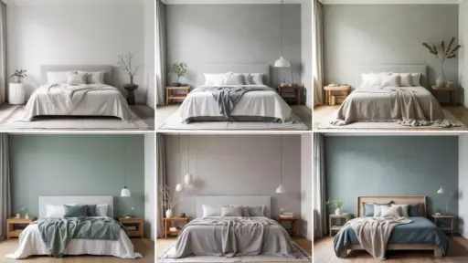
How Lighting Changes Alabaster
Lighting direction changes how Alabaster looks, and its warm undertones shift in each type of room.
North-facing rooms get cool light that makes Alabaster look softer and slightly muted, so adding warm wood or beige decor helps balance it.
South-facing spaces receive strong warm light that brings out more creaminess, so cooler accents like muted greens or soft grays keep it steady.
East-facing rooms look warmer in the morning, and softer later in the day, and light gray decor helps even out those shifts.
West-facing spaces get warm afternoon light that can make Alabaster look yellow, so adding cool tones like gray-blues or soft greens helps keep the room balanced.
Design Tips and Common Mistakes for Using Alabaster
Alabaster looks beautiful when used correctly, but a few choices can make it look too yellow or too flat. These tips and reminders help you keep the color balanced, clean, and consistent in any room.
- Avoid pairing Alabaster with very cool grays: Cool grays can make Alabaster look more yellow because the contrast is too sharp.
- Choose the right trim white: Soft whites like Pure White or White Snow work best. Bright icy whites can make Alabaster look creamier than you want.
- Balance the lighting and contrast in dim rooms: Low-light spaces need deeper accents or darker decor to keep Alabaster from looking dull or washed out.
- Skip crisp blue-white LEDs: Cool LED bulbs pull out the yellow tones in Alabaster, making the color look off.
- Mix warm and cool decor for balance: Mix warm woods, beige tones, and brass with cool greens or soft grays to keep the palette steady.
- Choose finishes wisely: Matte or eggshell walls with satin or semi-gloss trim add natural contrast without needing bright whites.
- Use the right flooring tones: Warm wood floors like oak or maple pair well and prevent Alabaster from looking too yellow.
- Match artwork and textiles to the undertones: Soft greens, muted blues, warm neutrals, and earthy tones help connect the room with the wall color.
These simple choices help Alabaster stay balanced, warm, and clean so every room feels polished and intentional.
Conclusion
Working with SW Alabaster, coordinating colors becomes much easier when you understand how its warmth reacts with other shades.
With the right mix of neutrals, accents, and finishes, you can create a bright and welcoming look that feels calm in any room.
Alabaster is flexible, so you can style it in many ways without feeling limited.
If you’re ready to design your own palette, use the steps and color ideas in this guide to choose the combinations that fit your style and lighting the best.

Alex Guerrero, a graduate with a Fine Arts degree from the Rhode Island School of Design, has been a visionary in the world of color and design for over 15 years. His professional journey began in the heart of the fashion industry in Milan, where he developed an acute sense for color harmonies and trends. Alex joined our team in 2018, offering fresh and innovative perspectives on color utilization in various spaces. Renowned for his ability to blend contemporary trends with timeless elegance. Outside of work, Alex is an accomplished painter and a volunteer art therapist, his artistic talents further enriching his professional insights.