Sherwin-Williams Sea Salt is one of those paint colors that just feels calm and fresh. It’s a soft green-gray with a hint of blue, and it works well in almost any room.
I’ve used it in my own home, and it instantly made the space feel more relaxed and inviting. But like any great color, Sea Salt really shines when it’s paired with the right coordinating shades.
In this post, I’ll share some of the best colors to pair with Sea Salt – from crisp whites and soft grays to deeper accent tones.
Whether you’re planning a whole room makeover or just picking trim and decor, these color combos will help you get that pulled-together look.
Choosing the right coordinating colors doesn’t have to be hard. With a few good options, you’ll see how easy it is to make Sea Salt work beautifully in your space.
Understanding Sea Salt
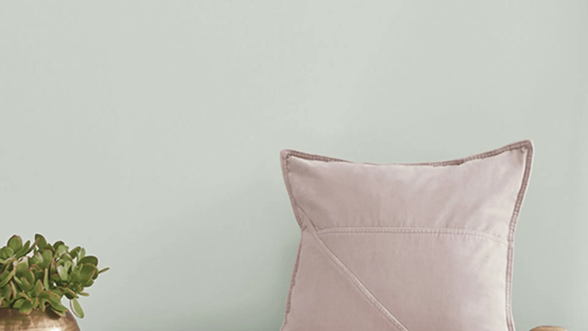
When I first saw Sea Salt by Sherwin-Williams, I didn’t know what to call it. Was it green? Was it blue? Maybe gray? Yes. It’s all three.
Sea Salt (SW 6204), with an LRV of 64, is a soft, muted greenish-graythat changes with the light. In the morning, it might be blue. By evening, you’ll catch more green. Sometimes it just looks calm and gray.
It’s like a color with moods, butnot the dramatic kind, more like a quiet friend who always feels easy to be around.
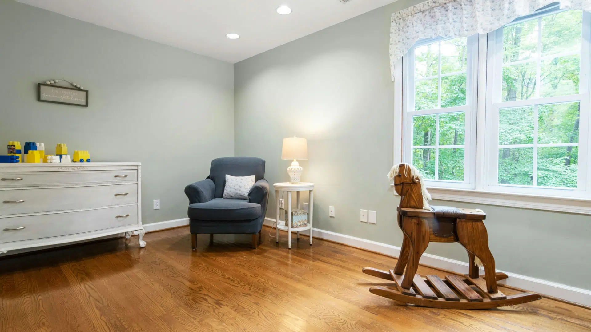
I’ve used Sea Salt in a few rooms now. Bathrooms feel like spas, bedrooms feel cool and calm, and iteven works in the living room. You need the right light and the right pairings. What makes it special? It doesn’t try too hard.
Sea Salt plays nice with other colors. It doesn’t compete. It gives you freedom. Want wood tones? Go for it. Light trim? Perfect. Warm accents? Still works. That’s the charm. Sea Salt is flexible, a backdrop, not a spotlight.
Top Colors to Pair with Sea Salt
I know how tricky it can be to find the right match for Sea Salt. You don’t want colors that clash with it; you want colors that complement it. I’ve tested quite a few, and theseare the ones I keep coming back to.
1. Pure White (SW 7005)
I love how this one looks next to Sea Salt. It’s crisp, clean, and brings just the right amount of contrast. It doesn’t have any strong undertones that could fight with Sea Salt’s softness, which is a big plus.
If you’re painting trim, doors, or ceilings, Pure White brightens the space without stealing the show. It gives everything a light, polished feel.
I’ve used it in bathrooms and bedrooms, and it always helps the room feel a little more open and airy. You’ll feel that fresh, breezy vibe instantly, even on cloudy days. It’s the kind of white that works.
2. Comfort Gray (SW 6205)
Comfort Gray is like Sea Salt’s older sibling, just a bit deeper, a bit more grounded, but with the same relaxed energy. If you’re looking for a slightly darker color that won’t overpower the room, this is the one. I love using it in adjacent rooms or hallways to create that perfect flow.
It keeps everything feeling connected without making the color palette feel repetitive. It works especially well in homes with open layouts or connected spaces.
3. Rainwashed (SW 6211)
Rainwashed leans more into the blue side, but still keeps that soft and peaceful look that Sea Salt is known for. If you want to channel that breezy, beach house style, this is a great pick.
I once painted a bedroom in Rainwashed, and every morning felt like waking up on vacation. It pairs beautifully with Sea Salt in adjoining bathrooms or accent walls.
There’s something about it that feels instantly relaxing, almost like a breath of fresh air. If you prefer calming spaces with a touch of color, Rainwashed is a must-try.
4. Accessible Beige (SW 7036)
Sometimes, Sea Salt can read a bit cool, especially in low light. Accessible Beige is a great way to warm things up while still keeping everything soft and neutral.
This color has a creamy warmth to it that brings out the best in Sea Salt. I’ve used it in living rooms with Sea Salt on an accent wall, and it made the entire space feel balanced and inviting.
It’s that perfect bridge between warm and cool tones, so if you have both in your furniture or decor, Accessible Beige helps tie everything together.
5. Alabaster (SW 7008)
If you want a white that’s soft but still clean-looking, Alabaster is a favorite of mine. It’s warmer than Pure White, so it brings a subtle coziness to the room without going too creamy.
Try it on cabinets, trim, or even full walls paired with Sea Salt accents. It helps tone down the coolness and brings a little depth without being overwhelming.
It feels clean but never sterile, which makes it a smart choice for kitchens, bathrooms, or anywhere you want a touch of warmth.
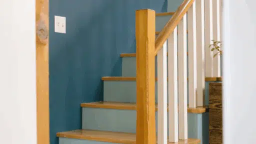
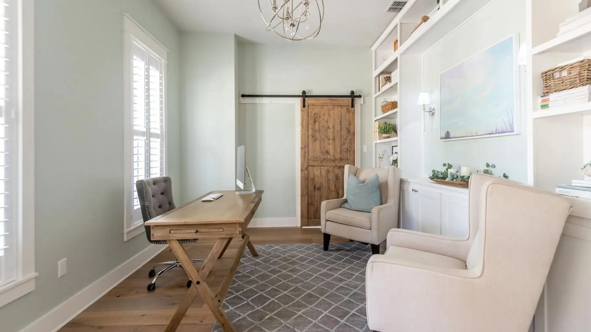
6. Naval (SW 6244)
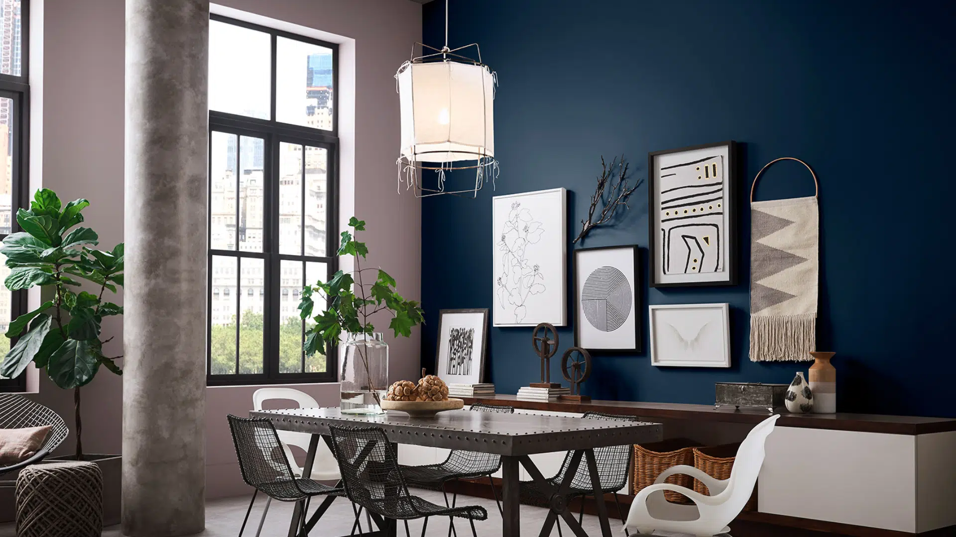
Naval is a bold, deep navy that beautifully brings out the cool tones in Sea Salt. I wouldn’t recommend using it on every wall unless you love drama, but as an accent, it’s a great choice. Absolutely stunning.
I once paired Naval with Sea Salt in a home office, using it behind open shelves and on the back wall. The contrast made the Sea Salt pop, but it still felt calm and cozy.
If you want to create a space with a little more punch while keeping that serene vibe, Naval is your go-to color for depth and interest.
7. Repose Gray (SW 7015)
Repose Gray is one of those grays that work almost anywhere. It’s soft, slightly warm, and plays very nicely with Sea Salt’s green-gray tones.
I’ve used this combo in open concept spaces where I needed a neutral background that still felt cohesive with Sea Salt. The result was a space that felt intentional and seamless, not busy or patchy.
It’s perfect for walls, ceilings, or even built-ins. Repose Gray helps everything feel grounded without dragging the room down.
8. Fleur de Sel (SW 7666)
Fleur de Sel is like Sea Salt’s quieter cousin. It’s a super soft gray with just a whisper of green. I love using it in smaller spaces, such as bathrooms or laundry rooms, where I want that spa-like feel to continue.
It’s subtle and clean, but not stark. It helps maintain the overall airy feel of a room without bringing in too much contrast or color.
If you prefer a soft, seamless palette that doesn’t demand attention, Fleur de Sel is a great supporting color.
9. Mega Greige (SW 7031)

When you want to add some depth and richness, Mega Greige delivers. It’s a warm, earthy greige that gives Sea Salt a nice counterbalance.
I’ve used it in dining rooms or family rooms paired with Sea Salt in the adjoining areas. It made the spaces feel cozy and inviting without making them dark.
Mega Greige has just enough body to feel elegant, yet remains casual enough for everyday living. It helps anchor the lighter colors in a natural, grounded way.
10. Heron Plume (SW 6070)
Heron Plume is that “barely-there” neutral that still does its job. It’s light, creamy, and super soft—perfect when you want something lighter than beige but warmer than white.
I use this when Pure White feels too stark or when I need a trim or ceiling color that melts into the background. It supports Sea Salt without clashing or competing.
It’s great for traditional or transitional spaces, especially when you want everything to feel blended and calm. You might not even notice it at first, but that’s the point.
Factors to Consider When Pairing Colors with Sea Salt
Let’s be honest, Sea Salt doesn’t always look the same. I’ve seen it shift tones in different rooms, and you probably will too. That’s why it helps to think about more than paint.
Lighting Changes Everything
Natural light makes Sea Salt look lighter, almost blue-green. In dim spaces or under warm bulbs, it leans more gray or even a bit murky. So here’s what I do:
Test it in different corners, morning, evening, with lights on and off. You’ll start to see its personality, and that helps you choosewhat goes next to it.
Bring in the Texture
Paint is just one part of the look. When I want that calm, coastal vibe, I bring in rattan, soft linen, woven baskets, and warm wood tones
Don’t overthink it. Just ask yourself: Does this feel natural? Sea Salt loves anything that feels real and relaxed.
Use Accent Pieces to Tie It Together
Pillows, rugs, wall art, and even a single vase can make a significant difference. I like to pick pieces that echo the other colors in the room, grays, blues, soft creams, or navy.
It’s a quiet way to make everything feel connected. And if you ever want to change things up, swap out a few pieces. It’s an easyfix.
In short, Sea Salt works best when seenin layers of light, texture, and detail. Start simple. Try a few things. You’ll feel it when it all comes together.
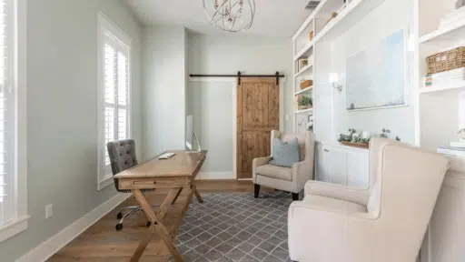
Room Designs and Styling Tips Using Sea Salt
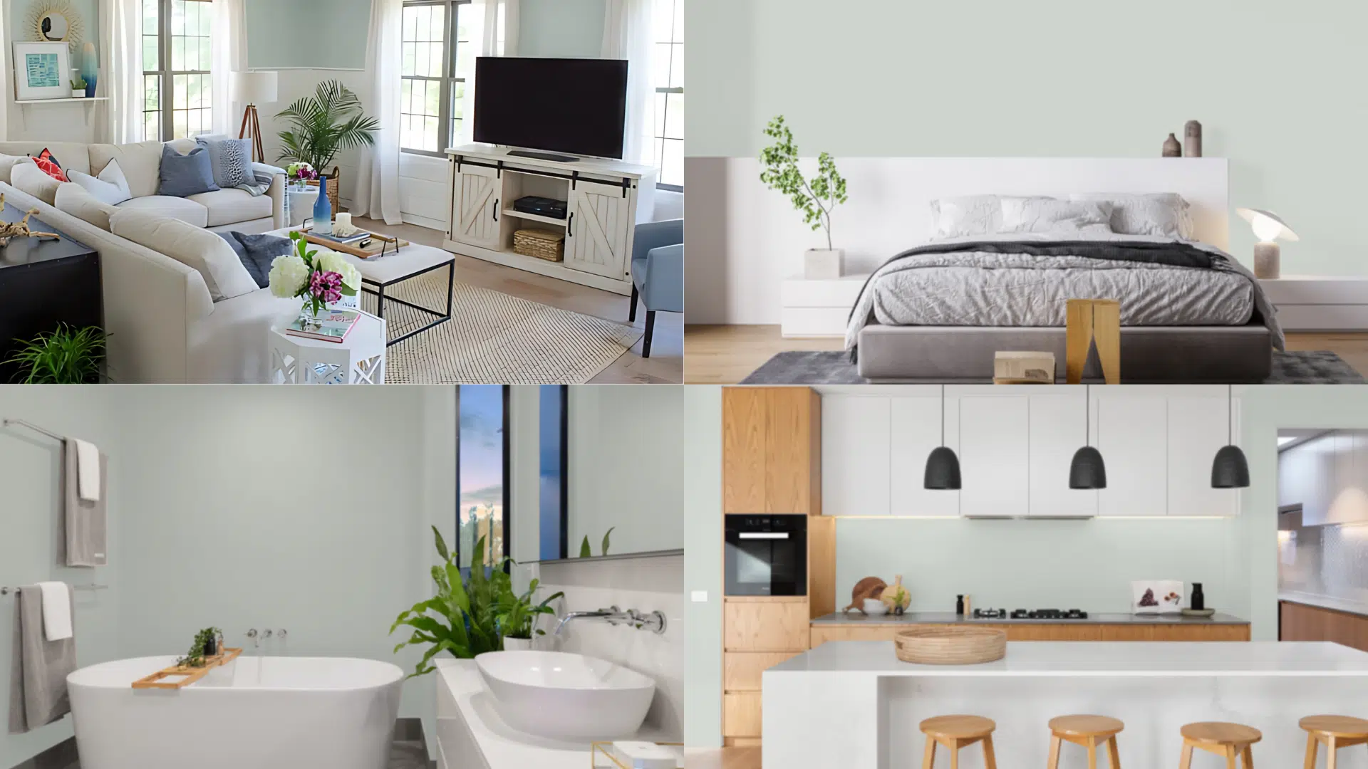
Let’s talk about how Sea Salt actually works in real spaces, not just swatches. I’ve used it in a few rooms myself, and I’ve seen what works (and what doesn’t). Here’s how you can make it feel right in every part of your home.
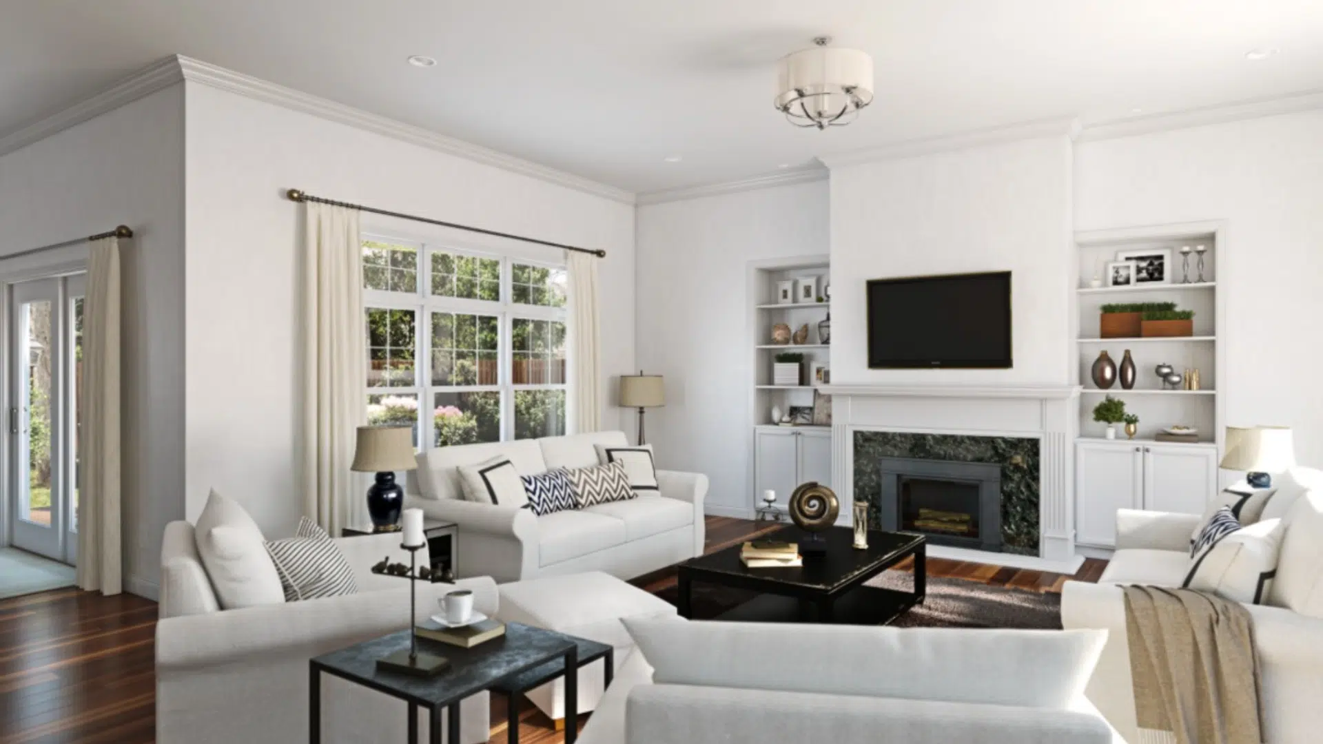
Living Room
I paired Sea Salt with Accessible Beigein my living room, and I’ve never looked back. The beige warms it up just enough, but the space still feels light.
It’s that mix of cozy and airy that makes you want to sit down and stay awhile. Soft lighting and natural wood help finish the look.
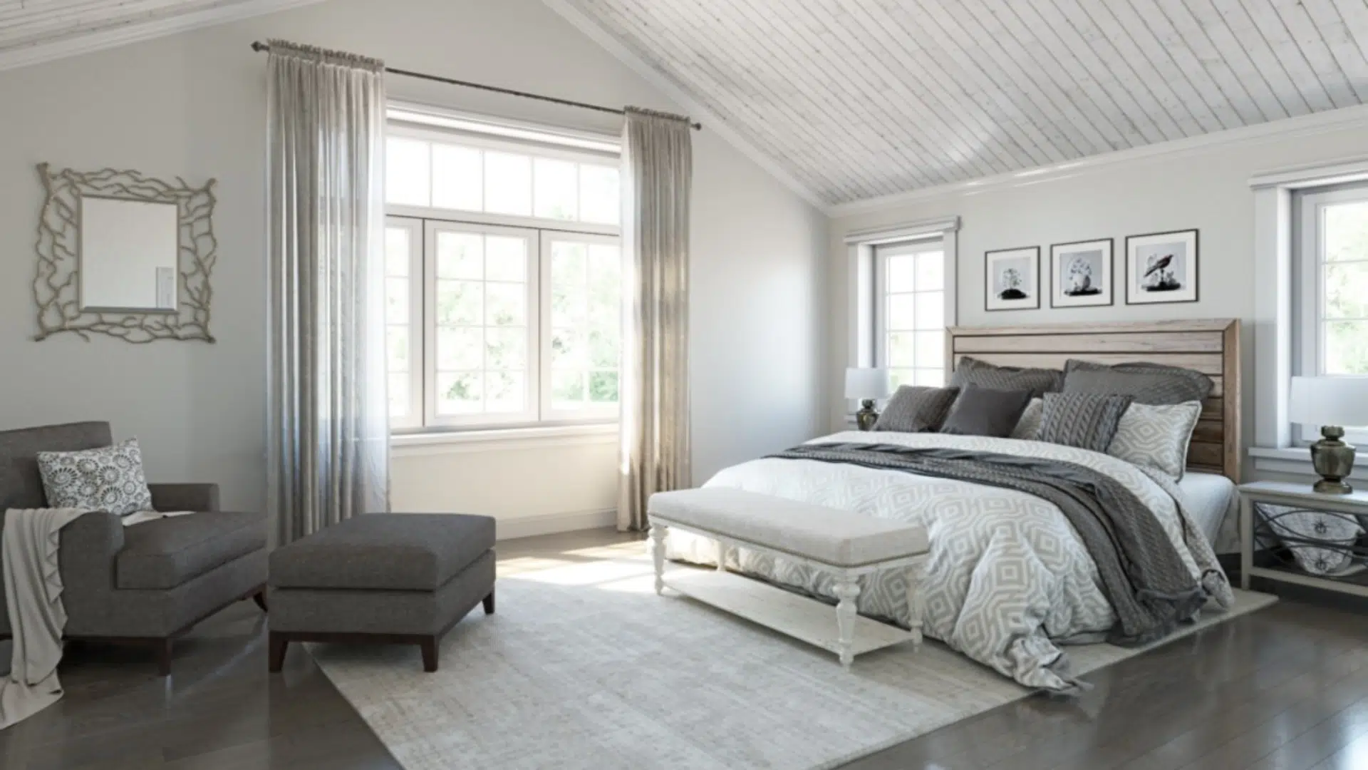
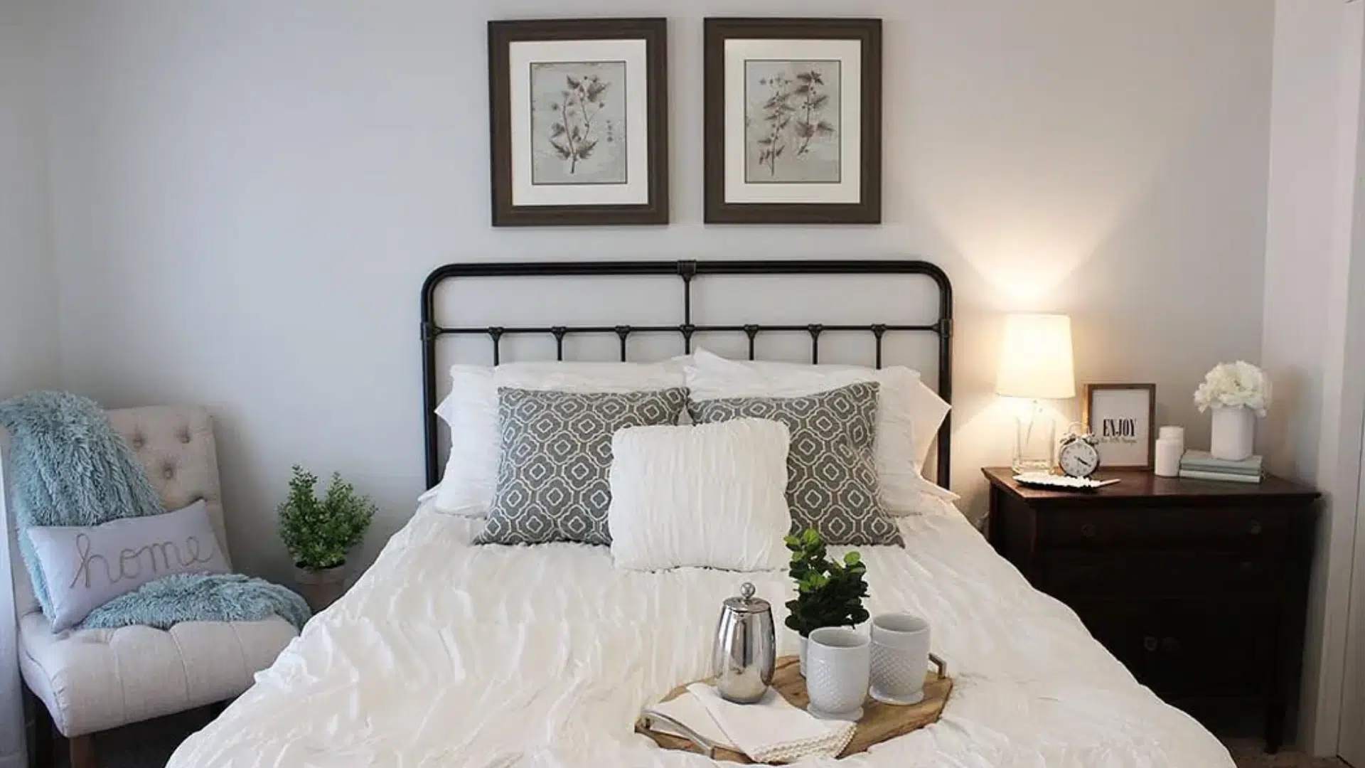
Bedroom
If you want a calm space to rest, try Sea Salt with Rainwashedand Alabaster. The blue-green tones melt into each other.
And the Alabaster on the trim? Clean but not stark. It feels like a quiet hug at the end of the day. You’ll sleep better;I know I did.
Bathroom
Sea Salt shines in bathrooms, especially next to Fleur de Seland Pure White. It gives off that soft, spa-like feel without trying too hard.
Everything looks clean, but still smooth and relaxed. Add a few woven baskets and white towels, and you’re done. It’s peace in paint form.
Kitchen
Now, the kitchen surprised me. I paired Sea Salt with Mega Greigeon the lower cabinets and Heron Plumeon the upper ones. It felt warm, but still fresh.
The colors didn’t fight; they just worked. To bring it all together, try brass hardware or a wood cutting board.
Sometimes, it’s not about the color alone; it’s about where you put it and what you pair it with. Sea Salt gives you room to play.
Conclusion
Sea Salt by Sherwin-Williams is more than just a paint color; it’sa feeling. It’s soft, calm, and flexible enough to work in almost any room.
Whether it leans blue, green, or gray in your space, it always brings a sense of peace. That’s why I keep coming back to it.
When paired with the right colors, such as Pure White, Rainwashed, Mega Beige, or Accessible Beige, it trulycomes to life. Each combination tells a different story, but they all evoke a sense of connectionand calm.
If you’re still unsure, don’t stress. Test a few samples.See how the light hits them. Trust your eye. You don’t need to follow the rules too closely.
Just focus on what feels good in your space. Your home should reflect you and feel like a place you want to be.

With a Master in Architectural Studies from University of Pennysylvania, Marwa Haydar has pioneered living spaces since 2005. Her expertise, initially honed in a prestigious architectural firm, is evident in her approach to creating environments. Marwa became part of our team in 2019 and has since been a driving force in our home improvement section, known for her practical yet stylish solutions. She’s been spearheading our design workshops since then, infusing her passion for teaching into her work. In her leisure time, Marwa enjoys exploring historic architecture and is an enthusiastic pottery hobbyist, further enriching her understanding of form and texture.