If you’re looking for a soft, fresh color that instantly makes a room feel calm and welcoming, Palladian Blue by Benjamin Moore is worth a closer look.
This beautiful blend of blue, green, and a hint of gray gives it a light and airy feel that works almost anywhere – bedrooms, bathrooms, living rooms, or even a front porch.
It’s not too bold, not too pale – just the right mix to create a peaceful vibe. I love how it changes with the light throughout the day, sometimes looking more blue, other times a soft green.
In this blog, I’ll walk you through how Palladian Blue looks in real homes, what colors go well with it, and tips to help you decide if it’s the right shade for your space.
Let’s see if this relaxing hue is the perfect match for your next paint project.
Is Palladian Blue a Warm or Cool Paint Color?
Palladian Blue leans toward the cool side of the color spectrum, thanks to its blue and green undertones.
However, it’s a transitional shade in warm lighting; it can feel more balanced, even slightly warm, while in cooler lighting, it shows its full crisp-blue charm.
This chameleon-like behavior makes it highly adaptable in a variety of rooms.
In sunny rooms, the green undertone becomes more pronounced, adding a fresh botanical vibe, while in low-light rooms, the blue-gray base helps the space feel calm and introspective.
Whether you’re aiming for coastal chic or modern traditional, this paint color anchors the design with elegance.
What’s Palladian Blue’s LRV?
The Light Reflectance Value (LRV) of Palladian Blue is 60.04. This places it in the mid-range, meaning it reflects a moderate amount of light.
It’s light enough to open up small spaces, yet saturated enough to provide definition. In practice, this means Palladian Blue works well in both dim and well-lit rooms.
It doesn’t wash out in direct sunlight, nor does it disappear in shadowy corners.
For best results, pair it with lighter trim and furnishings to let the color pop subtly without dominating the space.
Using Palladian Blue in Your House
Palladian Blue by Benjamin Moore is a soft green-blue that brings calm, elegance, and timeless style to any space. It works beautifully in both modern and traditional settings, adapting easily to light and decor.
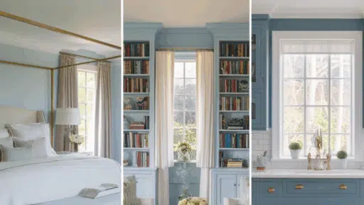
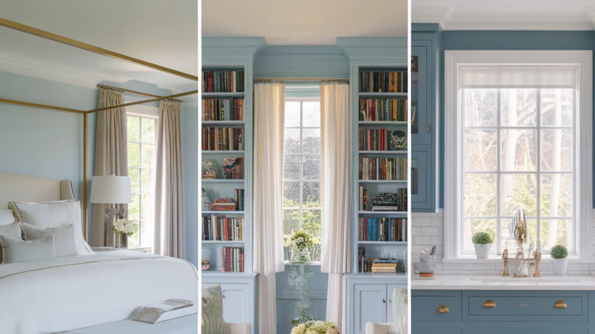
1. Bedroom
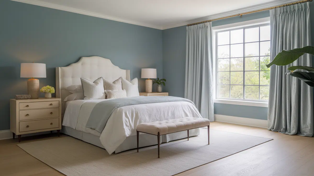
Palladian Blue sets the stage for a peaceful and restorative bedroom. Its soft green-blue tones create a spa-like feel, perfect for winding down.
Style Pairings:
- White or cream bedding
- Light wood or brass accents
- Linen curtains and neutral rugs
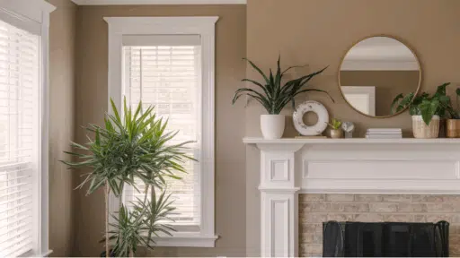
2. Living Room
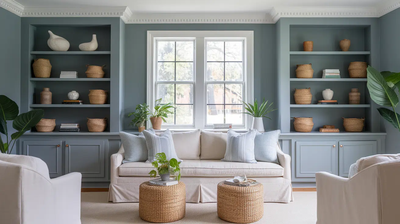
This color adds a refreshing yet sophisticated tone to living rooms. It works well on full walls or as an accent in built-ins or wainscoting.
Style Pairings:
- Neutral sofas in beige or ivory
- Woven textures and greenery
- White trim or crown molding
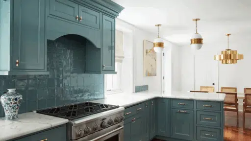
3. Kitchen
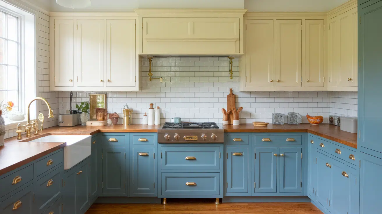
Palladian Blue is an ideal kitchen cabinet color if you want something soft but statement-worthy. It’s especially stunning with creamy tones and wood.
Style Pairings:
- Creamy white cabinets: White Dove, Swiss Coffee
- Warm wood or butcher block counters
- Subway tile or marble backsplash
4. Bathroom
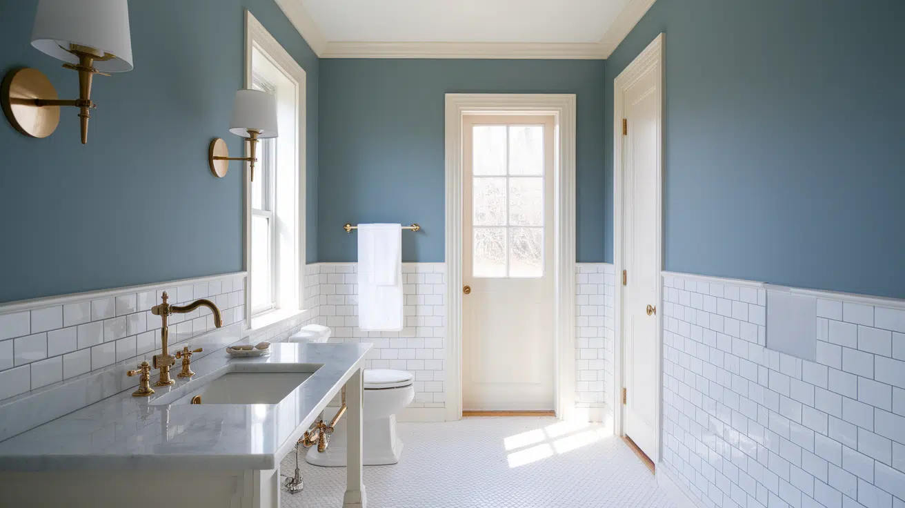
In bathrooms, Palladian Blue feels clean, airy, and spa-like. It works on walls or vanities, especially when paired with white or marble.
Style Pairings:
- White shiplap or wainscoting
- Marble or quartz counters
- Soft gold or chrome fixtures
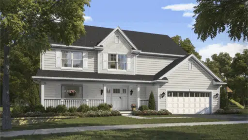
5. Exterior
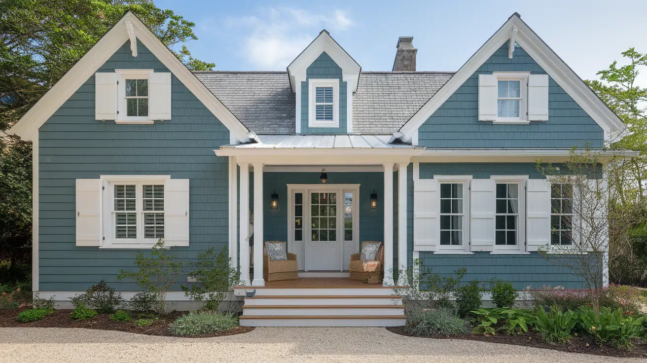
Palladian Blue brings charm to cottage, coastal, and farmhouse exteriors. It pops beautifully with white trim and natural surroundings.
Best Trim Pairings:
- Crisp whites like Chantilly Lace
- Warm whites like White Dove or Swiss Coffee
- Semi-gloss finish to define windows and eaves
Colors Like Palladian Blue You Might Love
If you like the soft, airy feel of Palladian Blue but want to explore other options, you’re in luck. Several shades offer that same fresh, calming vibe with their own subtle twist.
| Paint Color | Brand | Undertone | What Makes It Similar |
|---|---|---|---|
| Woodlawn Blue | Benjamin Moore | Blue with green-gray | Slightly deeper and more muted than Palladian Blue |
| Sea Salt | Sherwin-Williams | Green-blue with gray | Softer and more neutral, very calming |
| Brittany Blue | Benjamin Moore | Cool blue | Lighter, clearer blue with a crisp finish |
| Rainwashed | Sherwin-Williams | Blue-green | A tiny bit more green and serene |
| Healing Aloe | Benjamin Moore | Very soft green-blue | Pale, spa-like tone that feels clean and quiet |
If you’re torn between these options, grab a few peel-and-stick samples and see how they look in your space. Even small shifts in undertone can make a big difference.
Coordinating Colors and Palettes for Palladian Blue
Palladian Blue is incredibly flexible – it works beautifully in both monochromatic and high-contrast palettes. Its soft blue-green base pairs well with a wide range of colors, making it easy to build a cohesive and stylish look.
1. Go-To Neutrals: Try classic shades like Classic Gray, Balboa Mist, or Edgecomb Gray for a soft, soothing backdrop that lets Palladian Blue shine.
2. Accent Colors That Pop: Add warmth and contrast with soft blush, dusty coral, warm mustard, or even deep navy. These tones bring personality without overpowering the space.
3. Popular Color Schemes:
- Coastal: Crisp whites, sandy beige, and light gray-blues
- Traditional: Creamy neutrals, dark woods, and gold accents
- Modern Farmhouse: Matte black, clean white, and greige
Thanks to its balance and softness, Palladian Blue is perfect for creating layered, thoughtful color stories throughout your home.
Conclusion
Benjamin Moore’s Palladian Blue HC-144 truly is one of those rare colors that gets it right.
It’s calm without being dull, vibrant without shouting, soft, yet it somehow carries weight.
What I love most is how it shifts so gracefully between warm and cool depending on the light, making it one of the most flexible shades in the entire blue-green family.
Whether I’ve used it on a bathroom wall, a set of kitchen cabinets, or even a friend’s front porch, it always brings that timeless, soothing quality that feels just right.
It’s not a trendy color that will feel outdated next season – it’s a classic that quietly elevates every room it touches.
If you’re thinking about giving it a try, my best advice is to sample it in your space. I’ve seen it look completely different from morning to evening, and in every light, it’s beautiful.
Tape up a few swatches or paint a test board, walk past it throughout the day, and trust your instinct.
Chances are, once you see Palladian Blue in your own home, you’ll be hooked, just like I was.

Alex Guerrero, a graduate with a Fine Arts degree from the Rhode Island School of Design, has been a visionary in the world of color and design for over 15 years. His professional journey began in the heart of the fashion industry in Milan, where he developed an acute sense for color harmonies and trends. Alex joined our team in 2018, offering fresh and innovative perspectives on color utilization in various spaces. Renowned for his ability to blend contemporary trends with timeless elegance. Outside of work, Alex is an accomplished painter and a volunteer art therapist, his artistic talents further enriching his professional insights.