

Looking for a paint color that feels warm and fits well in many rooms? Benjamin Moore’s Cedar Key might be perfect for you.
This “greige” color mixes gray and beige with tiny hints of green that change throughout the day as the light shifts from morning to evening.
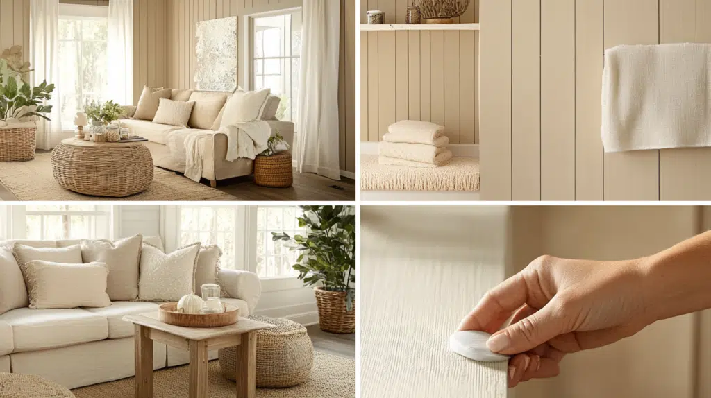
Cedar Key creates a calm feeling in living rooms, bedrooms, and kitchens.
With a Light Reflective Value of 61.05, it makes rooms feel bigger and brighter while hiding dirt better than lighter colors. It’s also great in north-facing rooms where it looks cooler and south-facing rooms where it feels warmer.
Keep reading to learn how Cedar Key can convert your space into a cozy, welcoming home that feels just right for everyday living and entertaining guests.
Understanding Cedar Key Undertones
Cedar Key by Benjamin Moore has undertones affect how it looks in different spaces. This warm, greige paint color combines gray and beige with subtle green undertones.
The color changes throughout the day as lighting shifts. The green undertones become more noticeable in natural sunlight, while it may appear more gray in artificial light.
North-facing rooms make Cedar Key look cooler and more gray, while south-facing rooms bring out its warmer tones.
These undertones also interact with nearby colors – next to blue, the green shows more, but near warm colors like red or orange, it looks more beige.
Understanding these undertones helps you determine how Cedar Key will look in your home and what colors will complement it.
Color Terminology
Attribute | Value |
| Color Code | OC-16 or 982 |
| Light Reflective Value (LRV) | 61.05 |
| Hex Code | #d7cec0 |
| RGB Value | 215, 206, 192 |
What These Numbers Mean?
Color Code (OC-16/982): This is the official Benjamin Moore color identification number, ensuring accuracy in paint selection.
- LRV (61.05): Light Reflectance Value (LRV) measures how much light a color reflects on a scale of 0 (pure black) to 100 (pure white).
Hex Code (#D7CEC0): A six-digit digital design and visualization code. It ensures the exact shade appears correctly on websites, branding, and virtual renderings.
RGB (215,206,192): The Red, Green, and Blue values define the color’s digital composition:
- Red = 215 (adds warmth)
- Green = 206 (adds a natural feel)
- Blue = 192 (keeps the color soft)
Psychology of Light Gray Shade

Light gray shades like Benjamin Moore’s Cedar Key influence how we feel in a space by promoting calm, clarity, and comfort. This color sits in the “greige” family, a perfect balance of gray and beige, which adds warmth without overwhelming a room.
Here’s how Cedar Key affects mood and atmosphere:
Creates a Calm, Peaceful Mood: Cedar Key’s subtle, soft tones make a space feel serene and grounded. It’s ideal for reducing visual noise and stress, making it perfect for bedrooms, living rooms, or reading nooks.
Encourages Focus and Balance: The neutral warmth of Cedar Key allows the mind to relax without feeling sleepy. It provides just enough energy to help with mental focus, making it a smart choice for home offices or study areas.
Adds a Sense of Space and Airiness: With its LRV of 61.05, Cedar Key reflects enough light to open up a room, especially helpful in smaller or dimly lit areas. This contributes to feelings of openness, clarity, and order.
Offers a Cozy Yet Sophisticated Feel: The beige undertones in Cedar Key make rooms feel welcoming and lived-in, while the gray gives it a modern, elegant twist. It feels both homey and elevated—a color that supports both relaxation and entertaining.
Promotes Harmony with Other Elements: Its quiet presence allows art, furniture, and textiles to shine. Whether you decorate with soft pastels, earthy tones, or bold patterns, Cedar Key provides the perfect neutral backdrop that doesn’t steal the spotlight.
In short, Cedar Key isn’t just a wall color; it’s an emotional anchor that brings warmth, clarity, and comfort to your everyday spaces.
Why Choose This Color?
Cedar Key is a warm, earthy color that brings a cozy feeling to any room. It works well in living rooms, bedrooms, and dining areas where you want a calm mood.
This color matches with many other colors like cream, tan, and soft green. Cedar Key looks different as the light changes during the day, giving your walls life.
It hides marks and small wall problems better than lighter colors.
Key Features
Cedar Key has a rich, warm tone that evokes nature. Its color, which is between brown and gray, works well in many home styles.
- It goes well with wood furniture and floors
- Changes slightly in different lighting
- Works in both modern and old-style homes
- It doesn’t show dirt as much as lighter colors
Durability
Benjamin Moore’s paints last a long time and keeps their color for years. Cedar Key stays looking fresh even with daily use.
- Stands up to washing and cleaning
- Doesn’t fade quickly in sunny rooms
- Covers wall marks and scratches well
- Needs fewer touch-ups over time
Texture Patterns
The paint goes on smoothly and evenly, making the walls look better. It dries with a nice finish that feels good when you touch it.
- Hides small bumps and wall problems
- Works well on both smooth and textured walls
- Looks great in a flat, eggshell, or satin finish
- It creates a soft look that isn’t too shin
Room-by-Room Color Recommendations
Cedar Key works well in many rooms of your home. This soft, warm gray with green hints can make spaces feel bigger and more peaceful.
It changes with the light throughout the day, looking different in the morning versus evening. Cedar Key pairs nicely with light and dark colors, making it a good base for any room in your house.
Living Spaces and Open Floor Plans
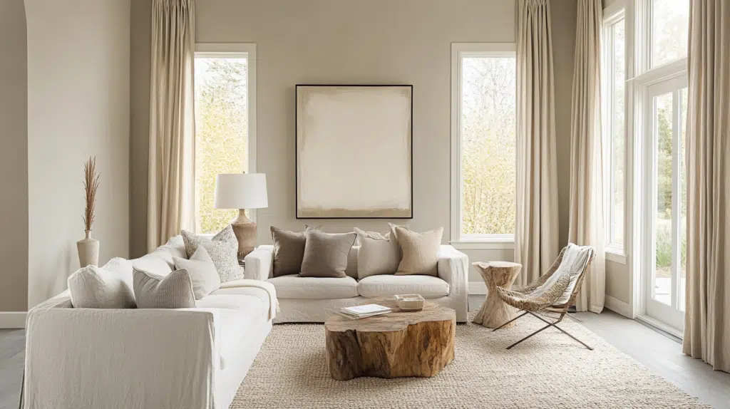
Cedar Key creates a calm feeling in living rooms and open areas where you spend most of your time.
Tips to Remember
- Paint one wall Cedar Key and the others white for a modern look that isn’t too bold.
- Match with natural wood furniture to bring out the warm tones in the paint
Bedrooms and Relaxation Areas
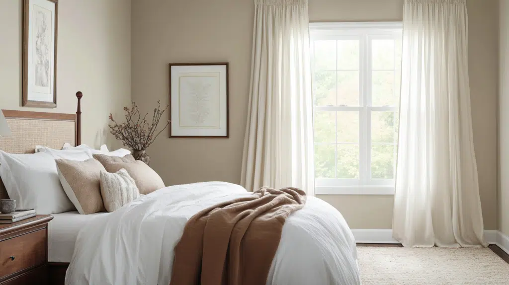
This color helps make bedrooms feel peaceful and restful without being too dark or too light.
Tips to Remember
- Use with soft white trim to make the room feel bigger
- Add cream or tan bedding to create a cozy space that helps you sleep better
Kitchens and High-Traffic Zones
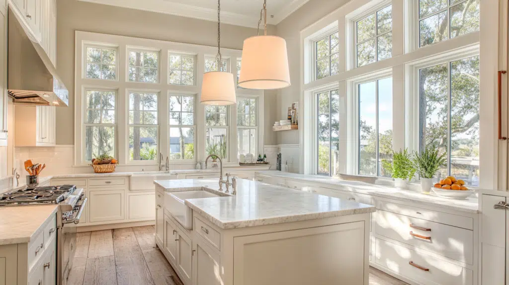
Cedar Key stands up well in busy areas and hides small marks and dirt better than lighter colors.
Tips to Remember
- Pair with white cabinets for a clean look that still feels warm
- Try painting just the kitchen island in Cedar Key to add some color without going overboard
Bathrooms and Spa-Like Retreats
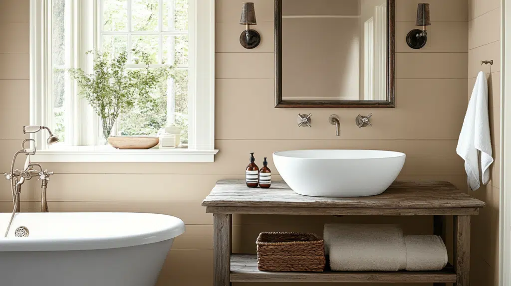
This color makes bathrooms feel like a nice hotel without trying too hard.
Tips to Remember
- Use with plants to bring out the green notes in the paint
- Match with light gray or white tile for a put-together look that feels clean
Color Pairings and Combinations for Cedar Key
Cedar Key works well with many other colors. You can mix it with light colors for a calm look or darker colors for more depth. Here are some great colors that go well with Cedar Key.
1. Seapearl (961)

Seapearl is a soft off-white that makes Cedar Key look warmer. When these colors are combined, rooms feel bigger and brighter. This pair works well in kitchens and living rooms.
2. Waynesboro Taupe (1544)

Waynesboro Taupe is a deeper color that makes Cedar Key stand out more. Together, these colors create a cozy feeling in any room. This mix is perfect for dining rooms and studies.
3. White Down (CC-50)

White Down is a creamy white that softens Cedar Key’s richness. These colors together make spaces feel clean but still warm. This combo works well in bedrooms and bathrooms.
4. Potters Clay (CC-360)

Potters Clay adds a reddish-brown touch next to Cedar Key. This pair creates a natural, earthy look in your home. Use these colors in entryways or family rooms for a welcoming feel.
Creating Cohesive Color Schemes
Finding colors that work well together can make your room look better. Cedar Key is a great starting point for many different color combinations. Here are some ways to use Cedar Key with other colors in your home.
Cool Color Scheme
- Pair Cedar Key with light blue for a beachy feel
- Add gray-blue colors to create a calm room
- Use navy blue as a bold accent color
- Try soft green shades for a nature-inspired look
- Mix in cool gray tones to balance the colors
Monochromatic Scheme
- Use lighter versions of Cedar Key for walls
- Paint trim with darker Cedar Key shades
- Add throw pillows in similar brown tones
- Look for furniture in matching Cedar Key shades
- Include picture frames in various Cedar Key tints
Warm Color Scheme
- Mix Cedar Key with soft yellow for a sunny feel
- Add rust-colored items for a fall-inspired look
- Include cream colors to brighten the space
- Try terra cotta accents for a Southwest-style
- Use gold-toned metals for handles and lamps
Coordinating with Furniture and Decor

Cedar Key is a warm, earthy color that complements many types of furniture and home items. When planning your room, consider how this color will look next to your furniture, metal items, fabrics, and decor pieces.
The right mix can make your space feel cozy and put together.
Wood Tones
Cedar Key pairs nicely with both light and dark wood tones. It brings out the warmth in oak and cherry woods while contrasting with darker woods like walnut.
This color helps make wooden furniture look richer and more natural in your space.
Tips to Consider
- Before buying large furniture, place a small wood sample against your painted wall to see how it looks together.
- Mix different wood tones in the same room with Cedar Key walls to add depth and interest to your space.
Metals
This paint color works well with warm-toned brass, copper, and gold metals. These metals will stand out nicely against the Cedar Key background.
Silver and chrome can also work to create a more modern mix.
Tips to Consider
- Use metal picture frames or light fixtures in warm tones to enhance the cozy feeling of Cedar Key walls.
- For a clean, fresh look, mix in some brushed nickel or silver metal pieces to balance the warmth of the wall color.
Fabrics
Cedar Key creates a nice backdrop for cream, tan, and light brown fabrics. It also pairs well with blue and green fabrics for a nature-inspired look.
The color helps make your fabric items feel more connected to the room.
Tips to Consider
- Test fabric swatches against your painted wall before buying big items like couches or curtains.
- Add some fabrics with small patterns, including the Cedar Key color, to tie your room together.
Decor
Wall art with nature themes or in earth tones will look great against Cedar Key walls. Plants also stand out nicely against this background, adding life to your space.
This color helps make your decor items feel more at home.
Tips to Consider
- Group decor items in odd numbers (3 or 5 pieces) for a more pleasing look against your Cedar Key walls.
- Choose picture frames in colors that match your furniture to create a pulled-together look in your room.
Similar Paint Colors: Finding Your Perfect Alternative
If you like Cedar Key but want other options, several colors have the same feel. These alternatives might work better in your space or match your furniture better.
1. Litchfield Gray (HC-78)

Litchfield Gray is a bit darker than Cedar Key with more gray tones. It works well in living rooms and bedrooms where you want a cozy feeling without being too dark.
2. Elmira White (HC-84)

Elmira White is lighter than Cedar Key but has the same warm undertones. It’s good for small spaces that need to feel bigger or rooms that don’t get much natural light.
3. Alaskan Skies (972)

Alaskan Skies has more blue in it compared to Cedar Key. It creates a calm feeling and pairs nicely with wood furniture and green plants.
4. Jute (AF-80)

Jute is a warmer color with more yellow-brown tones than Cedar Key. It’s great for kitchens and dining rooms where you want a warm, welcoming feel.
Application Tips and Techniques
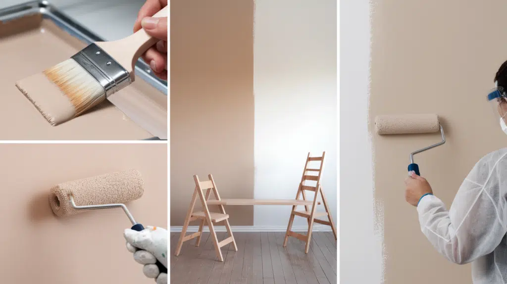
Properly preparing your painting area and gathering the right supplies will ensure the best results with Cedar Key before you dive into specific application techniques.
Here are some tips you should apply before using any paint:
- Surface Preparation Essentials: Clean walls well by washing dirt off and fixing holes. Use primer first to make the paint stick better.
- Selecting the Right Finish: Choose matte for rooms you don’t clean often, satin for kitchens and bathrooms, and gloss for doors and trim.
- Tools and Techniques: Small brushes work best for corners and edges. Rollers are good for big wall areas and give smoother results.
Final Thoughts
Cedar Key by Benjamin Moore is a friendly, easy-to-live-with paint color that works in almost any room. It changes throughout the day, looking different in morning light than evening light, keeping your walls interesting.
This paint hides marks well, pairs well with many wood tones, and makes spaces feel both bigger and cozier.
If you’re tired of plain white walls but scared of going too bold, Cedar Key offers the perfect middle ground—warm, calm, and never boring.
Ready to try Cedar Key in your home? Get a sample can today and paint a 2×2 foot square on different walls. Look at it morning, noon, and night before you decide.
Your perfect greige might be just one paint can away! What paint color are you using in your home? Share your Benjamin Moore favorites in the comments below!

Alex Guerrero, a graduate with a Fine Arts degree from the Rhode Island School of Design, has been a visionary in the world of color and design for over 15 years. His professional journey began in the heart of the fashion industry in Milan, where he developed an acute sense for color harmonies and trends. Alex joined our team in 2018, offering fresh and innovative perspectives on color utilization in various spaces. Renowned for his ability to blend contemporary trends with timeless elegance. Outside of work, Alex is an accomplished painter and a volunteer art therapist, his artistic talents further enriching his professional insights.