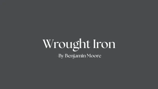
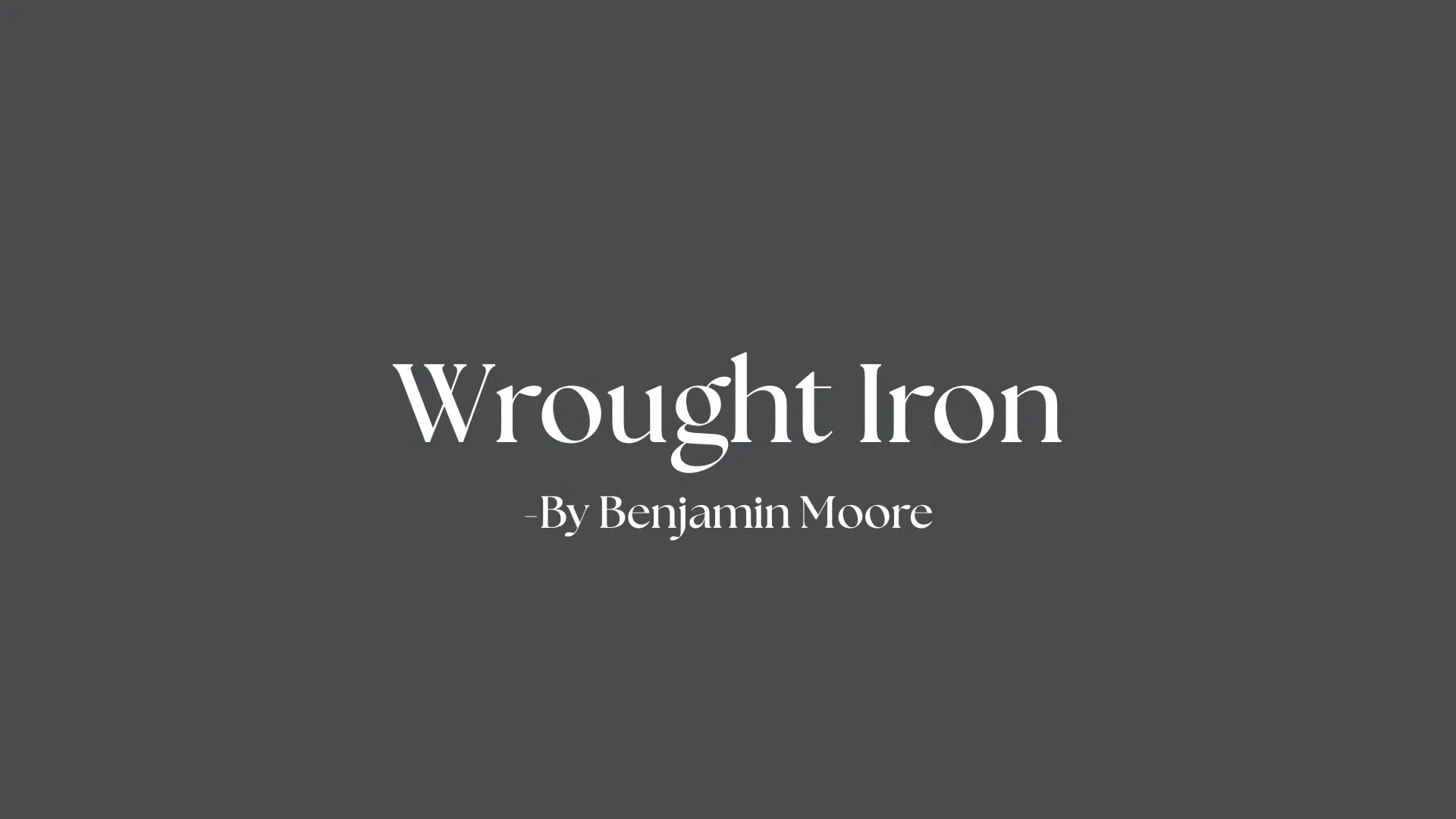
Have you been looking for a paint color that’s both bold and subtle at the same time? Dark paint colors can change a room completely, and Benjamin Moore’s Wrought Iron (2124-10) is worth your attention.
I’ve used this deep gray-black shade in my own home and want to share what I’ve learned. This isn’t just about color codes and technical specs – I’ll show you how this paint works in real homes.
In this post, you’ll find:
- How Wrought Iron looks in different lighting
- The best rooms to use it in
- Tips for pairing it with other colors
As someone who’s painted dozens of rooms over the years, I’ve made all the mistakes so you don’t have to. Let’s look at what makes this rich, deep color so special.
The Deep Undertones that Make Wrought Iron Stand Out
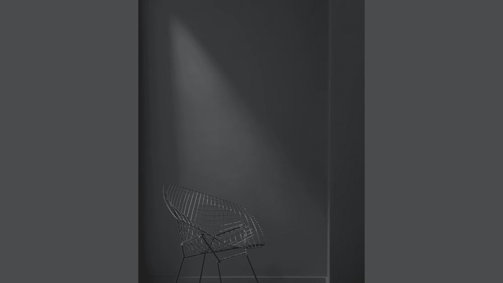
Wrought Iron isn’t just black – it’s way more interesting. When I first put it on my walls, I noticed something special about this color that makes it different from plain black paint.
This color sits between worlds. It mixes charcoal, navy, and soft black to create something unique. The LRV (Light Reflectance Value) of Wrought Iron is around 8.17, which means it absorbs most light while still showing its character.
You’ll see different sides of Wrought Iron depending on your lighting. In bright rooms, the navy hints come forward. But when the light dims? The charcoal aspects take over.
Look at it in morning light. Then check again at sunset. It’s like having different colors throughout the day. What makes this paint work so well? It’s the depth. Unlike flat black, Wrought Iron has layers that give walls texture without adding anything to them.
I’ve put this color in both my office and dining room. Each space feels distinct due to the way the color interacts with light. Try a sample patch first. Paint a board and move it around your room during different times of day. You’ll see how the color shifts and changes, showing its true value beyond just being “dark.”
How Does Wrought Iron Affect the Feel of A Room?
I’m always struck by how much a paint color can change the entire mood of a space. Wrought Iron does this in a way few other colors can.
It sets a calm, grown-up tone. When I painted my reading nook with Wrought Iron, the space instantly felt more special. Books stood out against the dark background. My brass lamp seemed to glow brighter.
In small rooms, this color creates a sense of closeness. My powder room went from boring to cozy with just two coats. The dark walls make the small space feel like a little retreat.
But big rooms? They feel different, too. You might think that dark colors make rooms feel smaller, but that’s not always the case. They can actually blur the edges of a room, making the walls seem less defined.
What I find most helpful about Wrought Iron is how it changes with the light. Morning sun brings out subtle blue hints. Evening lamps make it feel warmer and more like a charcoal setting. It’s a color that feels different throughout the day but always creates a strong impression.
What Makes Wrought Iron a Great Choice for Any Space?
I’ve tested many paint colors over the years, but Wrought Iron stands out because it complements almost any space. This isn’t just a one-trick color.
It crosses style boundaries with ease. I’ve seen it work in sleek, modern apartments with clean lines and minimal furniture. But it also looks right at home in my sister’s farmhouse kitchen on her island base cabinets.
You can use it on a single wall to create a focal point. My dining room has just one Wrought Iron wall, and it’s where everyone’s eyes go first when they enter.
Or go bold with all four walls.
When my neighbor painted her home office completely in Wrought Iron, it created a cocoon-like space that helps her focus. She says it “disappears” around her when she’s working.
What makes this color so friendly with other materials? It’s the subtle complexity in its formula. The touches of navy and charcoal let it connect with:
- Warm wood tones
- Cool stone surfaces
- Shiny metals (brass looks amazing against it)
- Both white and cream fabrics
You’ll find it works as a background or as the star. This flexibility makes it worth the investment—you won’t need to repaint when your style changes.
Top Spots to Use Wrought Iron Around Your Home
I’ve tried Wrought Iron in various places around my home, and I’ve found some spots where it really shines. These are my top picks for where this color works best.
1. Bedroom Walls
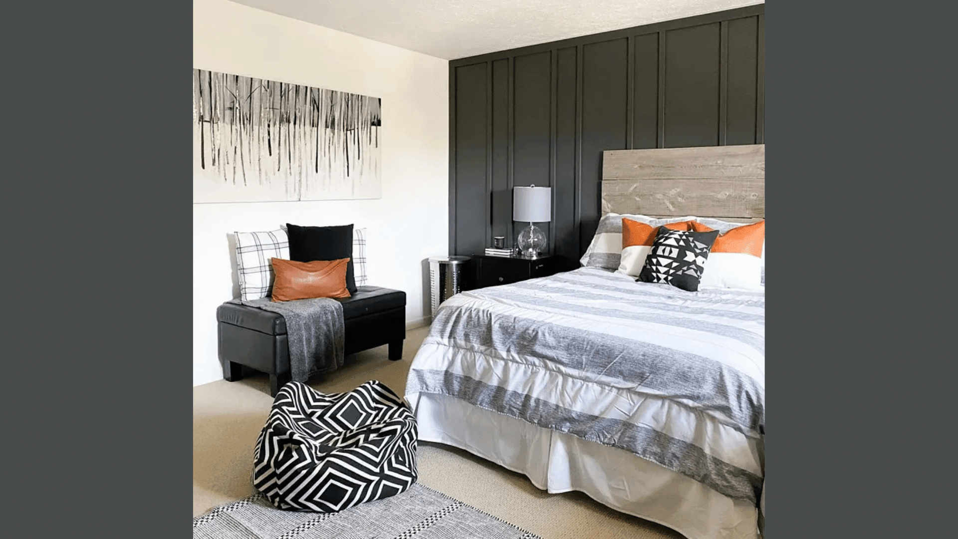
I painted my bedroom walls with Wrought Iron last year. The color creates a cozy sleep space that feels like a hug at night. Your bedroom is a place to rest, and dark walls can help block out visual noise.
In the morning, the slight blue hints in the paint come alive with natural light. If you’re worried about going too dark, try just the wall behind your headboard first.
2. Kitchen Cabinets
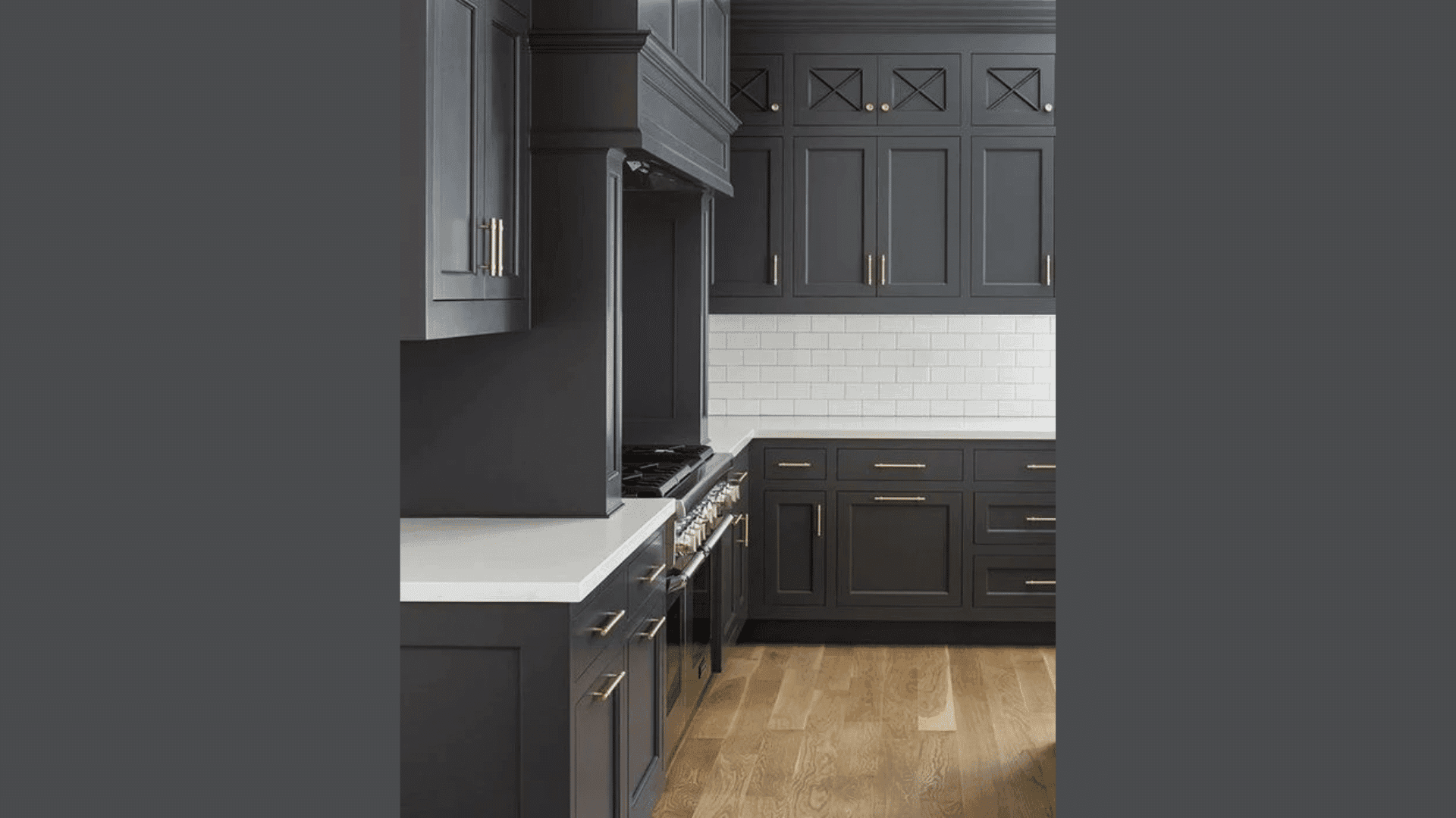
Kitchen cabinets occupy a significant amount of visual space. When I updated my lower cabinets with Wrought Iron (keeping the uppers white), the kitchen felt brand new.
The dark base grounds the room while making the space feel taller. Your countertops will stand out more against the darker background, too. This works with both marble and butcher block tops.
3. Bathroom Vanities
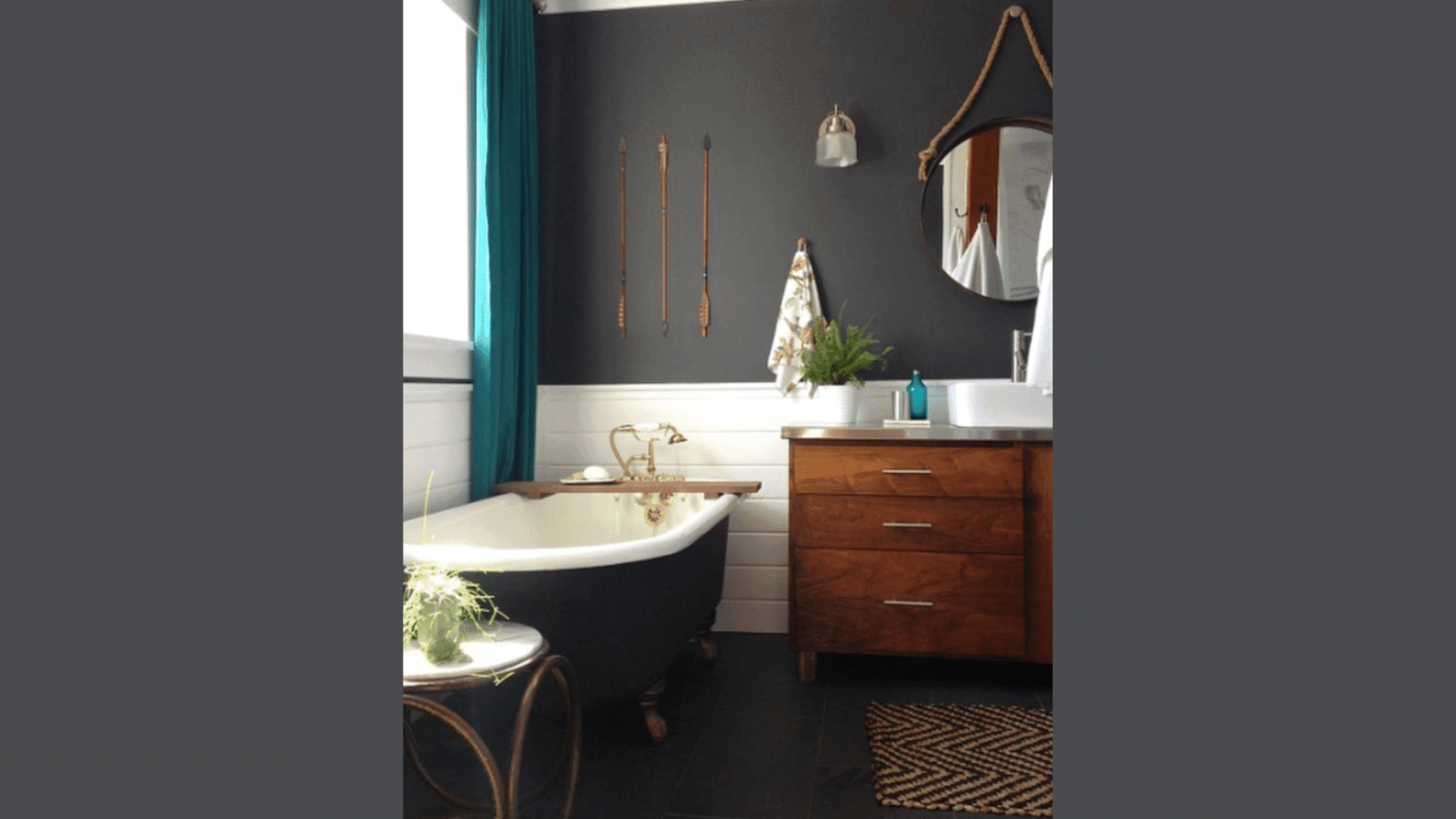
My guest bathroom vanity was boring before I painted it. Now it’s the first thing guests comment on when they visit. Wrought Iron turns a basic vanity into a custom piece. You don’t need to buy new when paint can transform what you have. The color pairs well with most bathroom fixtures, whether chrome, brass, or black.
How Wrought Iron Stacks up Against Other Benjamin Moore Colours?
I’ve tested numerous dark Benjamin Moore colors in my own home and in the spaces of my clients. Let’s see how Wrought Iron compares to other popular dark shades:
| Color | Undertones | Best For | When To Choose It Instead of Wrought Iron |
|---|---|---|---|
| Wrought Iron | Navy blue, charcoal | All-purpose dark that works in most rooms | When you want a softer black with blue hints |
| Kendall Charcoal | Warm green-gray | Cozy spaces like bedrooms and studies | When you want something less blue and slightly lighter |
| Cheating Heart | True charcoal with brown hints | Traditional spaces and wood-heavy rooms | When you want something warm without blue tones |
| Black Beauty | True black, minimal undertones | Modern, high-contrast spaces | When you want a true black with no color hints |
If you want a true black, go with Black Beauty. But if you want subtle drama that shifts with the light, Wrought Iron is my top pick. I find Wrought Iron more flexible than Kendall Charcoal because it works with both cool and warm color schemes. Kendall leans too green for some spaces.
When testing these colors, paint large swatches on different walls. The undertones appear differently depending on the lighting and other colors in the room.
Conclusion
After living with Wrought Iron in my home for over a year, I’m still happy with my choice. This color gives you that dark, moody look without the harshness of pure black.
It’s a friend to many styles – from modern apartments to cozy family homes. I love how it changes throughout the day, showing different sides of itself as the light shifts.
Remember to grab a sample pot first! Paint a board or a small section of your wall and watch it for a few days. This step saved me from several almost-mistakes over the years.
What makes Wrought Iron special is its balance. Dark but not too dark. Bold but not loud. Modern but also timeless. Whether you use it on an accent wall or go all-in on a full room, Wrought Iron brings a quiet confidence to your space that’s hard to match.
What room are you planning to paint?
Want to see another beautiful shade by Benjamin Moore? Check out my review of Benjamin Moore’s Wind’s Breath (OC-24) for another flexible option that works in almost any space.

Alex Guerrero, a graduate with a Fine Arts degree from the Rhode Island School of Design, has been a visionary in the world of color and design for over 15 years. His professional journey began in the heart of the fashion industry in Milan, where he developed an acute sense for color harmonies and trends. Alex joined our team in 2018, offering fresh and innovative perspectives on color utilization in various spaces. Renowned for his ability to blend contemporary trends with timeless elegance. Outside of work, Alex is an accomplished painter and a volunteer art therapist, his artistic talents further enriching his professional insights.