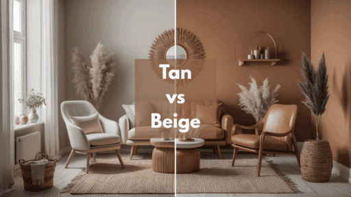
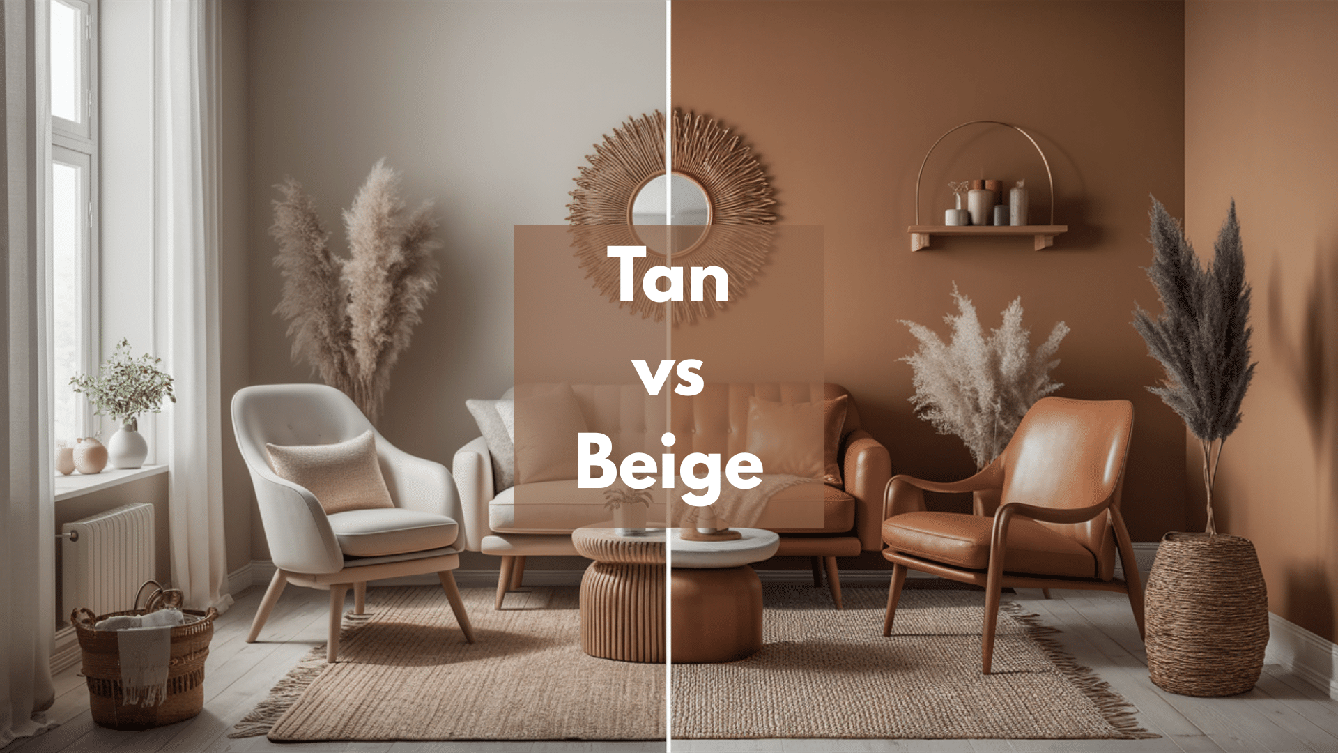
Is that wall color tan or beige?” If you’ve ever squinted at paint swatches trying to tell the difference, you’re not alone.
These two popular neutrals can look almost the same at first, but are actually quite different.
Choosing the right one can completely change the way your room feels, taking it from “just okay” to something that looks polished and pulled together.
I’ve helped hundreds of homeowners make this exact decision, and while many start out feeling confused, they ultimately end up with a color that perfectly suits their space.
In this article, you’ll learn the key differences between tan and beige, how to spot their undertones, and how to decide which one works best for your style. You’ll also find easy tips for mixing them to create beautiful, designer-worthy results.
By the time you finish reading, you’ll be ready to shop for neutrals with confidence and finally feel sure about your choices.
Understanding Tan
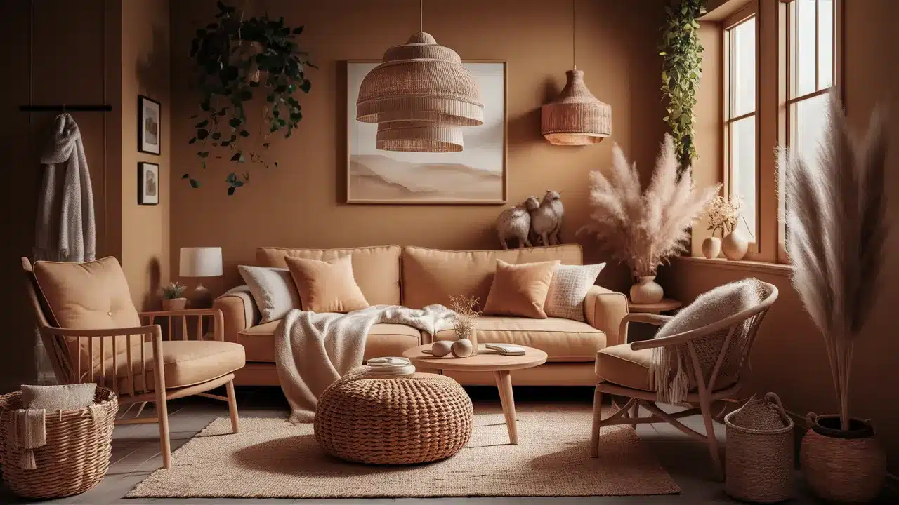
Tan is often referred to as nature’s neutral because it evokes images of sandy beaches, soft leather boots, and the vibrant colors of autumn leaves. It falls between beige and brown on the color scale, with a golden undertone that adds warmth, depth, and richness to any room.
The word “tan” actually comes from “tannum,” the Latin word for oak bark, which was used in the process of tanning leather long ago. This is part of why tan often has that perfect, leather-like quality we all recognize.
Tan works especially well in rooms where you want a cozy, welcoming feeling that makes people want to settle in and stay awhile. It adds softness and warmth without being too dark or heavy.
Some great tan paint colors to consider are Sherwin-Williams Accessible Tan, Benjamin Moore’s Huntington Beige, and Behr’s Basketry.
Understanding Beige
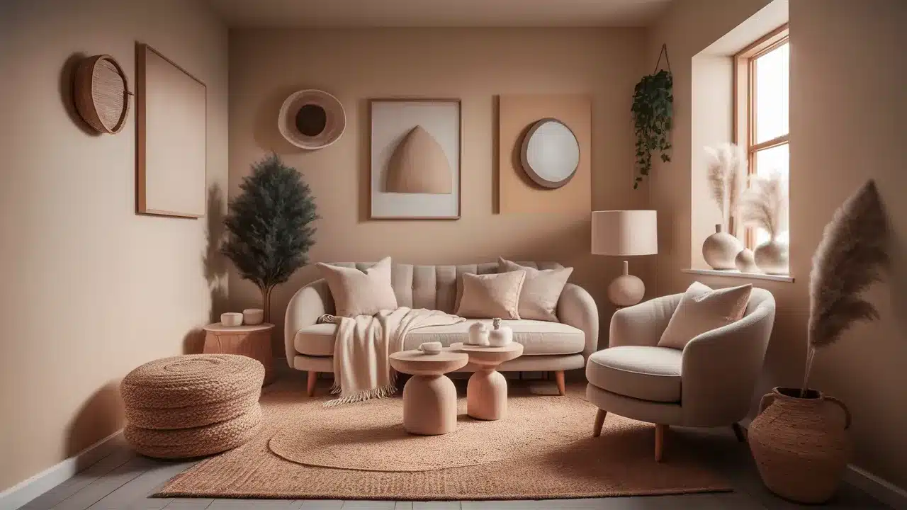
Beige is often referred to as the chameleon of neutrals because it’s so subtle, sophisticated, and versatile, making it easy to incorporate into almost any style of home.
Unlike tan, beige is lighter, softer, and has less yellow or brown in its mix, which gives it a more delicate and airy look.
Beige first gained popularity in the 1920s when the renowned designer Coco Chanel incorporated it into her fashion collections, and it has since remained a symbol of simple, classic beauty.
In decorating, beige creates a clean, quiet background that lets your furniture, artwork, and accessories stand out and shine. It’s the kind of color that doesn’t steal attention but enhances everything else.
If you’re looking for good beige paint options, consider Sherwin-Williams Agreeable Gray (which leans more toward beige than gray), Benjamin Moore’s Manchester Tan, or Behr’s Silky White.
Tan vs Beige
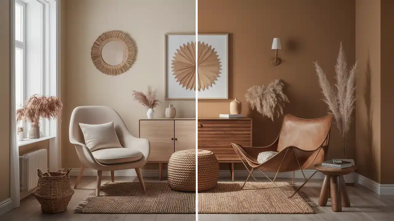
Both colors offer beautiful neutral options, but they serve different purposes in design and fashion. Let’s break down their key differences.
1. Undertones
Understanding undertones is crucial when choosing between tan and beige, as even a slight shift in color can significantly alter the ambiance of your space.
These slight differences matter a great deal, especially when matching paint with your furniture, flooring, and decor.
| Feature | Tan | Beige |
|---|---|---|
| Undertone | Warm, golden-brown; may show hints of orange or red | Cooler, gray-based; may show hints of pink or green |
| Overall Look | Rich, cozy, and slightly earthy | Soft, light, and more muted |
| Best for | Creating warm, welcoming spaces | Creating clean, airy, and calm spaces |
| LRV Range | 30-50 (absorbs more light) | 50-70 (reflects more light) |
Even though the difference may seem small, undertones can have a significant impact once the color is on your walls. Always test paint samples in various lighting conditions throughout the day to see the true undertones before making your final choice.
2. Versatility in Design and Fashion
Both tan and beige are flexible colors, but they each shine in different styles and settings. Knowing where each one works best can help you decide which neutral fits your space—or even your wardrobe—more naturally. Here’s a simple guide to help you:
| Feature | Tan | Beige |
|---|---|---|
| Best With | Rustic and traditional styles; wood and stone materials; jewel-tone accents; earth-toned color palettes | Modern and minimalist styles; warm or cool accents; metallic finishes and glass; almost any accent color |
| Fashion Use | Often used for bold statement pieces like leather jackets or boots | Commonly used for timeless basics that work through every season |
Tan brings warmth, richness, and a natural feeling that ties perfectly with heavier textures and bold contrasts. Beige, on the other hand, steps back slightly, offering a clean background that fits into almost any style while still feeling polished and stylish.
3. Light and Space Effects
Lighting plays a big role in how tan and beige look in your home. Understanding how these colors interact with light can help you pick the right one for your space. Here’s a simple breakdown to show how each one behaves:
| Feature | Tan | Beige |
|---|---|---|
| Light Reflection | Absorbs more light; creates a smaller but cozier feeling | Reflects more light; makes rooms feel larger and more open |
| Impact of Lighting | Feels warmer in southern light; may feel heavy in low-light rooms | Stays light and bright in most settings; enhances openness in small spaces |
The amount and direction of natural light in your room will also change how tan and beige appear. Northern light brings out cooler undertones, while southern light highlights warm tones, which explains why the same paint color can look very different from one house to another.
Which Color Suits You Best?
Choosing between tan and beige comes down to your personal style and space requirements. Here’s a quick guide to help you decide:
Choose Tan If You:
- Love warm, earthy interiors
- Have natural wood finishes
- Want a cozy atmosphere
- Have rooms with plenty of natural light
Choose Beige If You:
- Prefer light, open spaces
- Need to make small rooms feel bigger
- Want flexibility with accent colors
- Like modern or transitional styles
Before You Decide:
Take time to examine what’s already in your home. Your flooring sets the foundation—warm wood floors work better with tan, while cool-toned tiles suit beige. Look at your furniture pieces and fixed features like cabinets or countertops.
These permanent elements should guide your color choice. Test paint samples on your walls at different times of day since morning light shows different undertones than evening light.
Remember: The right neutral will complement what you already have, not fight against it.
How to Style Tan and Beige Together Without Clashing?
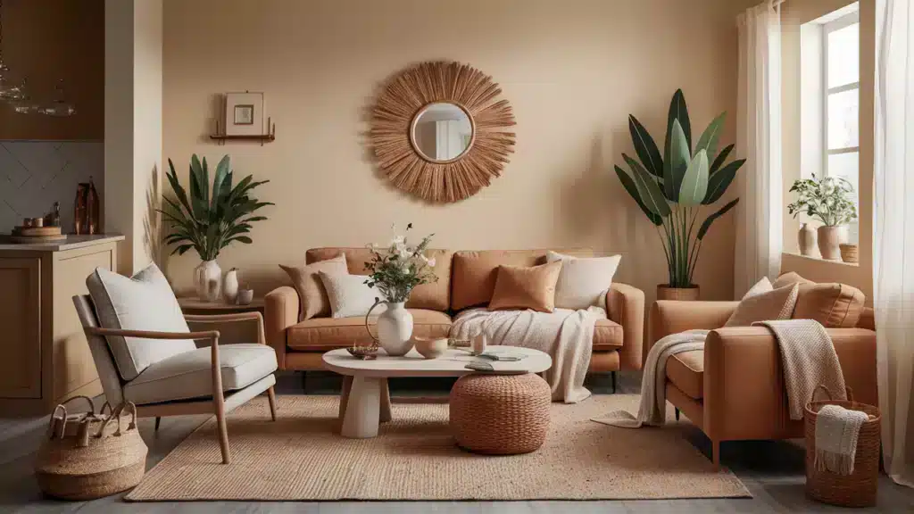
Who says you have to choose between tan and beige when they can work together beautifully?
When you use these two neutrals effectively, they create a layered, rich look that feels both stylish and welcoming.
You can try using tan for larger furniture pieces, such as sofas while keeping the walls a soft beige for a nice balance.
Alternatively, create depth by painting an accent wall a tan color against beige backgrounds. Layering different shades of both colors also gives a monochromatic look that feels polished but never boring.
Tan flooring with beige upholstery or the opposite can easily tie the room together. The key is to create intentional contrast, as shades that are too similar may clash instead of complementing each other.
Always choose tan and beige tones with the same undertone, either warm or cool, to maintain a clean and harmonious look.
Use the 60-30-10 Rule: 60% beige (walls), 30% tan (furniture), 10% white/black accents.
Conclusion
There is no clear winner in the tan versus beige debate, as both colors offer beautiful and stylish possibilities for your home and wardrobe.
Tan brings a sense of warmth, comfort, and coziness that makes rooms feel inviting and grounded. Beige, on the other hand, offers versatility and a fresh, open quality that complements almost any style or color scheme imaginable.
Before making a final decision, don’t be afraid to test a few samples because what looks perfect on a small paint chip might feel completely different once it’s covering a whole wall.
Most importantly, trust your instincts and pay attention to how each color makes you feel because you will be living with it every day.
What’s your experience with these two neutrals? Have you found your perfect shade yet? I’d love to hear your thoughts in the comments below!
If you enjoyed this blog, you'll definitely want to check out my comparison of White Dove and Swiss Coffee two of the most loved neutrals that can completely change the look and feel of your space!
Frequently Asked Questions
What Colors Go Well With Tan?
Tan looks great with rich colors like navy blue, emerald green, and burgundy. It also pairs nicely with cream for a softer look if you prefer something a little more attractive.
Can Beige Look Modern?
Yes, beige can definitely look modern when used correctly. Pair it with clean lines, simple shapes, and lots of texture. Adding a few bold black accents can give beige rooms a fresh, stylish feel.
Why Does My Beige Paint Look Pink?
Some beige paints have hidden pink or purple undertones that become more apparent in certain lighting conditions. That’s why testing paint samples on your walls is crucial before making a decision.

Alex Guerrero, a graduate with a Fine Arts degree from the Rhode Island School of Design, has been a visionary in the world of color and design for over 15 years. His professional journey began in the heart of the fashion industry in Milan, where he developed an acute sense for color harmonies and trends. Alex joined our team in 2018, offering fresh and innovative perspectives on color utilization in various spaces. Renowned for his ability to blend contemporary trends with timeless elegance. Outside of work, Alex is an accomplished painter and a volunteer art therapist, his artistic talents further enriching his professional insights.