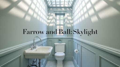
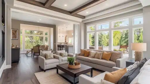
Have you been looking for the perfect shade of blue that changes with the light? I found it in Farrow & Ball’s Skylight No. 205.
Let me tell you why this color caught my eye – it’s a soft blue-grey that shifts throughout the day, just like the natural light from above.
After testing it in my guest bedroom with its large bay window, I fell in love with how it creates a peaceful space that feels bright yet cozy.
The way it adapts to different rooms and lighting conditions makes it truly special.
Come along as I share my experience with this versatile paint color and help you decide if it’s the right choice for your home.
What Makes Farrow and Ball Skylight Unique?
I’ve found that Skylight No. 205 stands out because of its ability to change character. In my small guest bedroom, it shows up as a clear, cool blue.
But here’s what’s interesting – when I painted my larger home office, the color became softer and more grey.
Let me break down its special qualities:
The color takes its name from the gentle light that comes through ceiling windows. I’ve noticed it has a Light Reflective Value (LRV) of 57, which means it reflects just the right amount of light – not too bright, not too dark.
What I really like about Skylight is its grey undertones.
These undertones help create a gentle, calming effect that works well in both modern and traditional spaces.
When the sun moves across the room, the walls seem to shift from pale blue to a subtle grey, making each moment in the space feel different.
Can Farrow and Ball Skylight Be Used in Any Room?
When I first bought Skylight, I was nervous about using such a specific color in multiple rooms. But after painting my guest bedroom, I fell in love with its flexibility and kept finding new places to use it.
A word of caution – I’ve learned that this color looks different in various lighting conditions.
I always suggest testing a sample in your space first. Watch how it changes from morning to evening, and with both natural and artificial light.
Here’s my top tip from all this painting: grab a sample and paint a big square on each wall you’re considering. I check it during breakfast, lunch, and dinner to see all its different moods.
Trust me – this extra step is worth it!
Stunning Rooms Featuring Farrow and Ball Skylight
I’ve used and seen Skylight in various spaces, and I want to share my personal experiences and tips for each room.
Let me break it down room by room.
1. Living Room
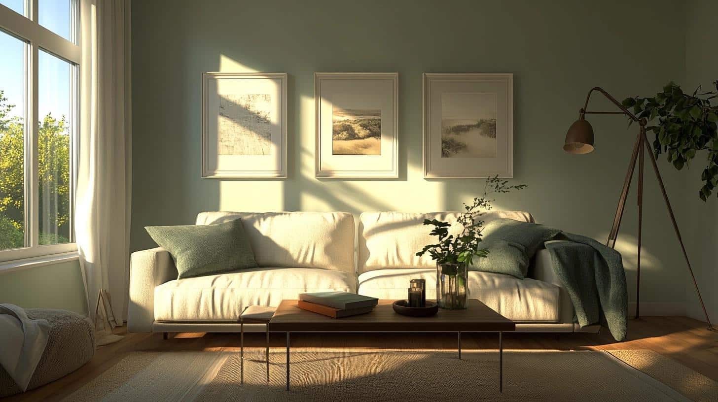
I painted my living room in Skylight last spring, and it’s created the perfect backdrop for family gatherings. The color shifted my space from feeling stuffy to airy and open.
What works with Skylight here:
- White linen curtains – they complement the wall color without competing
- Natural wood furniture – the warmth balances the cool tones
- Blue and green throw pillows – they build on the wall color
- Brass light fixtures – they add warmth and sparkle
2. Bedroom (My Favorite Space!)
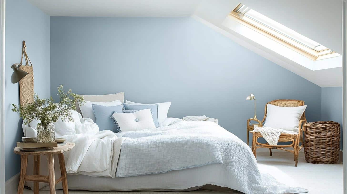
My guest bedroom was my first experiment with Skylight, and it remains my favorite application. The morning light makes the walls look like a soft cloud, while evening light brings out the grey undertones.
Tips from my experience:
- Layer different textures in white bedding
- Add natural elements like dried flowers
- Use mirrors to bounce light around
- Keep artwork simple – black and white photos work great
3. Bathroom
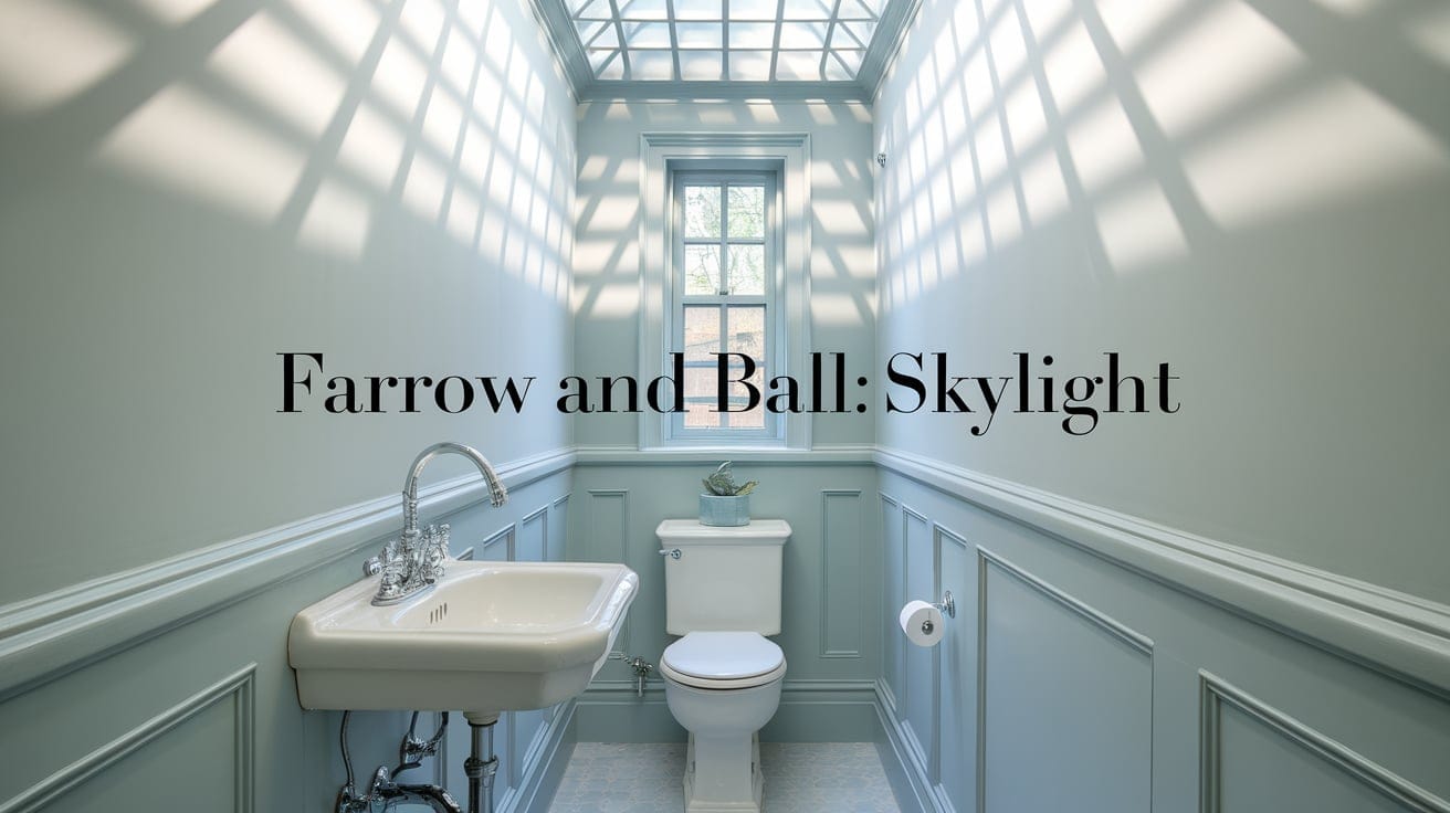
In my small powder room, Skylight makes the space feel bigger than it is.
Here’s my quick styling guide:
- Chrome or nickel fixtures
- White towels
- Clear glass accessories
- A large mirror to reflect light
4. Kitchen
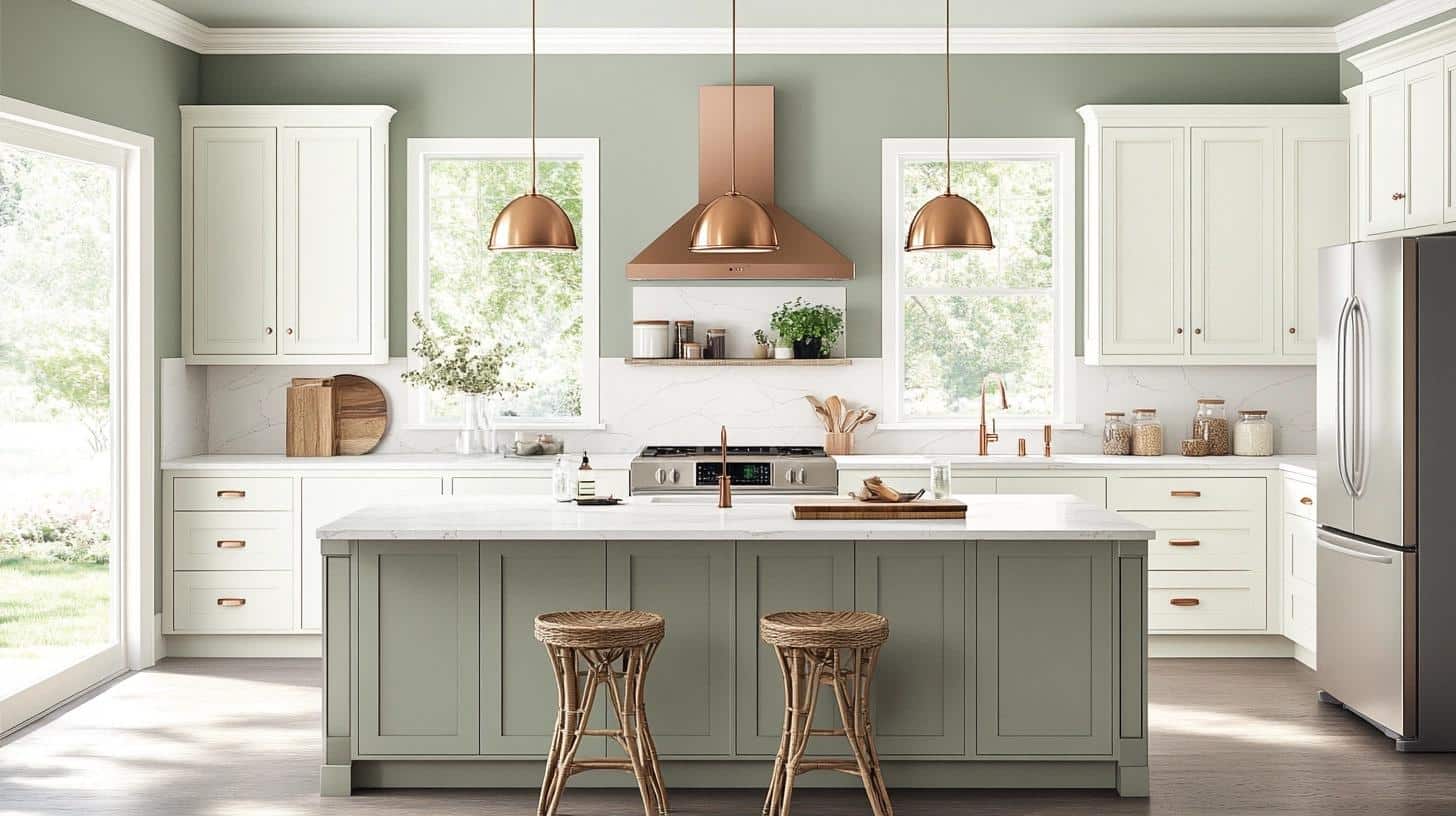
My kitchen gets northern light, and Skylight creates a fresh, clean feeling. The color works especially well with:
- White cabinets
- Marble or white stone counters
- Stainless steel appliances
- Open shelving with white dishes
What Surprised Me: The color feels different throughout the day – softer in morning light when I have coffee, brighter at lunch, and takes on a cozy grey tone during dinner prep.
My Top Kitchen Tip: I painted a large test patch near my stove and another by the window. After cooking several meals, I noticed how the color stayed true even with steam and cooking oils in the air. This convinced me it was the right choice for a hardworking kitchen.
5. Dining Room
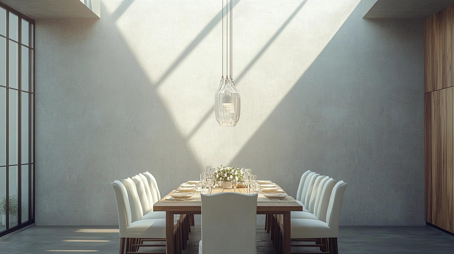
The dining room was my latest Skylight project.
The color creates different moods for different occasions – serene for morning coffee, sophisticated for dinner parties.
Mood Board Elements:
- Glass pendant lighting
- Light wood dining table
- White upholstered chairs
- Simple table linens in natural fabrics
6. Home Office
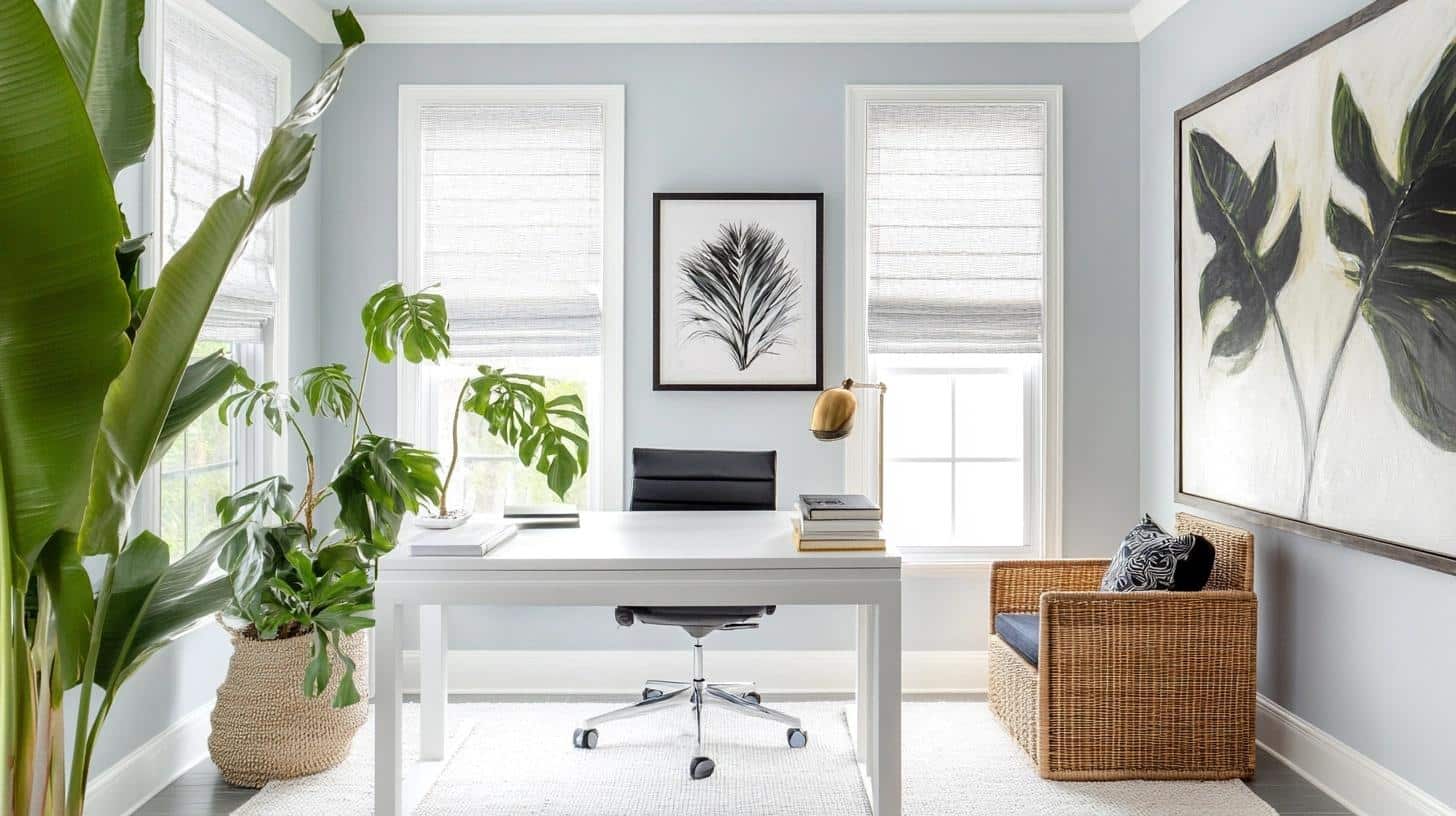
I spend most of my day in my Skylight-painted office, and it’s created the perfect work environment.
My Office Setup:
- White desk
- Green plants for life and color
- Simple roman shades in white linen
- Black and white art prints
- Warm wood bookshelf
For each room, I recommend testing how the color looks throughout the day. I put sample squares on different walls and lived with them for a week before making my final decision.
What Furniture to Pair with Skylight?
Wood Tones
I’ve found this color loves natural wood. In my living room, I tried different pieces:
- Oak pieces bring warmth without clashing
- Light maple furniture creates a fresh, bright feel
- Walnut adds depth while staying balanced
- White-washed woods enhance the room’s airy quality
Upholstered Pieces
Through trial and error in my home office and living spaces, these worked best:
- Cream linen chairs
- White cotton sofas
- Light grey velvet accent chairs
- Natural canvas ottomans
Metal Finishes
My favorite metal combinations:
- Brushed nickel lighting looks clean and fresh
- Chrome bathroom fixtures pop against the walls
- Brass accents add subtle warmth
- Silver picture frames complement the grey undertones
White Furniture
I discovered white furniture creates a winning combination:
- White bookshelves help the walls feel taller
- Simple white desks keep the space feeling open
- White bed frames enhance the room’s peaceful feeling
Color Combinations to Try
From my experiments across different rooms:
- Light pink accents soften the space
- Pale green pieces create a natural feel
- Navy blue additions add depth
- Grey pieces blend smoothly
Affordable Alternatives and Dupes of Skylight
I know Farrow & Ball paints can stretch the budget. After testing several options, I found some excellent alternatives that give a similar look for less.
Sherwin Williams Options:
- Tinsmith – My top pick, matches the blue-grey balance
- Upward – Slightly bluer, but still gives that airy feel
- Sea Salt – Has more green undertones but creates the same calm feeling
Benjamin Moore Matches:
- Silver Crest – Nearly identical in natural light
- Gray Cashmere – A touch grayer
- Winter Lake – Similar depth with slightly more blue
Money-Saving Tips From My Experience:
- Sample First: Buy sample pots of each option • Test in different lighting • Live with samples for a few days
- Paint Application: Use good quality primer • Apply thin coats • Use better brushes rather than more paint
- Getting the High-End Look: Paint trim bright white for contrast • Use quality rollers for smooth finish • Do three thin coats instead of two thick ones
What I Learned: The key to making budget options look expensive isn’t in the paint itself – it’s in the prep work and application.
I found taking extra time to prepare walls and using quality tools made a bigger difference than the paint brand.
Summing It Up
After living with Skylight in several rooms of my home, I can say this color brings a special quality to any space.
From my bright kitchen to my cozy bedroom, this gentle blue-grey creates rooms that feel both fresh and peaceful.
If you’re planning to try Skylight or one of its budget-friendly alternatives, remember to test your samples in different lighting conditions. Watch how the color changes throughout the day – it’s part of its charm.
Want to explore more paint colors? Check out my other paint guides:
- SW Pure White: A Clean Classic
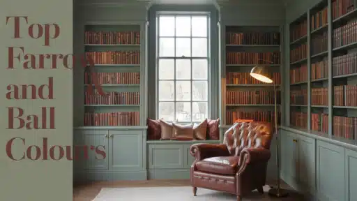
- Popular Farrow & Ball Colors
- Redend Point by Sherwin Williams
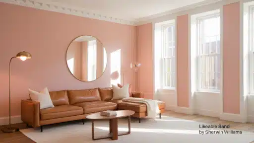
- Sherwin Williams Likeable Sand Review

