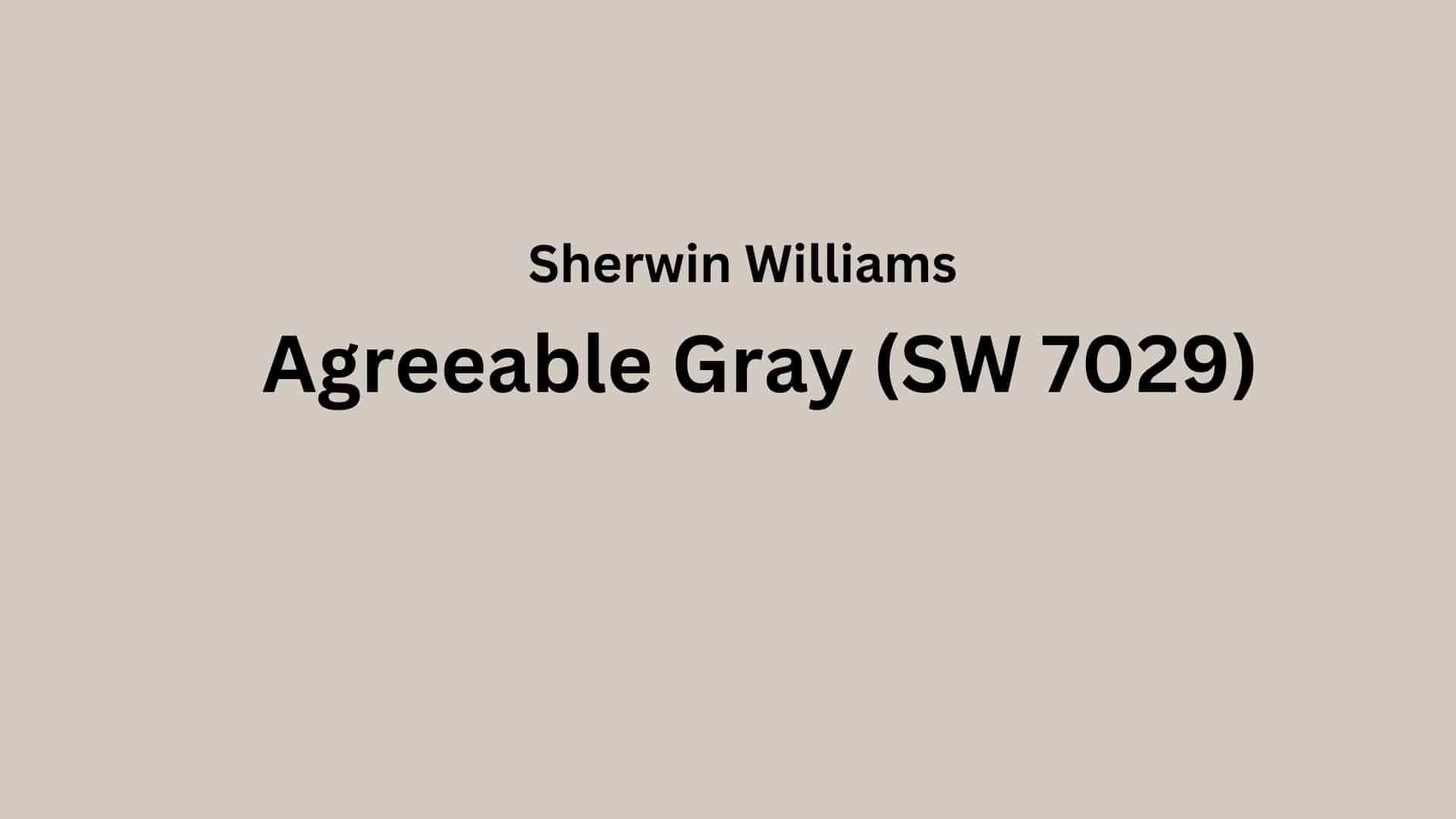
Looking for a paint color that works in every room?
Welcome to our color review of Sherwin Williams’ Agreeable Gray! This popular paint color has won the hearts of many homeowners and designers for good reasons.
Agreeable Gray has a Light Reflectance Value (LRV) of 60, which means it reflects a good amount of light while still providing enough color to define your walls.
This middle-range LRV helps make rooms feel open and bright without being too stark.
This soft gray has just the right mix of warm and cool tones, making it work well in many different rooms and with many other styles. It’s no wonder so many people pick this color for their homes!
Let’s examine what makes Agreeable Gray such a well-loved paint color and how it might work in your home.
Thinking about painting your cabinets? See how Agreeable Gray Cabinets: Your Designer’s Best‑Kept Secret offers helpful advice on finishes, primers, and when to choose alternatives like Mega Greige for extra depth.
Understanding the Color Basics of Agreeable Gray
Agreeable Gray (SW 7029) by Sherwin-Williams is a neutral greige color—a unique blend of gray and beige. It is a warm greige color with beige undertones.
This warm-toned gray creates a balanced atmosphere that works well across various design styles and spaces.
Color Details
| ATTRIBUTE | VALUE |
|---|---|
| Company Color Code | SW 7029 |
| LRV (Light Reflectance Value) | 60 |
| RGB Code | (209, 203, 193) |
| Hex Code | #D1CBC1 |
What Do These Numbers Mean?
- Company Color Code (SW 7029): This is the specific identifier used by Sherwin Williams for Agreeable Gray, making it easy to locate or request the exact shade.
- LRV (60): The Light Reflectance Value indicates how much light the color reflects. With an LRV of 60, Agreeable Gray reflects a good amount of light, making it a versatile mid-tone that’s bright enough for most spaces without being stark.
- RGB Code (209, 203, 193): These values represent the mix of red, green, and blue that create the color. Higher values mean lighter tones; in this case, the balance makes a soft, warm greige.
- Hex Code (#D1CBC1): This is the hexadecimal color value used in digital design and web applications. It corresponds directly to the RGB values and helps maintain color accuracy across screens.
Pyschology on Agreeable Gray
- Calming and Soothing: Greige combines the warmth of beige with the coolness of gray, creating a balanced tone that promotes relaxation and reduces visual stress.
- Versatile and Adaptable: Greige is often associated with flexibility. It feels at home in both modern and traditional spaces, making it a safe and stylish choice.
- Neutral Grounding: It provides emotional stability and a sense of groundedness, which is why it’s commonly used in spaces meant for focus or comfort.
- Minimalism: Greige shades evoke a sense of understated style and modern simplicity, often linked to refined taste and intentional design.
- Welcoming Warmth: Unlike cooler grays, greige carries a hint of warmth, making spaces feel more inviting and psychologically comforting.
Why Choose Agreeable Gray (SW 7029)?

Agreeable Gray is a perfect balance between gray and beige (making it a “greige”), offering warmth while staying neutral. It works well in both small and large spaces and adapts beautifully to different lighting conditions.
Unlike stark whites that can feel cold or bold colors that might overwhelm, Agreeable Gray creates a calming backdrop that complements almost any décor style.
1. Key Features
Agreeable Gray is a warm neutral with subtle undertones that shift slightly throughout the day. It pairs wonderfully with white trim and natural wood tones.
This versatile color works in any room of your home, from living areas to bedrooms, creating a consistent, harmonious feel.
2. Durability & Maintenance
This paint color hides dirt and small marks better than lighter colors. It’s easy to clean with just soap and water. The color stays true for years without fading, even in rooms that get lots of sunlight.
Touch-ups blend seamlessly when needed.
3. Finish Recommendations
For living rooms and bedrooms, choose an eggshell finish for a soft look that hides wall imperfections. In kitchens and bathrooms, satin finish offers better moisture resistance and cleaning ease.
Flat finish works well on ceilings, while semi-gloss makes trim and doors stand out beautifully.
Agreeable Gray in Different Rooms
Living Spaces & Open Floor Plans

Agreeable Gray helps big rooms feel cozy and warm. It makes open floor plans look put together without being too dark.
Additional Tips:
- Use white trim to make the gray color stand out more
- Try darker furniture to create a nice contrast with the light walls
Bedrooms & Relaxation Areas

This soft gray creates a calm feeling that helps with sleep and rest. It works well with many bedding colors and styles.
Additional Tips:
- Add soft lighting to make the room feel extra cozy at night
- Mix in some blue or green items to bring out the cool tones in the paint
Kitchens & High-Traffic Areas

Agreeable Gray hides small marks and dirt better than white walls. It looks clean with both light and dark cabinets.
Additional Tips:
- Pair with light countertops for a bright, clean look
- Use in mudrooms and hallways too—it handles daily life well
Bathrooms & Spa-like Retreats

Gray works well with white fixtures and tile. It makes small bathrooms feel bigger and more open.
Additional Tips:
- Add plants to bring life to the gray background
- Choose matching gray towels for a clean, put-together look
Color Pairings & Combinations

- Incredible White (SW 7028): This soft white makes Agreeable Gray look darker. It works great in rooms with bright walls and gray accents.
- Extra White (SW 7006): This is a clean, pure white that makes Agreeable Gray stand out more. This pair gives a fresh, clean look to any room.
- Coral Rose (SW 9004):This pink-orange shade adds warmth when used with Agreeable Gray. It brings a pop of color that makes gray walls look more interesting.
- Creamy (SW 7012):This warm off-white color pairs well with Agreeable Gray. The combo makes rooms feel cozy and welcoming without being too dark.
Creating Cohesive Color Schemes

1. Monochromatic Scheme
A monochromatic scheme uses different shades of the same color. With Agreeable Gray, you can make a room look calm and put-together.
- Pair Agreeable Gray with lighter versions like Eider White for a soft look
- Add darker shades like Dovetail for depth in corners or trim
- Use white ceilings to make the room feel bigger
- Try painting furniture in deeper grays for contrast
2. Warm Color Scheme
Warm color schemes with Agreeable Gray feel cozy and welcoming. These colors go well together for a friendly room.
- Mix with soft yellows like Butter Up for a sunny feeling
- Add tan colors like Accessible Beige for a nice match
- Try brick red or rust accents for a pop of color
- Use wood furniture to bring out the warm tones in Agreeable Gray
3. Cool Color Scheme
Cool colors with Agreeable Gray make rooms feel calm and fresh. These colors work well in bedrooms and bathrooms.
- Add light blue shades like Rain for a clean look
- Mix with green colors like Sea Salt for a nature feel
- Use navy blue as a bold accent color
- Try silver or chrome fixtures to bring out the cool tones
Coordinating with Furniture & Decor

1. Wood Tones
Agreeable Gray works well with many types of wood. This color makes your wooden furniture look good no matter what color the wood is.
- Dark woods like walnut and espresso look clean and sharp against this gray
- Medium woods, such as oak and cherry, add warmth to the room
- Light woods like maple and pine create a bright, airy feeling
- Weathered or whitewashed wood pairs nicely for a casual, beachy look
- Painted white wood trim makes the gray walls stand out more
2. Metals
This gray color goes with all kinds of metal finishes in your home. You can mix different metals, and they will still look good together.
- Silver and chrome add a cool, clean look to a gray room
- Brass and gold bring warmth and make the space feel cozy
- Matte black hardware creates a nice contrast against the soft gray
- Brushed nickel is a safe choice that always works well
- Mixed metals look put-together, not messy, with this gray as a background
3. Decor
Choosing the right items for your gray room can make it feel like home. Agreeable Gray is a good base for many colors and styles.
- Blue items (like pillows, rugs, or art) look calm and relaxing with this gray.
- Green plants stand out nicely against the neutral background
- White picture frames and candles keep the room feeling light
- Textured items like woven baskets add interest without being too busy
- Patterned rugs with gray plus one or two other colors tie the room together
Similar Colors & Alternatives

- Anew Gray (SW 7030)– This color is a bit darker than Agreeable Gray. It works well in living rooms and bedrooms where you want a warmer feeling.
- Mega Greige (SW 7031) – This is a deeper gray-beige mix that looks great in spaces with lots of natural light. It pairs nicely with white trim and wood elements.
- Perfect Greige (SW 6073) – A balanced mix of gray and beige that’s slightly warmer than Agreeable Gray. It’s good for spaces where you want a cozy but not too dark feel.
- Alpaca (SW 7022) – A lighter greige with subtle purple hints. This color creates a soft look and works well in bathrooms and hallways.
Final Thoughts
Agreeable Gray is a top pick for many homes. This color from Sherwin Williams works well in almost any room. It’s not too dark and not too light.
People love this color because it goes with many other colors. It looks good with white trim, wood floors, and many types of furniture. The gray has a bit of warmth to it, which makes the rooms feel cozy.
This color can make a room look bigger and brighter. It works in living rooms, bedrooms, kitchens, and bathrooms.
Many people who use this color are happy with how their rooms look after painting. It’s a safe choice that most people will like. If you’re not sure what color to pick, Agreeable Gray is a good bet.
Checking different colors for your home? Please go through our color schemes section for more info!

